Anatomy
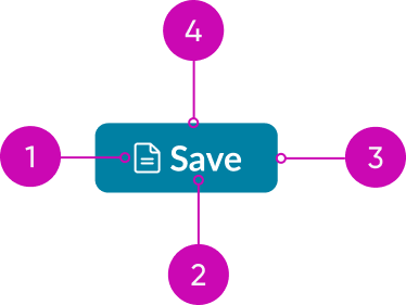
- Icon (optional): Visual element next to the label that emphasizes the action
- Label: Describes the action of the button
- Container: Frame containing the button
- Slot (optional): Container inside the button where you can add a component, and takes the place of the label and icon. Use a slot to clarify or emphasize a button’s function. Some additions make sense, such as a heading component. Other additions don’t make sense, such as a button (within a button).
Usage
Use different button variants and button types to guide the user through your design or workflow. Buttons can also help express the hierarchy of actions with variant styles. Choose the appropriate button style based on the importance of each action. Be sure to also consider the button type and configuration for each action.
Buttons with text have more visual impact and offer more context than iconic buttons. Iconic buttons should provide necessary visual context but aren’t meant to compete for the user's attention.
Variants
Learn about the attributes of button.
Types
The button component has these different types.
See usage guidance for bare button
See usage guidance for iconic button
See usage guidance for split button
See usage guidance for stateful button
Colors
Button has the following different color variants:
- Primary
- Primary positive
- Primary negative
- Secondary
- Secondary positive
- Secondary negative
- Tertiary
- Primary AI
- Secondary AI
- Tertiary AI
Color variants are ways to visually show the order of importance for buttons in the display. By applying variants to buttons, you can help the user make a decision quickly.
Primary
Use the primary button for the key action in a workflow or a component.

A primary button is designed to grab the user's attention and stand out from other buttons. Use one primary button per display in a workflow.
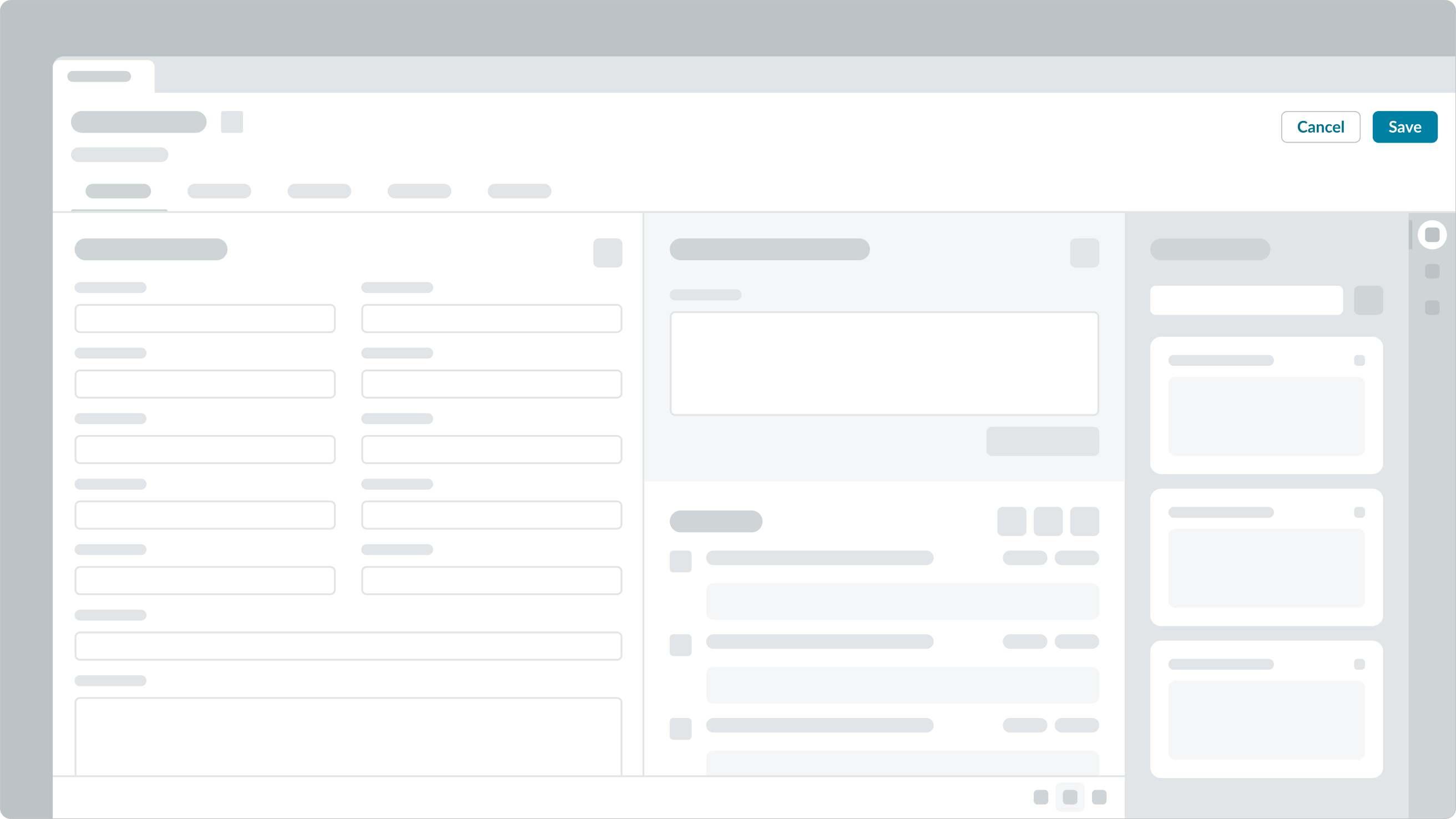
In this example, 'Save' is the primary action for the workflow. Its variant style makes it distinguishable from the 'Cancel' button.
You can use a primary button in isolated views or components (like a modal).
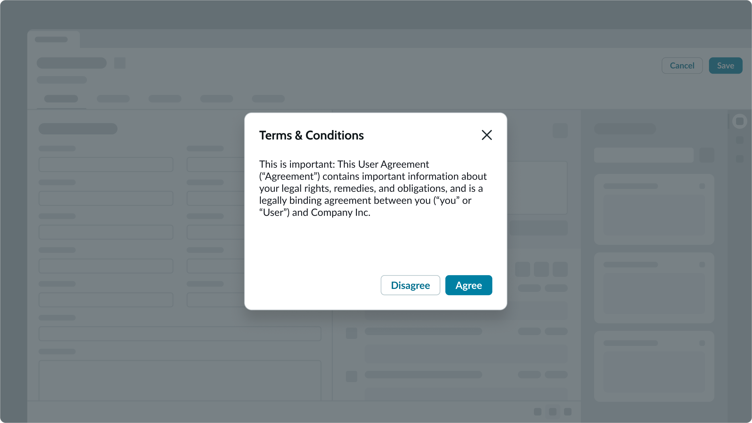
In this example, the primary variant is the main action the user should take within the modal. The primary button appears in its own view, so it doesn't conflict with the primary action of the page behind the modal.
Primary negative variant
Use the primary (negative) variant for critical or destructive actions, such as permanently deleting something.

The primary (negative) button clearly communicates the severity of a destructive action with its style.
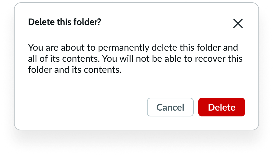
In this example, the modal informs the user that they are about to permanently delete a folder. This is a critical action, so the button uses the primary negative variant.
Primary positive variant
Use the primary (positive) variant for confirming an object or action.

Remember that the primary (positive) variant shouldn't exist by itself. Always pair this variant with a primary (negative) action to provide the user with two distinct choices.
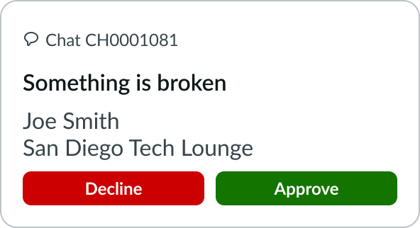
In this example, the user can decline or approve the request. The primary (positive) variant and the primary (negative) variant clearly show the two choices available to the user.
If you want to use only one button, use the primary variant instead.
Secondary variant
Use the secondary variant when the action is supplemental to completing a workflow. The secondary variant is the default for button.

The secondary variant has a recognizable appearance with a style that keeps it from standing out in the display.
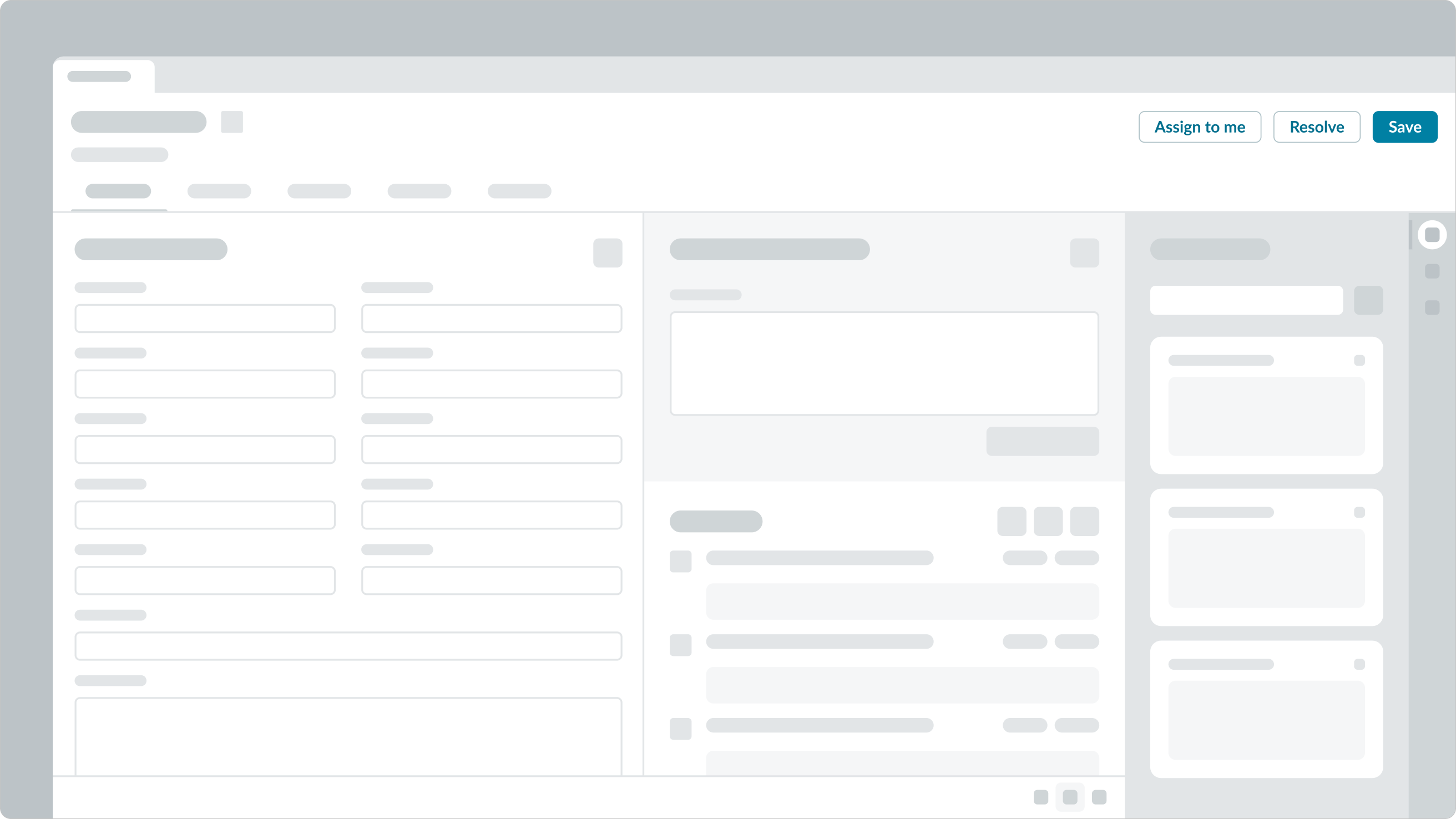
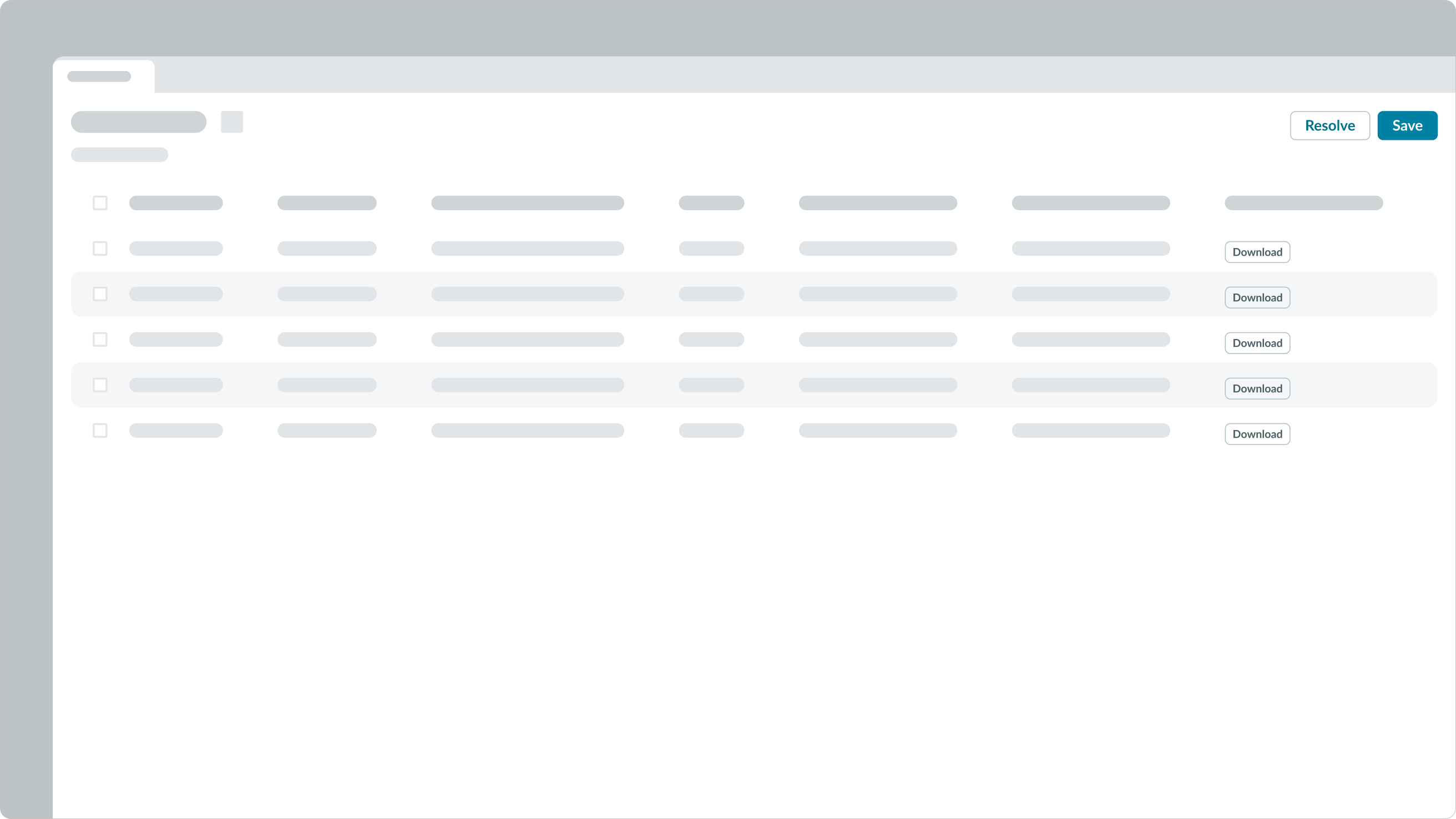
The actions 'Assign to me' and 'Resolve' are secondary variants of a button. They complement the primary action, ‘Save’.
Secondary negative variant
Use the secondary (negative) variant when there are multiple instances of a negative and positive action within a single view.

The secondary (negative) variant clearly communicates denying something or taking a destructive action. It's also an alternative to the prominent primary (negative) variant.
Secondary positive variant
Use the secondary (positive) variant when there are multiple instances of a negative and positive action within a single view.

The secondary (positive) variant clearly communicates confirming an action. It's also an alternative to the prominent primary (positive) variant.
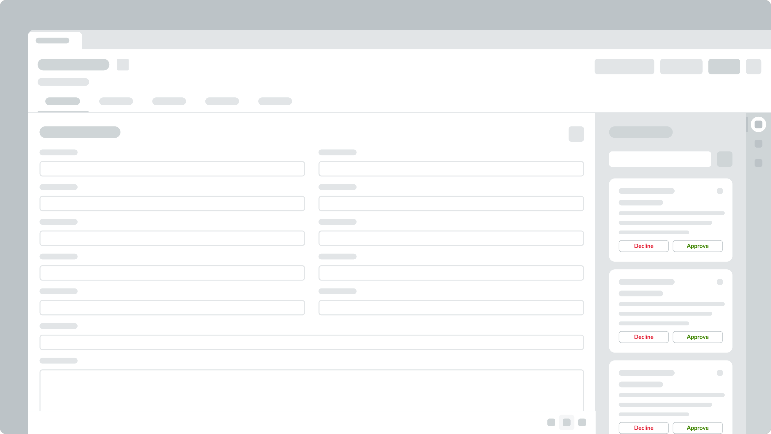
In this example, the secondary (positive) and secondary (negative) variants show multiple choices within a single view.
Tertiary variant
Use the tertiary variant for optional or repeated actions.

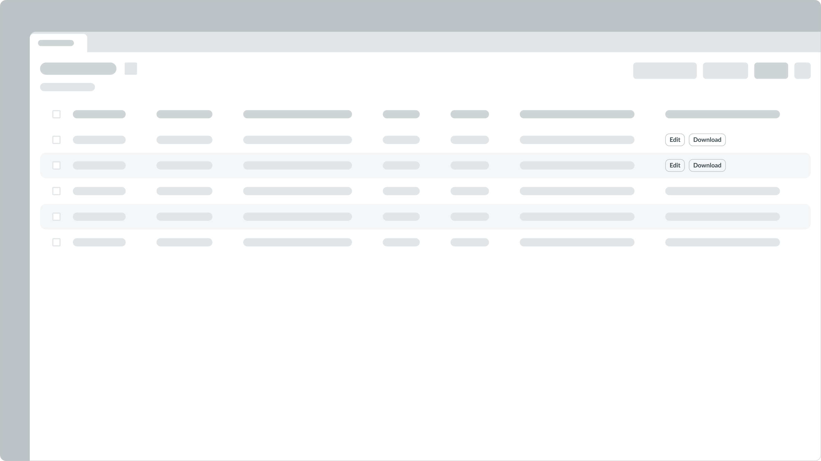
In this example, the 'Edit' and 'Download' actions are optional, so they use the tertiary button style.
AI variants
Use the AI variants with updated color palettes for AI-driven workflows.
AI primary variant

AI secondary variant

AI tertiary variant

Sizes
A button has three sizes: small (sm), medium (md), and large (lg). Size helps reinforce visual hierarchy, differentiate the different types, and indicate the functions of buttons. Choose a size that fits with your display and complements the surrounding content. The Gen AI variants are also available in small (sm), medium (md), and large (lg).
Small
Use the small size for areas that have limited space. This size is also recommended for non-essential actions.

Medium
Use the medium size alongside similarly sized components and content.

Note: medium is the default size for button.
Large
Use the large size to emphasize a button and to capture the user's attention.

Configurations
Learn how to customize button by configuring the available properties.
Presets and controllers
This component has a preset configuration that sets properties and event handlers, making it ready for use. You can override preset values with a custom configuration if needed. Preset values won’t upgrade with updates. To avoid using presets, configure manually. One preset can apply to a single component instance. See presets for more info.
A preset is linked to a controller, which serves as a data resource. Controllers provide configuration data and event bindings for the component. Selecting a preset adds the required controller to the page, allowing new components to use its preset. For more on controllers, see controllers. For default presets, see view properties and events in the controller API.
Label
You can configure the label for your button. The default is “Button.”
Variant
Configure the variant for your button to assign your button’s level of priority. Options include primary, secondary, tertiary, as well as positive/negative primary and secondary.
Size
Configure the appropriate size for your button.
Identifier
You can assign a static or animated icon for your identifier.
Accessibility
You can configure the tooltip label and ARIA properties for your button.
Design recommendations
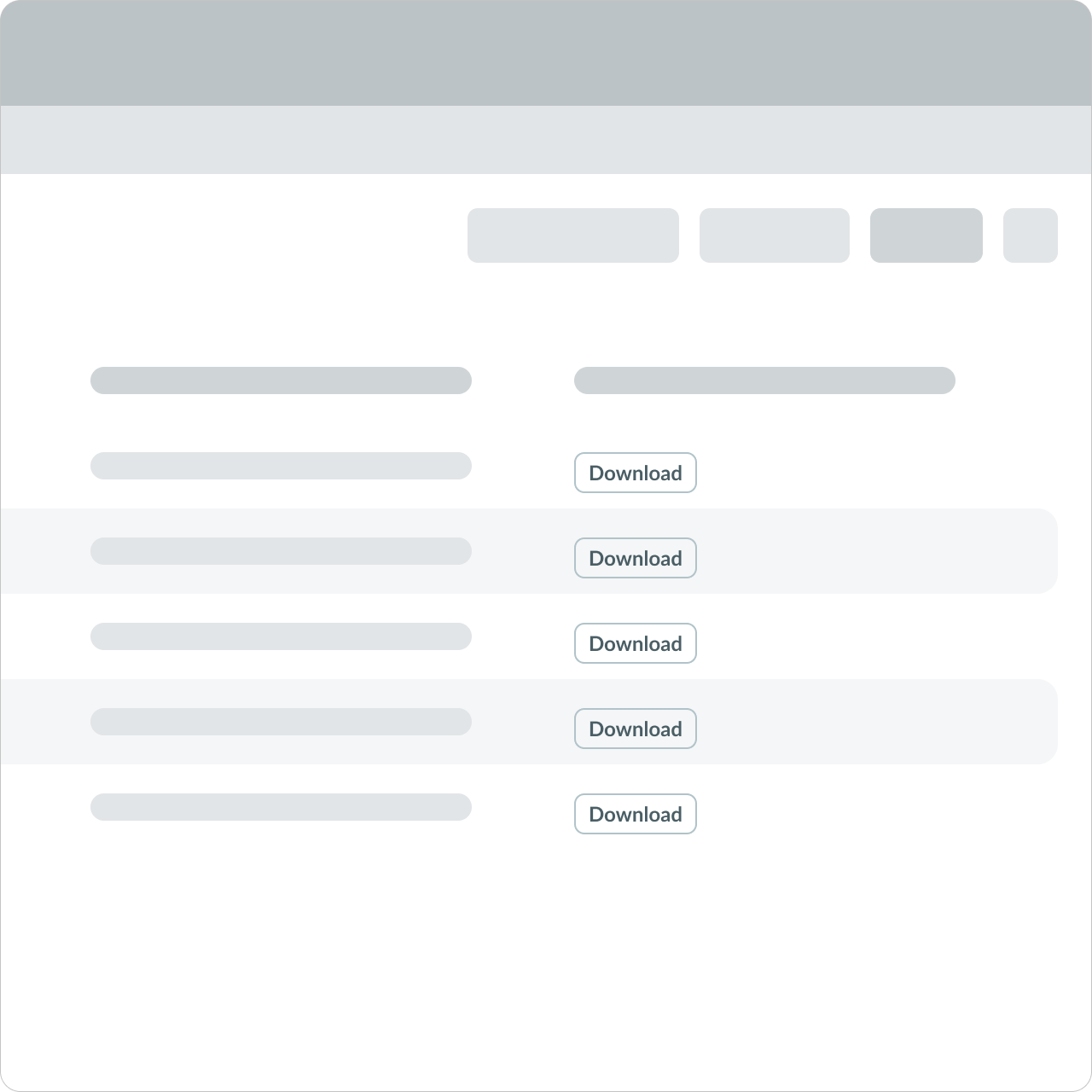
Use tertiary buttons for multiple repeated actions.
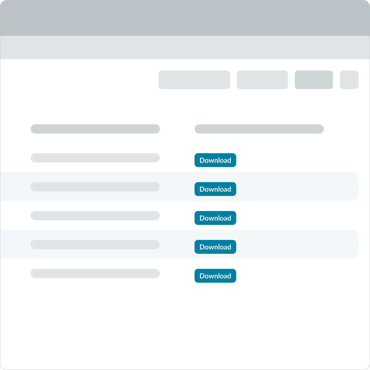
Avoid using multiple primary buttons for repeated actions. This can create unnecessary visual noise.
Remember that not every view needs a primary action. If none of the actions are essential to the workflow, you don't have to include a primary button.
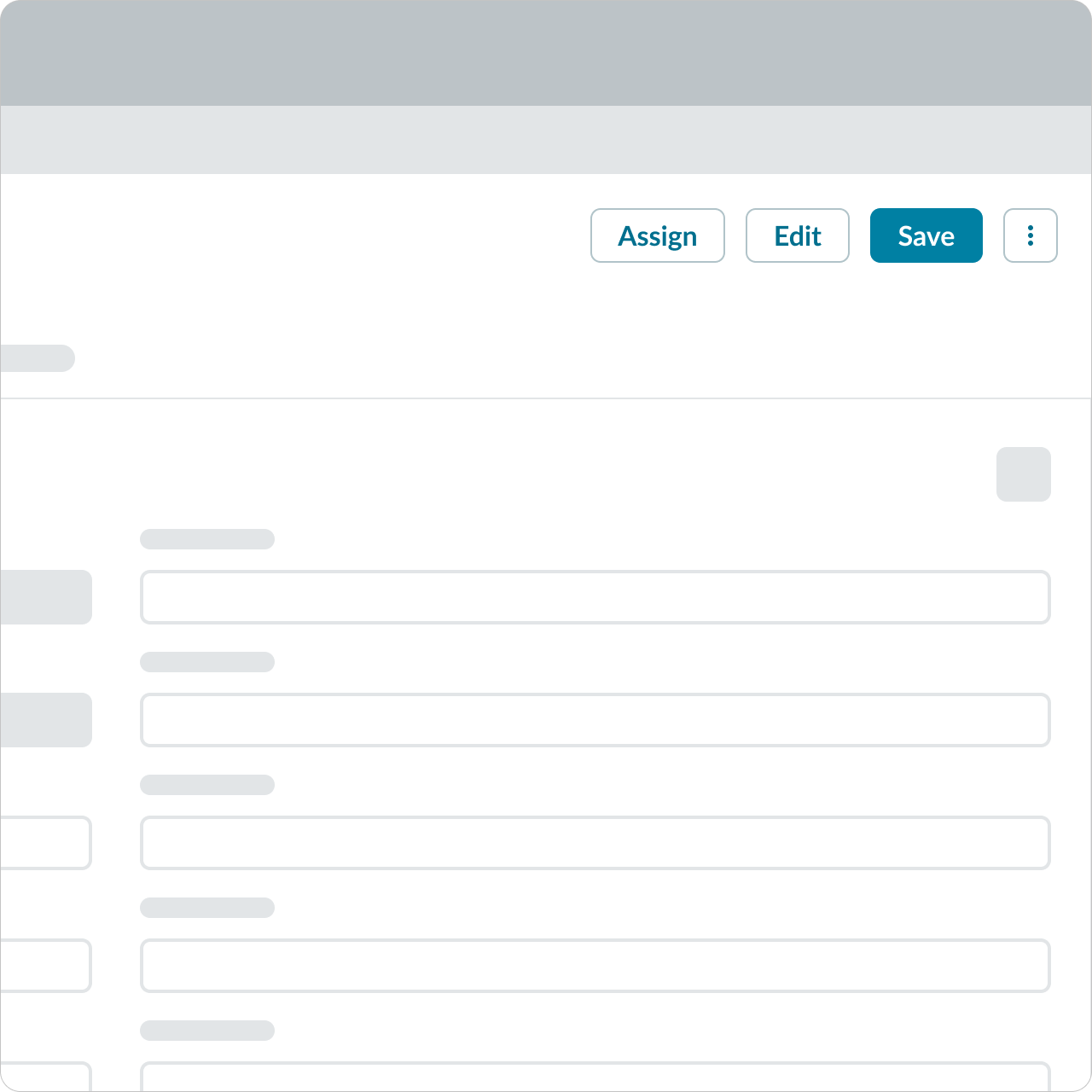
With the exception of an overflow menu, use consistent button types to group related actions together. In this example, the group of buttons shares the same type. The buttons establish a visual relationship based on style and position.
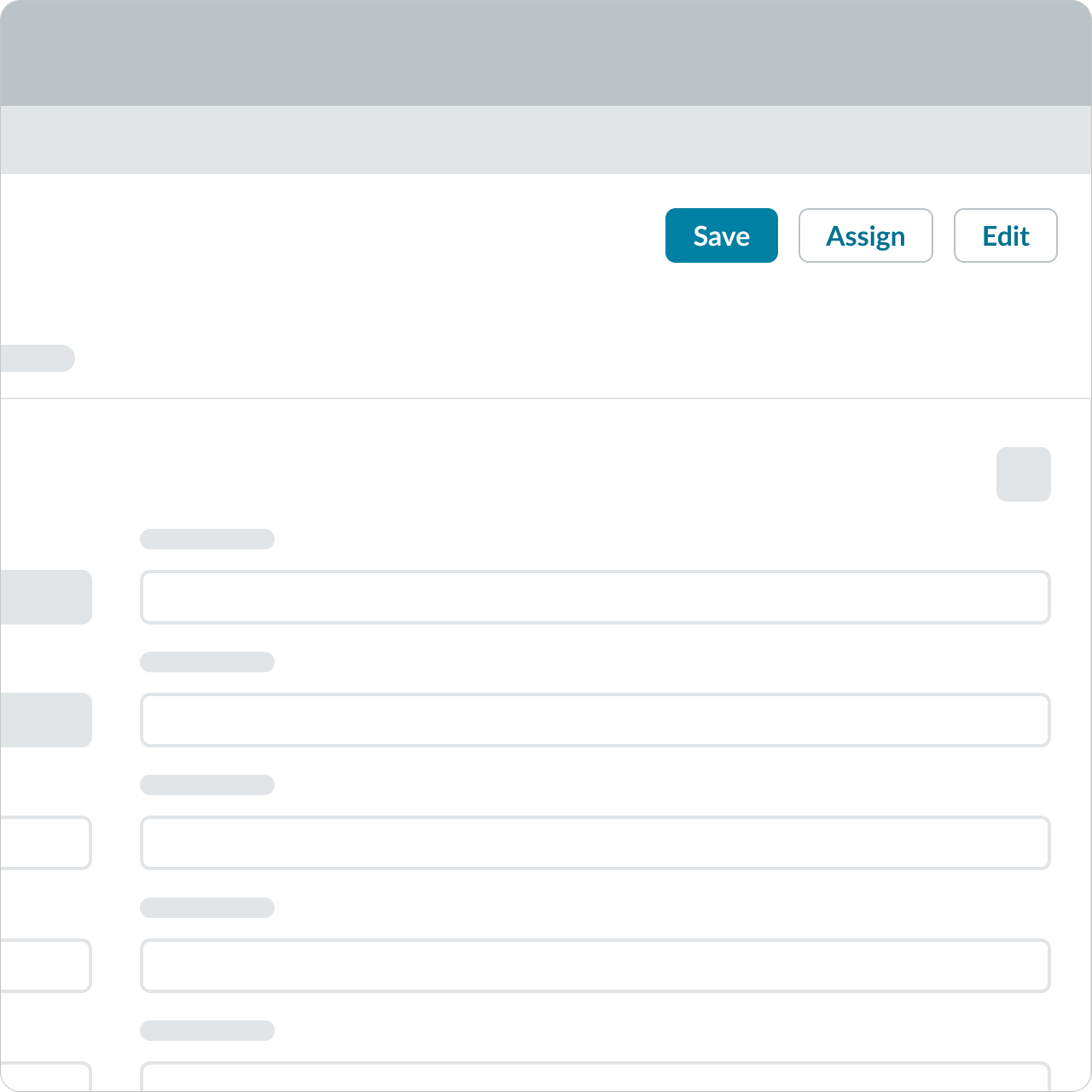
Avoid placing the primary button on the left. Primary buttons signify the most important action a user should take. Placing them on the left can deemphasize their importance and disrupt the expected visual hierarchy, leading to potential confusion.

With the exception of an overflow menu, button types should be consistent when used to group related actions. The buttons establish a visual relationship based on style and position.
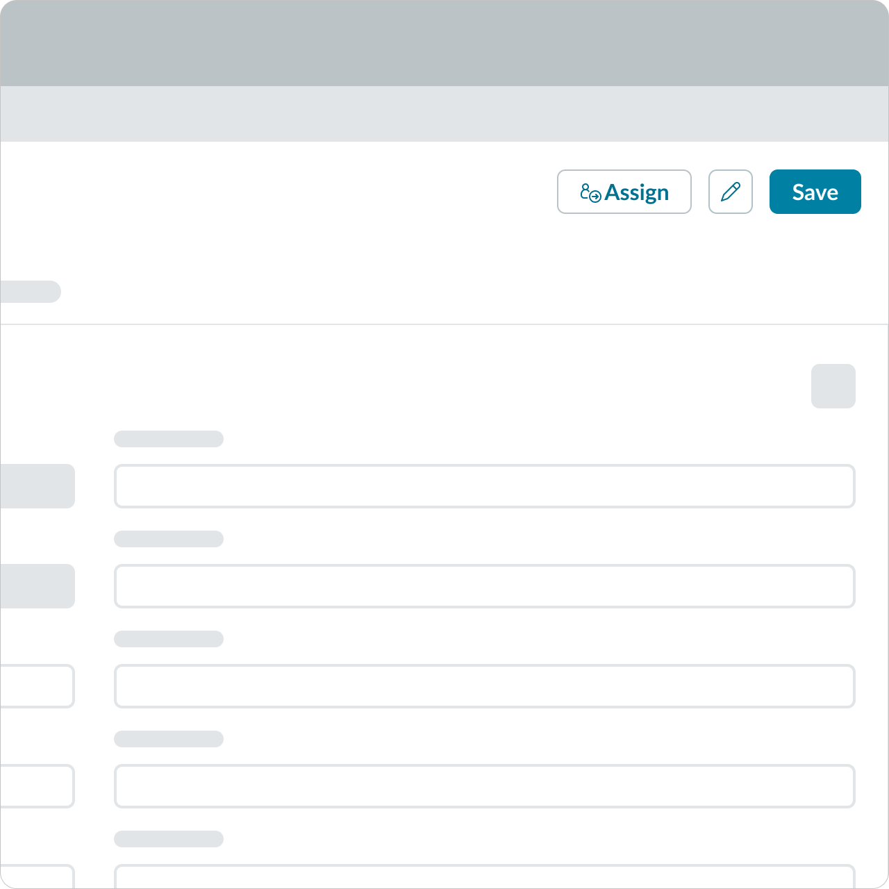
Avoid using different button types together, like mixing icon-only buttons with text buttons, as it can create inconsistency and confuse users. Stick to one button style to maintain a clear and cohesive visual hierarchy.
When grouping three or more buttons in one area, consider each button's impact on the task or workflow to determine which variant to use. Also use spacing to build relationships between buttons, divide actions, or break up functions.
Alignment and positioning
Each button's position should be based on importance starting from the right, especially when grouped with other buttons. This position serves as an anchor where the user can consistently look for primary actions across multiple views.
Remember to position any page-level actions at the top of the page. This location communicates that the button actions affect the content underneath. This positioning also applies to sections and components within content areas or containers. Keep these position patterns consistent to establish familiarity with the user. Consistent button placement and design makes natural sense to users, meets their expectations, and helps them navigate the task or workflow.
UI text guidelines
Consider these recommendations for labeling a button:
- Start with a verb to describe a specific action. This sets the expectation of what happens next.
- Use short labels. Two words is ideal. Three is OK. If needed for clarity, four is acceptable.
- Avoid commas, periods, and other punctuation
- Add an object to the verb if additional context or clarity is needed
- For example, “Add table"
- Add an article (like “a” or “an”) to add a more human, conversational tone
- For example, “Add a person”
- Use the same verb tense if there are multiple buttons
- For example, two buttons could be “Apply” and “Close,” both of which are present tense
Behavior
Learn how button behaves when the display changes or a user interacts with the component.
States
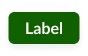
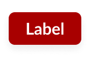
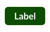
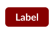
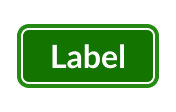
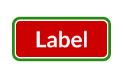
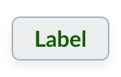
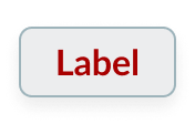
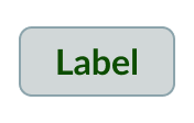
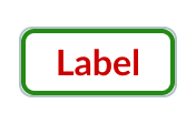
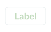
Button has the following states: default, hover, pressed, focus and disabled.
Primary
| State | Initial | Positive | Negative |
|---|---|---|---|
| Default |  |
 |
 |
| Hover | 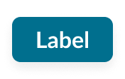 |
 |
 |
| Pressed | 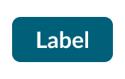 |
 |
 |
| Focus |  |
 |
 |
| Disabled |  |
 |
 |
Secondary
| State | Initial | Positive | Negative |
|---|---|---|---|
| Default |  |
 |
 |
| Hover | 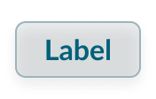 |
 |
 |
| Pressed | 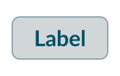 |
 |
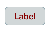 |
| Focus | 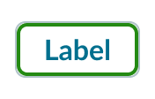 |
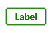 |
 |
| Disabled | 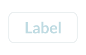 |
 |
 |
Tertiary
| State | Initial |
|---|---|
| Default | 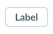 |
| Hover | 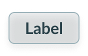 |
| Pressed | 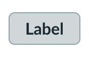 |
| Focus | 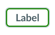 |
| Disabled | 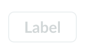 |
Responsive behavior
Learn how button responds to changes in a container or display.
Overflow
Consider using an overflow menu when the container or display can't fit all buttons. Overflow menus store actions in a dropdown menu that is accessible by the user.
Truncation
Truncation behavior isn't available for the button label. All button labels should be concise to help the user identify the action and decide whether they should take that action.
Usability
Internationalization
When the display translates to a right-to-left (RTL) language, the button flips its orientation. If the button includes an icon, the icon appears to the right of the label.
For RTL languages, an icon flips only if it communications direction.

Accessibility
Keyboard interactions
- Tab: Shifts focus to the button
- Space or Enter: Launches the button action

