

Anatomy
Learn about the individual parts of knowledge blocks.
Knowledge blocks
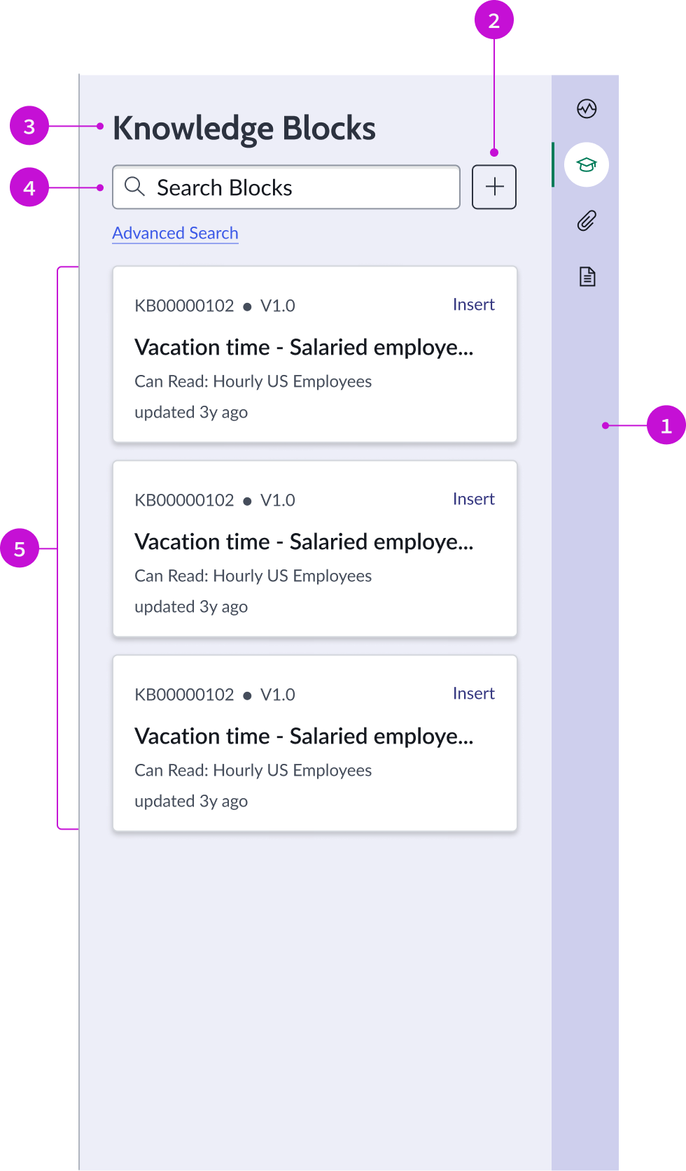
- Contextual sidebar: Container for various component types used in the context of the selected knowledge base
- Create new button: Iconic button component that enables the user to create a new knowledge block
- Section header: Header that identifies the contextual action opened by the stateful buttons in the right panel
- Search field: Input field component for a user’s query
- Knowledge blocks: List of all the available knowledge blocks, displayed with card components
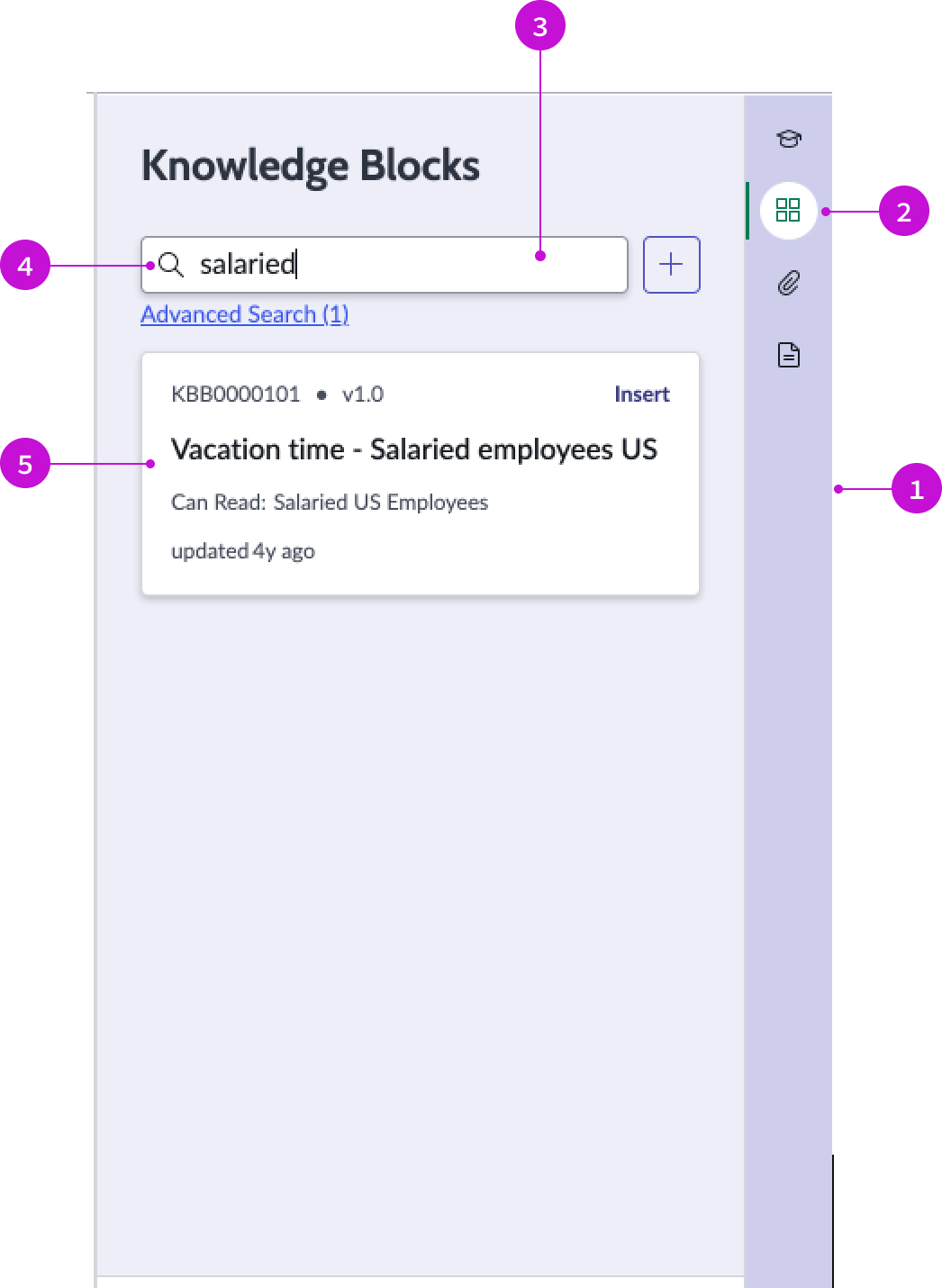
Block details

- Insert action: Inserts the block into the article that the author is building
- Back button: Navigates the user back to knowledge blocks view
- Knowledge block details: Link to the article and the body of the article; metadata includes the date and time of the last update and the user who submitted the changes
- Footer actions: Arrows for navigating forward and backward among knowledge block articles
Usage
Use the knowledge blocks page to add knowledge blocks to an article. You can search for existing articles and browse the results displayed as cards. Select an article to attach to one you are writing or create new articles.
Components
The knowledge blocks page is built with Horizon Design System components that have their own attributes and interactions.
Search input
The search input component enables a user to enter a search query to locate knowledge blocks. For more information, see the usage guidelines for search input.
- Contextual sidebar: Container for various component types used in the context of the selected knowledge base
- Stateful button: Displays or hides the search input panel from the contextual sidebar
- Search input field: Input field component for a user’s query
- Search icon: Iconic button that triggers a search on the user’s query
- Result card: Search result card for the knowledge block matching the search term
Interactions and behaviors
- Cards refresh when the user’s input query matches any results.
- If the search doesn’t match any keyword, an empty state illustration and message appear, advising the user that no match was found.
Defaults
By default the search input component displays these attributes:
- Search results must be an exact match to a keyword. Search does not support typeahead or autocomplete.
- Cards display without visual highlighting.
- The grid icon is the default stateful button in the contextual sidebar that opens the search panel.
Card
The card component contains the metadata for the knowledge block, the article ID and version, and the action to insert the block into an article. Permissions on the card define the user who is authorized to read the article, and a date-time stamp shows when the article was last updated.
For more information, see the usage guidelines for card.
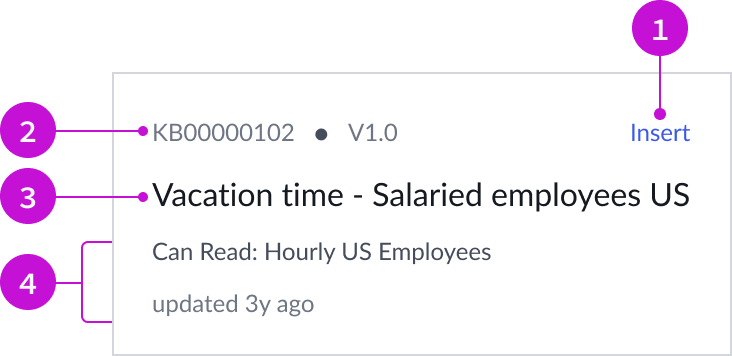
- Insert action: Inserts the block into the article that the author is building
- Article ID: Article number and version
- Title: Title of the knowledge block
- Metadata: Metadata associated with the article, including access role and update time
Interactions and behaviors
- Users can insert the content of a knowledge block into an article they are creating by selecting the “Insert” bare button.
- Selecting the card displays the details of the knowledge block..
- Users can open the knowledge article from a link in the details card.
Defaults
By default the card displays these attributes:
- Access role and last update time
- Article number and version
- Details card includes a short description of the article
Contextual sidebar
The contextual sidebar component enables a user to hide or display knowledge blocks using the stateful button in the sidebar.
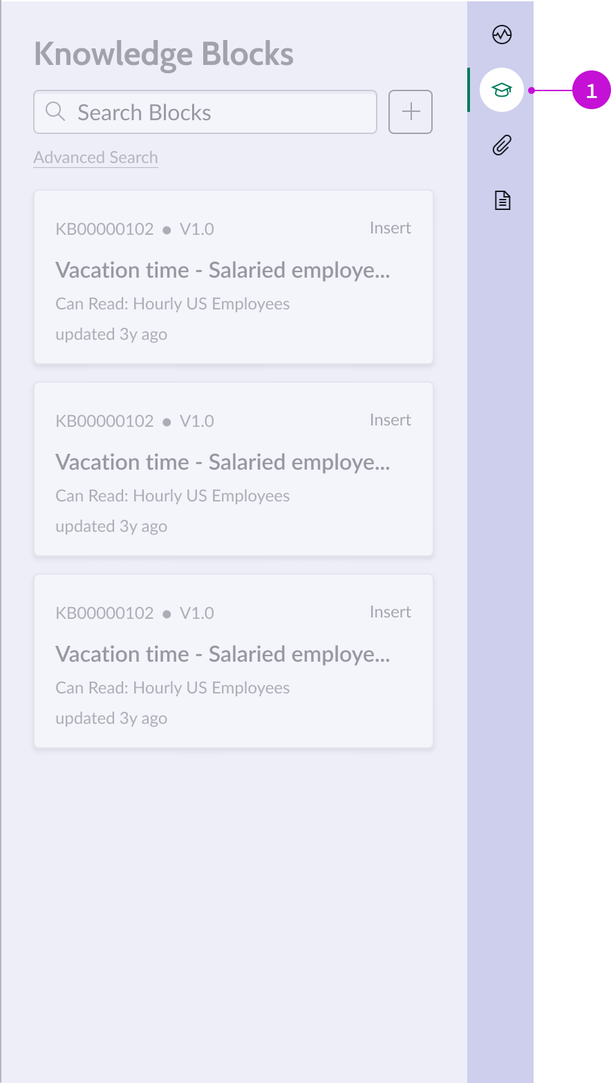
- Stateful button: Displays or hides the knowledge blocks panel from the contextual sidebar
Interactions and behaviors
- Selecting the knowledge stateful button displays the knowledge blocks panel.
- Selecting the stateful button when knowledge blocks are displayed closes the contextual sidebar.
- Refer to the usage guidelines for stateful button for the button states.
Defaults
By default the contextual sidebar component displays these attributes:
- Knowledge blocks open in the contextual sidebar when the page loads.
- The graduation cap icon is the default stateful button for knowledge blocks.
Configurations
The add knowledge blocks page template is intended to be used as-is in your experience and provides default functionality that fits most use cases. The page is created from a template that is updated automatically. If you copy the template in UI Builder and customize the page, you won’t receive template updates, and your page might not function properly after an upgrade.
User preferences
Users can control specific behaviors and features of the page through the user preferences menu options. The selections that users make in this menu persist until the user’s next session. Examples of user preferences options offered in workspaces are:
- Wrapping text in lists
- Showing banners
- Showing a counter on badges
- Show ribbon
- Show sidebar
Usability
The add knowledge blocks page template complies with all internationalization and accessibility requirements.
Internationalization
When this page template is used in an instance configured for a right-to-left (RTL) language, the individual components have their own behaviors. See the usage guidelines for the components used in the page for details.
Accessibility
For accessibility behaviors of specific components, see the usage guidelines for those components.
Keyboard interactions
Each component used in the add knowledge blocks page template has its own tab order and keyboard interactions. See the usage guidelines for details.