

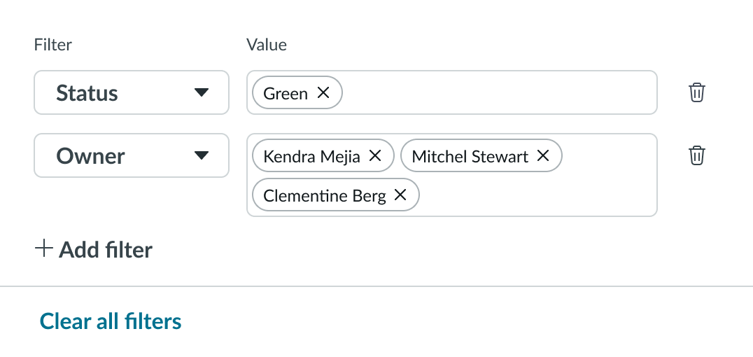
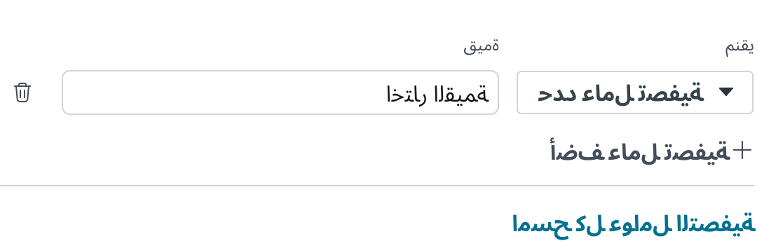
Anatomy
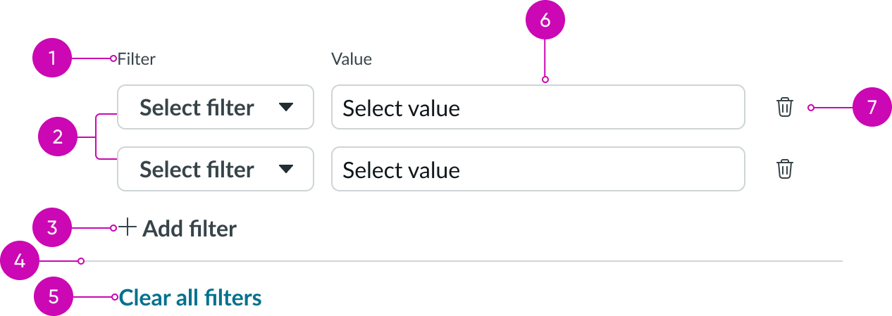
- Label: Identifies the filter element being applied
- Filter pairs: Dropdown component and a typeahead multi component used to select the filter and value; each filter is added to the condition builder as a dropdown + typeahead pair
- Add filter button: Button bare component that adds a new pair of filters to the view
- Separator: Line that separates the filter from the control that clears or resets all filters
- Clear/Reset control: Control that clears all filters; if default filters are defined, the control enables users to reset the filters to the default conditions
- Value selection: Typeahead multi component that enables user to select a value for the filter
- Delete icon: Iconic button that deletes the selected filter
Subcomponents
See the usage guidelines for button bare.
See the usage guidelines for button iconic.
See the usage guidelines for dropdown.
See the usage guidelines for typeahead multi.
See the usage guidelines for Date-time
See the usage guidelines for Date-time-interval
Usage
A quick filter enables users to quickly filter data available on the client side (UI) without passing complex queries to the database. The component filters the data as soon as the user selects any filter and value. This component is particularly effective when filtering multiple views of the same data, so the user doesn’t need to rebuild the filter experience for each view. A product or portfolio manager might use this filter to analyze data with a narrow focus across different views for planning purposes.
You can use the quick filter component in any container, such as a side panel or a popover.
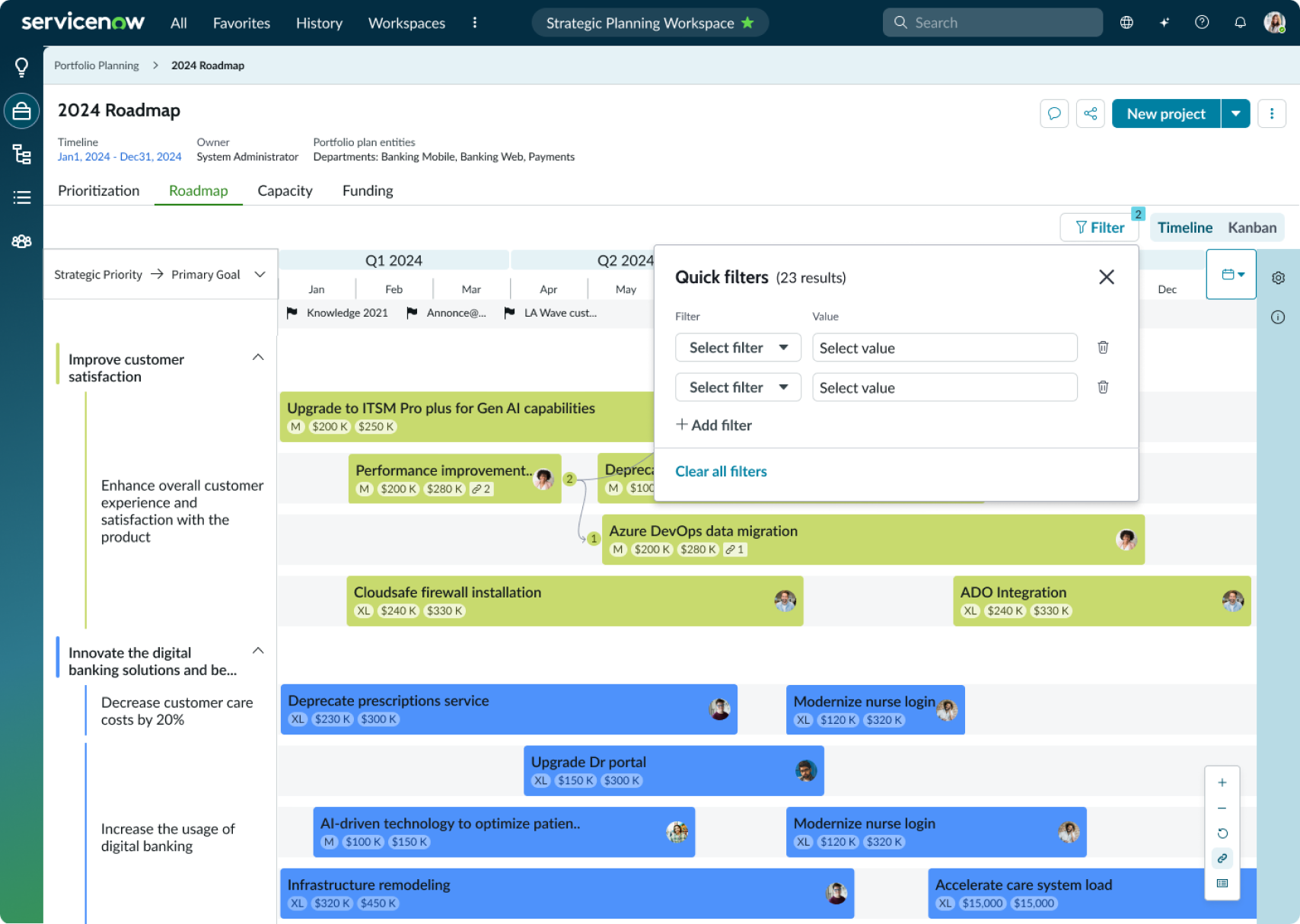
In this example, the Quick Filter component appears in a popover.
Configurations
Learn how to customize quick filter by configuring the available properties.
Preselected filters
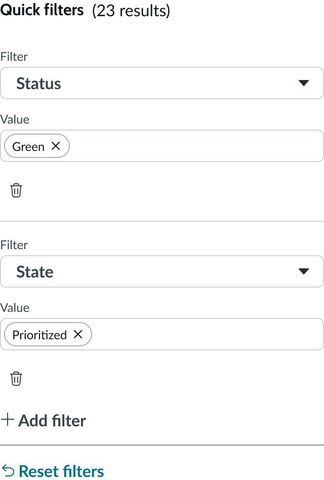
You can configure quick filter to show preselected filters to your users. These filters can help your users search records more efficiently, but don’t prevent users from selecting other filters.
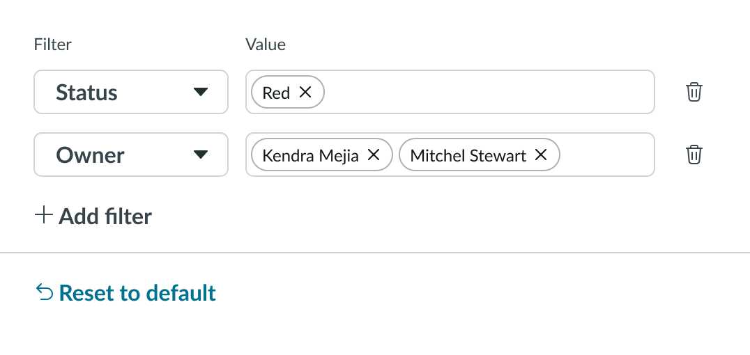
Default filters
You can configure default filters that enable users to reset their filter conditions to a default filter list. Typically, these would be the pre-selected filters you provide to your users, but could be a different list. Configuring a default filter list for your users doesn’t prevent them from selecting their own, individual filters.
Section header
You can configure a section header to appear at the top of the dropdown list items, for greater clarity and organization. For example, this configurable section heading can support messages like "Searching.." and "Showing 1-5 of 200" etc.
Footer actions
You can add configurable footer action buttons. If no footer actions are configured, only the Reset/Clear filters button displays by default.
Behavior
Learn how quick filter behaves when the display changes or a user interacts with the component.
Responsive behaviors
Learn how quick filter responds to changes in a container or display.
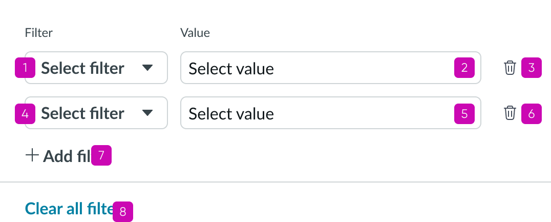
Initial filter state
In the initial state of the component, when no preselected filter list is configured, only the Add filter control is enabled.
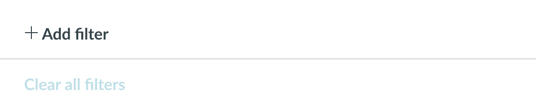
This example shows the initial state of the Quick filter before the user has added a filter pair.
Reset option
When default filters are configured, the Clear all filters button label changes to Reset to default. Users with default filters defined can only reset the filters to the default list and don’t have the option to clear all filters with a single action. When the user resets the filters to the default list, all filters selected by the user are removed except those in the default list.
Overflow
The width of the typeahead multi component is limited by the width of its container. However, the component can expand vertically when multiple values overflow the container’s width.
Small viewports
When screen resolution or container size is very small, the filter pairs reflow from a horizontal layout to a stacked version.
Interactions
Users select Add filters to add a dropdown + typeahead filter pair to the condition builder. This selection enables the actions for clearing filters or for resetting the conditions to the default list. Users with default filters defined won’t have the option to clear all the filters at once, and must delete individual filter pairs with the delete icon.
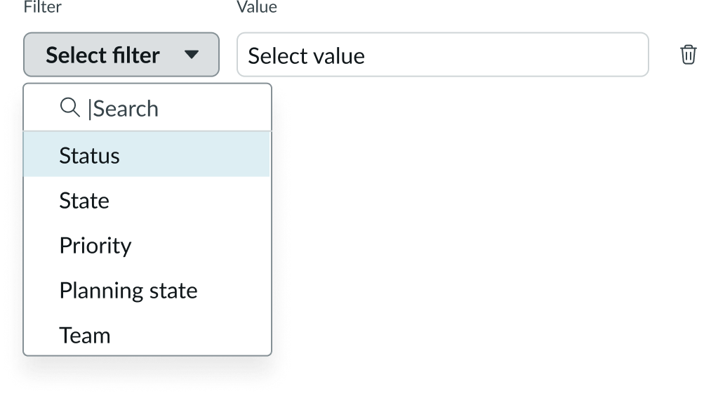
Users can select anywhere in the Filter box or select the chevron to display the dropdown list of options. Focus is on the search field, enabling the user to start typing or scroll through the list. Users can also filter the field options by typing in the typeahead input box. Only options that contain the user's input will display in the dropdown. When the input is empty, all available options display in the dropdown. To delete a filter, the user selects the trash icon.
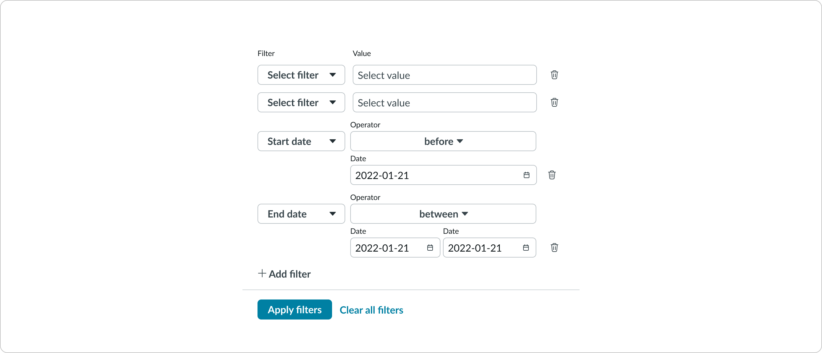
Filter by date/time
Users can filter by the date field. The time attribute is disabled by default. To enable the time attribute in the date filter, see configuration of the Date-time or Date-time-interval components.
Usability
Quick filter complies with all internationalization and accessibility requirements.
Internationalization
When this component is used in a platform configured for a right-to-left (RTL) language, the input fields and controls reorient on the right.
Accessibility
Learn how to access the actionable elements of quick filter through keyboard interactions and screen readers.
Quick filter tab order
Keyboard interactions
For keyboard options when focus is in a subcomponent, see the following usage guidelines:
Screen readers
When you apply ARIA labels to a component, screen readers announce the controls and content of quick filter in the prescribed tab order.