

Anatomy
Learn about the individual parts of bubble chart.
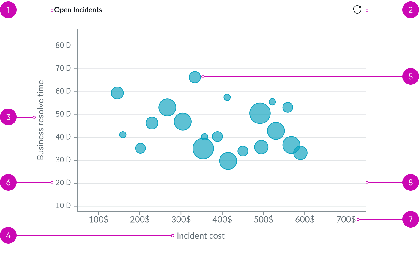
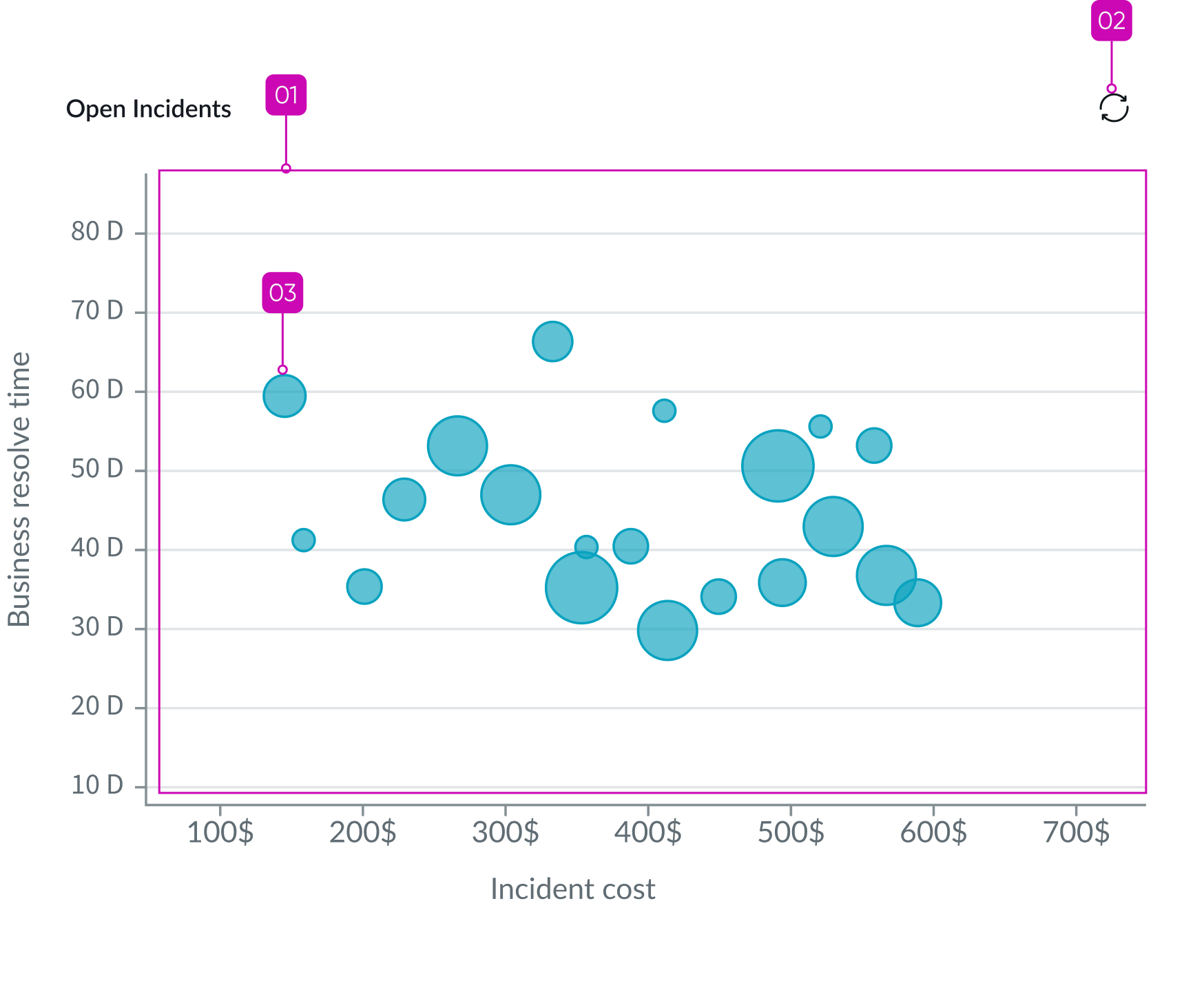
- Chart title: Title of table which can be wrapped or hidden
- Refresh button: Manually refreshes data
- Bubbles: Defines the the metrics
- Y axis title: Title of the y-axis of the chart
- Y axis label: Displays the grouped by row names in the first column
- Vertical grid lines: Designates the grouped by X axis values across the Y axis
- X axis label: Displays the grouped by column names
- X axis title: Title of the x-axis of the chart
- Legend: Applies when you include one or more “group bys” for the chart
Subcomponents
See the usage guidelines for button iconic.
See the usage guidelines for heading.
See the usage guidelines for text link.
See the usage guidelines for loader.
Usage
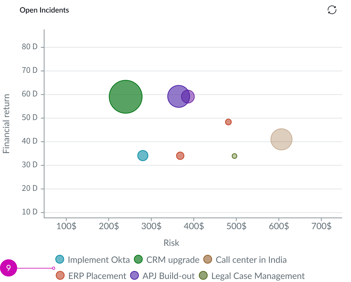
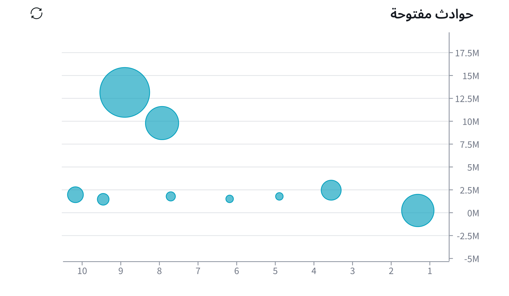
Use bubble chart to shows two ordinal fields, such as Priority and Age, as circles of different sizes along an x-y axis. Use the relative size and position of the circles to compare fields and see their relationships.
Configurations
Learn how to customize bubble chart. Use the data properties to select and organize the data you want your users to see from the source. Select the chevron icon to expand a section and display the properties in each category.
Header and border
The component header displays in the top left and contains the title and a description that appears when the user hovers over the information icon. You create the header and then show or hide it with the controls provided. By default, the header is configured to show, but the content is empty.
Visualization border
By default, a border around the chart. Unselect the “Show border” option to remove it.
Header separator
You can add a separator line between the header and the visualization. Disabled by default.
Chart title
By default, the chart title is blank, but you can add a title. When you add a title for your chart, you’re able to customize the color and make it wrap.
Header level
By default, text in the header is set to heading level 2 (H2). Heading levels H1 through H6 are also available.
Title alignment
By default, the title is aligned to the Start side. The start size can be the left or right depending on the language you use. Other options available from the dropdown are “Center” and “End”.
Title wrap
By default, long titles truncate with an ellipsis, and a tooltip showing the full title on hover, but you can set the title to wrap instead.
Title truncation
By default, the title text truncates at the end of the first line of text, but you can set the line of truncation to 2 or 3 lines instead. This option becomes available when the title truncates.
Refresh option
By default, refresh is available to the user in the “More options” menu, but you can hide it. This gives you more control over how refresh options are exposed on dashboards so you can align refresh behavior with your intended usage.
Header background color
By default, the color of the header background is neutral-0 (white). You can specify a different color (including a custom color) for the background.
Select a color for the visualization header background that aligns with your dashboard theme, branding, or design preferences. The color you choose applies only to the visualization header background.
For better accessibility, make sure a good color contrast exists between the header background and title text. The minimum contrast requirement for normal text is 4.5:1, and for large text is 3:1. To verify, check the contrast ratio in the color picker.
Note: Theming is not supported when you select a custom color.
Title color
By default, the title text is neutral-21 (black). You can specify a different color (including a custom color) for the title text.
You should select a color for the chart title that aligns with your dashboard theme, branding, or design preferences. The color you choose applies only to the chart title.
For better accessibility, make sure a good color contrast exists between the header background and title text. The minimum contrast requirement for normal text is 4.5:1, and for large text is 3:1. To verify, check the contrast ratio in the color picker.
Note: Theming is not supported when you select a custom color.
Data source
You can select between different data sources for your visualization: system data tables and preconfigured Performance Analytics indicators. If you are changing your data source, the option list provides suggestions based on previous selections and items that match your search.
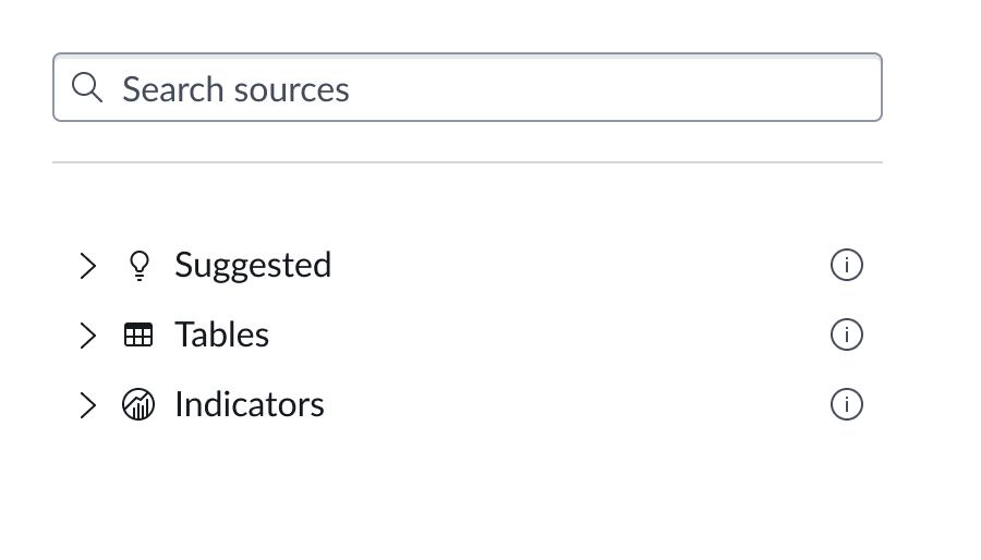
Tables
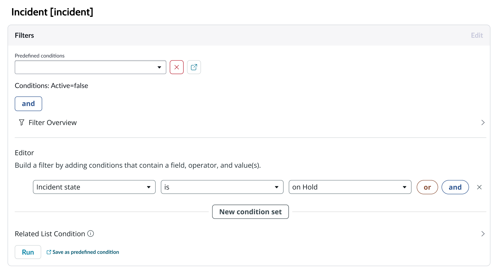
You can select any table from the system to use in your visualization and filter that data. When you apply a table as the data source, a preview list appears showing all available records in that table.
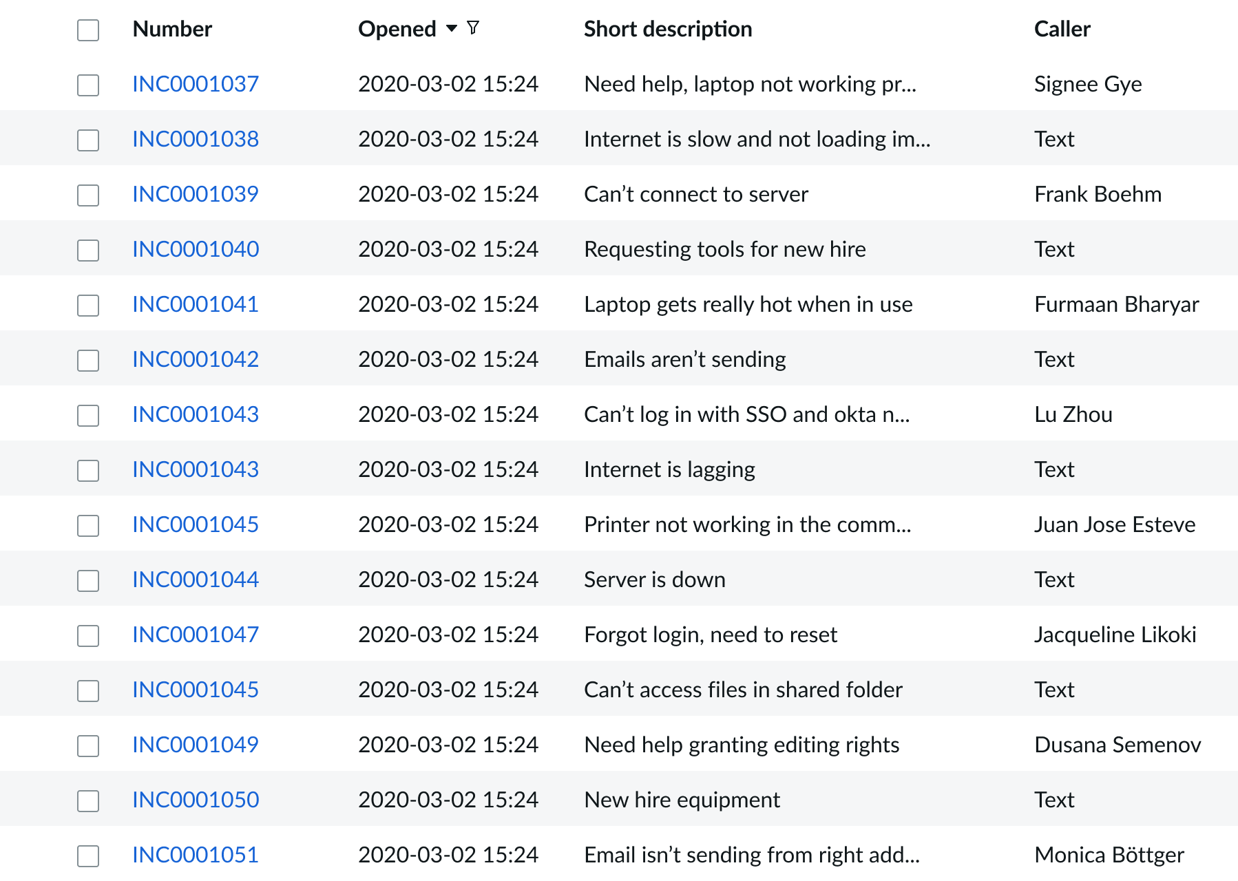
A condition builder above the list enables you to set filter conditions on the data before using it in your visualization. This is useful for limiting the data shown in the chart to only the data you need.
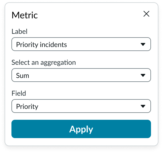
Metric (bubble size)
Select the specific data from the data source to display in the bubble chart and specify the label that identifies it. Select an aggregation type from the dropdown list. You can select a specific field from the data source table to display. If you leave the field empty, all fields are used, depending on any filtering conditions you applied when you selected the data source.
Dimensions
The dimensions define the bubble chart. They are enabled after you add the data source and metrics.
X axis
Mandatory numeric table field with values that show on the bubble chart's x axis.
Y axis
Mandatory numeric table field with values that show on the bubble chart's y axis.
Group by
You have the option to choose any table field other than the x- and y-axis to group all fields in a multiple series. Each group is distinguished by bubble color on the chart.
And we have a group by - an optional field to allow to split all records in multiple series.
Data update
By default, users can add individual chart filters, and use the filters set on that workspace page. You can also configure your chart to update automatically in real time or on a defined refresh schedule.
Follow filters
You can configure a data visualization to allow the use of individual chart filters and allow a chart to use the filters set on that workspace page. Filters set on the data source always run on the component. The “Follow filters” property, which is set to “true” by default, applies any filters set on the workspace page in addition to those set on the data source. Setting the “Follow filters” option to “false” prevents any filter input from the workspace page.
Filter icon
The filter icon and the number of filters impacting the visualization display by default. To hide them, unselect the “Show filter icon.”
Data drilldown
By default, users can drill down into data or launch a URL directly from a chart by selecting data points, slices, categories, or scores. This lets users view data such as records and record lists from data tables or KPI data from indicators or go to a URL that you specify.
Drill down label
You can add text that appears in tooltips and describes what happens when the user selects a chart data point.
Refresh after being away
You can configure your visualization to refresh after the user has been away from a page for more than a specified number of minutes.
Refresh requested
When the new value of this property is different from the previous one, you can trigger refresh by setting up a string that can be passed down.
Use data cache
You can cache user queries to shorten the load time for the data visualization. Unselected by default.
Info messages
Displays generic error messages by default.
Extended error messages
You can choose to show extended error messages which contain more details that can be helpful to admins. Unselected by default.
Custom no data message
By default, when a data source doesn’t return any info, the “no data available” message displays with generic content. However, you can set a custom message by changing the title, illustration, and message content.
Presentation
The presentation properties control the physical appearance of the chart. Use these properties to control how your users consume the data.
Display settings
You can use the following to modify the display of the data visualization.
Data table
You can use this setting to show a table with chart and graph data under the chart for easier screen reader access.
% of total tooltip
By default, when the user hovers over a data point such as a bubble, the percentage of the total Y axis value is displayed in a tooltip.
Colors
By default, the theme based color palette is used. For a single data source without “group by,” the first palette color (blue by default) is used for the single series. You can select another color.
For multiple data sources, a “single color” is used, but you can select the color for each series. When “group by” is used; you can select the palette and a different color is set per series.
Behavior
Learn how bubble chart behaves when the display changes or a user interacts with the component.
Chart positioning
The bubble chart is always centered within the container and retains a fixed height/width ratio. The height and width of the chart is responsive to the data visualization container size.
Bubble chart can’t be manually adjusted.
Responsive behaviors
The bubble chart is responsive based on the width and height of the container.
Interactions
When the enable drilldown property is active, users can select data points in a bubble chart to open individual records.
Truncation
By default, long titles truncate and an ellipsis displays. On hover, a tooltip shows the full content.
Usability
Bubble chart complies with all internationalization and accessibility requirements.
Internationalization
When this component is used in a platform configured for a right-to-left (RTL) language, all elements flip and the text aligns to the right.
Accessibility
Learn how to access the actionable elements of bubble chart through keyboard interactions and screen readers.
Bubble chart tab order
Keyboard interactions
Tab: Moves from the main header to the chart bubbles
Enter or space bar: Triggers an action associated with an interactive element when in focus.
Arrow right, arrow left: Moves from bubble to bubble right and left
Arrow up, arrow down: Moves focus from bubble to bubble up and down
Note: When using keyboard keys to move from bubble to bubble, the order is not linear; it’s based on the record lines and how they are sorted or arranged.