

Anatomy
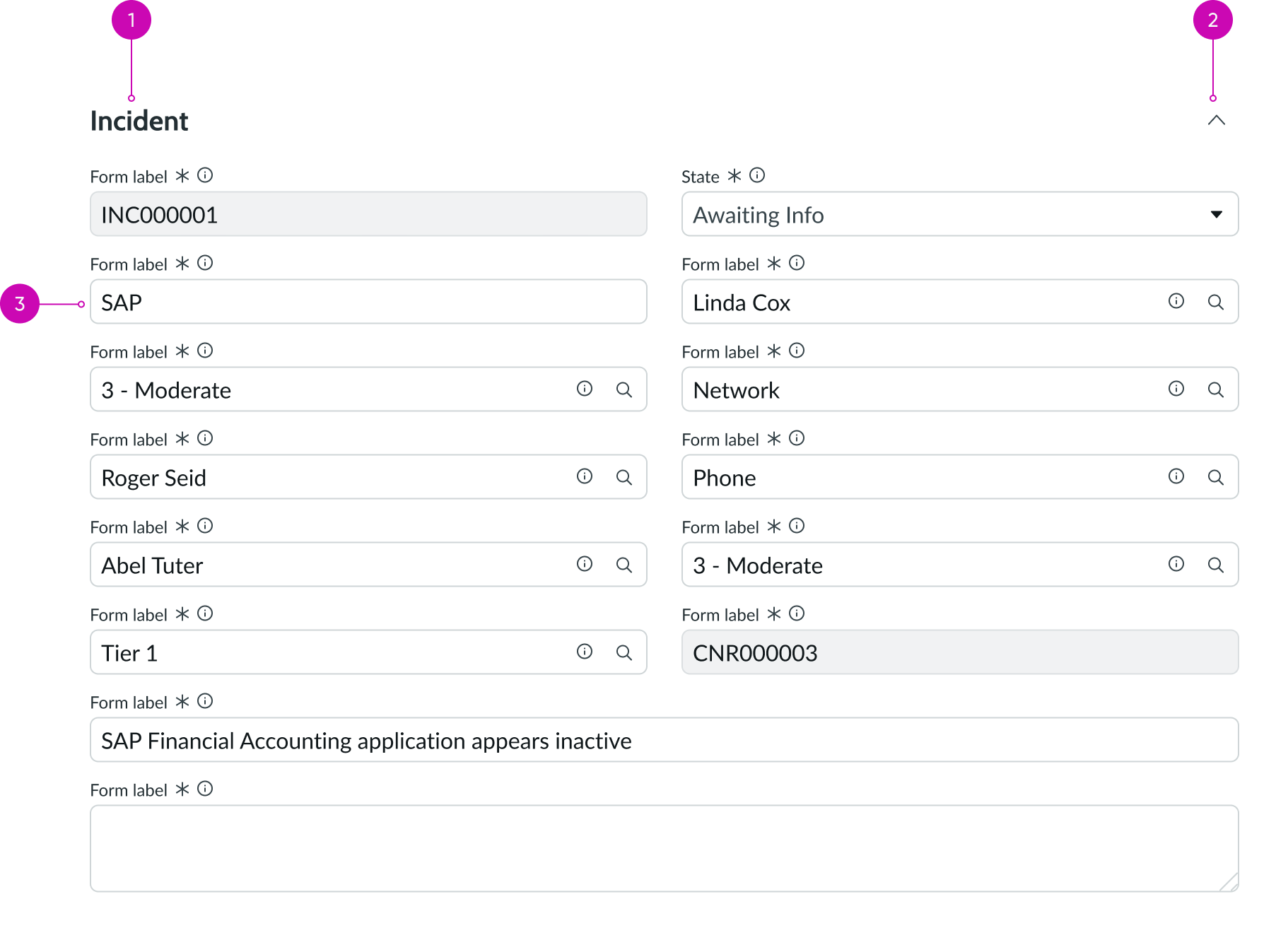
- Section header: Text that summarizes the group input fields in a part of the form
- Disclosure control (optional): Shows and hides the form fields in that section
- Input field: Component that allows for a user response in the form
Usage
The form fields component can be used instead of the form component for use cases that don’t require much customization around the form properties.
Configurations
You can configure the table, Sys ID, view type, query, read-only, and Workspace ID properties for the form fields component.
For more information on how to configure the properties available for form fields, go to the UIB setup documentation.
Design recommendations
Learn how to apply display only form in your design.
Alignment and positioning
Like the form component, form fields can be placed in a record. However, it can also be used in modal.
UI text guidelines
- Use sentence case for all titles, labels, and column headers
- Keep all text labels informative and short to increase readability and scanning
- Keep content concise and purposeful to help a user understand options and actions, and move successfully through tasks to achieve their goals
Behavior
The behaviors of the form component also apply to the form fields component.
Usability
The usability functions of the form component also apply to the form fields component.