


Anatomy
Learn more about the anatomy of Gantt chart.
Main anatomy
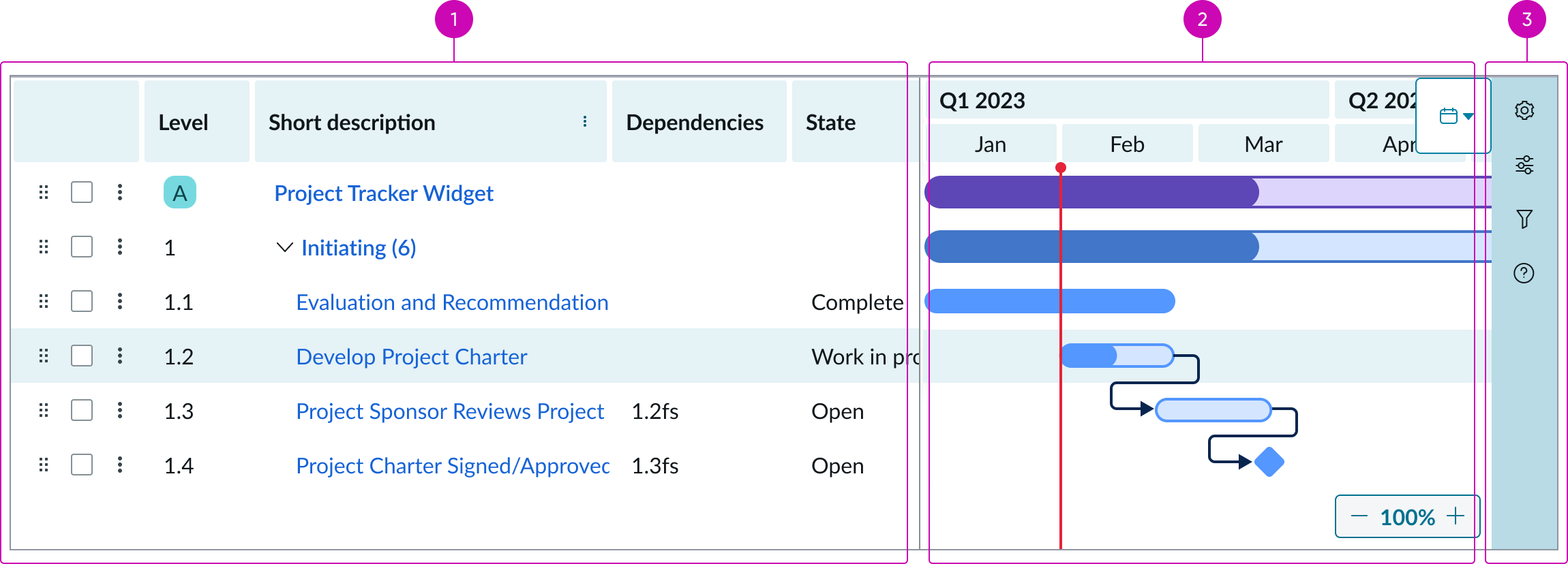
- Grid: Displays the timeline data in a table format
- Timeline: Displays items from the grid in a bar format with a timeline
- Sidebar: Navigation for Gantt specific settings and additional features
Grid anatomy
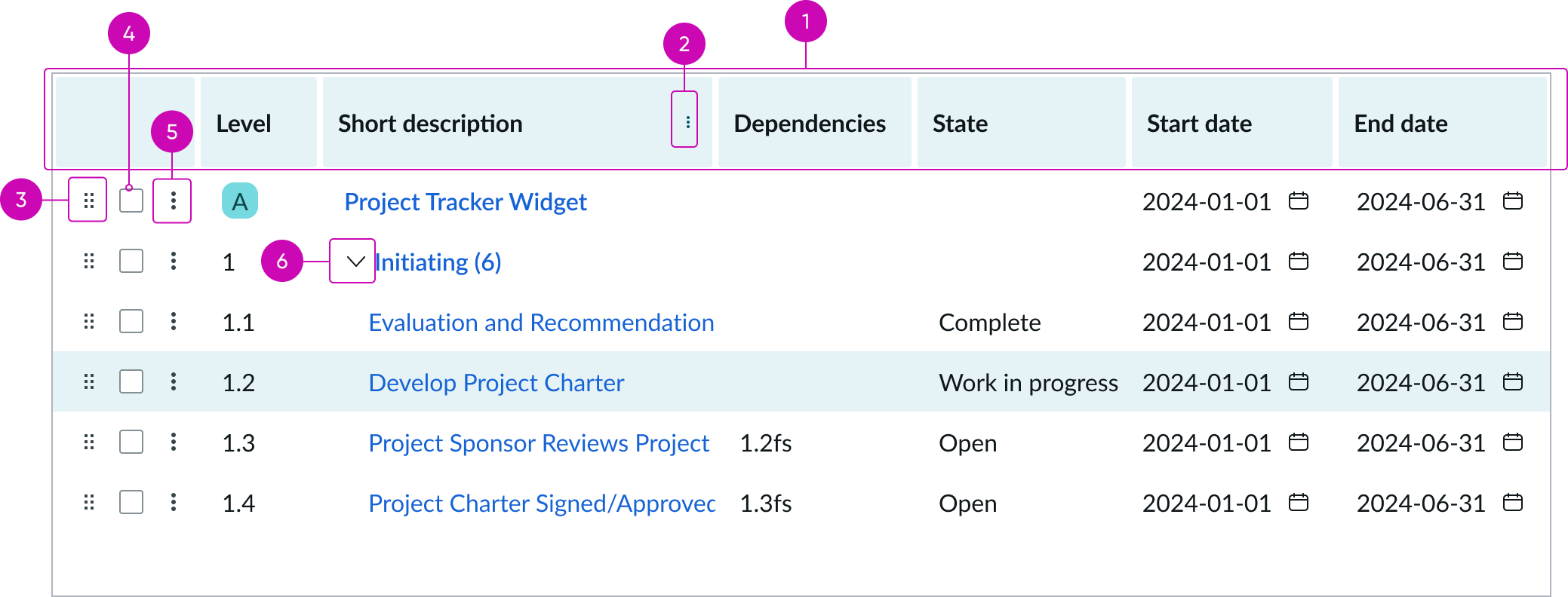
- Grid header: Header for the grid component
- Grid column header menu icon: Additional actions associated with that column, such as filtering or sorting
- Row drag and drop control: Icon when selected, can be handled vertically to rearrange the row
- Row selector: Checkbox that can be used to select multiple rows at once and apply an action
- Row context menu icon: Additional actions associated with that row, such as deleting, adding, editing, or copying
- Row expand/collapse icon: Expands to show child rows of the selected row, or collapses to hide child records of the selected row
Timeline anatomy
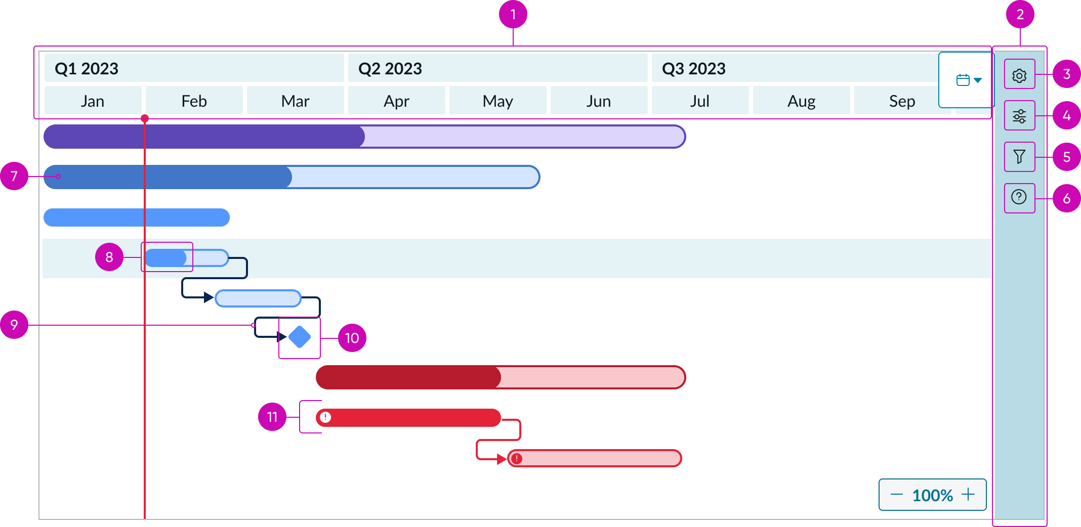
- Timeline header: Displays dates for the timeline; can display two levels of dates depending on the time frame selected
- Sidebar: Contains the settings and information icons, which open into respective menus
- Setting control icon: When selected, opens a side panel for editing the Gantt settings; can include column configuration for the grid, and visual settings for the timeline
- Filter control icon: When selected, opens a side panel for editing the Gantt filter
- Notification icon: When selected, displays notifications
- Help icon: When selected, opens a side panel with options for shortcuts and information on navigation
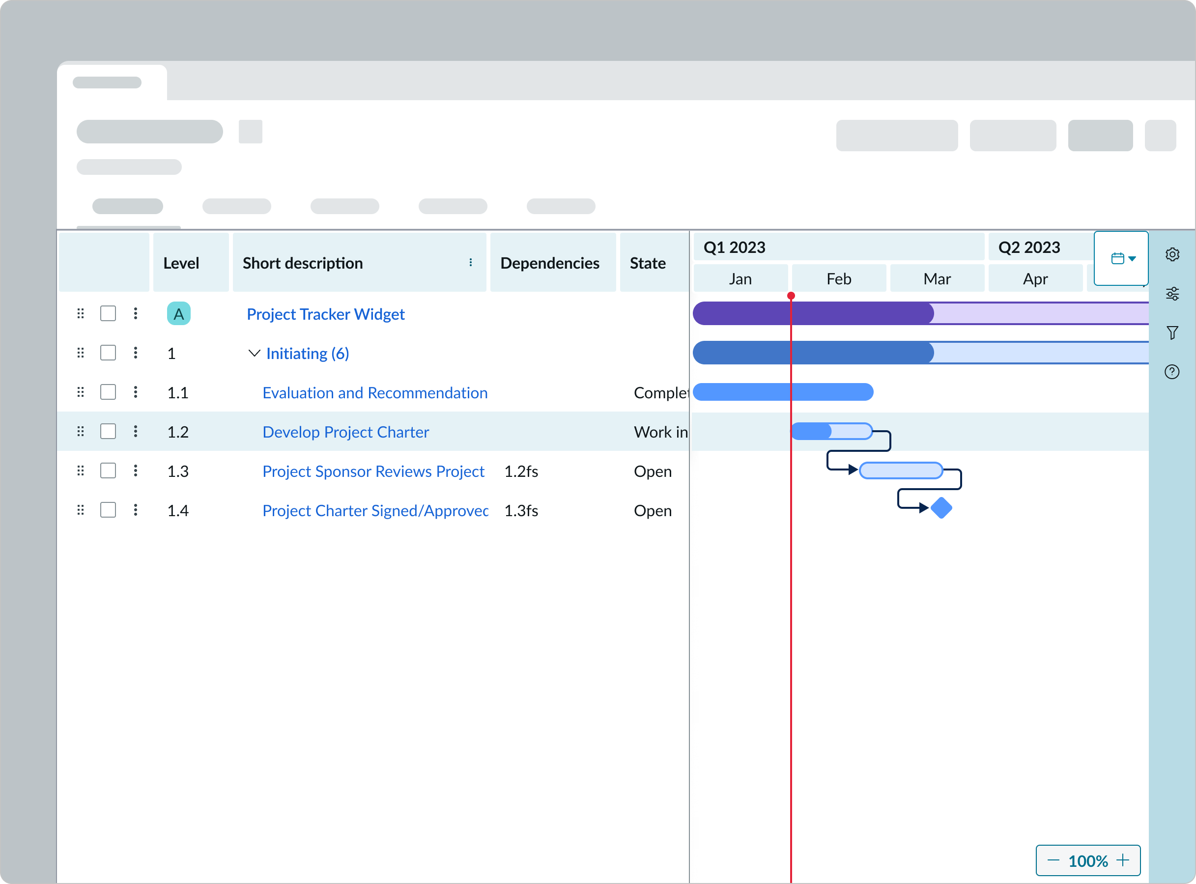
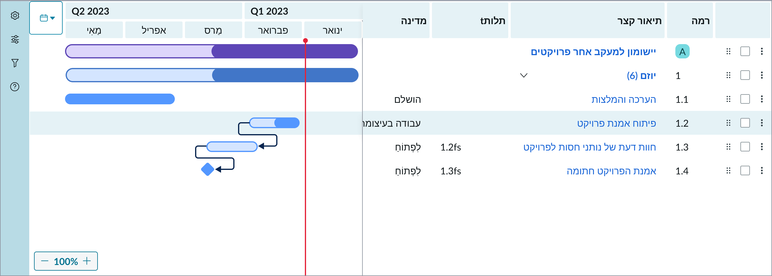
- Timeline bar: A record from the grid displayed in bar format; the bar can be expanded or moved to change the start/end date or the duration of the record
- Percentage complete in timeline bar: Shows the completion progress of a record; the darker color indicates progress completed
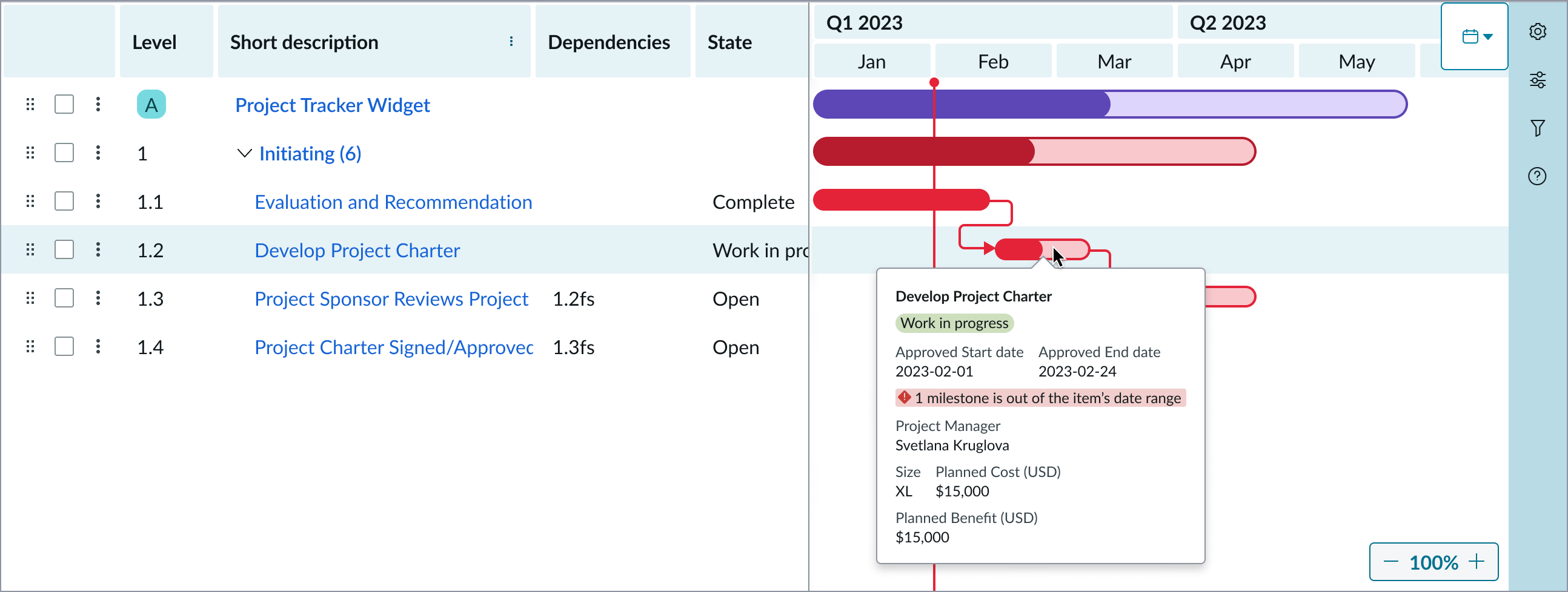
- Dependency line: Indicates the order of operations between records
- Milestone icon: Indicates a record contains a milestone date
- Critical icon: Indicates records that are critical to this Gantt chart
Usage
Gantt chart should be used to create detailed timelines for project tasks. For high level project planning, consider using the roadmap component instead.
See usage guidelines for roadmap
Variants
Learn about the variants of Gantt chart.
Types
Gantt chart has 3 types: basic, standard and advanced.
Basic
Read-only mode is the default setting for this type. It requires minimum setup and data to operate and offers limited features.
Standard
The standard type includes more configuration options and complexity than the basic, but still limits features that can be changed by the end-user.
Advanced
The advanced type includes all available properties and is intended for experienced users who are comfortable customizing the Gantt chart to fit their needs. This type enables users to alter the Gantt Chart's appearance and functionality.
Configurations
Learn how to customize Gantt chart by configuring the available properties.
Configuration level
You can set the configuration level to basic, standard, or advanced. The selection you make adjusts the configuration properties available to you for your Gantt chart.
UIB setup documentation for Gantt chart
Design recommendations
Learn how to apply Gantt chart in your design.
Alignment and positioning
Gantt chart should be placed in a page’s main column so it has enough space to display all elements.
Behavior
Learn how Gantt chart behaves when the display changes or a user interacts with the component.
Interactions
Learn how Gantt chart responds when a user interacts with it.
Add a task
User can add records using the UI actions in the header (if the workflow header has an action for it). If the Gantt component is being used without a header, there is a “+” button on a selected row that allows for the creation of a record below the selected row. There is also an “add task above/below” option upon right click on a row or in the row level actions menu.
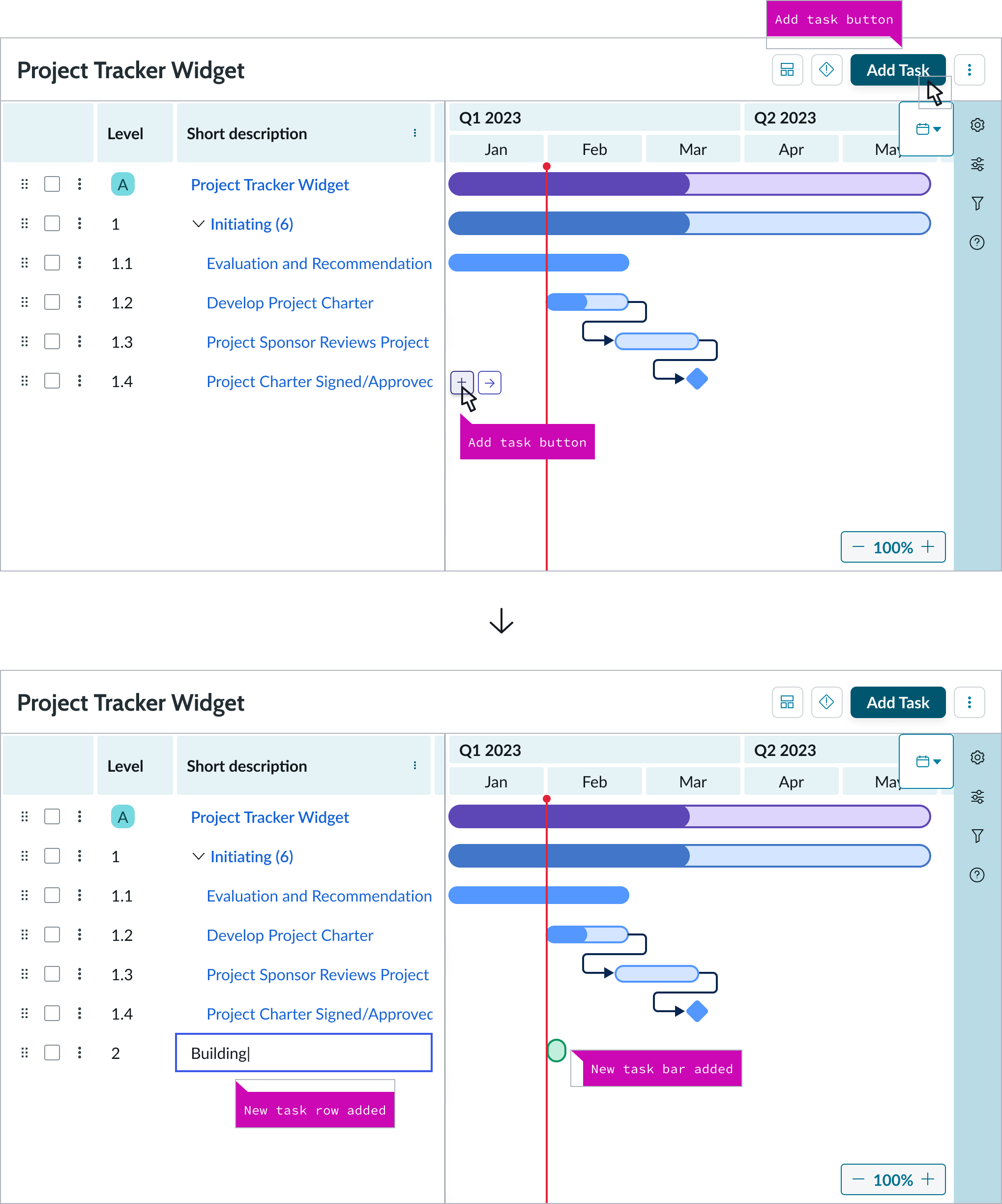
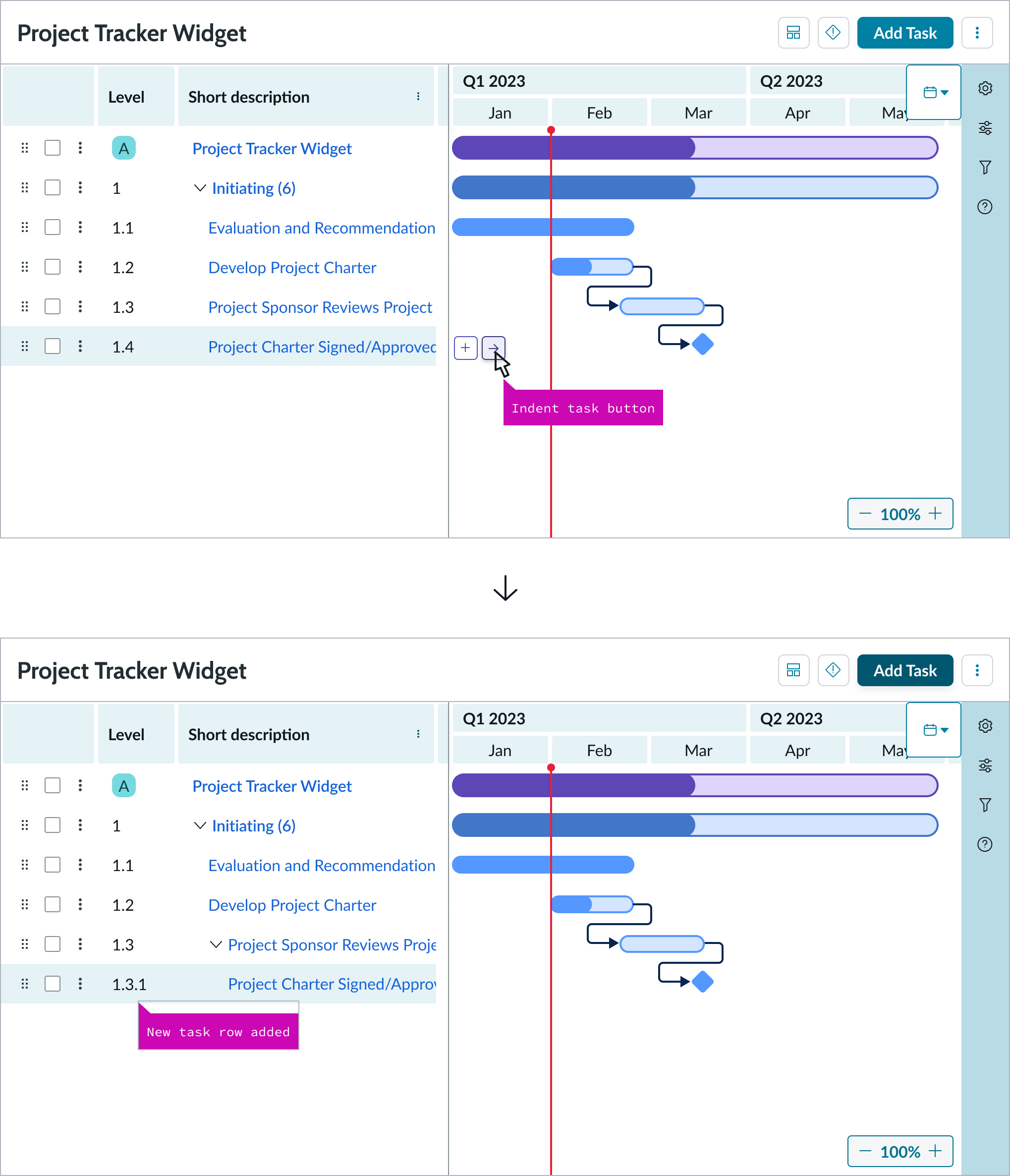
Create a child record
Users can create a child record by selecting the “right arrow” button (indent task) on a selected row and moving that record under another.
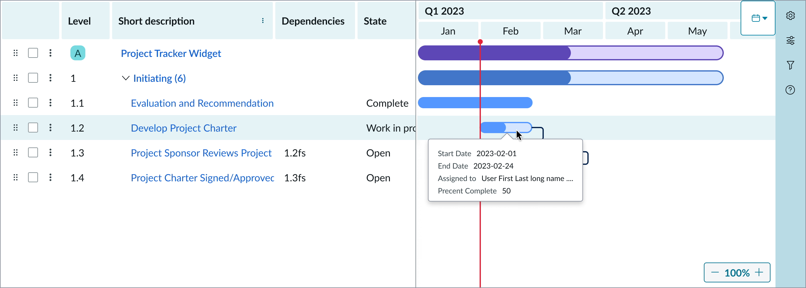
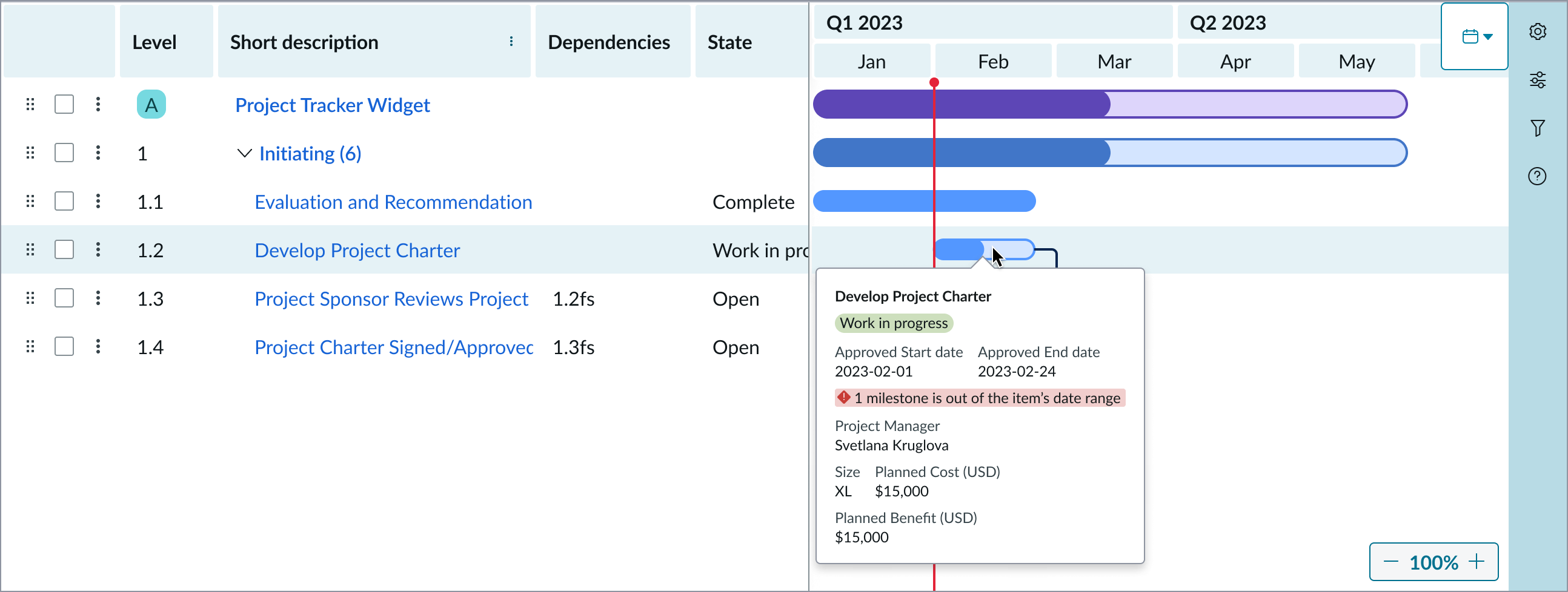
Hover popover
Hovering over a bar will open a popover with additional information. The popover can display the name and the start and end date of that record. Additional information can be configured to be shown in the popover using the label-value-tabbed or label-value-stacked components.

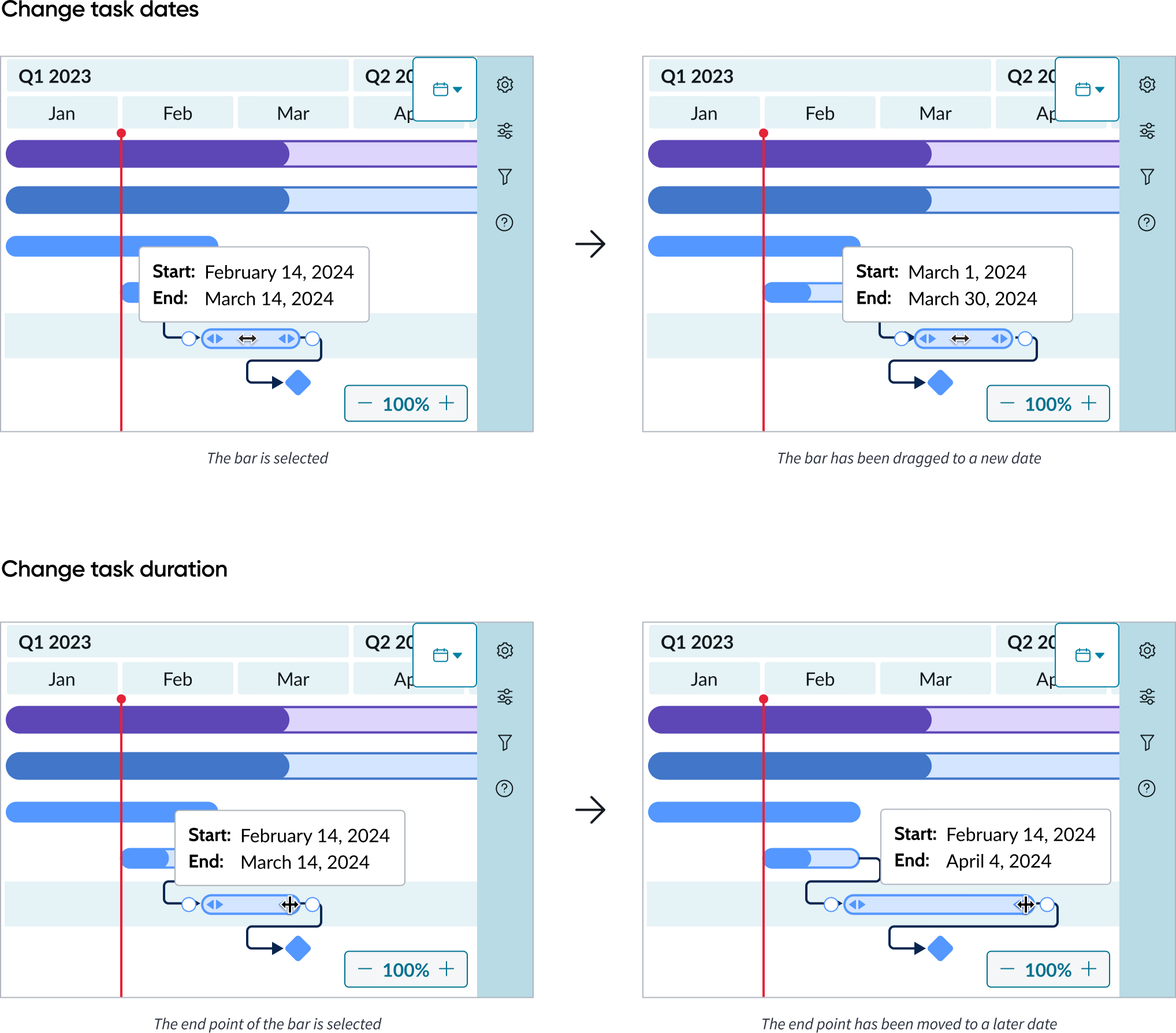
Move bars
User can move the dates of the record while retaining the record’s duration by clicking and dragging the entire bar. Users can also extend or shorten the date range of the record by clicking and dragging the start or end points of a bar. A popover with the new dates will display to allow for better accuracy.
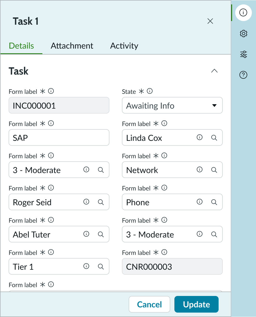
Details preview
User can see additional details for the tasks they select from the grid in a side panel form.
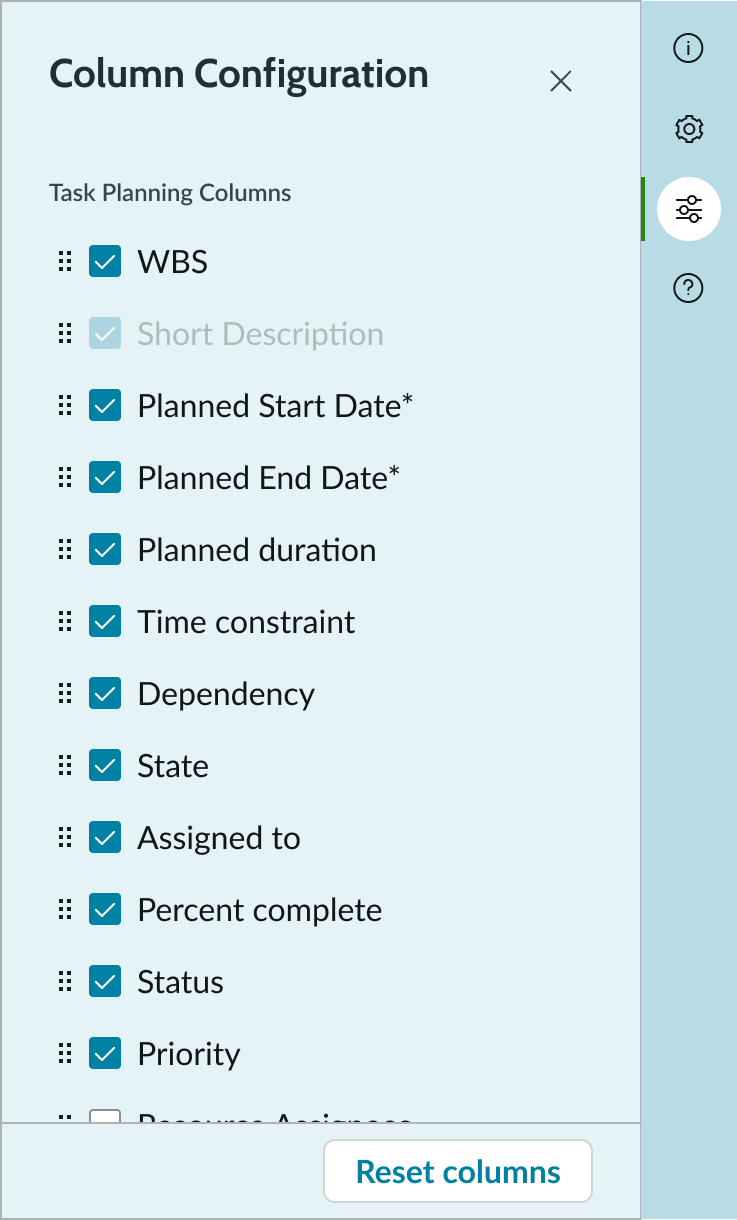
Settings menu
Users can select the settings icon to open the settings menu. Under the “Columns” tab, users can select options such as the planned start/end dates, dependencies, and milestones to customize their timeline. The “Short description” is selected by default and cannot be deselected.
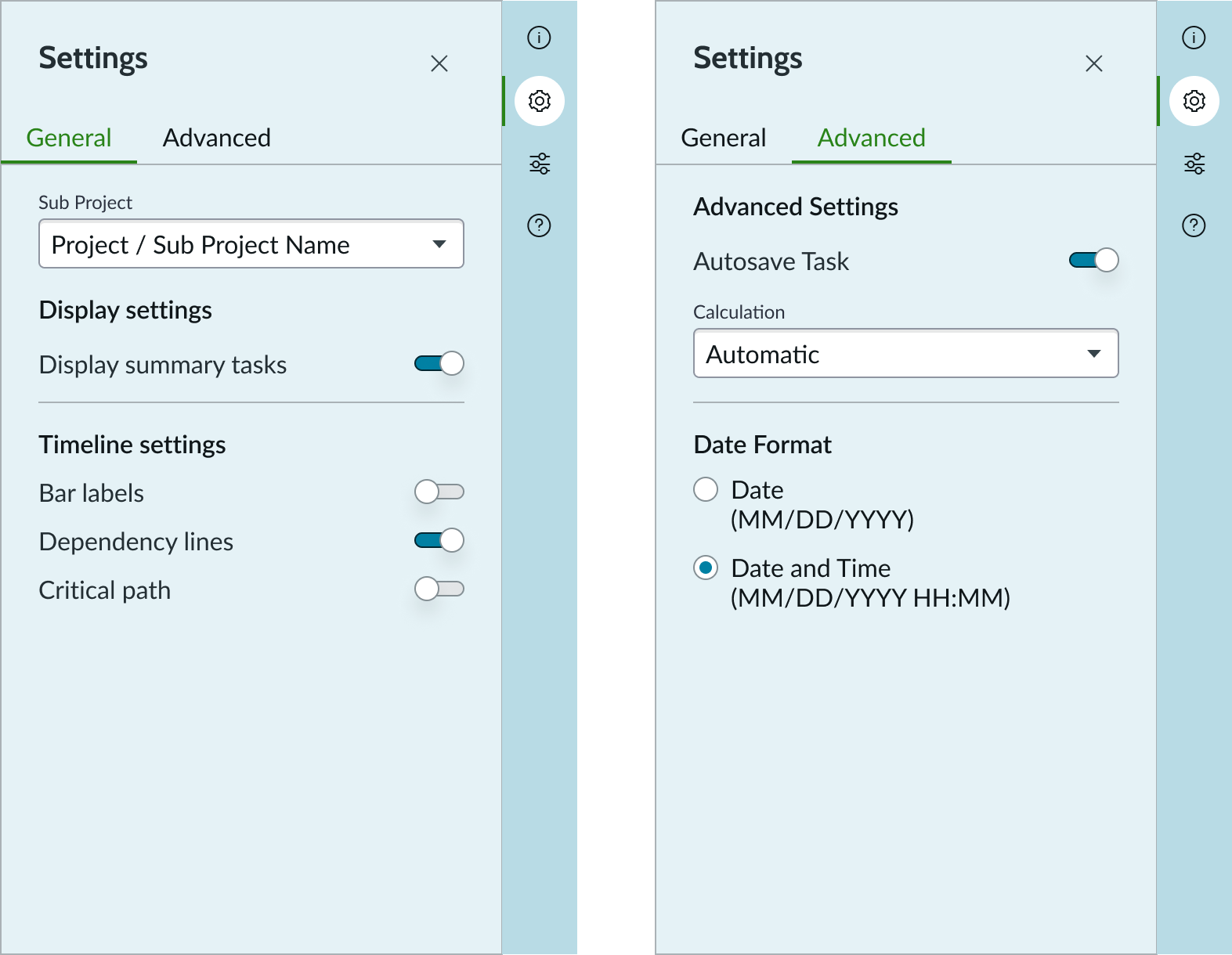
Column configuration
Users can change the columns that are shown in the grid
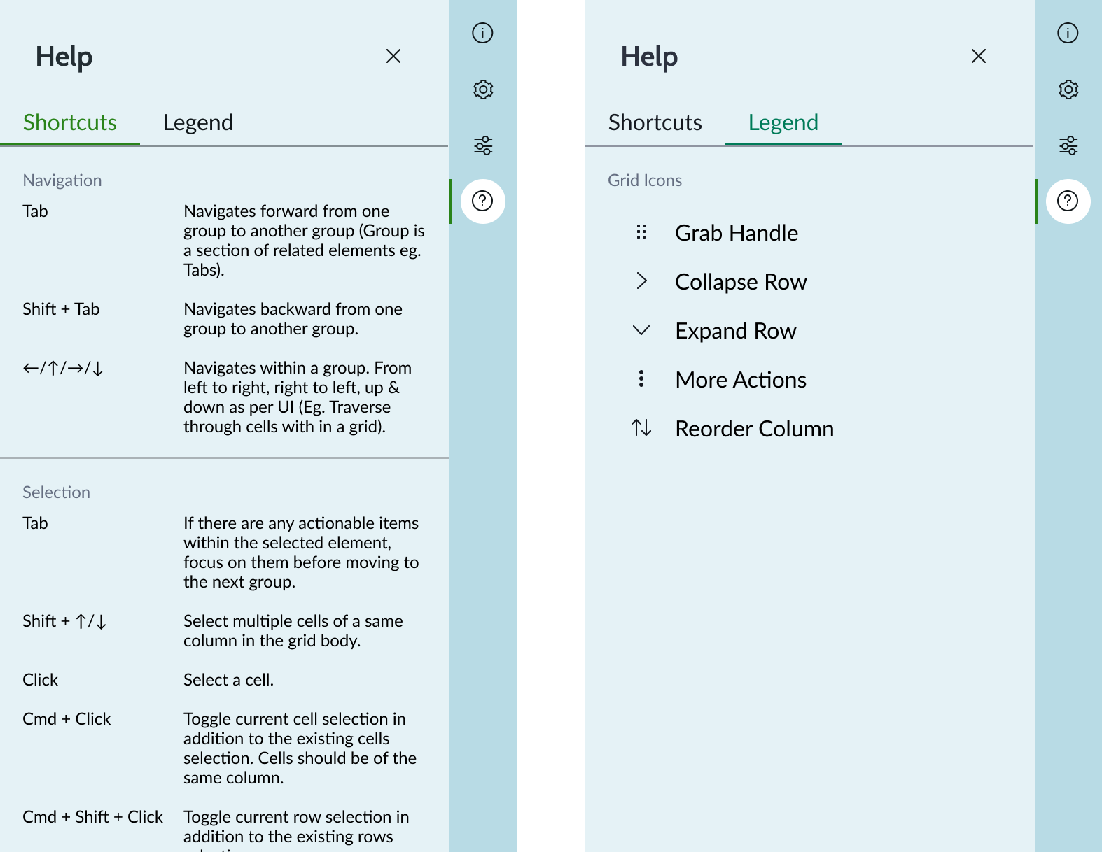
Help menu
Users can select the information icon to open the help menu. Under the “Legend” tab, users can view actions for the grid icons. Under the “Shortcuts” tab, users can view keyboard shortcuts to navigate the Gantt chart.
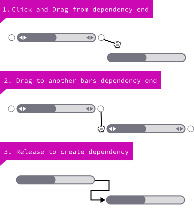
Create dependency
Users can create dependencies quickly using the dots at the beginning and ends of a bar on hover. By click/dragging those dots to dots on other bars, users can create a dependency between records. Clicking on the line will open the side panel where the user can make more adjustments.
Usability
Gantt chart complies with all internationalization and accessibility requirements.
Internationalization
When this component is used in a platform configured for a right-to-left (RTL) language, the list and timeline switch positions.
Accessibility
Learn how to access the actionable elements of Gantt chart through keyboard interactions and screen readers.
Keyboard interactions
You can access the actionable elements of Gantt with these keyboard keys:
| Key | Value |
|---|---|
| Tab | Moves to the next interactive element |
| Shift + tab | Navigates to the previous interactive element |
| Arrow keys | Navigates within a group |
| Shift + up arrow/down arrow | Selects multiple cells in a column in the list |
| Enter | Initiates an action such as opening a link or selecting a button |
| Esc | Exits the node menu |
| Command + S | Saves the open record |
| Command + C | Copies currently selected cell(s) data from a column |
Screen readers
When you apply ARIA labels to a component, screen readers announce the controls and content of Gantt chart in the prescribed tab order.