


iOS

Android
- Label: Describes the action of the button
Variants
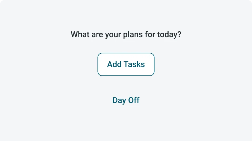
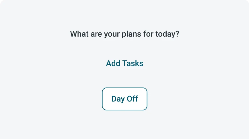
Text buttons offer three main variants: Primary, Destructive, and Positive. Utilizing these different variants can guide users through their choices and processes, with each variant emphasizing the importance of the respective action. Make sure to select the appropriate button variant based on the significance of each action, enhancing user interaction and overall experience.
Primary
The default variant for a text button is Primary, which helps users recognize that it allows for an action upon clicking. This choice enhances the visibility of the button, even with its minimalist design.

Destructive
The Destructive text button is used for critical actions with negative outcomes, such as logging out or exiting. Its red color clearly signals the seriousness of the action, helping users understand the consequences before proceeding.

Positive
The Positive text button is used for actions that confirm or approve, such as initiating a process or confirming a choice. It reinforces positive user decisions with a style that stands out, while maintaining balance and not overwhelming the display.

Keep button labels short and focused on the action. Ensure the text clearly communicates the intended action. Capitalizing only the first word.
Avoid overly long text on buttons. If the text is too long, avoid breaking it into two lines—shorten the label to fit, and only truncate the text as a last resort. Keep the text on a single line, using sentence case with only the first word capitalized.
- Secondary action
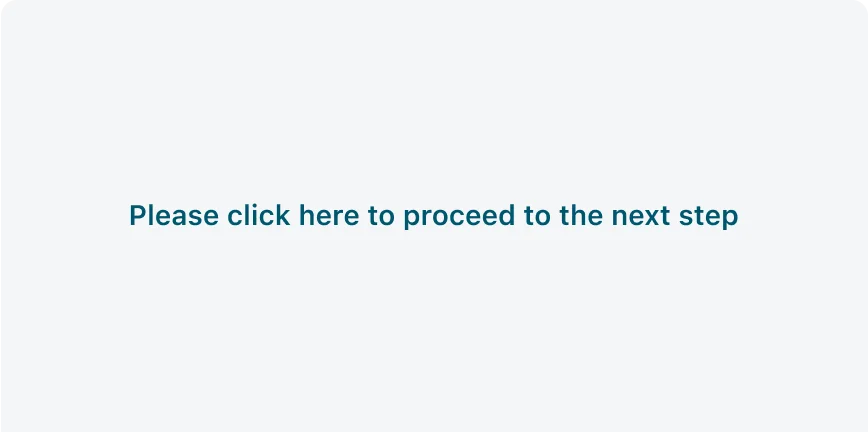
Use Text button for lowest priority actions.
Avoid use text button as the primary actions.
UI text guidelines
These are some recommendations for labeling a text button:
- Start with a verb to describe a specific action. This sets the expectation of what happens next.
- Use short labels. Two words is ideal. Three is OK. If needed for clarity, four is acceptable.
- Avoid commas, periods, and other punctuation
- Add an object to the verb if additional context or clarity is needed. For example, “Add table".
- Add an article (like “a” or “an”) to add a more human, conversational tone For example, “Add a person”
- Use the same verb tense if there are multiple buttons For example, two buttons could be “Apply” and “Close,” both of which are present tense
States
Text button has 2 states: Default and Disabled.
| State | Primary | Destructive | Positive |
|---|---|---|---|
| Default |  |
 |
 |
| Disabled |  |
 |
 |
Interactions
Learn where the text button appears in the app.
Launcher screen
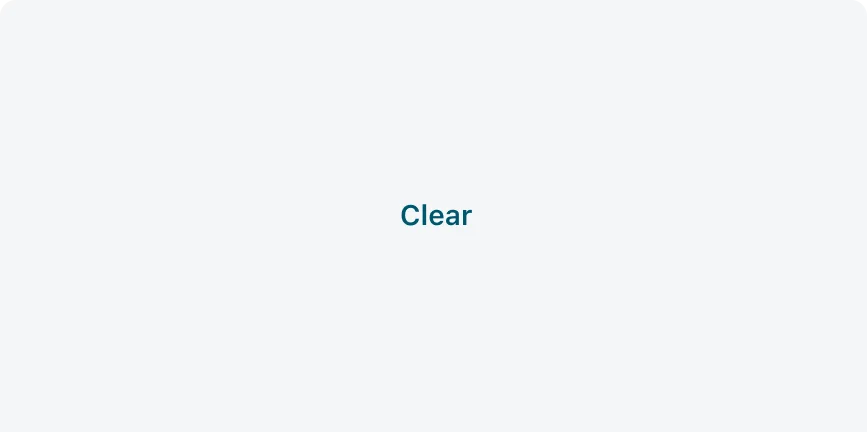
A text button can appear on the launch screen, guiding users to low-priority actions.

For example: a text button that leads to all my tasks.


