iOS
Android
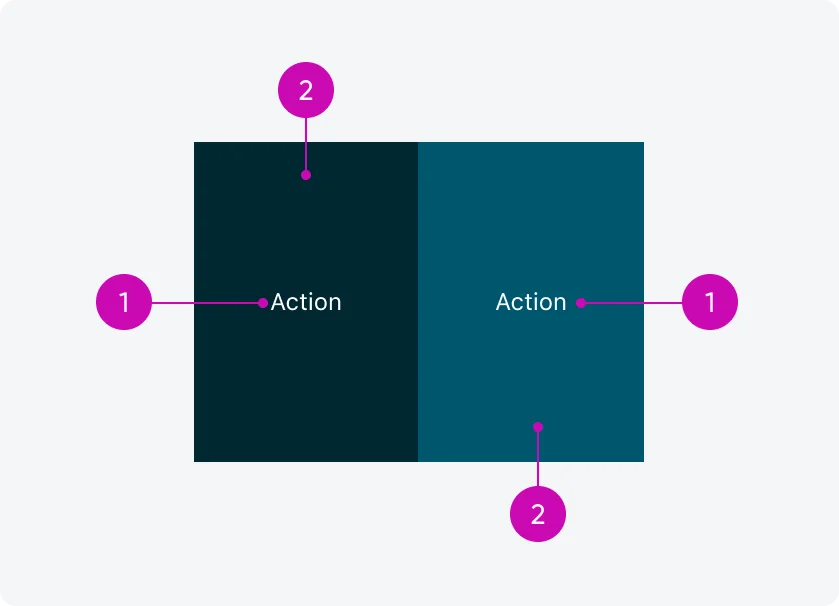
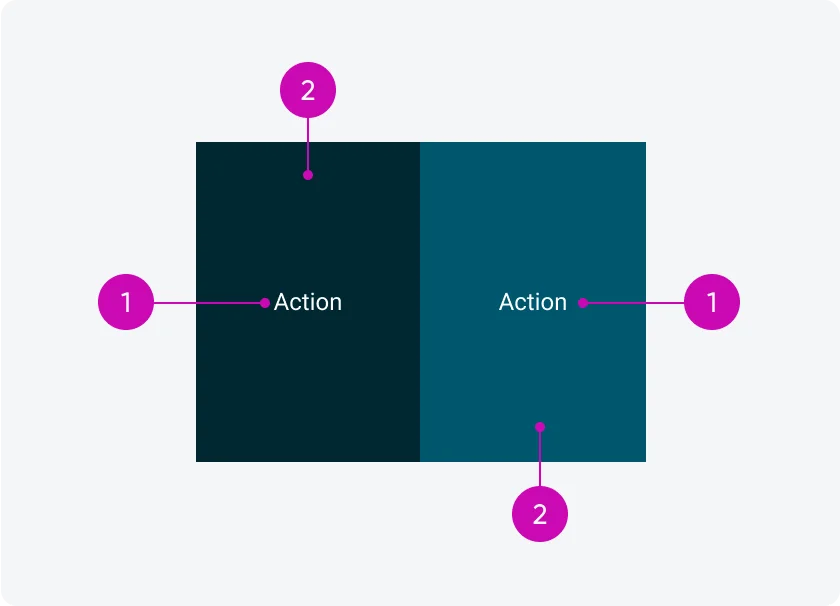
- Label: Describes the action of the button
- Container: Frame containing the action
Variants
Swipe actions have five primary variants: Primary, Secondary, Tertiary, and also support Destructive and Positive actions. Use different swipe variants to guide users through your design or workflow, ensuring that the appropriate actions are easy to access. Swipe actions can help convey the hierarchy of decisions, with varying styles indicating the importance of each option. Choose the right swipe action style and configuration based on the significance of each action, ensuring the design enhances user interaction and experience.
Primary
The Primary swipe action should be the most visually prominent, signaling the main action a user is expected to take. Use this variant to highlight the preferred or most likely action in a workflow. Only one primary action should be used per screen to avoid confusion and maintain clarity in the decision-making process.

Secondary
The Secondary variant represents a supplementary action that supports the workflow, but isn’t the main focus. It has a subtle appearance compared to the primary action, ensuring it doesn't overpower other elements on the screen. Use this when there are additional, less critical options available.

Tertiary
When configuring three actions for a swipe action, a tertiary color will be presented for the third swipe. This variant uses a distinct color that is defined as part of the mobile theming to ensure it visually differentiates from primary and secondary actions without confusing the user.

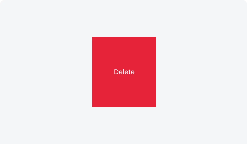
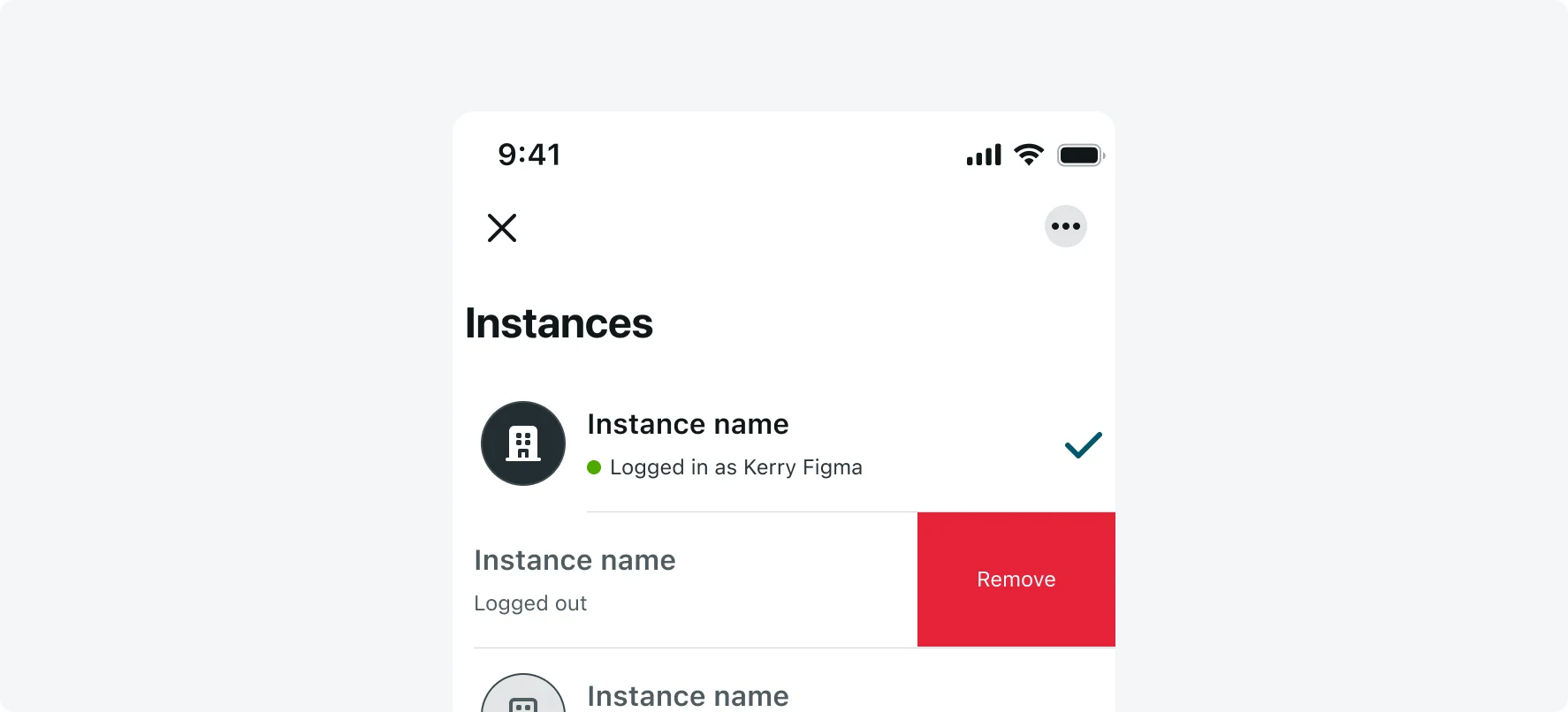
Destructive
The Destructive swipe action is reserved for critical actions that may have permanent or negative outcomes, such as deleting data. This variant uses a bold style to clearly communicate the severity of the action, warning users about the consequences before they proceed.

Positive
The Positive variant is used for actions that confirm or approve, such as submitting information or marking an item as completed. It reinforces positive user decisions, typically with a style that stands out but doesn’t dominate the display.

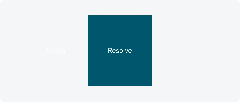
Configuration
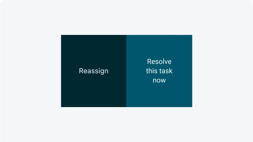
The swipe action can be configured as one, two, or three actions per side. When more than three actions are configured, an ellipsis icon will appear, triggering an action sheet that displays all available options.
One action
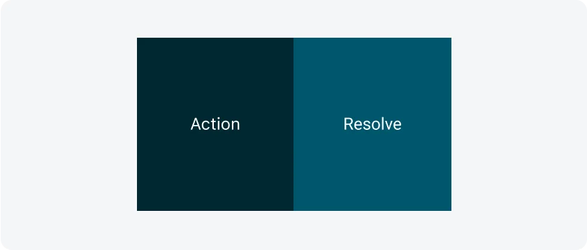
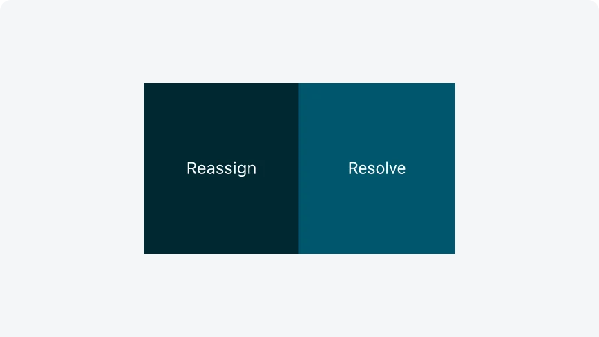
Two actions
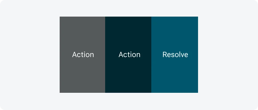
Three actions
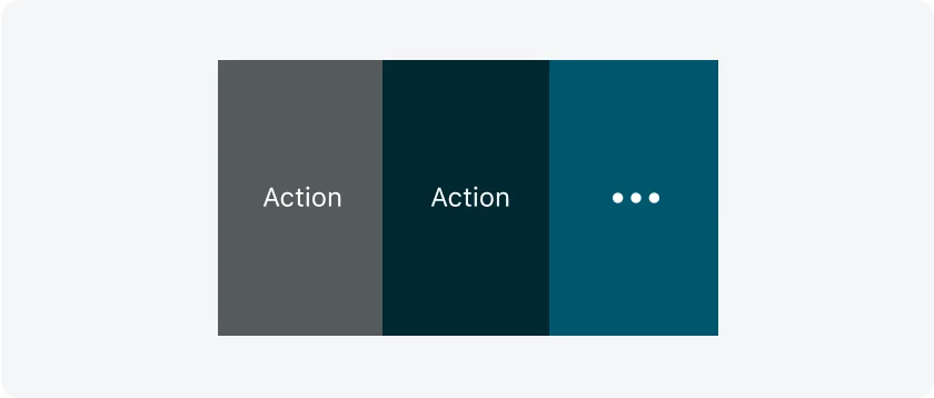
More actions
States
Swipe actions are only available in their default state. In offline or disabled modes, they are not accessible.
Keep button labels short and focused on the action. Ensure the text clearly communicates the intended action. Capitalizing only the first word.
Avoid overly long text on buttons. If the text is too long, avoid breaking it into two lines—shorten the label to fit, and only truncate the text as a last resort. Keep the text on a single line, using sentence case with only the first word capitalized.
- Accessibility
Ensure swipe actions are accessible through alternative input methods, such as buttons or menus, to accommodate users relying on assistive technologies like screen readers. Don’t Rely solely on swipe gestures, as they may be challenging for users with mobility or dexterity limitations.
Alignment and positioning
The button width adjusts dynamically based on the number of actions configured for the cell. The height also adjusts dynamically based on the cell height. You can include between one and three swipe actions, with one designated as the main button (Primary). Swipe action buttons stick to the side of the cell (It can be configured on both sides, but it is usually set to the right.) and reveal themselves upon swipe.
UI text guidelines
The default configuration for a swipe action button is plain text within a container, which can have different styles based on the variant you choose. Text swipe action buttons can clearly communicate available actions and shortcuts.
Consider these recommendations for labeling a swipe action button:
- Start with a verb to describe a specific action. This sets the expectation of what happens next.
- Use short labels. One word is ideal.
- Avoid commas, periods, and other punctuation
- Use the same verb tense if there are multiple buttons For example, two buttons could be “Delete” and “Edit,” both of which are present tense
Responsive behaviors
The button container width can be adjusted based on the responsive layout grid.