

iOS
Android
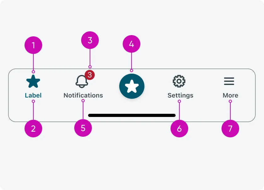
- Icon: The visual element representing a tab or action, helping users quickly identify its purpose.
- Label: Text that describes the tab or action, providing clarity alongside the icon.
- Badge (optional): A small indicator that highlights new activity, updates, or counts associated with a tab or action.
- Prominent Action Button (optional): A highlighted button for the app’s primary action, accessible across all screens and performing an immediate task rather than navigating.
- Notifications (default): A built-in area to show alerts or messages relevant to the user, typically tied to app activity.
- Settings (default): Provides access to configuration options or app preferences, always available in the navigation bar.
- More tab (optional): Appears when there are more tabs than fit in the available five slots, giving users access to the additional tabs in a consolidated menu.
Configurations
The navigation bar is highly configurable to support different app structures and workflows.
Tabs
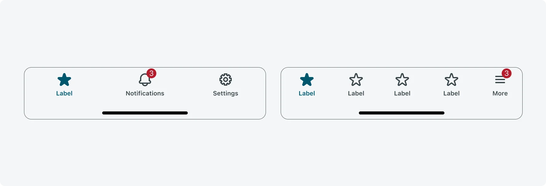
You can configure the number of tabs, along with each tab’s icon and label. If more tabs are added than fit in the available slots, a “More” tab automatically appears to provide access to the extra tabs.
Prominent Action Buttons (PAB)
Optionally, you can include a Prominent Action Button for the app’s primary action. The PAB is visible across all screens and performs an immediate action, such as opening a form or starting an AI conversation, rather than navigating to another view.
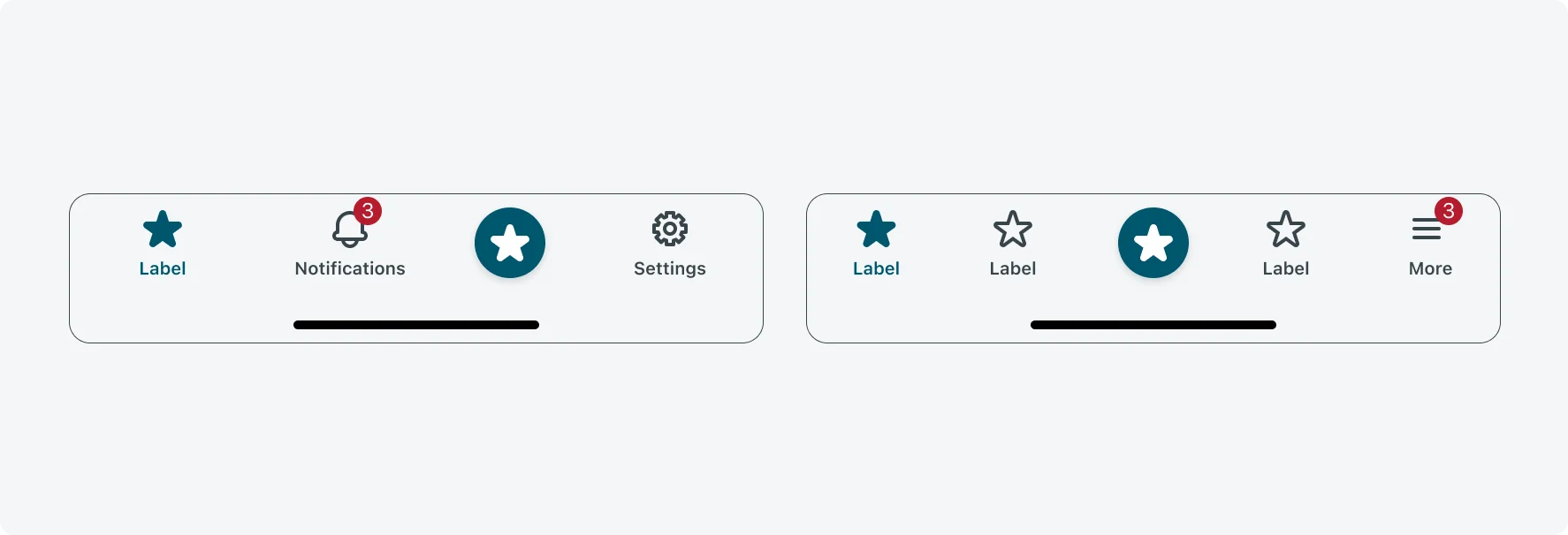
Alignment and positioning
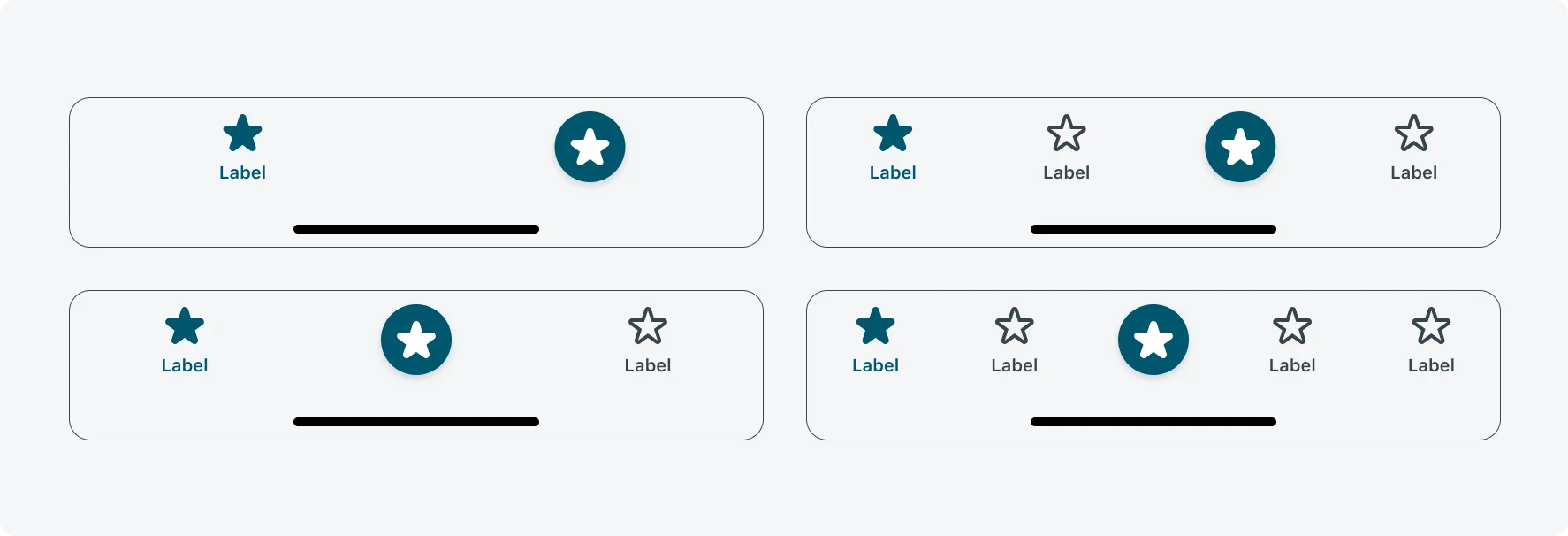
The Prominent Action Button (PAB) automatically adjusts its position based on the number of configured tabs to remain prominent and accessible. Placement follows these rules:
- 1 tab → 2nd slot, center-aligned
- 2 tabs → 2nd slot, center-aligned
- 3 tabs → 3rd slot
- 4 tabs → 3rd slot, center-aligned
- More than 4 tabs → 3rd slot, center-aligned
This dynamic positioning ensures the PAB is consistently visible without overlapping other tabs or UI elements.
UI text guidelines
Descriptive Titles: Give each tab a clear, descriptive name that communicates its purpose. Avoid generic titles like “Home” or “Apps,” which do not provide context for users.
Length and Space Considerations: Navigation tab titles have limited space, typically supporting up to five visible tabs before a “More” tab appears. Keep titles short to prevent truncation and ensure readability. When supporting multiple languages, verify that titles fit in all localized versions.
Visual Consistency: Use consistent capitalization, preferably Title Case (e.g., “Team Members”), and ensure that text length is balanced across tabs. Icons and text should be visually aligned and harmonious to maintain a clean, professional appearance.
Subcomponent states
Tabs
The tab within the navigation bar has 3 states: default, selected, disabled
| State | Label |
|---|---|
| Default |  |
| Selected |  |
| Disabled |  |
Prominent Action Button (PAB)
The prominent action button (PAB) within the navigation bar has 2 states: default, disabled
| State | Label |
|---|---|
| Default |  |
| Disabled |  |