


iOS
Android
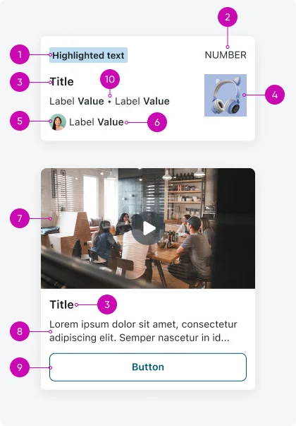
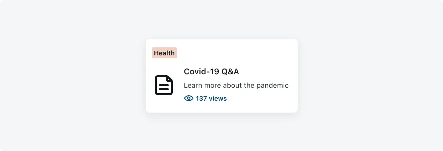
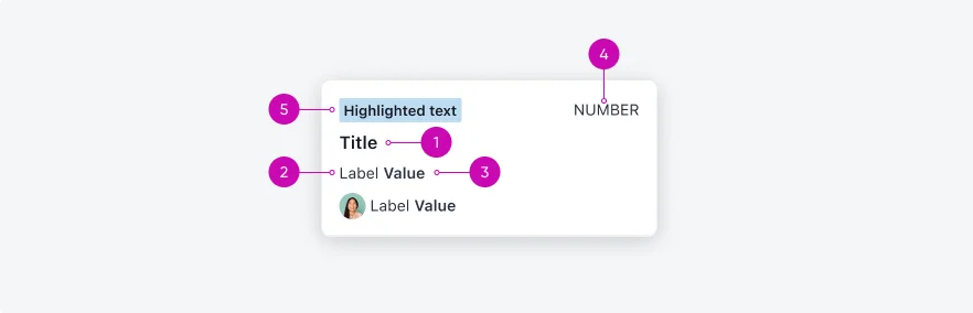
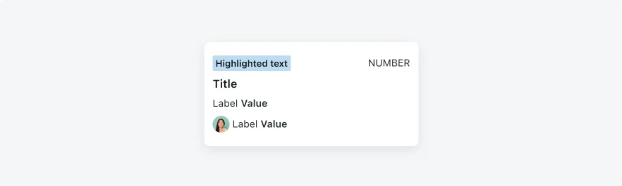
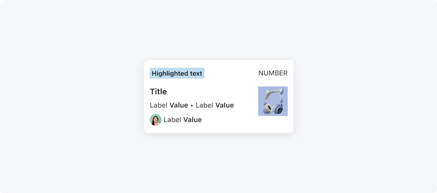
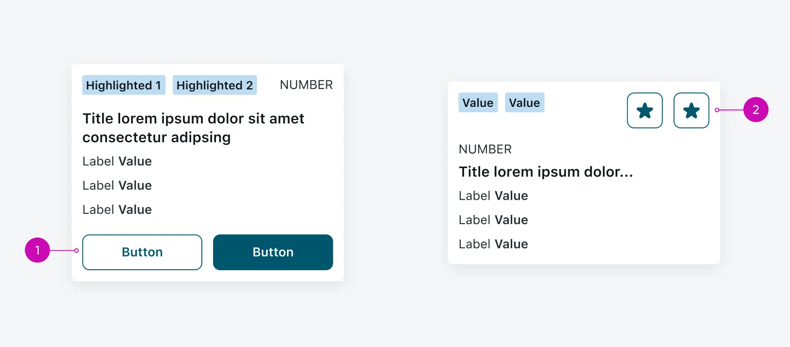
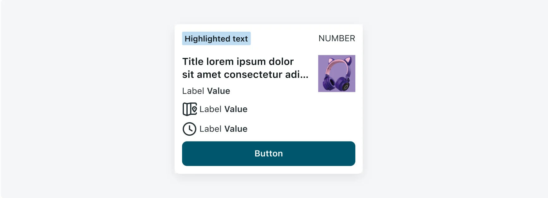
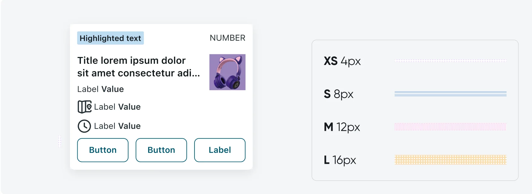
- Highlighted text: Use highlighted text and text decorator on Mobile Cards to make it easier for users to identify different types of information. Highlighted text and text decorator can be used for data such as priority and state.
- Number field: In case there’s a highlighted text, the number field will be placed on the top right of the mobile view. In case there isn’t a highlighted text, the number field will be placed on the top left of the mobile view.
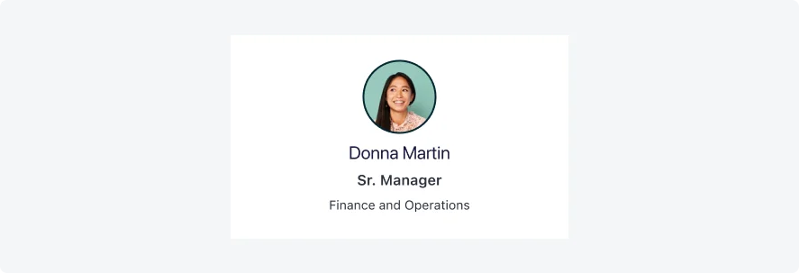
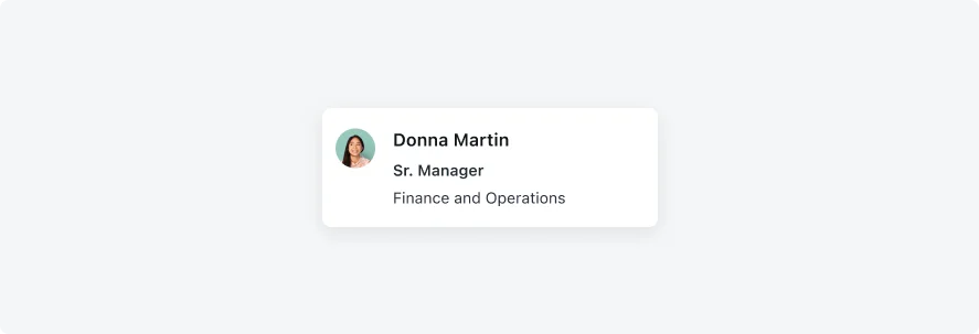
- Title: The title can include up to two lines of text, it’s recommended that it be concise, to the point and clearly convey the topic
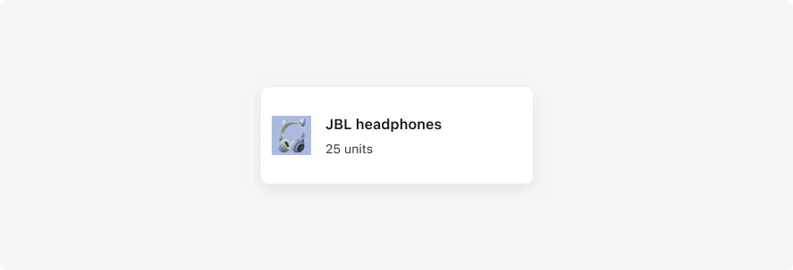
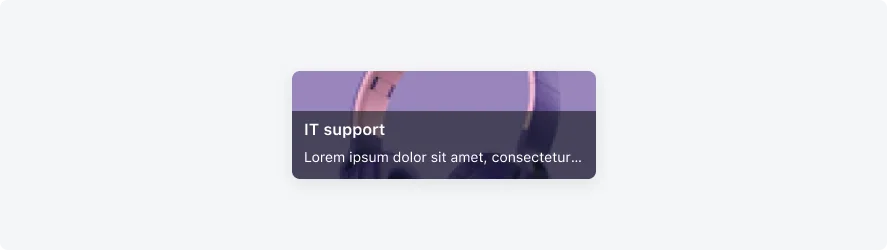
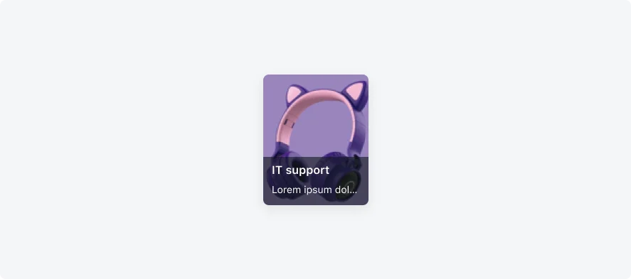
- Image / icon / avatar: Placing the image/icon/avatar on the right prevents the zigzagging the user might experience if some of the mobile views have an image while others don’t. Therefore, it is recommended to place it on the right.
- Value icon / avatar: Avatars commonly appear on the left, therefore, it is recommended to place them on the left.
- Text fields: The text field content is mainly for labels and/or values, it will usually contain short text
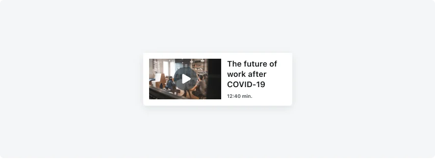
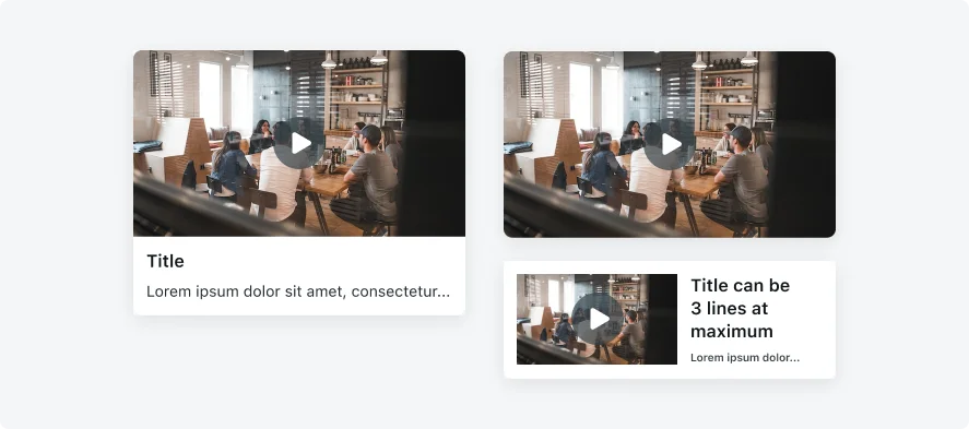
- Video: A Mobile card can include video clip, it is recommended to use an XL sized card
- Body text: Body text is meant for longer content with more details information. Avoid adding too much text to keep the card clear and focused.
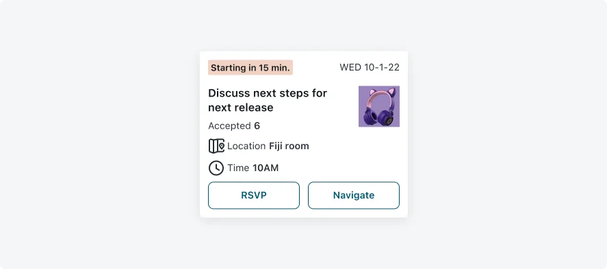
- Actions: Use card actions to allow users to quickly perform an action. Action can vary from Approve/Reject, navigation to a different screen, open a bottom sheet, etc.
- Separators: If there’s more than two fields on the same row, use the to separate between them. The separator’s color should be identical to the text field color it is used for.
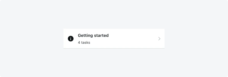
Types
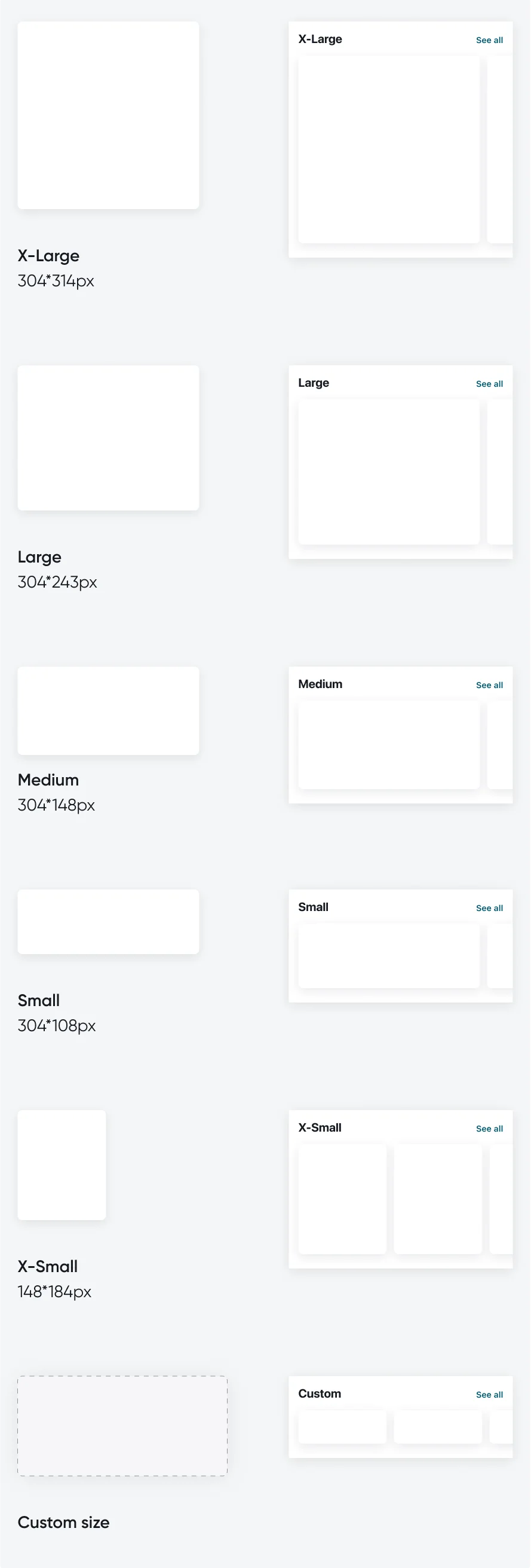
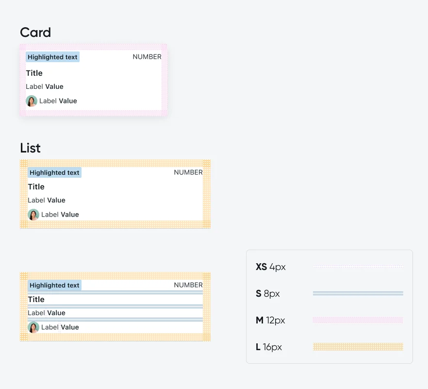
- <Card view>: should be used in a Launcher screen Mobile Cards, in their horizontal card view (vs. list view) have five fixed sizes (XL, L, M, S XS), and a custom size. You can configure one card size per horizontal record section.
- <List view>: should be used in a Related list on Recored screen
Variants
The Mobile cards has 18 variants: this section includes the OOTB card templates, and examples for different implementations. The starter templates include a variety of cards some are best suitable for vertical section, horizontal section, different card sizes, as standalone, or only in screen context. Make sure the template chosen answers your use case.
Template 1
Best for: Incidents, Requests, Pending/HR/IT approvals, HR tasks, SLA and Transfer order.
Recommended card size: Medium
This card contains: Highlighted text, Number field, Title, Image/Icon/Avatar, Text fields (3), Value icon/avatar
Template 2
Best for: Item request/order, Shift exchange, WOT, Map, Contracts, Time off, Inventory, Reservations.
Recommended card size: Medium
This card contains: Highlighted text, Number field, Title, Image/Icon/Avatar, Text fields (2), Value icon/avatar
Template 3
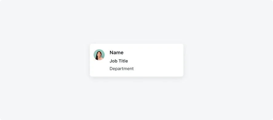
Best for: Contact, Profile. Recommended to use on Record screen.
Recommended card size: Use on Record screen only. For card view, use template 4.
This card contains: Title, Image/Icon/Avatar, Text fields
Template 4
Best for: Contact, Profile.
Recommended card size: Small
This card contains: Title, Image/Icon/Avatar, Text fields
Template 5
Best for: Search results, Items, Articles.
Recommended card size: Small
This card contains: Title, Image/Icon/Avatar, Text fields
Template 6
Best for: Articles.
Recommended card size: Medium
This card contains: Highlighted text (2), Title, Body text, Image/Icon/Avatar
Template 7
Best for: Timeline, Browse, Items, Services and Documents.
Recommended card size: Use on list screen and on vertical record section.
This card contains: Title, Image/Icon/Avatar, Text fields
Template 8
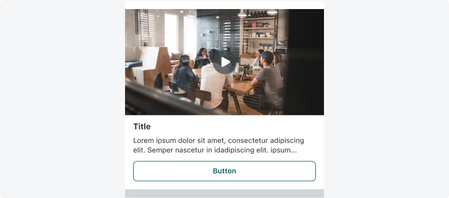
Best for: Campaigns, Video, Articles. Use this template to replace campaign section. Includes inline video.
Recommended card size: X-Large Recommended to use on horizontal record section only. For list view, use Template 11.
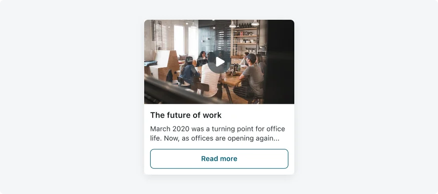
This card contains: Title, Body text, Video, Actions
Template 9
Best for: Campaigns, Video, Articles. Use this template to replace campaign section. Includes inline video.
Recommended card size: Large
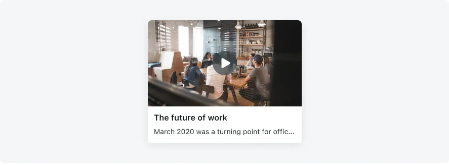
This card contains: Title, Body text, Video
Template 10
Best for: Campaigns, Video, Articles. Use this template to replace campaign section. Includes inline video.
Recommended card size: Custom (304*171px) Recommneded to use on horizontal record section only.
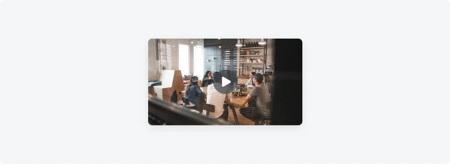
This card contains: Video
Template 11
Best for: Campaigns, Video, Articles. Use this template to replace campaign section. Includes inline video.
Recommended card size: X-Large Recommended to use on vertical record section/List view. For list view, use Template 8.
This card contains: Title, Body text, Video, Actions
Template 12
Best for: Campaigns, Video, Articles. Use this template to replace campaign section. Includes full screen video.
Recommended card size: Small
This card contains: Title, Text fields, Video
Template 13
Best for: Campaigns, Articles. Use this template to replace campaign section or media section.
Recommended card size: X-Large Recommended to use on horizontal record section only.
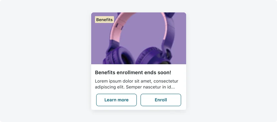
This card contains: Highlighted text, Title, Body text, Image/Icon/Avatar, Actions (2)
Template 14
Best for: Campaigns, Articles. Use this template to replace campaign section or media section.
Recommended card size: Large Recommended to use on horizontal record section only.
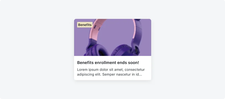
This card contains: Highlighted text, Title, Body text, Image/Icon/Avatar.
Template 15
Best for: Campaigns, Articles. Use this template to replace campaign section or media section.
Recommended card size: Small Recommended to use on horizontal record section only.
This card contains: Title, Body text, Image/Icon/Avatar.
Template 16
Best for: Campaigns, Articles. Use this template to replace campaign section or media section.
Recommended card size: X-Small Recommended to use on horizontal record section only.
This card contains: Title, Body text, Image/Icon/Avatar.
Template 17
Best for: Campaigns. Use this template to replace campaign section.
Recommended card size: Large Recommended to use on horizontal record section only.
This card contains: Highlighted text, Number field, Title, Image/Icon/Avatar, Text fields (3), Value icon/avatar (2), Actions (2).
Template 19
Best for: WOT
Recommended card size: Small
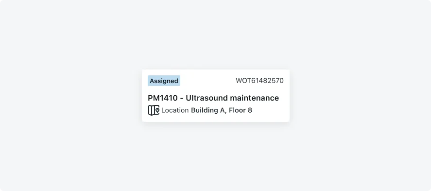
This card contains: Highlighted text, Number field, Title, Text fields, Value icon/avatar.
Template 20
Best for: Inventory
Recommended card size: X-Small
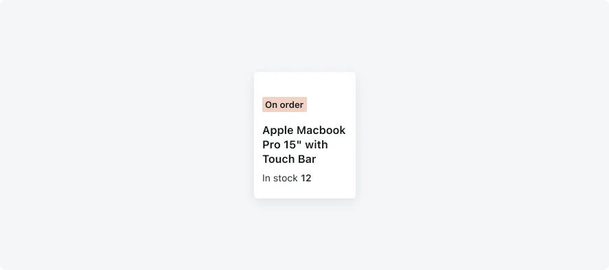
This card contains: Highlighted text, Title, Text fields.
Template 21
Best for: Task, WOT.
Recommended card size: Large
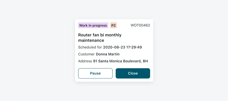
This card contains: Highlighted text (2), Number field, Title, Text fields(3), Actions (2).
Template 22
Best for: Task, WOT.
Recommended card size: Custom (304*204px)
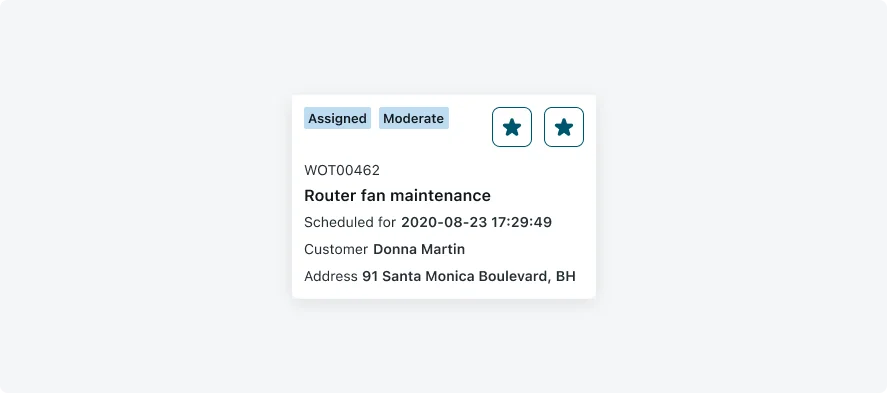
This card contains: Highlighted text (2), Number field, Title, Text fields(3), Actions (2).
Best Practice
- When using an image as a card background, consider configuring background color with opacity for the text in order to make sure your card is accessible.
- Use Image focus on faces when your card includes images with faces, the image will be cropped and focus on areas where faces are detected.
Configurations
Learn how to customize Mobile cards by configuring the available properties.
Card sizes
Mobile Cards, in their horizontal card view (vs. list view) have five fixed sizes, and a custom size. You can configure one card size per horizontal record section.
Card view will appear on Launcher screen and on Related list on Record screen.
Typography
The typography on Mobile Cards is defined by text styles (e.g.; Headline, Body, Subhead 1, Subhead 2, etc.). Each style holds the font properties- font name, weight, and size. It is crucial to use text styles for accessibility reasons, as the text size will change according to the user preferences on his device.
Use the different text styles in order to create a hierarchy in your card.
The styles mentioned below represent the recommendation based on the OOTB templates and should cover most use cases. However, different cards have different needs, and you may want to create a different hierarchy, based on the context and structure of your card.
Try to maintain a similar approach to the styles that are described below, in order to create consistency, and create the changes needed according to your needs. If you are not a designer, we do advise you to consult with a UX designer or reach out to one. To view the available text styles, please enable the Native Mobile Typography library.
- Title: Text style | Headline (iOS: SF Semibold, Android: Roboto Medium 16px)
- Label: Text style | Subhead 2 (Regular 14px)
- Value: Text style | Subhead 1 (iOS: SF Semibold, Android: Roboto Medium 14px)
- Number: Text style | Subhead 2 (Regular 14px)
- Highlighted text and text decorator: Text style | Highlighted value (iOS: SF Semibold, Android: Roboto Medium 13px)
*Note In case the user defines accessibility for typography, some of the text will be truncated. Make sure you Mobile Card drills down to a list screen or a record screen for full visibility.
Padding
The padding properties below describe the recommendation based on the OOTB templates. However, you may need to use different padding to achieve your desired outcome. If you do so, please maintain at least XS padding, and make sure that your padding can be devided by 4px.
Number field
In case there’s a highlighted text
In case there’s a highlighted text, the number field will be placed on the top right of the mobile view.
In case there isn't a highlighted text
In case there’s a highlighted text, the number field will be placed on the top left of the mobile view.
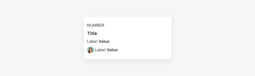
Image / Video / Icon / Avatar
It is recommended to place the image, icon or the avatar to the right of the card. However, in some use cases they can be placed on the right.
Placing the image/icon/avatar on the right prevents the zigzagging the user might experience if some of the mobile views have an image while others don’t. Therefore, it is recommended to place it on the right.
Avatars commonly appear on the left, therefore, it is recommended to place them on the left.
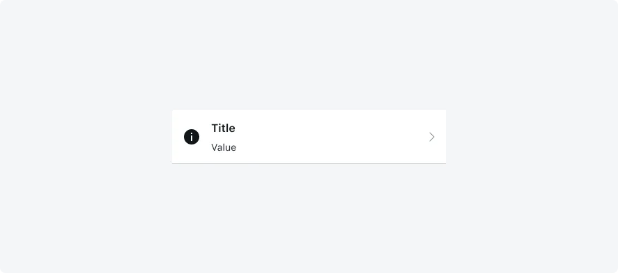
If the mobile view contains a navigation arrow icon, the icon variable should be: Navigation
- Video supports inline and full screen playback modes. The default playback mode is full screen. For inline videos we recommend configuring the video component to a ratio of 16:9, with 304 pixels wide and 171 pixels high.
- In case you want to add videos to small cards or in a video frame smaller than the above, it is recommended to use full screen playback mode.
- Video components support building rich and flexible cards. The video can be based on either a value from a field or a static URL. Cards can be used in different locations in the application such as record section, list, record screen header.
Separators

- If there’s more than two fields on the same row, use the • to separate between them.
- The separator’s variable color should be identical to the text field variable color it is used for.
Actions
Starting from Quebec, card actions are supported on Mobile Card. Below you will find recommendations on how to use buttons, sizes, variations, styles, padding and recommended locations. Mobile Cards support card actions.
Use card actions to allow users to quickly perform an action.
Actions can vary from Approve/Reject, navigate to a different screen, open a bottom sheet, etc.
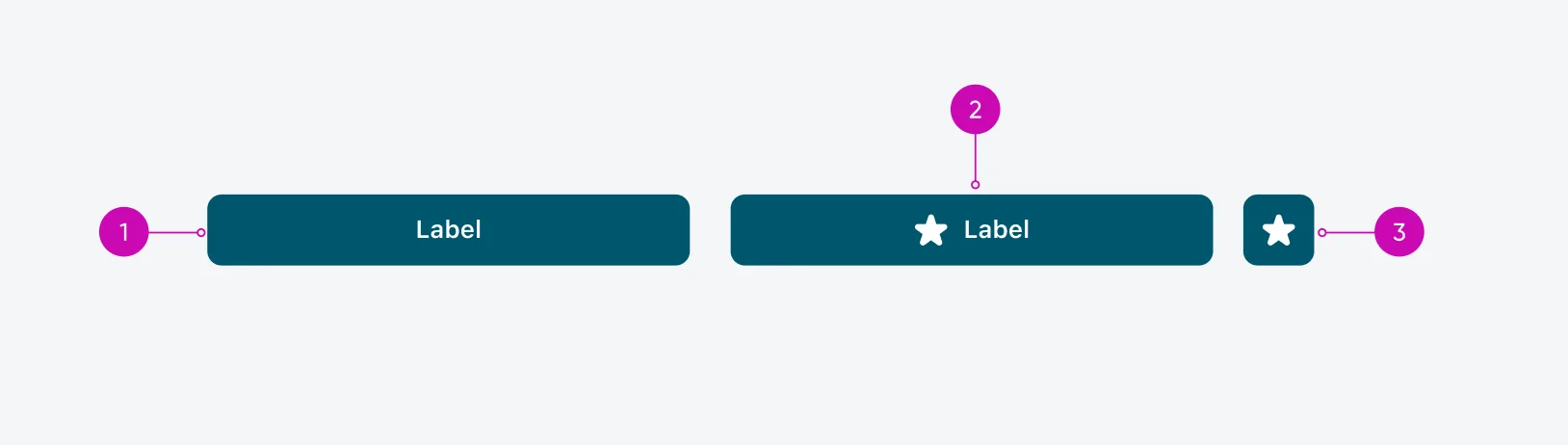
- The recommended text button height is 40px, and the button radius is 8px.
- For icon only buttons, use 40*40px and 8px button radius. Use the now-mobile-icons-buttons font for icons. Click here for the full list of available icons.
- Card Button: this type of buttons are used only on Card component
1. Actions | Variants
Use one of the following variations
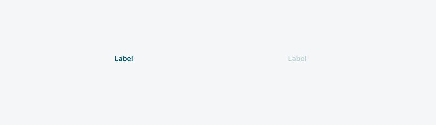
- Text only: Use Subhead 1 (14px semibold/medium) for the text.
- Text and icon: Use Subhead 1 (14px semibold/medium) for the text.
- Icon only: Use a 20px icon.
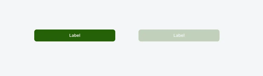
2. Actions | Styles
Use one of the following styles:
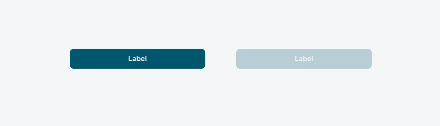
Primary | Use style to visually distinguish between primary and secondary options. To highlight the preferred or most likely action, assign a more prominent style to the primary button and a less prominent style to the secondary button or other alternative actions. A primary button is designed to grab the user's attention and stand out from other buttons. Use one primary button per display in a workflow.
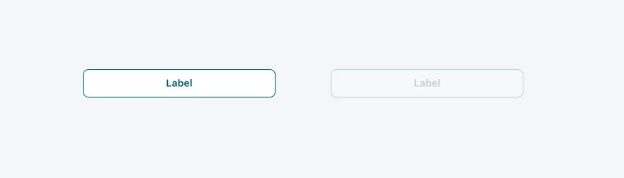
Secondary | A secondary button is outlined, featuring a stroke around the button container and, by default, has no fill. Use the secondary variant when the action is supplemental to completing a workflow. The secondary variant is the default for button. The secondary variant has a recognizable appearance with a style that keeps it from standing out in the display.
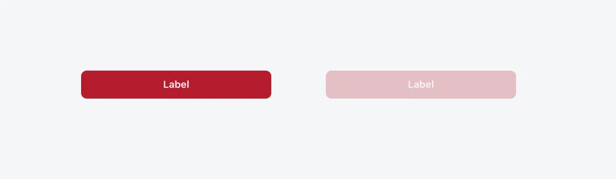
Destructive | Use the destructive variant for critical or irreversible actions, such as permanently deleting something. The destructive button’s style clearly communicates the seriousness of the action, signaling the potential negative consequences.
Positive | Use the positive variant for confirming an action or approving an object. However, the positive variant should never stand alone—always pair it with an alternative action that does not use a positive color, ensuring users have a clear distinction between the two options.
It is mostly recommended to place buttons on the bottom of the mobile view.
Icon only buttons can be placed at the top right, or bottom right (best suitable if there’s a number field) of the mobile view. Please note that using the icon buttons impacts the space left for text fields. If your view includes long text please consider using full buttons at the bottom of the card.
4. Actions | Number of button
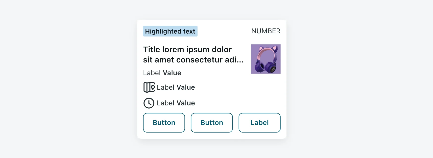
It is mostly recommended to configure up to 3 buttons.
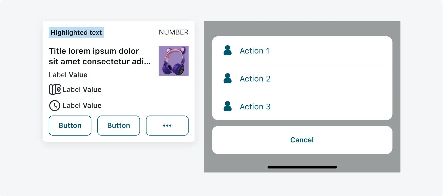
If there are more than 3 actions, set the 3rd icon to ... button and the rest of the actions will appear in an action sheet.
5. Actions | Padding
It is mostly recommended to configure up to 3 buttons.
Highlighted Text
Color is purposeful, not decorative. The strategic use of color plays a pivotal role in a product's success by helping dictate the desired feeling, action, and outcome of the user experience. Use highlighted text on Mobile Cards to make it easier for users to identify different types of information. Highlighted text can be used for data such as priority and state.
| COLOR PALETTE | DESCRIPTION | WHEN TO USE |
|---|---|---|
| Alert | The Alert color palette is used to denote standard value states (such as good, bad, or warning). Alert colors can be used to represent a critical, high, moderate, low, warning, or information status. | You want to highlight an important status, states, tasks. Or when the color has specific meaning and is not only used for decoration. |
| Grouped | The Grouped color palette is used to follow the color conventions in a line of business or industry. The meaning of each color depends on the business context. | You want to use a color based on industry conventions (for example, when the meaning of a color is defined in an industry standard). |
Alert
| ALERT NAME | HIGHLIGHTED COMPONENT | MOBILE VARIABLE |
|---|---|---|
| Critical |  |
alert--critical-0 |
| High |  |
alert--high-0 |
| Warning |  |
alert--warning-0 |
| Moderate |  |
alert--moderate-0 |
| Info |  |
alert--info-0 |
| Positive |  |
alert--positive-0 |
| Low |  |
alert--low-0 |
| Disabled |  |
alert-disabled-background |
| ALERT NAME | HIGHLIGHTED COMPONENT | MOBILE VARIABLE |
|---|---|---|
| Critical |  |
alert--critical-4 |
| High |  |
alert--high-4 |
| Warning |  |
alert--warning-4 |
| Moderate |  |
alert--moderate-4 |
| Info |  |
alert--info-4 |
| Positive |  |
alert--positive-4 |
| Low |  |
alert--low-4 |
| Disabled |  |
alert-disabled-background |
Grouped
| ALERT NAME | HIGHLIGHTED COMPONENT | MOBILE VARIABLE |
|---|---|---|
| Blue |  |
--now-color_grouped--blue- |
| Brown |  |
--now-color_grouped--brown-0 |
| Gray |  |
--now-color_grouped--gray-0 |
| Green |  |
--now-color_grouped--green-0 |
| Green-Yellow |  |
--now-color_grouped--green-yellow-0 |
| Magenta |  |
--now-color_grouped--magenta-0 |
| Orange |  |
--now-color_grouped--orange-0 |
| Pink |  |
--now-color_grouped--pink-0 |
| Purple |  |
--now-color_grouped--purple-0 |
| Teal |  |
--now-color_grouped--teal-0 |
| Yellow |  |
--now-color_grouped--yellow-0 |