iOS
Android
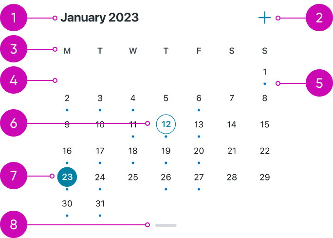
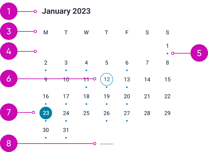
- Month and year title: display the month and the year of shown dates.
- Create new event button: create new a event on the calendar screen. On Android, it functions as a FAB (Floating Action Button).
- Days of the week: display the days of the week.
- Days that are related to the previous or following month: are not displayed on the Calendar’s month variant.
- A small circular indicator below the date: means that there is at least one event associated with that day.
- Today’s date: has outlined circle around it (if it is not the selected date).
- Shown date: has filled circle around it. The events associated with it are displayed in the events list.
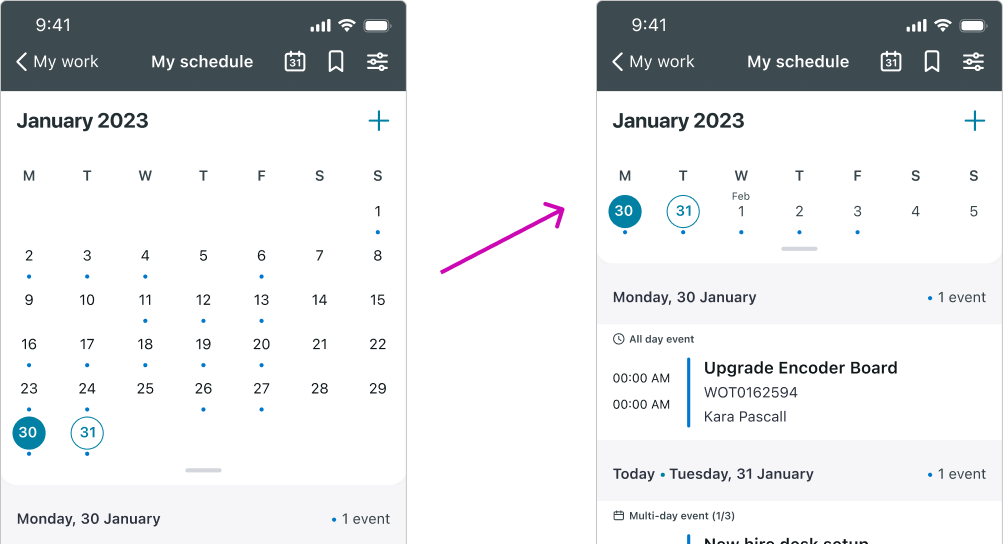
- Pull bar: is used to expand and collapse the calendar drawer. This action is toggling between the month and week mode of the calendar component.
Variants
The Calendar component has two variants: month mode which is displayed above and week mode.
Calendar's week mode
The compact week mode serves as the default mode for the Calendar component, as it allows for more space to display the events list effectively. In contrast to the Calendar's Month mode, the week mode showcases both the days of the current month and the days associated with the previous or following month.
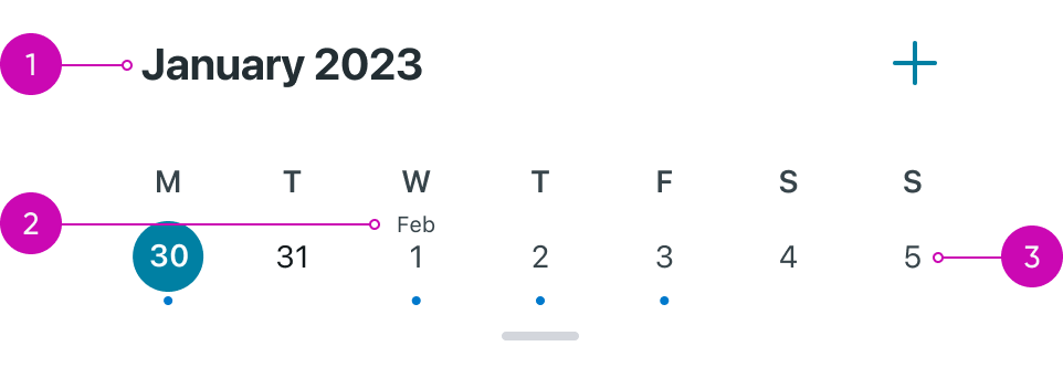
- Month and year title: in week mode the name of the month that is written in the title is determined by the currently viewed date.
- Month title: in week mode, when the week spans two different months, the title of the next month will appear above the first day of that month.
- Days that are related to the previous or following month: have a different color than the current month's days.
Alignment and positioning
As the user scrolls, the calendar collapses into a smaller view — the week mode. When the calendar component switches from month to week view, it remains fixed at the top.
- Calendar: The calendar remains sticky
Subcomponent states
Create new event button
“Create new event button״ Calendar component has 3 states:
- Default
- Loaded - while the document is still loading
- Error state - triggered by a document load failure
| State | iOS | Android Floating Action Button |
|---|---|---|
| Default |  |
 |
| Loaded |  |
 |
| Error |  |
 |
Interactions
Learn how Calendar component responds when a user interacts with it.
Navigate between months
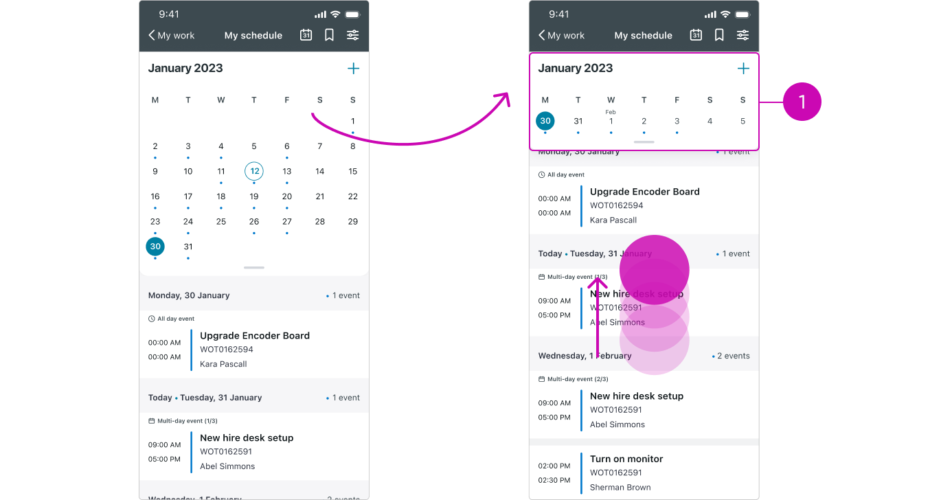
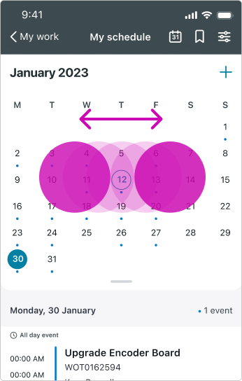
Users can navigate between months/weeks by swiping the Calendar left for the previous relative month/week and right for the next relative month/week.
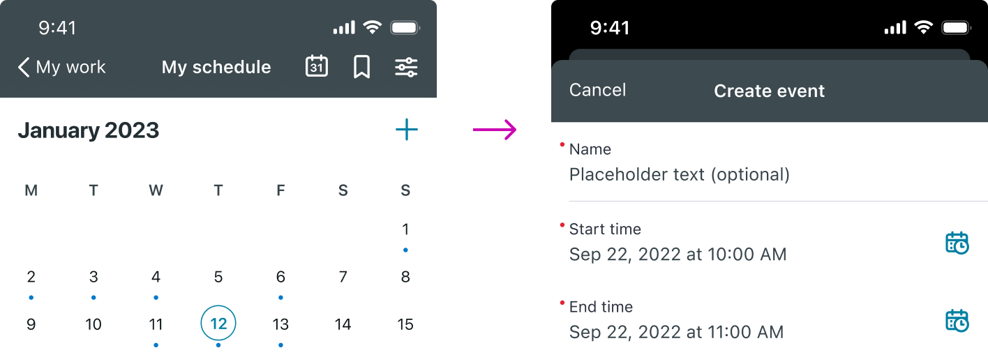
Creating an event
Creating a new event can be done by tapping the "Create New Event" button next to the title (on iOS) or by using the Floating Action Button (FAB) (on Android).
Switching between month mode and week mode
The calendar transitions to a smaller view — the week mode — as users scroll. They can also switch between modes manually by dragging or tapping the pull bar.