Anatomy
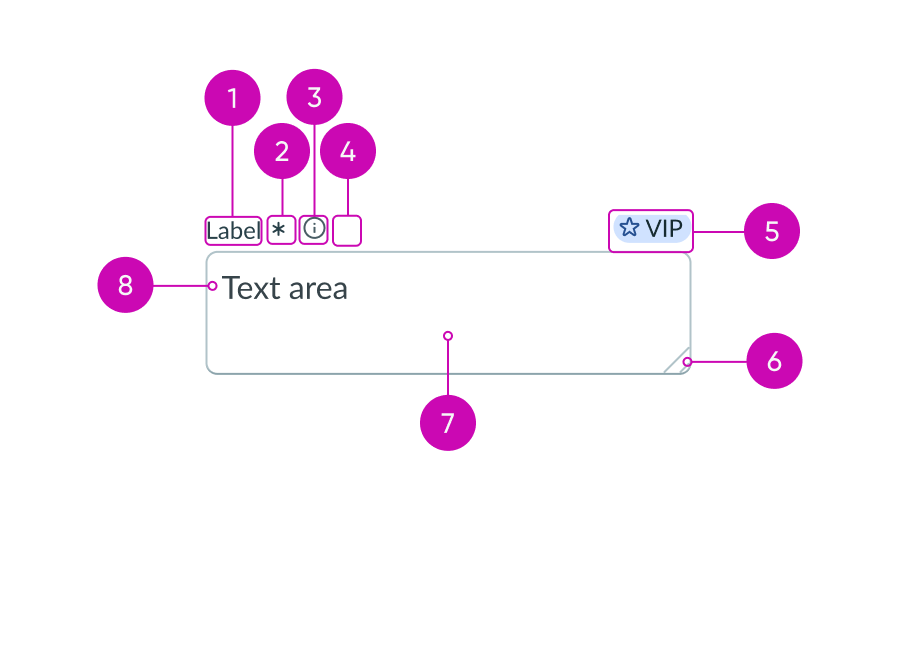
- Label: Text that identifies what the user should enter in a text input field; a label must be present for accessibility, either as the component's label element or external to the component
- Required indicator (optional): Field decorator that indicates a required field
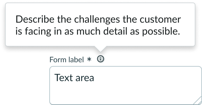
- Information button (optional): Opens a popover on hover and shows the field helper text
- Label-inline slot (optional): An available slot for an additional label icon
- Label-end slot (optional): An available slot at the end of the label line
- Resizer control: Modify the size of the text area
- Value: Text entered by a user
- Textarea field: Container for user input
Subcomponents
See usage guidance for dropdown
See usage guidance for popover
See usage guidance for iconic button
See usage guidance for input field
Usage
Use textarea where users need to compose text freely. This component is typically used for comments and work notes in any page (including portal pages) or forms in the platform.
Variants
Learn about textarea and find out how to use it in your design.
Types
The text area input field is only one type of the input field component.
See usage guidelines for input field
See usage guidelines for input password
See usage guidelines for input phone
See usage guidelines for input URL
Sizes
Textarea has the following sizes: small (sm) and medium (md). Size helps reinforce visual hierarchy, differentiate the different types, and indicate the functions of buttons. Choose a size that fits with your display and complements the surrounding content.
The resizer control in the bottom-right corner of each size is generated by the browser.
Small
Use the small size for areas that have limited space. The small size reduces the font size of the text .

Medium
Use the medium size alongside similarly sized components and content.
Note: Medium is the default size of textarea.

Configurations
Learn how to customize textarea by configuring the available properties.
Background color
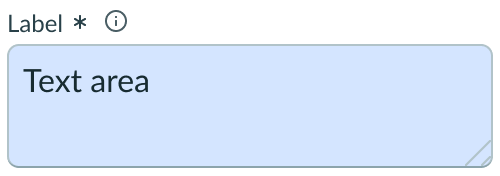
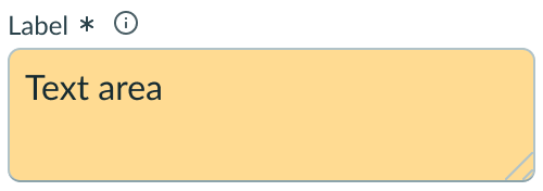
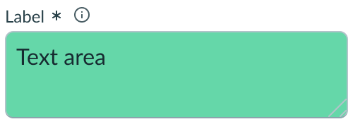
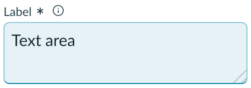
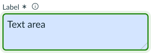
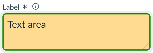
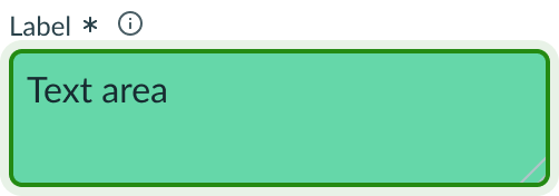
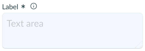
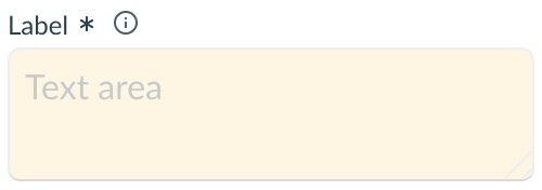
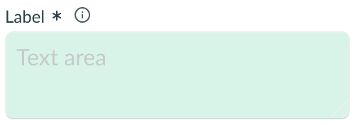
You can select a background color for your textarea component from a choice list. The background color you select is used to create the state variants for textarea.
The background color choices are:
- Initial (default)
- Blue
- Yellow
- Green
Placeholder text
You can create unique placeholder text for each textarea component. Placeholder text should be a hint that supplements the label. This can be the suggested format for the expected input or guidance on how to complete the field. The placeholder text disappears when the user types in a value.

Label wrapping
By default, field labels truncate with an ellipsis when they exceed the container width. To wrap labels, enable this property.

Required field indicator
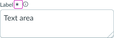
You can designate textarea as required with an asterisk indicator after the form label. This indicates that the user must enter a value in this field to complete the form.
Note: Don't use this indicator in conjunction with the optional field indicator.
Optional field indicator
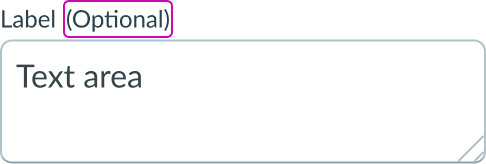
You can also configure textarea to be optional. Optional fields display "(Optional)" text next to the form label. Add this indicator to an optional field when all other fields are required by default. However, you can show the user that a field is optional without displaying the indicator at all.
Note: Don't use this indicator in conjunction with the required field indicator.
Slots
A slot is also available at the end of the label for displaying metadata. An additional slot is also available at the beginning of the textarea field.

This example shows a highlighted value at the end of the label used to associate metadata.

This example shows an AI icon at the start of the textarea field used to indicate the value was AI-generated.
The label has an end and in-line slot for additional information. The label-end slot is available at the end of the label line. The label-inline slot is available immediately after the field helper icon. You can add anything to the label-inline slot, but icons are the most appropriate use for this slot.

This example shows a color label with optional icon to indicate status or category.

This example shows a device type indicator in the label-inline slot.
The caret slot appears wherever the user places their text cursor within the textarea field.
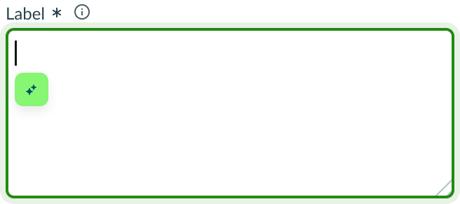
This example shows a dropdown trigger in the caret slot.
Unsaved field indicator
You can use the label-start slot to add an unsaved field indicator. The indicator appears as a small dot next to the field when the field contains unsaved changes and disappears when the changes are saved.
Note: If you want to add the unsaved indicator to all the fields in a form, see the Form usage guidelines.

This example shows an unsaved field indicator next to the label of the textarea field.
Field helper text
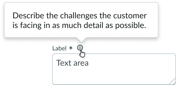
Field helper text displays information that guides the user on how to complete the textarea field. This can include formatting guidance, requirements, or an explanation of the field's purpose. When you configure field helper text, the information icon that triggers the popover appears.
Character counter
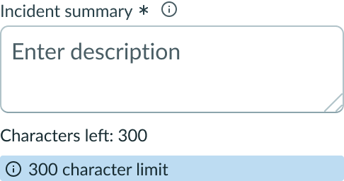
Configure a character counter to appear under the text area. This counter displays the number of characters remaining in the entry until the user reaches the maximum number of characters configured.
Character limits
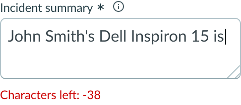
You can define the maximum and minimum number of characters that the user can enter in the field.
Resize
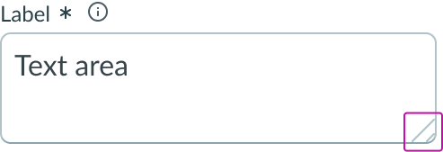
Resize is a control you can add to textarea that allows users to change the size and proportions of the field. Resizing options are available for either vertical or horizontal resizing or for resizing in both directions.
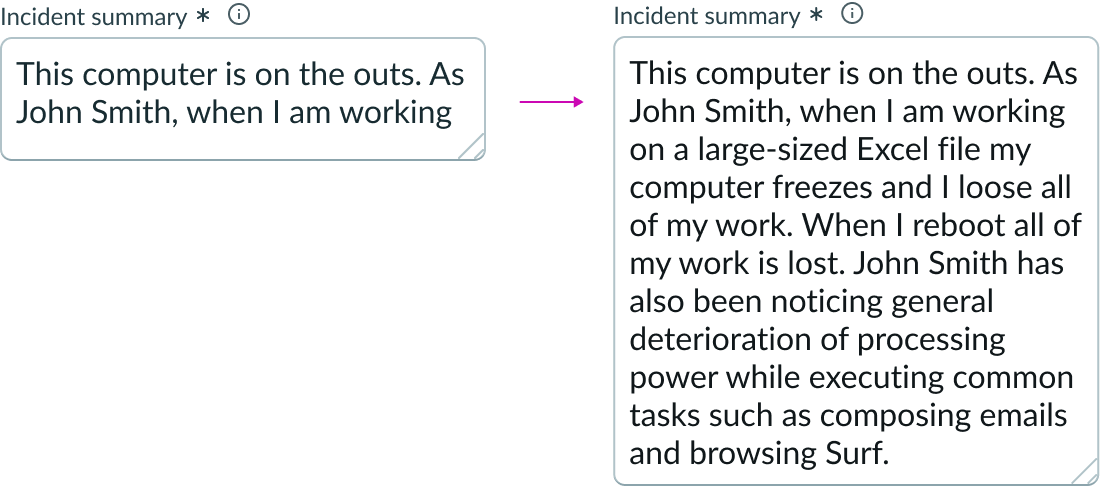
Auto resize
Configure the textarea input field to automatically resize in height as the user enters text. When input text overflows the default text area, a scrollbar appears. You have the option to set the maximum number of rows that can be displayed in the component when auto-resize is configured.
Label alignment
You can configure labels to align to the left of the textarea component to support more dense content.

Textarea field height
The default textarea field height is set to 256 pixels. This can be configured to accommodate the amount of text you anticipate in a field. The maximum number of rows allowed at the default font size is 16. If automatic field resizing is configured, a scroll bar appears when input grows beyond the maximum number of rows you've set.
You can disable the minimum and maximum height limits of the textarea field. Disabling the minimum height limit lets the field be resized below 64 pixels, while disabling the maximum height limit lets the field be resized above 256 pixels. However, even when the minimum height is disabled, the component cannot shrink below 26px for the small variant and 38px for the medium variant.
Design recommendations
Learn how to apply Textarea in your design.

Always use a label with placeholder text.

It is recommended that textarea fields have a label; don't use placeholder text as the label.
Alignment and positioning
The textarea component should be left aligned in its parent container. Positioning should follow all parent container's spacing specifications.
UI text guidelines
If there are too many words in your labels, field helper text, or placeholder text, consider using body text. You can also use body text when you need to provide additional guidance for the field or group of fields.
These are some recommendations for using text within textarea:
Labels
- Use a label that describes the expected input or a question you’re asking the user.
Form field messaging
- Informational message
- Use clear and concise language to help the user fill out the input
- Warning message
- Include information that helps the user understand any consequences or next steps with their next verb
- Use present tense since this message shows up before any input.
- For example, “Credit card information will only be used for purchasing purposes.”
- Error message
- Avoid blaming the user. Instead, tell them what happened and how they can fix it.
- Use past tense since this message shows up after the user submits something.
Field helper text
- Provide additional information to help the user understand the field and what they're expected to input
- Avoid putting critical information in an Information icon because they aren’t always visible
Placeholder text
- Use it sparingly because it disappears once the user puts their cursor in the input field
- Format placeholder text as an example of what should go in the input or a brief description of how to complete the field
Behavior
Learn how Textarea behaves when the display changes or a user interacts with the component.
States
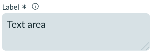
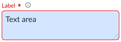
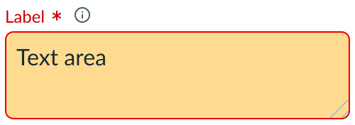
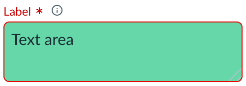
Textarea has the following states: default, hover, focus, disabled, read-only, and invalid. The appearance of each varies, depending on the background color you select.
| State | Initial | Blue | Yellow | Green |
|---|---|---|---|---|
| Default | 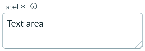 |
 |
 |
 |
| Hover |  |
 |
 |
 |
| Focus | 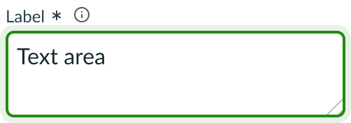 |
 |
 |
 |
| Disabled | 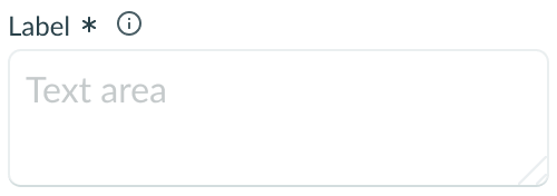 |
 |
 |
 |
| Read-only |  |
 |
 |
 |
| Invalid | 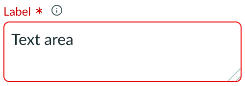 |
 |
 |
 |
Responsive behaviors
Textarea inherits the width of its container and resizes with the container. If you configure auto-resizing, the text area expands when the input overflows the default input field, and a scroll bar appears.
Interactions
The user can interact with certain elements associated with the input field slot. These can include an information icon to display field helper text, or a dropdown to show additional actions. For more information, see the usage guidance for those components.
Field helper popover
If you configure field helper text, a user can select the information icon to view additional information or suggestions for the expected input.
Resizing the field
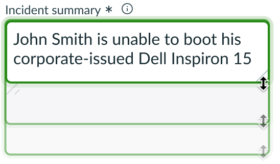
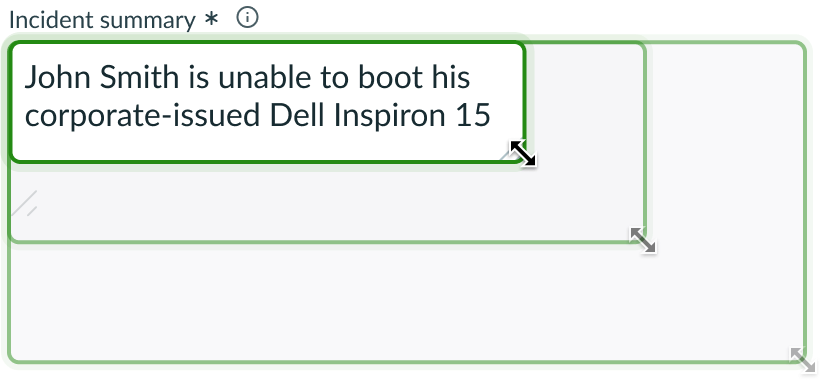
When configured, users can resize the Textarea field by selecting and dragging the resize control in the lower right corner of the field. Users can resize the field vertically, horizontally, or in both directiions at once by dragging diagonally.
Vertical resizing
Horizontal resizing

Diagonal resizing
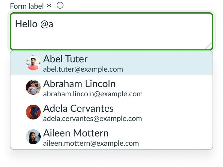
User @mention
Users can use the @mention feature to direct a work note to the attention of a particular user. When the writer types the @ symbol and the first letters of a name, a selection dropdown panel displays all user names in the system that match the characters entered.
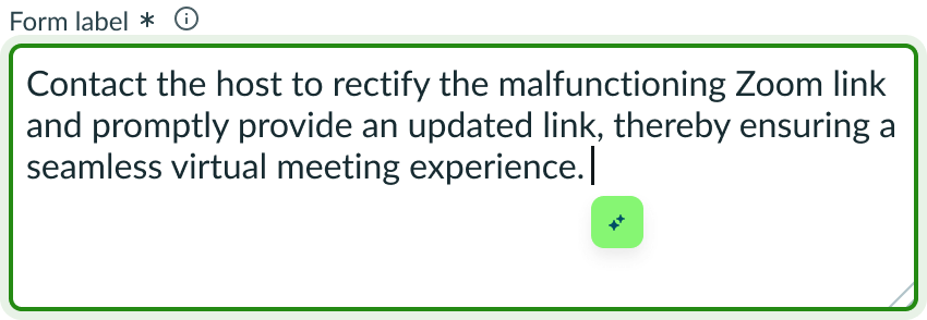
Caret slot
If you enable the caret slot, you can add a component that tracks and follows the user’s text cursor as it moves around the textarea field.
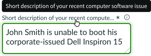
Truncation
When text in Textarea labels exceeds the width of the container or content area, the text truncates with an ellipsis, and a tooltip shows the full content on hover.
Labels
Labels truncate with ellipses when the container size or field slot options prevent the full label from displaying.
Usability
Textarea complies with all internationalization and accessibility requirements.
Internationalization
When the display translates to a right-to-left (RTL) language, the label aligns on the right. Any decorators or options in the input field slot flip their order and align to left of the label. The resizer control switches position to the lower left corner of the container, and users resize the field toward the right-aligned text and label.

Accessibility
Keyboard interactions
- Tab or Shift + Tab: Shifts between the interactive elements in the Textarea field in the standard tab order
When the focus is in the Textarea input field:
- Arrow right/left: Moves the text entry caret across available text
- Arrow up/down: Moves the text entry caret through rows of available text (if applicable)
- Control/Command + Shift: Selects text
- Shift + Arrow right/left: Selects one character at a time
Screen readers
- If a field is required, assign the aria-required=”true”, or the required HTML attribute to the field.
- Assign the aria-invalid attribute to "true" to alert when a field is marked as returning an error; by default, aria-invalid is set to "false"

