Anatomy
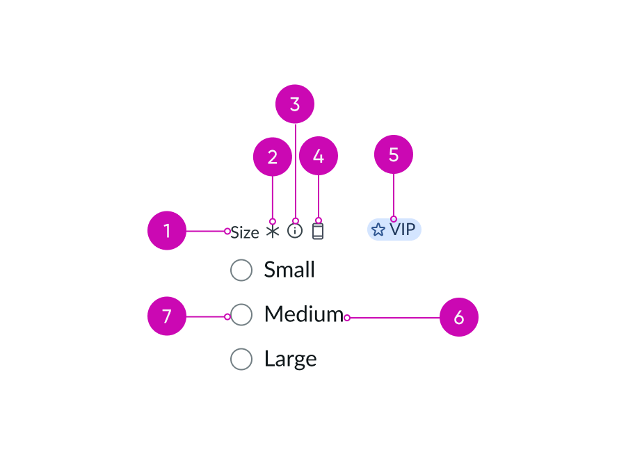
- Group label (optional): Text that describes the group of radio button options; if you don't include this label, include text above the group that describes the radio button options
- Required indicator (optional): Field decorator that identifies a required field
- Information button: Opens a popover and shows the field helper text
- Group label-inline slot (optional): An available slot for an additional label icon
- Group label-end slot (optional): An available slot at the end of the label line
- Label: Text that describes the radio button option
- Radio button: An input control for choosing a single option within a group of related options
Usage
Learn about radio buttons and find out how to use them in your design. Use radio buttons when you want the user to make only one selection from a group of options where the options are mutually exclusive.
Note: It's recommended that you have one option in a radio group selected by default.
Radio buttons are considered a form field that you can use in many places in an interface. You can use them in forms, lists, settings, or other features where you need the user to make a selection from a list of mutually exclusive options.
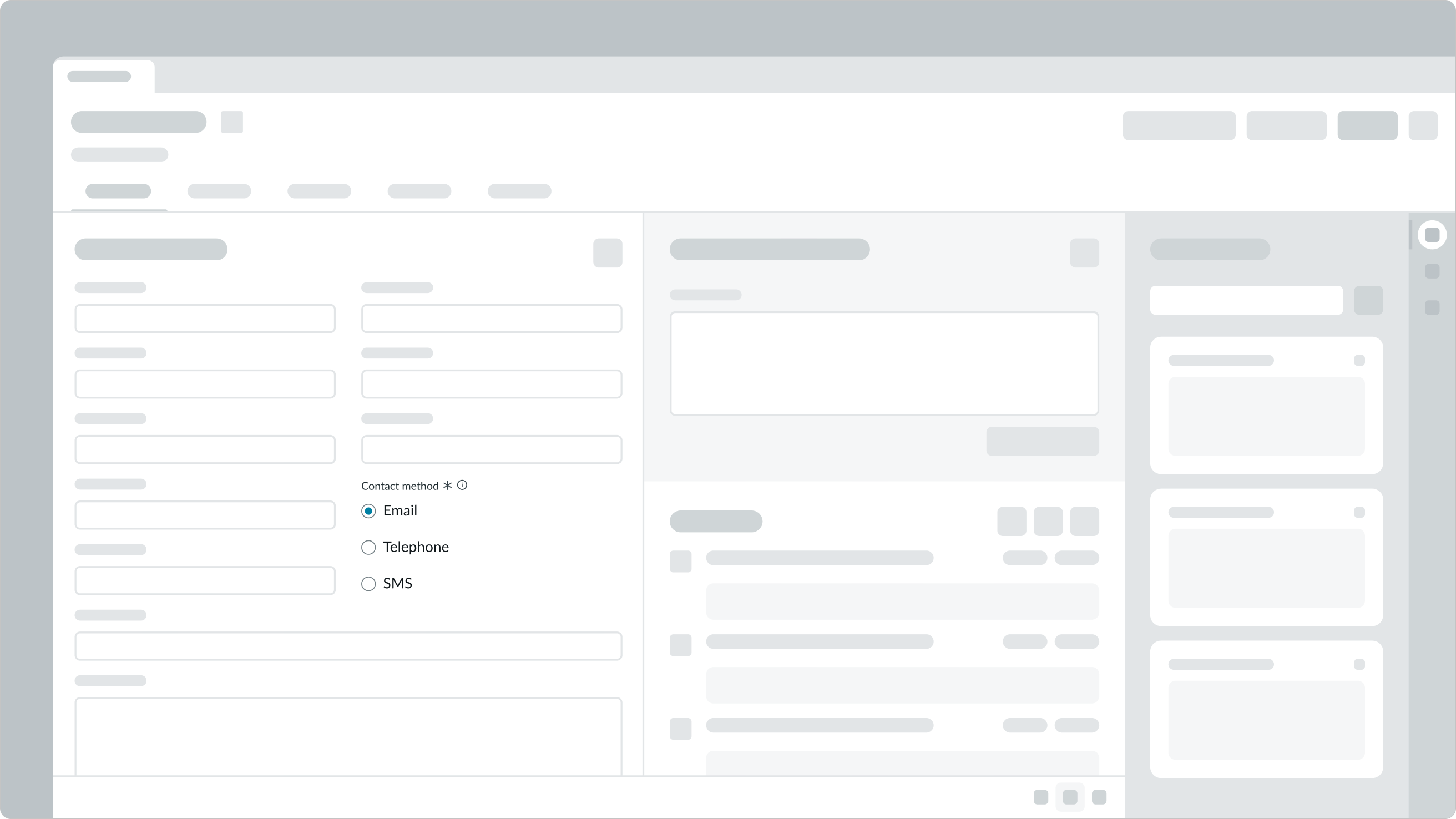
When the user selects a radio button, the application should allow them to take an action to submit or save their choice. Making the selection should not apply the changes automatically.
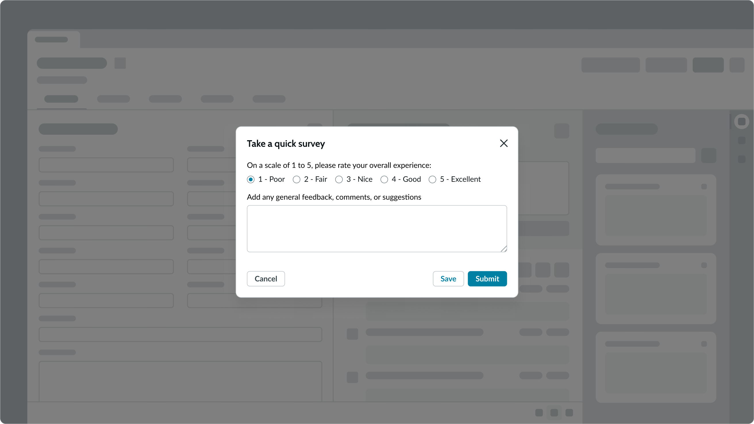
In this example, the user can rate their experience but must select the 'Submit' button to give feedback.
If you want the changes to take place immediately, consider using a toggle instead of a radio button.
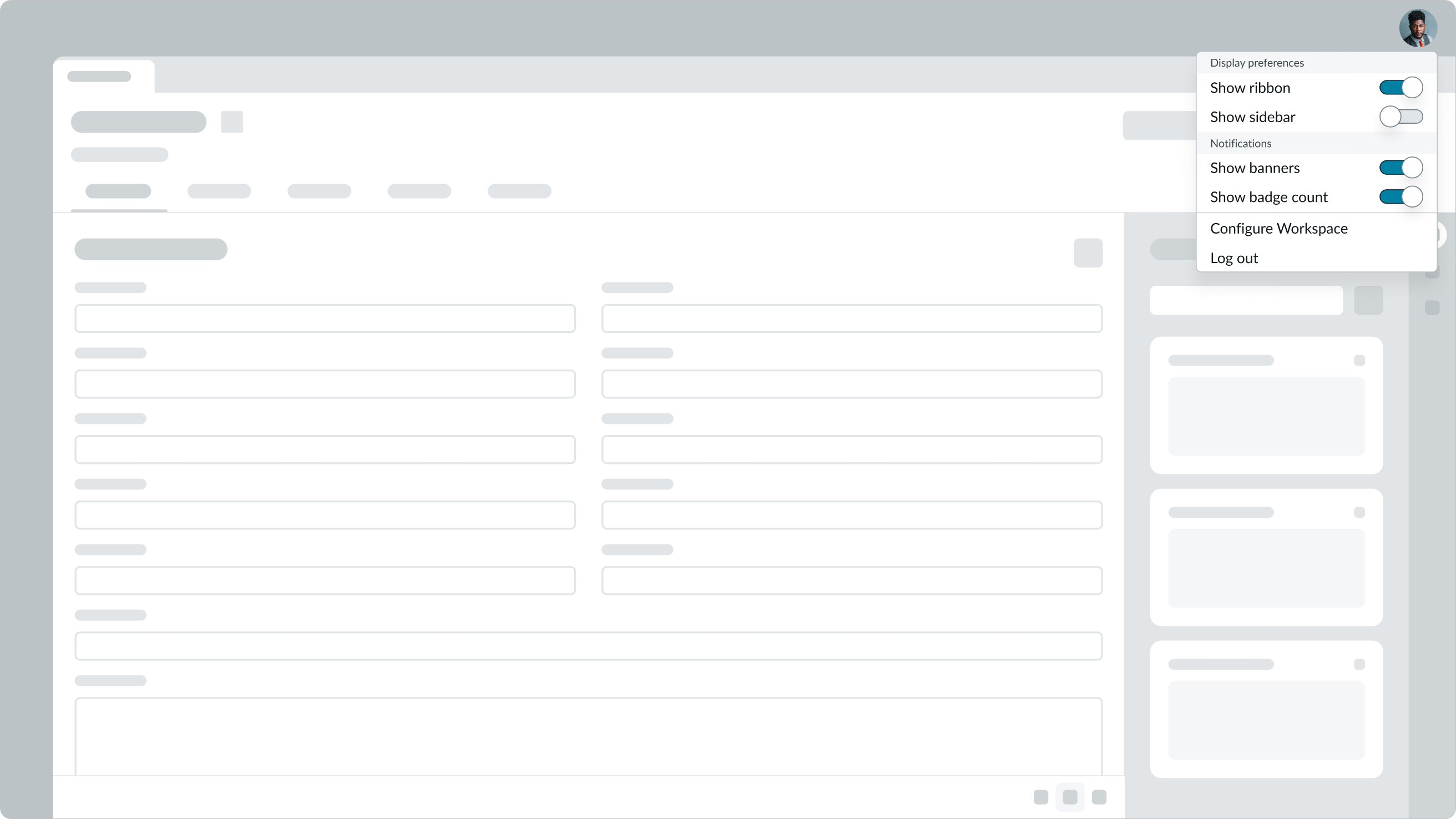
In this example, the display preferences and notification options take effect as soon as the user turns the toggle ON or OFF.
Radio buttons vs. checkboxes
Radio buttons and checkboxes may look like similar components, but when you use them varies.
- If the user can only choose only one item from a group, use a radio button. But if the user can select more than one option from the group, use a checkbox instead.
- If you're offering the user only one option, use a checkbox. Only use radio buttons for groups of options.
- If the user can turn a selection either ON or OFF, use a checkbox. For this to work, it must be clear what the ON and OFF states. If the meaning of the selected or unselected checkbox isn't clear, use radio buttons instead.
- If the user is making a "yes" or "no" answer, use a checkbox.
See usage guidance for checkbox
Variants
Learn about the variants of radio button.
Sizes
Radio buttons has the following sizes: small and medium.
Small

Medium

Configurations
Learn how to customize radio buttons by configuring the available properties.
Slots
The group label has an end and in-line slot for additional information. The label-end slot is available at the end of the label line. The label-inline slot is available immediately after the field helper icon. You can add anything to the label-inline slot, but icons are the most appropriate use for this slot.
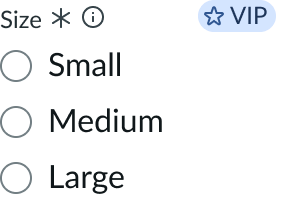
This example shows a color label with optional icon to indicate status or category.
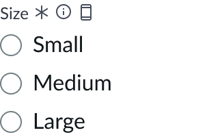
This example shows a device type indicator in the label-inline slot.
Unsaved field indicator
You can use the label-start slot to add an unsaved field indicator. The indicator appears as a small dot next to the field when the field contains unsaved changes and disappears when the changes are saved.
Note: If you want to add the unsaved indicator to all the fields in a form, see Form usage guidelines.
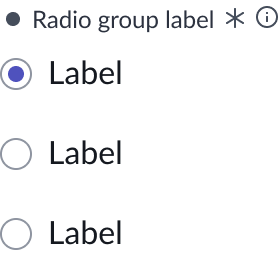
This example shows an unsaved field indicator next to the group label.
Label wrapping
By default, field labels truncate with an ellipsis when they exceed the container width. To wrap labels, enable this property.
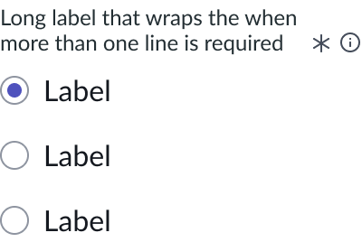
This example shows the label wrapping to multiple lines in the vertical layout.

This example shows the label wrapping to multiple lines in the horizontal layout.
Required field indicator
You can show that a radio button is required by adding a required field indicator, which places an asterisk indicator after the group label.
Note: This indicator shouldn’t be used with the optional field indicator.
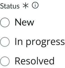
In this example, 'Status' is a required field.
Optional field indicator
You can show that a radio button is optional by adding an optional field indicator, which places "Optional" next to the group label.
Note: This indicator shouldn’t be used with the required field indicator.
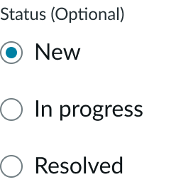
Field layout
You can configure the label to be horizontal or vertical. The default field layout is “vertical”.

In this example, the field layout is set to horizontal, and the radio group layout is set to vertical.

In this example, the field layout is set to horizontal and radio group layout is set to horizontal.
Field helper text
Field helper text can display text that provides additional information or guidance for completing the field. You can include field helper text by adding an information icon next to the group label. When a user selects the information icon, information displays in a popover.
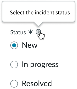
In this example, the popover gives instructions to the user on how to make a selection.
See usage guidance for popover
Design recommendations
Learn how to apply radio buttons in your design.
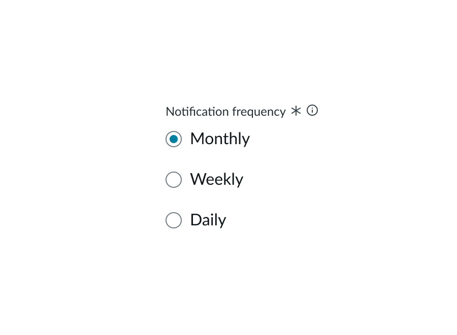
Use radio buttons for options in a concise list.
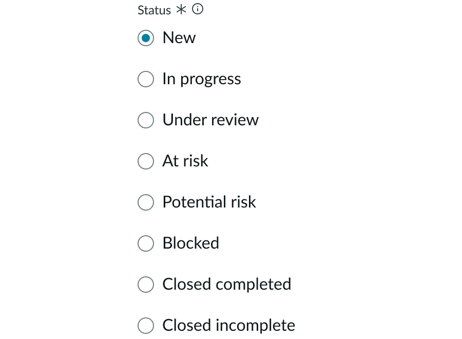
Avoid using radio buttons if the expected list of options is large. Consider using a dropdown instead.
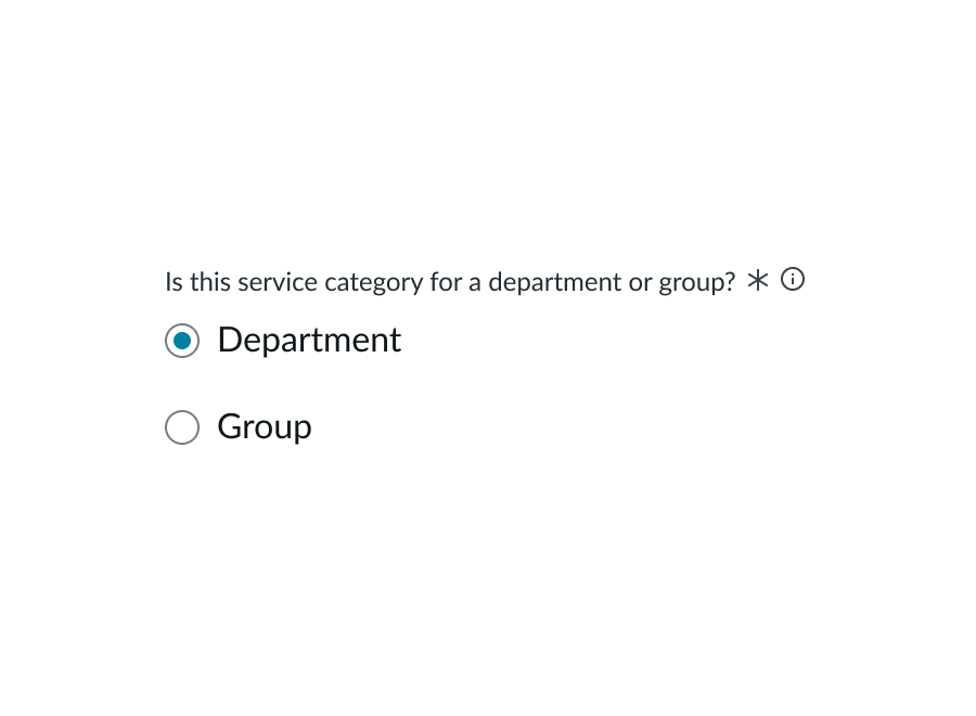
Instead, use checkboxes. Use radio buttons when the user can select only a single option.
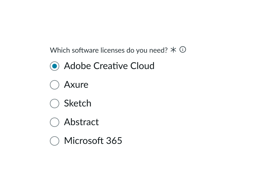
Don't use radio buttons for a group of options where the user can select multiple options.
Alignment and positioning
You can display a group of radio buttons inline horizontally or stacked vertically.

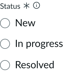
Use vertical alignment when possible to increase readability and scannability. If you use the horizontal alignment, be sure that the user can distinguish which radio buttons refer to which labels.
UI text guidelines
These are some recommendations for using text within radio buttons:
- Make sure the radio buttons labels are mutually exclusive options, meaning that the user can only select one option
- Use similarly formatted radio button labels so that people can read and scan them easier
- For example, the labels could be, “Pick my own date” and “Choose soonest available”
- If you’re using the radio button group label, ask the user a question or tell them what they’re selecting
- For example, the group label could be, “Choose when this event occurs” and the labels could be, “Once” “Weekly” and “Monthly”
- If a user skips a required field, use the form field message to remind them that they need to fill it out. However, avoid blaming the user.
Behavior
Learn how radio buttons behave when the display changes or a user interacts with the component.
States
Radio buttons have the following states: default, hover, focus, active, read-only, disabled, and invalid.
| State | Not Selected | Selected |
|---|---|---|
| Default | ||
| Hover | ||
| Focus | ||
| Active | ||
| Read-only | ||
| Disabled | ||
| Invalid |
Note: When a radio button is in the read-only or disabled state, a user can't interact with the radio button.
The read-only state is available for when you want to show the option, but not let the user to change it due to their role. For example, when a particular setting option isn't available because the user's permissions don't allow them to change it.
The disabled state shows that the option exists, but that it can't be selected or changed. For example, when a setting option isn't universal for all experiences in a product.
Invalid state
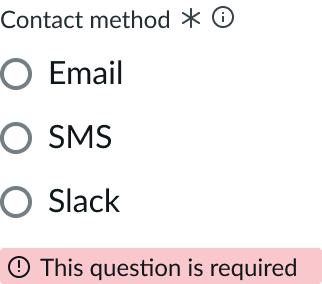
An invalid state occurs when the user doesn't select an option for a required field. When this happens, the group label and radio button appear in red. If the group label includes a required indicator, the indicator also changes to red. You can also include an optional error message to provide additional information on the error. The error message uses the critical form field message, which is part of the input field component.
See usage guidance for input field
In this example, the radio buttons are in an error state because the user hasn't completed a required field.
Responsive behaviors
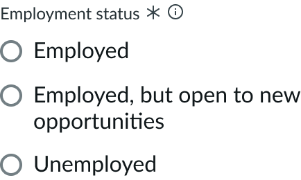
If the label exceeds the width of the container, it wraps to the next line. If you don't want the label to wrap, consider increasing the width of the container or shortening the radio button label.
Interactions
A radio button can be either selected or not selected. Only one option in a radio button group can be selected at a time.
| Interaction | Description | Example |
|---|---|---|
| Selected | A selected radio button indicates that the option is marked as true | |
| Unselected | An unselected radio button indicates that the option is marked as false. This is the default state for a radio button. |
When a user selects a radio button, a filled circle appears in the radio button to show that the user has selected it. A user can only deselect this radio button by choosing another option in the radio button group.
Truncation
The group label truncates if it exceeds the container width.
Usability
Radio buttons comply with all internationalization and accessibility requirements.
Internationalization
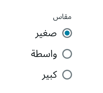
When the display translates to a right-to-left (RTL) language, the radio button elements flip. The radio buttons align on the right side of the container, while the label appears to the left of the radio button. If there is a group label, it appears above the radio buttons and aligns on the right side of the container.
Accessibility
Learn how to access the actionable elements of radio buttons through keyboard interactions and screen readers.
Keyboard interactions
You can access the actionable elements of radio buttons with these keyboard keys:
- Tab: Moves focus to the next option in a group
- Shift + Tab: Moves focus to the previous option in a group
When focus moves into a radio group, focus is set on the selected button if a radio button is selected. If none of the radio buttons is selected, focus is swet on the first button in the group.
- Space: Selects the focused radio button if it is not already selected
- Arrow keys: Moves focus to the previous or next radio button in the group
Screen readers
When you apply ARIA labels to a component, screen readers announce the controls and content of radio buttons in the prescribed tab order.
- The radio buttons are contained in or owned by an element with role “radiogroup”
- Each radio button element has role **“**radio”
- If a radio button is checked, the radio element has aria-checked set to "true"; if it is not checked, it has aria-checked set to "false"
- Each radio element is labelled by its content, has a visible label referenced by aria-labelledby, or has a label specified with aria-label
- The “radiogroup” element has a visible label referenced by aria-labelledby or has a label specified with aria-label
- If elements providing additional information about either the radio group or each radio button are present, those elements are referenced by the radiogroup element or radio elements with the aria-describedby property

