

Anatomy
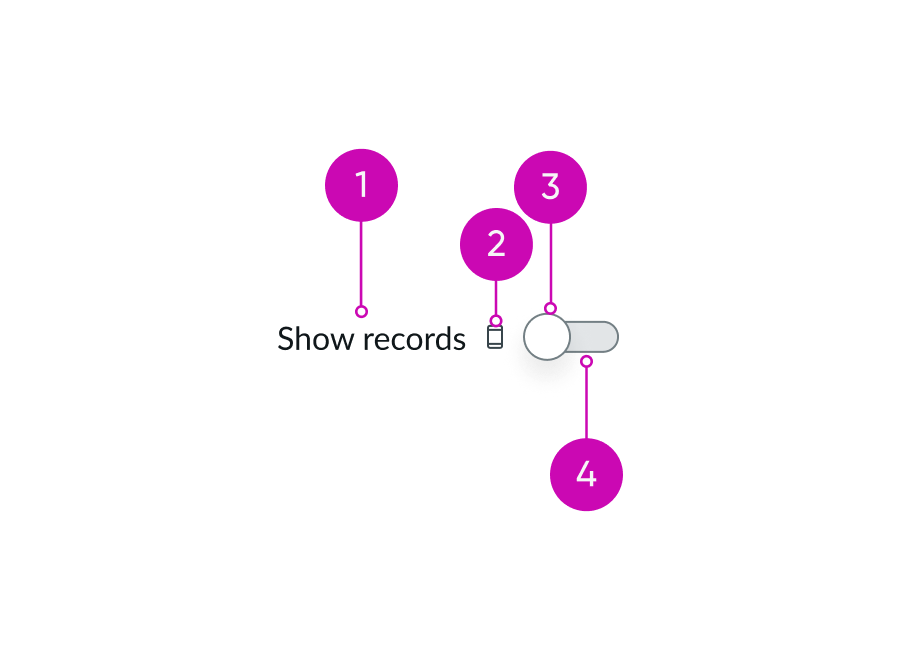
- Label: Label that identifies the function of the toggle
- Label-inline slot (optional): An available slot for an additional label icon
- Handle: Turns the toggle ON or OFF when selected
- Track: Toggle base that displays the status of an action with a color change
Subcomponents
See usage guidance for dropdown
Usage
You can use a toggle to turn an action or a setting ON and OFF. Use a toggle with other elements and components such as lists, dropdowns, and icons. A toggle shows the results of a user’s action.
Variants
Learn about the different variants for toggle.
Sizes
Toggles are available in 2 sizes: small (sm) and medium (md). The size you choose is dependent on the component's intended usage and the surrounding content. Remember to only use one consistent toggle size throughout your design.
Small

Medium

Configurations
Learn how to customize toggle by configuring the available properties.
Slot
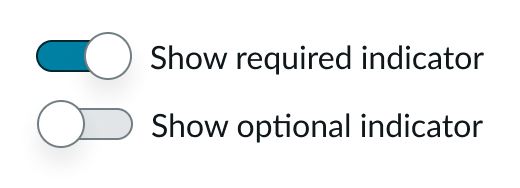
The label has an in-line slot for additional information. The label-inline slot is available immediately after the field helper icon. You can add anything to the label-inline slot, but icons are the most appropriate use for this slot.

This example shows a device type indicator in the label-inline slot.
Label positions
Configure a label for your toggle that explains its purpose and the logic behind its settings. You can place the label before, after, above, or below the toggle, depending on your design. Using a descriptive label for a toggle is good practice.

Checked state
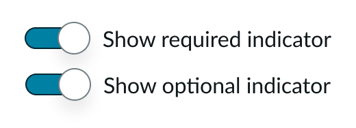
You can configure the toggle to appear in a selected (checked) state by default. By default, a toggle is not selected.
Disable a toggle
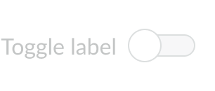
You can disable a toggle. Disabled toggles can be ON or OFF on the page, but are not actionable and appear in gray.
Design recommendations
Learn how to apply toggle in your design.
Do disable a toggle when only one option can be true
Don’t create experiences where conflicting options can both true
UI text guidelines
These are some recommendations for using text within toggle:
- For the label, use a verb to say what happens or changes in the interface when the person switches the toggle on.
- For example, the label could be, “Show authoring details” for preferences on an article
- Avoid using a negative verb in the label (like “Hide online status.”) People shouldn’t turn the toggle on to turn off or not show something.
Behavior
Learn how toggle behaves when the display changes or a user interacts with the component.
States
Toggle has the following states: default, hover, focus, and disabled.
| State | Example “on” | Example “off” |
|---|---|---|
| Default |  |
 |
| Hover |  |
 |
| Focus |  |
 |
| Disabled |  |
 |
Usability
Toggle complies with all internationalization and accessibility requirements.
Internationalization
When the display translates to a right-to-left (RTL) language, the toggle position and orientation flip.

For a RTL language, the toggle moves to the left of the optional text and changes its orientation (i.e. the ON state is to the left).
Accessibility
Keyboard interactions
- Tab: Shift focus to the toggle
- Space or Enter: Go between ON and OFF states