Anatomy
Learn about the individual parts of input field password.
Initial view
This is the initial view of the password input field before the user interacts with it
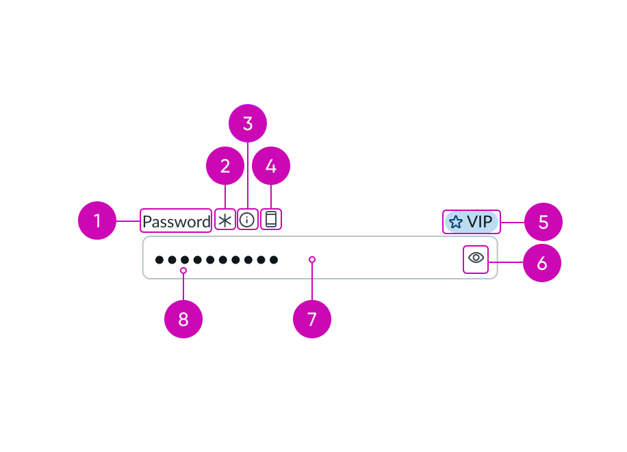
- Label: Text that identifies the expected user input; a label must be present for accessibility, either as the component's label element or external to the component
- Required indicator (optional): Field decorator that shows if a field is required
- Information button (optional): Opens a popover and shows the field helper text
- Label-inline slot (optional): An available slot for an additional label icon after the information button
- Label-end slot (optional): An available slot at the end of the label line
- Unmask password button (optional): Unmasks or masks the password
- Input field: Space for user input
- Value: Password entered by a user
Active view
This is the view of the input field as the user begins to enter their password. The value the user enters is validated against the requirements listed under the field.
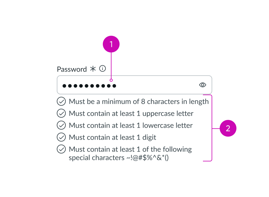
- Input mask: Masks user input for security
- Requirements (checklist view): Displays what's required for a correct password in a dynamic checklist below the field
Subcomponents
See usage guidelines button bare
See usage guidelines for popover
Usage
You can use input password where a login or sign-up is required.
Variants
Learn about the different attributes of input password.
Types
Input password is only one type of the input field component.
See usage guidelines for input
See usage guidelines for input phone
See usage guidelines for input URL
See usage guidelines for textarea
Sizes
Input password has two sizes: small (sm) and medium (md). Choose a size that fits with your display and complements the surrounding content. Remember to choose a size that supports the length of the expected user input, including any labels or decorators.
Small
Use the small size for areas that have limited space. The small size reduces the font size of the text.
If icons are included in the input field slot, the padding is reduced between multiple icons.

Medium
Use the medium size alongside similarly sized components and content.
Note: Medium is the default size for Input Password.

Configurations
Learn how to customize input password by configuring the available properties.
Slots
The label has an end and in-line slot for additional information. The label-end slot is available at the end of the label line. The label-inline slot is available immediately after the help icon. You can add anything to the label-inline slot, but icons are the most appropriate use for this slot.

This example shows an end slot with a color label with optional icon to indicate status or category.

This example shows a device type indicator in the label-inline slot.
Unsaved field indicator
You can use the label-start slot to add an unsaved field indicator. The indicator appears as a small dot next to the field when the field contains unsaved changes and disappears when the changes are saved.
Note: If you want to add the unsaved indicator to all the input fields in a form, see Form usage guidelines.

This example shows an unsaved field indicator next to the label of the input field.
Password requirements display
There are 2 configurations for displaying password requirements: default and compact.
Default
The default configuration shows password requirements, which you can configure to appear under the input field. These requirements indicate when a password is valid or invalid.

This is an example of an invalid state when a password doesn't meet the configured security requirements.
Compact
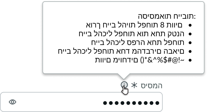
If you use the field in the compact configuration, the password requirements show up in the helper content popover instead of under the field.
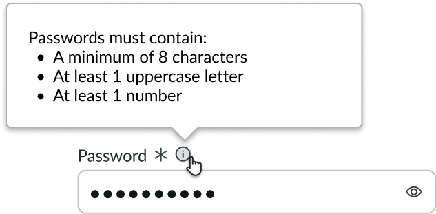
In this example, the password criteria appear in a popover in static text and aren’t responsive to user input.
Placeholder text
You can add placeholder text to provide users with guidance on the type of input and expected format. The placeholder text disappears when the user enters a character.

Label wrapping
By default, field labels truncate with an ellipsis when they exceed the container width. To wrap labels, enable this property.

Required indicator
You can configure an input field as required with an asterisk indicator after the form label. This indicates that the user must enter a value in this field.
Note: Don’t use this indicator with the optional field indicator.

Optional indicator
You can configure an input field as optional. When used, optional fields display "(Optional)" text next to the label. When all other fields are required by default, add this indicator to an optional field. However, you can show the user that a field is optional without displaying the indicator at all.
Note: This indicator shouldn’t be used with the required field indicator.

Design recommendations
Learn how to apply input password in your design.
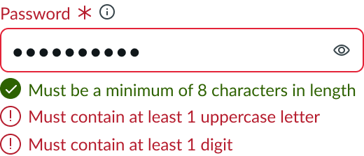
Use the Requirements property to validate a password.
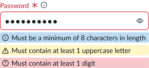
Avoid using field messaging. Field messaging doesn’t have built-in validation against your requirements.

Use separate password requirements to inform users when a specific criteria has been met.
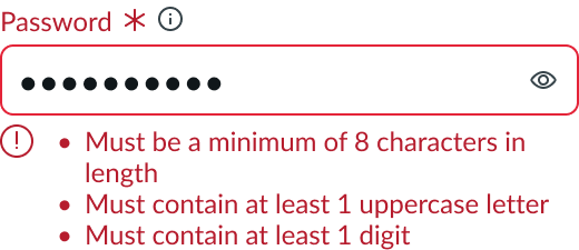
Avoid using a single password criteria message for all of the items in a password checklist. With password criteria you can have 2 criteria fulfilled and 1 not, so they should display separately.
UI text guidelines
These are some recommendations for using text within the input password component.
Label
- Use a label that tells the user that this input is for passwords only.
Form field messaging
- Informational message
- Use clear and concise language to help the user fill out the input
- For example, “Remember to create a strong password.”
- Use clear and concise language to help the user fill out the input
- Warning message
- Include information that helps the user understand any consequences or next steps
- Use present tense since this message shows up before any input.
- For example, “Avoid reusing passwords.”
- Error message
- Avoid blaming the user. Instead, tell them what happened and how they can fix it.
- Use past tense since this message shows up after the user enters something
- For example, “This password hasn't met the criteria.”
Password criteria
- Clearly state what requirements must be met for the password to be acceptable
- These are requirements, so you can make them direct and brief
Field helper text (popover)
- Provide additional information about password requirements to help the user understand what they're expected to input
- If you’re adding a list into the popover, consider formatting it using bullets to make it easier to read
Placeholder text
- Use sparingly because it disappears once the user puts their cursor in the input field
- Format placeholder text as an example of a password or a brief description of how to complete the field
- For example, “Enter your password.”
Behavior
Learn how input password behaves when the display changes or a user interacts with the component.
States
Input password has the following states: default, hover, focus, read-only, disabled, and invalid.
Input field
| State | Example |
|---|---|
| Default |  |
| Hover |  |
| Focus |  |
| Read-only |  |
| Disabled |  |
| Invalid |  |
Requirements
Requirements is a custom UI for input password that displays the criteria for setting a password, such as length, special characters, and more. These requirements appear beneath the field and validate the user’s input as they type. If you use the field in compact mode, the requirements are displayed in the field helper popover.
Requirements have the following states: default, success, and error.
| State | Example |
|---|---|
| Default | |
| Success | |
| Error |
Responsive behaviors
Input password resizes based on the width of its container.
Interactions
Learn how input password responds when a user interacts with it.
Requirements
A checklist of password requirements appears in a default view before focus and before entry.
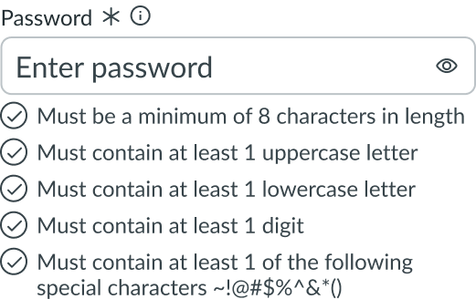
As the user begins to enter a password, the field validates the input against the requirements. Successful password requirements appear in green, and failed requirements appear in red. The input field remains in an error state until all requirements have been met.
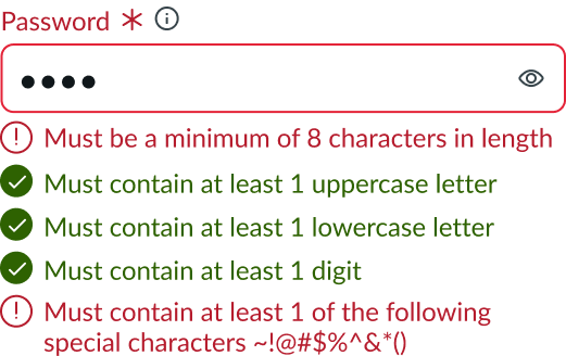
As the user corrects any failed requirements, those items switch to green, indicating a successful state.
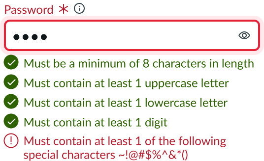
When the user finishes entering a password that meets all requirements, the input field appears in a non-error state.
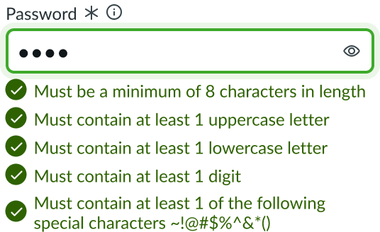
If the user clicks outside the field after entering a successful password, the requirements are hidden.

Information button
When the field is used in the compact mode, users can view the password criteria in the helper content popover by selecting the information button.

Unmask password button
The text entered into the input field is automatically masked. Users can unmask the password by activating the unmask password button.

Truncation
The label truncates when it exceeds the input width or when the label options prevent the full label from displaying.

Usability
Input password complies with all internationalization and accessibility requirements.
Internationalization
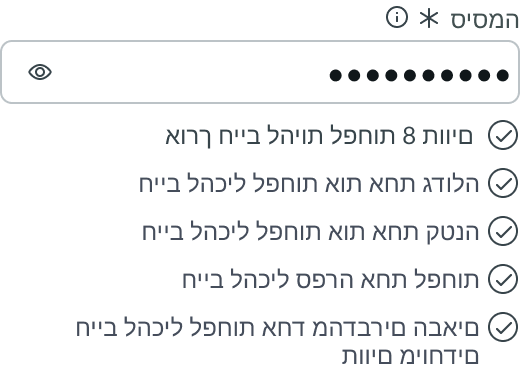
When this component is used in a platform configured for a right-to-left (RTL) language, the field label, field helper contents, and password criteria all align on the right. RTL formatting also re-orders any input field slots and the button for converting the password to clear text.
Default requirements display
Compact requirements display
Accessibility
Learn how to access the actionable elements of input field password through keyboard interactions and screen readers.
Keyboard interactions
Items in the password criteria checklist and the field helper are not interactive and are not in the tab order. The tab order for the password input field is the info icon, password input field, and the control for unmasking the password.
- Tab or Shift + Tab: Moves focus through interactive elements within the form field. Interactive elements include field helpers, the text input field itself, and any elements in the field slots, such as buttons or dropdowns.
- Arrow right/left: When focus is on the input field, moves the text entry caret across available text.
- Arrow up/down: Moves the text entry caret through rows of available text (if applicable).
- Ctrl/Cmd + Shift: When focus is on the input field, selects text. Press the right arrow key to select the characters to the right or press the left arrow key to select the characters to the left.
- Arrow left/right + Shift: Select one character at a time, either to the left or to the right.
Screen readers
- Use input type=password to provide the necessary screen reading abilities for the masked input field.
- Assign the aria-describedby attribute to contents of field helper; this provides supplementary user guidance for content required in the input field.
- If the user clicks out of the input field with password criteria in an error state, the screen reader announces the specific errors.
- When the required field indicator is used, set the aria-required value on the field to true. By default, this value is set to false.
- Set aria-invalid to true for a field marked as returning an error. Assistive technology alerts if this attribute is set to any value other than false. By default, aria-invalid is set to false.


