

Anatomy
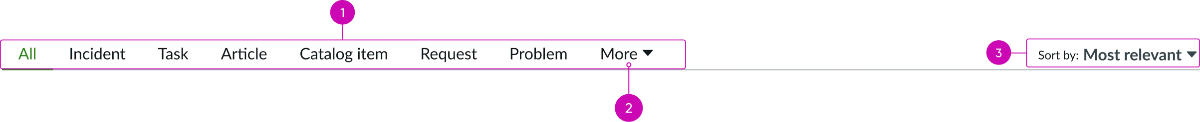
- Filter tabs: Filter search results by type
- More tab: Overflow tab that appears when all tabs don’t fit in the tab container; contains all additional tabs in dropdown
- Sort dropdown: Sorting options available based on the active filter tab
Subcomponents
See the usage guidelines for Tabs
See the usage guidelines for Dropdown
Usage
Learn about how to use navigation filters for the tabs to enable search users to quickly drill down and find the information they are looking for. For example, if a user searches for a KB article about reseting their password, they can search for “password reset” and click on the “KB” tab on the results page. To filter the results even more, you can configure the items available for the ‘sort by’ dropdown.
Configurations
Learn how to customize tab filter by configuring the available properties.
Search filter tabs
You can configure the navigation filters for the tabs used to display the user’s search results. An ‘All’ tab appears first followed by the tab filters you specify in the order specified.
Selected tab
You can specify the filter tab selected by default. If not specified, the ‘All’ tab is selected.
Sort filters
You can configure the items available for the ‘sort by’ dropdown using filters or specifying fields. The first sort filter is always set to the ‘Relevancy’ option followed by the sort filters you specify in the order specified.
Selected sort filter
You can specify the sort filter selected by default. If not specified, the ‘Relevancy’ filter is selected.
Design recommendations
Learn how to apply tab filter in your design.

Ensure there is enough padding after the last tab label to accomodate the sort dropdown.
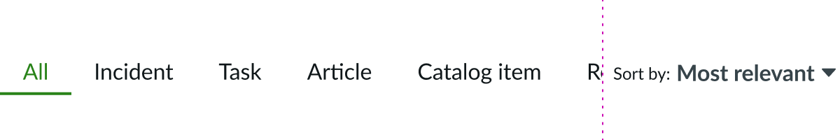
This design doesn’t contain enough padding, so the label is cut off by the sort dropdown.
Behavior
Learn how tab filter behaves when the display changes or a user interacts with the component.
Responsive behavior
Learn how tab filter responds to changes in a container or display.
Horizontal tab overflow
In certain circumstances, all available tabs might not fit in the tab container. When this happens, an overflow tab (the "More" option) appears and contains all additional tabs. The overflow menu format mirrors the tab type except for icon-only tabs. The overflow items for icon-only tabs displays the icon with a text label (and not just the icon).