


Anatomy

- Star rating: User-generated mechanism for leaving feedback on the content.
Usage
Use the star rating to let users provide feedback on content. This feedback helps other users determine what content is most helpful or relevant at a glance. The feedback also determines how content appears according to your ranking logic. You can configure the ranking logic to order content by star ratings, views, comments, or other factors.
Always include the option to rank content next to the content metadata at the end of the content. Rating content is a secondary action, whereas the primary action for the content should be to either interact with, subscribe to, or comment on the content.
Variants
Learn about the variants of star rating.
Types
Star rating has two types: authenticated and unauthenticated.
Authenticated
For signed in users, the star feedback option shows in the footer of content.

Unauthenticated
For guest users, the star feedback component still appears. However, when they try to interact with it, they are redirected to a sign in screen. Only after signing in is their rating applied to the content.
Sizes
Star rating doesn't have any predefined sizes. Instead, it's sized according to its container and the surrounding content.
Configurations
Learn how to customize star rating by configuring the available properties.
Order
All subcomponents and elements within star rating are in fixed positions that can't be changed. However, you can align them horizontally or vertically depending on your use case.

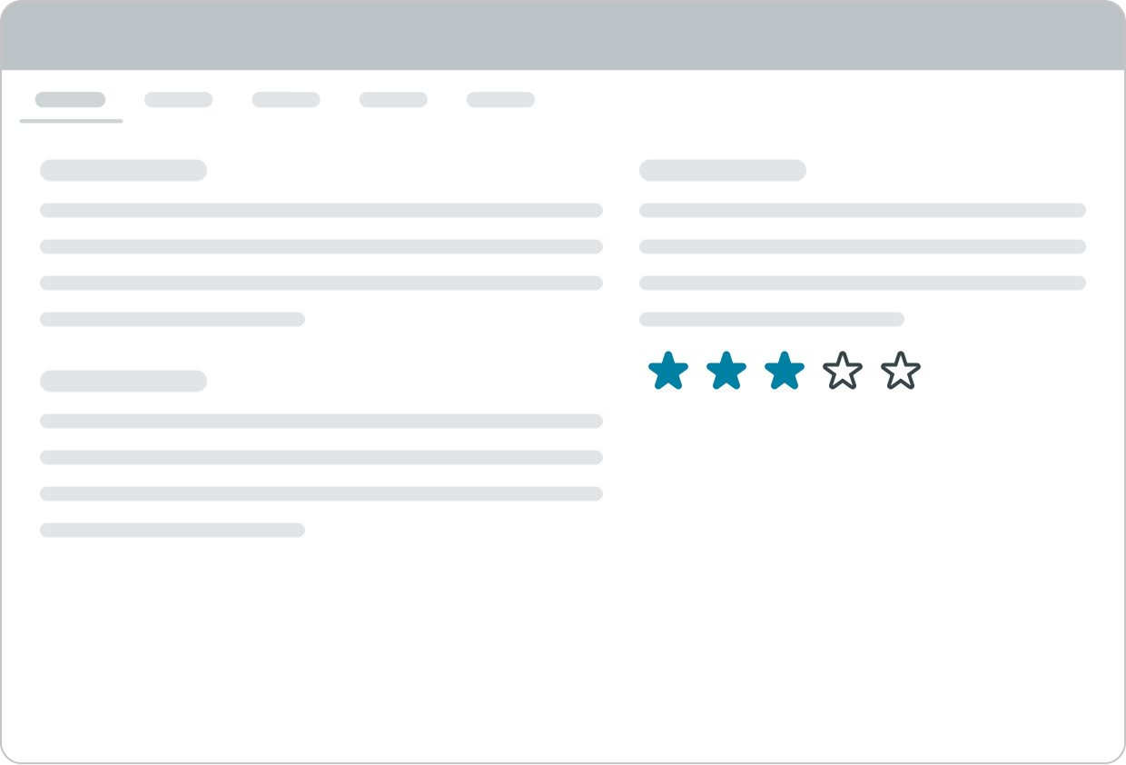
In this example, the star rating elements appear horizontally to fill the space below the content.

In this example, the star rating elements appear vertically to fill the space.
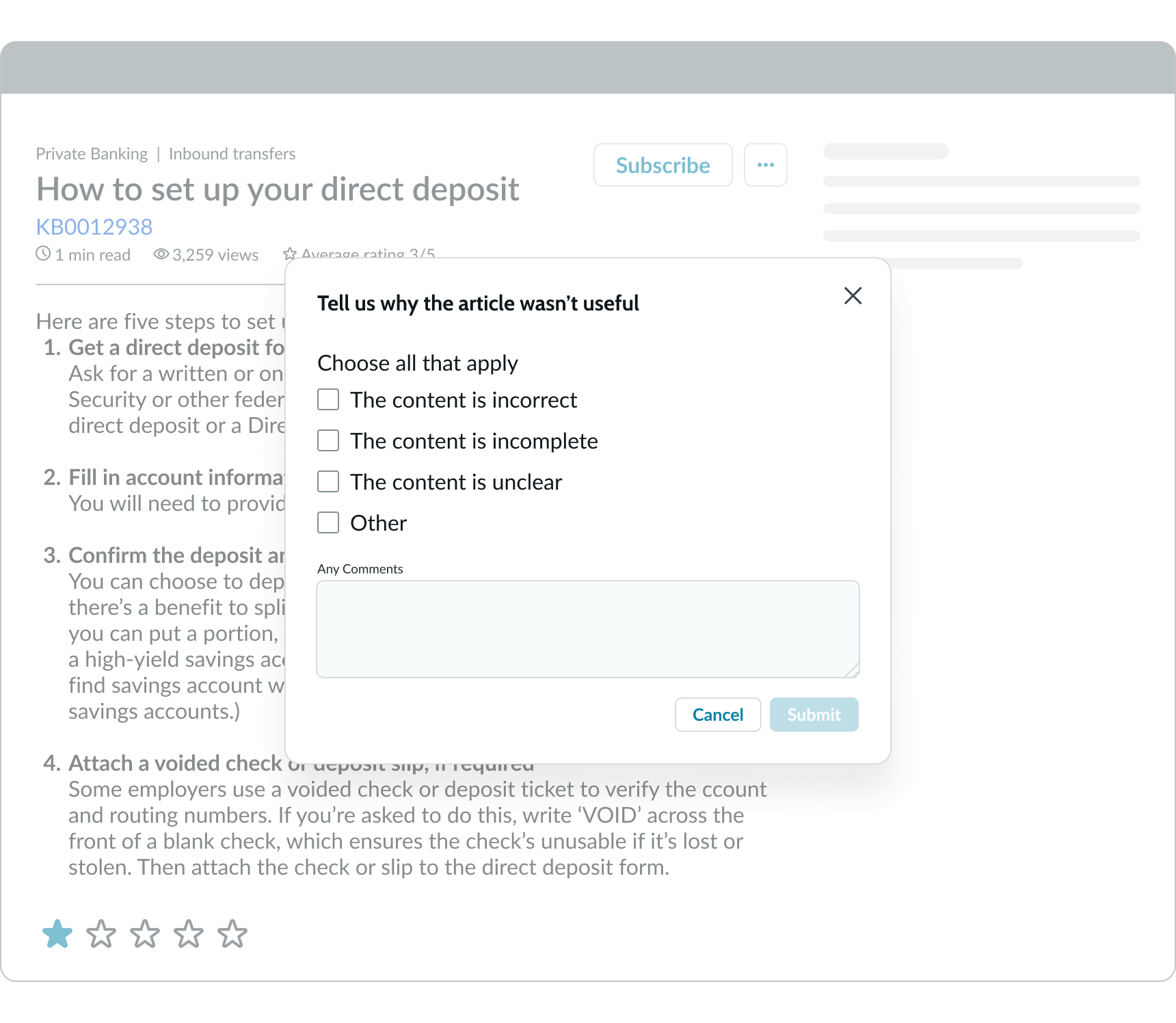
Feedback modal
You can configure a modal to appear if a user submits a low star rating on the content. By default, a 1 or 2-star rating activates this modal, but you can configure this based on your preference. You can also customize the contents of the modal depending on the type of feedback you're looking for.
This modal is optional, and you can turn it off if it isn't necessary for your use case. After the user submits their feedback in the modal, they return to the content.
Design recommendations
Learn how to apply star rating in your design.
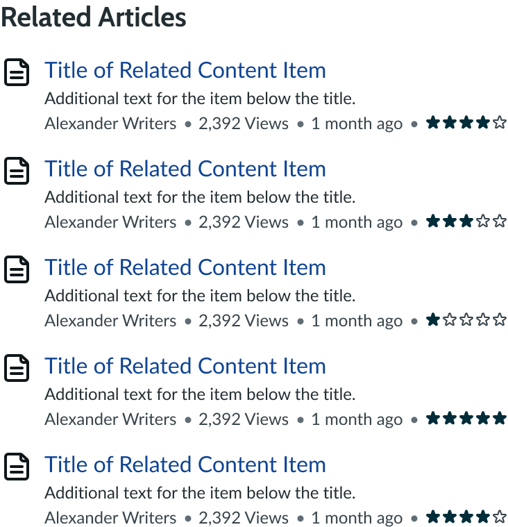
Use the star rating for only 1 piece of content per page.
Avoid using multiple star ratings for components on a single page because this can confuse users as to which stars apply to which content.
Alignment and positioning
Within the star rating component, the subcomponents always appear in the same position.
It's recommended that you position the star rating near the other metadata at the bottom of the content. This way, the user can read the content before rating it.
UI text guidelines
These are some recommendations for using text within star rating:
- Use sentence case for all labels
- Start the label with a verb to encourage the user to take action
- Ensure content is contextual and specific to offer guidance and support to the user
Behavior
Learn how star rating behaves when the display changes or a user interacts with the component.
States
The star rating can have 7 states: default, disabled, hovered, pressed, read-only, focused, and selected. The hovered, pressed & read only states for star rating all appear the same.
| State | Example |
|---|---|
| Default |  |
| Disabled |  |
| Hovered |  |
| Pressed |  |
| Read only |  |
| Focused |  |
| Selected |  |
Responsive behaviors
The component, being compact, doesn’t have a responsive change at smaller breakpoints.

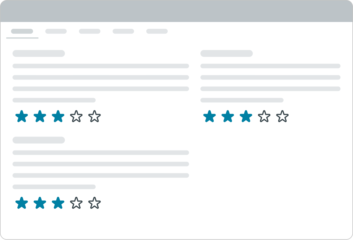
In this example, the subcomponents rearrange based on the width of the display.
Interactions
Learn how star rating responds when a user interacts with it.
Selecting a rating
The user can rate the content by selecting the number of stars. After the user selects a star rating for the content, a confirmation alert with a success message displays on top of the content.
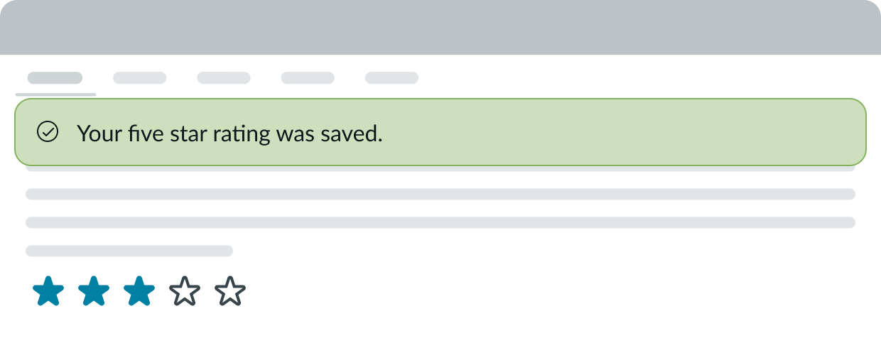
In this example, the success message appears to notify the user that their rating was saved.
Usability
Star rating complies with all internationalization and accessibility requirements.
Internationalization
When the display translates to a right-to-left (RTL) language, the rate label and the "Cancel" bare button (when available) flip positions. Additionally, the star rating progresses from right to left.

Accessibility
Keyboard interactions
You can access the actionable elements of star rating with these keyboard keys:
- Tab: Moves between actionable elements
- Space: Selects the focused star if it is not already selected
- Arrow right or Arrow down: Move focus to the next star in the group, uncheck the previously focused star, and check the newly focused star
- Arrow left or Arrow up: Move focus to the previous star in the group, uncheck the previously focused star, and check the newly focused star