

Anatomy
A scorecard can be displayed in two ways: hierarchical and non-hierarchical.
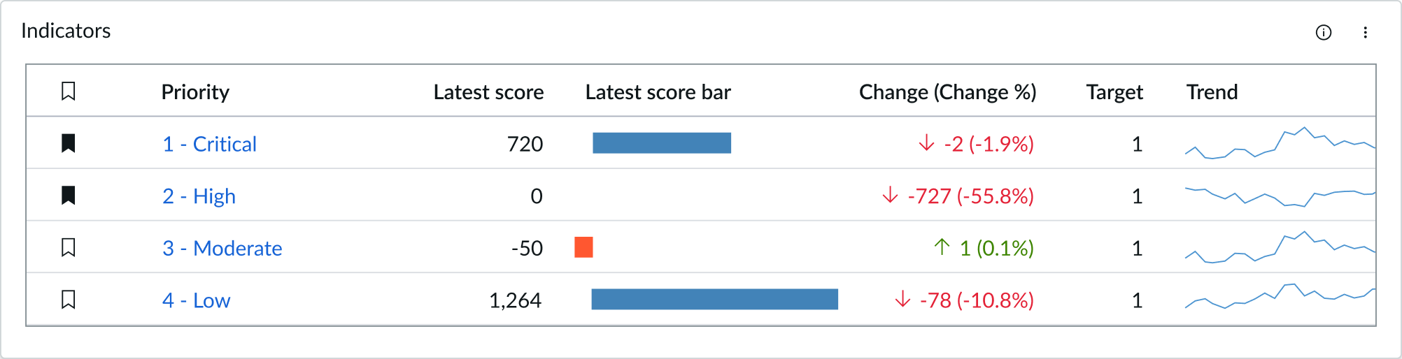
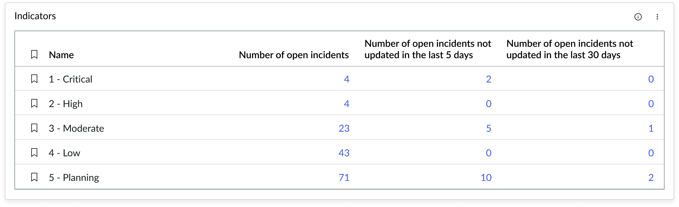
Non-hierarchical
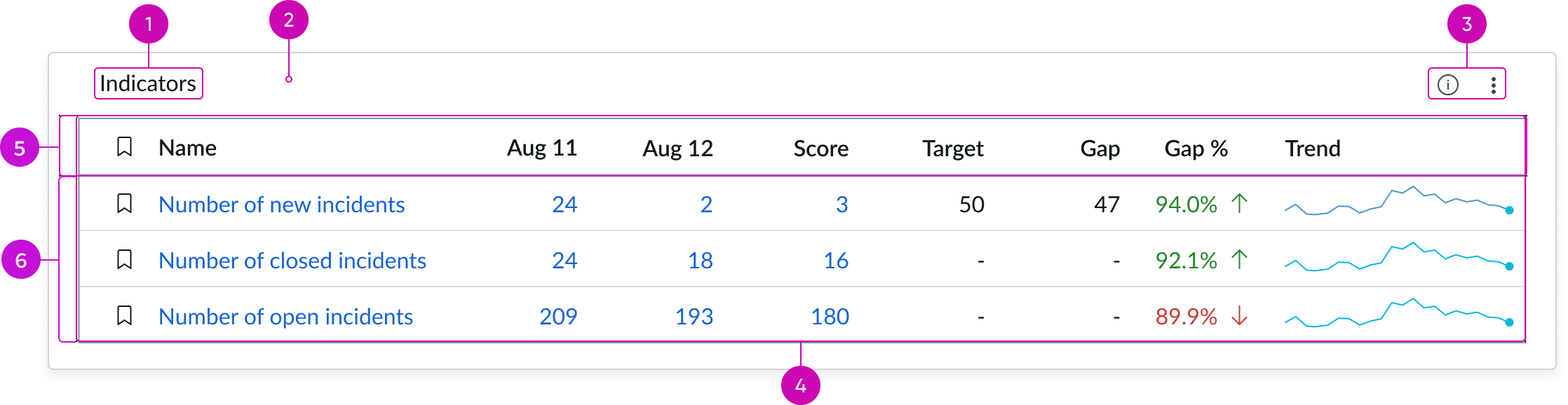
- Widget title: Identifies the content of the list
- Widget container: Container holding the title and iconic buttons
- Widget actions: Actions related to the list; this could include actions such as filter, description, and settings
- Scorecard: Scorecard for the use case
- Column header: Displays the labels describing the different breakdowns in each column
- Scorecard rows: Rows in the scorecard list; when there isn’t an indicator hierarchy, no chevron icons are displayed
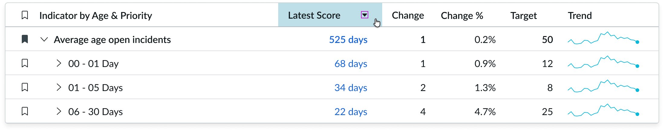
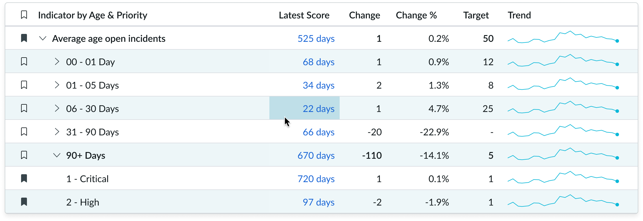
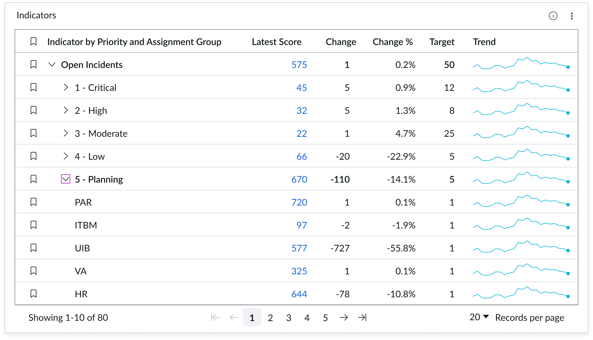
Hierarchical (Parent/Child Relationship)
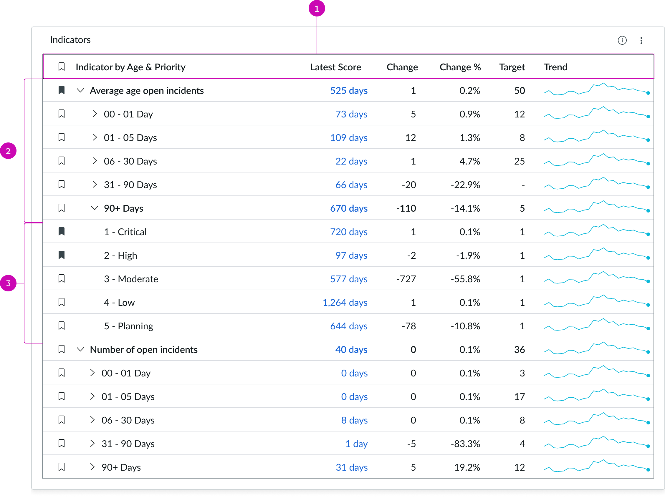
- Column Header: Displays the labels describing the different breakdowns in each column
- Parent Row: Row marked with a chevron icon that has child rows; the chevron is the trigger for expanding the hierarchy to display child rows
- Child Row: Nested row within a parent row; child rows are at the bottom of the hierarchy and can’t be expanded
Subcomponents
See usage guidance for pagination control
See usage guidance for sparkline
See usage guidance for button iconic
Usage
Use the indicator scorecard component to help users easily view and access indicators directly from a page.
In this example, the indicator scorecard component appears in the Analytics Center to help the user view and access indicators.
Variants
Learn about the variants of indicator scorecard.
Sizes
The indicator scorecard component doesn’t have any specific sizes. You can configure the size of the component based on the use case.
The table width automatically adjusts, based on the component size.
Configurations
You can customize the indicator scorecard by configuring the following properties.
Header and border
The component header displays along the top and contains the title you give the visualization. By default, the header is configured to show, but the content is empty.
Header separator
By default, there isn’t a separator between the header and the rest of the visualization, but you can show the header separator.
Chart title
By default, the chart title is blank, but you can add a title. When you add a title for your chart, you’re able to customize the color and make it wrap.
Heading level
By default, text in the header are set to heading level 2 (H2). Heading levels H1 through H6 are also available.
Large font size
By default, the indicator scorecard title uses the non-bold Title-tertiary font style. Otherwise, it uses the bold Header-secondary font.
Title alignment
By default, the title is aligned to the Start side. The start size can be the left or right depending on the language you use. Other options available from the dropdown are “Center” and “End”.
Title wrap
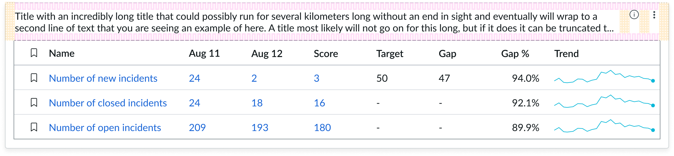
By default, long titles truncate with an ellipsis and a tooltip showing the full title on hover, but you can set the title to wrap instead.
Title truncation
By default, the title text truncates at the end of the first line of text, but you can set the line of truncation to 2 or 3 lines instead. This option becomes available when the title truncates.
Visualization border
By default, a border around the chart. Unselect the “Show border” option to remove it.
Header background color
By default, the color of the header background is neutral-0 (white). You can specify a different color (including a custom color) for the background.
Select a color for the visualization header background that aligns with your dashboard theme, branding, or design preferences. The color you choose applies only to the visualization header background.
For better accessibility, make sure a good color contrast exists between the header background and title text. The minimum contrast requirement for normal text is 4.5:1, and for large text is 3:1. To verify, check the contrast ratio in the color picker.
Note: Theming is not supported when you select a custom color.
Title color
By default, the title text is neutral-21 (black). You can specify a different color (including a custom color) for the title text.
You should select a color for the chart title that aligns with your dashboard theme, branding, or design preferences. The color you choose applies only to the chart title.
For better accessibility, make sure a good color contrast exists between the header background and title text. The minimum contrast requirement for normal text is 4.5:1, and for large text is 3:1. To verify, check the contrast ratio in the color picker.
Note: Theming is not supported when you select a custom color.
Data
Data properties selects and organizes the data you want your users to see from the source. Some configurations for indicator data sources require that the indicator have breakdowns.
Indicator
Indicators are preconfigured business metrics that assess performance across attributes such as cost, quality, technical risk, investments, user satisfaction, and business value. If breakdowns are defined for an indicator, you can apply filter conditions on those values.
Source definition
Select a source definition type from the dropdown. Options include:
- Condition based - Use to set a condition to determine which indicators to display.
- Manually selected - Use to add indicators manually one at a time. You can set a breakdown and element to filter each indicator that you select manually.
- Indicator group - Use to set an indicator group as the source.
Filter
Use the filter condition builder to create a query string for filtering the indicator list. This is the default view of the list that your users see. Users select the filter icon, located in the top right corner of he scorecard.
Time series aggregation
A time series aggregation consists of an aggregation, such as AVG or SUM, combined with a running or cumulative time series over a period.
Sort
Use to select a metric to sort the chart by default. The default sort direction is Asc (ascending).
Sort direction
The sort icon only appears at the top of a column when the column has been sorted. Columns can be sorted in ascending or descending order. Users can only sort one column at a time.
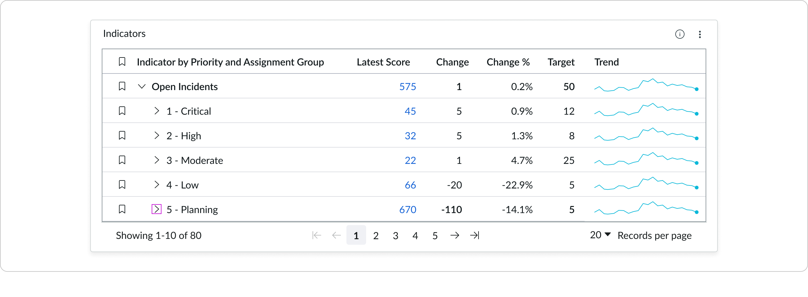
In this example, indicators are sorted by target in descending order.
Data update
By default, users can add individual chart filters, and use the filters set on that workspace page. You can also configure your chart to update automatically in real time or on a defined refresh schedule.
Follow filters
By default, any filters set on the workspace page and those set on the data source are applied. You can use the “Follow filters” property to prevent any filter input from the workspace page. Filters set on the data source always run on the component.
Filter icon
The filter icon and the number of filters impacting the visualization display by default. To hide them, unselect the “Show filter icon.”
Drill down
By default, users can drill down into data or launch a URL directly from a chart by selecting data points, slices, categories, or scores. This lets users view data such as records and record lists from data tables or KPI data from indicators or go to a URL that you specify.
Filter element
Show the applied filter element(s) together with the Indicator name. If a filter can’t apply to a visualization, the element(s) don’t show. Toggle off to hide the filter element(s) applied.
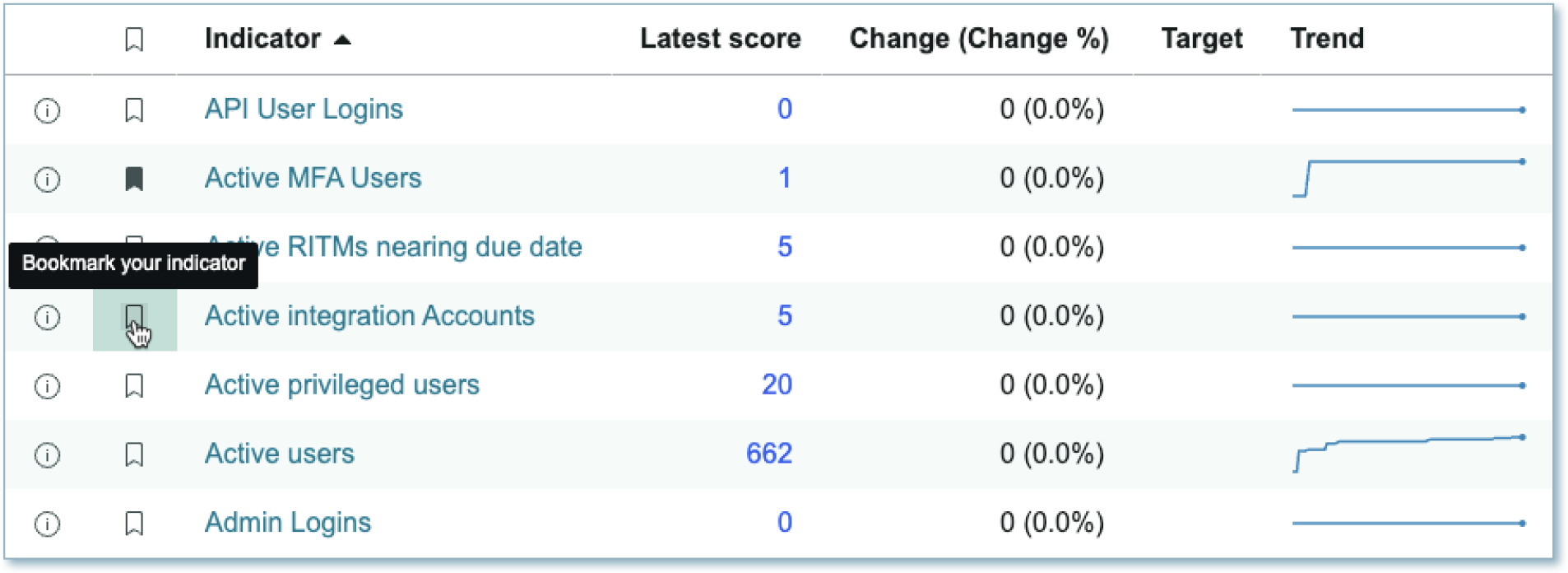
Bookmark
Use to show or hide a column of bookmarks. When on, users can bookmark indicators and breakdowns for themselves. The bookmarks show by default.
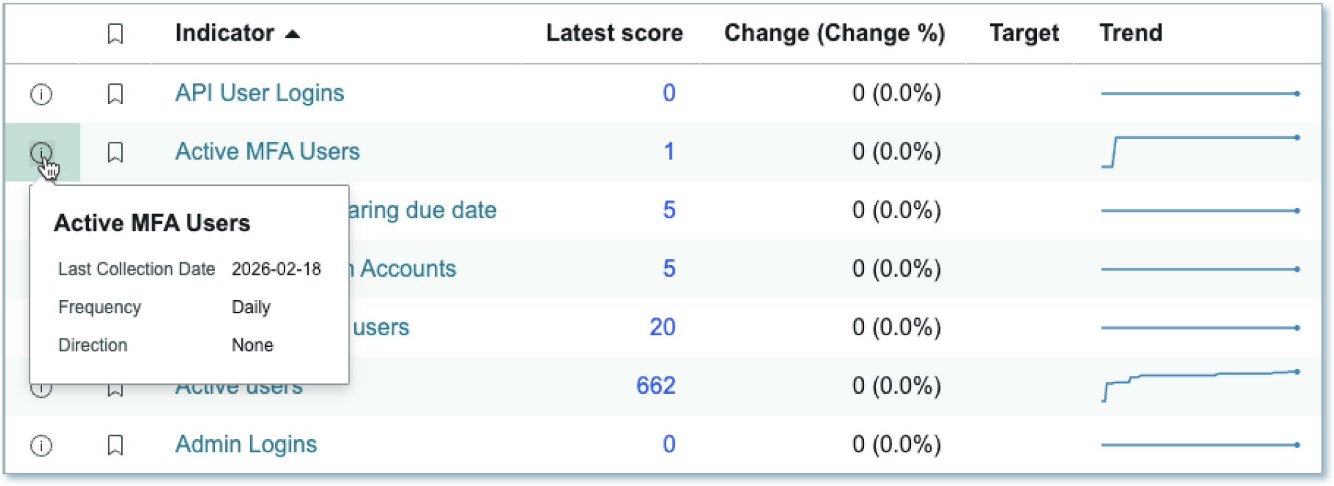
Indicator info
Use to show or hide the indicator information icon. When shown, indicator information includes information about the last collection date, frequency of collection, and direction. Shown by default.
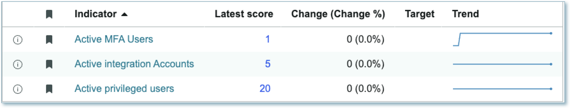
Bookmarked items
Use to show only bookmarked items.
Use data cache
You can cache user queries to shorten the load time for the data visualization. Unselected by default.
Presentation
The presentation properties control the physical appearance of the chart. Use these properties to control how your users consume the data.
Display settings
You can use the following to modify the display of the data visualization.
Max elements per page
The page size as determined by the maximum number of indicators or breakdown elements shown. The increments are 10, 20, 50, and 100 indicators/elements. 10 is the default.
Alternative row colors
Use to display background color for alternating rows. This can make reading the table data easier. On by default.
Row lines
Use to display border lines to show separate rows. Hidden by default.
Column lines
Use to display border lines to show separate columns. Hidden by default.
Behavior
Learn how indicator scorecard behaves when the display changes or a user interacts with the component.
States
Indicator scorecard has the following states: default and hover.
Default
Hover
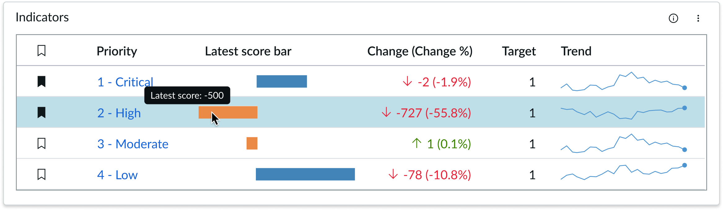
When the user hovers over a row, the row displays a background color.
Hover on row and a cell example
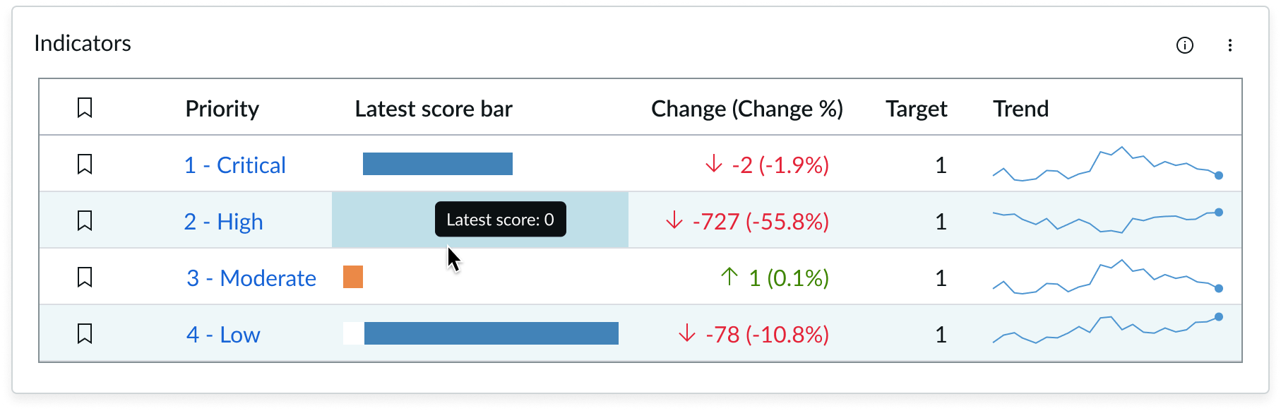
Hovering over latest score bar shows tooltip of latest score value\
Responsive Behaviors
Indicator scorecard has different states, depending in the element or subcomponent
Text wrapping
When text in the indicator scorecard exceeds the width of the container or content area, the text wraps to the next line.
The title text can wrap to two lines before it truncates with an elipsis. Action buttons remain top-aligned to the text.
If the column header label exceeds the width of the column, the text wraps to two lines. The text labels and sort action are bottom aligned to the cell.
Use concise column labels. Long label text that wraps is hard to scan.
Interactions
Learn how the indicator scorecard component responds when a user interacts with it.
Nested breakdowns
Breakdowns can be configurable to have nesting set to on or off. The following is an example of nesting enabled.
The following is an example of nesting disabled.
Usability
The indicator scorecard component complies with all internationalization and accessibility requirements.
Internationalization
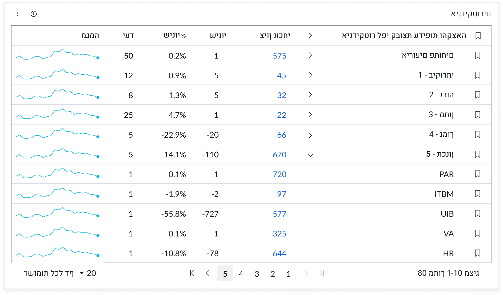
When this component is used in a platform configured for a right-to-left (RTL) language, every element of the page flips, and the text aligns to the right.
Accessibility
Learn how to access the actionable elements of the indicator scorecard component through keyboard interactions.
Indicator scorecard tab order
This is the tab order for indicator scorecard.
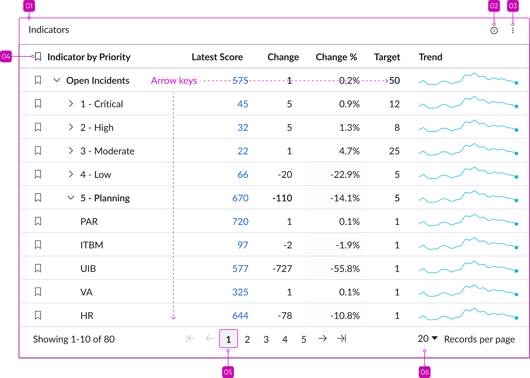
The tab key moves focus to the beginning of each row in the list. Users navigate the cells in a row with the arrow keys. When moving from left to right in a row, focus moves from the last cell to the first cell in the next row.
Keyboard interactions
You can access the actionable elements of the indicator scorecard with these keyboard keys:[Component name] tab order
Tab: Navigates through the header and footer in the tab order shown; tab key doesn’t navigate in the list
Arrow left, arrow right: Moves focus through cells in a row horizontally in either direction
Arrow up, arrow down: Moves focus vertically between rows to the bookmarkt of the row
Enter/Space bar: Opens actionable items in a row, such as links, and triggers chevrons to expand or collapse sections
Shift + Tab: Navigates through actionable items in reverse order
Screen readers
When you apply ARIA labels to a component, screen readers announce the controls and content of pagination control in the prescribed tab order.
Accessibility considerations
Ensure that all actionable elements are keyboard-accessible to provide an inclusive experience for all users. Best practices for focus management.