

Anatomy
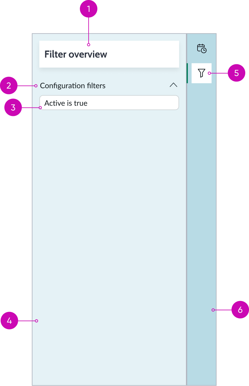
- Title: Name of the filter panel; this value is not configurable
- Content tree: Collapsible list of the filters applied to the calendar
- Condition: Individual conditions of the filters
- Calendar report panel: Filter panel containing filter conditions opened from the contextual sidebar
- Filter icon: Trigger icon in the contextual sidebar that opens the calendar report panel containing configured filters
- Contextual sidebar: Container with stateful buttons for opening various component types used in the context of a specific record
Subcomponents
See the usage guidelines for contextual sidebar.
Usage
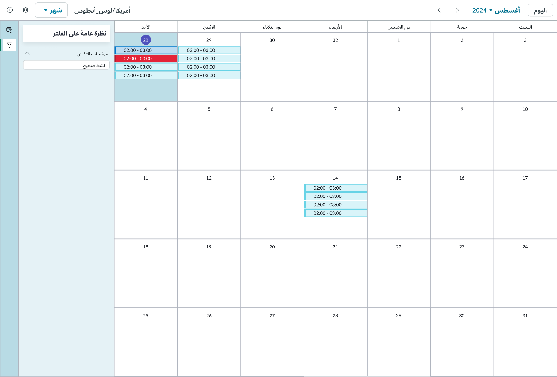
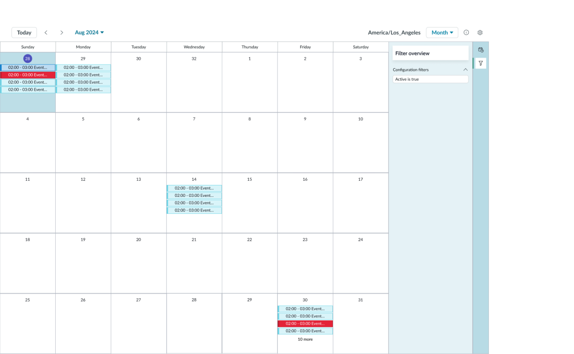
Users can view all the filter conditions configured for a calendar in the filter panel for calendar report. These conditions are fixed and aren’t configurable by the user. The user triggers display of the filter panel by selecting the filter icon in the contextual sidebar. The other features and functions of calendar report are exactly the same as for the calendar component. For information about using the calendar features, see the usage guidelines for calendar.

Configurations
Learn how to customize calendar report by configuring the available properties. For a full list of available configuration,, see the usage guidelines for calendar.
Data to filter
You can configure calendar report to filter data using any field from the table on which the calendar was built. When you create the filter, a list of predefined filter conditions is populated for that table and is available for selection. This list is configured in the sys_report_source table. You can create additional filter conditions by editing the filter table using a condition builder. These filter conditions are displyed in the filter panel opened from the contextual sidebar.
Configure the field to report on as the starting event and another field as the ending event. These fields must be data type fields. For example, the task table start date field is Opened, and the end date field is Closed. To identify the specific events that appear in the calendar for this date range, configure the display fields. The task table default calendar events are identified by their number and short description.
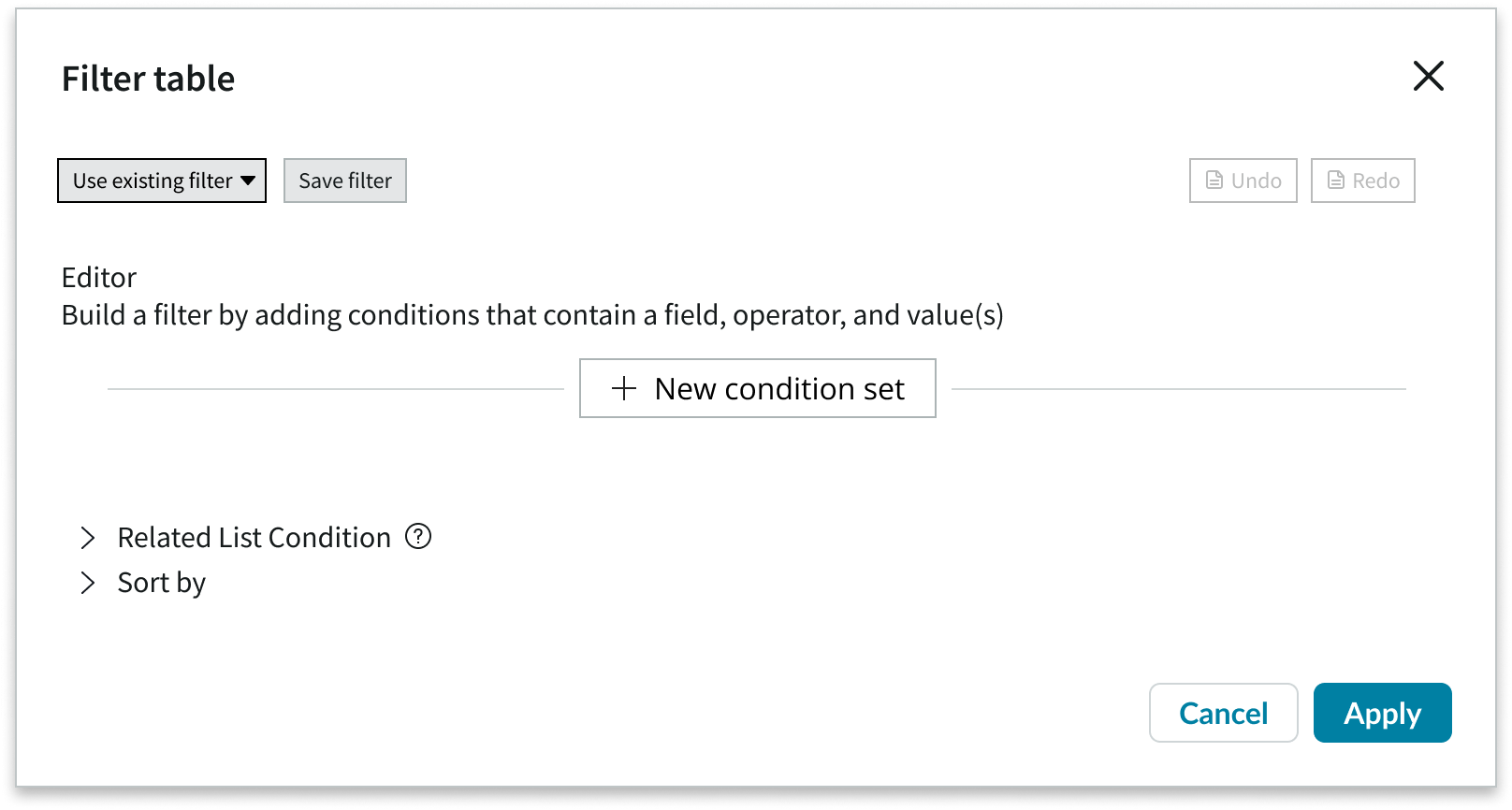
This is an example of the condition builder used to configure custom filter conditions for the calendar.
Design recommendations
Calendar report doesn’t have any design recommendations. However, the calendar component has design recommendations that affect the way the filter panel for calendar report displays. For details, see the usage guidelines for calendar.
Behavior
Learn how calendar report behaves when the display changes or a user interacts with the component. For more information about the behavior of the various features and functions of calendar report, see the usage guidelines for calendar.
Responsive behaviors
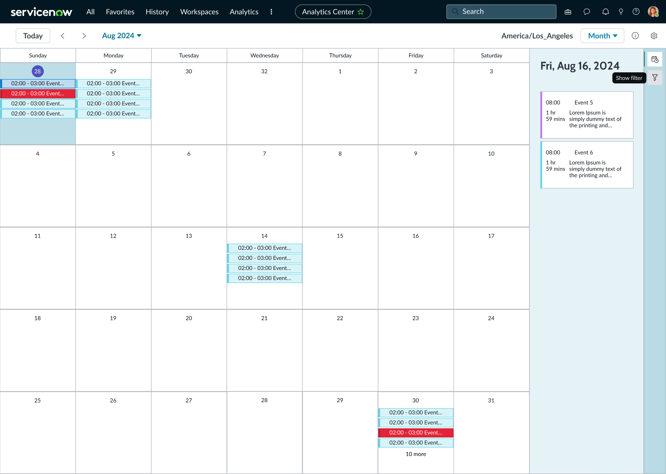
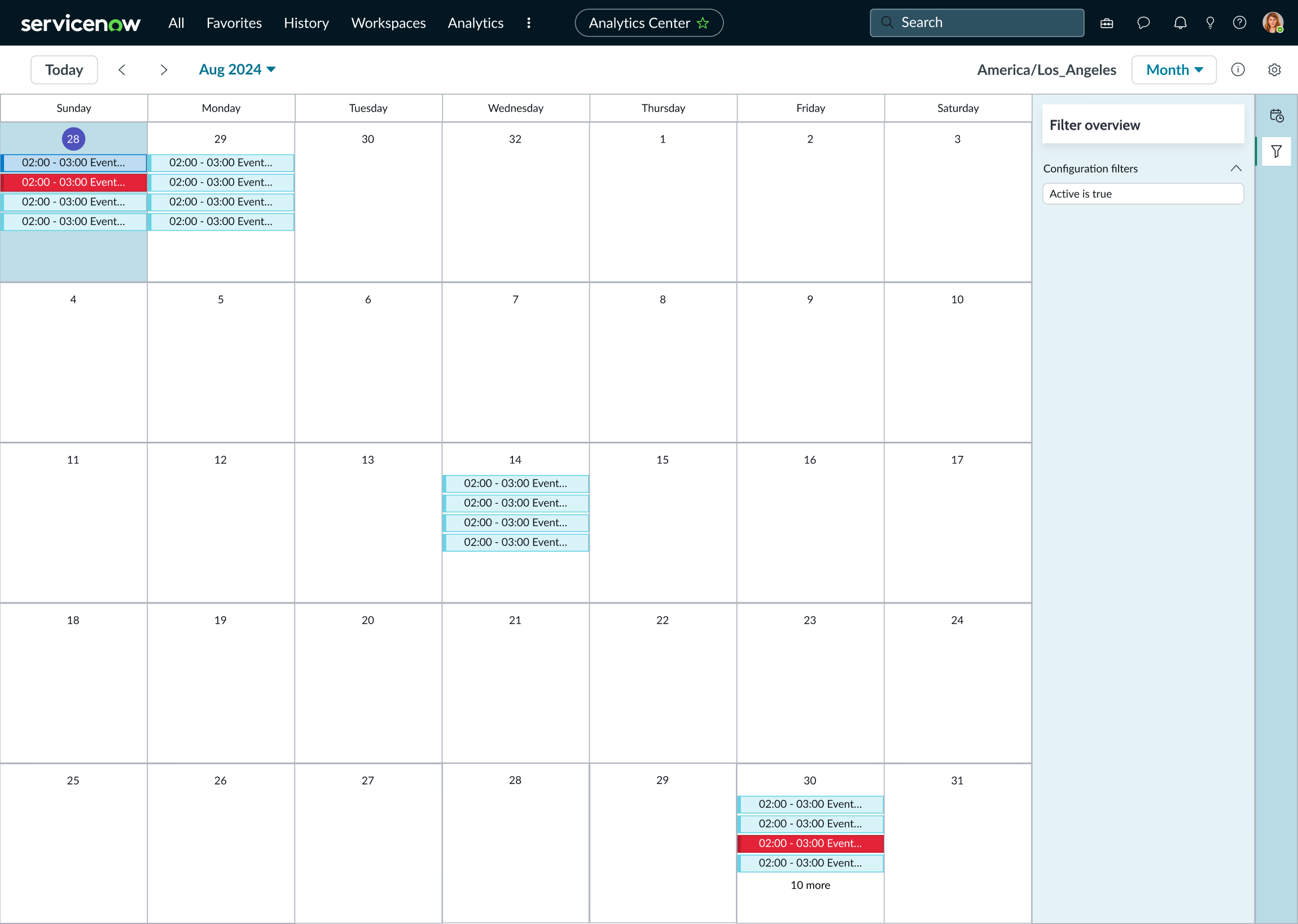
The calendar report filter panel opens on the right side of the calendar and applies the configured filter.
Interactions
To open the calendar report filter panel. users select the filter icon in the contextual sidebar.
In the filter panel, users select the chevron icon to expand or collapse each condition section.
Usability
Calendar report complies with all internationalization and accessibility requirements.
Internationalization
When this component is used in a platform configured for a right-to-left (RTL) language, the orientation of all elements within the calendar flips, including the calendar record filter panel and its contents.
Accessibility
Learn how to access the actionable elements of calendar record through keyboard interactions and screen readers.
Calendar report tab order
This is the high-level tab order for calendar report.
This view shows the tab order for the calendar component and the calendar report filter panel.
Keyboard interactions
For the complete keyboard commands for the calendar component, see the usage guidelines. Use these keyboard commands for accessing and navigating the calendar report filter panel:
- Tab: Navigates through actionalble iterms in the calendar report in the specific order
- Shift + Tab: Navigates through actionable items in reverser order
- Enter: Interacts with subcomponents; opens the filter panel from the contextual sidebar stateful button icon
When focus is in the filter panel: - Tab: Navigates through filter conditions, going from top to bottom
- Shift + Tab: Navigates through filter conditons in reverser order