

Anatomy
Learn about the individual parts of timeline.
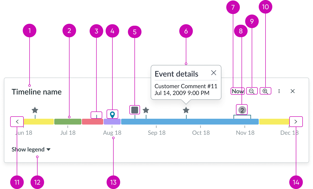
Main anatomy
- Header (optional): Text that describes the contents in the timeline
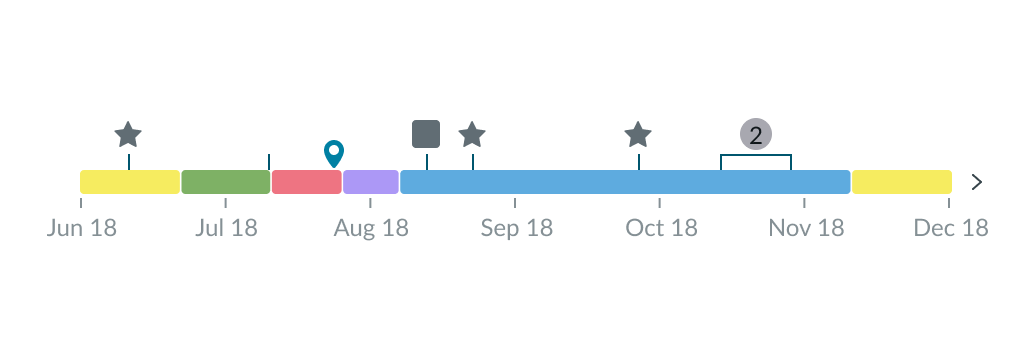
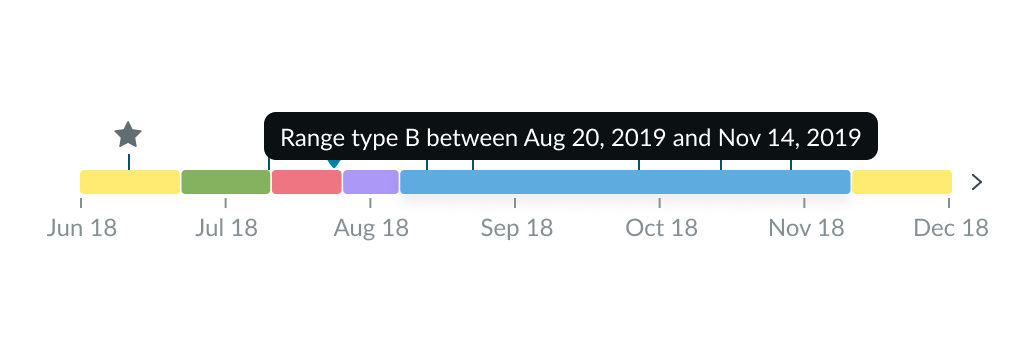
- Range indicator (optional): Represents an event that is currently happening or previously happened during the determined period; it is another facet of data on the timeline represented by colors you have configured
- Event indicator (optional): Annotation line that represents the specific moment an event happened during the determined period of time
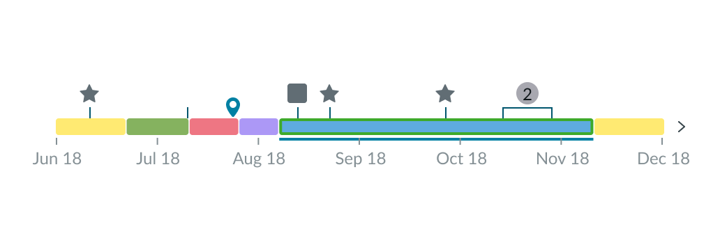
- Marker (optional): Visual representation of a custom interactive annotation on the timeline.
- Icon (optional): Visual representation of a specific event type
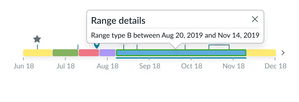
- Popover: If the Display popover toggle is turned on, a popover displays when users select the timeline. Designers can display any macrocomponent in the popover, including action buttons. When the toggle is turned off, a tooltip displays when users hover over the timeline.
- ”Now” button (optional): An action that automatically pans to show a range focused on the most recent day within the timeline; can be customized to any label and time span
- Grouped events: Automatically appears when 2 or more events group together because they’re too close to one another in the current view
- Zoom out control (optional): Moves timeline view to earlier times and events on the timeline
- Zoom in control (optional): Moves timeline view to later times and events on the timelines
- Timeline backward control: Moves backward through time, showing the same time range as the current view
- Legend control (optional): Dropdown that shows and hides the legend
- Timeline labels: Date labels that dynamically change or update to reflect the section of the timeline in view
- Timeline forward control: Moves forward through time, showing the same time range as the current view
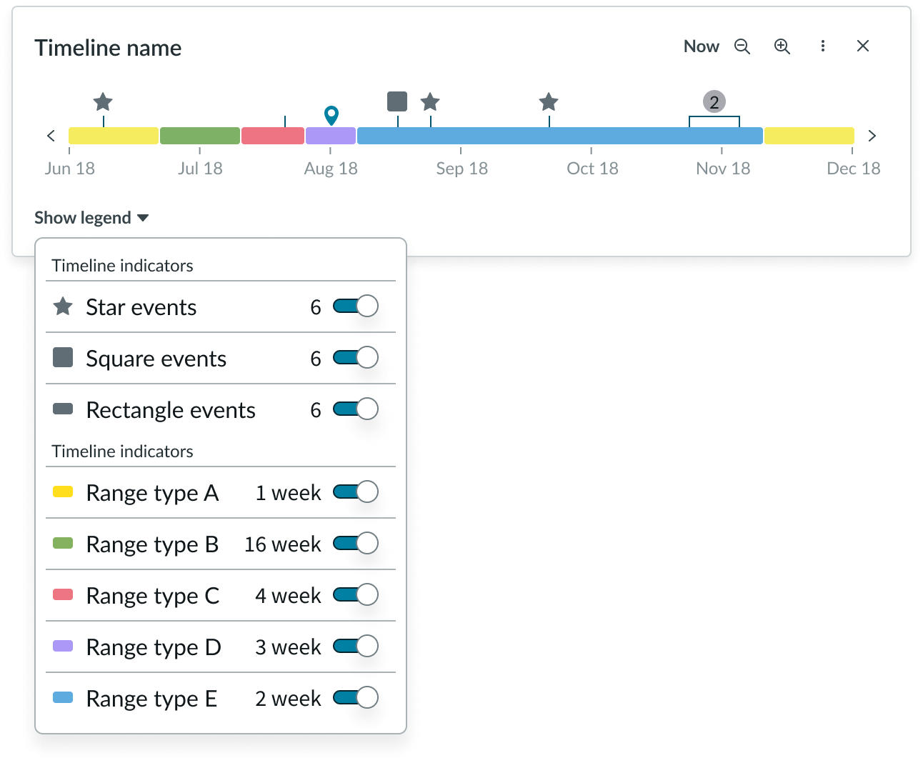
Timeline legend anatomy
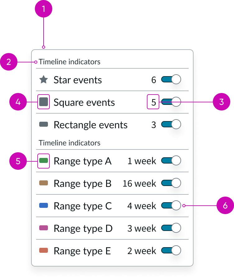
- Container: Space that defines the different elements on the timeline
- Section header: Text that describes the relation between all items in the group
- Event value: Total number of the specific type of event
- Event icon: Unique visual identifier to differentiate events on the timeline
- Range type: Shows the status color for the range on the timeline
- Event toggle: Toggles the visibility of event indicators or ranges on the timeline
Subcomponents
Usage
You can use a timeline as a visual aid that shows events in chronological order within a high-level overview.
This timeline component is flexible to accommodate various use cases and can be informational or navigational. It can include events and ranges, and the timeline can also be interactive or fixed, depending on your use case.
For example, you can use the timeline to view changes in a service over time. It can show installations, upgrades, service calls, and other important events. In this way, a timeline can also be a way to navigate through events over time.
Another example is using the timeline to show customer touchpoints for CSM. The timeline can show all points of contact (phone calls, emails, and meetings) that an agent has had with a customer, in addition to any record changes.
A timeline can also offer insight into service problems by showing events related to the root cause of an alert, primary alerts, and secondary alerts with their level of severity.
All information that appears in the timeline component is populated with data from an external table.
Configurations
Learn how to customize timeline by configuring the available properties.
Note: You can set a minimum range view, such as a timeline that can’t zoom in smaller than a set number of days, or a maximum view, such as a timeline that can’t zoom out larger than a set number of months.
Presets and controllers
This component has a preset configuration that sets properties and event handlers, making it ready for use. You can override preset values with a custom configuration if needed. Preset values won’t upgrade with updates. To avoid using presets, configure manually. One preset can apply to a single component instance. See presets for more info.
A preset is linked to a controller, which serves as a data resource. Controllers provide configuration data and event bindings for the component. Selecting a preset adds the required controller to the page, allowing new components to use its preset. For more on controllers, see controllers. For default presets, see view properties and events in the controller API.
Timeline header
You can configure the header of the timeline. This provides the user with an overview of the events and segments visible in the timeline.
Timeline range
You can configure the minimum and maximum time ranges that appear on the timeline. This depends on the number of events the user needs to see, in addition to the context of the timeline.
“Now” button
You can configure this action button to show any time range that you choose (a day, week, month, etc.). This helps the user revert to a specific time range and view, which is helpful if they have been panning and zooming along the timeline.
Default view
You can configure the scope of the timeline that the user sees when the experience loads. The section of the timeline that the user initially sees depends on the experience you are creating as well as the context of the timeline.
Zoom controls
You can hide the pan and zoom icons from the timeline display by turning on the toggle, Hide pan and zoom. By default, the toggle is off. You might keep the toggle off so users can zoom into shorter sections of the timeline.
Event icons
If you show an event on the timeline, you must always include an event icon. You can’t show the event indicator by itself. You can choose any of the icons from the Icon Gallery to visually distinguish each event type on the timeline. It is recommended that you include event icons when you have 2 or more event types.
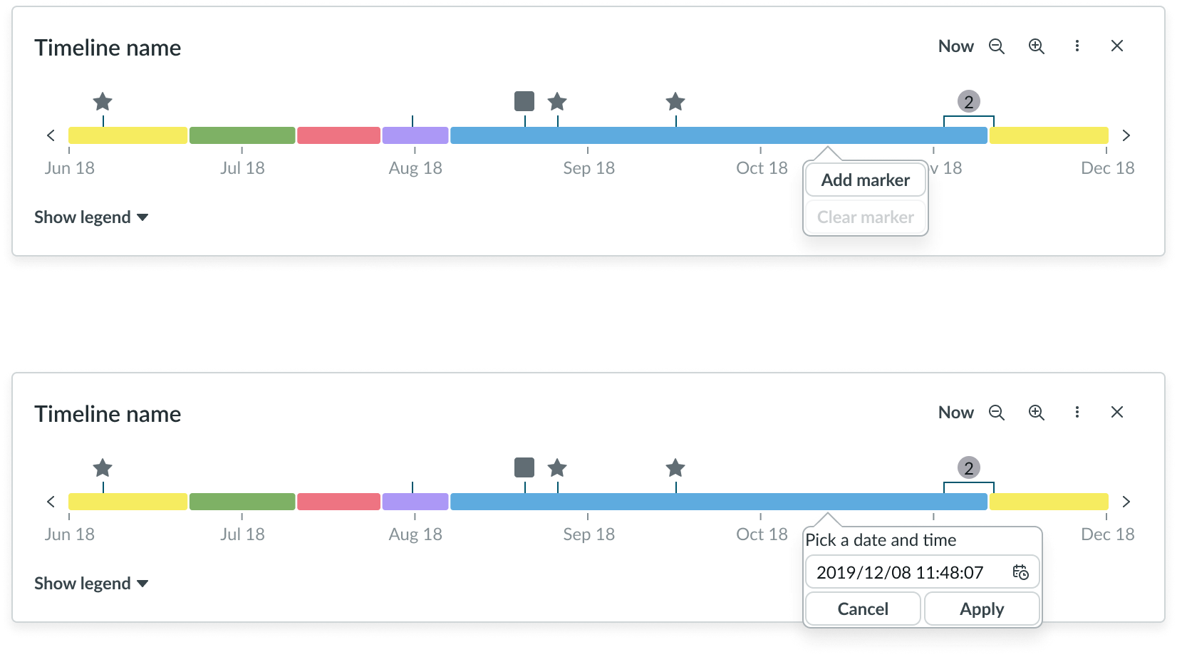
Markers
You can enable single or multiple markers on the timeline by toggling Enable markers on. By default, markers are disabled, and the marker type is single. To add a marker on the timeline, the user right-clicks on the appropriate position on the timeline, selects Add marker, selects the date and time, and then selects Apply.
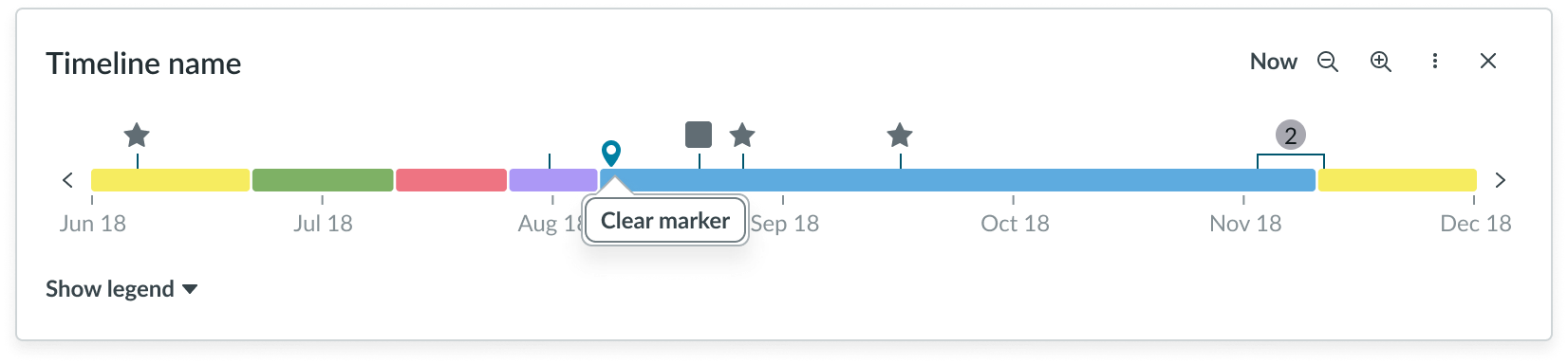
To clear a marker from the timeline, the user right-clicks the marker and selects Clear marker.
Range indicators
You can configure the colors for the different range indicators on the timeline. The colors can represent whatever you want. For example, certain colors can show the status of a service.
Legend controls
You can configure whether the legend control appears on the timeline. If the timeline has no events or segments, consider hiding the legend to keep from distracting the user.
You can also configure the labels within the legend, which directly reference the event icons and range indicators on the timeline. The legend shows all the events and segments in relation to the total timeline (and not just the current view).
Popover
If the Display popover toggle is turned on, a popover (shown below) displays when users select the timeline. Designers can display any macrocomponent in the popover, including action buttons. When the toggle is turned off, a tooltip displays when users hover over the timeline.
Behavior
Learn about the different states of the timeline component.
States
Timeline has the following states: empty, loading, error, and disabled.
| State | Example |
|---|---|
| Empty | 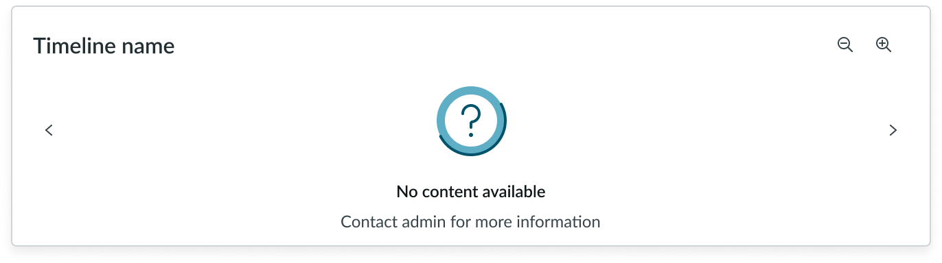 |
| Loading | 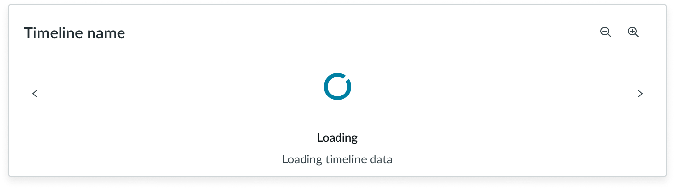 |
| Error | 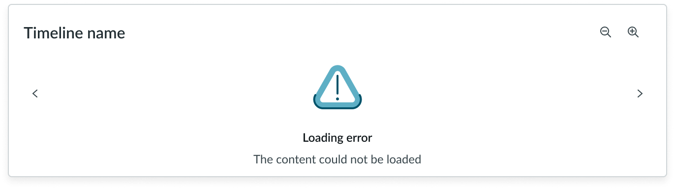 |
| Disabled | 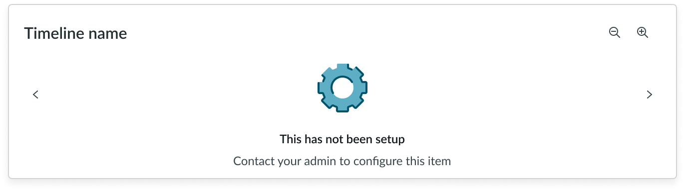 |
Event timeline states
The event timelines have 3 states: default, hover, and selected.
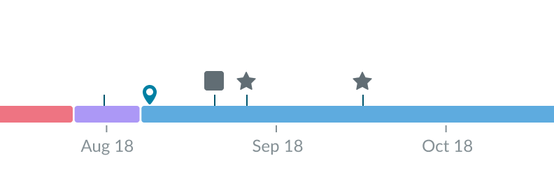
Default
The default state of the event timeline is how it appears on the timeline without any user interaction.
In this example, the event timeline is shown in default state
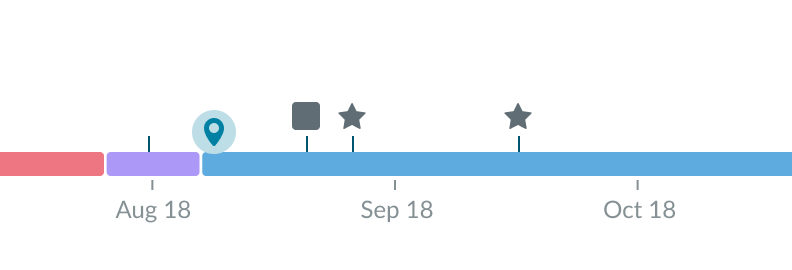
Hover
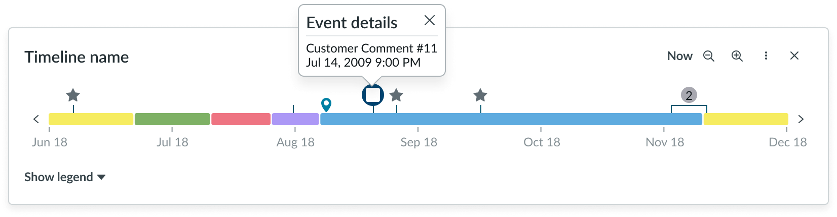
The hover state occurs when the user places their cursor over an event timeline on the timeline. If the display popover configuration is turned off, on hover, a tooltip appears that shows data (like date and time) for that event. You can configure what data appears within the tooltips and choose not to include a timestamp. If the display popover configuration is turned on the tool tip is not shown.
In this example, the event timeline is shown in hover state
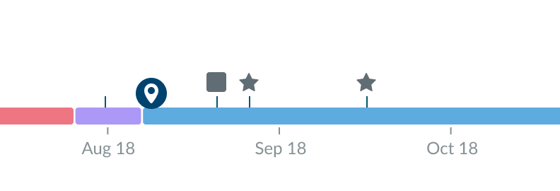
Selected
The selected state appears when the user actively selects an event timeline on the timeline.
In this example, the event timeline is shown in selected state
In this example, the event timeline is shown in selected state with display popover property turned on
Event icon states
The event icons have 3 states: default, hover, and selected.
Default
The default state of the icon is how it appears on the timeline without any user interaction.
Hover
The hover state occurs when the user places their cursor over an event icon on the timeline. On hover, a tooltip appears that shows data (like date and time) for that event. You can configure what data appears within the tooltips and choose not to include a timestamp.
Selected
The selected state appears when the user actively selects an event icon on the timeline.
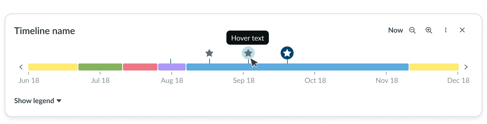
In this example, the event icons are shown in the 3 possible states: default, hover, and selected.
Button states
The button that opens the legend has 3 states: default, hover, and selected.
Marker states
Markers have the following states: default, hover, and selected.
Default
The default state of the marker is how it appears on the timeline without any user interaction.
In this example, the marker is shown in its default state
Hover
The hover state occurs when the user places their cursor over a marker on the timeline.
In this example, the marker is shown in its hover state
Selected
The selected state appears when the user actively selects the marker on the timeline.
In this example, the marker is shown in its selected state
Responsive behaviors
Learn how timeline responds to changes in a container or display.
Contained events
If the user zooms out far enough and events are close together, a bracket appears with a number above it. This identifies that there are 2 or more events in this segment on the timeline.
The user can’t select the value to show the events. Instead, they must zoom in to see the individual events again.
Timeline labels
The date range labels underneath the timeline adapt based on the user’s zoom level and can be as finite as seconds.
As the user zooms out, the dates become broader. As the user zooms in, the dates become narrower. You can limit how broad or narrow the dates appear by configuring the limits on the zoom controls.
Legend labels
The legend always shows all events and segments on the total timeline, whether or not the events and segments are currently visible at the user’s zoom level.
Interactions
Learn how timeline responds when a user interacts with it.
Viewing the legend
The user can open the legend (if available) to see what the icons and status colors represent on the timeline.
Within the legend, the user can view or hide the individual events and segments by using the toggle component next to each item.
Selecting an event
The user can select an event icon on the timeline to initiate an event (if configured). The event that occurs depends on the experience configured for the user.
Selecting a range
The user can also select a range on the timeline.
Zooming
The user can zoom in and out on the timeline with the iconic buttons. This allows the user to see more events on the timeline instead of only the default view.
Zooming in decreases the timeline scope and shows fewer dates while zooming out increases the timeline scope and shows more dates.
Moving markers
Markers support drag and drop. Markers can be added anywhere along the visible timeline and can be repositioned by dragging across the timeline horizontally.
Navigate through the timeline
The user can navigate through the timeline using the chevrons on either end of the timeline (if available). This allows the user to see different sections of the timeline while staying within the same zoom level.
Truncation
The labels on the timeline don’t truncate. Additionally, the item labels within the legend don’t truncate. Instead, they wrap to the next line if they exceed the width of the container.
Usability
Timeline complies with all internationalization and accessibility requirements.
Internationalization
When the display translates to a right-to-left (RTL) language, the timeline elements display in a left-to-right (LTR) format. All other elements in the timeline flip. The header and the legend button also align on the right.
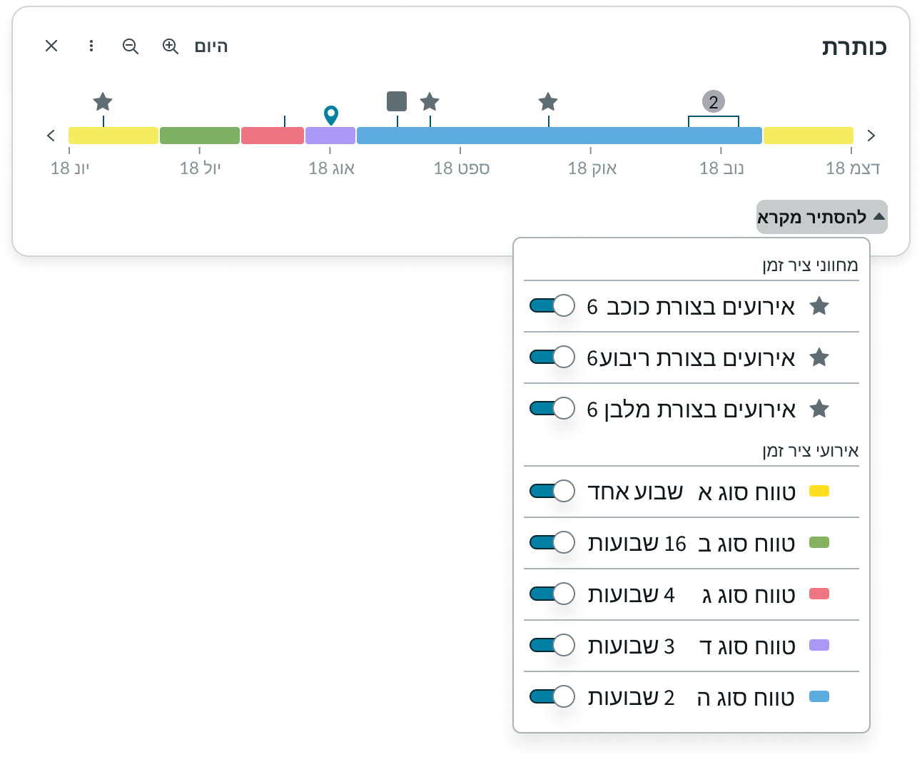
In this example, the timeline component displays in a right-to-left language. The timeline still retains its consistent left-to-right order for RTL languages, but other elements in the component change their orientation.
Accessibility
Keyboard interactions
You can access the actionable elements of timeline with these keyboard keys:
| Keyboard key | Action |
|---|---|
| Tab | Moves focus to the next actionable element |
| Enter or Space | Initiates any actionable elements |
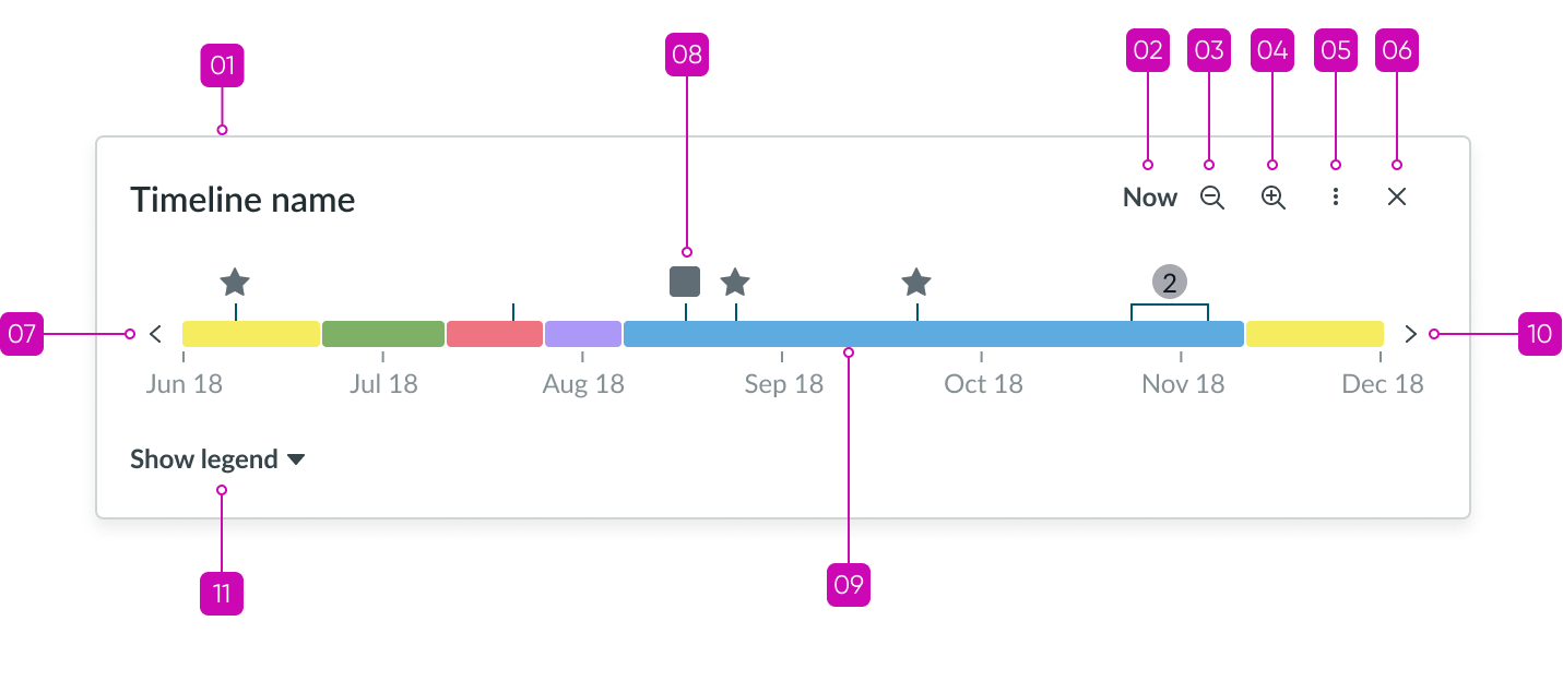
In this image, the annotations show the tab order for the timeline component.
| Tab order | Element |
|---|---|
| 1 | Header |
| 2 | “Today” button |
| 3 | Zoom out control |
| 4 | Zoom in control |
| 5 | Overflow menu |
| 6 | Close |
| 7 | Timeline backward control |
| 8 | Icon |
| 9 | Range indicator |
| 10 | Timeline forward control |
| 11 | Legend control |