

Anatomy
Learn about the individual parts of pie and donut charts
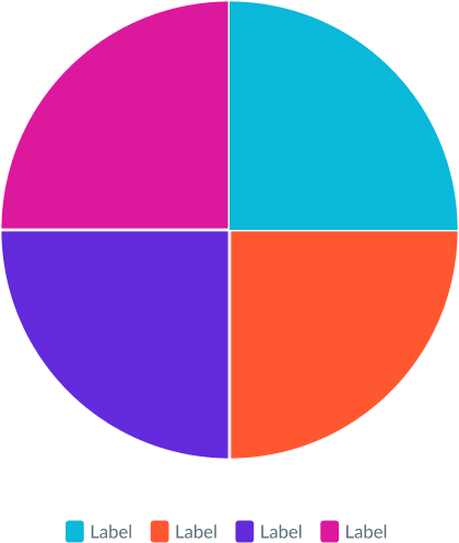
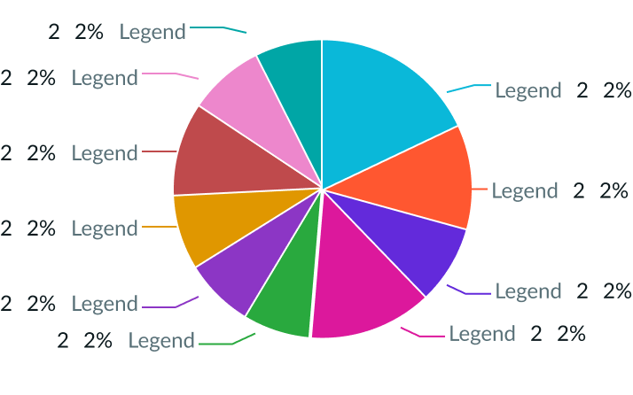
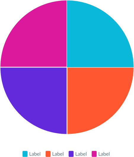
Pie chart
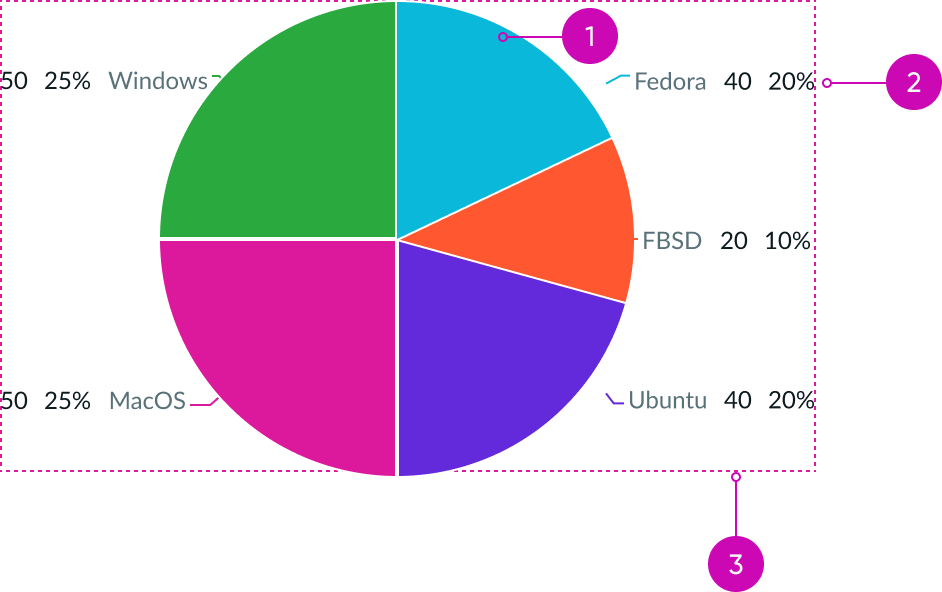
- Pie chart: Circular chart that is for a part-to-whole data analysis
- Data label (optional): Combination of a legend, value, or a percentage
- Container: Borderless area that contains the chart
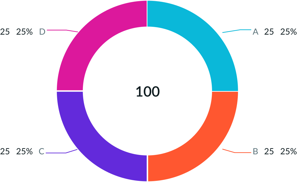
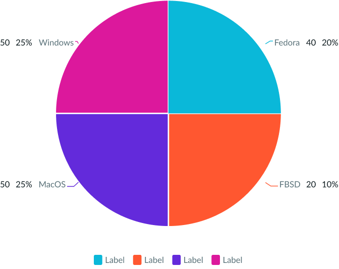
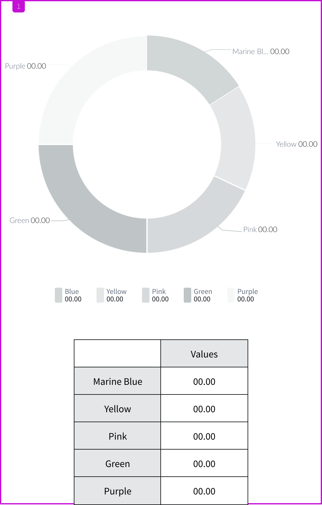
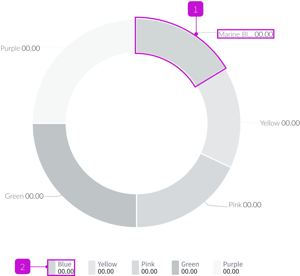
Donut chart
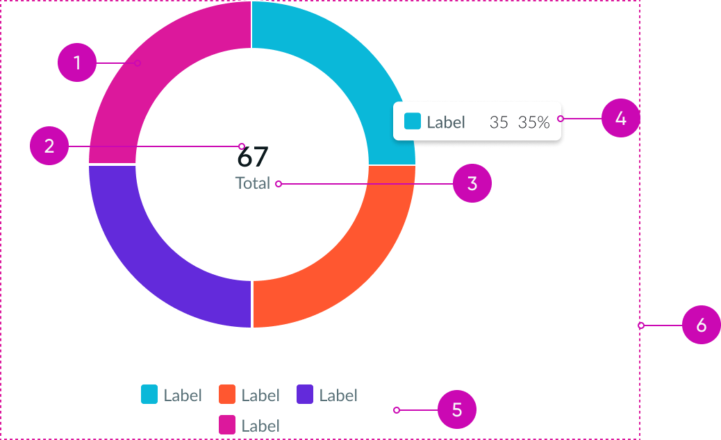
- Donut chart: Circular chart for a part-to-whole data analysis; it includes an inner circle for displaying data
- Total value (optional): Sum of the values of all the slices
- Total value label (optional): Supplemental text label
- Tooltip (optional): Label and associated value that appear above a slice on hover by default
- Register (optional): Section that identifies the slices in the chart
- Container: Borderless area that contains the chart
Usage
Use a pie chart to display individual data segments that are part of a whole. This allows the user to visually compare different data pieces as they relate to each other and to the entire data set. Use 4-6 segments for the best readability. If the number of segments exceeds 10, use a bar chart to visualize the data. If you want to display the total value of the chart, use a donut chart instead of a pie chart.
Types
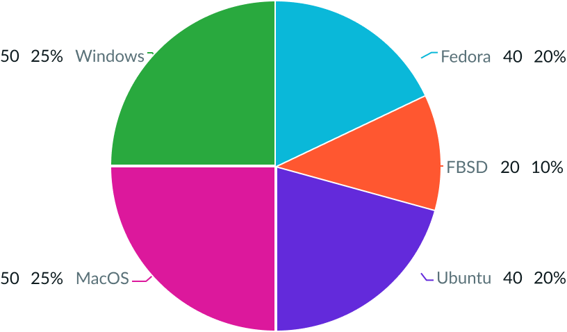
There are three types of segmented charts: pie, donut, and semi-donut.
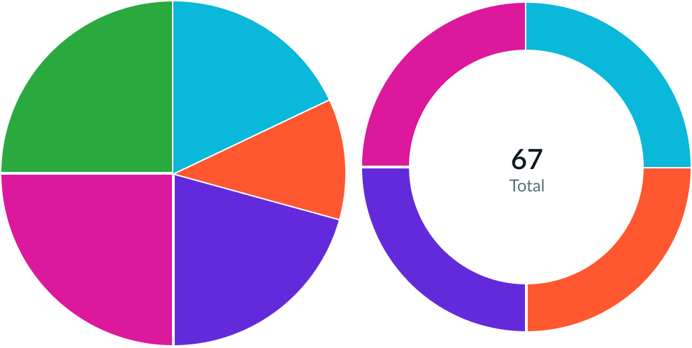
Pie and donut
The difference between a pie chart and donut chart is the way you display the data. All slices within a pie chart are solid, whereas the donut chart features an empty space in the center for data.
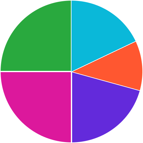
Semi-donut
Semi-donut charts display in a 180-degree view and fit in a smaller area than a full donut chart. However, the slice size in semi-donut charts is smaller than in a full donut chart with the same number of values.
![Example of a semi-donut chart with data labels and the total value displayed in the center]](https://static.horizon.servicenow.com/components/now-vis-pie-wrapper_australia_3785-20790.png)
Configurations
Learn how to customize pie and donut charts by configuring the available properties
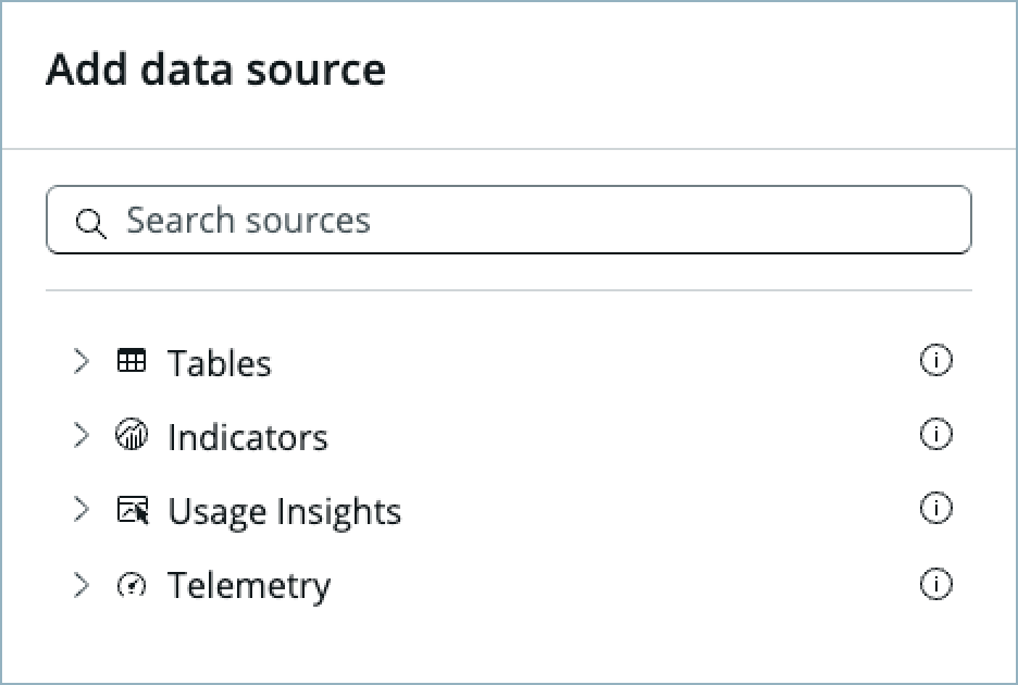
Data Sources
You can select between 4 different data sources for your visualization: system data tables, preconfigured Performance Analytics indicators, Usage Insights, and Telemetry to visualize telemetry KPIs and trends from the Telemetry Data Connector (traces/metrics/logs). If you are changing your data source, the option list provides suggestions based on previous selections and items that match your search.
Tables
You can select any table from the system to use in your visualization and filter that data. When you apply a table as the data source, a preview list appears showing all available records in that table.
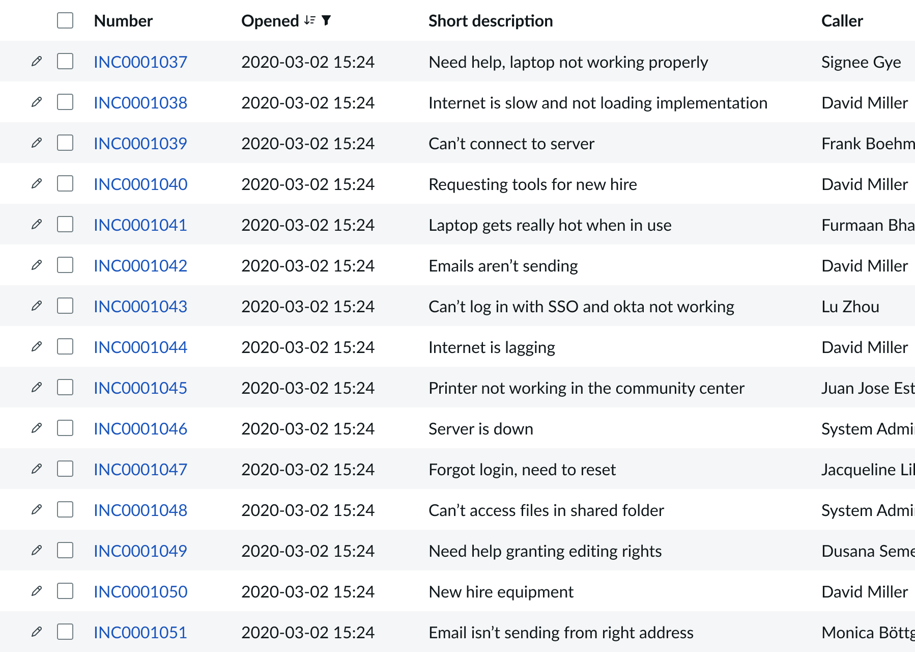
A condition builder above the list enables you to set filter conditions on the data before using it in your visualization. This is useful for limiting the data shown in the chart to only the data you need.
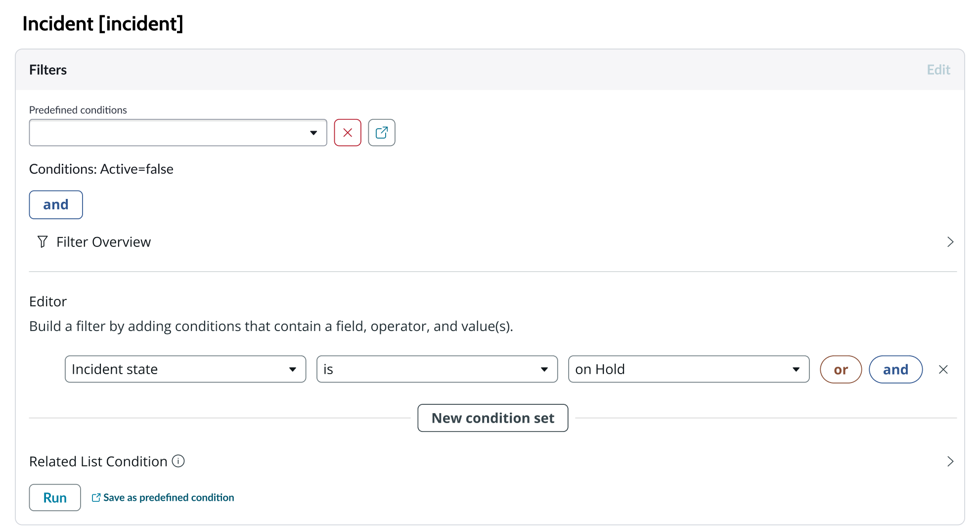
Indicators
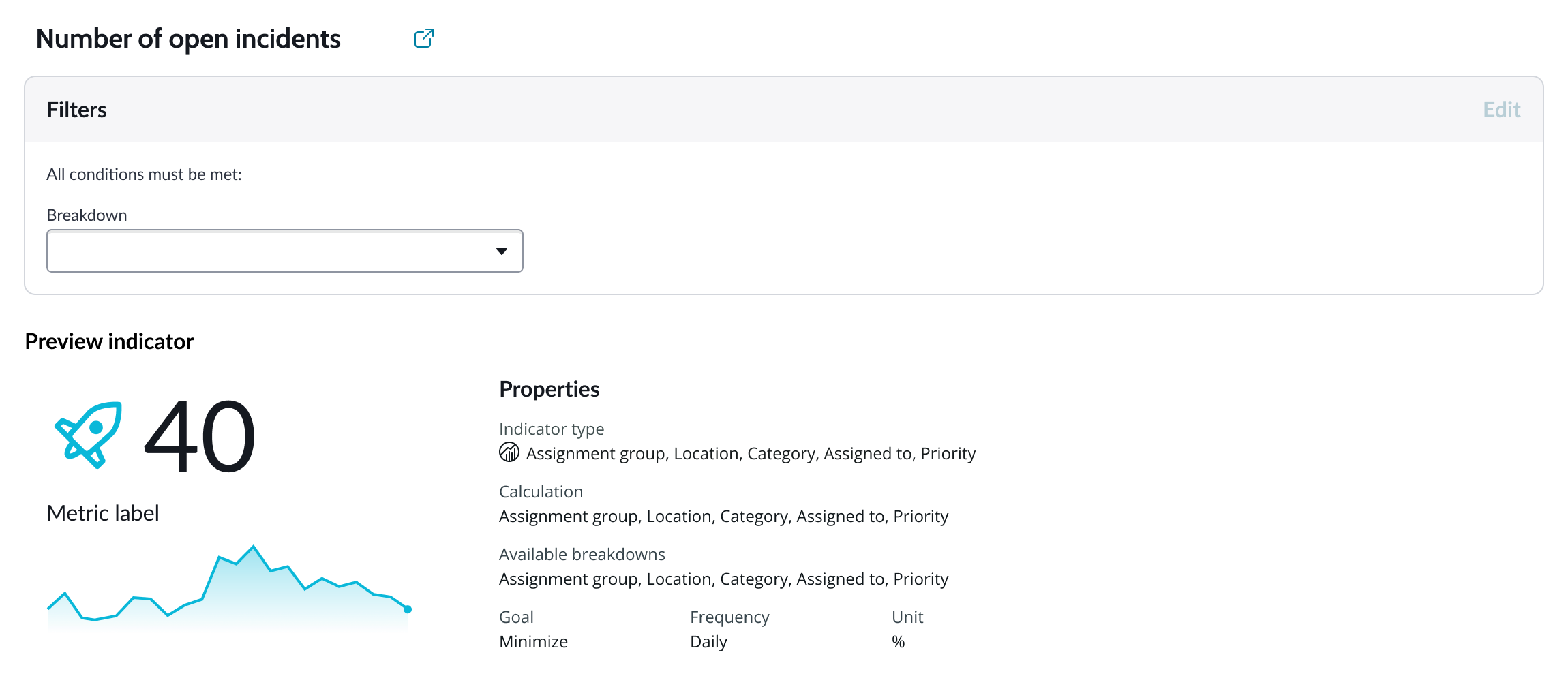
Indicators are preconfigured business metrics that assess performance across attributes such as cost, quality, technical risk, investments, user satisfaction, and business value. Indicators are configured in the Performance Analytics application and reflect common measurements that users need. If breakdowns are defined for an indicator, you can apply filter conditions on those values.
Data snapshot indicators
Data snapshot type of indicators enable intraday collection and analysis, filtering by breakdown hierarchy, with the ability to report partial scores.
Key features:
- Move beyond daily snapshots: Collect and analyze data multiple times throughout the day (intraday) for granular insights.
- Breakdown hierarchy: Filter through hierarchical structures (department to team to individual) to pinpoint issues and identify trends at any level.
- Partial scores: Track progress toward goals mid-period in order to take corrective action early instead of waiting for periods to close.
- Deeper insights: Drill down through multiple dimensions to uncover hidden patterns.
- Simplified setup: Create fewer, more generalized indicators.
- Dynamic filtering: Apply breakdowns on-demand without preconfiguration.
- Reduced maintenance: Fewer indicators mean less ongoing work.
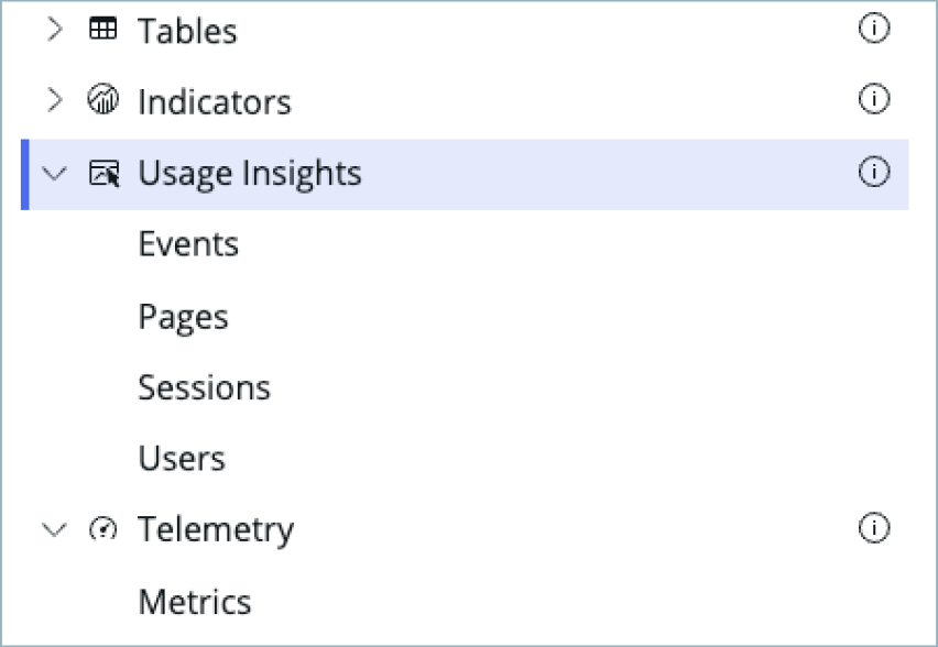
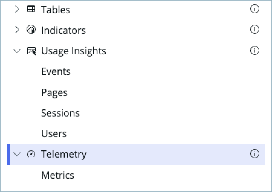
Usage Insights
Usage insights are the user experience analytics data points: events, page views, sessions, and users.
Telemetry
Use this data source to visualize telemetry KPIs and trends from the Telemetry Data Connector (traces/metrics/logs) in Platform Analytics.
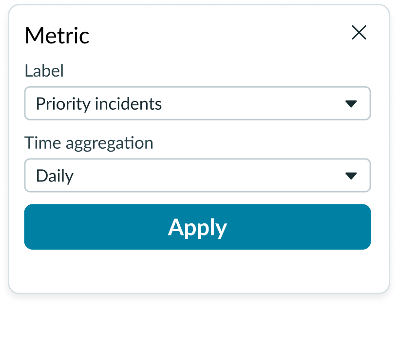
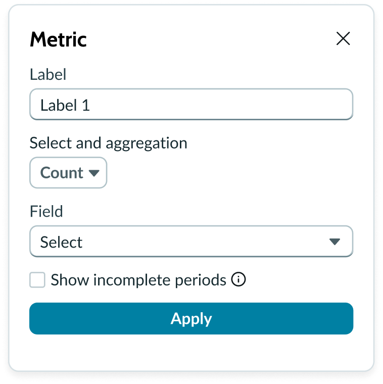
Metric selection
Select the specific data from the data source to display in a pie/donut chart and the label that identifies it. The default aggregation used is Count. You can select a specific field from the data source table to display. If you leave the field empty, all fields are used, depending on any filtering conditions you applied when you selected the data source.
Show incomplete periods
For Data Snapshot indicators only. To provide users real time progress tracking, for each “Metric” you can select the “Show incomplete periods” setting to display scores for the current, incomplete period to track progress.
Grouping data
Grouped charts compare one or more data sets across all categories. “Group By” is used with aggregate functions like Sum, Count, or Average. The function selected tells the data provider how to treat the data when it is grouped. You can select a field (for table data sources) or a breakdown value (for indicator data sources) as the grouping value.
Note: Not all indicator data sources have available breakdown values. Charts that use indicator data sources without breakdown values can’t be grouped.
Header and border
The component header displays in the top left and contains the title and a description that appears when the user hovers over the information icon. You create the header and then show or hide it with the controls provided. By default, the header is configured to show, but the content is empty.
Visualization border
By default, a border around the chart. Unselect the “Show border” option to remove it.
Header separator
You can add a separator line between the header and the visualization. Disabled by default.
Chart title
By default, the chart title is blank, but you can add a title. When you add a title for your chart, you’re able to customize the color and make it wrap.
Header level
By default, text in the header is set to heading level 2 (H2). Heading levels H1 through H6 are also available.
Title alignment
By default, the title is aligned to the Start side. The start size can be the left or right depending on the language you use. Other options available from the dropdown are “Center” and “End”.
Title wrap
By default, long titles truncate with an ellipsis, and a tooltip showing the full title on hover, but you can set the title to wrap instead.
Title truncation
By default, the title text truncates at the end of the first line of text, but you can set the line of truncation to 2 or 3 lines instead. This option becomes available when the title truncates.
Refresh option
By default, refresh is available to the user in the “More options” menu, but you can hide it. This gives you more control over how refresh options are exposed on dashboards so you can align refresh behavior with your intended usage.
Header background color
By default, the color of the header background is neutral-0 (white). You can specify a different color (including a custom color) for the background.
Select a color for the visualization header background that aligns with your dashboard theme, branding, or design preferences. The color you choose applies only to the visualization header background.
For better accessibility, make sure a good color contrast exists between the header background and title text. The minimum contrast requirement for normal text is 4.5:1, and for large text is 3:1. To verify, check the contrast ratio in the color picker.
Note: Theming is not supported when you select a custom color.
Title color
By default, the title text is neutral-21 (black). You can select a different color (including a custom color) for the title text.
You should select a color for the chart title that aligns with your dashboard theme, branding, or design preferences. The color you choose applies only to the chart title.
For better accessibility, make sure a good color contrast exists between the header background and title text. The minimum contrast requirement for normal text is 4.5:1, and for large text is 3:1. To verify, check the contrast ratio in the color picker.
Note: Theming is not supported when you select a custom color.
Sorting
You can enable a sorting feature that orders the data slices by name or by value, in ascending or descending order. Slice order starts at the top (12 o’clock) position and runs clockwise. Sorting is available for both data source types.
Date range
You can use the “Apply date range” setting to apply a date range filter from filter component or manual configuration to the visualization.
Auto aggregation periods
For Data Snapshot Indicators, automatically picks the best aggregation period when a date filter is used. Affects only this visualization and does not change the indicator's default aggregation period. Clear the checkbox to always use the indicator's default period.
Data update
By default, users can add individual chart filters, and use the filters set on that workspace page. You can also configure your chart to update automatically in real time or on a defined refresh schedule.
Follow filters
By default, any filters set on the workspace page and those set on the data source are applied. You can use the “Follow filters” property to prevent any filter input from the workspace page. Filters set on the data source always run on the component.
Filter icon
The filter icon and the number of filters impacting the visualization display by default. To hide them, unselect the “Show filter icon.”
Drill down
By default, users can drill down into data or launch a URL directly from a chart by selecting data points, slices, categories, or scores. This lets users view data such as records and record lists from data tables or KPI data from indicators or go to a URL that you specify.
Drill down label
You can add text that appears in tooltips and describes what happens when the user selects a chart data point.
Show selected data point
To visually show the selected data point use this property. By default, it isn’t selected. Often can be used when the chart is acting as filter.
Refresh after being away
You can configure your chart to update automatically or on a defined refresh schedule.
Refresh requested
When the new value of this property is different from the previous one, you can trigger refresh by setting up a string that can be passed down.
Use data cache
You can cache user queries to shorten the load time for the data visualization. Unselected by default.
Info messages
Displays generic error messages by default.
Extended error messages
You can choose to show extended error messages which contain more details that can be helpful to admins. Unselected by default.
Custom no data message
By default, when a data source doesn’t return any info, the “no data available” message displays with generic content. However, you can set a custom message by changing the title, illustration, and message content.
Presentation
The presentation properties control the physical appearance of the chart. Use these properties to control how your users consume the data.
Display settings
You can use the following to modify the display of the data visualization.
Height
The chart size is configured using a height setting expressed in pixels. You can configure any size you want for your visualization. Select the size, based on the amount of data in your chart, the range of values, and the resolution of the data that you want to show. The default chart size is 250 pixels.
Data table
You can use this setting to show a table with chart and graph data under the chart for easier screen reader access.
% of total tooltip
By default, when the user hovers over a data pointer, the percentage of the total Y-axis value is displayed in a tooltip. This can be hidden.
Legend
By default, the visualization displays a legend. The legend position relative to the chart is configurable for above, below, left, and right sides.
You can display the value corresponding to the area of the chart the user hovers on. The value displays as a tooltip and in the chart legend.
Data labels
Show or hide data labels on the chart. You can configure the labels to indicate the value of each slice, including the percerntage of the whole.
Colors
You select between 3 color schemes: default, color palette, and fixed element color. The fixed element color selection is not available for indicator data sources. The color palette selection provides a list of predefined color schemes in a dropdown list with a search field.
Design recommendations
Learn how to apply pie and donut charts in your design.
Limit the number of slices to help users focus on a simple proportion at-a-glance for data comparison.
Avoid creating too many slices in a pie chart. This adds cognitive overload and makes it difficult for the users to analyze the data.
Use a register instead of data labels when your chart has many slices. Consider using a scrollbar in the container if the register is too tall.
When a chart contains too many slices, data labels can overlap with one another.

Keep enough space in the display for the legend and the chart when you define the container sizes.
Avoid shrinking the chart size to accommodate the register in a display. Smaller charts cause visual strain and make it difficult for the user to compare and contrast the slices.
Always include data labels or a legend to help users understand the contents of a pie chart.
Avoid using a pie chart without any type of labels. This makes it difficult for the user to understand the chart’s purpose or context.
Choose only one method for labeling the data in a pie chart.
Avoid using data labels and a register together. This creates redundant information and adds visual noise. The tooltip appears by default on hover.
Alignment and positioning
Data labels include a leader line, which is connected to the label and positioned in the middle of the slice. The data label positioning depends on where the slice appears in the container and can’t be manually adjusted. The chart is always centered within the container.
Register positioning
If you include a legend, it center-aligns with the chart. You can choose the position of the legend with respect to the chart and align it with any container edge.
Behavior
Learn how pie and donut charts behave when the display changes or a user interacts with the component.
Responsive behaviors
Learn how pie and donut charts respond to changes in a container or display.
Chart positioning
The diameter of a pie chart with data labels uses 65% of the container area from the shortest edge.
Without data labels, the diameter of a chart is 80% of the container area from the shortest edge.
Data overflow
When the number of data categories exceeds the number of available slices, the last slice in the slice order becomes an “Other” slice. All remaining categories appear in this slice.
![Displays a donut chart with the maximum number of slices and the other category for overflow data]](https://static.horizon.servicenow.com/components/now-vis-pie-wrapper_australia_3785-21096.png)
Interactions
If a data selection action is configured for the chart, selecting a data slice launches an action, such as opening a new page or opening a record.
Truncation
Pie and donut chart text doesn’t truncate. Make sure your labels are concise and meaningful.
Usability
Pie and donut charts complie with all internationalization and accessibility requirements.
Internationalization
Labels for pie and donut charts do not localize for right-to-left (RTL) languages.
Accessibility
Learn how to access the actionable elements of pie and donut charts through keyboard interactions and screen readers.
Pie and donut chart tab order
This is the high-level tab order for pie and donut charts.
Example of the first tab order if reader table is on
Example of the tab order when the data labels are configured to show and one or more appear truncated
Keyboard interactions
Users can access the chart legend and the chart navigator with these keyboard keys:
- Tab: Moves focus forward between the chart container, the chart, and the legend
- Shift + Tab: Moves focus backwards
- Esc: Dismisses displayed tooltip
- Enter or space bar: Triggers an action associated with an interactive element when in focus, such as opening a list view for a data point or muting a dataset
- Arrow up, down, right, left: When the chart has focus, moves focus through the segments starting with the top right; right or down moves focus clockwise; left or up moves counter clock wise. When the legend has focus, moves focus through the legend items
Navigating large charts quickly: - Home: Moves focus to top right (first) segment
- fn + Arrow up or left: (Mac) Moves focus to top right (first) segment
- End: Moves focus to last segment
- fn + Arrow down or right: (Mac) Moves focus to last segment
Screen readers
Pie and donut charts can be configured with an ARIA label to describe to screen reader users what the chart shows. However, the screen reader can’t read the elements of the chart itself. A screen reader can read values from a data table that accompanies the chart via manual use of the arrow keys on the user’s keyboard. Data tables are enabled with an accessibility control in user preferences on the instance and not in the component.
This example shows the donut chart data table. The screen reader reads the entries as the user manually navigates the table using the arrow keys.