

Anatomy
Learn about the individual parts of gauge chart.
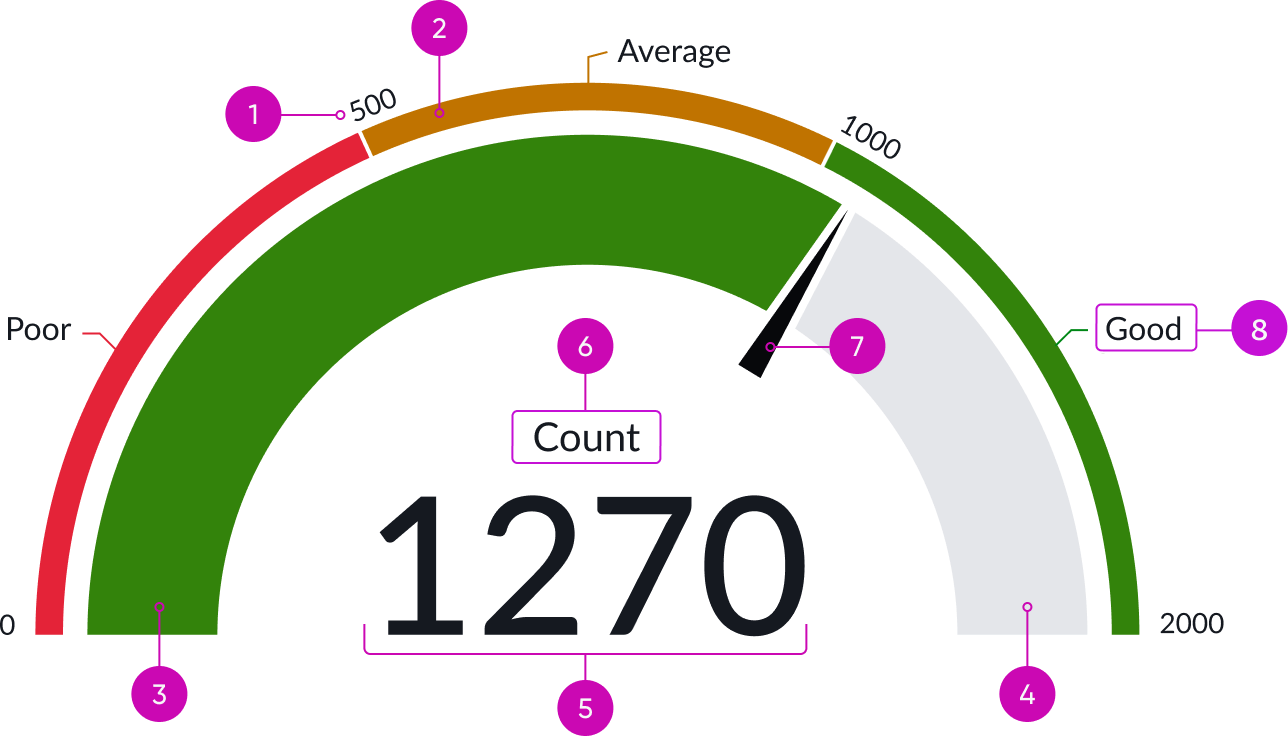
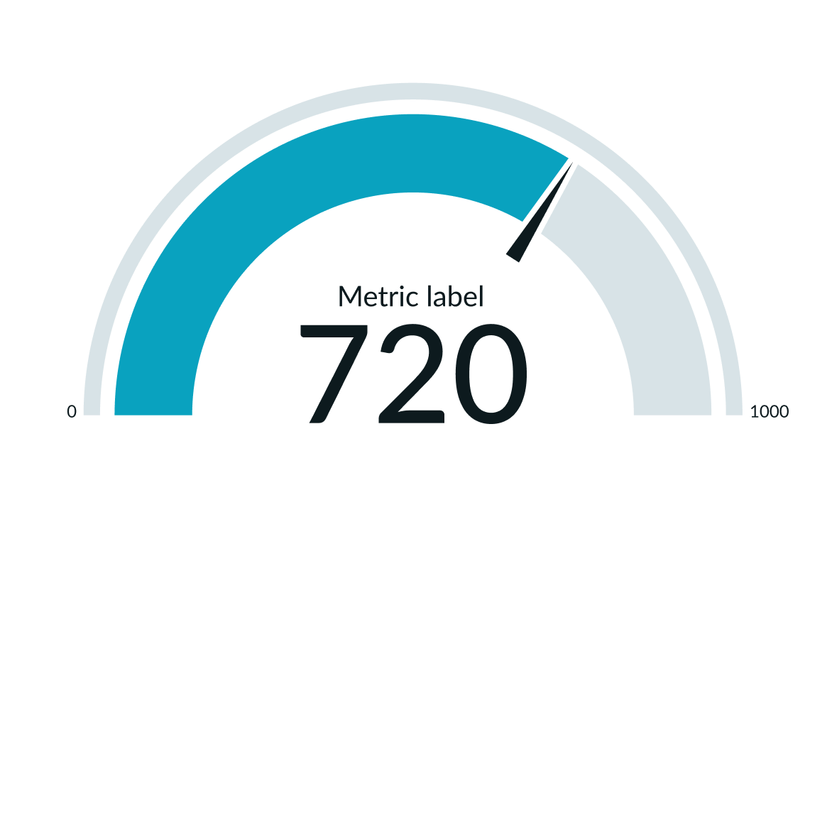
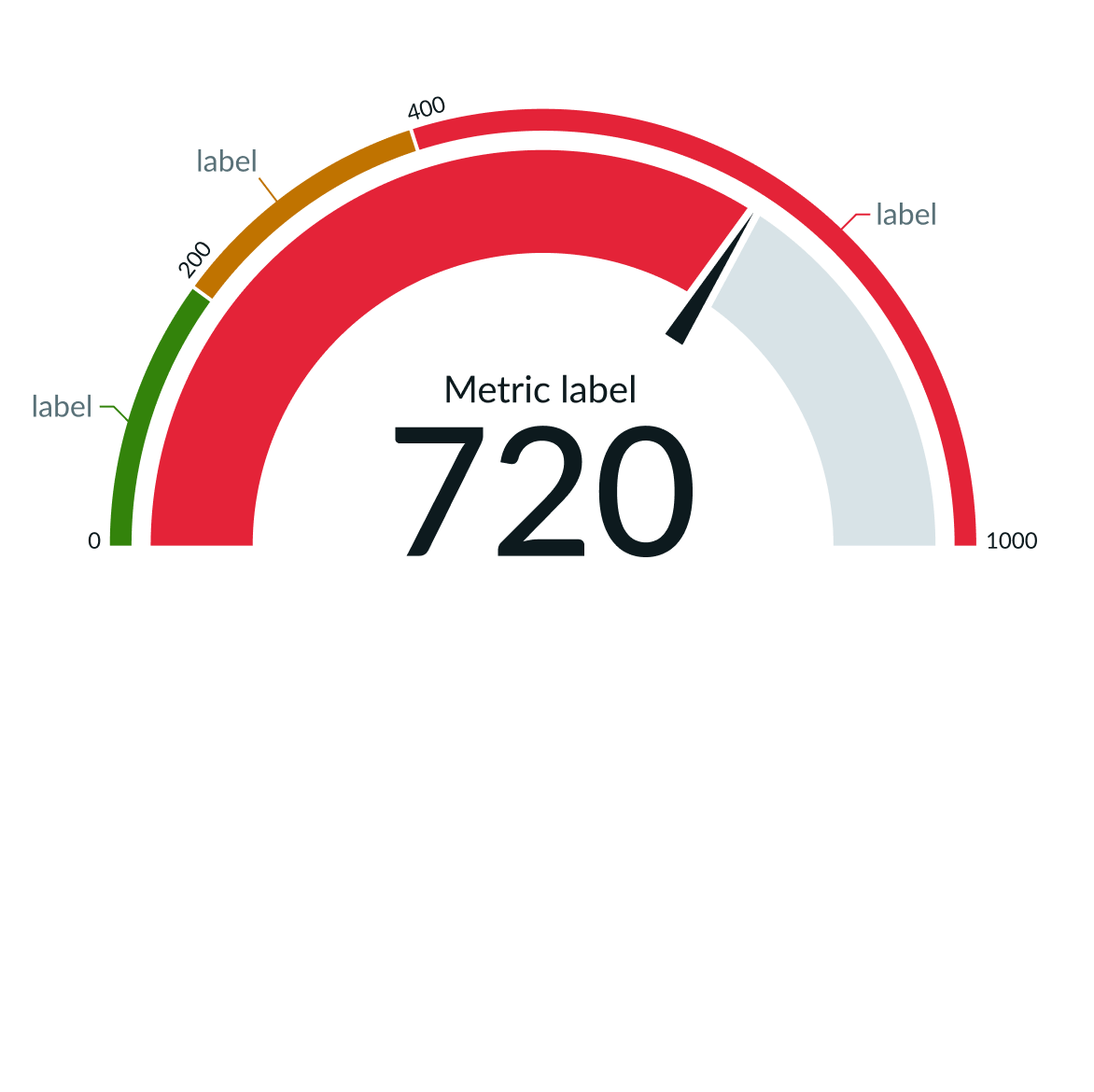
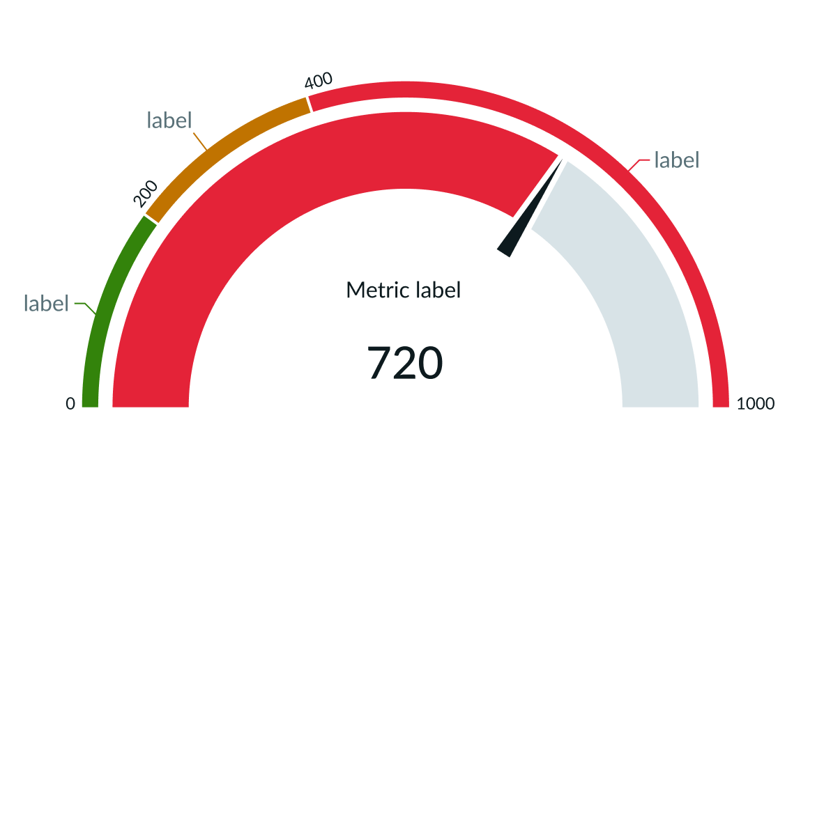
180 degree gauge chart
- Range limits: Max value of any given range segment; can be shown or hidden
- Range arc segment: Division of the arc that represents different values of the same metric; can be configured to show 1 to 5 segments
- Score/value arc: Graphical representation of the range score/value
- Score/value arc background: Graphical representation of full possible range
- Score value: Numerical representation of range score/value
- Metric label: Metric value of score or achievement value, such as poor, good, excellent
- Gauge needle: Range score/value position on arch; can be shown or hidden
- Range labels: Explanation of any given range segment; can be shown or hidden
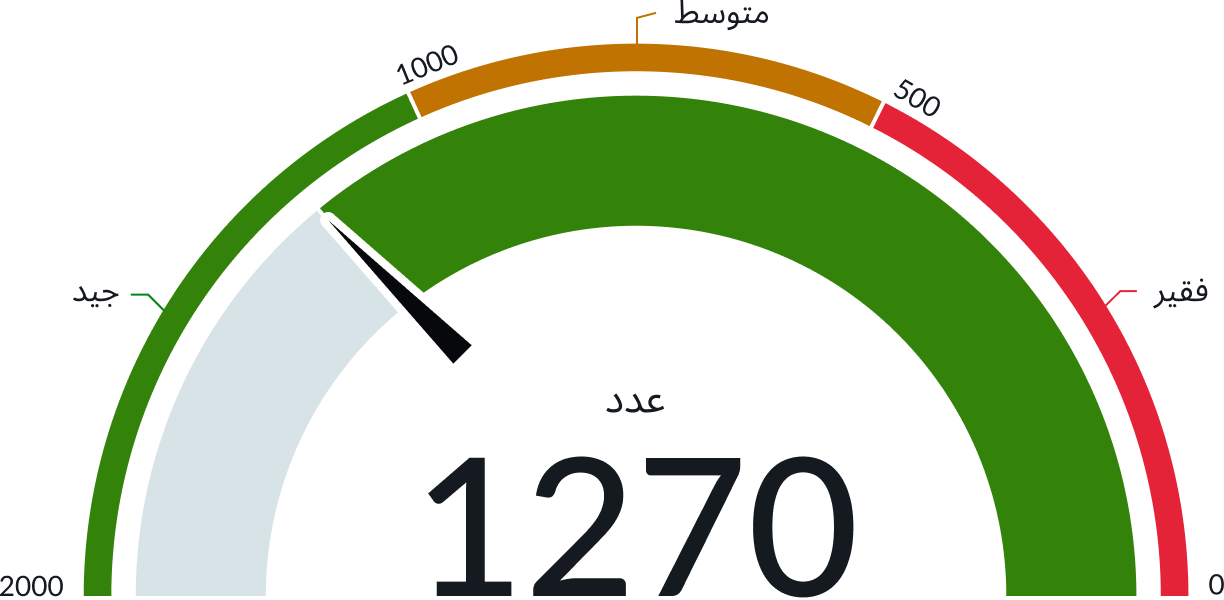
240 degree gauge chart
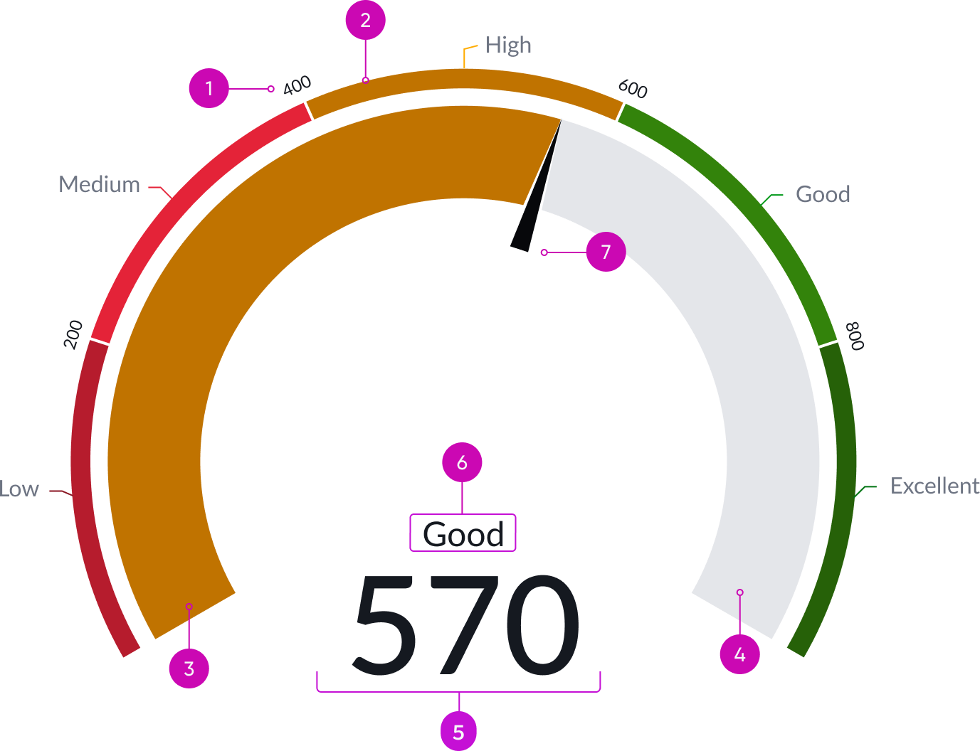
Anatomy of 240 deg Gauge
- Range limits: Max value of any given range segment; can be shown or hidden
- Range arc segment: Division of the arc that represents different values of the same metric; can be configured to show 1 to 5 segments
- Score/value arc: Graphical representation of the range score/value
- Score/value arc background: Graphical representation of full possible range
- Score value: Numerical representation of range score/value
- Metric label: Metric value of score or achievement value, such as poor, good, excellent
- Gauge needle: Range score/value position on arch; can be shown or hidden
- Range labels: Explanation of any given range segment; can be shown or hidden
Subcomponents
See the usage guidelines for button iconic
See the usage guidelines for heading
See the usage guidelines for text link
See the usage guidelines for loader
Usage
Gauge chart shows where a single value lies across a range from minimum to maximum expected values. Set colored data ranges to help users understand progress.
Configurations
Learn how to customize gauge chart by configuring the available properties.
Data Sources
You can select between 4 different data sources for your visualization: system data tables, preconfigured Performance Analytics indicators, Usage Insights, and Telemetry to visualize telemetry KPIs and trends from the Telemetry Data Connector (traces/metrics/logs). If you are changing your data source, the option list provides suggestions based on previous selections and items that match your search.
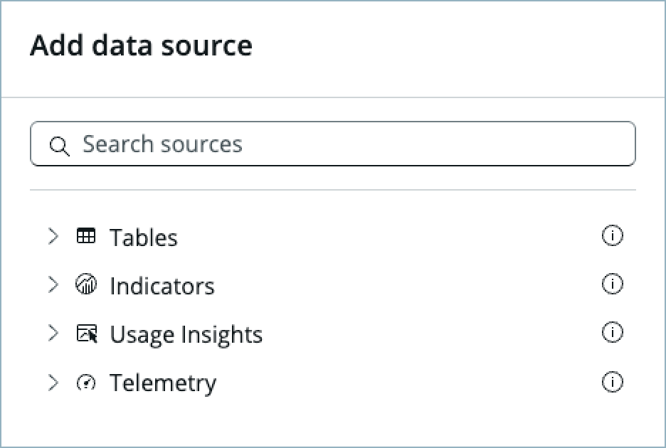
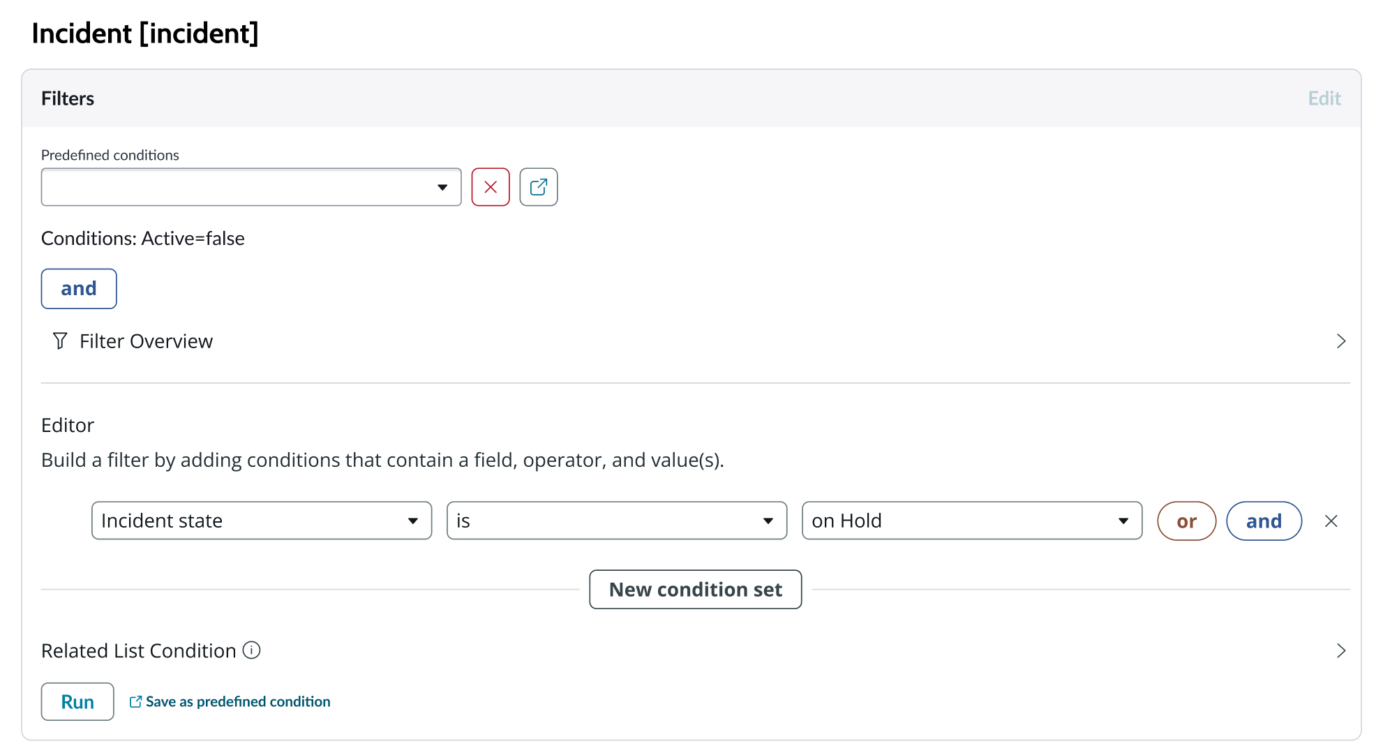
Tables
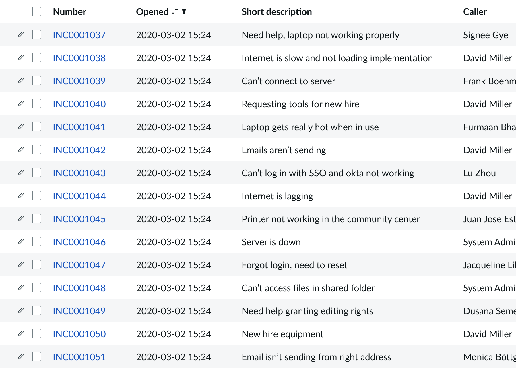
You can select any table from the system to use in your visualization and filter that data. When you apply a table as the data source, a preview list appears showing all available records in that table.
A condition builder above the list enables you to set filter conditions on the data before using it in your visualization. This is useful for limiting the data shown in the chart to only the data you need.
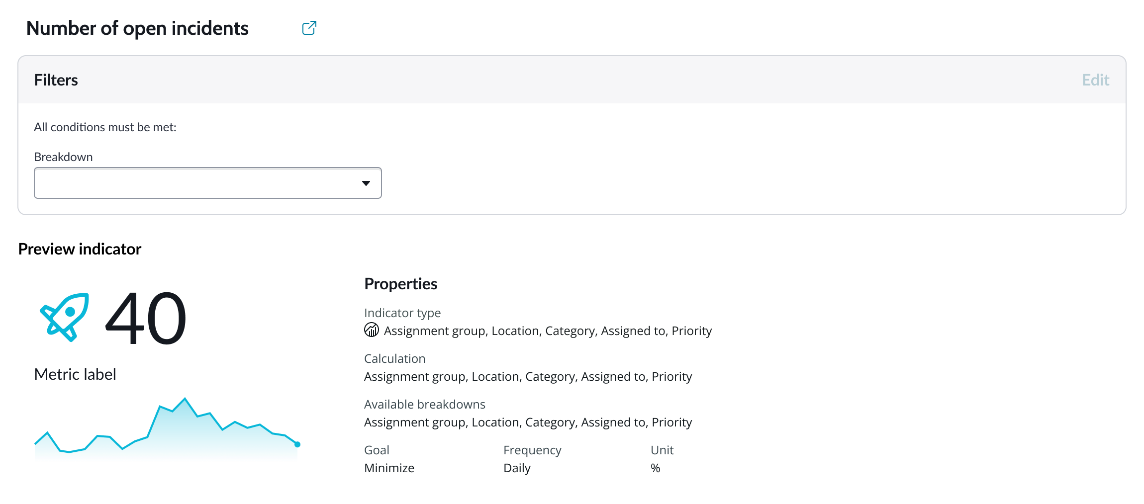
Indicators
Indicators are preconfigured business metrics that assess performance across attributes such as cost, quality, technical risk, investments, user satisfaction, and business value. Indicators are configured in the Performance Analytics application and reflect common measurements that users need. If breakdowns are defined for an indicator, you can apply filter conditions on those values.
Data snapshot indicators
Data snapshot type of indicators enable intraday collection and analysis, filtering by breakdown hierarchy, with the ability to report partial scores.
Key features:
- Move beyond daily snapshots: Collect and analyze data multiple times throughout the day (intraday) for granular insights.
- Breakdown hierarchy: Filter through hierarchical structures (department to team to individual) to pinpoint issues and identify trends at any level.
- Partial scores: Track progress toward goals mid-period in order to take corrective action early instead of waiting for periods to close.
- Deeper insights: Drill down through multiple dimensions to uncover hidden patterns.
- Simplified setup: Create fewer, more generalized indicators.
- Dynamic filtering: Apply breakdowns on-demand without preconfiguration.
- Reduced maintenance: Fewer indicators mean less ongoing work.
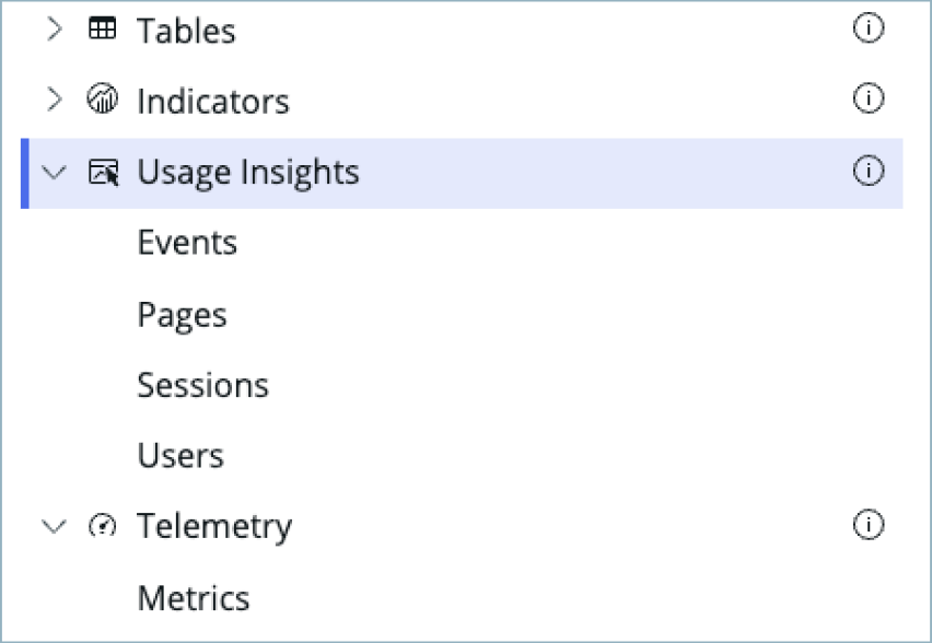
Usage Insights
Usage insights are the user experience analytics data points: events, page views, sessions, and users.
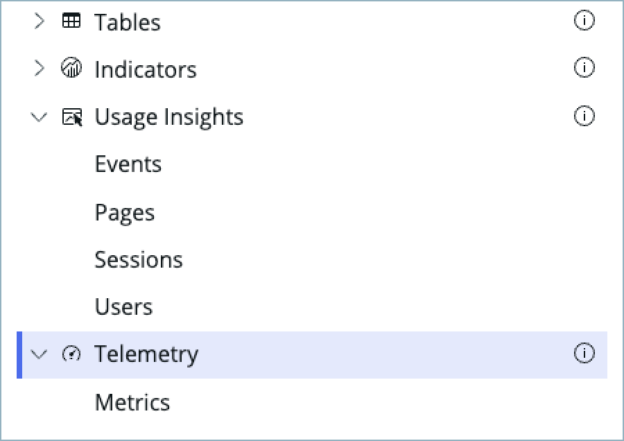
Telemetry
Use this data source to visualize telemetry KPIs and trends from the Telemetry Data Connector (traces/metrics/logs) in Platform Analytics.
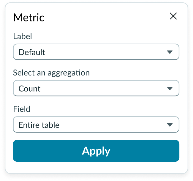
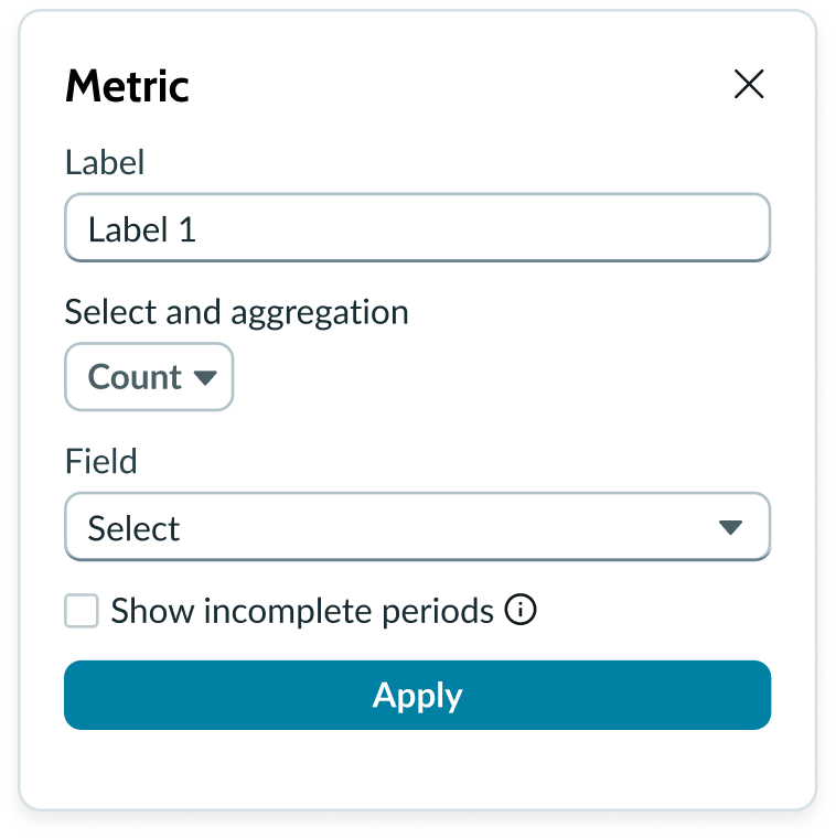
Metric selection
Select the specific data from the data source to display in the chart and the label that identifies it. Select an aggregation type from the dropdown list. You can select a specific field from the data source table to display in the chart. If you leave the field empty, all fields are used, depending on any filtering conditions you applied when you selected the data source.
Date range
You can use the “Apply date range” setting to apply a date range filter from filter component or manual configuration to the visualization.
Auto aggregation periods
For Data Snapshot Indicators, automatically picks the best aggregation period when a date filter is used. Affects only this visualization and does not change the indicator's default aggregation period. Clear the checkbox to always use the indicator's default period.
Show incomplete periods
For Data Snapshot indicators only. To provide users real time progress tracking, for each “Metric” you can select the “Show incomplete periods” setting to display scores for the current, incomplete period to track progress.
Data properties
Data properties selects and organizes the data you want your users to see from the source. Configuration options in UI Builder depend on whether you select table data or indicators. Some configurations for indicator data sources require that the indicator have breakdowns.
Header and border
The component header displays in the top left and contains the title and a description that appears when the user hovers over the information icon.
Visualization border
By default, a border around the chart. Unselect the “Show border” option to remove it.
Header separator
You can add a separator line between the header and the visualization. Disabled by default.
Chart title
By default, the chart title is blank, but you can add a title. When you add a title for your chart, you’re able to customize the color and make it wrap.
Header level
By default, text in the header is set to heading level 2 (H2). Heading levels H1 through H6 are also available.
Title alignment
By default, the title is aligned to the Start side. The start size can be the left or right depending on the language you use. Other options available from the dropdown are “Center” and “End”.
Title wrap
By default, long titles truncate with an ellipsis, and a tooltip showing the full title on hover, but you can set the title to wrap instead.
Title truncation
By default, the title text truncates at the end of the first line of text, but you can set the line of truncation to 2 or 3 lines instead. This option becomes available when the title truncates.
Refresh option
By default, refresh is available to the user in the “More options” menu, but you can hide it. This gives you more control over how refresh options are exposed on dashboards so you can align refresh behavior with your intended usage.
Header background color
By default, the color of the header background is neutral-0 (white). You can specify a different color (including a custom color) for the background.
Select a color for the visualization header background that aligns with your dashboard theme, branding, or design preferences. The color you choose applies only to the visualization header background.
For better accessibility, make sure a good color contrast exists between the header background and title text. The minimum contrast requirement for normal text is 4.5:1, and for large text is 3:1. To verify, check the contrast ratio in the color picker.
Note: Theming is not supported when you select a custom color.
Title color
By default, the title text is neutral-21 (black). You can specify a different color (including a custom color) for the title text.
You should select a color for the chart title that aligns with your dashboard theme, branding, or design preferences. The color you choose applies only to the chart title.
For better accessibility, make sure a good color contrast exists between the header background and title text. The minimum contrast requirement for normal text is 4.5:1, and for large text is 3:1. To verify, check the contrast ratio in the color picker.
Note: Theming is not supported when you select a custom color.
Data updates
You can configure your chart to update automatically in real time or on a defined refresh schedule.
Follow filters
When follow filters is enabled, the filter icon and the number of filters impacting the visualization display by default.
Filter icon
The filter icon and the number of filters impacting the visualization display by default. To hide them, unselect the “Show filter icon.”
Data drilldown
By default, a user can click anywhere on gauge chart, and drill down directly into the data. This enables users to view data such as records and record lists from data tables or KPI data from indicators. You can disable this by clicking the “Enable drilldown” toggle.
Refresh after being away
You can configure your chart to update automatically or on a defined refresh schedule.
Refresh requested
When the new value of this property is different from the previous one, you can trigger refresh by setting up a string that can be passed down.
Use data cache
You can cache user queries to shorten the load time for the data visualization. Unselected by default.
Info messages
Displays generic error messages by default.
Extended error messages
You can choose to show extended error messages which contain more details that can be helpful to admins. Unselected by default.
Custom no data message
By default, when a data source doesn’t return any info, the “no data available” message displays with generic content. However, you can set a custom message by changing the title, illustration, and message content.
Presentation
The presentation properties control the physical appearance of the chart. Use these properties to control how your users consume the data. Select the chevron icon to expand the section and display the properties in each category.
Display settings
You can use the following to modify the display of the data visualization.
Gauge arc angle
You can configure the gauge chart to be a “180 degree” or “240 degree” arc angle. “180 degree” is the default.
Value label size
You can change the chart label size from the default M (medium) to S (small) or L (large).
Inner radius
You can configure the ratio of the inner radius to the outer radius of the gauge chart using decimals. The default is 0.7 and the values can be from 0.7 to 0-.95.
Data table
You can use this setting to show a table with chart and graph data under the chart for easier screen reader access.
Ranges
You can configure the gauge chart minimum and maximum range values, or create custom ranges to apply to a gauge chart.
Minimum
You can configure the start value of the gauge scale. The default is 0 (zero).
Maximum
You can configure the end value of the gauge scale. If you don’t enter a “Max value,” it’s defined automatically. By default, the limit value of each range shows on the chart, but you can toggle this off.
Custom
You can configure up to 5 ranges.
Number
To configure the number of ranges for the gauge chart from 2 to 5.
Color scheme
You can configure the color direction. Choose from “Green to red,” “Red to green,” or define a custom color for each range.
Label
You can specify a custom label name for each range.
Less than or equal to value
You can assign the max value for each range. Note that the minimum possible value prefills for each subsequent range, but you can increase it. By default, the range limit value appears on the chart. You can toggle this off.
Labels
By default, labels don’t show for the score, but the label for the range limit does.
Score
Defines what should be shown in the secondary label above the score value. Default is none. You can change the “Score label” to show a metric label for total values, or a range label for ranges such as average.
Range limit
When you select “Range label”, by default the label appears as the primary below the secondary range value. This emphasizes the range label over the exact value of the score.
If you configure custom ranges, you can toggle the range limit labels on. The default is “None” and these labels don’t appear.
Design recommendations
Learn how to apply gauge chart in your design.

Use multiple range breakdowns
Don’t limit the range breakdown to one
Keep metric score and metric label readable sizes
Metric score and label size shouldn’t be too small and hard to read.
Behavior
Learn how gauge chart behaves when the display changes or a user interacts with the component.
Chart positioning
The gauge chart is always centered within the container and retains a fixed height/width ratio. The height and width of the chart is responsive to the data visualization container size.
Gauge chart can’t be manually adjusted.
Responsive behaviors
The gauge chart is responsive based on the width and height of the container
Interactions
When the enable drilldown property is active, users can select data points in a pivot table to open individual records. You can deactivate this property and use the UI Builder “Events” tab to set the redirctions on click to any other page.
Truncation
When text in gauge chart exceeds the width of the container or content area, the text truncates with an ellipsis, and a tooltip shows the full content on hover.
Usability
Gauge chart complies with all internationalization and accessibility requirements.
Internationalization
When this component is used in a platform configured for a right-to-left (RTL) language, all elements flip and the text aligns to the right.
Accessibility
Learn how to access the actionable elements of gauge chart through keyboard interactions and screen readers.
Keyboard interactions
Users can access the chart navigator with these keyboard keys:
- Tab: Moves focus forward from the whole chart area through any truncated labels
- Shift + tab: Moves focus backward from any truncated labels to the whole chart area
- Enter or space bar: Triggers an action associated with an interactive element when in focus, such as refreshing the data or triggering chevrons to open and close.
Screen readers
When you apply ARIA labels to a component, screen readers announce the controls and content of pivot table in the prescribed tab order.