

Anatomy
Stackable Side by Side Panel divided into two sections side-by-side (indicated by a dotted outline) to hold two components; the containers not visible by the user.

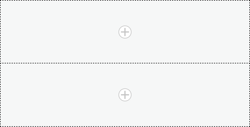
Stackable Side by Side Panel divided into two stackable sections (indicated by a dotted outline) to hold two components; the containers not visible by the user.
Usage
Use the Stackable side by side panel to organize and display two components side-by-side or stacked. One way you can use this component is to arrange two components side by side but when there’s not much space on the page, have them display stacked. For example, use the Stackable side by side panel to arrange the heading component on the left and a declarative action bar component on the right and set the minimum width. When the page is reduced to a size less than the minimum width and the action bar buttons can’t fit the display, the action bar component will move from side by side to stacked under the heading component.
Variants
Learn about the variants of Stackable side by side panel .
Sizes
A Stackable side by side panel takes up no space when it's empty. You set a minimum width that when exceeded it will show a side-by-side layout, and when not it will stack the components.
Configurations
Learn how to customize Stackable side by side panel by configuring the available properties.
Presets and controllers
This component has a preset configuration that sets properties and event handlers, making it ready for use. You can override preset values with a custom configuration if needed. Preset values won’t upgrade with updates. To avoid using presets, configure manually. One preset can apply to a single component instance. See presets for more info.
A preset is linked to a controller, which serves as a data resource. Controllers provide configuration data and event bindings for the component. Selecting a preset adds the required controller to the page, allowing new components to use its preset. For more on controllers, see controllers. For default presets, see view properties and events in the controller API.
Mode
You can config the initial display mode for the user’s first render, and the display mode to change based on the available space or stacked regardless of the available space.
Minimum width
The minimum width (in pixels) is required to display components side-by-side. If the available width on the page for the Stackable side by side panel is less than the minimum width you specify, the two components will display stacked. If the available space on the page is equal to or more than the minimum width, the two components will display side-by-side.
Height
You can specify whether you want the components to fill the entire available height of the container.
Usability
Stackable Side by Side Panel complies with all internationalization and accessibility requirements.
Internationalization
When the display translates to a right-to-left (RTL) language, the Stackable side by side panel components will switch positions (left becomes right and right becomes left). Each component used inside the Stackable side by side panel responds in accordance with its individual internationalization requirements.