

Anatomy
Learn about the individual parts of flyout menu.
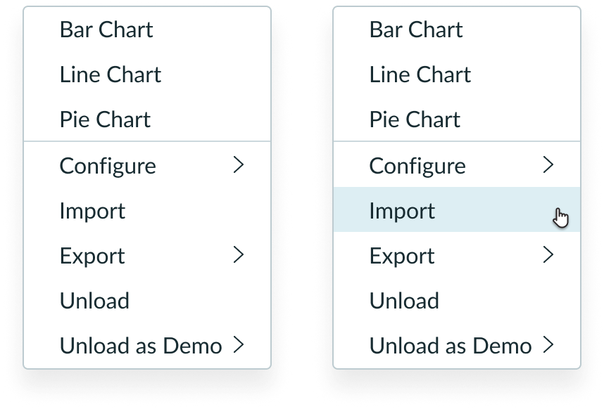
List item
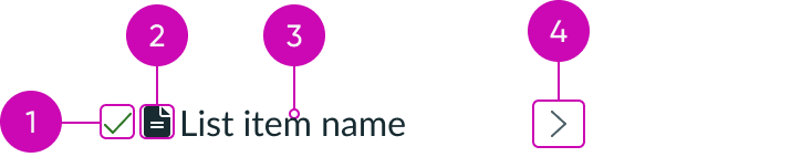
- Selected state icon: Appears to the left of the option label when a user selects an option from a multiple-select list or a single-select list
- Icon (optional): Can be used in a list item to further illustrate the context and help distinguish between list items
- Label: Describes the item or action
- Nested menu indicator: Indicates that another menu is nested within this list item
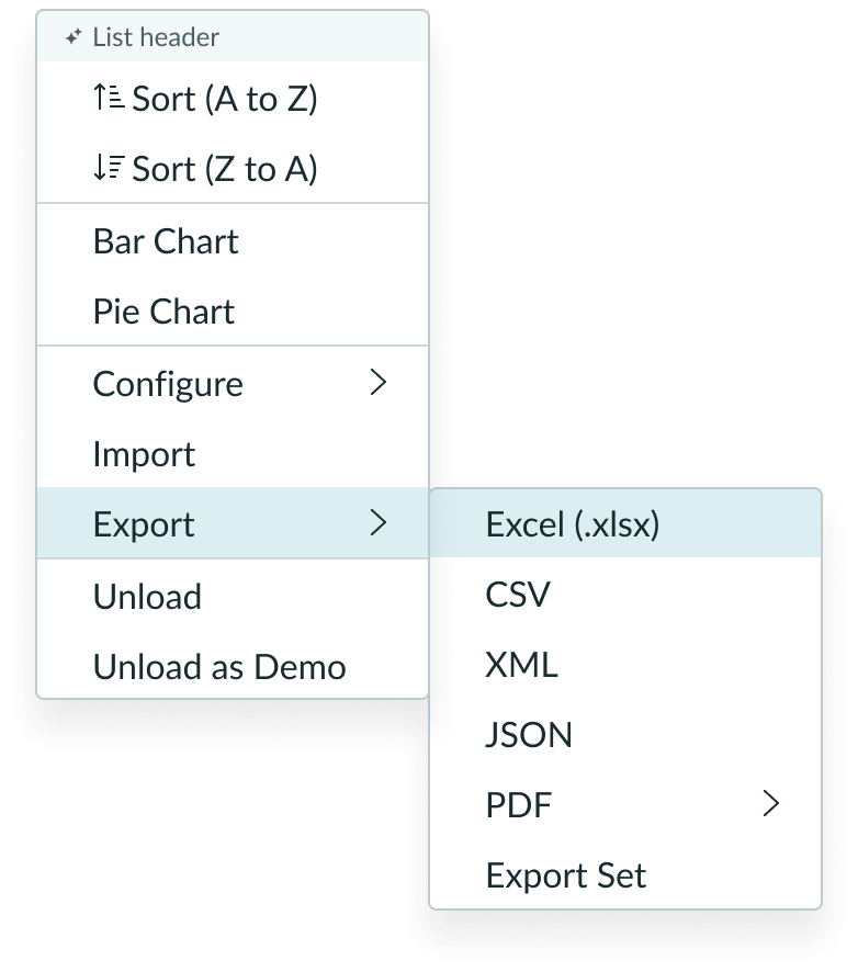
Nested menu
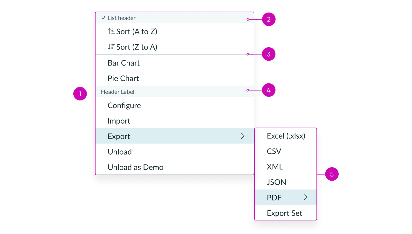
- Parent menu: The top hierarchical menu
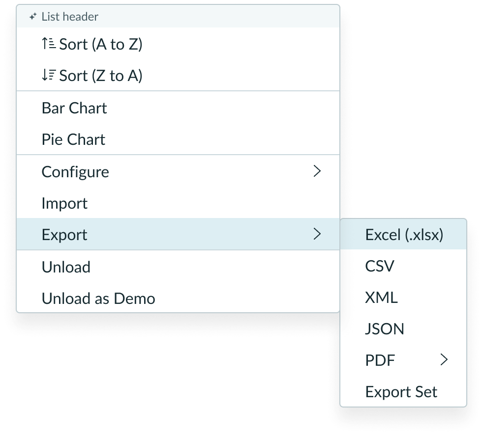
- List header (optional): Provides information about the entire panel and can only be applied at the highest level; icon can be configured
- Divider line (optional): A way to group visually related items in the panel container
- Header (optional): Visually groups categories of options or actions; if a header or headers are used, then all options or actions should be placed in a header group
- Nested menu/Child menu: A child menu triggered from a parent list-item
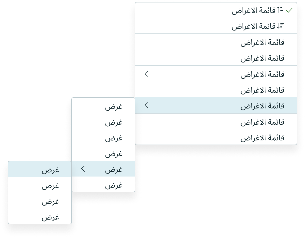
Nested menu (reflow)
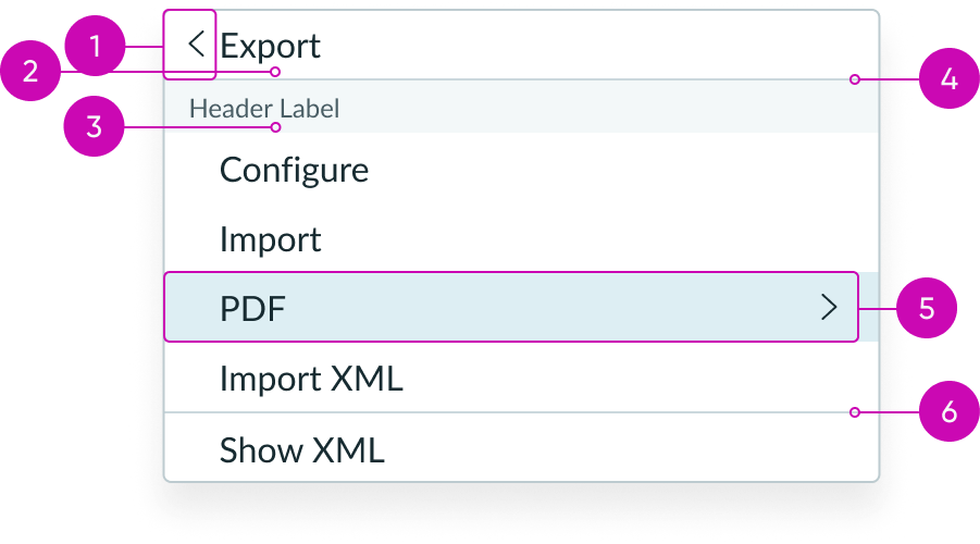
- Parent menu navigation icon: Used to go up a level in the hierarchy; only present in nested menus; never at the top level
- Parent menu label: Label for parent list-item
- Header (optional): Visually groups categories of options or actions; if a header or headers are used, then all options or actions should be placed in a header group
- Navigation divider line: Separates parent label from list-item content
- Nested menu list-item: Contains another nested menu
- Divider line (optional): A way to group visually related items in the panel container
Subcomponent
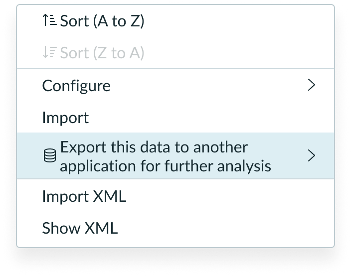
See the usage guidelines for dropdown list.
Usage
Flyout menu lets users interact with multiple levels of actions or options without leaving their current context. Users can navigate through various menus within the hierarchy and interact with list-items to make a selection, perform an action, or proceed further into nested menus.
Variants
Learn about the variants of flyout menu.
Sizes
Flyout menu is available in the following sizes: small (sm), and medium (md). Both the icon and font sizes are affected.
Small

Medium

Configurations
Select
To determine what happens when the user selects a dropdown list item, you can set this property to “single,” “multi,” “none,” or “nested.”
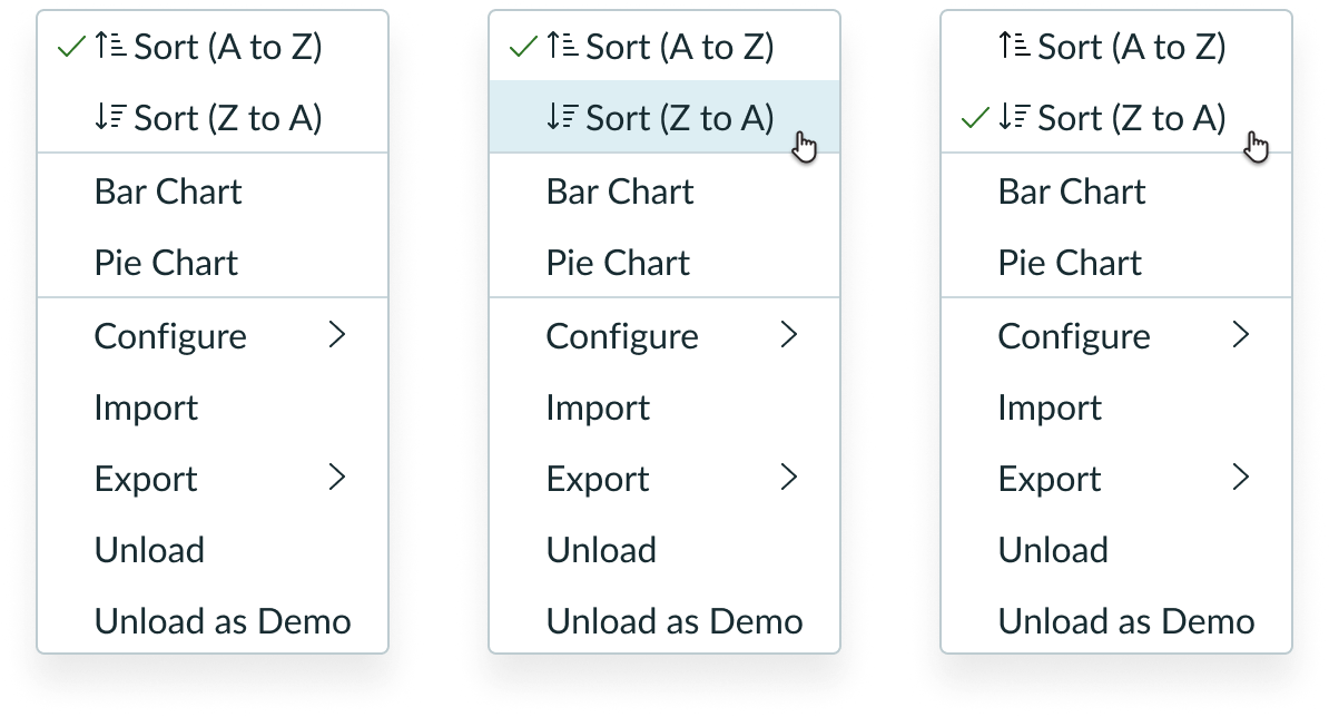
Single
The user can display a selection of a list-item, indicated by a selected state icon.
In this example, the first list-item is selected. If the user selects a different list-item, the selection moves to the newly-selected list-item.
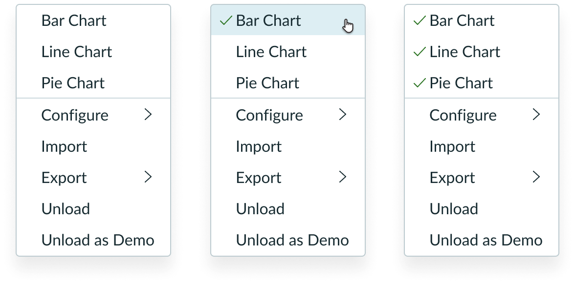
Multi
The user can display a selection of multiple list-items.
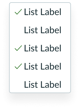
In this example, multiple list-items are selected. They act like toggles; selecting an already-selected item will unselect it.
None
The user can select a list-item without visual indication.
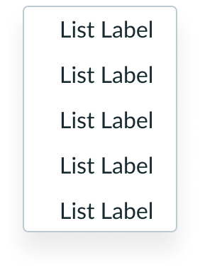
As this configuration is primarily used for actions, no selection appears, and the menu closes.
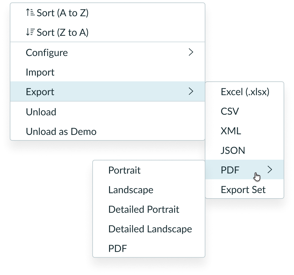
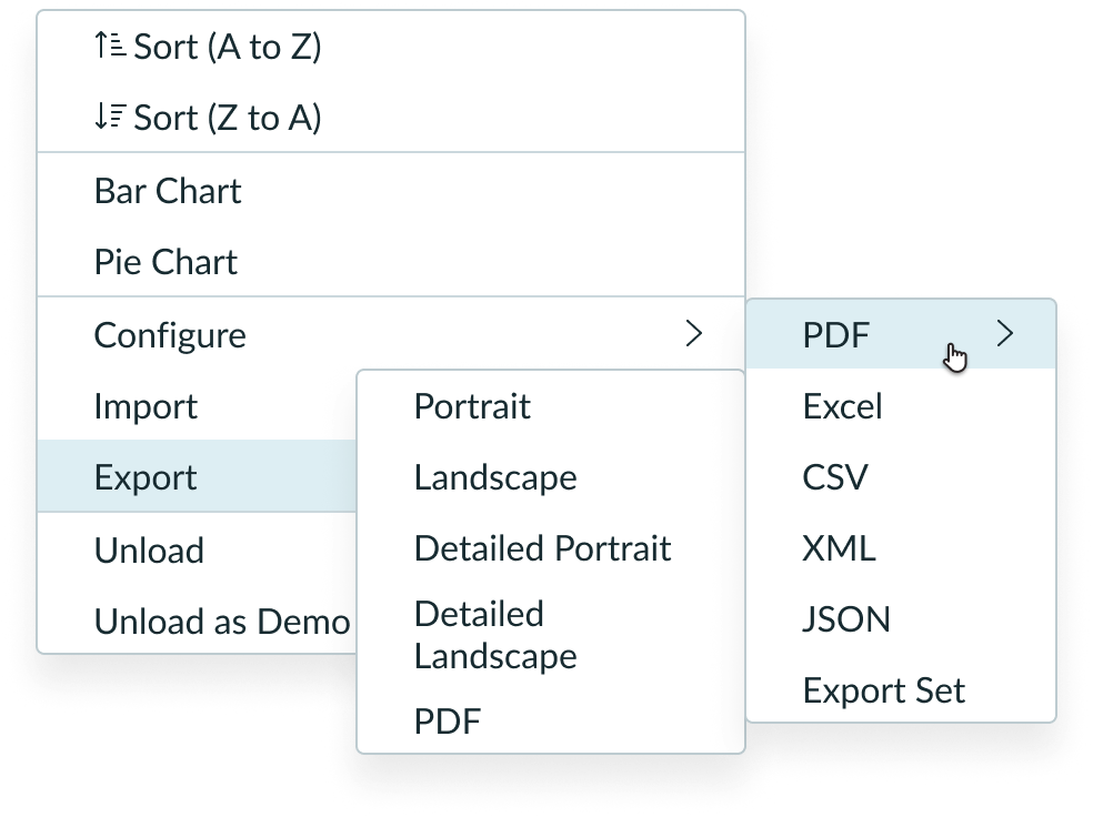
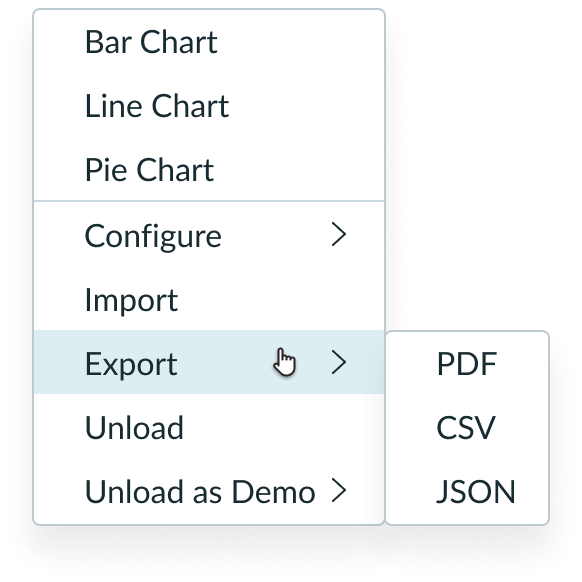
Nested
Contains an additional nested menu.
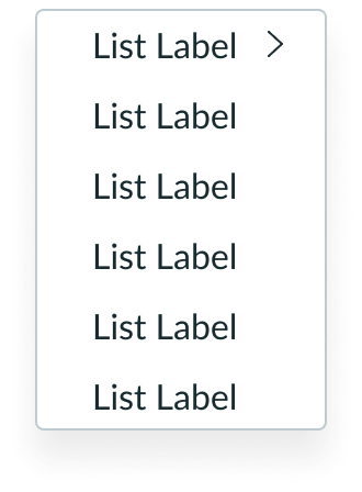
Selecting the list-item with a chevron icon opens a nested child menu.
Size
The default size for flyout menu is medium (md), but you can change the size to small (sm).
Behavior
Learn how flyout menu behaves when the display changes or a user interacts with the component.
States
Flyout menu has the following states: default, hover, selected, and disabled.
| State | Example |
|---|---|
| Default |  |
| Hover |  |
| Selected |  |
| Disabled |  |
Responsive behaviors
Learn how flyout menu responds to changes in a container or display.
Dynamic height and width
By default, the height and width of flyout menu adjust to fit the content. You can define maximum sizes for both height and width. If a maximum width is set, it’s applied to all nested child menus.
In this example, the width is set to fit to content.
In this example, the max width is set to 180px and is applied to the nested child menu.
Text wrapping
When a label is longer than a single line, it wraps to the next line. The icon and nested menu indicator are vertically centered within the list-item.
Scrolling
When the number of list-items exceeds the dropdown panel height, the list-items scroll within the panel at the defined max height.
Nested menu positioning
By default, nested menus appear to the right of their parent menu.
When a nested menu is unable to fit to the right of the parent menu due to a viewport boundary, it follows best fit options.
In this example, a viewport boundary to the right of the flyout menu prevents the second nested menu from appearing to the right of its parent menu.
When a nested menu is unable to fit due to viewport boundaries, it begins to overlap with existing parent menus.
In this example, viewport boundaries to the right of and below the flyout menu cause the second nested menu to overlap with a parent menu.
Interactions
Learn how flyout menu responds when a user interacts with it.
Single
Selecting an item in the list displays a selection. Selecting another item in the list removes the selection from the previous item and displays it with the new item. The selection isn’t removed when a user selects the item again. When a selection is made, the menu closes.
Multi
Selecting an item displays a selection on multiple list items. Selecting an already selected item unselects it, behaving like a toggle. The menu remains open upon selections.
None
Selecting an item performs an action and closes the menu. No selection appears.
Nested
When hovering over a nested menu item, a child menu opens to the right of it. By default, it is top-aligned, but if there isn’t enough space, it follows fit behavior rules.
Usability
Flyout menu complies with all internationalization and accessibility requirements.
Internationalization
When the display translates to a right-to-left (RTL) language, the nested menu appears to the left of the parent menu. The chevron icon is flipped to use chevron-left.
Accessibility
Learn how to access the actionable elements of flyout menu through keyboard interactions and screen readers.
Keyboard interactions
- Enter or Space: Triggers an action associated with the row with focus
- Arrow up or Arrow down: Moves focus up and down the menu
- Arrow right: If focus is on a nested menu item, opens nested menu and focuses on first item
- Arrow left: Closes a submenu, places focus back on the submenu trigger
- Escape key: Closes entire menu