

Anatomy
Learn about the individual parts of box plot.
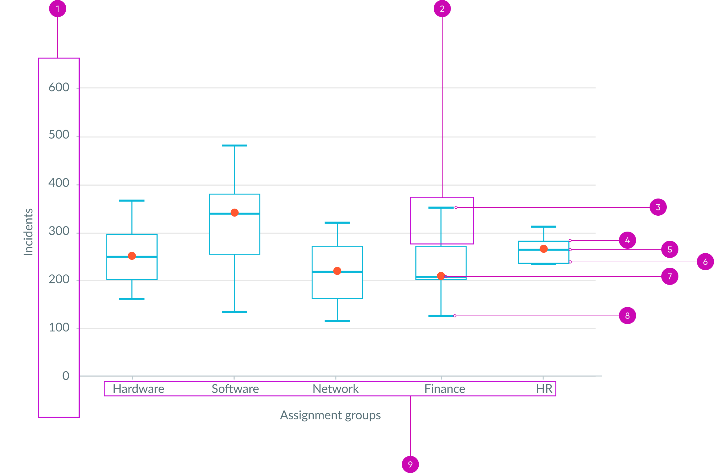
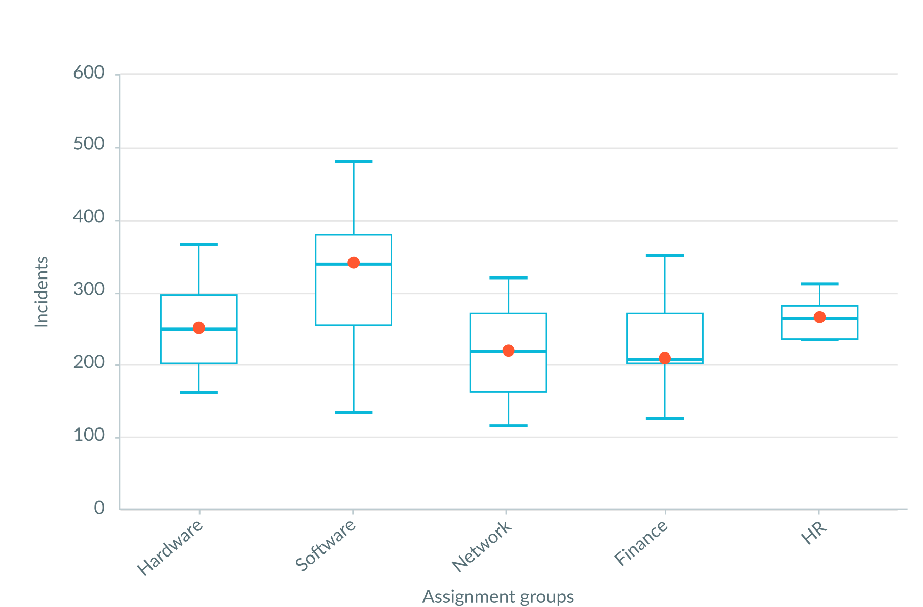
- Y-axis labels: Incremental values for y-axis
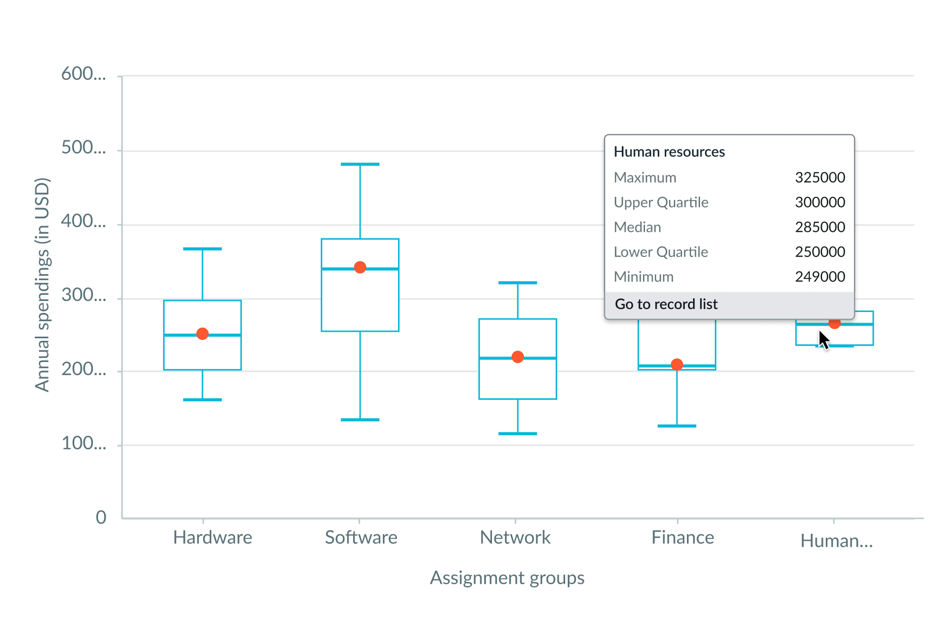
- Whisker: Upper whisker is the top 25 percent and the boundary is the maximum value of the dataset; lower whisker is the bottom 25 percent and the minimum value of the dataset
- Maximum: Largest y-axis value
- Upper quartile: Q3/75th percentile; middle value between the median and the highest value (not the “Maximum”) of the dataset
- Median: 50th percentile; the middle value of the data set
- Lower quartile: Q1/25th percentile; middle number between the smallest number (not the “Minimum”) and the median of the dataset
- Mean: Average value of the dataset
- Minimum: Smallest value of the dataset
- X-axis labels: Text values for x-axis
Usage
Box plot provides a simple format to summarize and analyze large datasets. It particularly excels at comparing data distributions across different groups. Instead of displaying the raw data points, box plot uses boxes and lines to represent data values, based on quartiles. This compact, visual summary of data enables you to easily compare group distributional properties and discover useful data insights.
Because these measures don't make assumptions about data distribution, box plots are especially suitable for the early stages of analysis. Box plot works best when you have at least 20 data points per group. It analyzes the datasets you provide to determine the distribution shape, spread, and central tendency. It creates and displays this analysis using 5 key values: Minimum, lower quartile, median, upper quartile, and maximum.
Use box plot to discover and leverage data insights from multiple, related datasets. For example, use a box plot chart to analyze the age range of all customers who attended a convention and determine the age groups with the fewest attendees. Then, target marketing campaigns to these age groups to potentially increase ticket sales.
Reading a box plot
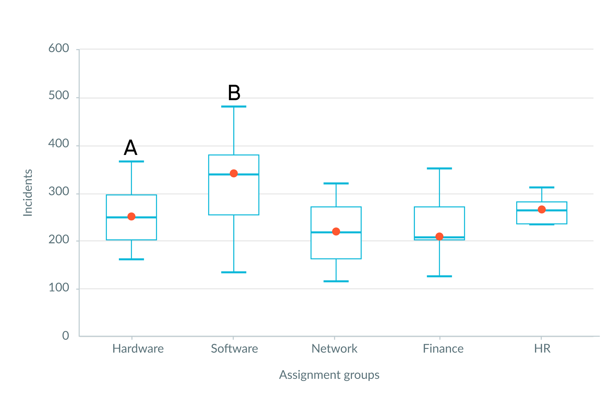
Learn how to interpret a box plot. For example, a wide box (IQR) indicates greater variability in the middle 50% of the data. Long whiskers suggest a wide range of data outside the middle 50%.
Central tendency
Users can compare central tendencies by using the median line and the overall vertical placement of the boxes. In the chart below, group B has a higher median line than group A. Group B’s entire distribution is shifted upwards relative to group A.
Variability
To assess variability in a box plot, note that half of the data in the example box plot above falls within the interquartile box. The longer the box and whiskers, the greater the variability of the distribution. The total length of the whiskers represents the range of the data. In the box plot above, group A has longer box and whiskers than group B. Group A has more variability than group B.
Skewness
You have a symmetrical distribution when the box centers approximately on the median line, and the upper and lower whiskers are about equal length. If the two sides are not roughly equivalent, your distribution is skewed. To determine whether a distribution is skewed, look at where the median line falls within the box and whiskers. If the mean is higher than the median, as in A above, the data is positively skewed.
If the two sides are not roughly equivalent, your distribution is skewed as in group A and B.
Configurations
Learn how to customize box plot by configuring the available properties.
Data source
You can select between different data sources for your visualization: system data tables and preconfigured Performance Analytics indicators. If you are changing your data source, the option list provides suggestions based on previous selections and items that match your search.
Tables
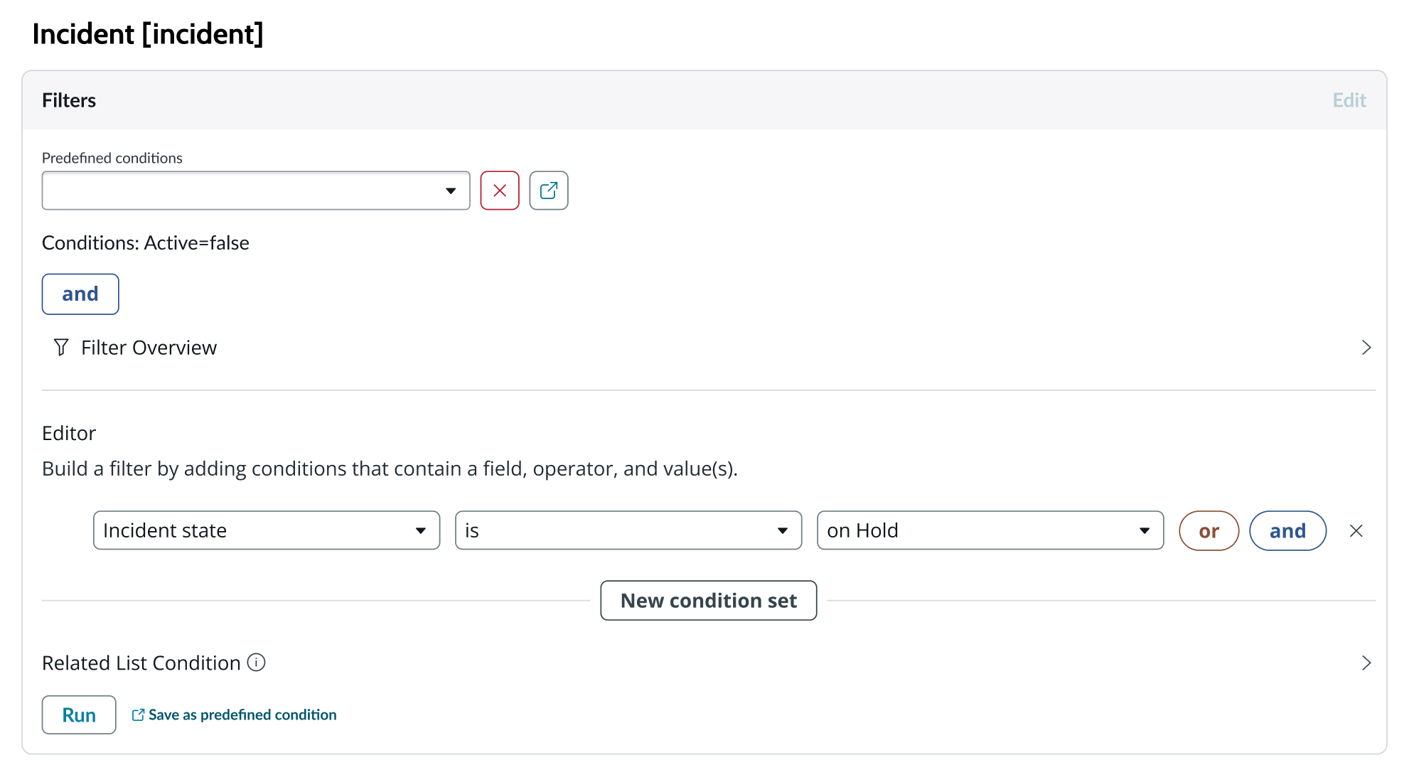
You can select any table from the system to use in your visualization and filter that data. When you apply a table as the data source, a preview list appears showing all available records in that table.
A condition builder above the list enables you to set filter conditions on the data before using it in your visualization. This is useful for limiting the data shown in the chart to only the data you need.
Data properties
Use the data properties to select and organize the data you want your users to see from the source. Select the chevron icon to expand a section and display the properties in each category.
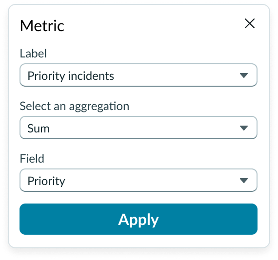
Metric selection
Select the specific data from the data source to display in the box plot and the label that identifies it. The default aggregation used is Count. You can select a specific field from the data source table to display. If you leave the field empty, all fields are used, depending on any filtering conditions you applied when you selected the data source.
Dimensions
For box plot charts, you can add a title to the x- and y-axis, hide the y-axis, and hide the background grid.
X axis and Y axis
For the x axis (vertical) and y axis (horizontal), default measurements are based on the data source(s) you choose. You can select a different x and y axis measurement from the dropdowns that display options related to the data source.
Grouping
To build the box plot, specify how you want the data broken down and grouped, and what field to use as a measurement for the data.
The grouping happens as the box plot is built.
Header and border
The component header displays in the top left and contains the title and a description that appears when the user hovers over the information icon. You can create the header and then show or hide it with the controls provided. By default, the header is configured to show, but the content is empty.
Header separator
You can add a separator line between the header and the visualization. Disabled by default.
Chart title
By default, the chart title is blank, but you can add a title. When you add a title for your chart, you’re able to customize the color and make it wrap.
Header level
By default, text in the header is set to heading level 2 (H2). Heading levels H1 through H6 are also available from the dropdown.
Title alignment
By default, the title is aligned to the Start side. The start size can be the left or right depending on the language you use. Other options available from the dropdown are “Center” and “End”.
Title wrap
By default, long titles truncate with an ellipsis, and a tooltip showing the full title on hover, but you can set the title to wrap instead.
Title truncation
By default, the title text truncates at the end of the first line of text, but you can set the line of truncation to 2 or 3 lines instead. This option becomes available when the title truncates.
Visualization border
By default, a border around the chart. Unselect the “Show border” option to remove it.
Refresh option
By default, refresh is available to the user in the “More options” menu, but you can hide it. This gives you more control over how refresh options are exposed on dashboards so you can align refresh behavior with your intended usage.
Header background color
By default, the color of the header background is neutral-0 (white). You can specify a different color (including a custom color) for the background.
Select a color for the visualization header background that aligns with your dashboard theme, branding, or design preferences. The color you choose applies only to the visualization header background.
For better accessibility, make sure a good color contrast exists between the header background and title text. The minimum contrast requirement for normal text is 4.5:1, and for large text is 3:1. To verify, check the contrast ratio in the color picker.
Note: Theming is not supported when you select a custom color.
Title color
By default, the title text is neutral-21 (black). You can specify a different color (including a custom color) for the title text.
You should select a color for the chart title that aligns with your dashboard theme, branding, or design preferences. The color you choose applies only to the chart title.
For better accessibility, make sure a good color contrast exists between the header background and title text. The minimum contrast requirement for normal text is 4.5:1, and for large text is 3:1. To verify, check the contrast ratio in the color picker.
Note: Theming is not supported when you select a custom color.
Data update
By default, users can add individual chart filters, and use the filters set on that workspace page. You can also configure your chart to update automatically in real time or on a defined refresh schedule.
Follow filters
By default, any filters set on the workspace page and those set on the data source are applied. You can use the “Follow filters” property to prevent any filter input from the workspace page.
Filter icon
The filter icon and the number of filters impacting the visualization display by default. To hide them, unselect the “Show filter icon.”
Drill down
By default, users can drill down into data or launch a URL directly from a chart by selecting data points, slices, categories, or scores. This lets users view data such as records and record lists from data tables or KPI data from indicators or go to a URL that you specify.
Refresh after being away
You can configure your chart to update automatically or on a defined refresh schedule.
Refresh requested
When the new value of this property is different from the previous one, you can trigger refresh by setting up a string that can be passed down.
Use data cache
You can cache user queries to shorten the load time for the data visualization. Unselected by default.
Info messages
Displays generic error messages by default.
Extended error messages
You can choose to show extended error messages which contain more details that can be helpful to admins. Unselected by default.
Custom no data message
By default, when a data source doesn’t return any info, the “no data available” message displays with generic content. However, you can set a custom message by changing the title, illustration, and message content.
Presentation properties
The presentation properties control the physical appearance of the chart. Use these properties to control how your users consume the data. Select the chevron icon to expand the section and display the properties in each category.
Axes
For box plot charts, you can add a title to the x- and y-axis, hide the y-axis, and hide the background grid.
Y axis
For the y-axes (horizontal), you can specify a value range that can accommodate the values you expect from your data. The default range is dynamic, meaning that the range increases or decreases automatically to accommodate the range of data displayed in the chart. Enter a negative value for the bottom of the range to display any negative values from the data source selected.
By default, the y-axis information appears on the left side of the chart. You can change it to the right side, and choose a variation of the y-axis style.
X axis data labels
For the x-axes (vertical), you can have long labels wrap and you can adjust the size of the labels, which are 100 pixels by default. 100 pixels is the maximum and 0 is the minimum.
Colors
You can change the box plot element line color by choosing a color from the color picker.
Behavior
Learn how box plot behaves when the display changes or a user interacts with the component.
Responsive behaviors
Learn how box plot responds when the container size shrinks.
Label rotation
The x-axis labels rotate to fit when the container shrinks, regardless of whether you set the labels to wrap.
Truncation
When text in box plot exceeds the width of the container or content area, the text truncates with an ellipsis. The full content appears in a data tooltip on hover over each chart element.
X axis labels truncated
Y axis labels truncated
Interactions
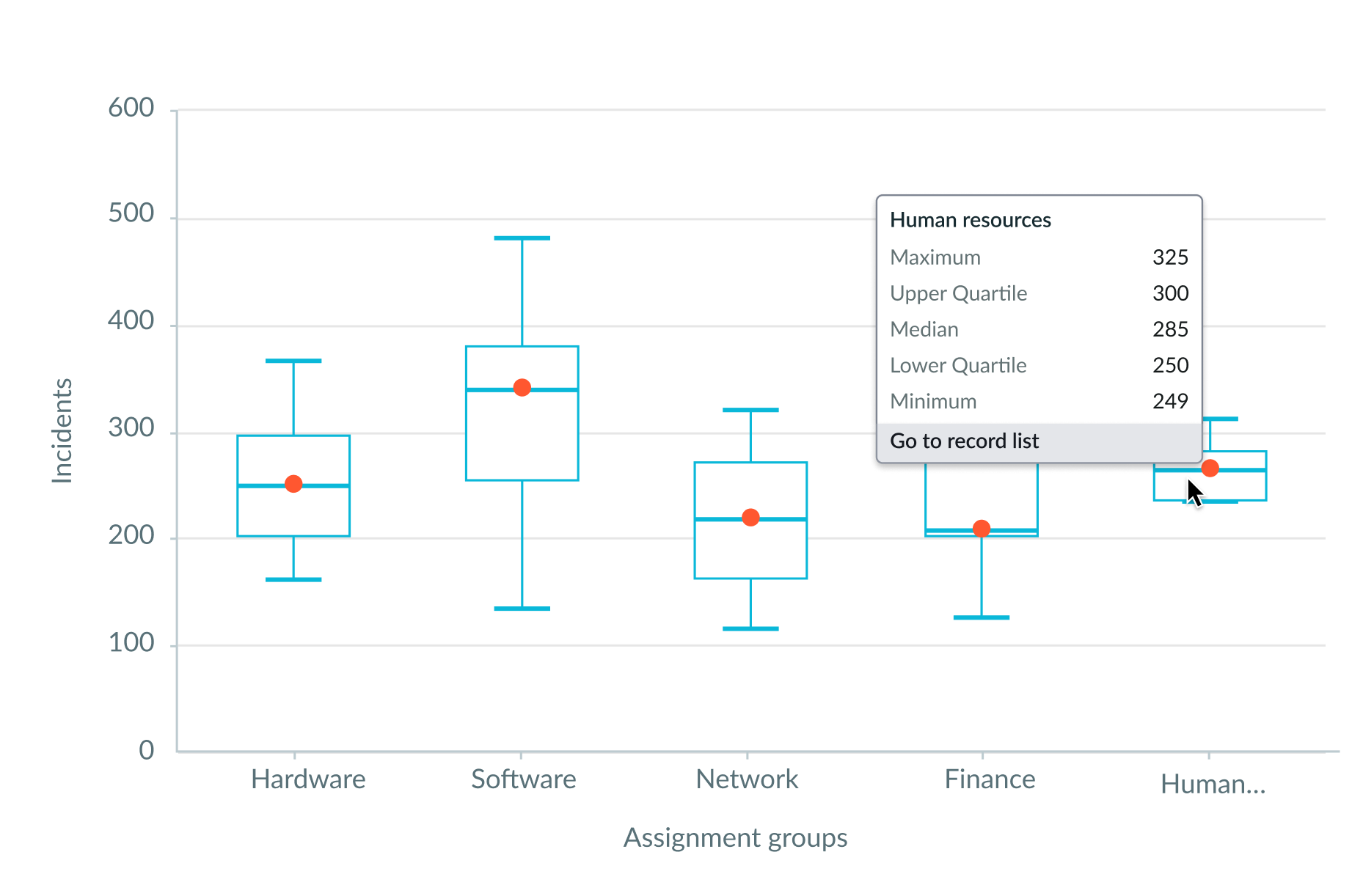
When data drill down is enabled, users can open records directly from a box plot chart by clicking on a chart element.
Usability
Box plot complies with the keyboard interaction and screen reader accessibility requirements.
Internationalization
Box plot doesn't change for right-to-left (RTL) languages.
Accessibility
Learn how to access the actionable elements of box plot through keyboard interactions and screen readers.
Box plot tab order
This is the high-level tab order for box plot.
Keyboard interactions
You can access the actionable elements of box plot with these keyboard keys:
- Tab: Moves focus to the More options (vertical ellipsis), then to the first element in the graph
- Arrow right: Moves focus to the next element
- Arrow left: Moved focus to the previous element
- Enter/return: Triggers element action
When the focus is on an element:
- Arrow up: Moves focus to the mean dot in the element.
- Arrow right: Moves focus to the next element mean dot
- Arrow left: Moves focus to the previous element mean dot
Screen readers
When you apply ARIA labels to a component, screen readers announce the controls and content of