

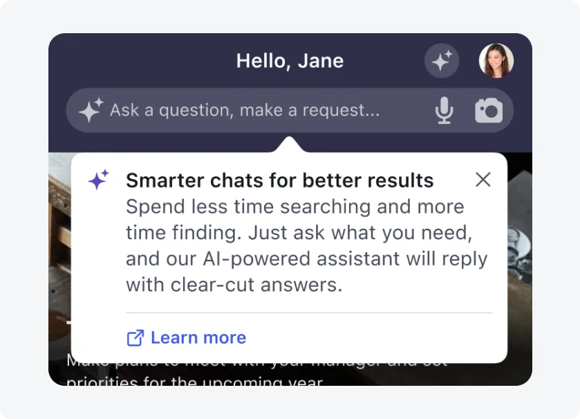
iOS
Android
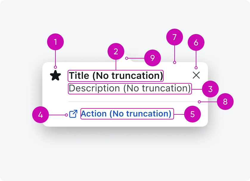
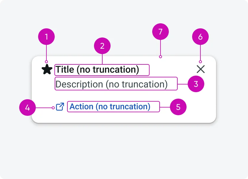
- Icon (optional): Visual cue that reinforces the message and helps users quickly understand the purpose of the tooltip
- Title: Short, scannable headline that clearly states the tooltip’s main point or value
- Description (optional): Supporting text that provides additional context or explains how or why to use the feature.
- Icon button (optional): An optional action represented by an icon that lets users quickly act or learn more without reading extended text.
- Text button (optional): A clear, tappable call to action that guides the user to the next step or deeper interaction.
- Close button: Allows users to dismiss the tooltip when they’re done or not interested.
- Container: Visual surface that groups all tooltip content and separates it from the underlying UI.
- Separator (iOS only): Divider that visually distinguishes content from actions within the tooltip.
- Tip (iOS only): Directional pointer that anchors the tooltip to the UI element it’s describing.
Configurations
Tooltips are highly configurable to support different use cases and content needs. Most elements are optional and can be included as needed. Only core structural elements are required to ensure clarity and usability.
- Required: Title, Close button, Container
- Platform-specific required (iOS): Tip
- Conditional: Separator (appears only when an action is present)
- Optional: Icon, Description, Icon button, Text button
This flexibility allows the tooltip to scale from lightweight hints to more action-oriented guidance without changing the core component.
Design recommendations
Make tips short, actionable, and engaging
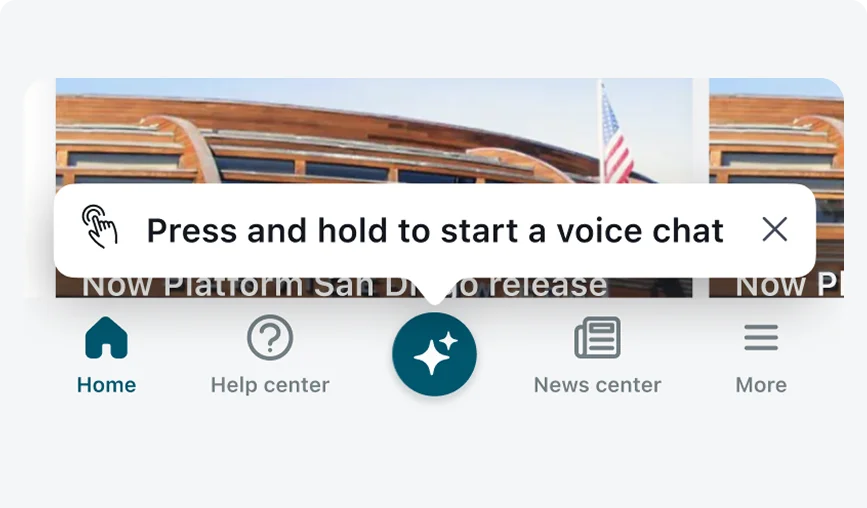
Use clear, action-oriented language and limit tips to one or two sentences to help users understand the feature and take action.
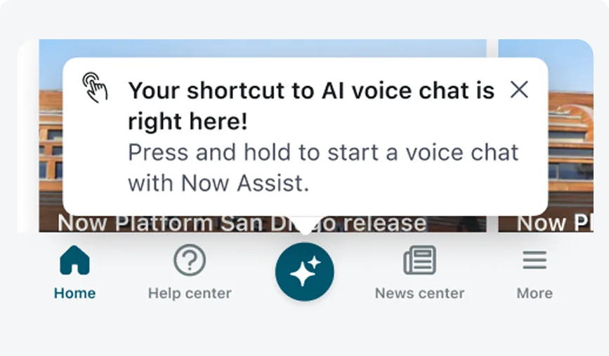
Avoid lengthy tooltips and content that is promotional or unrelated to the current task or user flow. Promotional content includes messaging that advertises, sells, or is not aligned with the user’s current context.
Set clear rules for tooltip display
Do
Display only one tooltip at a time and define eligibility rules so tips reach users who are likely to benefit. Use parameter- or event-based conditions and set a reasonable cadence, such as showing a tip at most once every 24 hours.
Don't
Avoid showing multiple tooltips simultaneously or to users who already know the feature, and don’t trigger tips without clear relevance or rules.
Alignment and positioning
On iOS, the tooltip’s tip points directly to the target UI element. Tooltips should never cover the target UI element.
On Android, tooltips default to the bottom-right of the target UI element and adjust dynamically in 8 dp increments to stay on screen. Tooltips should never cover the target UI element.