Anatomy
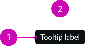
- Container: A designated area that contains the label
- Label: Text that identifies an element; the label text should be text only and not use any other interactive element
Subcomponents
See usage guidance for iconic button
Usage
Use a tooltip to label iconic buttons.
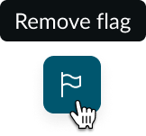
You can also use a tooltip to provide the user with additional context.
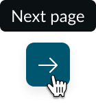
However, don't use tooltips to communicate critical information (e.g., error messages) or to display actions to the user (e.g., links or buttons). This hides information from the user instead of making it easily accessible or viewable.
Also be cautious about using too many tooltips because they can create a confusing user experience.
Variants
Learn about the variants of tooltip.
Types
Learn about the different types for tooltip.
Standard tooltip
This type only accommodates a single line of text. Use a standard tooltip to signify the purpose of an element or to label an iconic button.

Multi-line tooltip
This type can accommodate multiple lines of text. Use a multi-line tooltip to provide an explanation or to clarify an element. Multi-line tooltips wrap once the text reaches the max width of the container.

Configurations
Learn how to customize tooltip by configuring the available properties.
Content
You can configure the text that displays within the tooltip.
Delay
You can set the tooltip time delay in milliseconds. This is the time between when a user interacts with the target element and the tooltip appears or disappears. The default time is 300ms.
Design recommendations
Learn how to apply tooltip in your design.
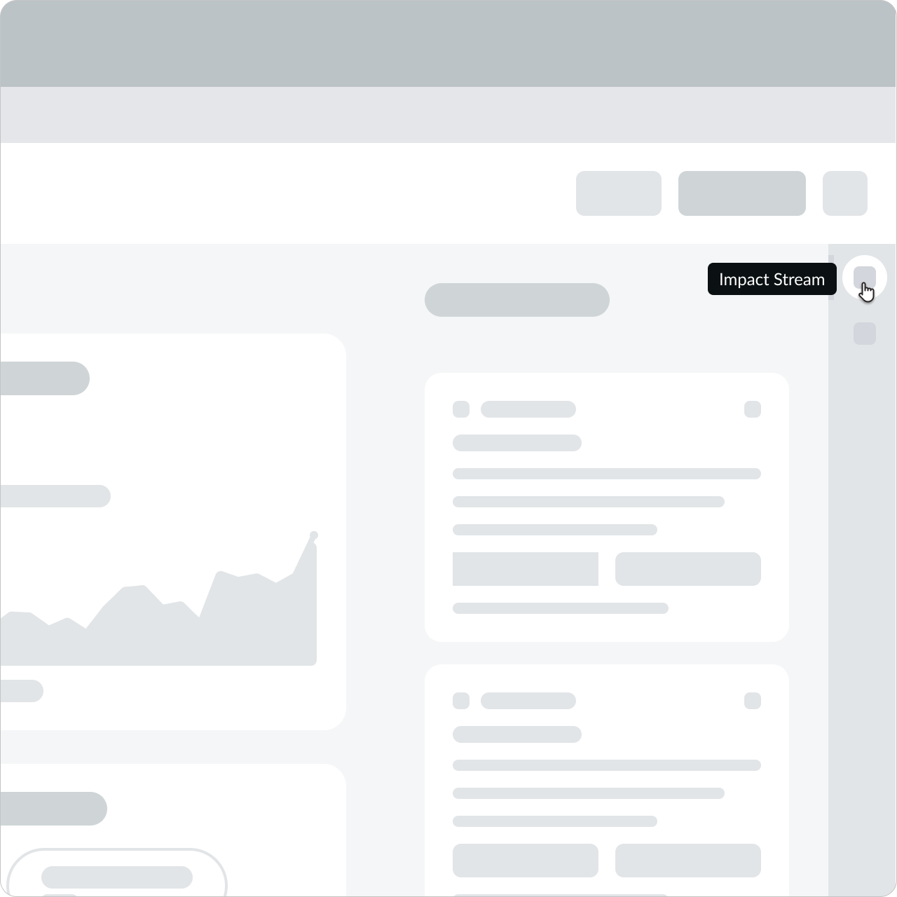
Only show one tooltip per element.
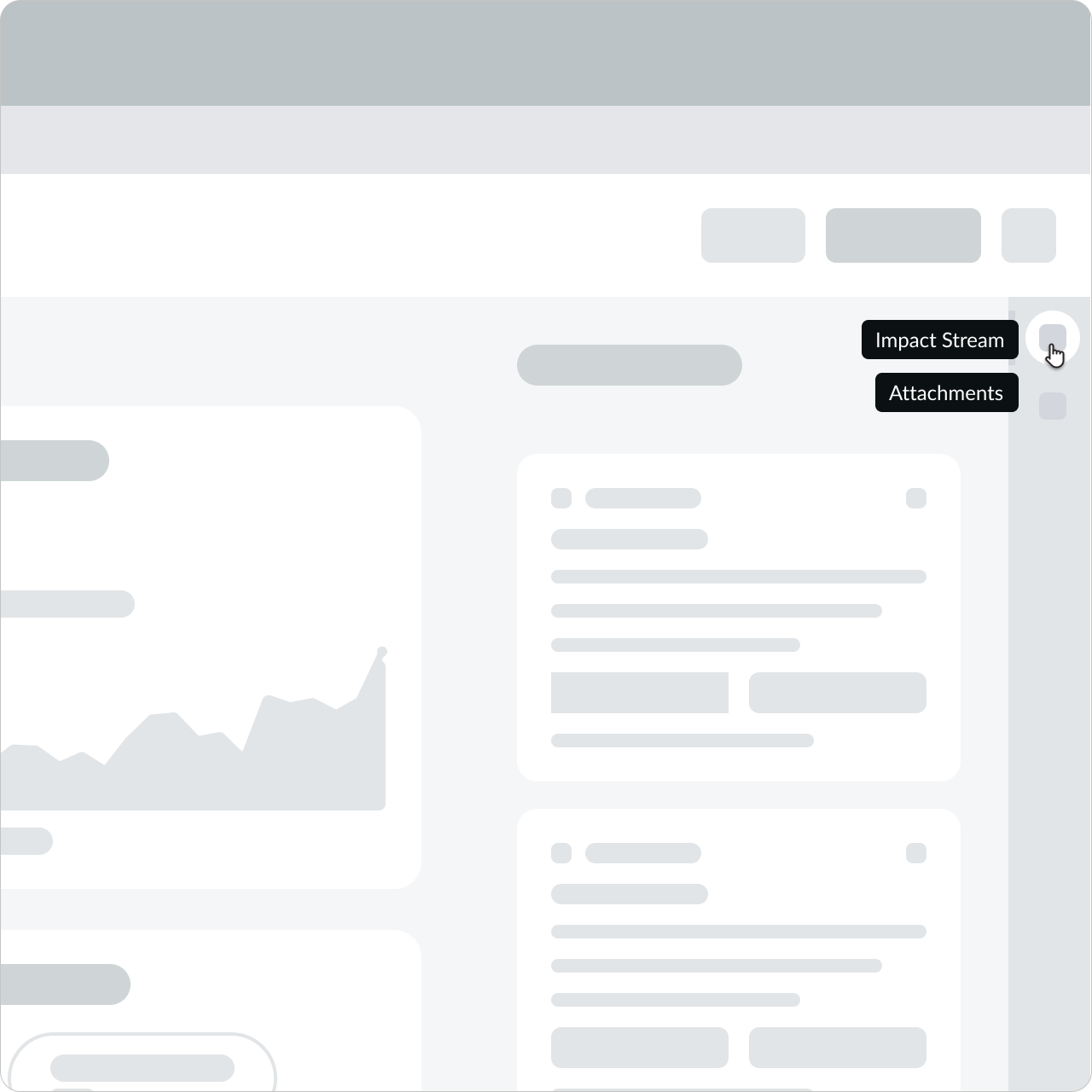
Don't show multiple tooltips for one element. This creates visual noise and a confusing user experience.

If an element doesn't need additional clarification, don't use a tooltip.

Don't use tooltips to restate text that is already displayed within the element. This is repetitive and doesn't offer any help or context.
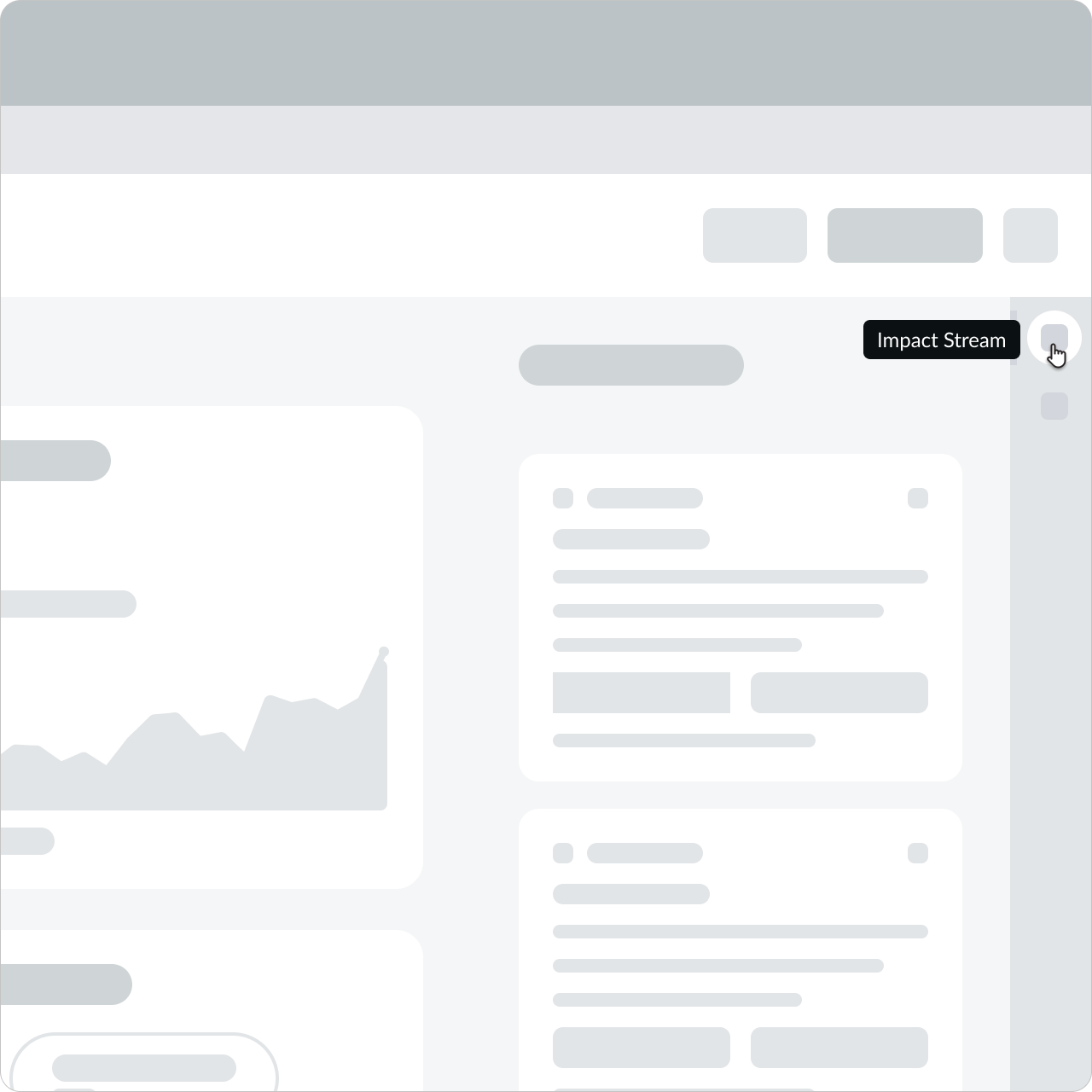
Position the tooltip close to the element it describes without creating an overlap.
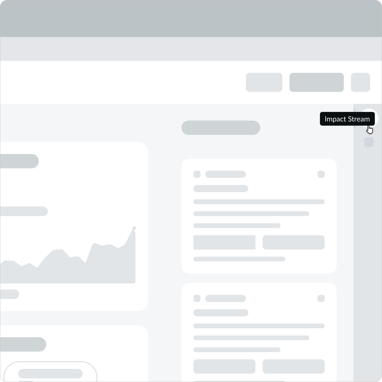
Don't position the tooltip where it overlaps the element it describes. This limits the user's access and creates a poor user experience.
Alignment and positioning
A tooltip is always positioned relative to its element, not the position of the mouse. Tooltips automatically determine their position based on the viewport location and the space available, so ensure your design has enough space for tooltips. Consider an element's distance from the viewport edges to prevent any scrolling behaviors and to keep tooltips from getting cut off.
A tooltip shouldn't block important content or disrupt the user experience.
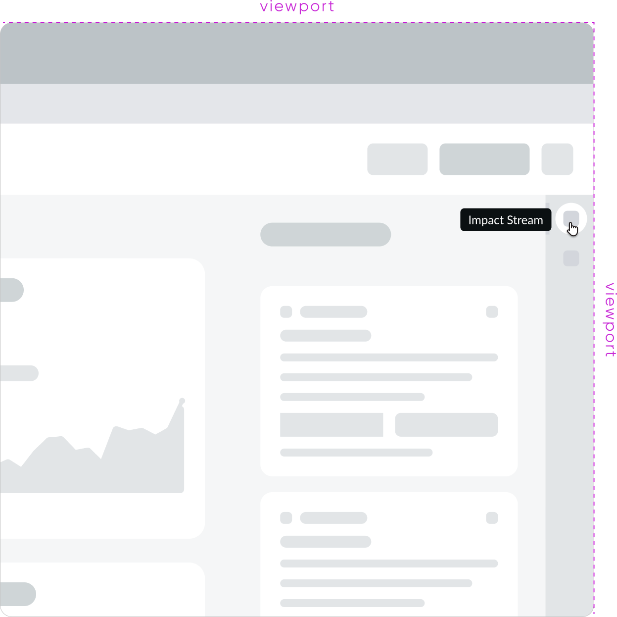
To avoid blocking content, you can choose a specific relative position (top, right, bottom, or left) to preserve the visibility of neighboring elements or information. If an element is near the edge of the viewport area, you won't be able to select tooltip positioning options that appear outside of the viewport.
| Positioning | Example |
|---|---|
| Top | 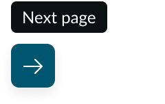 |
| Right | 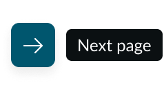 |
| Bottom | 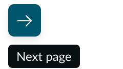 |
| Left | 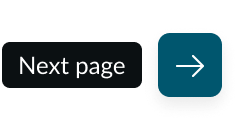 |
UI text guidelines
These are some recommendations for using text within a tooltip:
- Use tooltips to provide additional clarification or context, especially for interactive elements that are only icons without a visible label (like an iconic button)
- If the tooltip appears over a form field label, start the text with a verb to encourage the person to do something
- For example, if the form field label is, “Urgency” then the tooltip could be, “Choose how important this issue is”
- Avoid repeating the visible label in the tooltip and give the person supplementary or helpful information instead
- Use fewer than two lines of text and 50 characters to make them easier to read and translate
- Make sure that the text helps the person stay on task. It shouldn’t distract them from what they need to do.
Behavior
Learn how tooltip behaves when the display changes or a user interacts with the component.
Responsive behavior
A tooltip appears when the user hovers or focuses on an element. It also appears when content (like a label) truncates.
Remember that tooltips don't appear on mobile devices. For mobile use cases, show tooltip information in a different way (like adding help text).
Truncation
The content within a tooltip doesn't truncate because tooltips don't have a character limit. However, tooltips can show the full version of truncated content.

In this example, the truncated title appears in full in the tooltip.
Usability
Tooltip complies with all internationalization and accessibility requirements.
Internationalization
When the display translates to a right-to-left (RTL) language, the tooltip content aligns to the right of the tooltip container.

Accessibility
Learn how to access the actionable elements of tooltip through keyboard interactions and screen readers.
Keyboard interactions
A tooltip shows when the user has an element in focus.
Tab: triggers a tooltip by shifting focus to an element; this focus state is never transferred to the tooltip
Screen readers
Each tooltip should have an aria-describedby attribute for the element it describes.
If an element doesn't need a tooltip, remember to complete the alt text field so that screen readers can access the element.

