Responsive behaviors
Anatomy
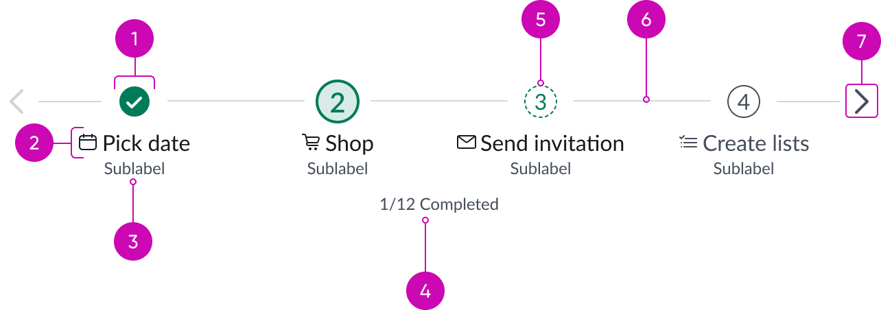
- Step identifier: Current status of a step; a step number is optional
- Step label (optional): Step name; an icon is optional
- Step sub-label (optional): Text that provides additional information about a step
- Completed task indicator (optional): Number of steps completed out of the total number of steps
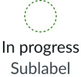
- In progress: Step is partially completed
- Connection line: Connects steps and pagination arrows within the stepper
- Pagination arrows: Iconic buttons that appear when the stepper overflows its container; enables navigation to steps that are not currently visible
Usage
You can use stepper to help users manage their progress through a workflow. Use a numbered stepper when there is a specific order to complete the tasks or use a non-numbered stepper when users can complete steps in any order.
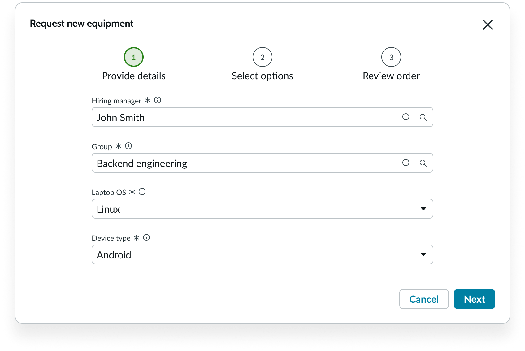
In this example, the numbered stepper appears at the top to show the user all the steps required to onboard the new employee.
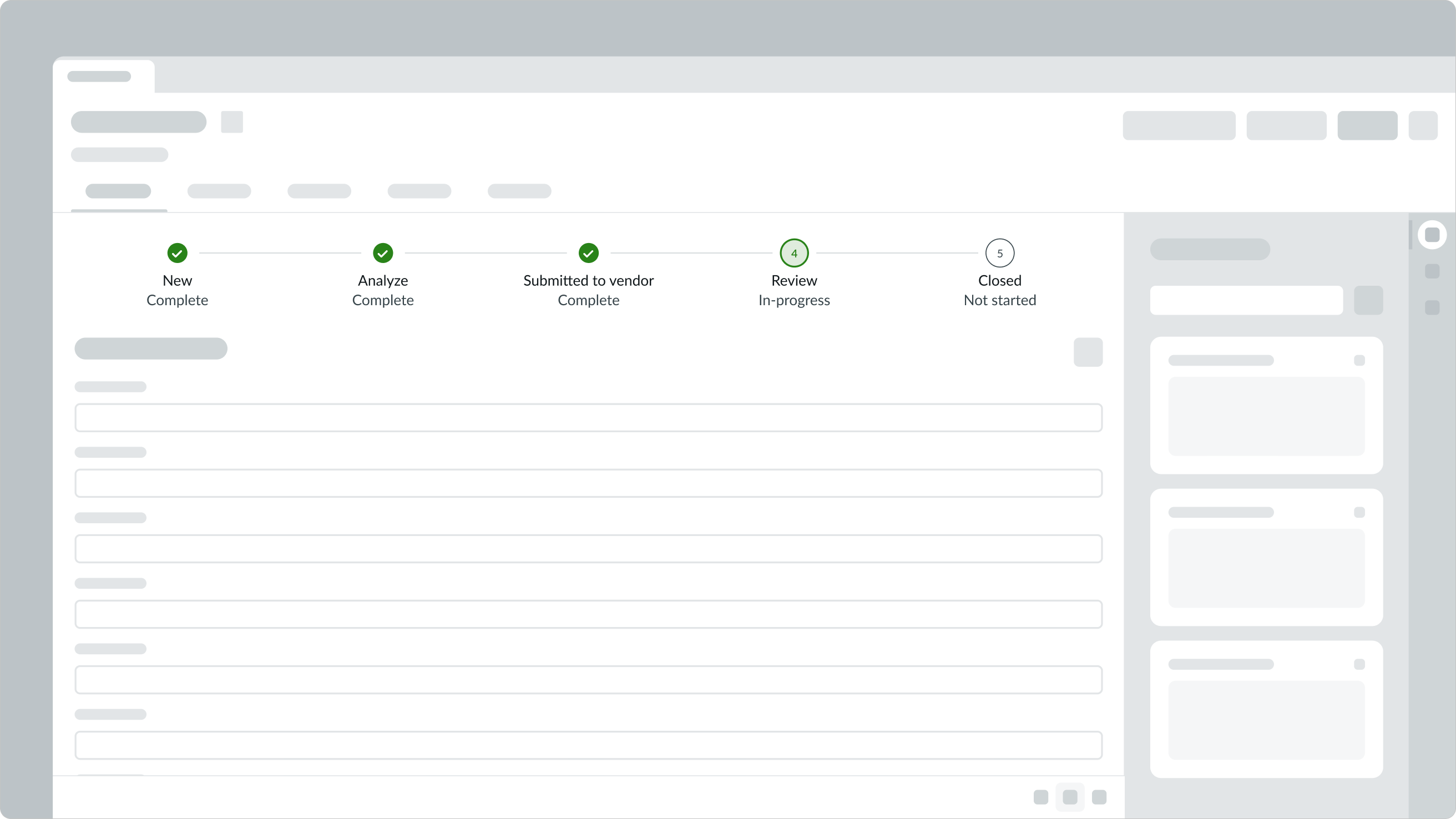
If the steps can only be progressed in a linear order, you can also use the read-only version of stepper to display a current state within a process. In the example below, a read-only stepper is used to display a completion status for new hardware request.
Configurations
Learn how to customize your stepper by configuring the available properties.
Size
You can set the stepper size to small or medium.
Small

Medium

Numbered stepper
You can configure your stepper to number all steps and to display the current step number. Your stepper is numbered by default.

Non-numbered stepper
You can choose not to display numbers if the end user can complete the tasks in any order.

Label position
You can configure where the stepper label displays in relation to the stepper. Top, bottom, and right are all available options.
Top

Bottom

Right

Selected item
You can set a stepper item to display as selected when the user opens the stepper.

Read-only
You can set your stepper to read-only to display in presentation mode. This will remove all interactivity except for pagination.

Additional elements
You can configure each step to display information your users may need as they progress through the workflow. The default configuration is a step identifier with a step label.
| Elements | Example |
|---|---|
| Step identifier only | |
| Step identifier and step label (default) |  |
| Step identifier, icon, step label |  |
| Step identifier, icon, step label, sub-label |  |
| Step identifier, icon, step label, sub-label, pagination |  |
| Step identifier, icon, step label, sub-label, pagination, Completed task indicator |  |
Design recommendations
Learn how to apply stepper in your design.

Be consistent with the information you include under each step.

Don’t display varying levels of information and decoration in the step label and sub-label.

Always pair an icon with a label.

Avoid using only an icon to label a step.

Do make the stepper read-only to prevent users from skipping a step.

If the steps can only be progressed in a linear order, do not make the stepper interactive
Alignment and positioning
You can only align the stepper horizontally in your design. Always position the stepper at the top of the multi-step process so that the user has a common reference point as they move between steps.
UI text guidelines
These are some recommendations for using text within stepper:
- The label should categorize what’s in the step or say what the person should expect to do
- For example, the label could be, “Order summary”
- The sub-label can provide any additional or clarifying details about the step
- For example, the label could be, “Purchase” and the sub-label could be, “Choose a payment method”
- Consider starting the label with a verb to tell the person they need to do something in a step
- For example, the label could be, “Review contact details”
- If you’re using an identifier with the label, the icon should make sense with label
- Use similar formatting for labels for consistency and to make it easier to scan them
- For example, stepper labels could be “Review cart” and “Place order,” which uses a verb followed by an object
Behavior
Learn how stepper behaves when the display changes or a user interacts with the component.
Status indicators
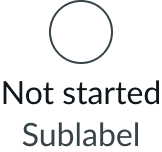
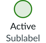
Each step can have one of the following statuses: Not started, Active, In Progress, and Complete.
| Status | Description | Numbered example | Non-numbered example |
|---|---|---|---|
| Not Started | The user has not yet interacted with this step | 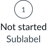 |
 |
| Active | The current step the user is on | 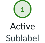 |
 |
| In progress | The user has interacted with this step but has not yet completed it. | 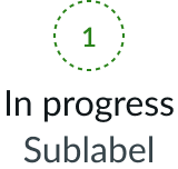 |
 |
| Complete | The user has completed this step | 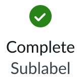 |
 |
States
Each status above has its own states.
Not Started
The Not Started status has the following states: default, hover, pressed, and disabled.
| State | Example |
|---|---|
| Default | 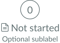 |
| Hover |  |
| Pressed | 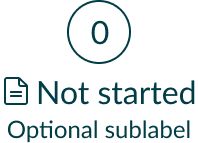 |
| Disabled | 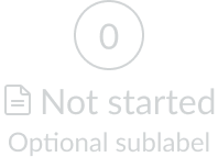 |
Active
The Active status has the following states: default, hover, and pressed.
| State | Example |
|---|---|
| Default | 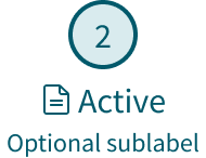 |
| Hover | 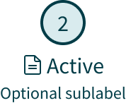 |
| Pressed | 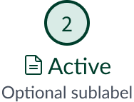 |
In Progress
The In Progress status has the following states: default, hover, and pressed.
| State | Example |
|---|---|
| Default | 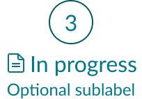 |
| Hover | 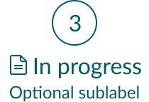 |
| Pressed | 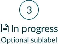 |
Complete
The Complete status has the following states: default, hover, and pressed.
| State | Example |
|---|---|
| Default | 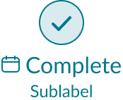 |
| Hover | 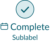 |
| Pressed | 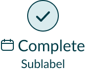 |
Cancelled
The Complete status has the following states: default, hover, and pressed.
| State | Example |
|---|---|
| Default | 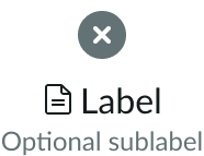 |
| Hover | 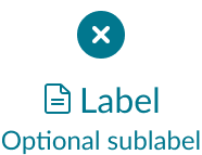 |
| Pressed | 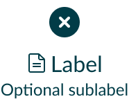 |
Error
The Complete status has the following states: default, hover, and pressed.
| State | Example |
|---|---|
| Default | 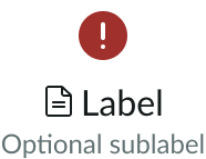 |
| Hover | 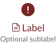 |
| Pressed | 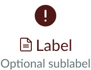 |
Learn how stepper responds to changes in a container or display.
Overflow
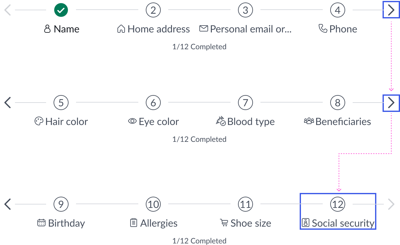
A stepper can contain a maximum of 99 steps. If the steps overflow the stepper's container, pagination arrows buttons automatically appear on either end. The pagination arrows use the iconic button sub-component. If the arrow is black, it indicates that there is additional content out of view. If the arrow is disabled, it indicates that the user is at the beginning or end of the stepper flow.
The responsive behavior of the stepper component is
determined by available container space. Number of pages will vary depending on the total number of steps and container size.
See usage guidance for iconic button
Progress status
The user's progress status is independent of whether the step is in an active state.
For example, if a stepper has the "Complete" status and a user views that step, the step becomes "Active." However, the step doesn't lose its "Complete" status and the completed count doesn't change.
Pagination
Pagination will adjust to ensure that the selected step is always within view.
Truncation
Labels and sub-labels truncate with an ellipsis if they are too long for the content slot.

Users can hover over the label to invoke a tooltip that contains the contents of the full label.
Try to keep the stepper labels and sub-labels short and concise to avoid truncation, because truncated labels affect readability.
Interactions
In a non-numbered stepper, the user can select a step to open it regardless of where they are in the flow. In a numbered stepper, once the user completes a step and selects the action button, they are advanced to the next step.
Usability
Stepper complies with all internationalization and accessibility requirements.
Internationalization
When the display translates to a right-to-left (RTL) language, the labels, icons, and completion status change their orientation from right to left and align on the right. For a numbered stepper, the order of the steps moves from right to left.

Accessibility
Keyboard interactions
When focus is on the stepper:
- Tab: Moves focus to the first visible step
- Shift + Tab: Moves focus to the last visible step
When focus is in the stepper:
- Tab: Moves focus to the next focusable element (a step or pagination)
- Shift + Tab: Moves focus to the previous focusable element (a step or pagination)
- Arrow right: Moves focus to the next step in the flow
- Arrow left: Moves focus to the previous step in the flow
- Enter or Space: When focus is on a step, activates that step and displays the information associated with it; when focus is on an arrow, activates pagination
- Home: Moves focus to first step
- End: Moves focus to last step
When focus is on the pagination arrows in a stepper:
- Focus remains on the arrow unless the arrow enters a disabled state (like on the first or last step in a stepper)
- If the arrow is disabled in the new page, the focus moves to the first or last step depending on which arrows the user has in focus
