Anatomy
Learn about the individual parts of select.
Select field
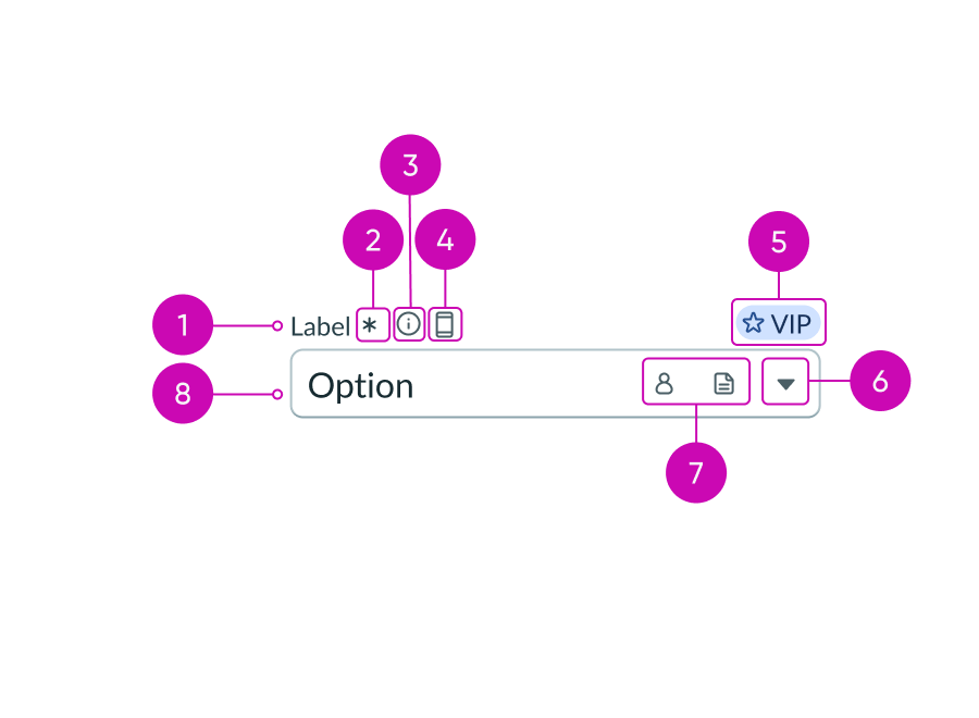
- Label: Text that identifies what the user is choosing an option for; a label must be present for accessibility, either as the component's label element or external to the component
- Required indicator (optional): Field decorator that indicates if a field is required
- Information icon (optional): Opens a popover and shows the field helper text
- Label-inline slot (optional): An available slot for an additional label icon
- Label-end slot (optional): An available slot at the end of the label line
- Caret icon: Indicates the field contains a dropdown list
- Input field slot (optional): Displays additional actions or decorative elements; a maximum of two can be added
- Selected list item: Text that identifies the selected list item from the dropdown list
Dropdown list
See usage guidelines for dropdown list
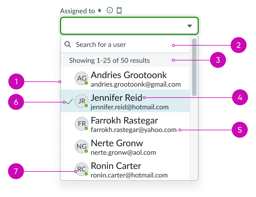
- Dropdown list: Displays a list of options
- Search field (optional): Takes in a search query and highlights matching values
- Section header (optional): A header within the dropdown list that helps organize or provide additional information about a group of options; more than one section header can be used
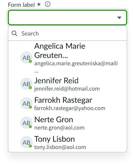
- List item label: The main information within an option; when an option is selected the option label is displayed in the select field
- List item sub-label (optional): Supplemental information associated with the option label
- Selected indicator: Identifies the selected list item
- Avatar (optional): The avatar associated with each option can be displayed; used when avatar is relevant to the dropdown list options
Usage
Use select when you want users to choose from a defined pre-existing set of options. Select can be used in many different contexts, but some common use cases include selection of location, category, stage, and priority.
Variants
Learn about the variants of select.
Sizes
Select has two sizes: small (sm) and medium (md). Choose a size that fits with your display and complements the surrounding content.
Small
Use the small size for areas that have limited space. The small size reduces the font size of the text. The size of the field indicators and the padding size between them do not change; they are the same size as for the default “Medium”.
If icons are included in a select field, the padding is reduced between multiple icons.

Medium
Use the medium size alongside similarly sized components and content.
Note: Medium is the default size for select.

Configurations
Learn how to customize select by configuring the available properties.
Slots
The label has an end and in-line slot for additional information. The label-end slot is available at the end of the label line. The label-inline slot is available immediately after the field helper icon. You can add anything to the label-inline slot, but icons are the most appropriate use for this slot.

This example shows a color label with optional icon to indicate status or category.

This example shows a device type indicator in the label-inline slot.
The input field slot can appear at the beginning or end of a select field.

This example shows an AI icon used to indicate the value was AI generated.
Unsaved field indicator
You can use the label-start slot to add an unsaved field indicator. The indicator appears as a small dot next to the field when the field contains unsaved changes and disappears when the changes are saved.
Note: If you want to add the unsaved indicator to all the input fields in a form, see Form usage guidelines.

This example shows an unsaved field indicator next to the label.
Label wrapping
By default, field labels truncate with an ellipsis when they exceed the container width. To wrap labels, enable this property.

Required field indicator
You can configure a select field as required with an asterisk indicator after the label. This indicates that the user must enter a value in this field to complete the form.
Note: This indicator shouldn’t be used with the optional field indicator.

Optional field indicator
You can configure a select field as optional to indicate the user isn't required to select a value in this field to complete the form. Optional fields display "(Optional)" text next to the label.
Note: This indicator shouldn’t be used with the required field indicator.

Disabled field indicator
You can disable a select field which makes the field unavailable for users to interact with.
Field helper text
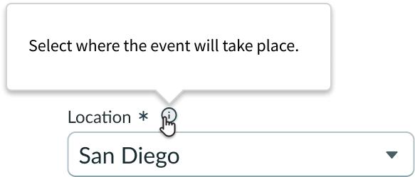
Use the field helper text to display information needed for guiding users on how to complete the field. The helper text displays in a popover when the information icon is activated.
See usage guidance for popover
Field layout
You can configure the field layout to be horizontal or vertical. The default field layout is “vertical”.

This example shows the horizontal layout.
Auto-focus
You can use auto-focus to automatically place focus on a select field when a page is opened.
Search field
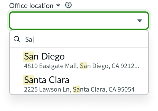
Users can search within the list of options and view matching results that update as they type. The system highlights matching characters in both primary and secondary values. Primary values take precedence as the most relevant search results when paired with secondary values.
Section header
Section headers provide additional information related to the results in the dropdown list. This can be organizational information for the presented options, or a count of the number of options to choose from.
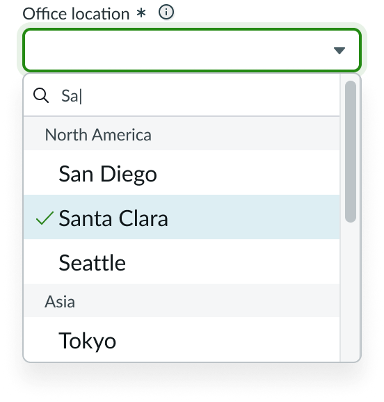
Section headers "North America" and "Asia" organize the list items by continent.
Dropdown list dimensions
By default, the dropdown list has the same width as the select field. However, the dropdown list width can be configured to be wider. Similarly, the dropdown list height can display 5 options at a time, but the height can be configured to display more.
Design recommendations
Learn how to apply select in your design.
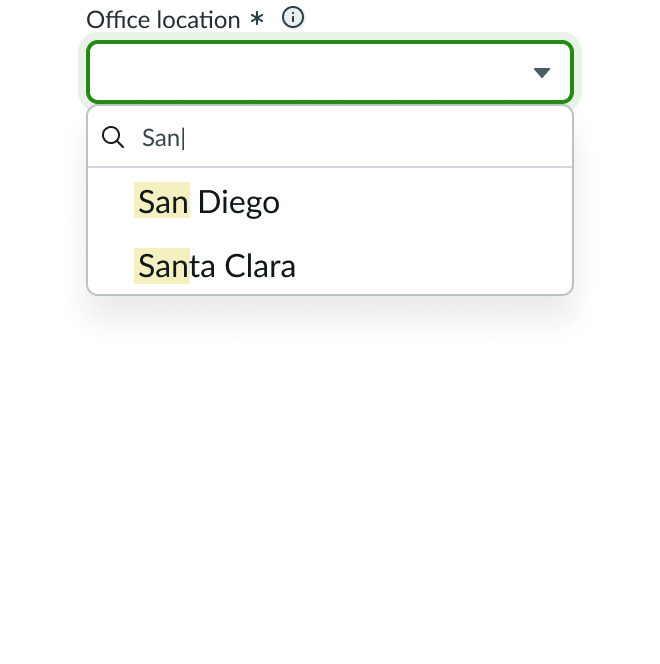
Use Select with search when search isn't the main experience, to help the user narrow down the list of possible options.
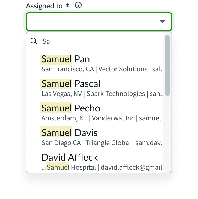
Don't use Select if search is the main experience. Use Typeahead instead if the user will be searching through a long list of options for a specific value.
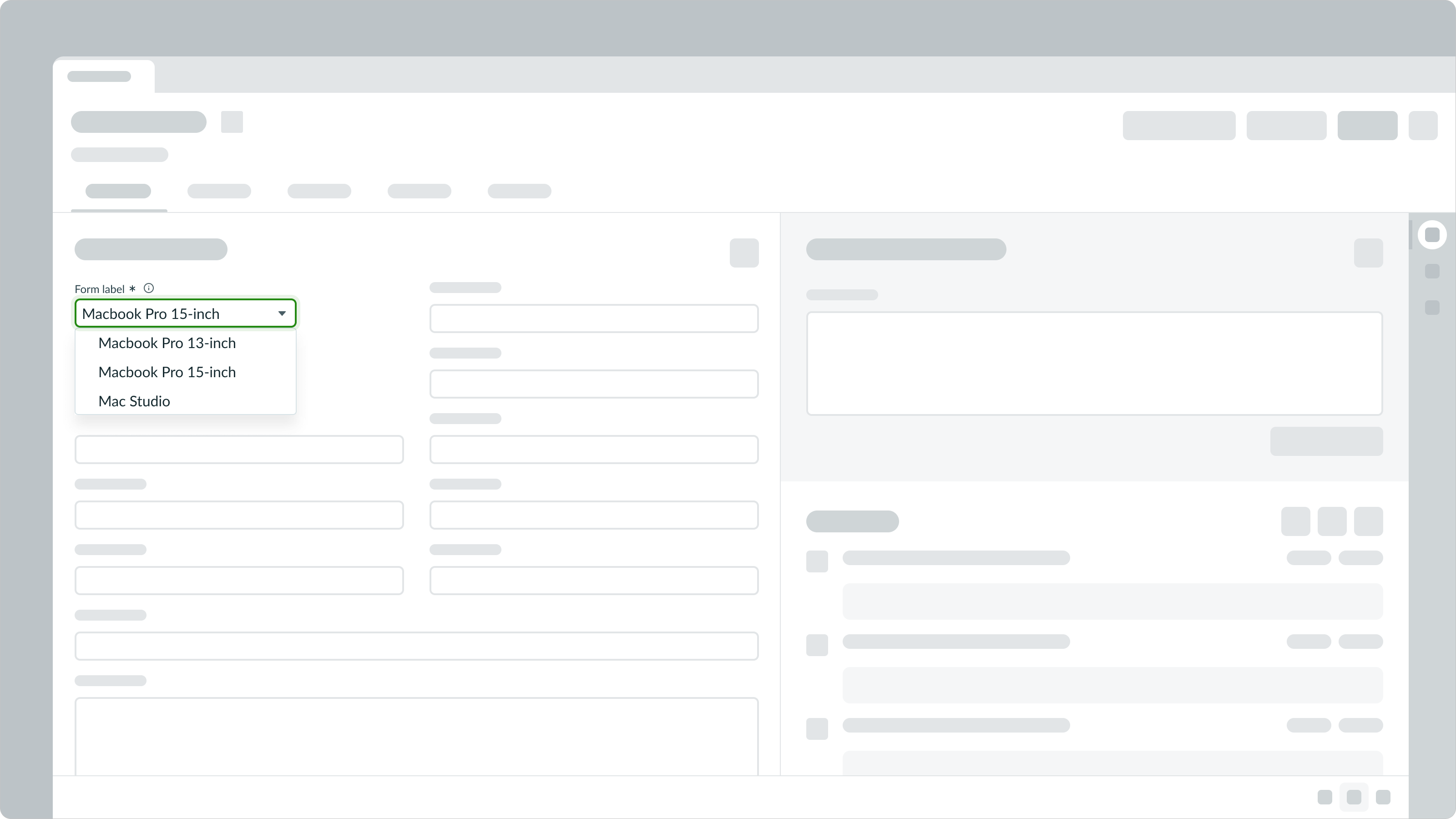
Select should be used in a form where users can select an option and submit the data.
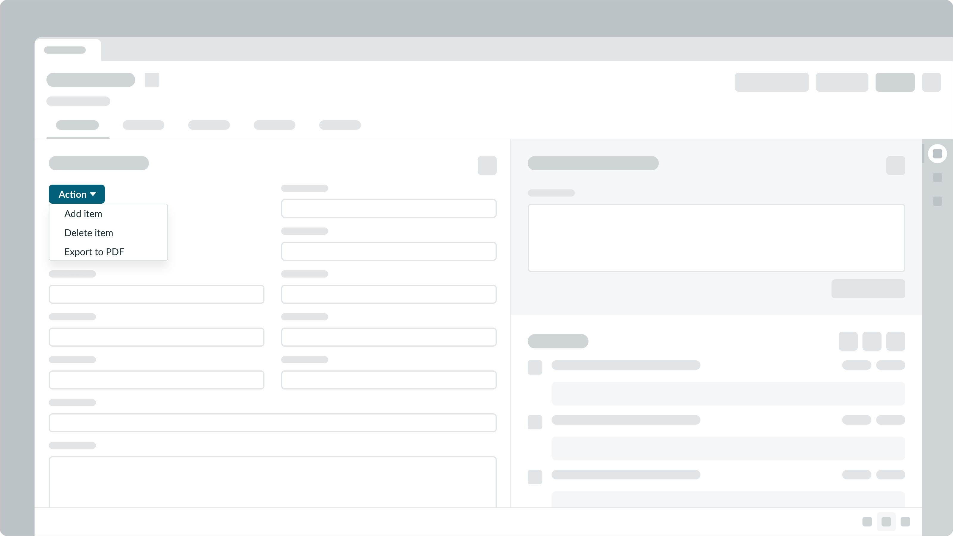
Select shouldn't be used to initiate immediate actions. Instead, use dropdown.
See usage guidance for dropdown
Alignment and positioning
Select can also be used in conjunction with an input field. One example is an input for currency. Select can be positioned at the end of an input slot to display the currency for a monetary amount.

When used in conjunction with an input field, select can be positioned in the right or left input slot. For a phone number input, select is positioned in the left input slot to display an area code.

UI text guidelines
These are some recommendations for using text within a select field:
- The form label should clearly tell the user what they’re selecting
- If you’re using a field helper, the popover component is flexible and can contain different types of content. Follow the writing tips when creating UI text for this configuration.
- If you're using a field helper, remember that the text is only visible once the user selects the icon. Therefore, you should avoid hiding any important information in the popover.
- If you’re using placeholder text in the search field, format it as an example of what should go in the input or as a brief description of what to do
Behavior
Learn how select behaves when the display changes or a user interacts with the component.
States
Select has the following states: default, hover, focus, read-only, disabled, and invalid.
| State | Normal |
|---|---|
| Default |  |
| Hover |  |
| Focus |  |
| Read-only |  |
| Disabled |  |
| Invalid |  |
Invalid state
In an invalid state, the label and indicator of a required select field appears in red. If the label includes either a required indicator or an optional indicator, it also appears in red. Use an invalid message to help the user resolve the error. The invalid message appears under the select field and can be customized to fit your experience and audience.

Responsive behaviors
Select inherits the width of its container and resizes with the container.
Interactions
A user can interact with the select dropdown list and any controls associated with the select field.
Auto-complete
When a user begins to type in the field, the component attempts to match the characters entered with items in the list. If a match is found, the field is populated automatically, and the dropdown list is not displayed.
Dropdown list and other actions
A user can select the field to open the dropdown list, choose an option from the list, and open the information icon or any field decorators to initiate further actions.
Truncation
The label truncates when it exceeds the input width or when the label options prevent the full label from displaying.
Usability
Select complies with all internationalization and accessibility requirements.
Internationalization
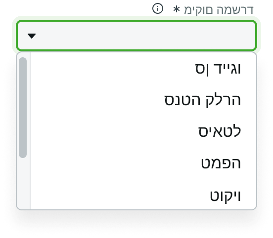
For right-to-left languages, alignment of items in the panel flips. Dropdown list items become right-aligned, while caret and decorators move to the left. Carets must remain in the leftmost position.
Accessibility
Learn how to access the actionable elements of select field through keyboard interactions and screen readers.
Keyboard interactions
- Tab or Shift + Tab: Moves between the select field and any interactive elements in the standard tab order
When the focus is in select input field:
- Enter: Toggles the dropdown list open or closed
- Typing one or more characters selects the first valid item from the dropdown; aria-selected must be set to “true”
When the focus is in select dropdown list:
- Arrow down: Moves focus to next option
- Arrow up: Moves focus to previous option
- Enter: Selects option and collapses dropdown
- Escape: Collapses the dropdown and moves focus to the select input field
- Home: Moves focus to the first option and selects it
- End: Moves focus to the last option and selects it
Screen readers
- Assign the aria-label or aria-labeledby attribute to select field to allow screen readers to provide additional context for that form field
- Assign the aria-describedby attribute to contents of field helper; this provides supplementary user guidance for the content required in the field
- Assign the aria-required to required field indicator and set to "true"; by default, aria-required is set to "false"
- Assign the aria-invalid to "true" to alert when a field is marked as returning an error; by default, aria-invalid is set to "false"
- Assign the aria-selected to "true" to show option is selected

