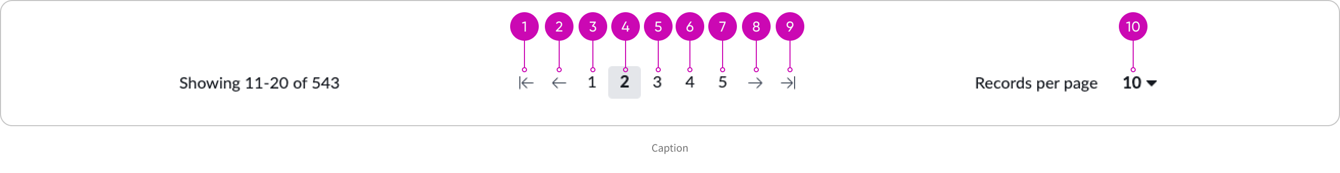
Anatomy
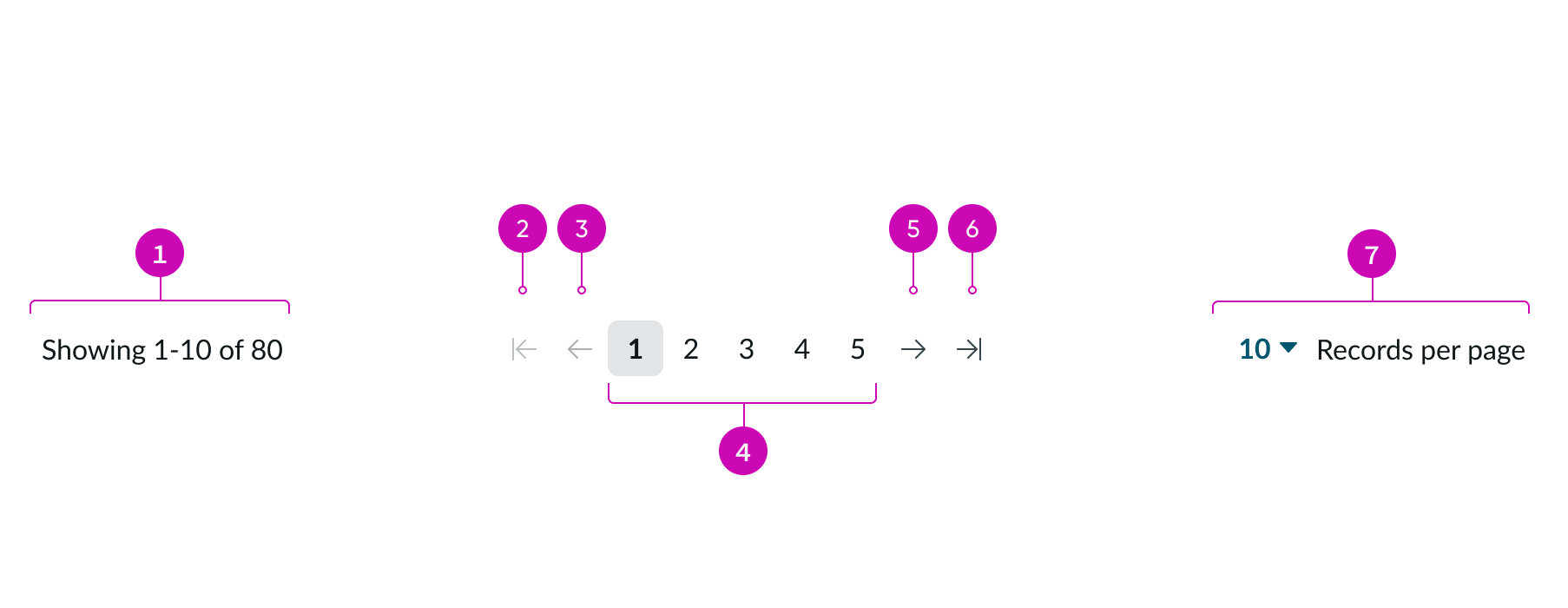
- Page counter: Text noting current set of page numbers displayed in the total range
- First page arrow: Icon that navigates to the first page number in the range
- Previous page arrow: Icon that navigates to the previous page number in the range
- Page number range: Consecutively numbered pages in the range; the range changes as the number of records per page changes
- Next page arrow: Icon that navigates to the next page number in the range
- Last page arrow: Icon that navigates to the last page number in the range
- Dropdown: Dropdown that lets the user select the number of records to display on each page in the range
Subcomponents
See usage guidance for dropdown
See usage guidance for button iconic
Usage
Pagination control divides a large set of content into consolidated pages that the user can navigate.
Detailed list
Use the full pagination control with a list to help users navigate between pages.
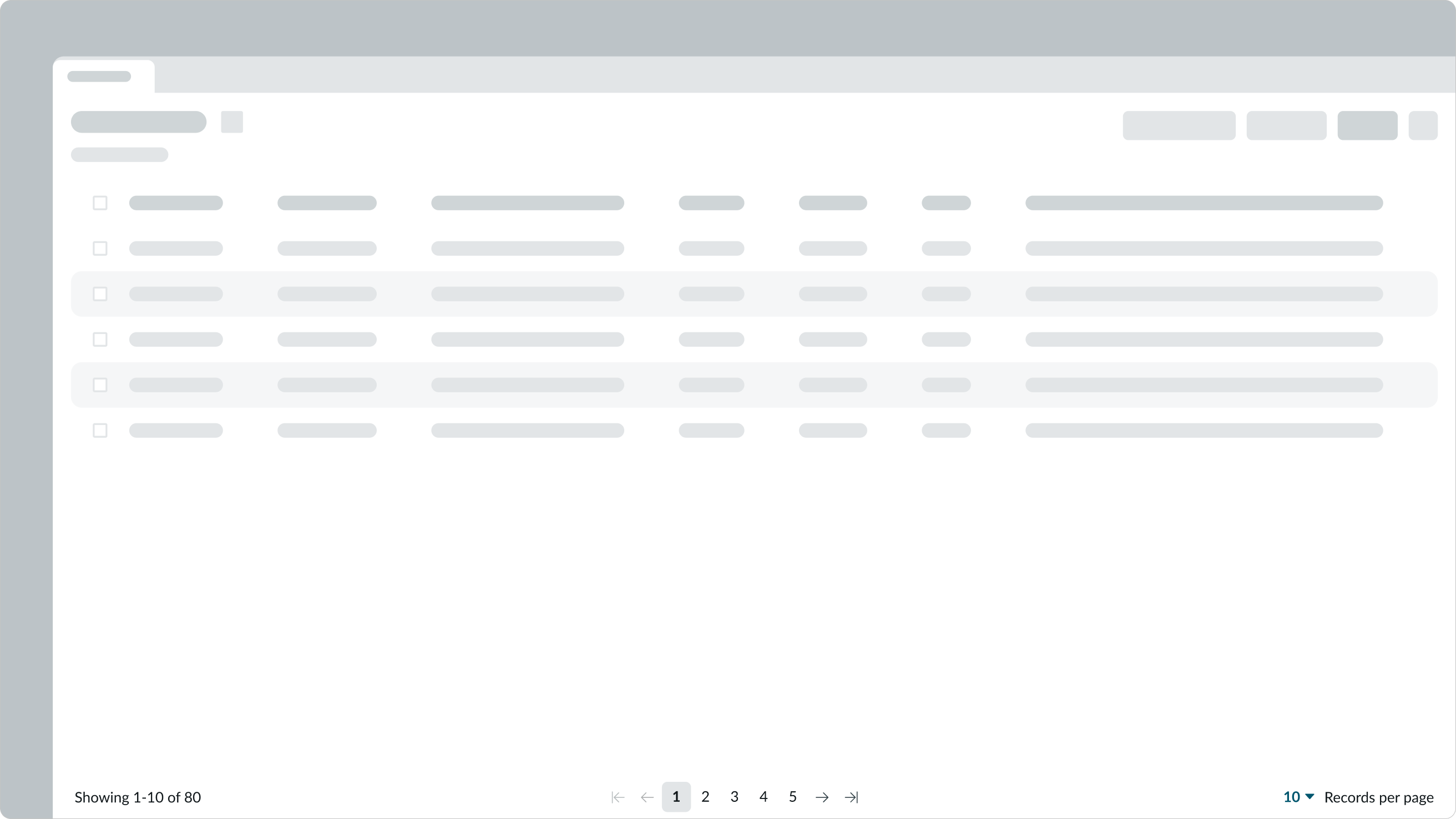
In this example, pagination control appears underneath a list in a full-page display.
Simple list
You can also use pagination control in a simple list.
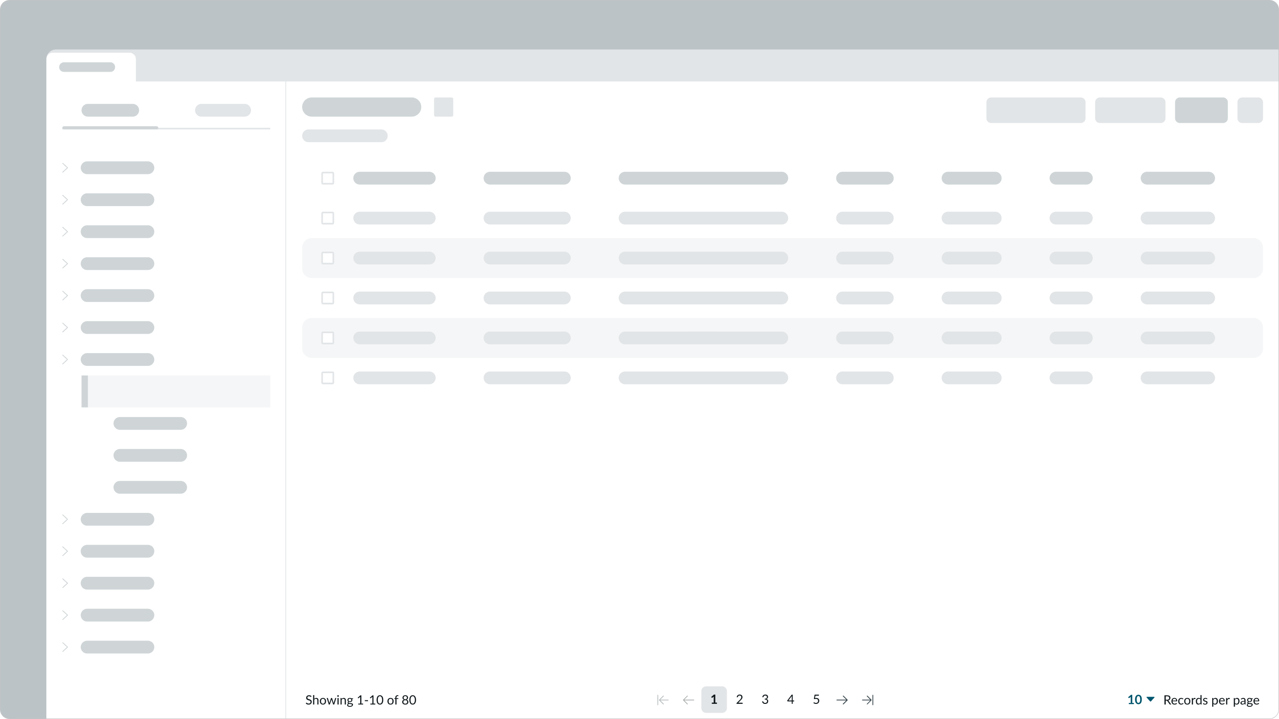
In this example, pagination control appears beneath a simple list to help the user navigate through service issues.
Configurations
Learn how to customize pagination control by configuring the available properties.
Presets and controllers
This component has a preset configuration that sets properties and event handlers, making it ready for use. You can override preset values with a custom configuration if needed. Preset values won’t upgrade with updates. To avoid using presets, configure manually. One preset can apply to a single component instance. See presets for more info.
A preset is linked to a controller, which serves as a data resource. Controllers provide configuration data and event bindings for the component. Selecting a preset adds the required controller to the page, allowing new components to use its preset. For more on controllers, see controllers. For default presets, see view properties and events in the controller API.
Presets
This component contains preset configuration values that are intended for use with the record list component only. Some preset values for pagination control won’t function as expected if used with the standalone component. When using this component outside of the record list, select None for a preset and configure the component manually.
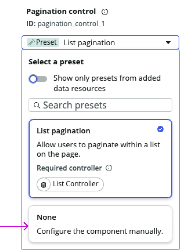
This example shows the preset selection panel for pagination control. Designers should select None and configure the standalone component manually.
Display controls
You can configure pagination control to show or hide any of its subcomponents or elements. Your choices are based on the use case and space available.

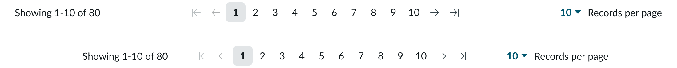
In this example, pagination control displays only the page counter and the page numbers with arrows for a smaller set of data.
When the use case doesn’t specify a page counter, you can display a simplified pagination control with arrows for navigation to a set of previous or next pages.

When pagination control is displayed as part of a list page, and the user groups records, you can configure the dropdown label with text that describes the rows per group instead.

In this example, customizable text for the page counter reads “Showing 1-20 of 100” and the dropdown label reads “Rows per group.”
Behavior
Learn how pagination control behaves when the display changes or a user interacts with the component.
States
Pagination control has the following states: default, hover, active, focus, and selected. For details about the dropdown states, see the usage guidelines.
| State | Example |
|---|---|
| Default |  |
| Hover |  |
| Active |  |
| Focus |  |
| Selected |  |
Responsive behaviors
Learn how pagination control responds to changes in a container or display.
Sizing
When pagination control is resized from a larger to a smaller display, the space between the page counter and page numbers decreases, as does the space between the dropdown and page numbers.
For smaller spaces, pagination control only shows the active page in addition to the first, previous, next, and last arrows.

Pagination control inherits the width of its container. The width of each page number expands to accommodate the full value (up to the ten-thousands).

Interactions
Learn how pagination control responds when a user interacts with it.
Page number shifting
If there are 10 pages visible in a larger range, all 10 pages remain visible until the user selects page number 7. The page numbers then shift by one page to the left. This pattern continues as the user selects subsequent page numbers.

When a page number shifts to the left or right, the selected page number remains in the center of the page range. If the last page shown in the visible range is selected, that number shifts to the center.

Dropdown panel
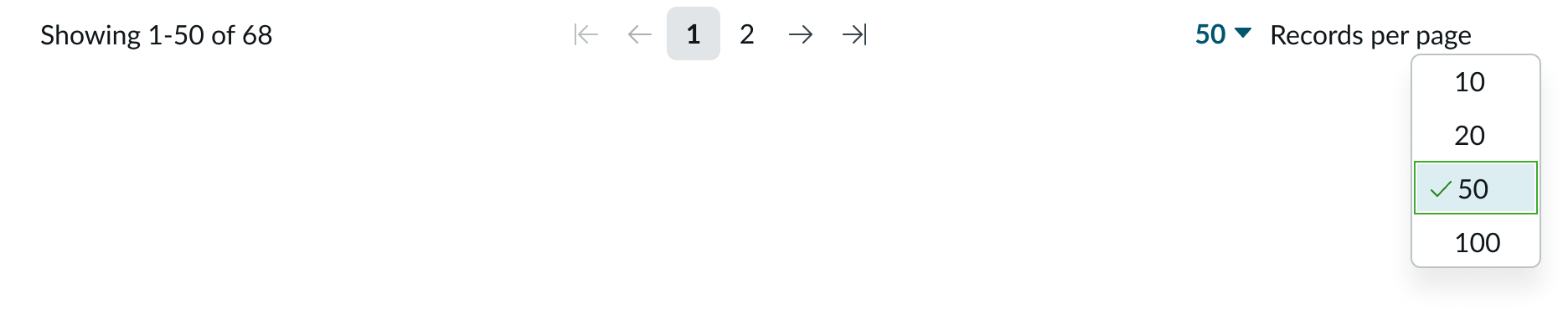
Users open the dropdown to configure the number of records per page for their list. The default number of records is 10.
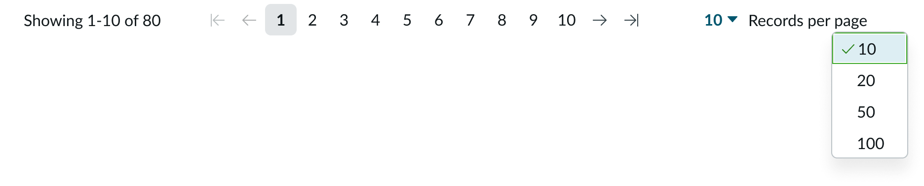
When the user changes the number of records on the page, the page range scale adjusts to the change in the number of total pages. As the number of records per page increases, the number of pages decreases.
Usability
Pagination control complies with all internationalization and accessibility requirements.
Internationalization
When the display translates to a right-to-left (RTL) language, the page order flips. The page counter and the dropdown also flip their orientation.

Accessibility
Learn how to access the actionable elements of pagination control through keyboard interactions and screen readers.
Keyboard interactions
You can access the actionable elements of pagination control with these keyboard keys:
- Tab: Moves focus to the first interactive element and then through the page range in the tab order shown; the tab skips page arrows that are disabled because of the current page location
- Tab + Shift: Moves focus to the previous interactive element; if no element is present, focus moves back to the element before pagination
- Enter: Selects an action, such as a navigation arrow or page number.
When focus is in the records per page control: - Enter: Opens the dropdown list
- Arrow up or Arrow down: Moves focus up or down in the dropdown list of available row counts
When focus is on a value in the dropdown list: - Enter: Selects the row count for the list
Screen readers
When you apply ARIA labels to a component, screen readers announce the controls and content of pagination control in the prescribed tab order.
- Use aria-label to identify the navigation region
- Assign role navigation to the pagination control
- Ensure the current page has aria-current set to “true”
- Use aria-disabled if a page link is disabled