Anatomy
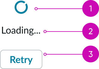
- Icon: Indicates the loading action; it is available in either a medium (md) or large (lg) size
- Label (optional): Text displayed below the icon that describes the action taking place
- Action (optional): A button that provides the user with an action during the loading process
Usage
Learn about loader and find out how to use it in your design.
Loaders facilitate the transition and retrieval of data between states and pages, especially in cases where timing can be variable and may be subject to multiple loading factors. However, only use loaders when you expect a wait time of more than 0.5 seconds. A loader is unnecessary for shorter wait times.
When you use loaders, be sure to establish a hierarchy to show the user where information will display first. If two loaders are present, a user may expect that two independent experiences are loading. If a single loader is present, a user may expect that a single experience is loading.
Loaders vs. progress bars
A loader shouldn't be a substitute for a progress bar. Loaders should only temporarily display to signify a transaction or communication between the user and a service. Progress bars provide more context regarding the progression toward completing a process.
See usage guidance for progress bar
Variants
Learn about the attributes of loader.
Sizes
Loaders are available in the following sizes: medium (md) and large (lg). Choose a size based on your design and use case.
Medium
Use a medium loader to indicate when content is loading within smaller areas like panels, modals, and form controls. They're also ideal for areas with limited space. Avoid using this size when you use labels and actions together.

Large
Use a large loader to indicate when content is loading within larger areas like full page views, large panels, and modals. They're also ideal for any areas that don't have space constraints.

Configurations
Learn how to customize loader by configuring the available properties.
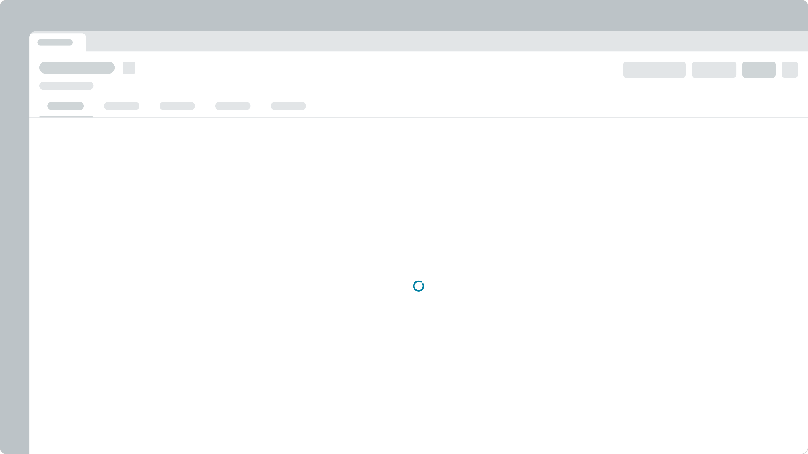
Loaders with only an icon
If no context is needed, you can provide only an icon to show the loading process.
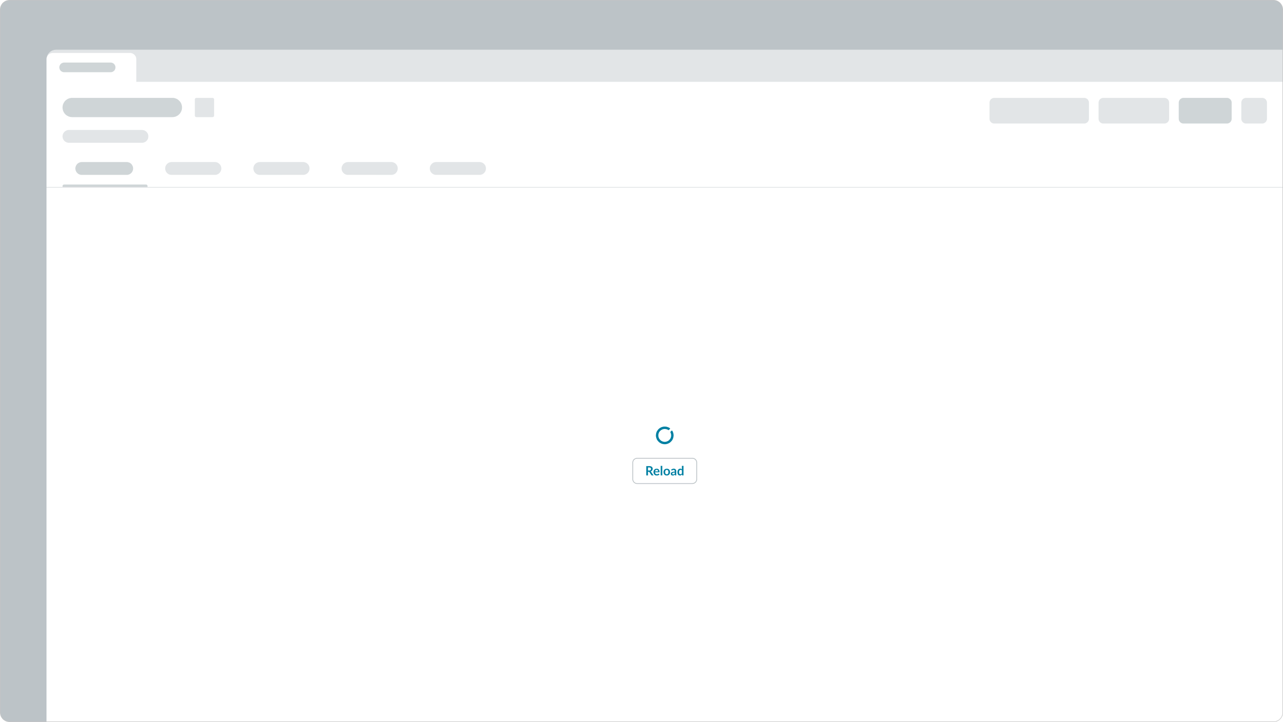
Loaders with an action button
Including an action button allows the user to interrupt the current loading state and initiate an action. Use an action button when the load time is unpredictable.
Loaders with a description
This configuration includes a description that tells the user what content is currently loading.

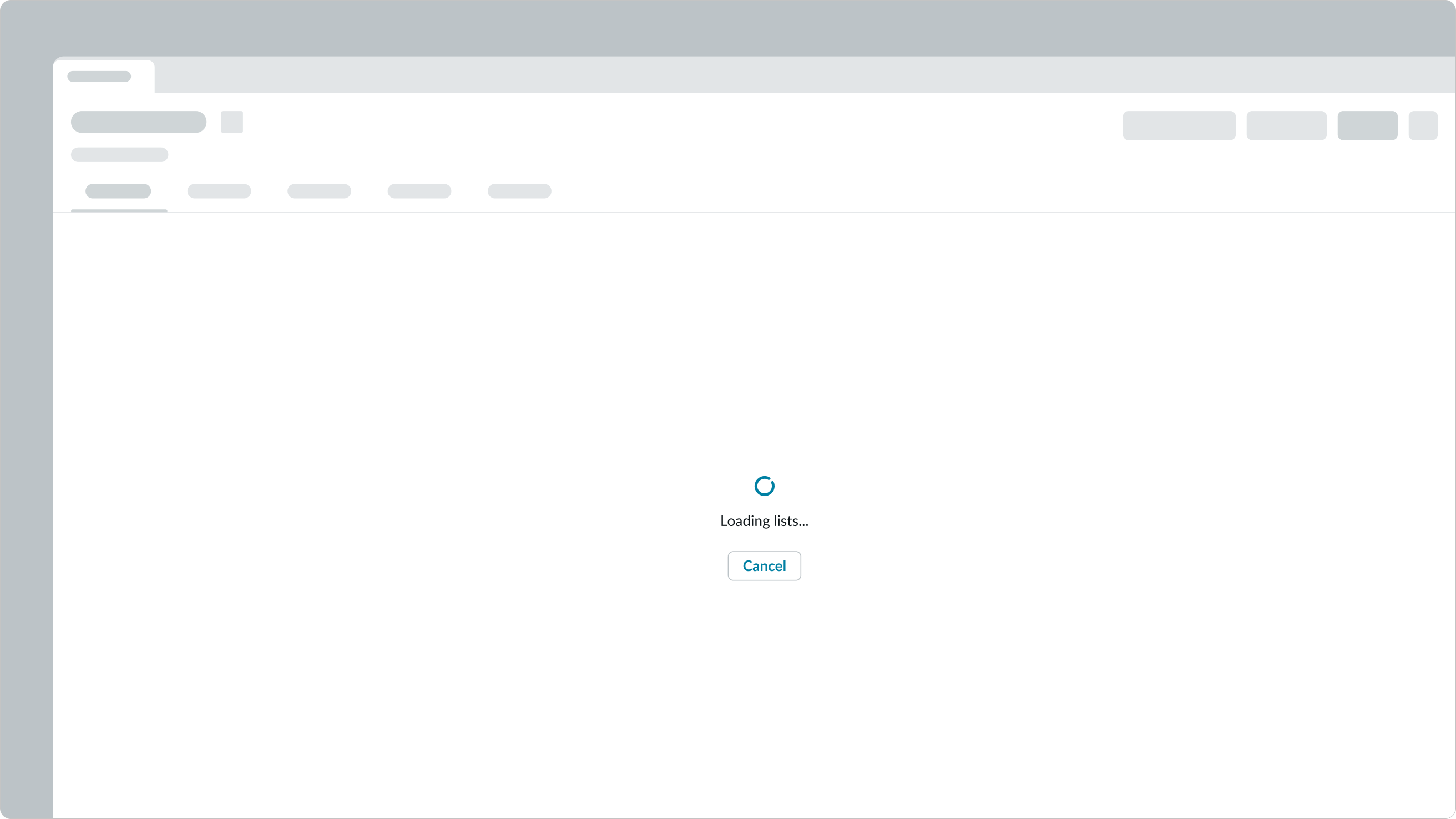
Loaders with a description and action button
This configuration includes a description and an action button.
Design recommendations
Learn how to apply loader in your design.
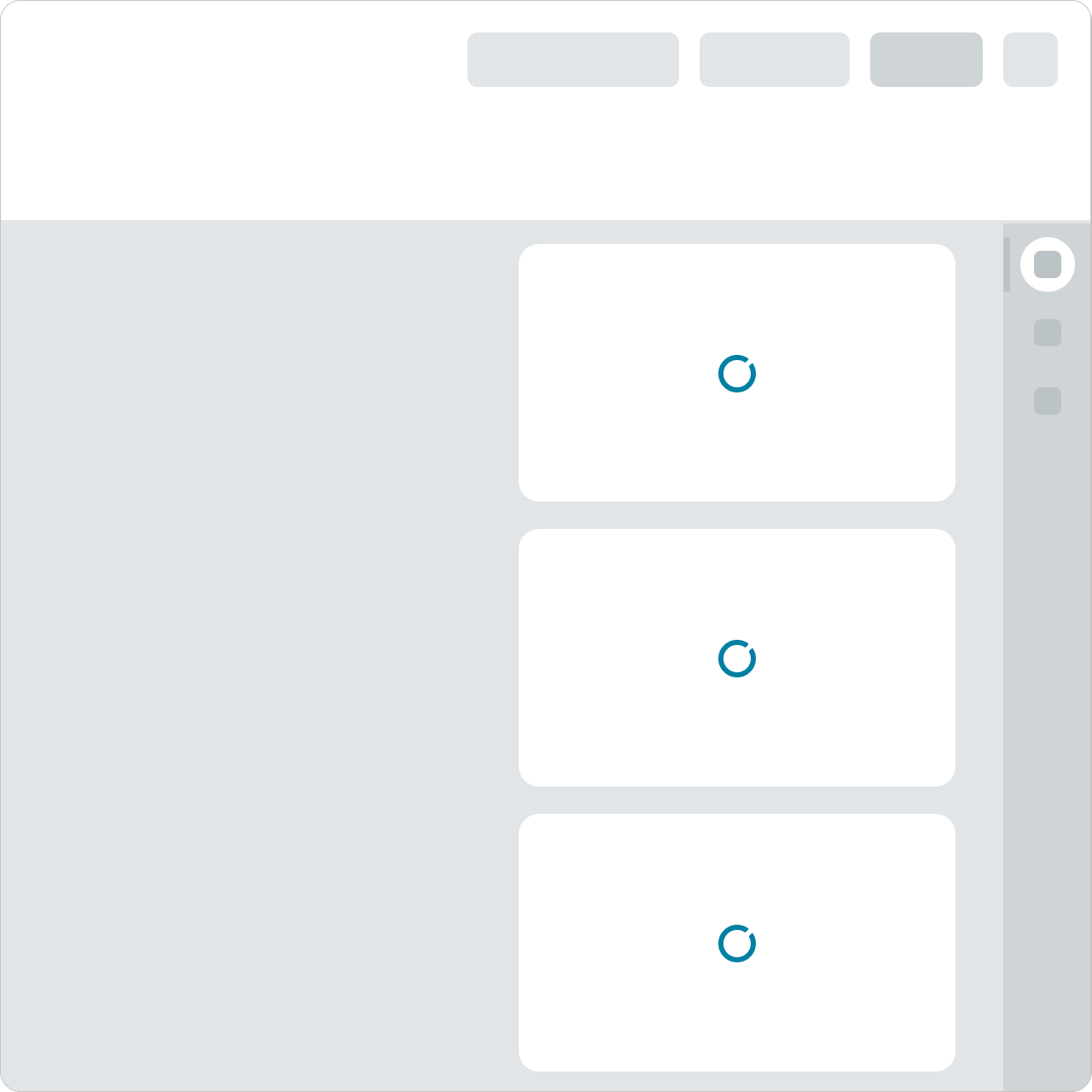
These loaders are proportional to the containers they're located in.
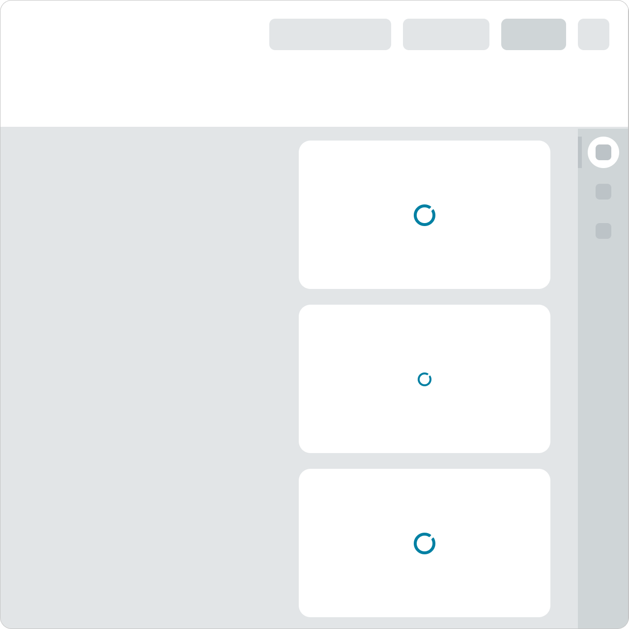
Using a mix of large- and medium-sized loaders in a smaller area causes visual tension. Inconsistent loader sizes for similar components and elements can also cause confusion with loading hierarchy and user expectations.
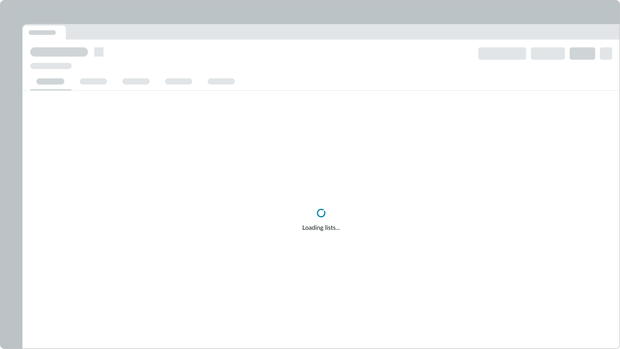
Using a single loader can help focus a user's attention on a primary area.
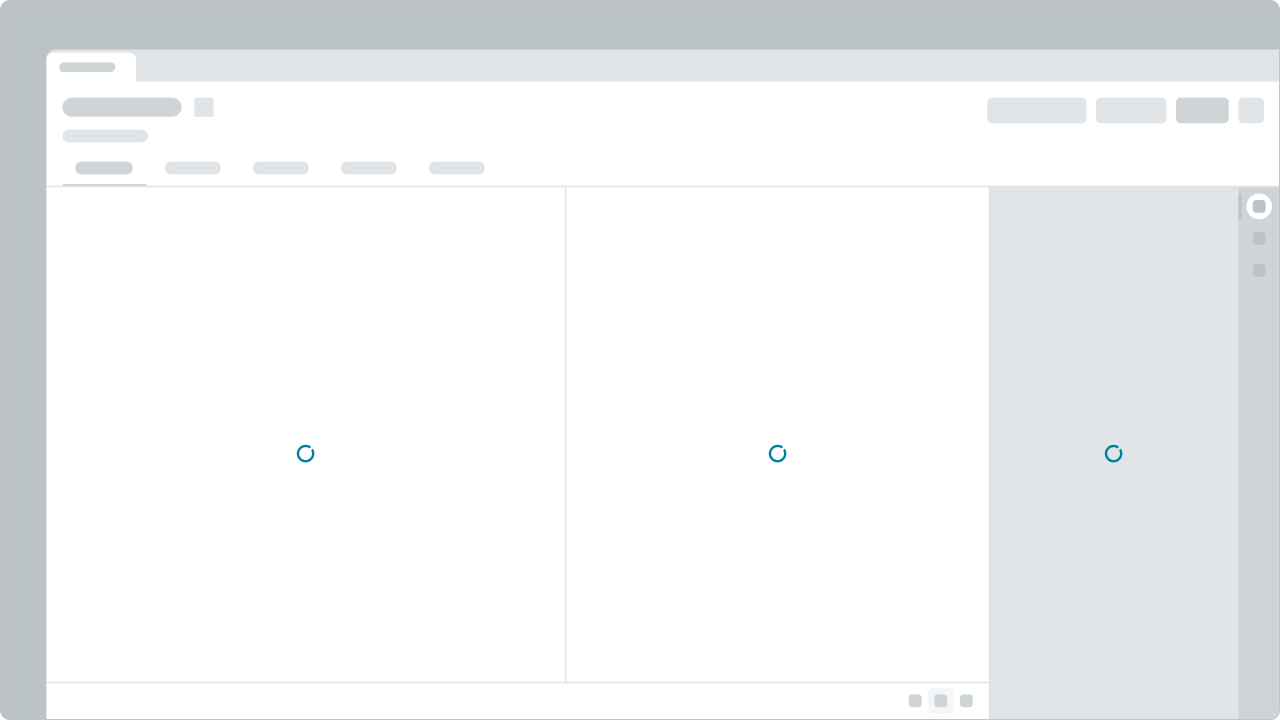
Avoid using multiple loaders within a single view. This may cause unnecessary disruption to a user's workflow and give the impression that the experience is slow. If multiple loaders are needed, consider consolidating multiple loaders within a single loader over a larger area.
Alignment and positioning
Loaders are centered horizontally in their containers. If the loading content has a known or targeted height, loaders vertically align to the middle of the container.
UI text guidelines
These are some recommendations for using text within loader:
- If using a label under a loader, tell the person what is happening while they are waiting or what to expect when loading has finished
- For example, “One moment while we open this file...”
- If using a button with a loader, label the button based on what it will do when the person selects it. This could be an option to stop the loading process or could be another verb the person might want to take.
- For example, if the user is submitting something, the button could be “Cancel submission”
Usability
Loader complies with all internationalization and accessibility requirements.
Internationalization
When the display translates to a right-to-left (RTL) language, the orientation of the loader won't change. Loader elements are always aligned in the center of the component's parent container.
Accessibility
Learn how to access the actionable elements of loader through keyboard interactions and screen readers.
Keyboard interactions
- Tab: Shifts focus to the action button (if available)
- Enter or Space: Launches the action button (if available)
Screen readers
- Give the loader either the alert or status role, depending on the priority of the use case
- For a single loader, set the aria-live property to assertive
- When using more than a single loader, set
aria-liveto polite

