Anatomy
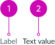
- Label: Describes the associated value
- Value: Can be a string, string type, highlighted value, text link, JSX, or HTML
Subcomponent
See usage guidelines for highlighted value
See usage guidelines for text link
Usage
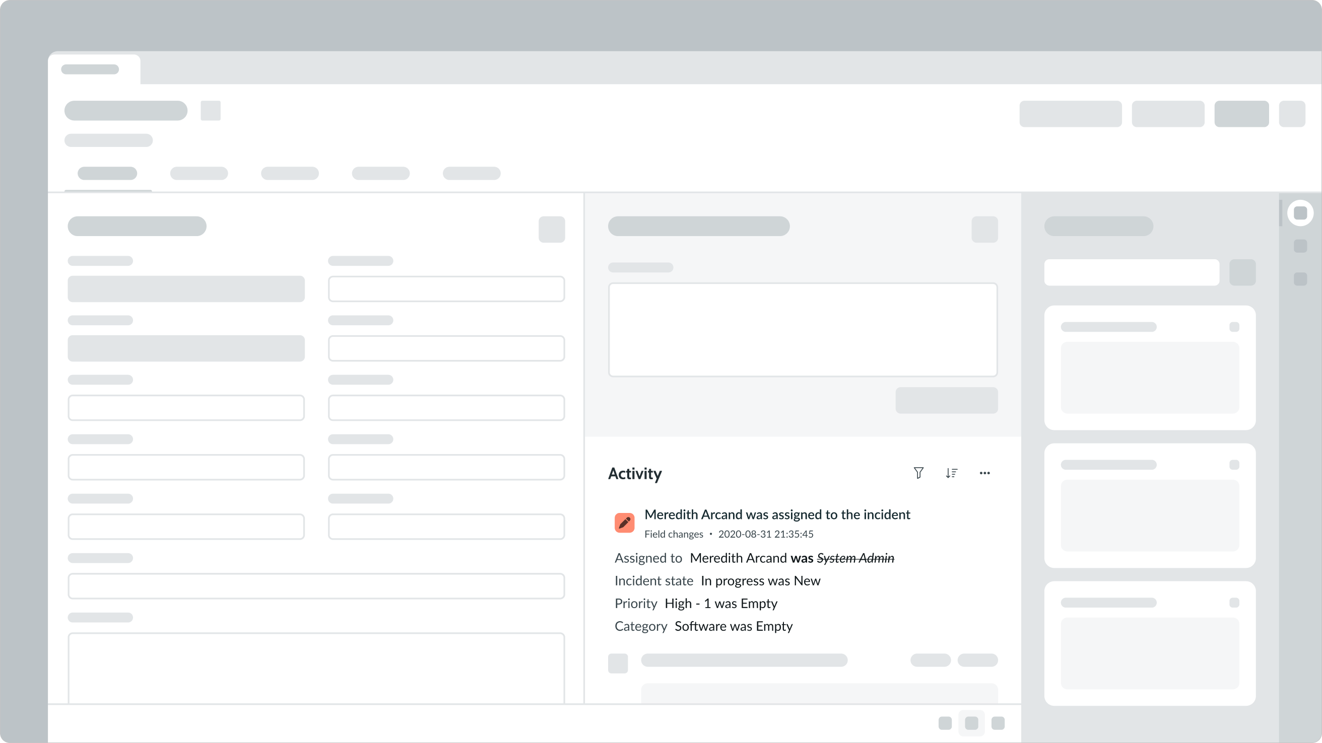
In this example, the activity stream uses label-value pair (tabbed) component to display secondary information for ease of scannability.
Variants
Learn about the attributes of label value tabbed.
Types
Label value tabbed consists of 2 text components: a label and a value. The label is an identifier for the displayed value. There are multiple types of label-value pairs: tabbed, stacked, and inline. This page covers guidance on how to use the tabbed label-value pair.
Click the following links for guidance on the other types.
See guidance for label value stacked
See guidance for label value (inline)
Sizes
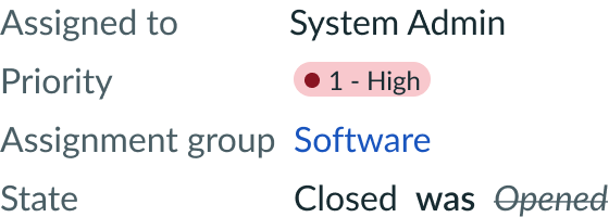
Label value tabbed has the following sizes: small and medium.
Small
Use the small size for secondary or tertiary information. You can also use this size if your design has space constraints.
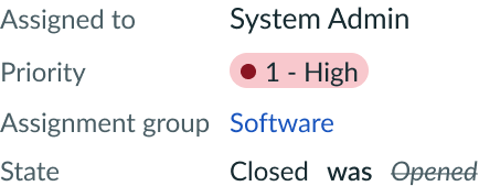
Medium
Use the medium size for information that supplements the primary content. Medium is the default size for label-value pair (tabbed).
Configurations
Learn how to customize label value tabbed by configuring the available properties.
Value types
The values you configure can be any of the following:
- String
- Highlighted value
- Text link
- JSX
- HTML
String
You can display a string value as the value. This can be a single value or an array of values.

Previous value
You can display a previous value as the value. They can be crossed out and appended only with a "was" label. The "was" label is not customizable but it will translate.

Highlighted value
You can display a highlighted value as the value. All highlighted value configurations are still available within label-value pair (tabbed).

Text link
You can display a text link as the value. All text link configurations are still available within label-value pair (tabbed).

JSX
You can display raw JSX as the value.
HTML
You can display raw HTML as the value.
Delimiters
Use delimiters to separate multiple values associated with a label. Delimiters can be commas, pipes, or slashes. A space is automatically added after each delimiter. However, if you need a space before and after the delimiter, you must manually add the space (e.g., Amy | Vice President). Be sure to use the same type of delimiter throughout your design to keep a consistent experience.
Fixed width
You can specify a fixed width for the label. The label then wraps or truncates at this fixed width depending on your wrapping settings.

In this example, the label wraps to the specified width.
Label text wrapping
You can set the label text to wrap instead of truncate once it extends to beyond 30% of the max width. If you set a fixed width, the label wraps at that fixed width.

In this example, the label wraps when it exceeds 30% of the maximum width.
Design recommendations
Tabbed label-value pairs display side-by-side in their own line, with spacing between the label and the value to create a visual distinction. When you display multiple label-value pairs, they will appear one on top of the other and left align.

Multiple label-value pairs (tabbed) should appear one on top of the other.

When multiple label-value pairs (tabbed) appear side by side, it impacts readability and makes it tough to distinguish the individual pairs.
UI text guidelines
These are some recommendations for using text within label value tabbed:
- Use short labels to avoid text wrapping to the next line
- You can use either present tense verbs or nouns in the label depending on the info you’re showing
- For example, “Contact was Abel Tuter” or “Assigned to Abel Tuter”
Behavior
Learn how label value tabbed responds when a user interacts with it.
Truncation
Truncation depends on how much horizontal space is available in the container. The label in a tabbed label-value pair truncates after it extends to beyond 30% of the max width. Labels truncate with an ellipsis, and a tooltip displays the truncated label on hover.

Only the label within a container is truncated. If the values are longer than the width of the container, they wrap to the next line.
Usability
Label value tabbed complies with all internationalization and accessibility requirements.
Internationalization
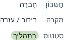
For a right-to-left (RTL) language, the labels and values flip vertically and right align.
Accessibility
Learn how to access the actionable elements of label value tabbed through keyboard interactions and screen readers.
Keyboard interactions
If the value is a text link, a user can Tab to reach the link. Otherwise, label value tabbed doesn't have keyboard interactivity.
Note: An option in the user Preferences menu on the operating system sets a tab stop on non-interactive text that truncates in this component, such as a title or label, and makes that text a tooltip trigger. The user presses Enter or the spacebar to open the tooltip and view the entire content. To enable this feature, set the Enable keyboard focus on truncated text option to true in the Accessibility panel of the Preferences menu.
Screen readers
The order in which screen readers will read label value tabbed is based on the array.

