Anatomy
Learn about the individual parts of input phone
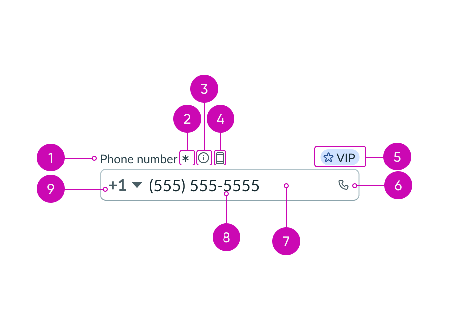
Input phone field
Input phone field dropdown
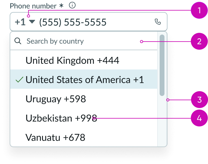
- Dropdown trigger: Opens and closes the dropdown panel
- Search field (optional): Takes in a search query and highlights matching values
- Dropdown list: Displays a list of countries and their associated country codes
- List item: Text label that displays a country name followed by the country code numerals; these list items are alphabetized in the dropdown panel; when a list item is selected, only the country code is displayed
Subcomponents
See usage guidance for dropdown
See usage guidance for search input
Usage
Use input phone to display a phone number that the user can call by selecting the phone button.

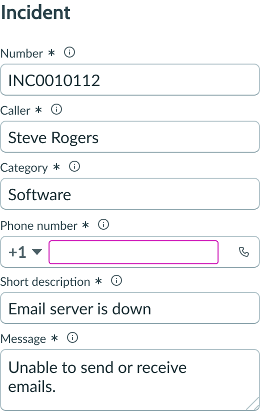
Input phone can also be blank, allowing the user to enter a phone number and either save or call that number.
Variants
Learn about the attributes of input phone.
Types
Input phone is only one type of the input field component.
See usage guidelines for input
See usage guidelines for input password
See usage guidelines for input URL
See usage guidelines for textarea
Sizes
Input phone has two sizes: small (sm) and medium (md). Choose a size that fits with your display and complements the surrounding content. Remember to choose a size that supports the length of the expected user input, including any labels or decorators.
Small
Use the small size for areas that have limited space. The small size reduces the font size of the text.
If icons are included in the input field slot, the padding is reduced between multiple icons.

Medium
Use the medium size alongside similarly sized components and content.
Note: Medium is the default size for input phone.

Configurations
Learn how to customize input phone by configuring the available properties.
Slots
The label has an end and in-line slot for additional information. The label-end slot is available at the end of the label line. The label-inline slot is available immediately after the help icon. You can add anything to the label-inline slot, but icons are the most appropriate use for this slot.

This example shows a color label with optional icon to indicate status or category.

This example shows a device type indicator in the label-inline slot.
Unsaved field indicator
You can use the label-start slot to add an unsaved field indicator. The indicator appears as a small dot next to the field when the field contains unsaved changes and disappears when the changes are saved.
Note: If you want to add the unsaved indicator to all the input fields in a form, see Form usage guidelines.

This example shows an unsaved field indicator next to the label of the input field.
Placeholder text
You can add placeholder text to provide users with guidance on the type of input and expected format. The placeholder text disappears when the user enters a number.

In this example, the placeholder text includes the country code +1 and the example phone number (555) 555-5555
Label wrapping
By default, field labels truncate with an ellipsis when they exceed the container width. To wrap labels, enable this property.

Field layout
You can configure the field layout to be horizontal or vertical. The default field layout is vertical. When the field layout is horizontal, the field label, required icon, and helper icon display to the left of the input field.

Shows the field layout horizontal
Required indicator
You can configure an input field as required with an asterisk indicator after the form label. This indicates that the user must enter a value in this field.
Note: This indicator shouldn’t be used with the optional field indicator.

Optional indicator
You can configure an input field as optional. When used, optional fields display "(Optional)" text next to the label. Add this indicator to an optional field when all other fields are required by default. However, you can show the user that a field is optional without displaying the indicator at all.
Note: This indicator shouldn’t be used with the required field indicator.

Field helper text
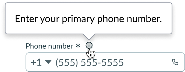
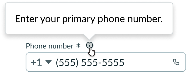
Use the field helper text to display information needed for guiding users on how to complete the field. The helper text displays in a popover when the information icon is activated.
Country codes
If your use case requires users to enter phone numbers outside of the US, you can configure country codes to be displayed in a dropdown. Selecting a country from the dropdown list displays the country code in the input.
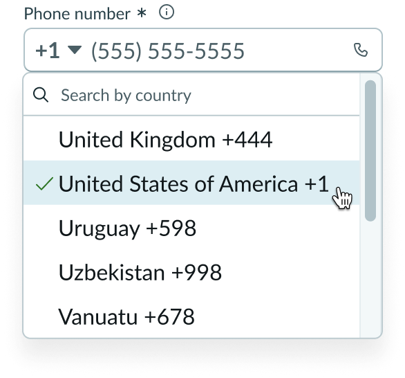
In this example, the user selected the dropdown trigger to reveal all possible country codes
Design recommendations
Learn how to use input phone in your design.
Alignment and positioning
The text aligns to the left within the input field.
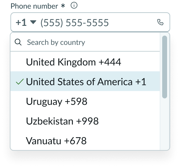
If you include a dropdown panel, the list items in the dropdown list align to the left.
UI text guidelines
These are some recommendations for using text within input phone.
Labels
- Use a label that tells the user that this input is for phone numbers only.
Form field messaging
- Informational message
- Use clear and concise language to help the user fill out the input
- For example, “Remember to include the country code.”
- Use clear and concise language to help the user fill out the input
- Warning message
- Include information that helps the user understand any consequences or next steps
- Use present tense since this message shows up before any input
- For example, “Avoid using dashes between numbers.”
- Error message
- Avoid blaming the user. Instead, tell them what happened and how they can fix it.
- Use past tense since this message shows up after the user submits something
- For example, “Failed to verify this phone number.”
Field helper text
- Provide additional information about password requirements to help the user understand what they're expected to input
- If you’re adding a list into the popover, consider formatting it using bullets to make it easier to read
Placeholder text
- Use sparingly because it disappears once the user puts their cursor in the input field
- Format placeholder text as an example of a phone number or a brief description of how to complete the field
For additional UI text guidelines, visit the usage guidance for the input component.
Behavior
Learn how input phone behaves when the display changes or a user interacts with the component.
States
Input phone has the following states: default, hover, focus, disabled, read only and invalid.
A read-only state shows a number that the user can't change, update, or call directly. For example, input phone may be in a read-only state if the employer assigned a specific phone number to the employee.
| State | Normal |
|---|---|
| Default |  |
| Hover |  |
| Focus |  |
| Read-only |  |
| Disabled |  |
| Invalid |  |
Responsive behaviors
Input phone resizes based on the width of its container.
Interactions
Learn how input phone responds when a user interacts with it.
Invalid state
If a user enters an invalid phone number and navigates away from the input, the input state changes to invalid. Similarly, bypassing a required input results in the state changing to invalid. In either case, the input remains invalid until corrected. When in an invalid state, both the label and the asterisk—or optional text, if configured—appear in red.

Phone button
The user can enter a phone number and call that number directly by selecting phone icon in the input field.

Information button
If you’ve configured field helper text, a user can select the information icon to view additional information or suggestions for the expected input.
Dropdown
When Country Codes have been configured, the dropdown is displayed at the start of the input. Selecting the dropdown triggers a dropdown list. Selecting a list item only displays the country code in the dropdown.
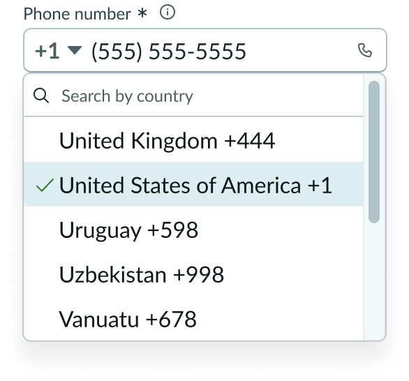
In this example, the user selected the dropdown trigger to reveal all possible country codes
Usability
Input phone complies with all internationalization and accessibility requirements.
Internationalization
When the display translates to a right-to-left (RTL) language, the content flips and aligns on the right. The phone icon appears on the left instead of the right side, and all list items within the dropdown list align to the right.

Accessibility
Learn how to access the actionable elements of input phone through keyboard interactions and screen readers.
Keyboard interactions
You can access the actionable elements of input phone with these keyboard keys:
- Tab: Follows the Tab order within the input field and moves from the country code to the phone number
- Tab or Shift + Tab: Moves between the interactive elements on the input field in the standard tab order; if the component includes a dropdown, it appears in the tab order after the country code

When focus is in the text input field:
- Arrow right/left: Moves the text entry caret across available text
- Arrow up/down: Moves the text entry caret through rows of available text (if applicable)
- Control/Command + Shift: Selects text
- Shift + Arrow right/left: Selects one character at a time
When focus is in the dropdown panel:
- Enter or Space: Selects the currently focused menu item and closes the dropdown panel
- Down arrow: Moves focus to the next non-disabled menu item
- Up arrow: Moves focus to the previous non-disabled menu item
- Home: Moves focus to the first non-disabled menu item
- End: Moves focus to the last non-disabled menu item
- Esc: Closes the dropdown panel without making a selection
Screen readers
When you apply ARIA labels to a component, screen readers announce the controls and content of input phone in the prescribed tab order.
- Assign the aria-label or aria-labeledby attribute to input field to allow screen readers to provide additional context for that form field
- Assign the aria-describedby attribute to contents of field helper; this provides supplementary user guidance for the content required in the input field
- Assign the aria-required to required field indicator and set to "true"; By default, aria-required is set to "false"
- Assign the aria-invalid to "true" to alert when a field is marked as returning an error; by default, aria-invalid is set to "false"

