Anatomy

- Icon: Icon that shows user presence
Subcomponents
Usage
Use the presence icon to indicate a user’s availability. The presence icon uses specific symbols with the state colors. This offers a visual cue to users who may not be able to distinguish the colors from one another. You can use the presence icon with an avatar, to show a user’s availability in a chat, or in a profile.
Avatar
Pair a presence icon with an avatar to show a user's availability.

Chat
Use a presence icon to show the availability of a list of users (such as agents in a dropdown list).

User profiles
Use a presence icon on a user profile to display a user's online status.

Variants
Learn about the presence icon and find out how to use it in your design.
Sizes
The presence icon is available in five sizes for all utility icons: extra small (xs), small (sm), medium (md), large (lg), and extra large (xl). Choose a size based on the context of the presence icon as well as the surrounding components.
| Size | Preview |
|---|---|
| Extra small | |
| Small | |
| Medium | |
| Large | |
| Extra large |
Design recommendations

The size of the presence icon works well with the status label text.

The presence icon is too large for this display. Its size should correspond to the surrounding content and components.

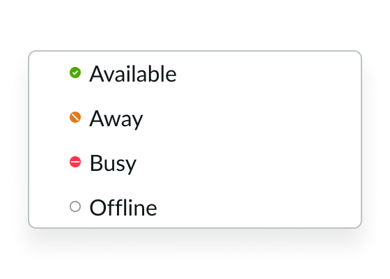
The status labels are clear and concise.

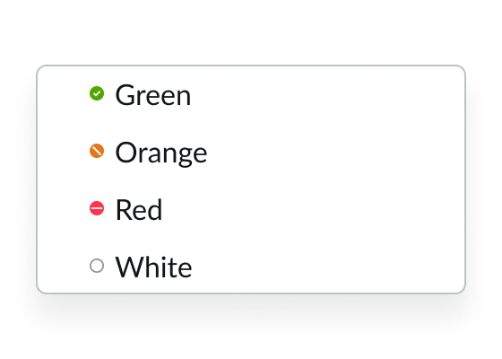
The status labels only describe the color and don't convey the meaning of the presence icon.
UI text guidelines
- Don't use ambiguous or slang words for status labels; pick a word that accurately represents the state of the presence icon
- Avoid using more than one word for a status label
Behavior
Learn how the presence icon behaves when the display changes or a user interacts with the component.
States
The presence icon has the following different states: available, busy, away, and offline.
| State | Generic |
|---|---|
| Available | |
| Busy | |
| Away | |
| Offline |
Usability
The presence icon complies with all internationalization and accessibility requirements.
Internationalization
When the display translates to a right-to-left (RTL) language, the presence icon does not flip its positioning and remains on the right side. The exception is when the presence icon is used within the avatar component.

In this example, the presence icon appears with an avatar in a RTL language.
