Anatomy

- Icon: Symbol or character configured to support a given use case
- Container: Space that contains the icon
Subcomponents
See usage guidance for iconic button
See usage guidance for tooltip
Usage
Button stateful is a component that can be used to express an active state through a visual change. Where you use it in your display will depend on the context and surrounding content.
Navigation
Using button stateful in the navigation helps to display relevant information while saving space. Button stateful uses the highlighted variant when it’s part of the navigation. A unique background style or highlight indicates the selected view. The user can only trigger one button at any given time.

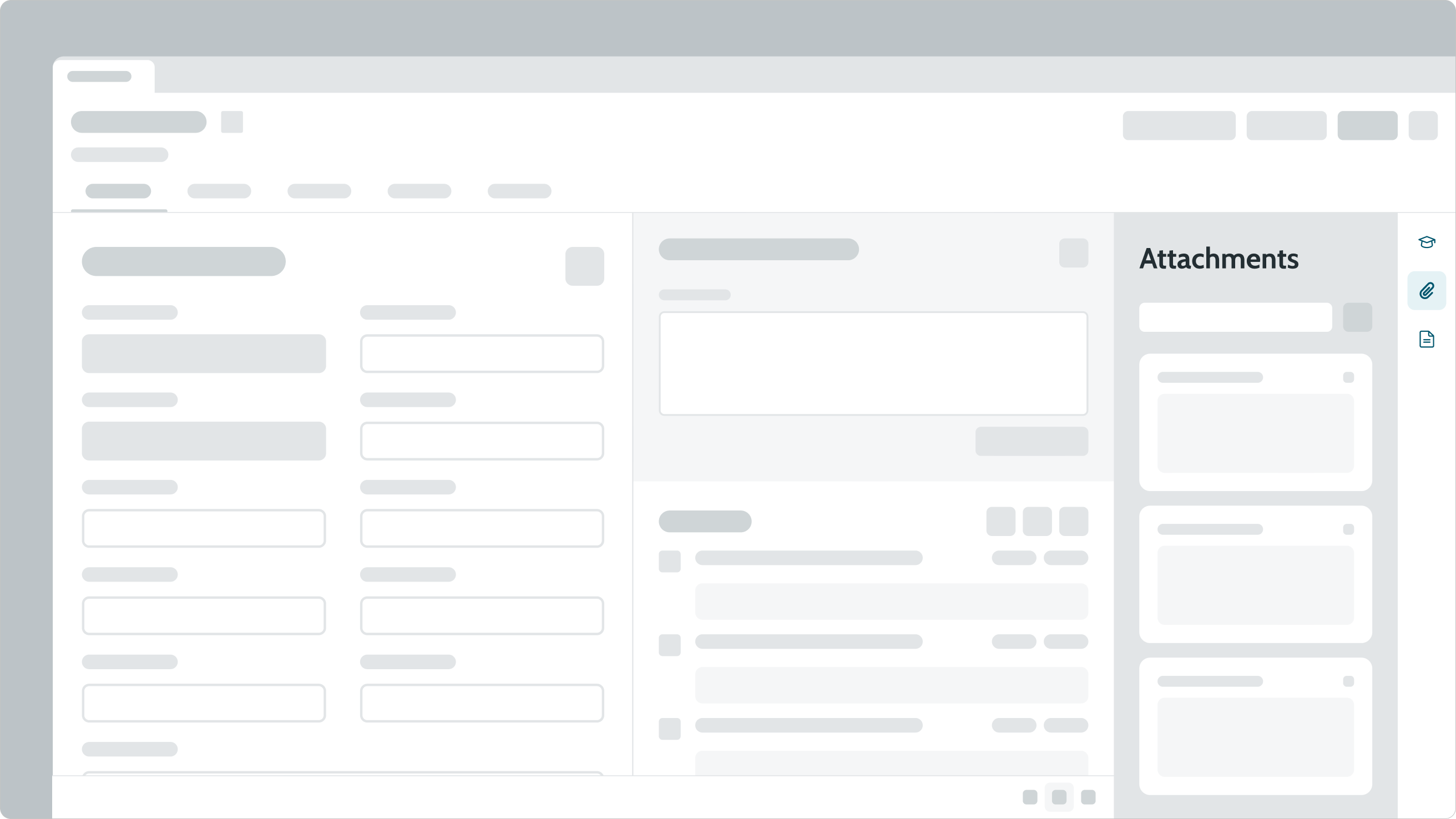
The right sidebar uses stateful buttons for navigation.
View switcher
View switchers help the user go between different displays of the same set of information. Similar to navigation, view switching uses the highlighted variants of a button stateful. The selected view is indicated by a unique background style or highlight, and only one button can be triggered on at any given time.

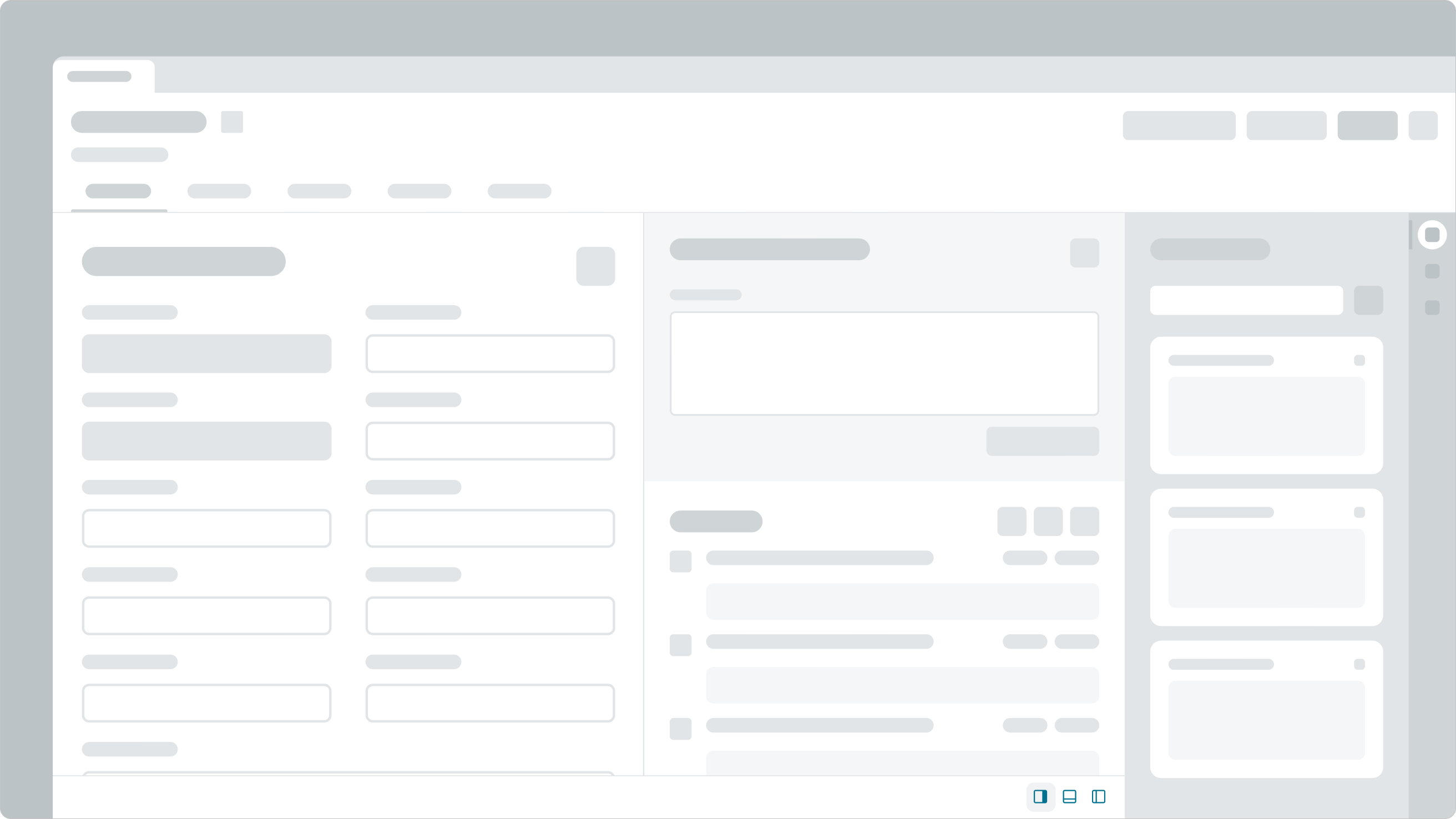
The bottom area is a view switcher, which uses stateful buttons to change how the Forms and Activity areas display information.
Action toggle
Stateful buttons create a quick and easy way to toggle between actions.
Variants
Learn about button stateful and find out how to use it in your design.
Colors
Button stateful has the following color variants: primary, primary selection, secondary, secondary selection, tertiary, and tertiary selection. The primary color variant emphasizes important actions in the display. Meanwhile, the secondary and tertiary color variants signify actions of lesser importance.
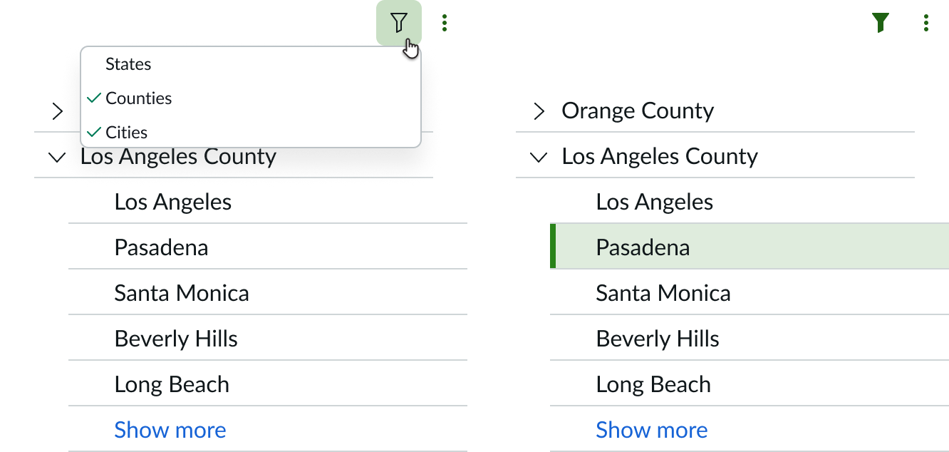
The button stateful selection variants are intended to match other components with selection styling. For example, use the primary selection variant of button stateful for a content tree filter. In the image below, the primary selection variant of the filter button stateful matches the styling of the item selected in the content tree.

In this example, the filter button stateful uses primary selection variant. The primary selection variant matches the styling of content tree component.
| Variant | Example |
|---|---|
| Primary | |
| Secondary | |
| Tertiary | |
| Primary selection | |
| Secondary selection | |
| Tertiary selection |
Sizes
The button stateful is available in the following sizes: small (sm), medium (md), and large (lg). Choose a size based on the available space and the button's context to surrounding components and content.
Medium is the default size for button stateful.

Configurations
Icon selection
You can choose which icon to use for a button stateful. The button's use case will determine what type of icon you should use. Remember to use icons that are relatable and consistent with existing patterns. For instance, a paperclip icon could navigate a user to "Attachments." This is a common pattern for many products and websites.

The star and “thumbs up” icons in this card are action toggles. The filled “thumbs up” icon shows that a user marked this card as helpful. Selecting the icon again would revert it to an outlined icon.
Highlighted style
The highlighted property sets the style to add a color background when selected. Use the highlighted style for a button stateful when a user can only select one option at a time. Don't use the highlighted style for stateful buttons that can be simultaneously toggled on. By default, selected state no background.

Tooltip content
Stateful buttons don't have labels. Instead, they use a tooltip to reinforce and supplement the button's intent. You can configure the content that appears inside of a tooltip. The tooltip appears on hover after a slight delay.

An example of tooltip content in button stateful. Remember to use the correct phrasing for signifying opposite states.
Design recommendations

Choose the correct variant to use based on use case and use one variant style. Tertiary style is used here because actions are of low importance.

Don't mix different variant styles. This example incorrectly uses all variants together.

Do use to toggle between states, such as, bookmarking an item.

Don’t use button stateful to trigger a single action, such as opening an external link.
Alignment and positioning
Learn how to place stateful buttons and any elements in your design.
UI text guidelines
These are some recommendations for using text with button stateful:
- Use a verb to express what will happen when the person selects the button
- For example, the button could say “Flag comment” to inform a person that selecting it will flag the comment
- Remember to change the verb to represent what will happen when the person selects the button again
- For example, the button could say “Unflag comment” to inform a person that selecting it again will remove the flag from the comment
- Use a verb or verb and an object to describe when the button is selected and not selected. Remember to change the verb to represent the selected and not selected states of the button.
- For example, you might use a thumbs up icon to let someone like or show support for something. In this scenario, the tooltip would say “Like” if the button isn’t selected, and “Unlike” if it’s selected.
Behavior
Learn how button stateful behaves when the display changes or a user interacts with the component.
States
All variants of button stateful have the following states: default, hover, selected, pressed, and disabled. For more information on variant usage, see variants section above.
The selected state has an option to use a highlighted style. The highlighted style adds a color background when selected. Use the highlighted style for a button stateful when a user can only toggle on one option at a time. Don't use the highlight style for stateful buttons that can be simultaneously toggled on. By default, selected state has no background.
Primary
| State | Primary variant | Primary selection variant |
|---|---|---|
| Default |  |
 |
| Hover |  |
 |
| Pressed |  |
 |
| Selected |  |
 |
| Selected (highlighted style) |  |
 |
| Selected hover |  |
 |
| Selected pressed |  |
 |
| Focus |  |
 |
| Default disabled |  |
 |
| Selected disabled |  |
 |
Secondary
| State | Secondary variant | Secondary selection variant |
|---|---|---|
| Default |  |
 |
| Hover |  |
 |
| Pressed |  |
 |
| Selected |  |
 |
| Selected (highlighted style) |  |
 |
| Selected hover |  |
 |
| Selected pressed |  |
 |
| Focus |  |
 |
| Default disabled |  |
 |
| Selected disabled |  |
 |
Tertiary
| State | Tertiary variant | Tertiary selection variant |
|---|---|---|
| Default |  |
 |
| Hover |  |
 |
| Pressed |  |
 |
| Selected |  |
 |
| Selected (highlighted style) |  |
 |
| Selected hover |  |
 |
| Selected pressed |  |
 |
| Focus |  |
 |
| Default disabled |  |
 |
| Selected disabled |  |
 |
Responsive behavior
Learn how button stateful responds to changes in a container or display.
Usability
Button stateful complies with all internationalization and accessibility requirements.
Internationalization
When the display translates to a right-to-left (RTL) language, the order of importance for buttons flips. Consider this order when you include a button stateful in your design. Also remember that icons flip for a RTL language only if they communicate direction (e.g. an arrow icon).
Accessibility
Learn how to interact with the button stateful using a keyboard and screen reader.
Keyboard interactions
When the button is in focus:
- Space or enter: Toggles the state of the button between pressed and unpressed
Screen readers
The button stateful requires configuration of the aria-label attribute in the configAria property to be accessible using a screen reader.

