

Anatomy
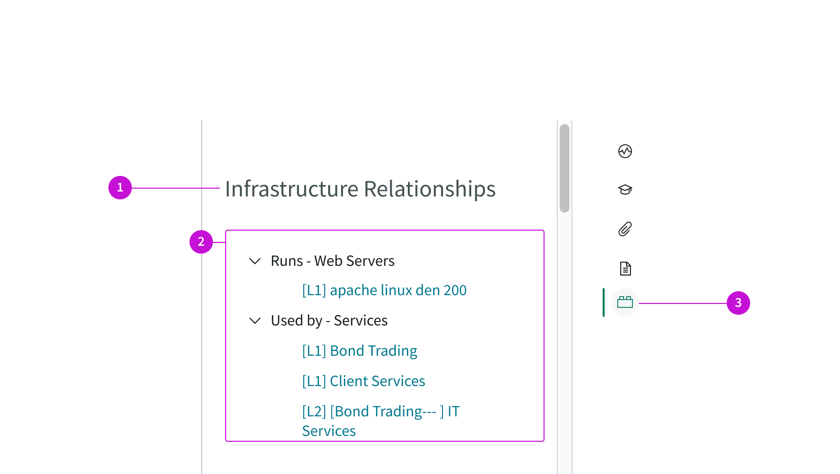
- Title: Default title of the panel
- Content tree: Hierarchical tree that shows the relationships of the configuration items in the list to the current CI being viewed; related CIs are displayed under collapsible classes
- Contextual side panel icon: Opens and closes the panel containing the CI relationships tree
Usage
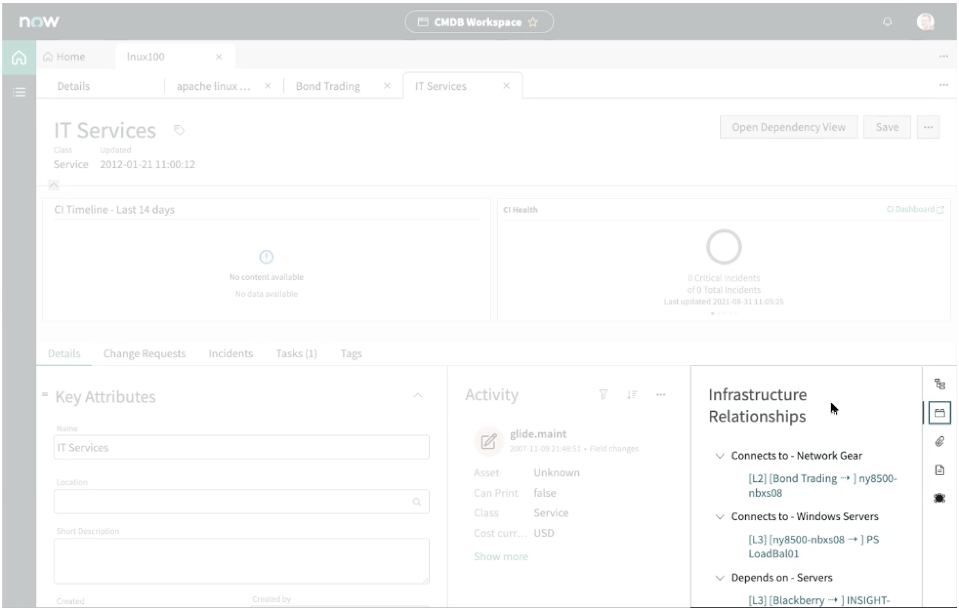
The CI infrastructure relationships page shows the relationships between configuration items (CI) and provides links to affected CIs.
Users can use this page template to:
- Track dependent CIs that might be affected by an outage or a change.
- Open a dashboard to see details for a dependent CI such as location, health, and activity.
- View any tasks, incidents, or change requests associate with a dependent CI.
Components
The CI infrastructure relationships page template is built with Horizon Design System components that have their own attributes.
Content tree
The content tree component displays the relationship between parent and child nodes in a collapsible, hierarchical structure. Child nodes in the tree are linked to records that display in tabs. For more information, see the usage guidelines for content tree.
Interactions and behaviors
This is how the content tree reacts to user interaction and changes to the container size when used in the CI infrastructure relationships page template.
- When the content tree is taller or wider than the height of the parent container, a scrollbar appears to let the user see the full content tree.
- Parent classes and child nodes have a highlighted hover state.
- Selecting the chevron icon on a CI class expands or collapses that node.
- Users can select child node links to open a record associate with that CI in a subtab.
- Users can resize the content tree container by grabbing the handle on the divider and dragging it right or left.
Defaults
By default the content tree displays these attributes:
- Entries that are too wide for the container wrap to two lines.
- Each child node indicates the degrees of separation between the child node and the main CI in the form.
Configurations
The CI infrastructure relationships page template is intended to be used as-is in your experience and provides default functionality that fits most use cases. The page is created from a template that is updated automatically. If you copy the template in UI Builder and customize the page, you won’t receive template updates, and your page might not function properly after an upgrade.
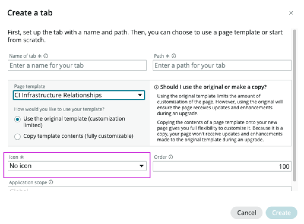
Selecting the icon
Users can configure the icon that opens the relationship panel from the contextual sidebar. The Icon field is in the dialog box used to create a tab for the contextual sidebar component. Use the dropdown to select an icon from the library.
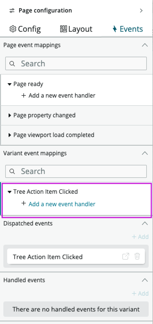
Event action
Selecting a child node in the content tree triggers the Content tree actionable item clicked event. This event doesn’t have a default action associated with it and must be configured to perform the action you want, such as opening a record. When the page is referenced by another screen, you can add an event handler to the body of the CI infrastructure relationships page under Variant event mappings. Use this selection to configure an action when a child node is selected.
For instruction on configuring an event to trigger an action, see Configure an event handler.
Usability
The CI infrastructure relationships page template complies with all internationalization and accessibility requirements.
Internationalization
When this page template is used in an instance configured for a right-to-left (RTL) language, the individual components have their own behaviors. See the usage guidelines for the components used in the page for details.
Accessibility
For accessibility behaviors of specific components, see the usage guidelines for those components.
Keyboard interactions
Each component used in the CI infrastructure relationships page template has its own tab order and keyboard interactions. See the usage guidelines for details.
Screen readers
When you apply ARIA labels to a component, screen readers announce the controls and content of each component in the prescribed tab order. See the usage guidelines for details.