

Anatomy
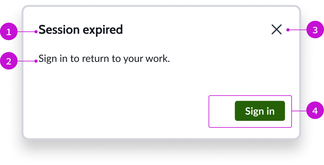
- Header: Text title accompanied by a close button
- Content slot: Container for the main content of the modal; the content can be text, forms, lists, cards, or other elements
- "Close" action: Iconic button for exiting the modal
- Footer: Container for buttons related to the content of the modal
To learn about how to add and configure an Alert Modal to a page, see Add modal to component.