

Anatomy
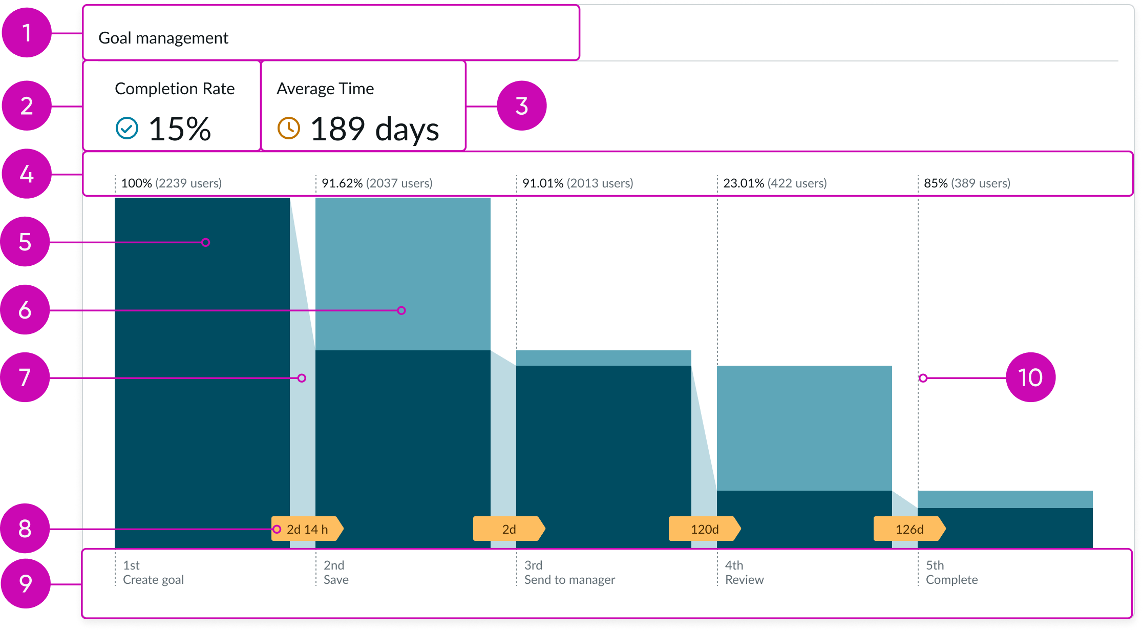
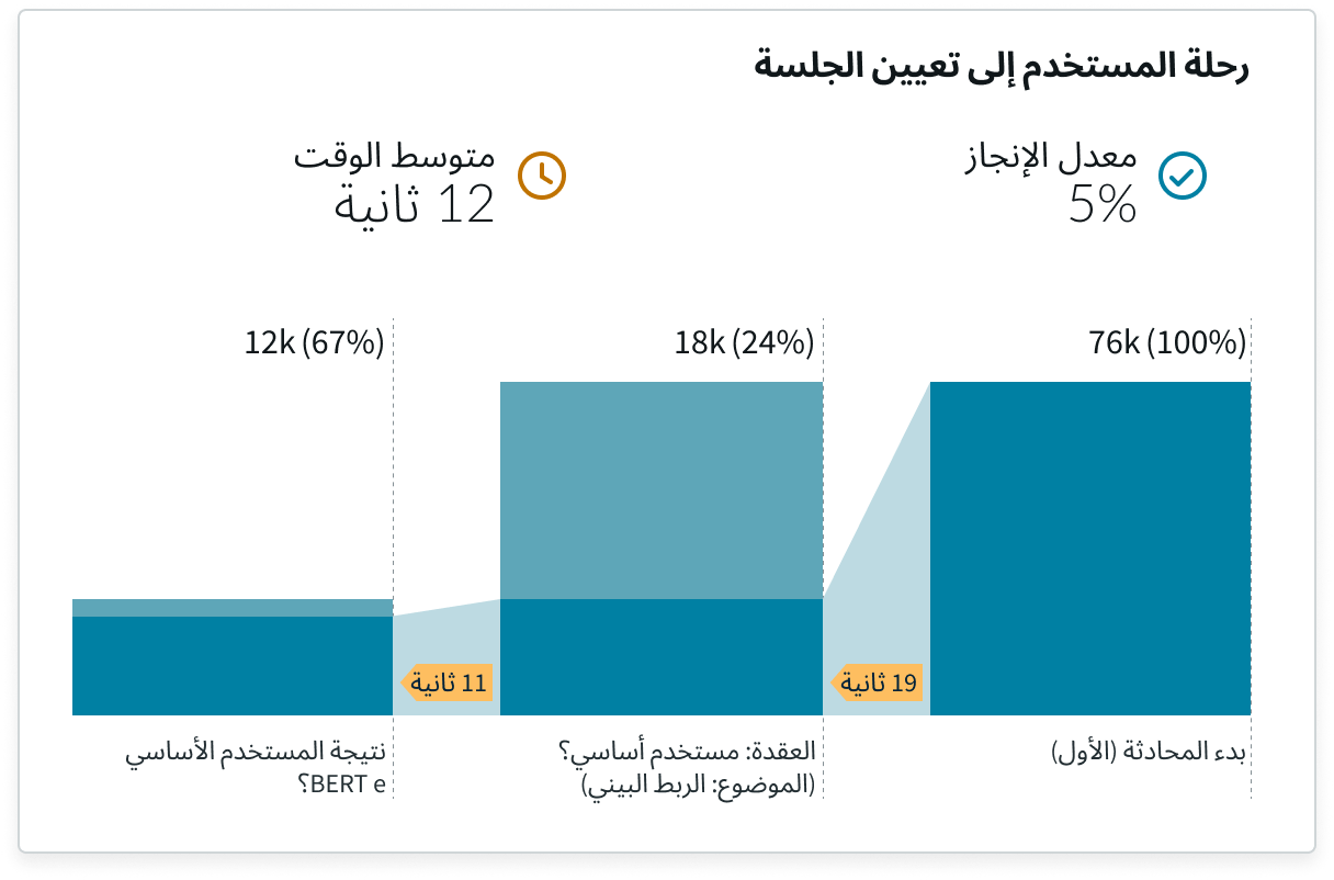
- Chart title: Short title of chart
- Completion rate: Percentage of users who completed a specific set of actions in a predefined funnel order
- Average Time: Average time it took for users to complete specific actions from the funnel
- Step count: Percentage and total number of users that completed each step
- Engaged Users data bars: Bars that show the aggregated values for users that performed the step; the bars are proportional to the values each represents
- Abandoned Users data bars: Bars that show aggregated values for users that left the step before completing it; the bars are proportional to the values each represents
- Conversion drop: Visual comparison drop between 2 steps of users that performed each step
- Conversion time: Average time it took users to complete the previous step
- Step name: Name of the step and number position in the funnel
- Dashed line divider: Separates each step column
Usage
Funnels help optimize user experience by understanding if users are completing specific user flows in an application.
By using the funnel chart, a user can track pain points in their applications and review conversion rates for various processes, such as: onboarding, search completion, and finding desired Knowledge Base (KB) articles.
The funnel can include multiple actions that lead to the success or failure of a flow.
Funnel analysis displays three primary metrics:
- Number of users that progress from one step to the next
- Conversion rates per stage
- The average time it takes for users to advance from one step to the next
Configurations
Learn how to customize funnel. Use the data properties to select and organize the data you want your users to see from the source. Select the chevron icon to expand a section and display the properties in each category.
Presentation properties
The presentation properties control the physical appearance of the chart. Use these properties to control how your users consume the data. Select the chevron icon to expand the section and display the properties in each category.
Header and border
The component header can display in the top left and contains the title and a description. You create the header and then show or hide it with the controls provided. By default, the header is configured to show, but the content is empty.
Header separator
Use the controls to add a line that separates the header from the rest of the funnel chart. This line is hidden by default.
Chart title and description
By default, the chart title is “Funnel”, but you can change it. If the title is long, it truncates and an ellipsis displays. If you want, you can have the title to wrap to a second line.
You can add an optional chart description that appears when the user hovers over the information icon.
Border
A chart border is shown by default, but you can configure it to be hidden.
Data source
You need to specify the source from which your funnel selects and organizes the data you want your users to see.
Application
You can choose the application from a list of applications in your instance.
Platform
When you choose Mobile App for the application, iOS is selected, but you can specify Android.
Version
When you choose Mobile App from for the application, by default all versions of the app are included, but you can specify a single version.
Funnel
You can choose a funnel from a list of all funnels created in the selected application.
Date range
The default date range is up to 30 periods with periods equalling days.
Specify periods
You can configure a custom number of periods to be displayed as well as define a period as Days, Months, or Years.
Conversion information
By default, funnel shows the conversion information, but you can hide any of this data from the user.
Conversion time
The average time it takes for users to advance from one step to the next that displays by default.
Conversion percentage
The percentage of users who have completed the previous step shows by default. When the text exceeds the allotted space, it wraps to a second line. Any text that runs beyond the second line is truncated.
Converted users
The number of users who completed the previous step that shows by default.
Hide funnels chart
You can hide the visual chart part of funnel which shows by default.
Step name
You can hide the step names that appear by default.
Design recommendations
Learn how to apply a funnel chart in your design.
Chart positioning
Funnel chart is always centered within the container and retains a fixed height/width ratio. The height and width of the chart is responsive to the container size.
Funnel chart can’t be manually adjusted.
Behavior
Learn how funnel behaves when the display changes or a user interacts with the component.
States
Funnel chart has the following states: default, hover, data not configured, and no data.
| State | Example |
|---|---|
| Default | 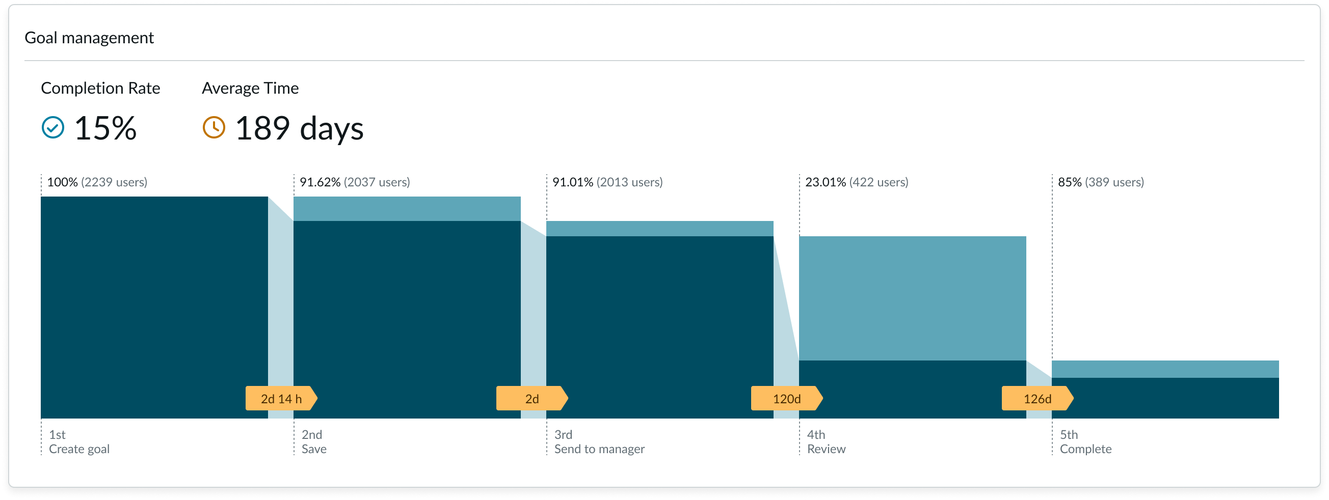 |
| Hover |  |
| Data not configured | 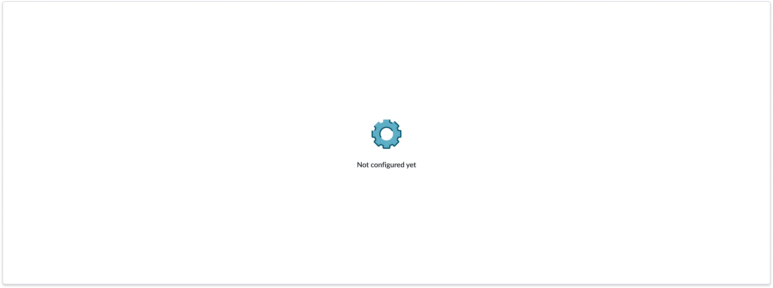 |
| No data | 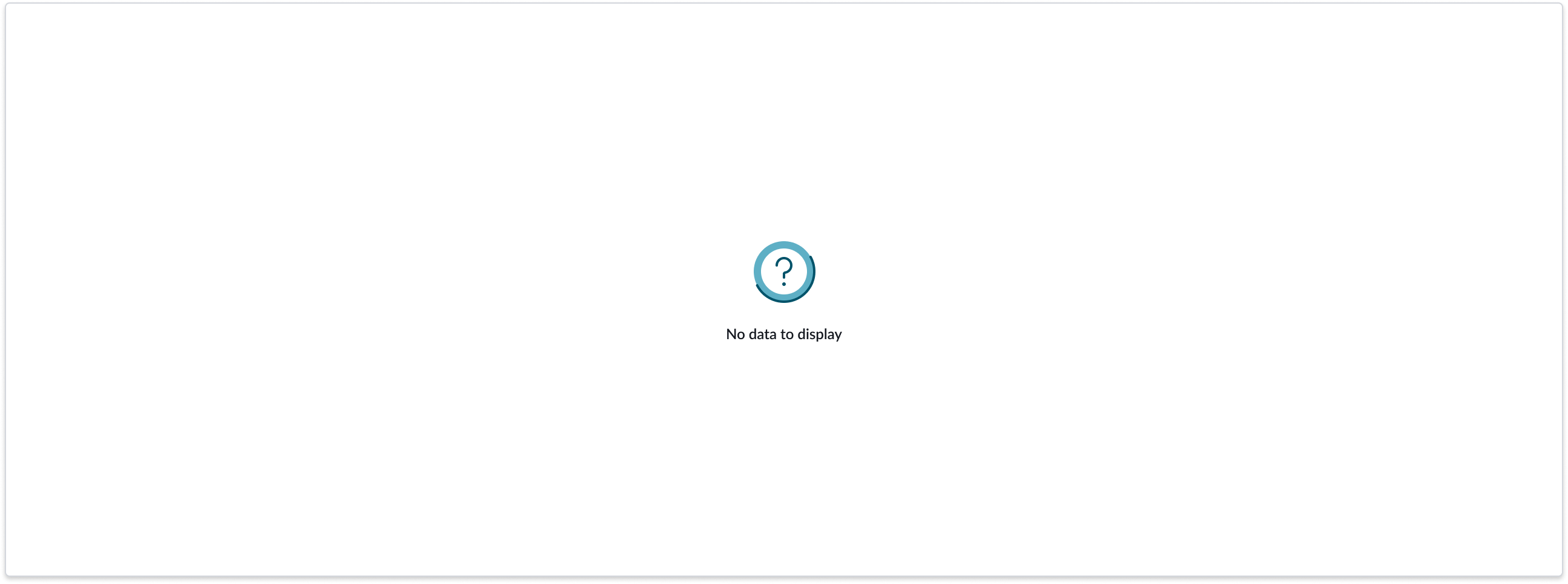 |
Responsive behaviors
The funnel chart resizes to occupy the container width and height.
Truncation
Long text in the step count and step name wrap to a second line, and the step name rotates 45%. Text that extends beyond the second line, truncates and an ellipsis displays. On hover, a tooltip shows the full content.
If the conversion time extends the space, an ellipsis displays and on hover, a tooltip shows the full conversion time.
Interactions
When a user places their mouse pointer on a step vertical bar, step count, or step name, a tooltip displays.
Usability
Funnel chart complies with all internationalization and accessibility requirements.
Internationalization
When this component is used in a platform configured for a right-to-left (RTL) language, all elements flip and the text aligns to the right.
Accessibility
Learn how to access the actionable elements of funnel chart through keyboard interactions and screen readers.
Keyboard interactions
Funnels doesn’t currently support keyboard keys.
Screen readers
Funnels has no elements that a screen reader can announce.