

Anatomy
Learn about the individual parts of node map.
Basic anatomy
- Node: The visual unit used to represent ideas or concepts within the node map; includes a node label
- Icon: An icon inside the node; can display as an icon, avatar, image, or profile initials
- Node label: The text attached to the node; includes a node title and node subheading
- Node menu: An action bar that opens when the user selects a node
- Edge: A line that connects one node to another
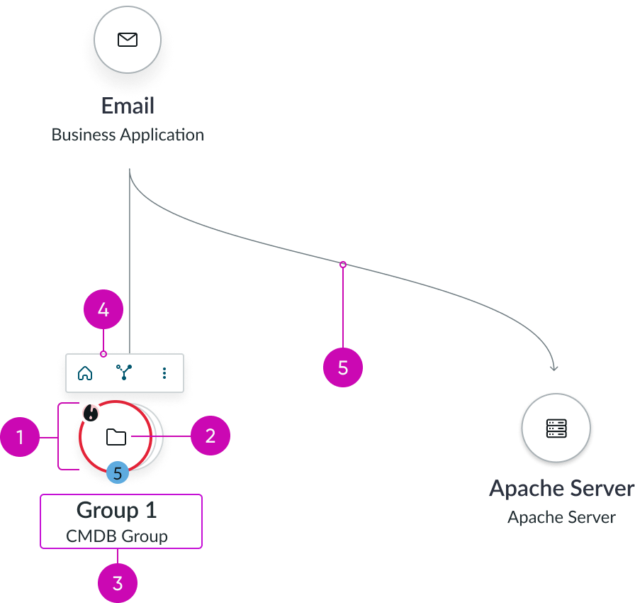
Node group expanded

- Node group: The highest level node in a node group; the node that displays before expanding into the the node group container
- Node group number: Displays the number of nodes in the selected node group
- Nested node group (optional): A node group within a node group
- Status icon: Customizable status icon; only WCAG appropriate colors are available
- Node group container: Expands when the node group is selected; displays all nodes in a given node group
Node menu
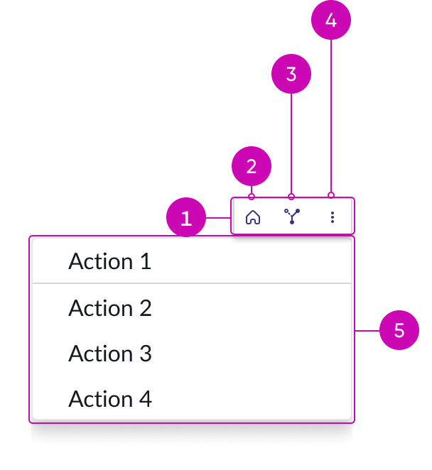
- Node menu container: Holds the 3 node menu items
- Home button: Iconic button; can be hidden
- Show nodes button: Iconic button; can be hidden
- Overflow menu button: Iconic button; fully customizable
- Node menu dropdown panel: Holds the actions for the node menu items
Subcomponents
See usage guidelines for icon presence
See usage guidelines for now icon
Usage
Node map is intended to visualize relationships between ideas, however, it can be used for a variety of use cases. For example, team organization charts can use node map to illustrate hierarchy and relationships between team members.
Layouts
Learn about the layout types available in Node map.
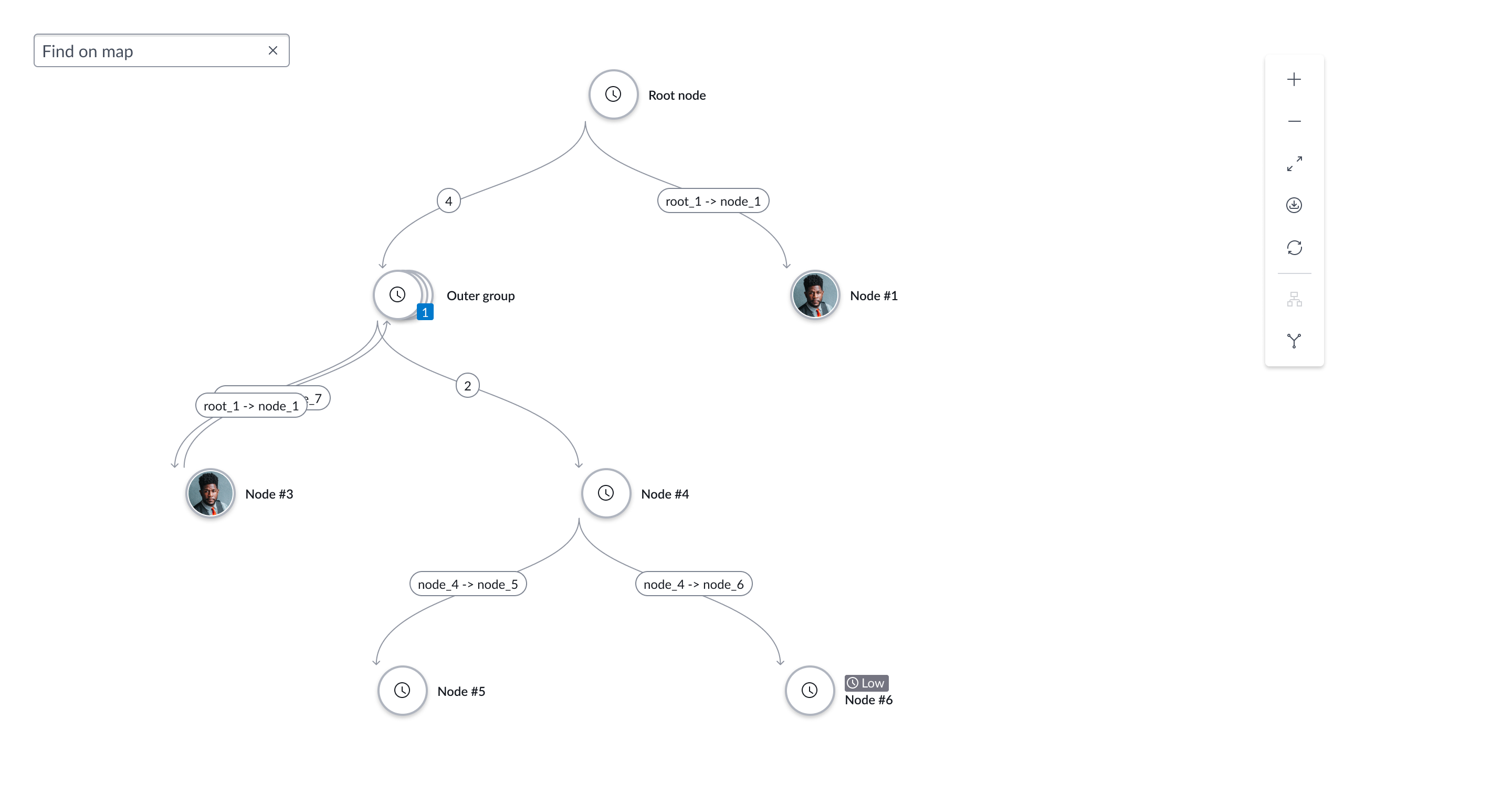
Hierarchical top-down
This layout type arranges nodes in a tree-like structure. Use this structure to define parent-child relationship between nodes.

Layered with group containers
This layout type arranges nodes into distinct groups or clusters based on their relationships. Use this layout to visually emphasize relationships or categories, for example, when visualizing a network with multiple interconnected components.

Unified force
This layout type arranges nodes with interconnecting edges like strings holding the nodes together in a physics-based simulation. Use this layout to represent complex interconnecting relationships without hierarchy, such as configuration management database (CMDB) data.
Unified vertical
Arranges nodes in a top-to-bottom or a bottom-to-top structure. Use this layout to represent hierarchy or sequence of nodes in a vertically-aligned spread.
Force
This layout type is similar to unified force, it arranges nodes with interconnecting edges like strings in a physics-based simulation. Unlike unified force, you can customize the visual appearance of nodes in this layout. Use this layout to represent generic layouts without hierarchy.
Horizontal
This layout type arranges nodes from left to right, creating a linear flow structure. Use this layout to illustrate sequential processes, timelines, and step-by-step workflows.
Radial
This layout type uses node edges to highlight the connections between nodes. It arranges nodes in a circular pattern, creating a ring-like structure. Use this layout to illustrate the relationships (connections) between the nodes. For example, you can use this layout type to show a visual representation of the connection between tables in a database.

Additional controls and content slots
Node map supports additional controls for users to interact with the map. There are three controls available: Finder, Control Panel, and Minimap. You can configure the visibility and position of the controls in the map. In addition to the controls, you can also add components in the node map using the content slots.
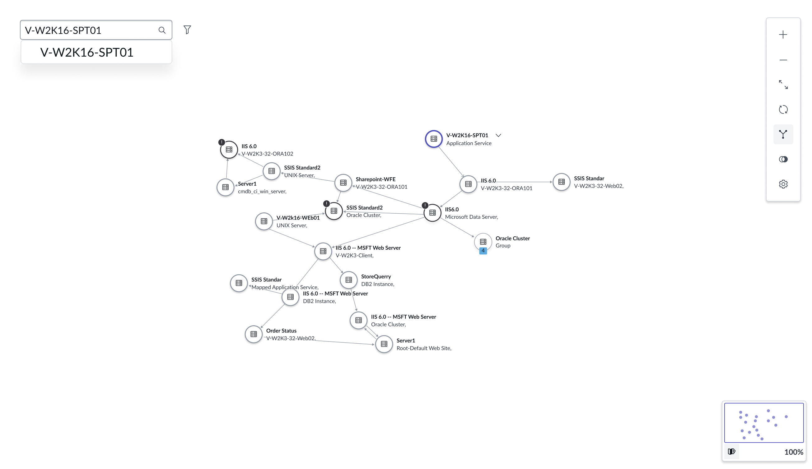
Finder
Finder is a search box in the map. Users can use this search box to perform a live search for nodes and edges based on an input string. Finder classifies results based on whether the matching information is present in a node or an edge. Node map highlights and zooms into the matching nodes and edges based on the search string.

Control Panel
Control Panel enables users to control the map zoom, reset the zoom to make the map fit the screen, and export of download the map. You can configure the control panel to export or download the map as a PDF, JPG, or PNG file.

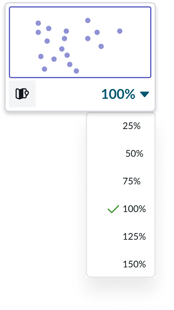
Minimap
Minimap provides a preview of the map along with options to set a zoom value in increments of 25% starting from 25 to 150%. Users can interact with the minimap to focus on portions of the map.
Content slots
Node map supports up to three content slots. Content slots are placeholders where you can add components in the map. Content slots help improve the flexibility and extensibility of the node map experience. They enable modular interactions and contextual extensions without affecting the map’s core visualization. You can use each slot to open modals, legends, or execute additional tasks to enhance the map’s usability. For example, you can add button components to provide additional functionality like reset, refresh, or share the map.

Configurations
Learn how to customize node map by configuring the available properties.
Data
You can define the map layout and assign nodes and edges to your node map. You can also choose to remove arrows from your node edges.
Node style
You can use the existing node style or customize it for your team. You can also configure the height and width of your nodes.
Home node
You can assign a node as a “home node,” to center all other nodes around it. You can also hide nodes and edges in your map. When a node or edge is hidden, they are not visible on the map, but will still align with the configured map layout.
Hidden nodes and edges
You can hide nodes and edges in your map. When a node or edge is hidden, they are not visible on the map, but will still align with the configured map layout.
Expanded group nodes
By default, group nodes are shown in the collapsed state, with the option to expand. However, you can configure the group nodes to be expanded by default and a “collapse” action will be available.
Customisable tooltips and popups
You can customize the tooltip or popup that appears when you hover over or select a node or edge. This customized tooltip or popup displays actions, labels, components, or experiences based on your configuration. This feature is available in the hierarchical, layered, and force layouts.
User interactions
By default, nodes and edges come with context menus. However, you can choose to hide these respective context menus.
Placeholder states
You can configure the placeholder states to display error state messages for cases where the node map can’t display. Placeholder states include: loading, empty, and error. You can also use the placeholder states to determine the position of content slots and controls in the map.
Reduce node spacing
You can enable this property to minimize the spacing between nodes.
Inactive node IDs
You can specify nodes to display as grayed-out and not selectable.
Fit to screen
You can configure node map to expand its container to maximize available screen space.
Manage element selection
You can enable this property so the user can select nodes or edges using the selected element ID property.
Selected element ID
You can enable this property to specify nodes and edges that participate in the map layout. Must enable the manage element selection property first to configure this.
Merge edge segments
You can enable this property to reduce the number of lines that enter or leave a node. This can help organize your node map to appear cleaner.
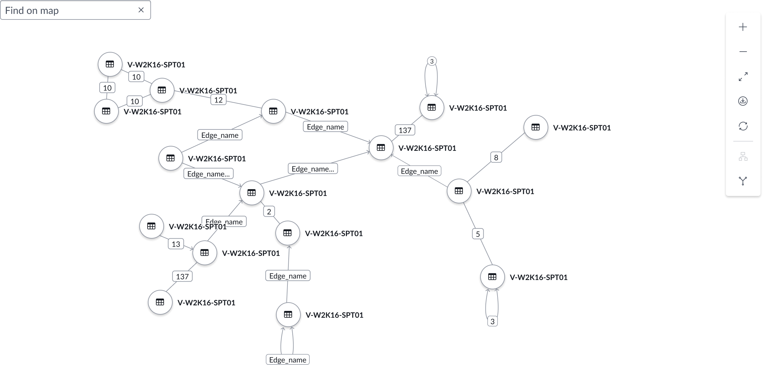
Aggregate edges
You can configure the node map to display the number of merged edges. Edges can be merged based on the connecting nodes or the direction of the edges between the same pair of nodes. Edge aggregation also works for self-referencing nodes.
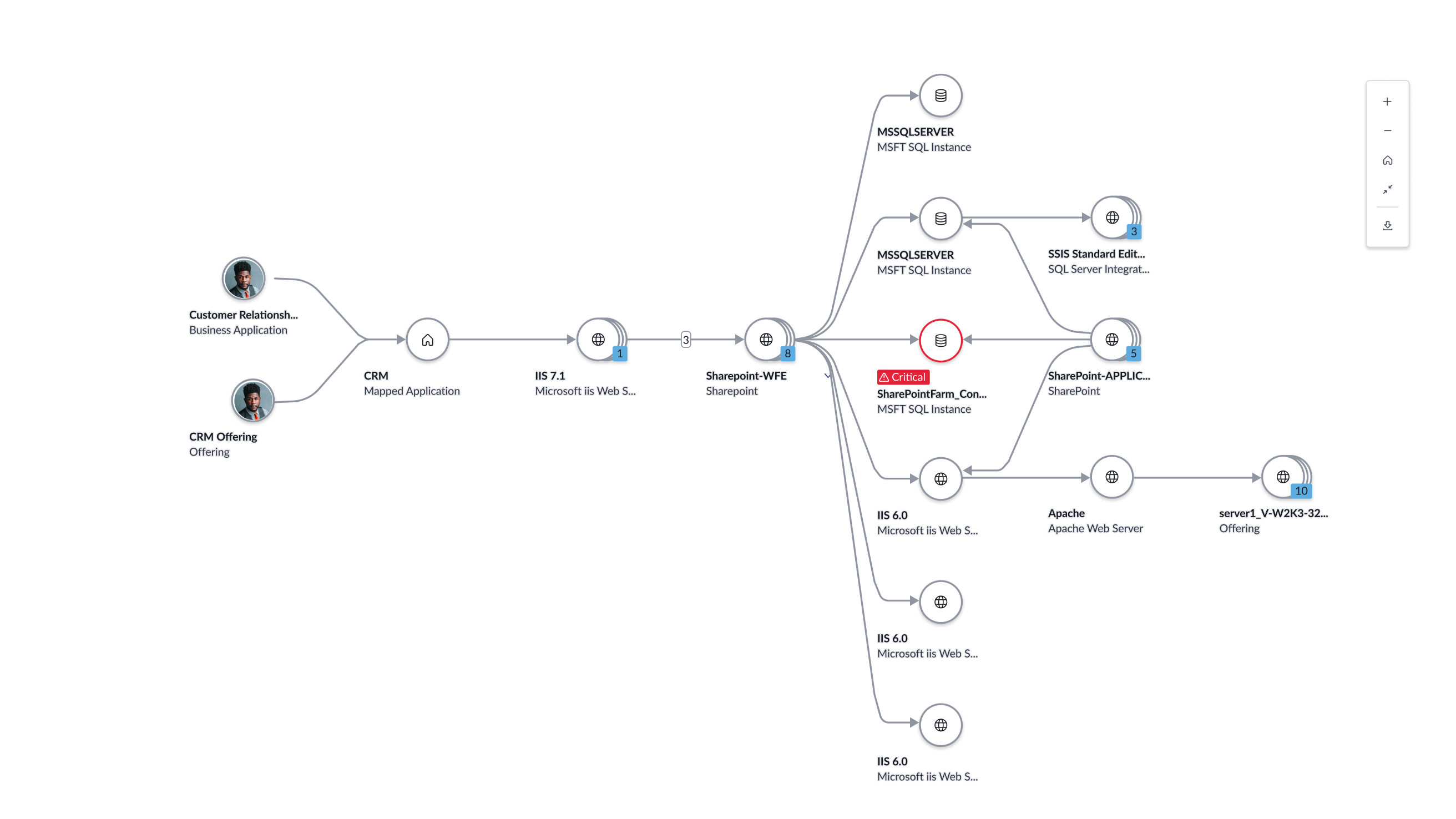
Status icon
You can configure this property to specify the color and icon used for a node.
Contextual actions - keep menu open
Clicking a node opens a hovering action panel on top of the node. Default actions include ‘Set as Home node” and More menu.
Nodes partition
For layered groups, you can assign partition numbers to nodes to determine the vertical hierarchy of your map. A node set to zero appears at the top of your node map. Higher numbers appear farther down the map.
Nodes tooltip content
You can configure this property to customize tooltip content that appears when a user hovers over a node.
Edges tooltip content
You can configure the tooltip content that appears when a user hovers over a node edge.
Edge status color
Edges can be configured to display in any of the available colors to convey status.
Design recommendations
Learn how to apply node map in your design.
Alignment and positioning
We recommend that you be intentional and concise when adding nodes to your node map. Make sure that there is a need for each node and that the size of your node map correlates to the amount of space where your node map lives.
UI text guidelines
These are some recommendations for using text within node map:
- Use clear and distinct language for the subheading; try to use fewer than 15 characters, including spaces
- Use sentence case for the node title; only capitalize the first letter in the string of text and any proper nouns
Behavior
Learn how node map behaves when the display changes or a user interacts with the component.
States
Learn about node map states.
Standard node states
Node map has the following standard node states: default, hover, focus, selected, and inactive.
| State | Example |
|---|---|
| Default |  |
| Hover |  |
| Focus |  |
| Selected |  |
| Inactive |  |
Grouped node states
Below are the standard node states as they apply to grouped nodes.
| State | Example |
|---|---|
| Default |  |
| Hover |  |
| Focus |  |
| Selected |  |
Responsive behaviors
Learn how node map responds to changes in a container or display.
Interactions
Learn how node map responds when a user interacts with it.
Node repositioning
In Hierarchical and Unified vertical layout types, the user can reposition the nodes by dragging and dropping them. Dragging nodes does not affect the position of any other child nodes in the node map.
Node menu
Users can open the node menu by selecting a node.
Edges
Users can select an edge to open an overflow menu.

In the image above, the node edge overflow menu is in pressed state.
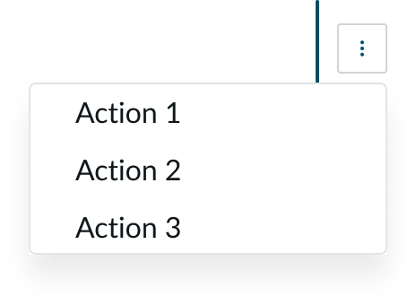
In the image above, the node edge overflow menu is open.
Select from merged edges
If a user selects a merged edge, it opens a menu that enables the user to select an individual edge.
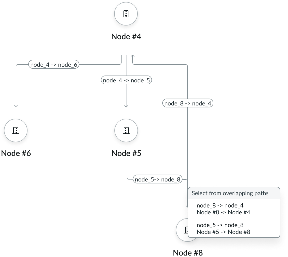
In the image above, the “select from overlapping paths” menu is open.
Truncation
When header text in node map exceeds 20 characters, the text truncates with an ellipsis, and a tooltip shows the full content on hover.

When subheading text in node map exceeds 2 lines, the text truncates with an ellipsis, and a tooltip shows the full content on hover.

Usability
Node map complies with all internationalization and accessibility requirements.
Internationalization
When this component is used in a platform configured for a right-to-left (RTL) language, the node label text flips to display right to left. Any proper nouns that can't be translated appear left-to-right (LTR).

Accessibility
Learn how to access the actionable elements of node map through keyboard interactions and screen readers.
Keyboard interactions
You can access the actionable elements of node map with these keyboard keys:
Tab: Moves to the next interactive element
Enter/space: Selects the node and moves focus to the node menu
Esc: Exits the node menu
Screen readers
When you apply ARIA labels to a component, screen readers announce the controls and content of node map in the prescribed tab order. The tab order is determined by the order the nodes are given in the configuration and alternates between nodes and edges.
For cases where an aggregated edge label is just a number, the edge.ariaLabel can be used to describe the edge type. You can use the edge.ariaLabel to enable users to have their own custom descriptions for edges that are different from the visible label. Sometimes the label is a number, but the aria-label needs to be specify what this number means, such as "4 aggregated edges", or "4 duplicate connections."