

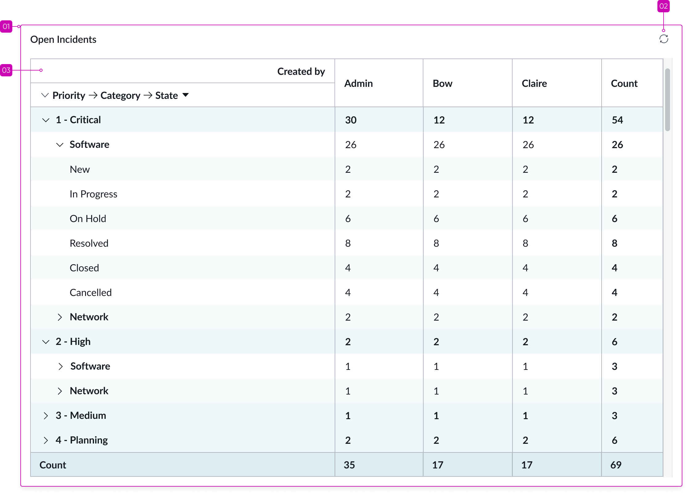
Anatomy
Learn about the individual parts of pivot table.
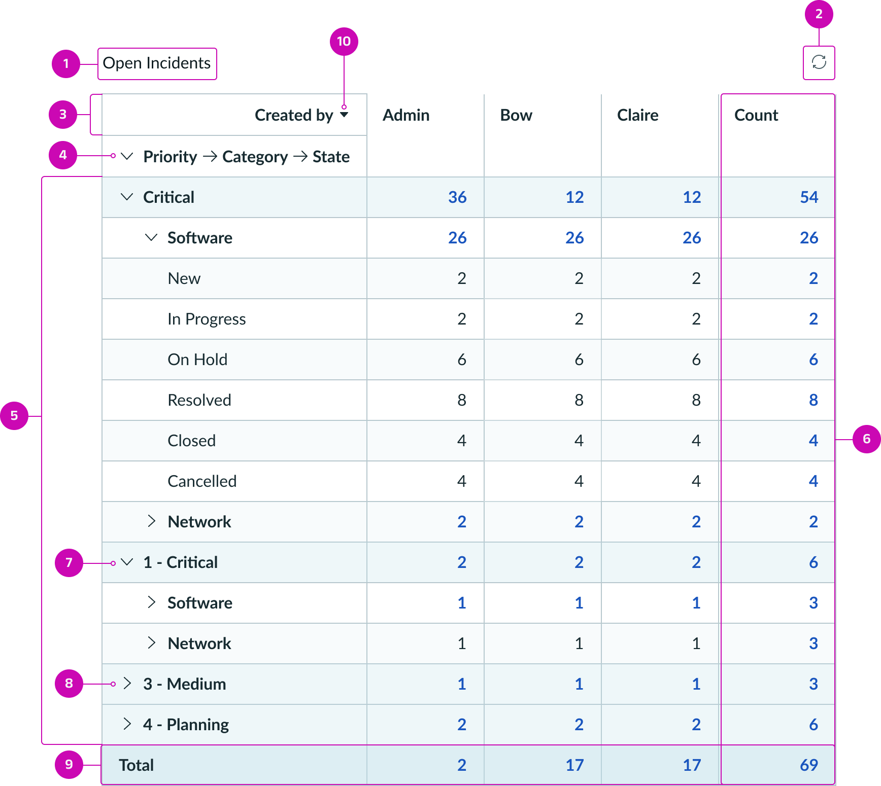
- Chart title: Title of table which can be wrapped or hidden
- Refresh button: Manually refreshes data
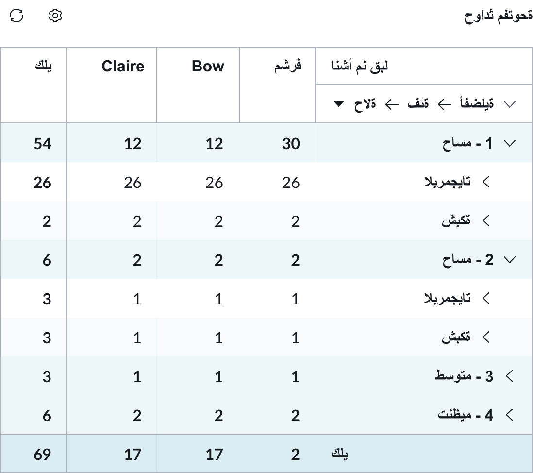
- Column header: Displays the grouped by column names
- Row header: Displays the grouped by row names in the first column
- Rows: Fields from the column selected, using a collapsible accordion
- Row total: Count of all the values from each metric
- Expanded group row: User clicks the chevron to expand a row in a group to show its child rows
- Collapsed group row: User clicks the chevron to collapse and hide the group child rows
- Column total: Shows the count for each metric in each field for the column selected
- Sorting: The sorting icon enables users to sort the table during runtime
Multiple table data sources without sorting
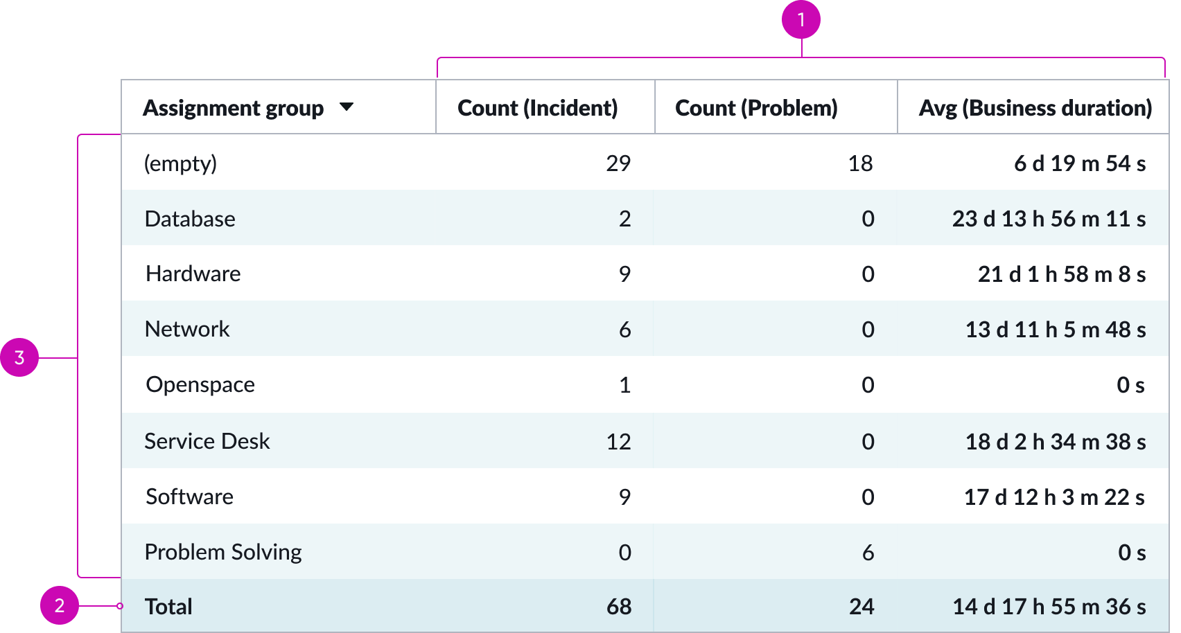
- Data sources: Columns for multiple table data sources
- Totals: Shows total counts for each metric
- Metrics: Metrics for the selected table data source
Multiple indicator data sources with 1 sorting row
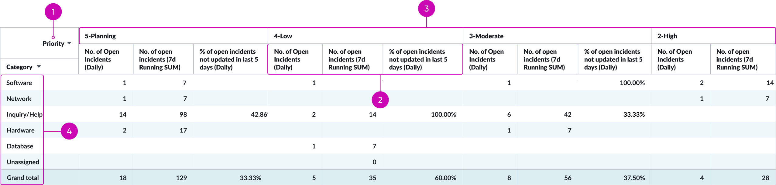
- Column: The table column being sorted
- Data sources: Columns for multiple indicator data sources
- Row: Sorted rows from the selected table column
- Metrics: Metrics for the selected indicator data sources
Multiple data sources with 1 grouping row
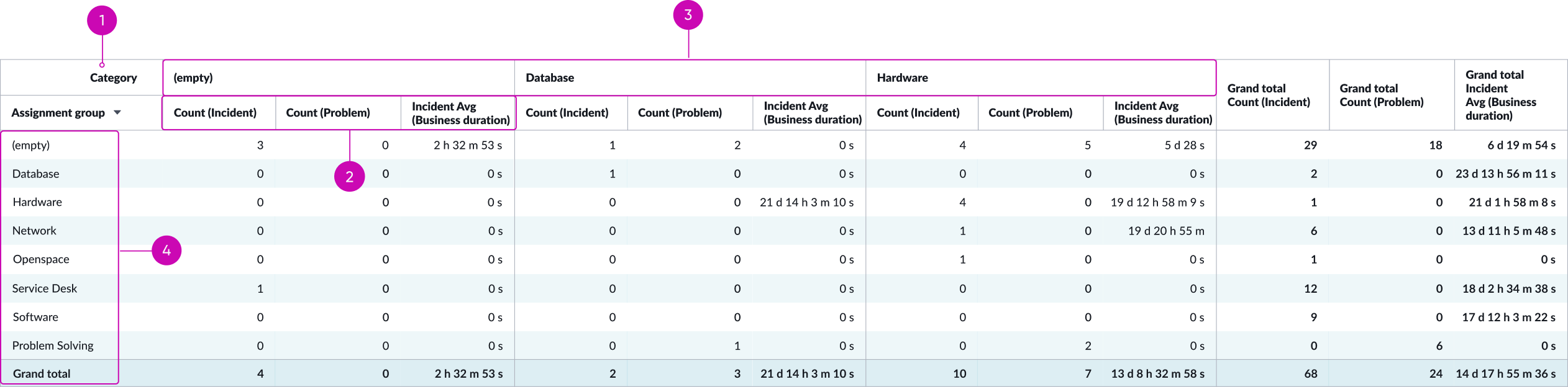
- Column: The table column being grouped
- Data sources: Columns for multiple table data sources
- Rows: Grouped rows from the selected table column
- Metrics: Metrics for the selected table data sources
Pivot table header row
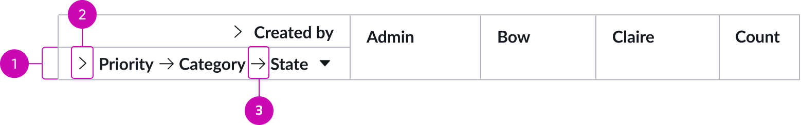
- Row header: Identifies the row header for each grouped level; displays by default
- Expand/collapse button: User clicks to show and hide all rows
- Bread crumbs arrows: Separate the names of each grouped level in parent/child order
Subcomponents
See the usage guidelines for empty state
See the usage guidelines for text link
See the usage guidelines for icon
See the usage guidelines for tooltip
Usage
Use a Pivot table to do the following:
- Query large amounts of data
- Calculate subtotals and aggregate numeric data
- Summarize data by categories and subcategories
- Create custom calculations and formulas.
When viewing a Pivot table, the user can expand and collapse levels of data to focus on results and drill down to details for areas that interest them. Designers can create Pivot tables using multiple data sources to get a more complete picture of the data.
Configurations
Learn how to customize pivot table by configuring the available properties.
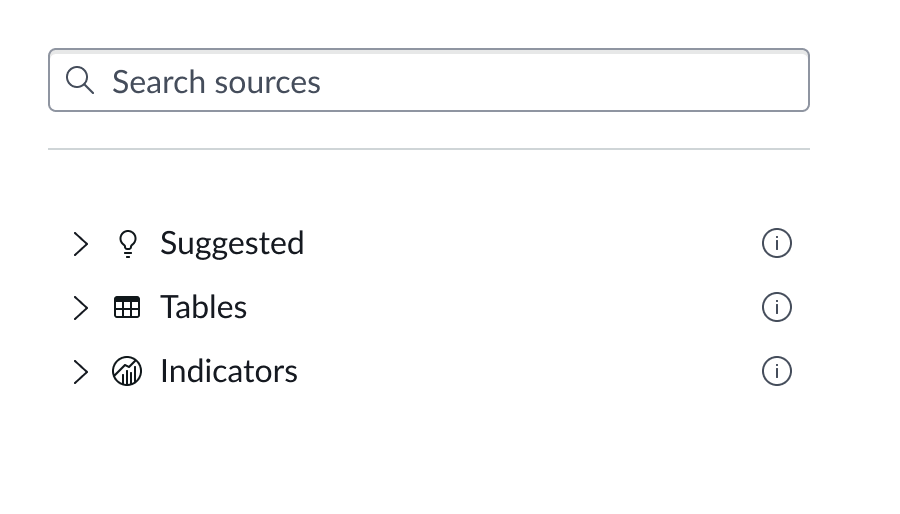
Data source
You can select between different data sources for your visualization: system data tables and preconfigured Performance Analytics indicators. If you are changing your data source, the option list provides suggestions based on previous selections and items that match your search.
You can configure multiple data sources for your pivot table and sort and group metrics from these data sources. However mixing data source types is not supported. Select either all table or all indicator data sources. There isn’t a limit on how many data sources you can add, but an excessive number forces the user to scroll to see all the metrics and makes the table difficult to use.
Tables
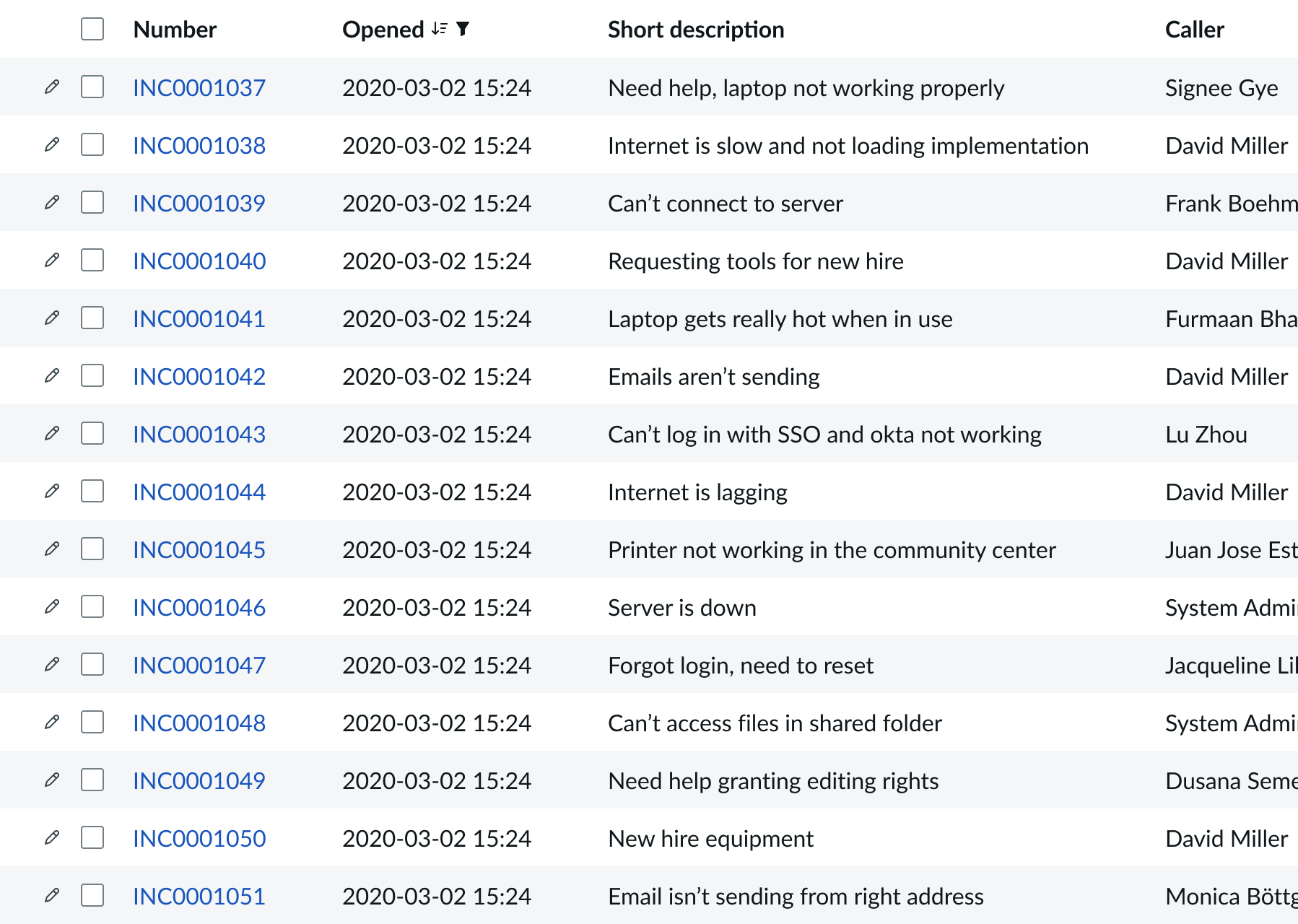
You can select any table from the system to use in your visualization and filter that data. When you apply a table as the data source, a preview list appears showing all available records in that table.
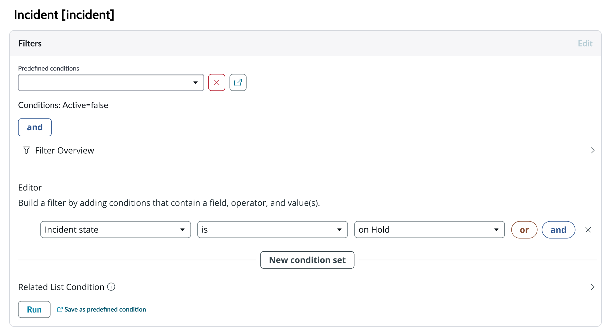
A condition builder above the list enables you to set filter conditions on the data before using it in your visualization. This is useful for limiting the data shown in the chart to only the data you need.
Indicators
Indicators are preconfigured business metrics that assess performance across attributes such as cost, quality, technical risk, investments, user satisfaction, and business value. Indicators are configured in the Performance Analytics application and reflect common measurements that users need. If breakdowns are defined for an indicator, you can apply filter conditions on those values.
Data snapshot indicators
Data snapshot type of indicators enable intraday collection and analysis, filtering by breakdown hierarchy, with the ability to report partial scores.
Key features:
- Move beyond daily snapshots: Collect and analyze data multiple times throughout the day (intraday) for granular insights.
- Breakdown hierarchy: Filter through hierarchical structures (department to team to individual) to pinpoint issues and identify trends at any level.
- Partial scores: Track progress toward goals mid-period in order to take corrective action early instead of waiting for periods to close.
- Deeper insights: Drill down through multiple dimensions to uncover hidden patterns.
- Simplified setup: Create fewer, more generalized indicators.
- Dynamic filtering: Apply breakdowns on-demand without preconfiguration.
- Reduced maintenance: Fewer indicators mean less ongoing work.
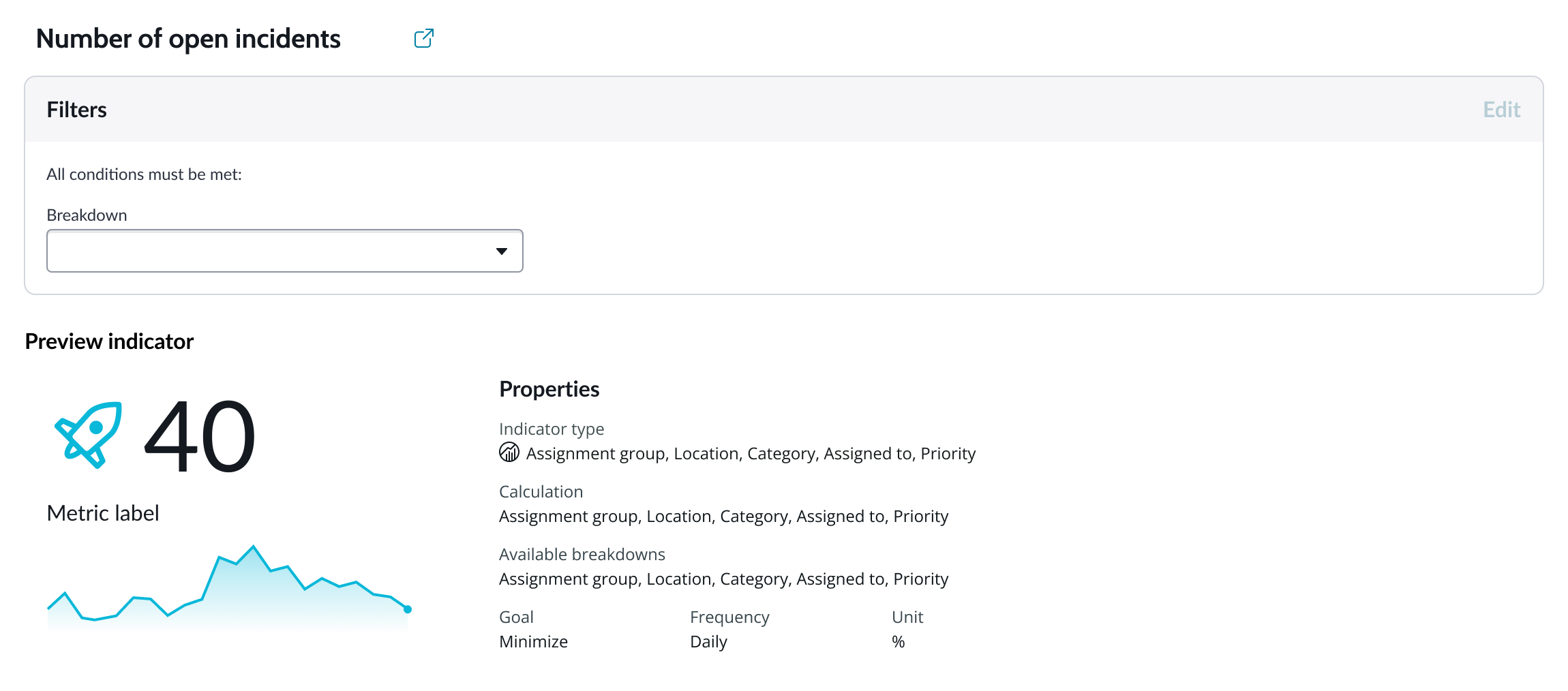
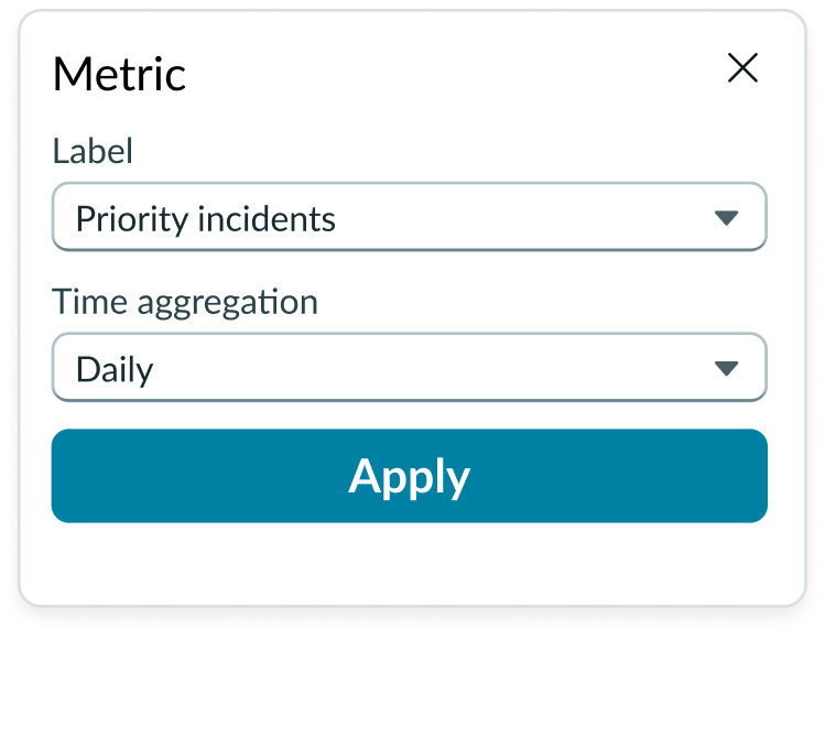
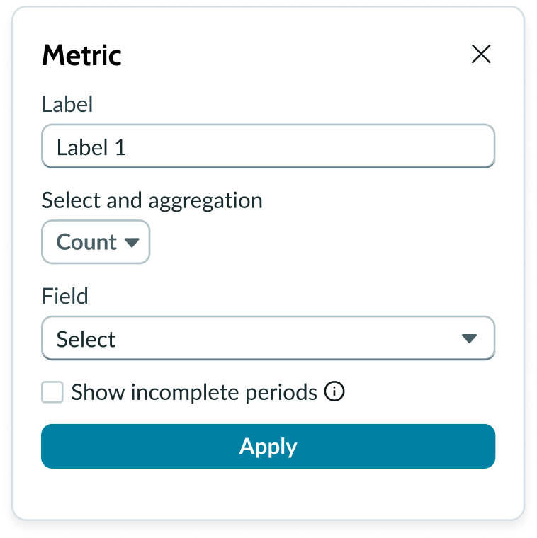
Metric selection
Select the specific data from the data source to display in the box plot and the label that identifies it. The default aggregation used is Count. You can select a specific field from the data source table to display. If you leave the field empty, all fields are used, depending on any filtering conditions you applied when you selected the data source.
Show incomplete periods
For Data Snapshot indicators only. To provide users real time progress tracking, for each “Metric” you can select the “Show incomplete periods” setting to display scores for the current, incomplete period to track progress.
Grouping data
Grouped charts compare one or more data sets across all categories. “Group by” is used with aggregate functions like Sum, Count, or Average. The function selected tells the data provider how to treat the data when it is grouped. You can select a field (for table data sources) or a breakdown value (for indicator data sources) as the grouping value.
Note: Not all indicator data sources have available breakdown values. Charts that use indicator data sources without breakdown values can’t be grouped.
Header and border
The component header displays along the top and contains the title you give the visualization. By default, the header is configured to show, but the content is empty.
Visualization border
By default, a border around the chart. Unselect the “Show border” option to remove it.
Header separator
You can add a separator line between the header and the visualization. Disabled by default.
Chart title
By default, the chart title is blank, but you can add a title. When you add a title for your chart, you’re able to customize the color and make it wrap.
Header level
By default, text in the header is set to heading level 2 (H2). Heading levels H1 through H6 are also available.
Title alignment
By default, the title is aligned to the Start side. The start size can be the left or right depending on the language you use. Other options available from the dropdown are “Center” and “End”.
Title wrap
By default, long titles truncate with an ellipsis, and a tooltip showing the full title on hover, but you can set the title to wrap instead.
Title truncation
By default, the title text truncates at the end of the first line of text, but you can set the line of truncation to 2 or 3 lines instead. This option becomes available when the title truncates.
Refresh option
By default, refresh is available to the user in the “More options” menu, but you can hide it. This gives you more control over how refresh options are exposed on dashboards so you can align refresh behavior with your intended usage.
Header and border
The component header displays in the top left and contains the title and a description that appears when the user hovers over the information icon. You create the header and then show or hide it with the controls provided. By default, the header is configured to show, but the content is empty. You can show or hide a bordering box around the chart.
Header background color
By default, the color of the header background is neutral-0 (white). You can specify a different color (including a custom color) for the background.
Select a color for the visualization header background that aligns with your dashboard theme, branding, or design preferences. The color you choose applies only to the visualization header background.
For better accessibility, make sure a good color contrast exists between the header background and title text. The minimum contrast requirement for normal text is 4.5:1, and for large text is 3:1. To verify, check the contrast ratio in the color picker.
Note: Theming is not supported when you select a custom color.
Sorting
You can enable a sorting feature that orders the data columns by name or by value, in ascending or descending order. Sorting is available for both data source types; table and indicator.
Users can sort any column in the table at runtime.
Auto aggregation periods
For Data Snapshot Indicators, automatically picks the best aggregation period when a date filter is used. Affects only this visualization and does not change the indicator's default aggregation period. Clear the checkbox to always use the indicator's default period.
No value display format
By default, when the metric value is set to “Count,” you can choose to show zero (0) when there’s no value in the selected dataset or configurations.
Data update
Use the data properties to select and organize the data you want your users to see from the source. Select the chevron icon to expand a section and display the properties in each category.
Follow filters
By default, any filters set on the workspace page and those set on the data source are applied. You can use the “Follow filters” property to prevent any filter input from the workspace page. Filters set on the data source always run on the component.
Filter icon
The filter icon and the number of filters impacting the visualization display by default. To hide them, unselect the “Show filter icon.”
Drill down
By default, users can drill down into data or launch a URL directly from a chart by selecting data points, slices, categories, or scores. This lets users view data such as records and record lists from data tables or KPI data from indicators or go to a URL that you specify.
Refresh after being away
You can configure your chart to update automatically or on a defined refresh schedule.
Refresh requested
When the new value of this property is different from the previous one, you can trigger refresh by setting up a string that can be passed down.
Use data cache
You can cache user queries to shorten the load time for the data visualization. Unselected by default.
Info messages
Displays generic error messages by default.
Extended error messages
You can choose to show extended error messages which contain more details that can be helpful to admins. Unselected by default.
Custom no data message
By default, when a data source doesn’t return any info, the “no data available” message displays with generic content. However, you can set a custom message by changing the title, illustration, and message content.
Presentation
The presentation properties control the physical appearance of the chart. Use these properties to control how your users consume the data.
Display settings
You can use the following to modify the display of the data visualization.
Freeze row header and footer
You can make the chart header row stay visible while the user scrolls. On by default. You can also make the chart footer row visible while the user scrolls. Off by default.
Freeze first column
Use to keep first column visible while the user scrolls. On by default.
Alternative row colors
Use to display background color for alternating rows. This can make reading the table data easier. Shown by default.
Alternative column colors
Use to display background color for alternating columns. This can make reading the table data easier. Hidden by default.
Row lines
Use to display border lines to show separate rows. Hidden by default.
Column lines
Use to display border lines to show separate columns. Shown by default.
Table size settings
Use the following to modify the first column and column header content width.
Truncate first column
By default, the width of the first chart column is limited because it truncates at the end of the first line of text.
First column max width
When the first column truncates, you can specify its max width. Max width cannot be less than width of first column header. Lower values are ignored.
Wrap column headers
You can set the column headers to wrap. This breaks the header text into lines matching content width, min. limit 100px. Does not apply to first column. Off by default.
Truncate column headers
By default, when the column chart header content width exceeds the width of the content area (minimum limit 100 pixels), the text truncates with an ellipsis, and a tooltip shows the full column header content on hover.
Does not apply to first column.
Colors
By default, theme based colors are applied to text and background in pivot table. You can set the color type to “Single color” and use the controls to set the colors and define color rules.
Design recommendations
The presentation properties control the physical appearance of the chart. Use these properties to control how your users consume the data. Select the chevron icon to expand the section and display the properties in each category.
Display settings
When you create a pivot table, the row and column headers stay in place (freeze) when the user scrolls, and alternate row colors and column lines appear. You can hide each of these with the controls provided and you can also freeze the row footer, display alternate column colors, and dispay row lines.
Behavior
Learn how pivot table behaves when the display changes or a user interacts with the component.
Chart positioning
The pivot table is always centered within the container and retains a fixed height/width ratio. The height and width of the chart is responsive to the data visualization container size.
Pivot table can’t be manually adjusted.
Responsive behaviors
When the pivot table exceeds the height or width of the data visualization container, a scroll bar appears.
Interactions
When the enable drilldown property is active, users can select data points in a pivot table to open individual records.
Truncation
By default, column headers truncate when they exceed the width of the column. A good practice is to prevent truncation by configuring text wrapping. This makes headers easier to read when the table displays multiple data sources.
Usability
Pivot table complies with all internationalization and accessibility requirements.
Internationalization
When this component is used in a platform configured for a right-to-left (RTL) language, all elements flip and the text aligns to the right.
Accessibility
Learn how to access the actionable elements of pivot table through keyboard interactions and screen readers.
Pivot table tab order
Tab order of focus
Keyboard interactions
You can access the actionable elements of pivot table with these keyboard keys:
- Tab: Moves focus forward from the pivot table refresh and configuration settings buttons, column heading, through the Configuration panel fields.
- Shift + Tab: Moves focus backwards through the same pivot table elements.
- Enter or space bar: Triggers an action associated with an interactive element when in focus, such as refreshing the data or triggering chevrons to open and close.
- Arrow right, arrow left: Moves focus through cells in a pivot table horizontally right and left
- Arrow up, arrow down: Moves focus through cells in a pivot table vertically up and down
Screen readers
When you apply ARIA labels to a component, screen readers announce the controls and content of pivot table in the prescribed tab order.