

Anatomy
Learn about the individual parts of customer activity.
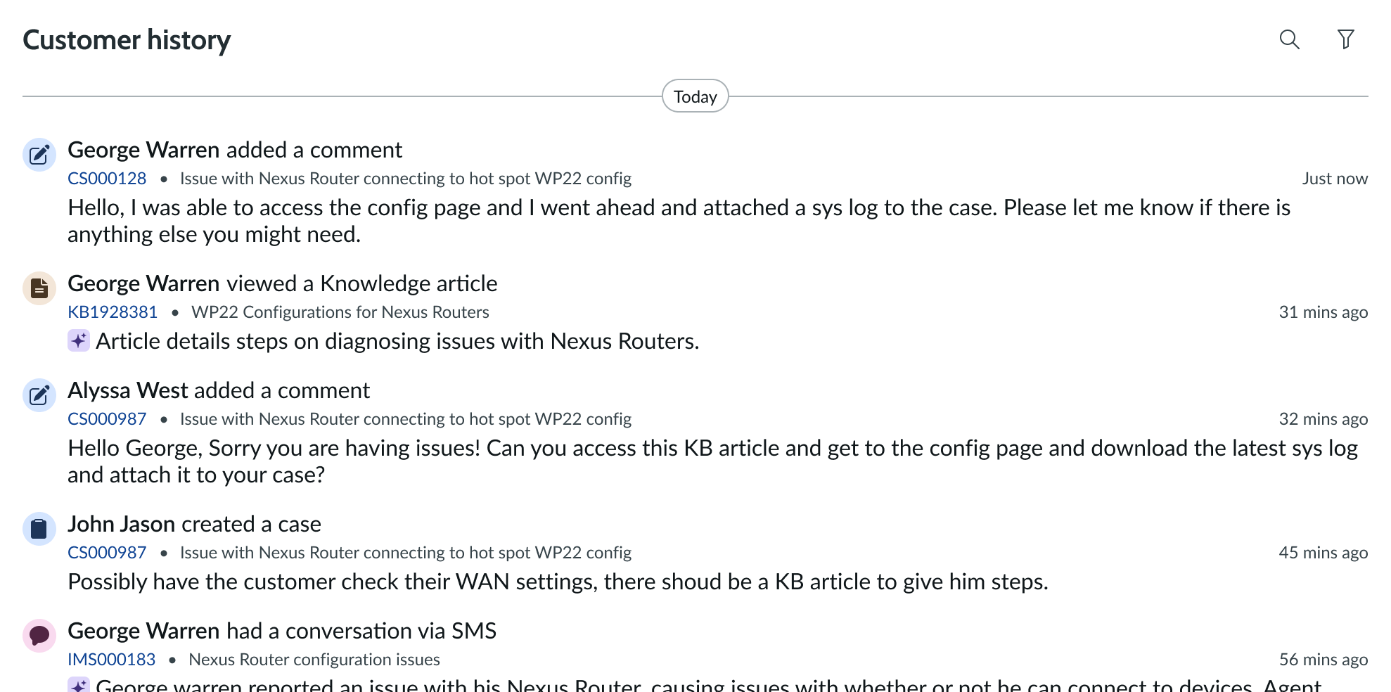
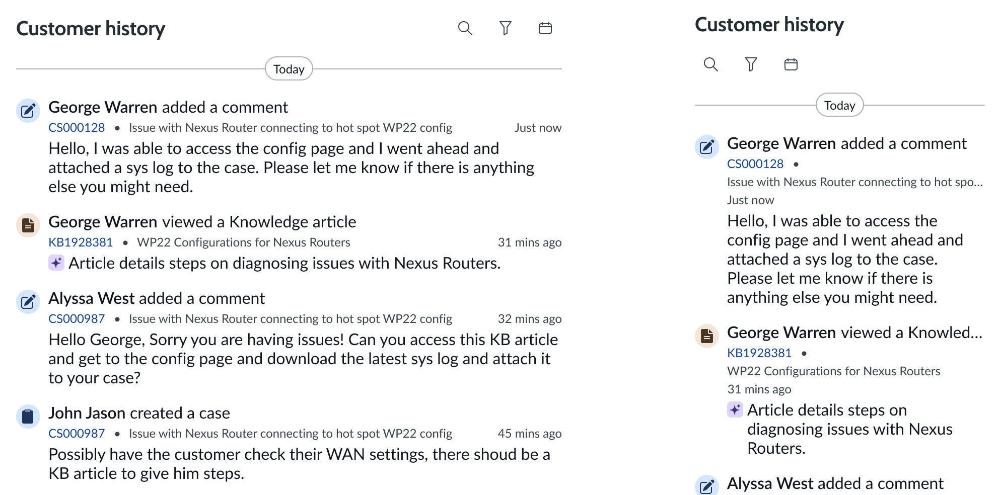
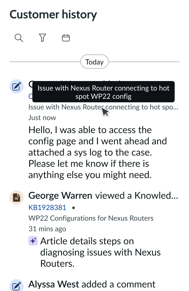
Main anatomy
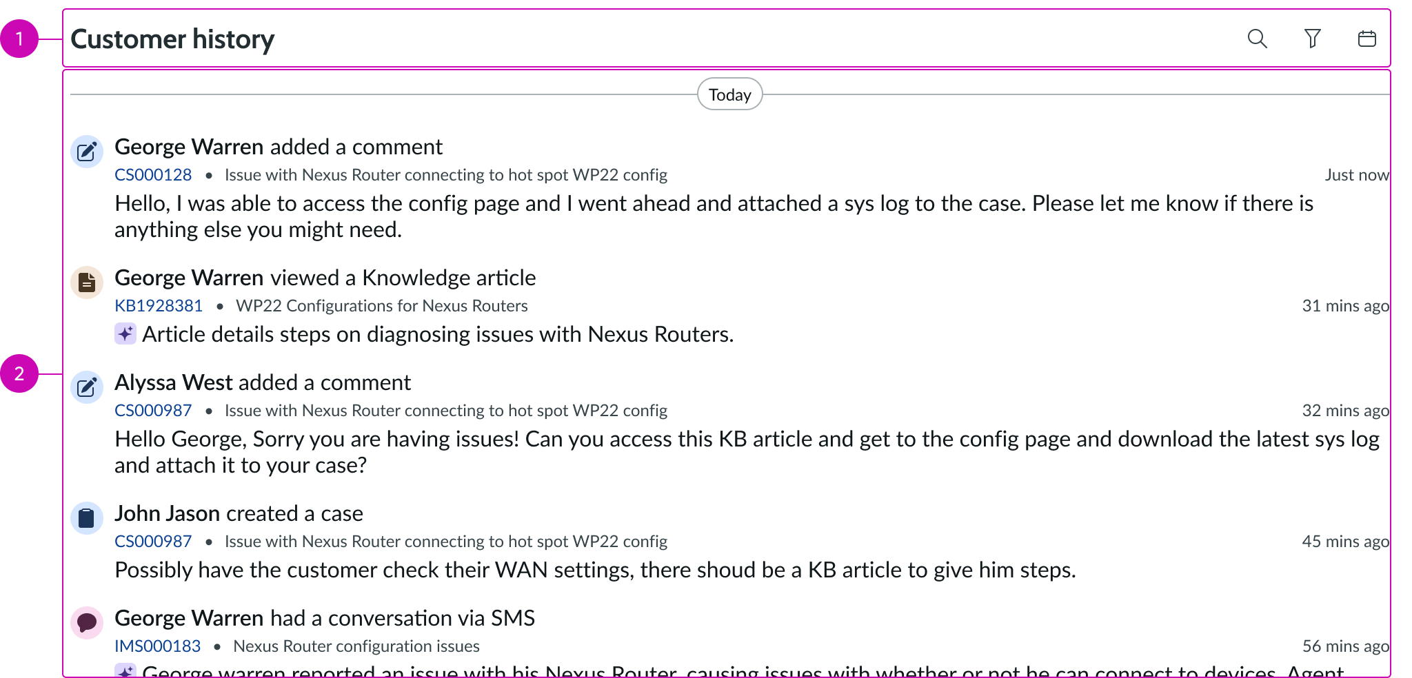
- Header: Includes the title of the selected activity type and allows the user to filter feed by search, by type or by date
- Feed: Displays a customer’s record activity within a selected activity type
Header
- Heading: Displays the type of record selected in the filter panel
- Keyword search: Used to search by keyword to filter customer activity displayed in the feed
- Record type filter: Used to filter by customer activity content by record type
- Date range filter: Used to filter the feed by date; customer activity between the selected start and end date is displayed in the feed
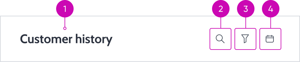
Feed
- Date: A label that separates feed items by creation date
- Feed item: A single activity event on a record associated with the customer
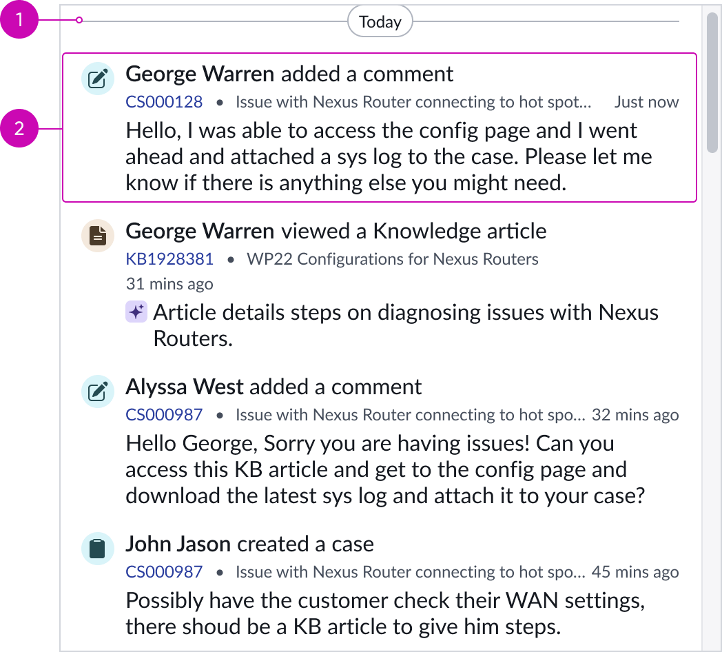
Feed item
- Feed item container: A box that holds feed item information
- Feed item icon: An assigned icon that is associated with the feed item description; provides a helpful visual to reinforce the feed item description
- Feed item title: A brief description of the record activity
- Metadata: Displays relevant information associated to the activity, such as the record number or time stamp
- Description: Additional contextual information about the activity
Subcomponents
See the usage guidelines for button
See the usage guidelines for card
See the usage guidelines for collapse
See the usage guidelines for empty state
See the usage guidelines for heading
See the usage guidelines for icon
See the usage guidelines for input
See the usage guidelines for loader
See the usage guidelines for text link
See the usage guidelines for highlighted value
Usage
Customer activity should be used to track record-related activity for a single customer. It provides context for a user and is visible on a related record tab.
Configurations
Learn how to customize customer activity by configuring the available properties.
Disable the search
The search option within the header can be disabled if it is not necessary for the use case the component is leveraged. If the search is disabled, the header will resize to fill the space that is left.

Search option disabled
Disable the content type filter
The content type filter within the header can be disabled if it is not necessary for the use case the component is leveraged. If the content type filter is disabled, the header will resize to fill the space that is left.

Filter option disabled
Disable the date range filter
The date range filter within the header can be disabled as well. If the data range filter is disabled, the header height will decrease, as less space is needed for the header.
Date range filter option disabled
Empty state messages
An empty state refers to a case where the user enters a query into the search field that does not yield any matching results.
An empty state message should be included to provide the user with context and guidance on how to refine their search. Empty state messages should be clear and brief and are limited to a single line. If the empty state message exceeds the given space, it will truncate without a tooltip.
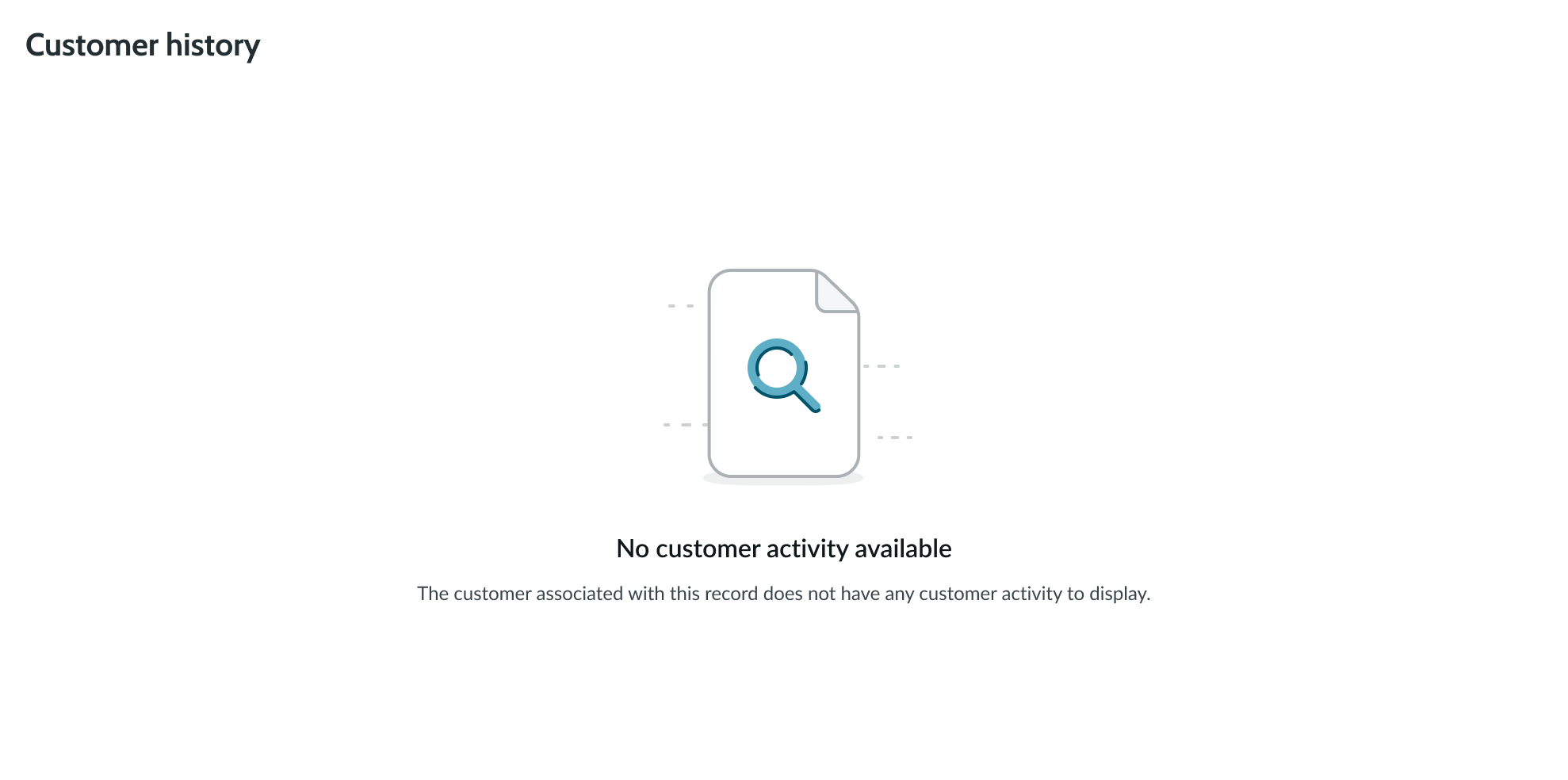
Empty state when there is no content to display in the feed
Design recommendations
Learn how to apply customer activity in your design.
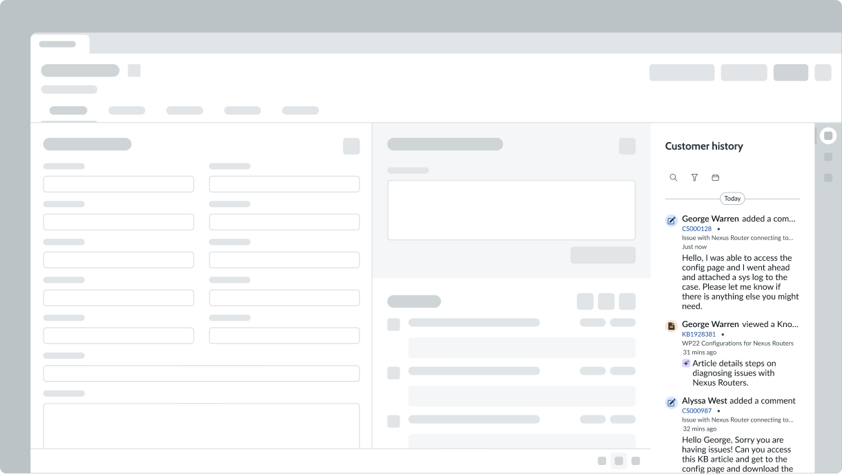
Do place Customer Activity in context of a record.
Don’t place Customer Activity outside the context of a record.
Alignment and positioning
Within the component, the header and feed appear stacked. The positioning of these sections and the elements contained within them is fixed and not configurable.
Behavior
Learn how customer activity behaves when the display changes or a user interacts with the component.
States
Customer activity doesn’t have any states, however the subcomponents within customer feed have their own states.
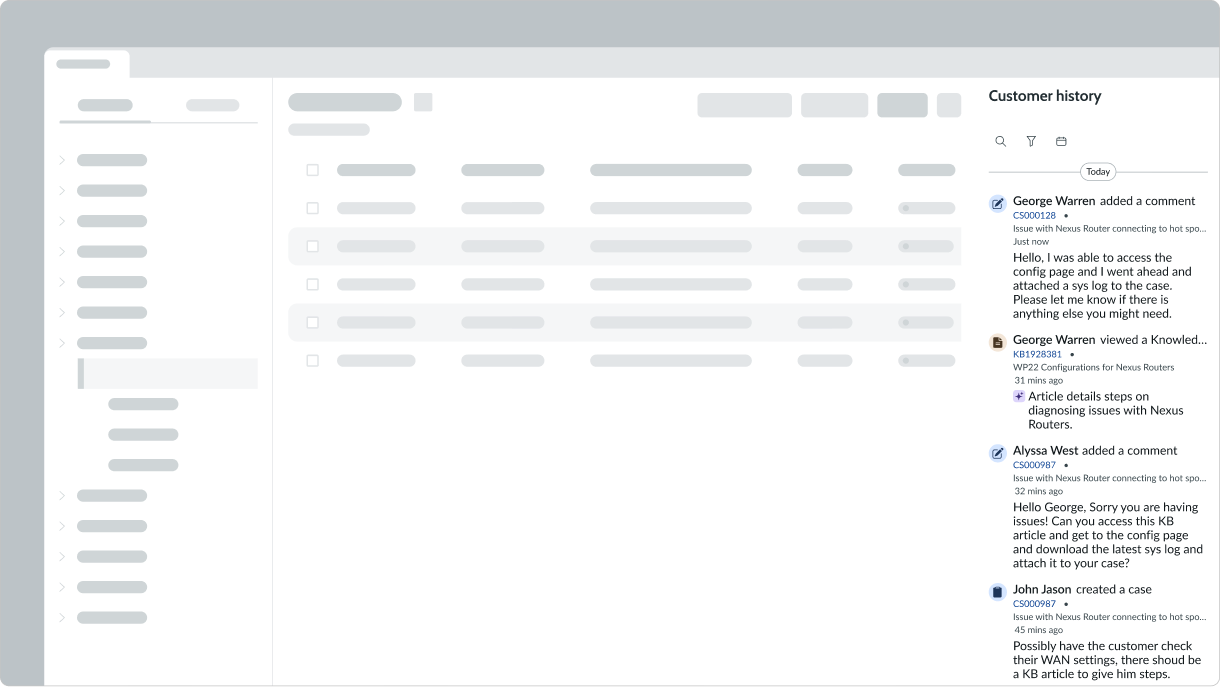
Responsive behaviors
Customer activity content automatically resizes to fit the container. This includes feed item text, which will wrap to the next line as the container shrinks. The header adapts to the smaller breakpoint moving filter options to a new line for more space.
Responsive behavior of customer activity component
Interactions
Learn how customer activity responds when a user interacts with it.
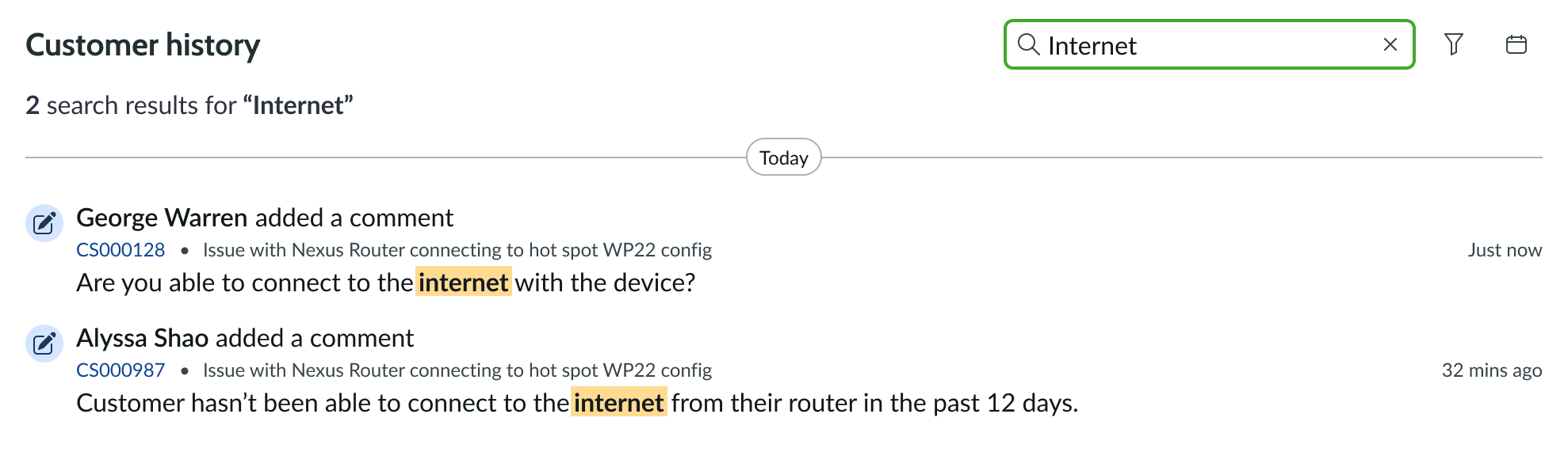
Using the search
When the user selects the search in the header, it will expand an input in the header for the user to enter keywords into. Upon submitting a keyword search it modifies the items displayed in the feed below accordingly. For example, searching with the keyword “Internet” would result in the feed displaying all customer activity associated with the keyword.
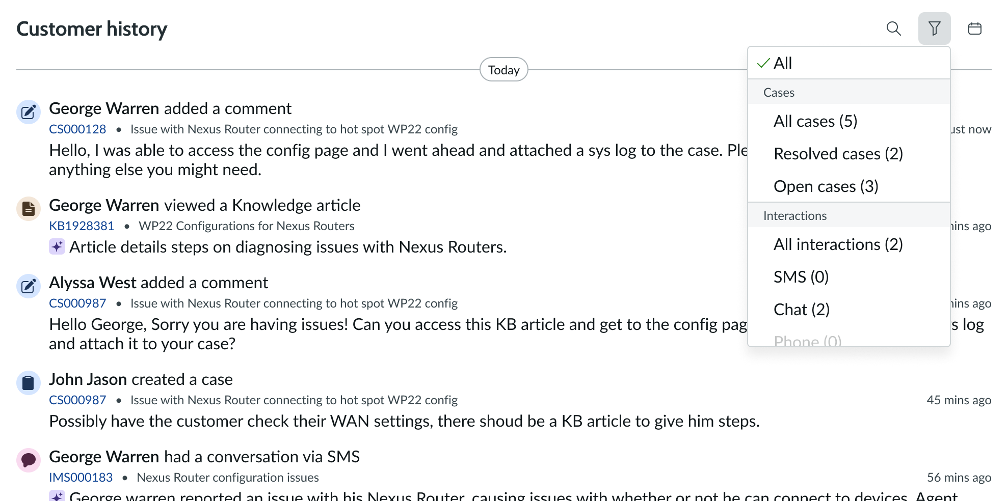
Using the content type filter
When the user selects the filter in the header, it will display a dropdown select list for the user to choose a record type. Upon selection it modifies the items displayed in the feed below accordingly. For example, selecting “cases” from the list would result in the feed displaying all customer activity associated with a case record.
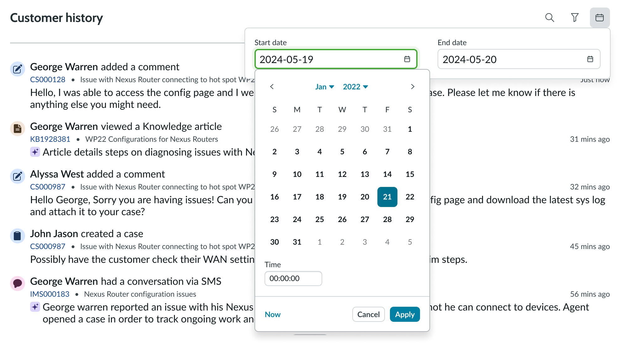
Using the date range filter
When the user applies the date range filter within the header, the feed filters down the content to display only items within the date range selected.
Truncation
When a record title in an activity entry, in the meta data section, exceeds the width of the container or content area, the text truncates with an ellipsis, and a tooltip shows the full content on hover.
Responsive behavior of customer activity component
Usability
Customer activity complies with all internationalization and accessibility requirements.
Internationalization
When the display translates to a right-to-left (RTL) language, the controls, filter panel, header and feed will flip sides.
Accessibility
Learn how to access the actionable elements of avatar through keyboard interactions and screen readers.
Keyboard interactions
You can access the actionable elements of avatar with these keyboard keys:
- Tab: Navigates through actionable items in the toolbar; follows the specified tab order
- Space or Enter: Launches an action or swtiches a stateful button on and off
Focus is in the dropdown panel
- Space or Enter: Opens the dropdown panel
- Arrow up and Arrow down: Shifts focus between options in the dropdown without opening the dropdown panel
Focus is in the menu
- Space: Changes the selection in the menu without closing it; if an option isn’t checked, it checks the focused option and unchecks the previously checked option
- Arrow up/arrow down/arrow right/arrow left: Shifts focus to the next item; if focus is on the last item, it shifts to the first item, if enabled
- Home: If arrow-key wrapping is not enabled, it shifts focus to the first item in the open menu
- End: If arrow-key wrapping is not supported, it shifts focus to the last item in the open menu
- Keys A – Z: Shifts focus to the next menu option in the open menu that begins with the selected letter
- Escape: Closes the menu and returns focus to the element that opens the menu
- Tab: Shifts focus to the next element in the tab sequence; if the item in focus is in a menu, it closes that menu
- Shift + tab: Shifts focus to the previous subcomponent or element in the tab order; if the previous subcomponent or element was outside a menu, this closes the menu and opens all parent menu containers
Screen readers
Screen readers follow the tab order of the customer feed component. For left-to-right (LTR) and right-to-left (RTL) languages, the tab order is as follows:
- Filter panel
- Date range filter
- Activity feed