

Anatomy
Kanban board does not provide a default view for the lane header, footer or card. In order to render them, the user needs to either activate the visual task board plugin or manually pass component templates for each one of them as properties.
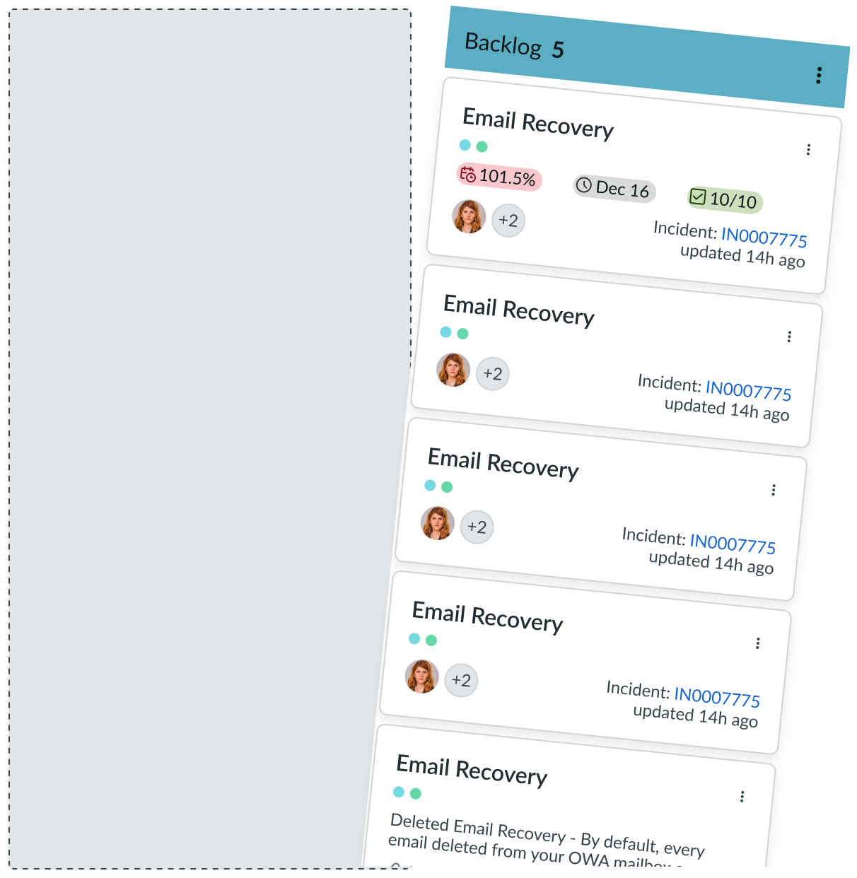
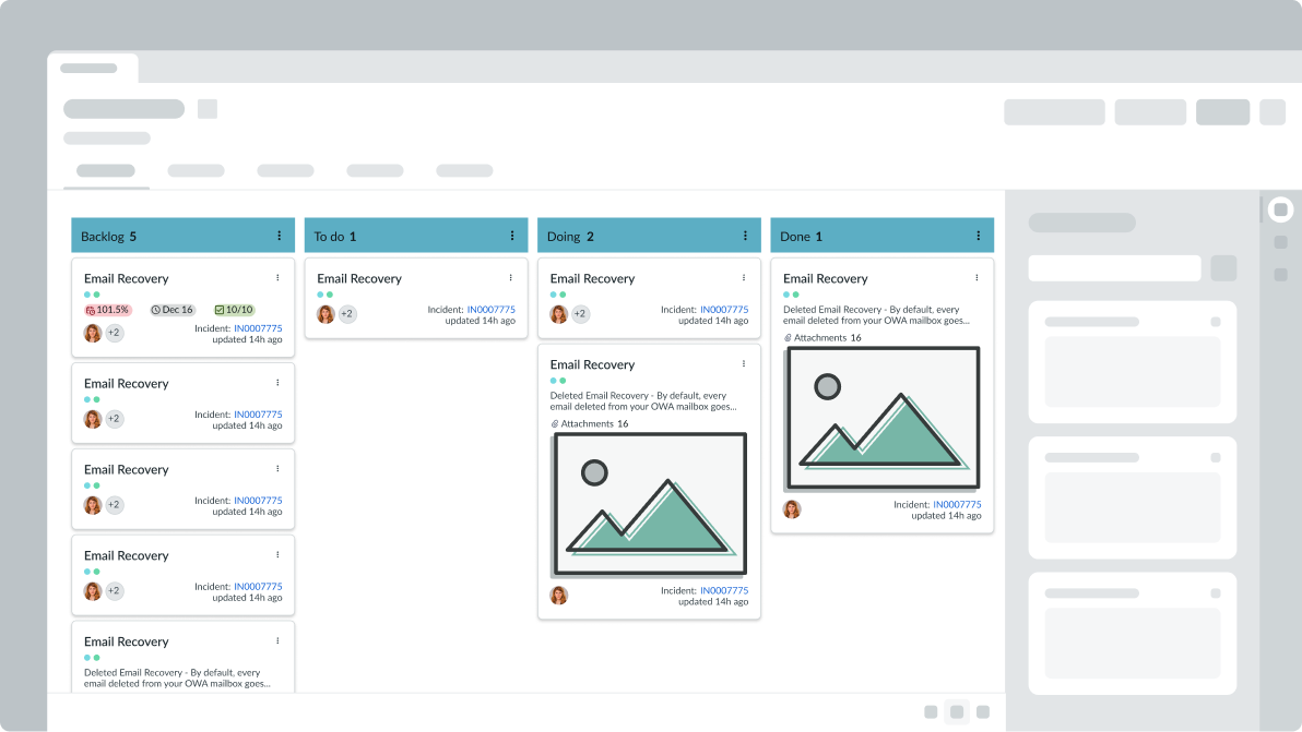
Vertical lanes only layout
The anatomy image below shows Kanban board with only the vertical lanes configured.
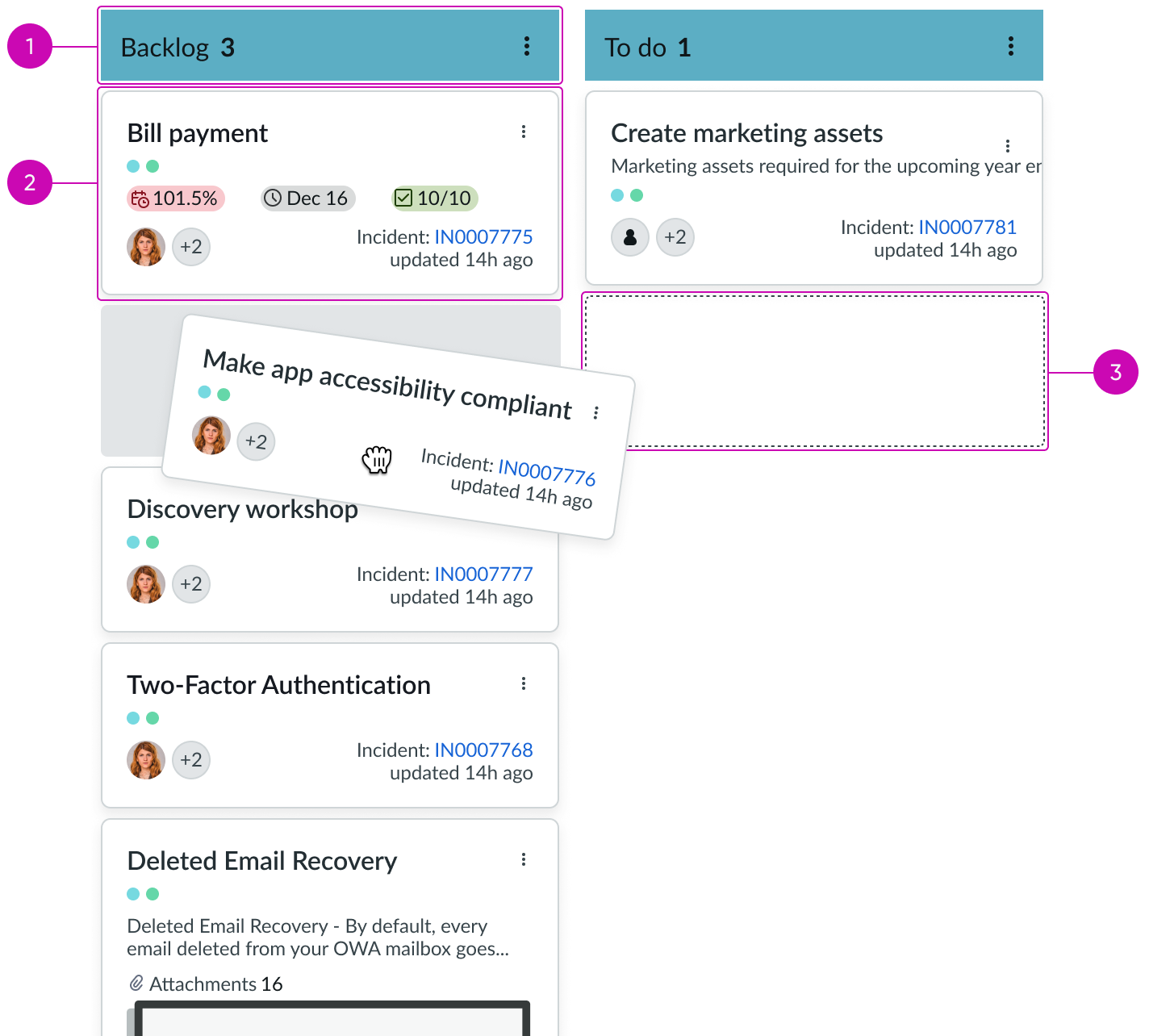
- Column header: Provides a title and count for the number of cards in the column
- Card: A task on the Kanban board; can display information from an attached record
- Card container: Space that holds a card
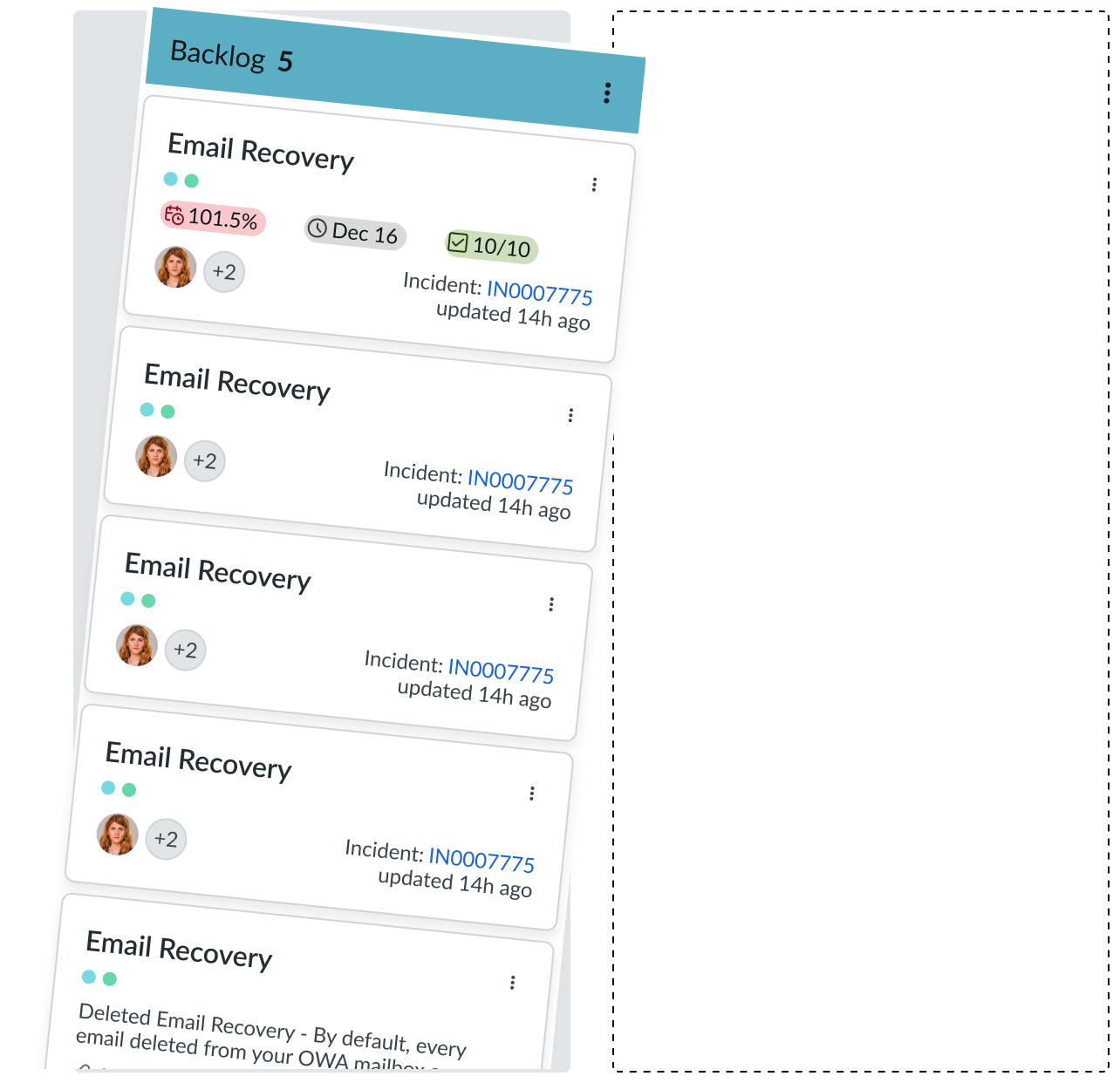
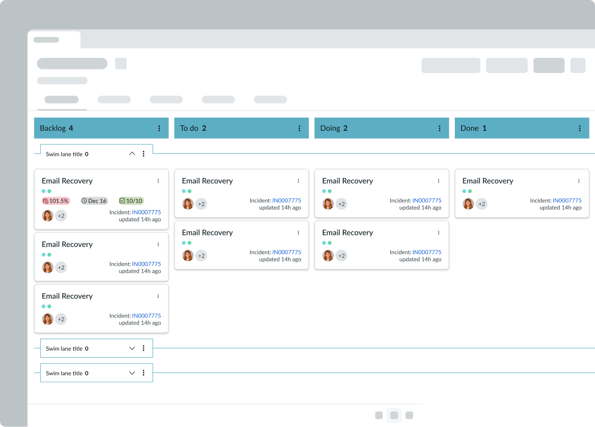
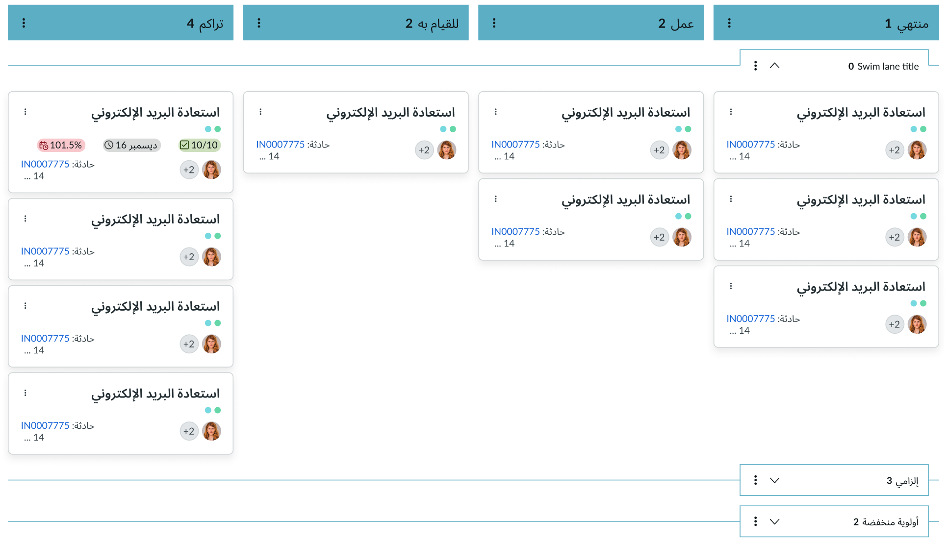
Vertical lanes and swimlanes layout
The anatomy image below shows Kanban board with both the swimlanes and vertical lanes configured.
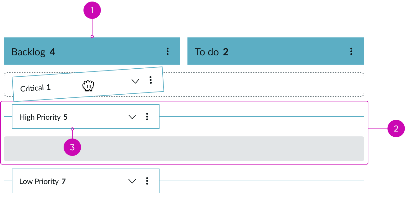
- Column header: Provides a title and count for the number of cards in the column
- Swimlane: Row that can hold cards
- Swimlane header: Provides a title, metadata, and a count for the number of cards in the row
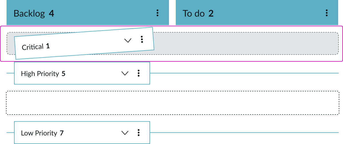
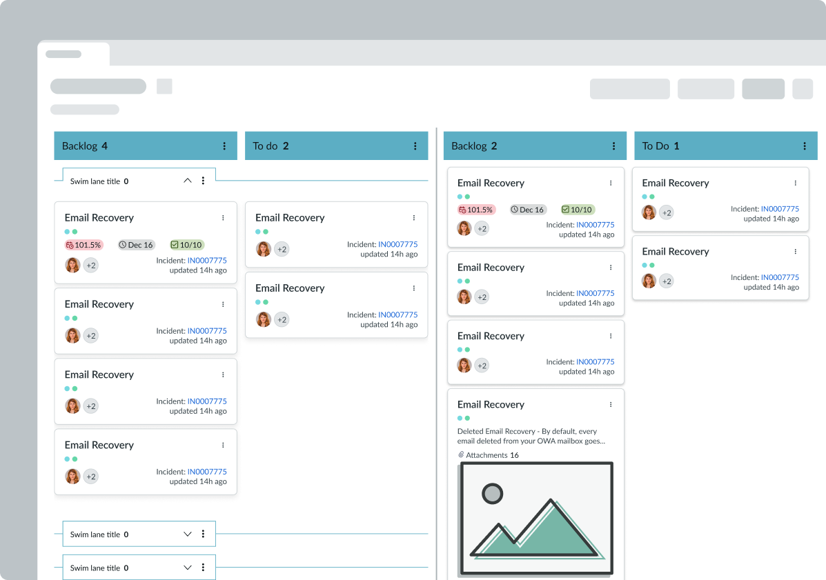
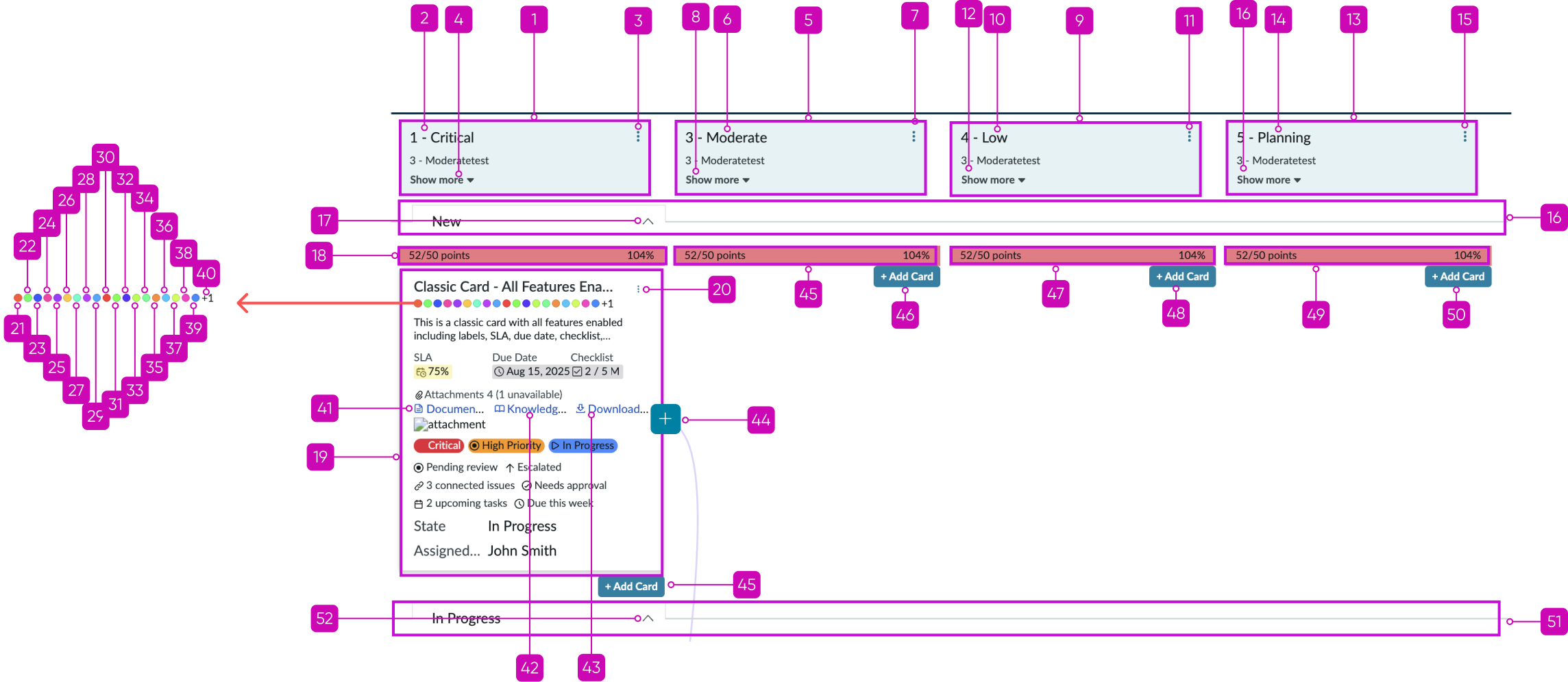
Header in row layout
The anatomy image below shows Kanban board with both the vertical lanes and swimlanes configured, and the swimlane header is set to display in the the row.
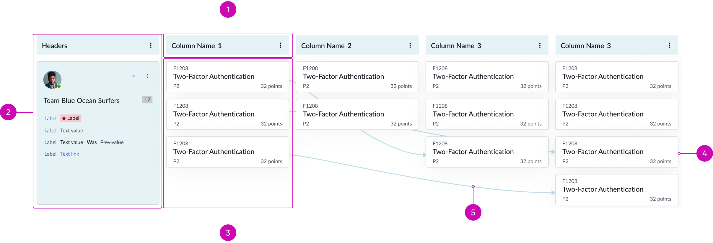
- Column header: Provides a title and count for the number of cards in the column
- Row header: Provides a title, metadata, and a count for the number of cards in the row
- Cell: Area representing the intersection of the row and column headers
- Card: A task on the Kanban board; can display information from an attached record
- Dependency line: Lines used to illustrate dependencies between cards
Usage
Use Kanban board to manage projects by visualizing workflows and processes.
Dependency lines
Dependency lines are a visual representation of dependencies between cards. When enabled, you can create and configure dependency lines between cards. When Kanban board renders, it displays the dependencies. The appearance of the dependency lines (color, variant, and type) is also configurable. See the Dependency lines property for details.
Aside from the administrator, a user also can create dependency lines between cards. To do so, the user hovers over a card, selects the + button that appears, and selects a target card.
Configurations
Learn how to customize Kanban board by configuring the available properties.
Vertical lane header template
A template name can be entered (such as sn-vtb-lane-header) to display vertical lanes. The template name will automatically generate an array that contains display properties for the vertical lanes.
Cell header template
A template name can be entered (such as sn-vtb-cell-header) to display cell headers. The template name will automatically generate an array that contains display properties for the cell headers.
Lane footer template
A template name can be entered to display a lane footer. The template name will automatically generate an array that contains display properties for the lane footer.
Vertical lane drag & drop
By default, drag and drop capabilities are enabled. However, you can disable them.
Vertical lane drag source display template
You can configure this property to customize the placeholder element that displays in the source space that a vertical lane is being dragged from.
Vertical lane drop destination display template
You can configure this property to customize the placeholder element that displays in the identified destination that a vertical lane is being dropped into.
Override vertical lane configurations
You can override global vertical lane configurations to enable individual vertical lane configurations.
Swimlane header template
A template name can be entered (such as sn-vtb-swimlane-header) to display swimlanes. The template name will automatically generate an array that contains display properties for the swimlanes.
Show swimlane header in the row
You can configure the swimlane header to display as part of the row instead of above the row. By default, it displays above the row.
Swimlane lane header
The swimlane title, card count and the contextual menu in the header can be configured through JSON.
Swimlane drag & drop
By default, drag and drop capabilities are enabled. However, you can disable them.
Swimlane drag source display template
You can configure this property to customize the placeholder element that displays in the source space that a swimlane is being dragged from.
Swimlane drop destination display template
You can configure this property to customize the placeholder element that displays in the identified destination that a swimlane is being dropped into.
Override swimlane configurations
You can override global swimlane configurations to enable individual swimlane configurations.
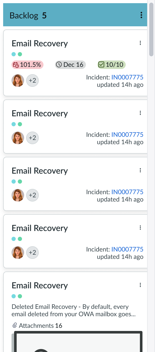
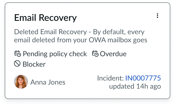
Card template
A template name can be entered to display Kanban cards. The template name will automatically generate an array that contains display properties for the cards.
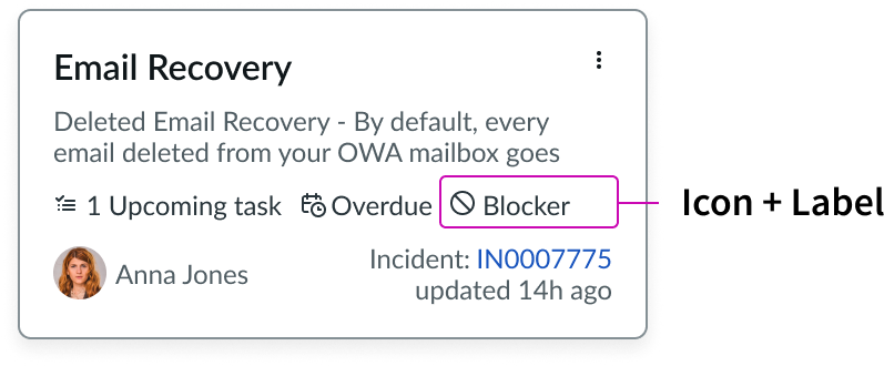
Cards can support up to 3 highlighted values, up to 5 labels with read-only icons, and 1 hyperlink. When selected, a hyperlink will open in a new tab.
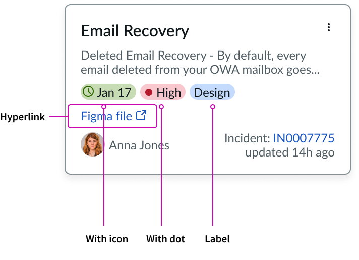
Below is an example of a card that contains 3 labels with read-only icons.
Card drag & drop
By default, drag and drop capabilities are enabled. However, you can disable them.
Card drag source display template
You can configure this property to customize the placeholder element that displays in the vertical lane space that a card is being dragged from.
Card drop destination display template
You can configure this property to customize the placeholder element that displays in the identified destination that a card is being dropped into.
Override card configurations
Individual cards can be configured which overrides the global cards configurations.
Enable dependency lines
You can enable dependency lines in the board. Dependency lines are a visual representation of dependencies or relationships between cards in the board.
Selected cards
You can configure the board to select multiple cards. The user can select multiple cards using the CMD key (Mac) or Ctrl key (Windows).
Keyboard arrow navigation
By default, arrow navigation mode is enabled so that lanes and cards are accessible with the arrow keys. You can also configure arrow key accessibility for other interactive elements by adding those navigation options. If you don’t need arrow key interactions for your board, you can disable this mode.
Read-only mode
You can configure Kanban board to display in read-only mode to restrict users from editing the board.
Wrapper events
There are three types of wrappers in the board: card wrapper, lane header wrapper, and lane footer wrapper. You can configure this property to register the events you’d like to apply to any of these wrappers.
Scroll configurations
You can configure this property to customize the appearance of the vertical lane scroll bar. This can include increasing the width of the bar, including rounded edges, and changing the color of the scroll bar and the track.
Load component from registry
By default, Kanban board is configured to pull component templates from the UXF registry, if the registry has templates available. However, if you would like to manually import your component templates, you can disable this property.
Advanced board styles
While you can add advanced custom CSS styles, we recommend that you use theming instead to achieve a more cohesive appearance.
Declarative action map
You can configure this property to map inner component action to page action.
Design Recommendations
Learn how to apply Kanban board in your design.
Do allocate most of the screen area to the Kanban board component. Placing your board in a larger area helps visualize your work better and help in seamless interaction.
Do not place the Kanban board component in small area because it does not help you visualize your work and creates interaction difficulties.
Recommended to use single Kanban board component on a page.
Do use only one Kanban board per page.
Alignment and positioning
Kanban board doesn’t have any guidance on alignment or positioning.
UI text guidelines
Buttons and contextual menu item text should be concise, actionable, and clearly state what happens when a user makes the selection.
Behavior
Learn how Kanban board behaves when the display changes or a user interacts with the component.
States
Kanban board doesn’t have any states. However, the subcomponents within Kanban board have their own states.
Responsive behavior
Kanban board automatically resizes to fit the container. When the Kanban board content is taller or wider than the height of the parent container, contents within the board component, lanes and cards do not change in size.
Scroll bar
When the cards in a vertical lane or a swimlane exceed their container size, a vertical scroll bar appears.
Interactions
Learn how Kanban board responds when a user interacts with it.
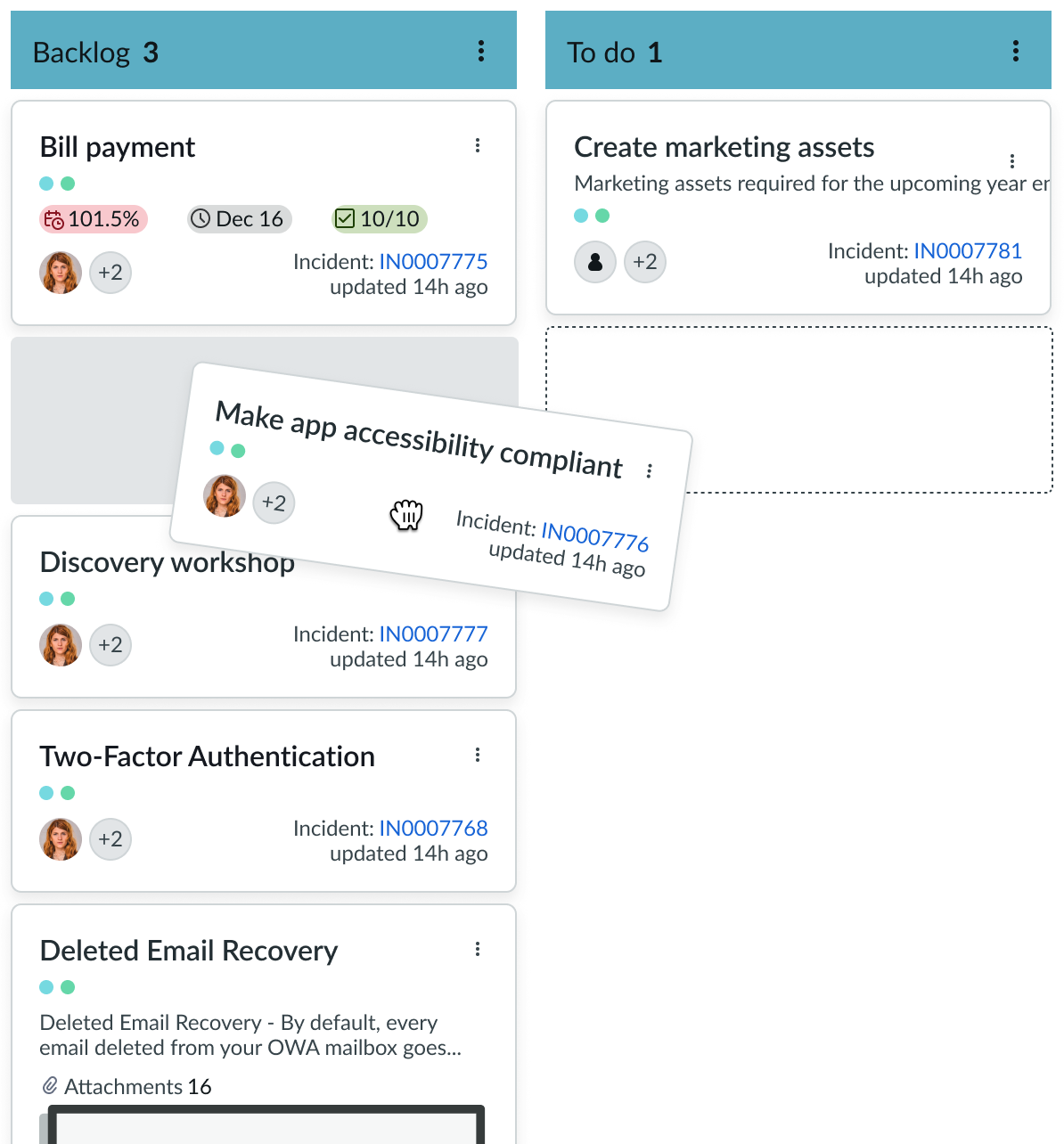
Reorder vertical lanes
You can reorder vertical lanes by dragging a lane from its current position and dropping it next to the desired lane. For example, to change the lane order A-B-C-D to A-C-B-D, drag lane B and drop it between lane C and lane D.
Reorder swimlane
Just like vertical lanes, you can reorder swimlanes by dragging a lane from its current position and dropping it next to the desired lane. Dragging a swimlane will temporarily collapse all the swimlanes. This makes it easier to see the swimlane order. Once you drop the swimlane in your preferred position, the swimlanes will expand again.
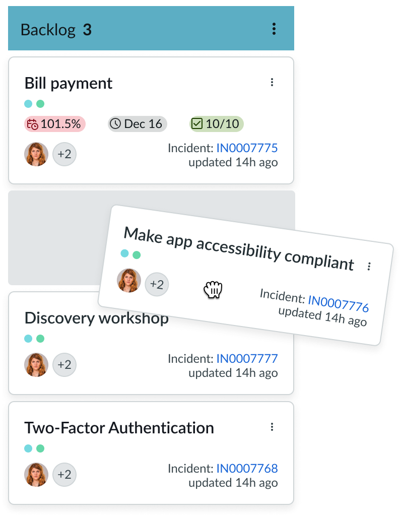
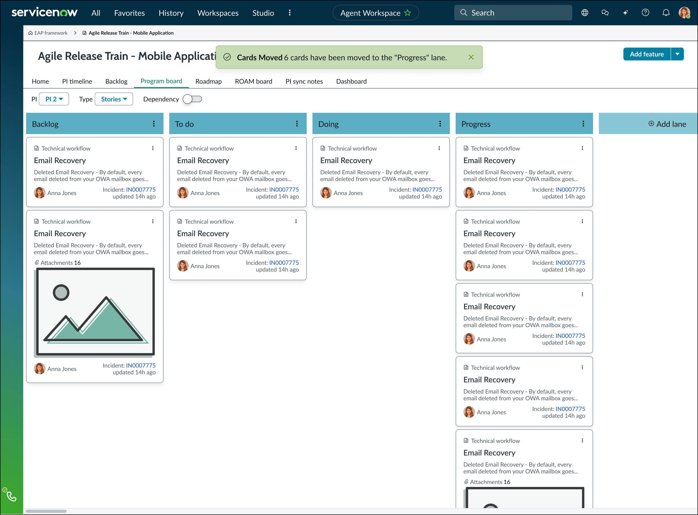
Drag and drop cards
If the Card drag-and-drop property and the Selected cards property are enabled, you can drag and drop a single card or multiple cards at once. To drag and drop multiple cards, the user selects more than 1 card and the cards stack when they are dragged. The card stack displays a count and the drop area is highlighted upon hover. When the cards are dropped, an alert message appears to inform the user that the cards have been moved successfully.
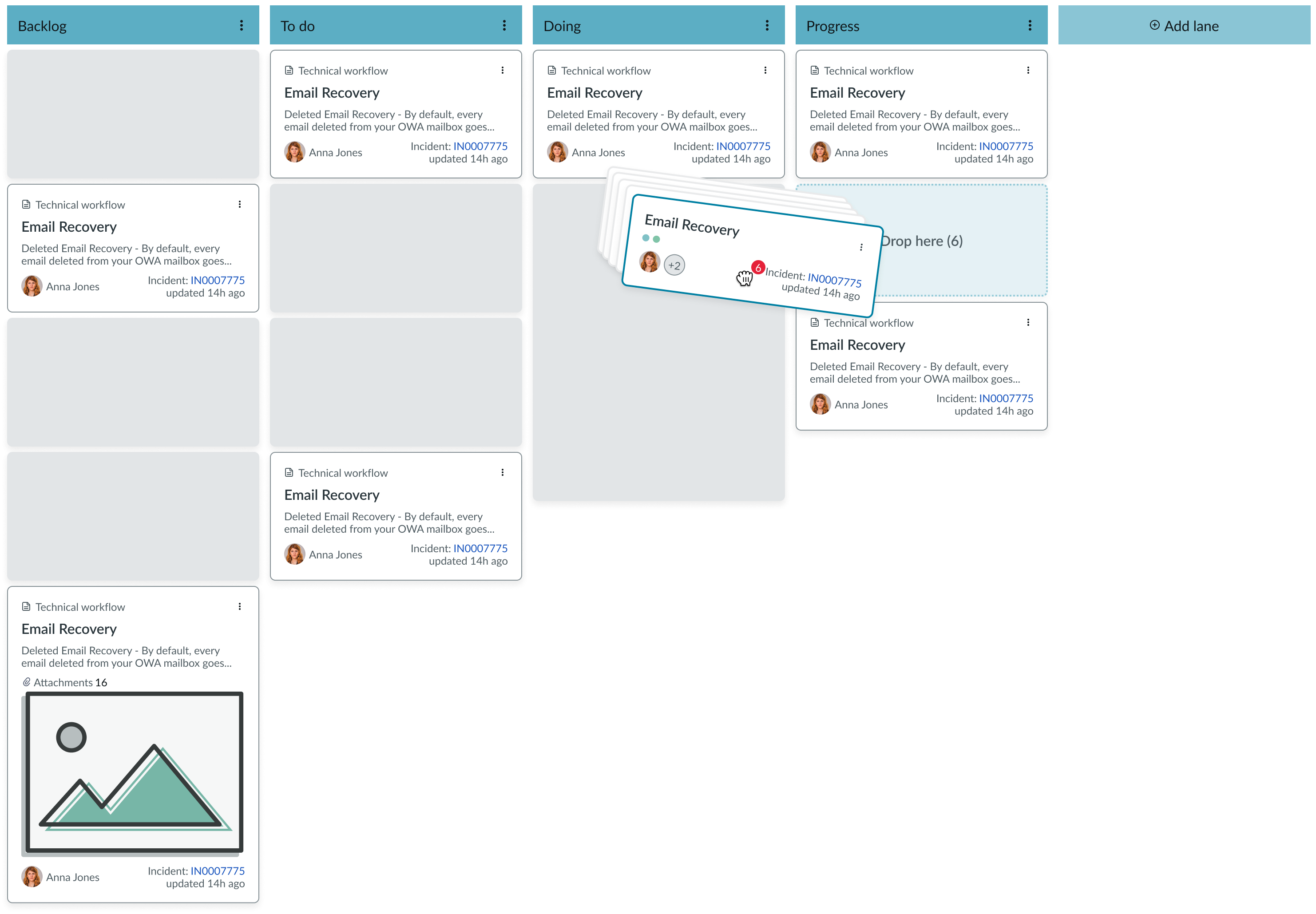
When the cards are dropped, an alert message appears to inform the user that the cards have been moved successfully.
Modify card details
You can select a card to view and modify the card details.
Truncation
Truncation behavior is dependent on the kanban board element.
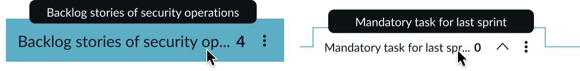
Lane titles
When vertical lane and swimlane titles exceeds container width, the text is truncated with an ellipsis and a tooltip then shows the full content on hover.
Card labels with read-only icons
Card labels with read-only icons will overflow to the next line. Labels cannot exceed 3 lines in total.
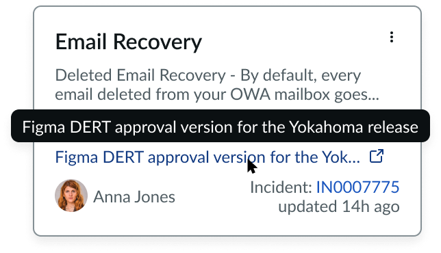
Card hyperlinks
Card hyperlinks that are longer than 1 line will be truncated. A tooltip will display the link in full.
Usability
Kanban board complies with all internationalization and accessibility requirements.
Internationalization
When the display translates to a right-to-left (RTL) language, the fields and button sets align to the right. Any proper nouns that can’t be translated appear left-to-right (LTR).
Accessibility
Learn how to access the actionable elements of Kanban board through keyboard interactions and screen readers.
Keyboard interactions
You can access the actionable elements of Kanban board with these keyboard keys:
- Tab: Moves focus through the component in the prescribed tab order.
- Arrow keys: Moves focus between lanes and cards.
- F2: Enables/disables grid mode.
- Enter: By default, the enter key is not implemented, but it can be configured as needed.
- CMD or Ctrl: Hold and select multiple cards.
When the focus is outside the board:
- Tab: Moves focus to the first lane.
When the focus is on a card:
- Enter/Space: Selects the card in focus.
- Arrow keys: Move the selected card in the direction of the arrow key.
- Enter/Space: Drops or deselects the card.
When the focus is on a lane or card:
- Tab: Exits the Kanban board.
When grid mode is enabled:
- Right Arrow: Moves focus one cell to the right.
- Left Arrow: Moves focus one cell to the left.
- Down Arrow: Moves focus one cell down.
- Up Arrow: Moves focus one cell up.
- Enter: By default, the enter key is not configured. It can be configured to disable grid navigation and places focus on the first widget, if the cell contains one or more widgets. If the cell contains editable content, it moves the focus to an input field, such as a textbox.
When grid mode is disabled:
- Tab: Used to access the Kanban board content, starting with the first lane. Focus moves to the first lane header, respective cards, and then to lane footer. The focus continues through the following lanes in the same order.
- Right Arrow/Down Arrow: Moves focus to the next widget inside the cell. Otherwise, it passes the key event to the focused widget.
- Left Arrow/Up Arrow: Moves focus to the previous widget inside the cell. Otherwise, it passes the key event to the focused widget.
- Tab: Moves focus to the next widget in the grid.
- Shift + Tab: Moves focus to the previous widget in the grid.
- F2: Moves focus out of the grid cell and restores grid navigation functions.
- Esc: Moves focus out of the grid cell and restores grid navigation functions. Otherwise, it passes the key event to the focused widget. If content was being edited, it may undo edits.
Tab order
Screen readers
When you apply ARIA labels to the grid, screen readers announce the table name and number of columns and number of rows.
Grid navigation mode
Given that ARIA labels are applied on the components that take arrow navigation focus, screen readers announce the name as they take focus. When you apply ARIA labels to the row headers and column headers, screen readers announce the content when there is switch from one column or row to another.
Interactive mode
Screen readers announce the content as per the interactive component screen reader considerations.