

Anatomy
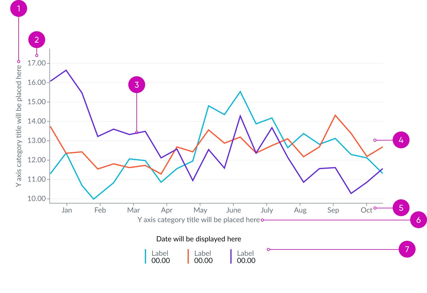
- Y-axis title: Chart axis label that identifies the values or measurements of the y-axis
- Y-axis values: Data values, frequencies, or percentages shown on the y-axis
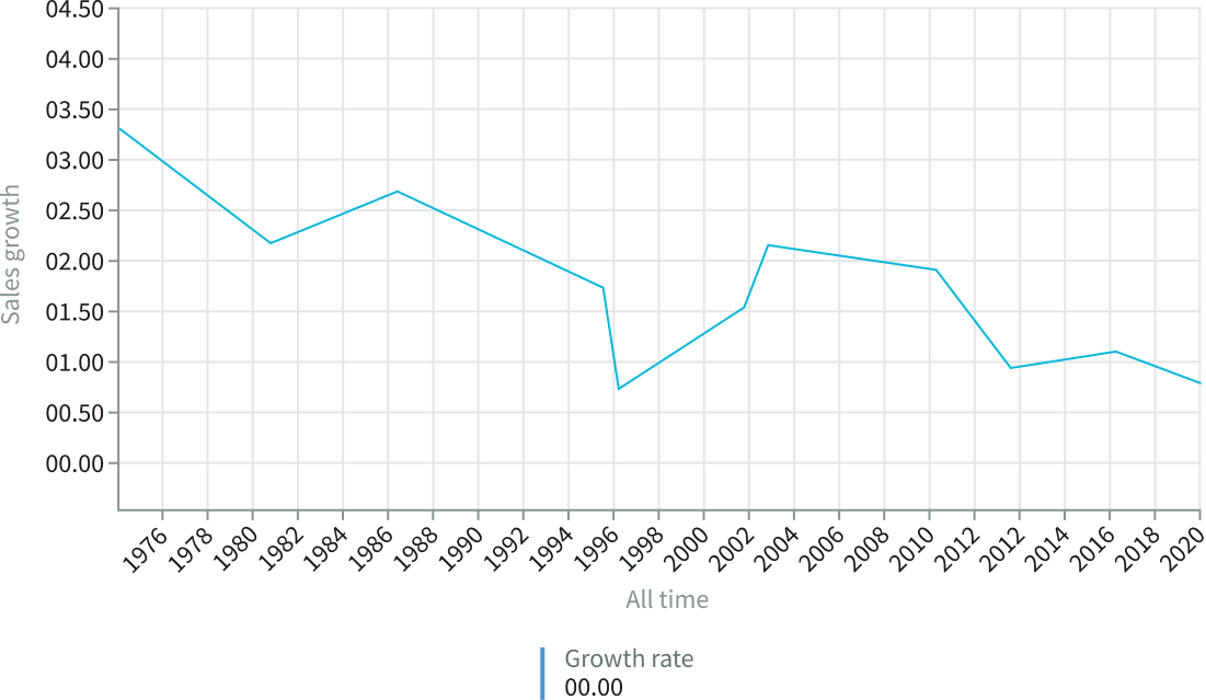
- Data series: Line representing data points at successive intervals of time; each point on the chart corresponds to both a time and a quantity being measured
- Grid: Horizontal or vertical lines that span the width of the chart area; the grid lines serve as visual guides to evaluate the series data values
- X-axis values: Time scale
- X-axis title: Chart axis label that identifies the date groups on the x-axis
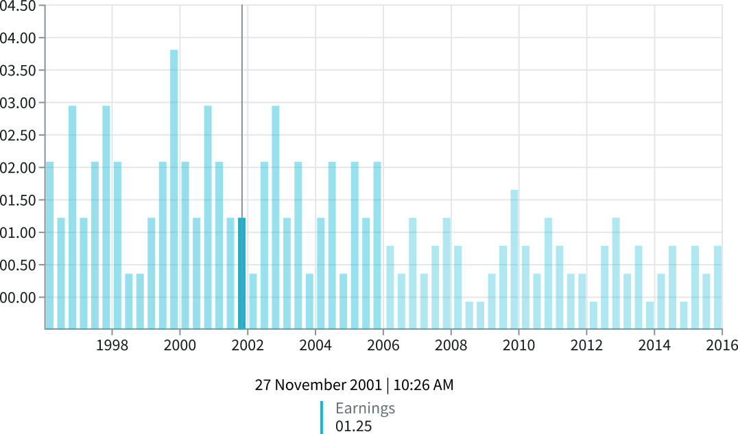
- Legend: Displays a color swatch, series name, and various values associated with a selected data point, including date and time; can be used as an alternate method of labeling data directly
Usage
Use time series charts to create visual representations of how data behaves over time. When users visualize changes in data over time, they can identify trends, spot outliers in cyclical patterns, and analyze changes in a key metric.
Time series charts can exist on their own, but you can also use them in dashboards to provide a quick snapshot of the data to a user.
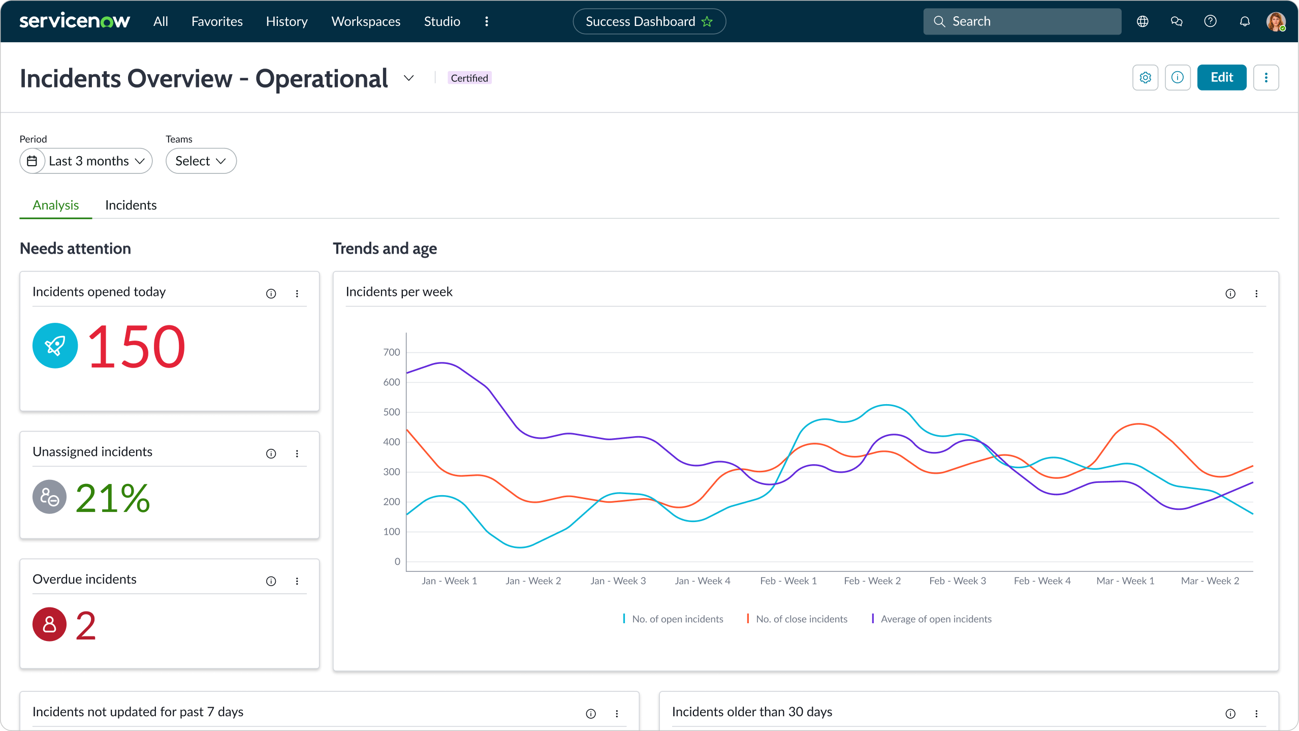
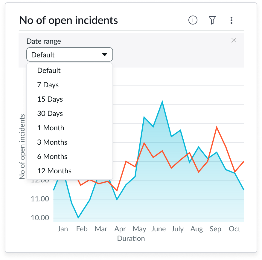
In this example a time series area chart displays an age trend for open incidents
Variants
Learn about the variants for time series.
Types
You can choose between these time series chart types: area, column, line, stepline, or spline. The available configuration properties are the same for all types of time series charts.
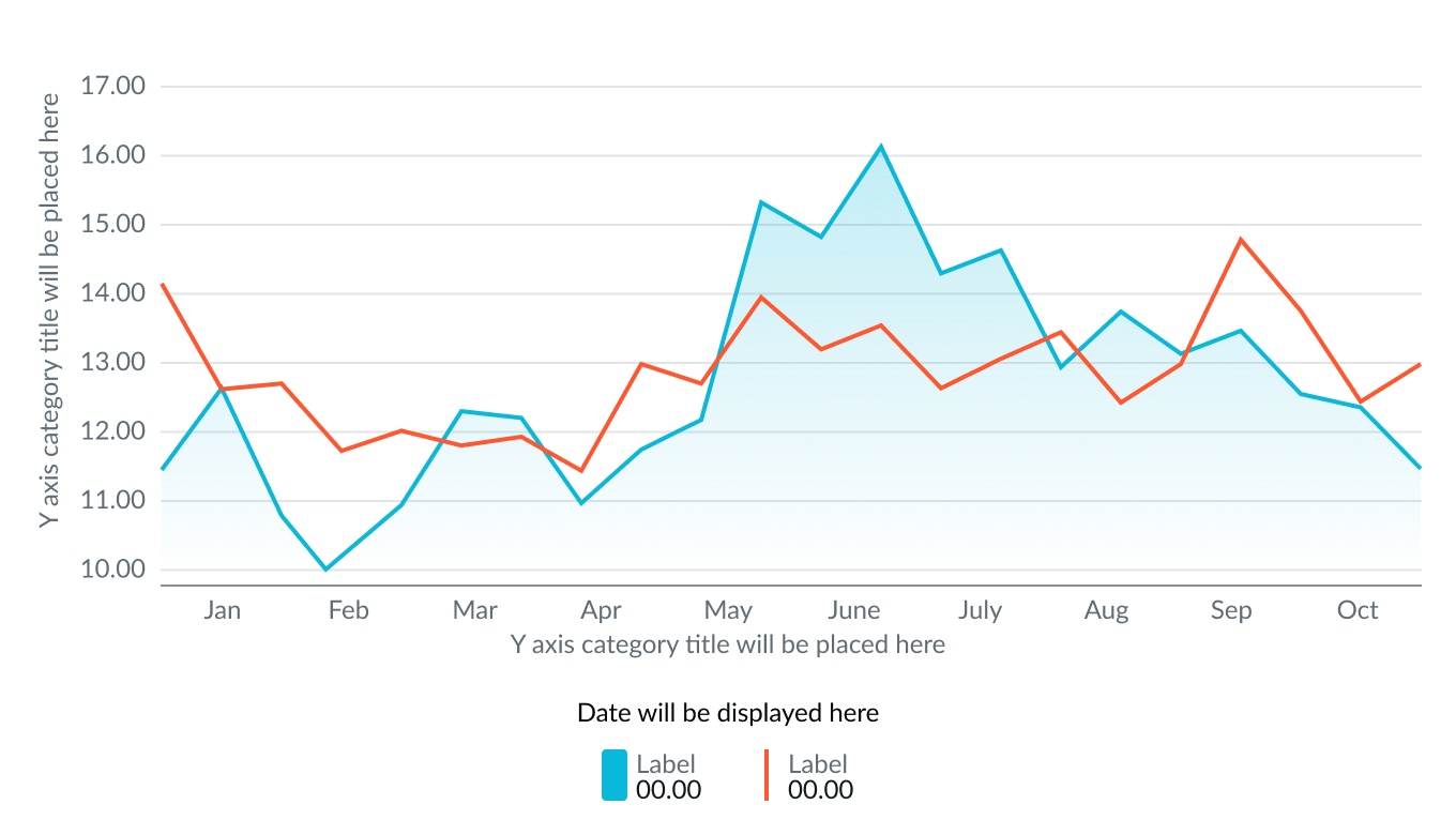
Area chart
The area type visually emphasizes the space between the 0.00 value on the X-axis and the data points with color shading. The change in color occurs for positive and negative results. This visual distinction differentiates an area chart from a line chart.
Use this type to show trending data over time in a more visual way.
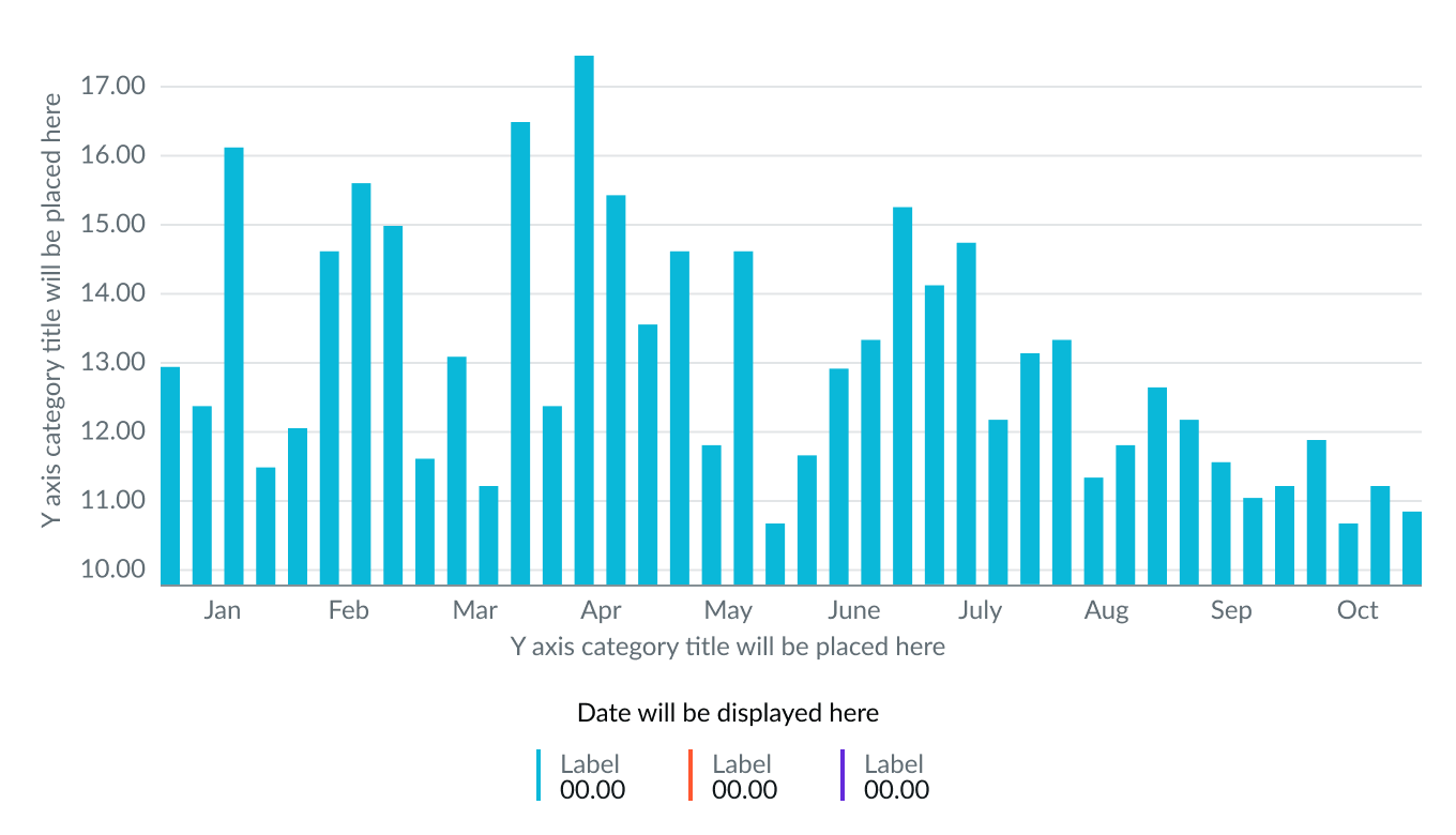
Column chart
The column type shows changes in data over time by displaying the data as proportional vertical bars. While there isn’t a limit to the number of bars you can include in a column chart, too many bars may affect the user’s ability to identify and compare data.
Use this type to compare sub-categories within a single category or to show positive and negative values.
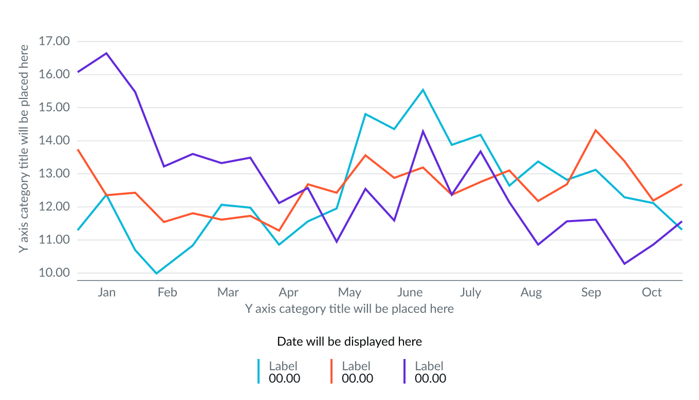
Line chart
The line type shows changes in data over time by connecting data points with straight lines at regular intervals.
Use this type to emphasize a trend in data points over time.
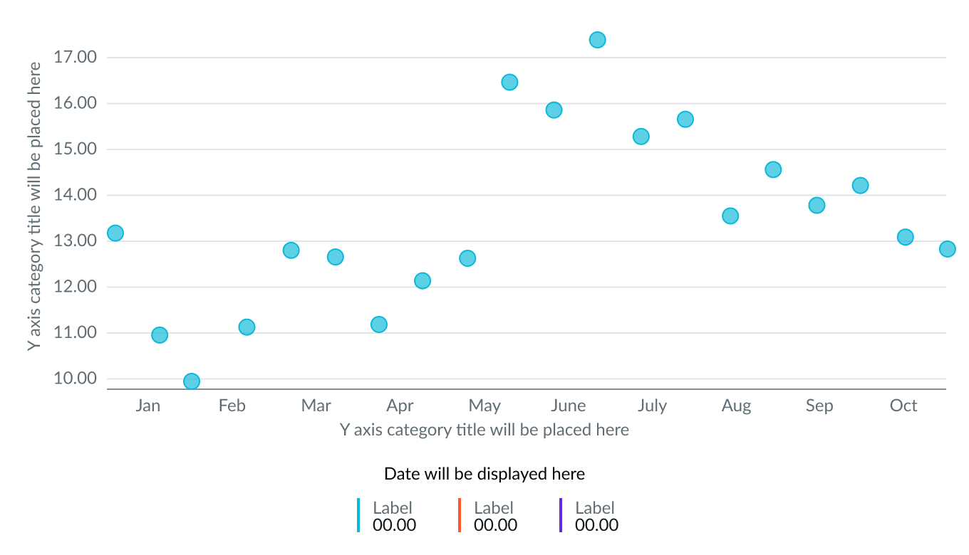
Scatter line chart
In a scatter chart, the values are displayed as two separate data points evenly distributed along the x-axis timeline. This chart type doesn’t have lines connecting the data points.
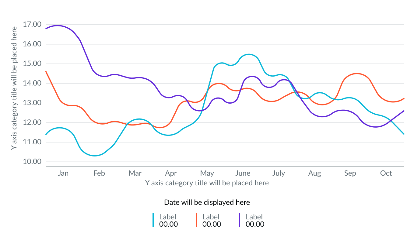
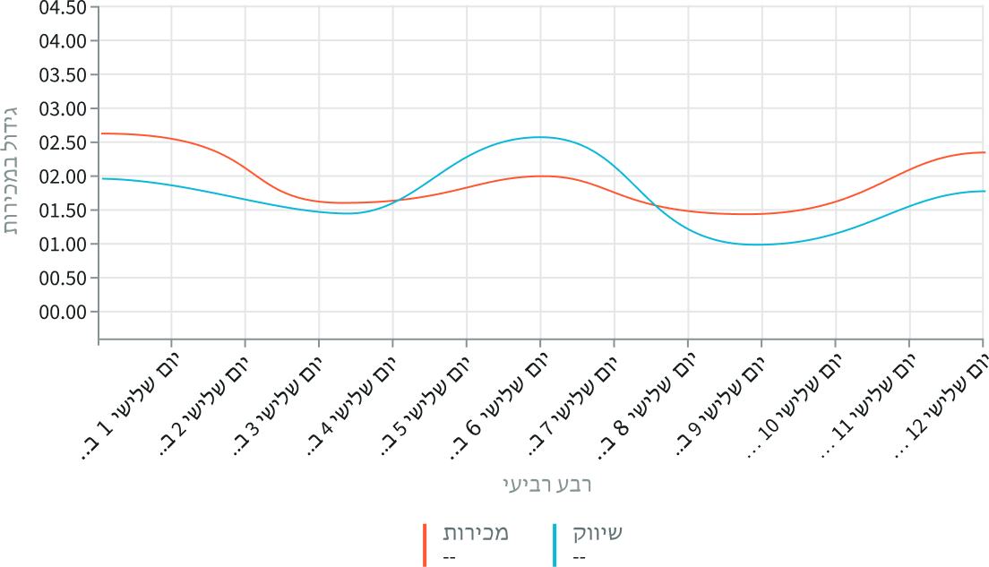
Spline chart
Spline smoothing is a specific style for a line or area chart. Instead of straight lines, the chart uses a curved line to connect the data points in the chart. It does this by averaging the missing values in a limited set of data points.
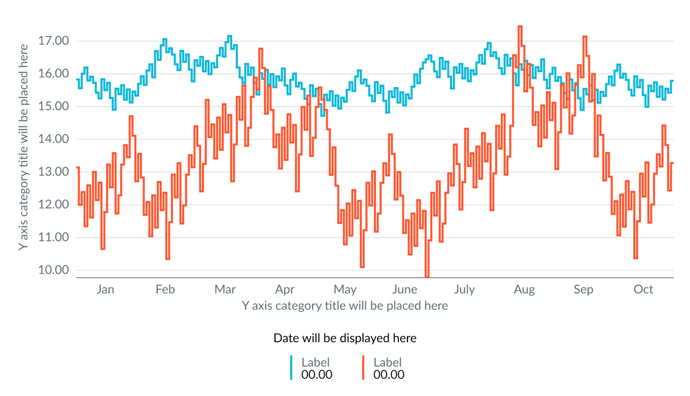
Step chart
A step type shows changes in data points over time by connecting the points with horizontal and vertical lines.
Use this type to identify specific data points, especially when data remains constant between time intervals.
Configurations
Learn how to customize time series charts by configuring the available properties. Configuration has two categories: data and presentation.
Data Sources
You can select between 4 different data sources for your visualization: system data tables, preconfigured Performance Analytics indicators, Usage Insights, and Telemetry to visualize telemetry KPIs and trends from the Telemetry Data Connector (traces/metrics/logs). If you are changing your data source, the option list provides suggestions based on previous selections and items that match your search.
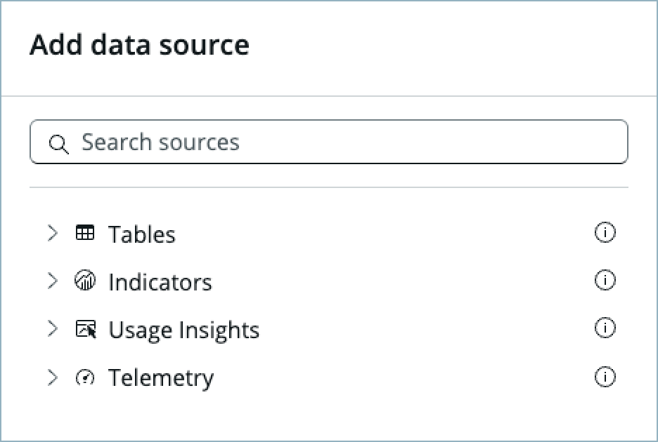
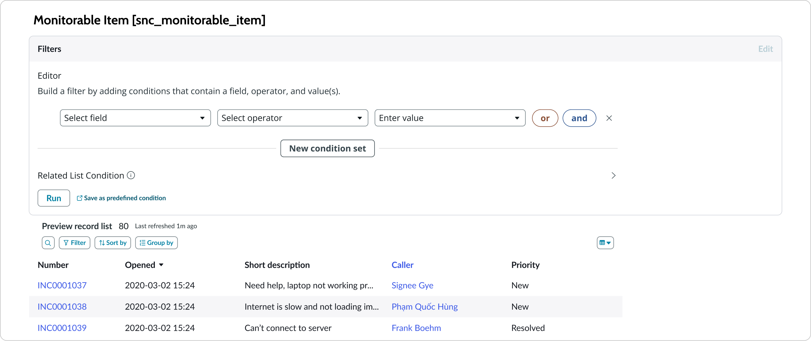
Tables
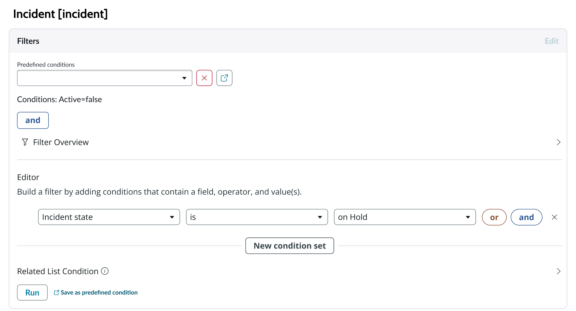
You can select any table from the system to use in your visualization and filter that data. When you apply a table as the data source, a preview list appears showing all available records in that table.
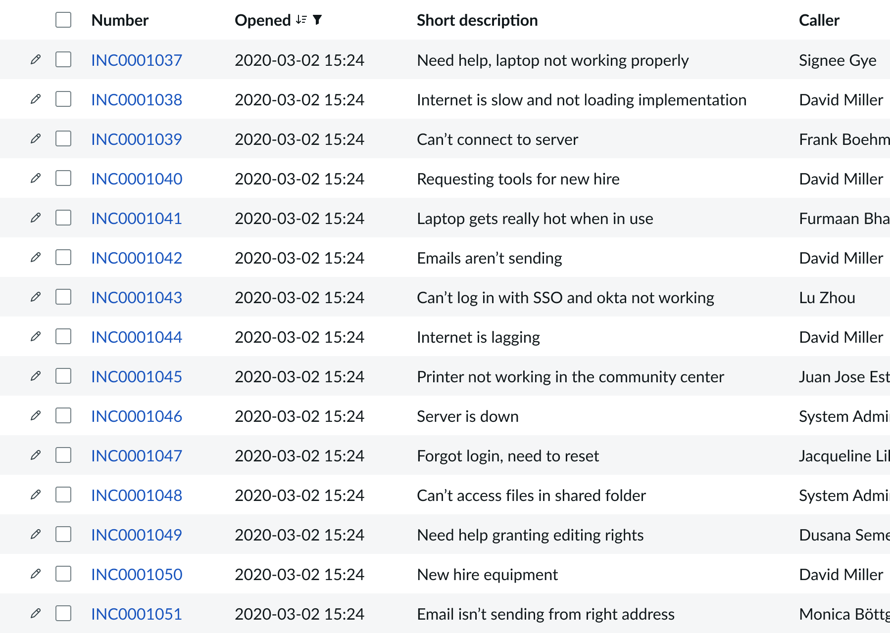
A condition builder above the list enables you to set filter conditions on the data before using it in your visualization. This is useful for limiting the data shown in the chart to only the data you need.
Indicators
Indicators are preconfigured business metrics that assess performance across attributes such as cost, quality, technical risk, investments, user satisfaction, and business value. Indicators are configured in the Performance Analytics application and reflect common measurements that users need. If breakdowns are defined for an indicator, you can apply filter conditions on those values.
Data snapshot indicators
Data snapshot type of indicators enable intraday collection and analysis, filtering by breakdown hierarchy, with the ability to report partial scores.
Key features:
- Move beyond daily snapshots: Collect and analyze data multiple times throughout the day (intraday) for granular insights.
- Breakdown hierarchy: Filter through hierarchical structures (department to team to individual) to pinpoint issues and identify trends at any level.
- Partial scores: Track progress toward goals mid-period in order to take corrective action early instead of waiting for periods to close.
- Deeper insights: Drill down through multiple dimensions to uncover hidden patterns.
- Simplified setup: Create fewer, more generalized indicators.
- Dynamic filtering: Apply breakdowns on-demand without preconfiguration.
- Reduced maintenance: Fewer indicators mean less ongoing work.
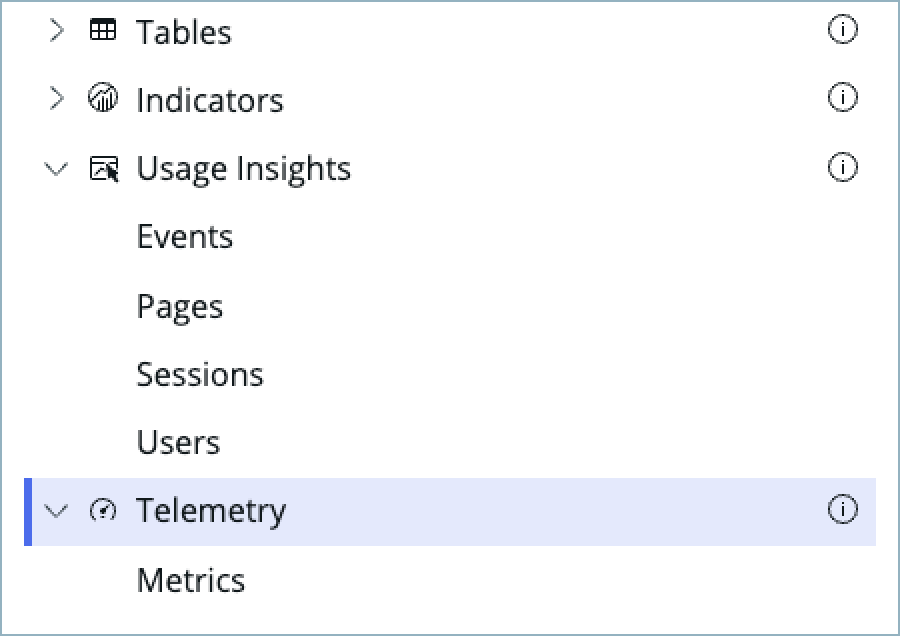
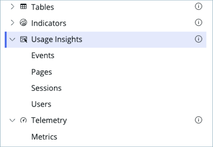
Usage Insights
Usage insights are the user experience analytics data points: events, page views, sessions, and users.

Telemetry
Use this data source to visualize telemetry KPIs and trends from the Telemetry Data Connector (traces/metrics/logs) in Platform Analytics.
MetricBase
A MetricBase data source provides summary data from applications that monitor or act on large amounts of machine-generated data. Data in MetricBase is gathered at a predefined sampling rate and used by data visualization charts to display summary views of time series data. For example, with MetricBase you might summarize average CPU usage data by collecting and storing it in 5 minute intervals.
The MetricBase data source is only available for time series charts.
Usage Insights
Usage insights are the user experience analytics data points: events, page views, sessions, and users.
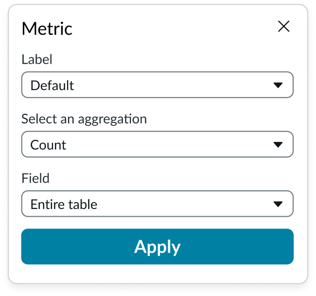
Metric selection
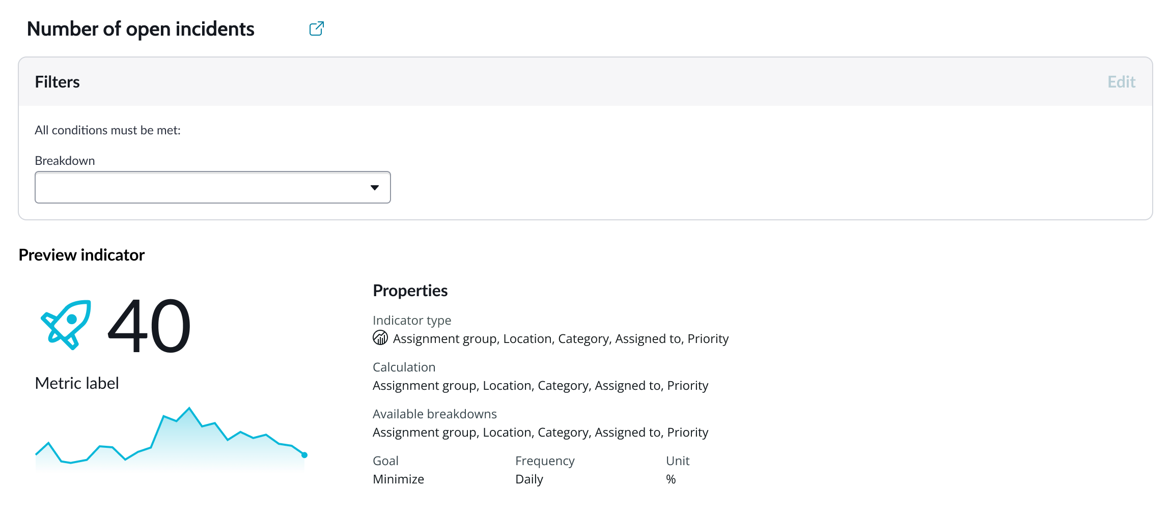
Select the specific data from the data source to display in the chart and the label that identifies it. Select an aggregation type from the dropdown list. You can select a specific field from the data source table to display in the chart. If you leave the field empty, all fields are used, depending on any filtering conditions you applied when you selected the data source.
Grouping data
Grouped charts compare one or more data sets across all categories in a side-by-side format. “Group By” is used with aggregate functions like Sum, Count, or Average. The function selected tells the data provider how to treat the data when it’s grouped. You can select a field (for table data sources) or a breakdown value (for indicator data sources) as the grouping value.
Note: Not all indicator data sources have available breakdown values. Charts using indicator data sources that don’t have breakdown values can’t be grouped.

Alternative grouping
If you add multiple metrics (up to 3) to a chart, you can add alternative Group by's for each metric for the user to select from.
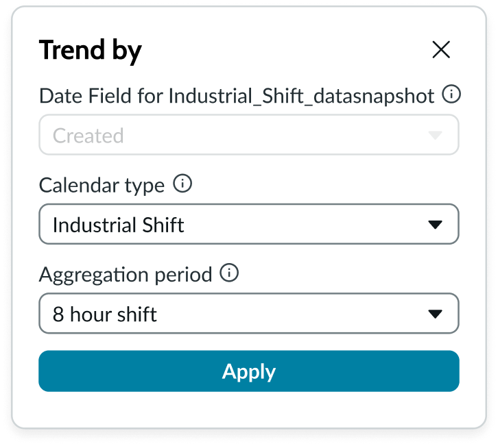
Trend by
Available for time series visualizations when the data source type you choose is “Data snapshot indicators” or tables.
Data snapshot indicators
Use trend by to select the “Calendar type” and “Aggregation period” to apply to the data.
Trend by is made up of the following options:
- Date Field is defined when an indicator is created and cannot be changed in UI Builder. It can only be changed in the indicator itself. If "None" is displayed for the date field, the results are shown as aggregate totals for the selected time period.
- Calendar type uses the calendar that is set as the default on the indicator. It can be changed to another available calendar.
- Aggregation period uses what is already set for the indicator. However, you can change the “Aggregation period” and control how to group the data over time.
- Options depend on the calendar you select. Business calendars display the periods defined within the business calendar group.
- “Auto” automatically selects the most suitable aggregation period based on the selected date range, applied date filters, or data availability. This helps ensure that data is presented acurately without requiring manual reconfiguration of the aggregation period.
Header and border
The component header displays along the top and contains the title you give the visualization. By default, the header is configured to show, but the content is empty.
Visualization border
By default, a border around the chart. Unselect the “Show border” option to remove it.
Header separator
You can add a separator line between the header and the visualization. Disabled by default.
Chart title
By default, the chart title is blank, but you can add a title. When you add a title for your chart, you’re able to customize the color and make it wrap.
Header level
By default, text in the header is set to heading level 2 (H2). Heading levels H1 through H6 are also available.
Title alignment
By default, the title is aligned to the Start side. The start size can be the left or right depending on the language you use. Other options available from the dropdown are “Center” and “End”.
Title wrap
By default, long titles truncate with an ellipsis, and a tooltip showing the full title on hover, but you can set the title to wrap instead.
Title truncation
By default, the title text truncates at the end of the first line of text, but you can set the line of truncation to 2 or 3 lines instead. This option becomes available when the title truncates.
Refresh option
By default, refresh is available to the user in the “More options” menu, but you can hide it. This gives you more control over how refresh options are exposed on dashboards so you can align refresh behavior with your intended usage.
Header background color
By default, the color of the header background is neutral-0 (white). You can specify a different color (including a custom color) for the background.
Select a color for the visualization header background that aligns with your dashboard theme, branding, or design preferences. The color you choose applies only to the visualization header background.
For better accessibility, make sure a good color contrast exists between the header background and title text. The minimum contrast requirement for normal text is 4.5:1, and for large text is 3:1. To verify, check the contrast ratio in the color picker.
Note: Theming is not supported when you select a custom color.
Title color
By default, the title text is neutral-21 (black). You can select a different color (including a custom color) for the title text.
You should select a color for the chart title that aligns with your dashboard theme, branding, or design preferences. The color you choose applies only to the chart title.
For better accessibility, make sure a good color contrast exists between the header background and title text. The minimum contrast requirement for normal text is 4.5:1, and for large text is 3:1. To verify, check the contrast ratio in the color picker.
Note: Theming is not supported when you select a custom color.
Date range
For Indicator data sources, a default period type and date range displays based on the indicator source you choose. For example, “Months” is the period type and “3 Months” is the date range that displays for a preconfigured performance indicator source by default.
In addition to the standard calendar, business calendars such as Gregorian, fiscal, and any manually added calendar are also supported.
Show maximum range
For Indicator data sources, if you select “Show maximum range,” the chart shows the data for all dates. Then, you can choose to show the date range selector control on the data visualization that gives the user the ability to quickly change date range from the predefined options.
Set absolute period
For Indicator data sources, you can set an absolute period start and period end date for the date range.
Number of periods
For Indicator data sources, you can enter any number of periods to include, but keep in mind how the range you configure affects data density and the readability of your chart.
Period
For Indicator data sources, you can configure the period type and the date ranges available. For example, for the user experience analytics data source type, the default period type is days and the date range that displays is “30 days”. You can change the period type to “Weeks” and the make the date range default “2 Weeks”.
Current date for period end date
For Indicator data sources, if you to view data from a set start date to the current date, such as daily sales trends for a current month, you can set the period end date to update automatically to the current date.
Change date range
For Indicator data sources, you can also enable the date range picker that adds a date range dropdown from which the user can quickly change the time range displayed to one of predefined date ranges. The option can be visible by default or available on demand from the "More options" menu. The date range selector is not available for the Table data source type.
Show range picker
For Indicator data sources, you can also enable the date range picker that adds a date range dropdown from which the user can quickly change the time range displayed to one of predefined date ranges. The option can be visible by default or available on demand from the "More options" menu. The date range selector is not available for the Table data source type.
Derived series charts
You can enable each type of derived series chart by setting its flag to true in the Additional settings panel. These charts are only available for indicator data sources. Each time series chart type supports configuration of these views:
- Target
- Forecast
- Forecast range
- Trend
- Confidence band
- Threshold
- Comment
Note: With the exception of the Forecast chart, derived series charts are not available when a value is selected for the “Group by” property.
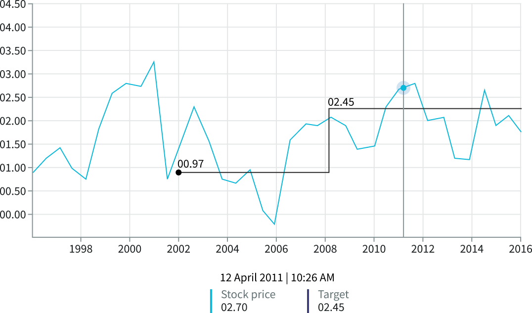
Targets
Targets resemble thresholds, but instead of indicating a static value, they can change over time. Targets are only available when indicators are the selected data source.
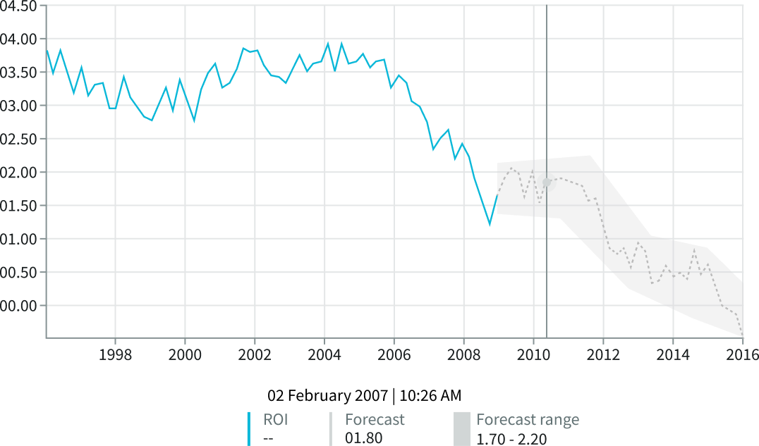
Forecast
You can configure a forecast of future data for any type of time series chart. Forecasts show future data projections, based on historical data and are only available when indicators are the selected data source.
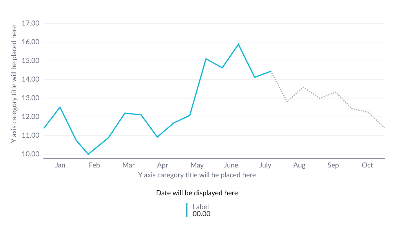
Forecast range
A forecast range overlays the forecast data with a prediction band. The forecast feature must be enabled for forecast range to be available. A forecast range is only available when indicators are the selected data source.
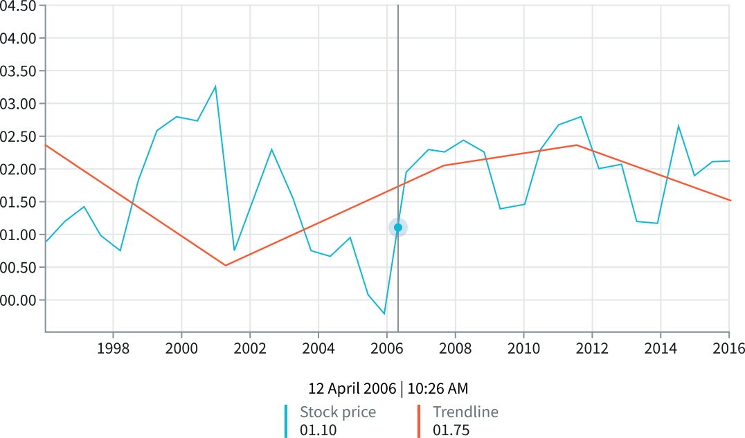
Trend
A trendline indicates the general trend of data over time. A trendline is only available when indicators are the selected data source.
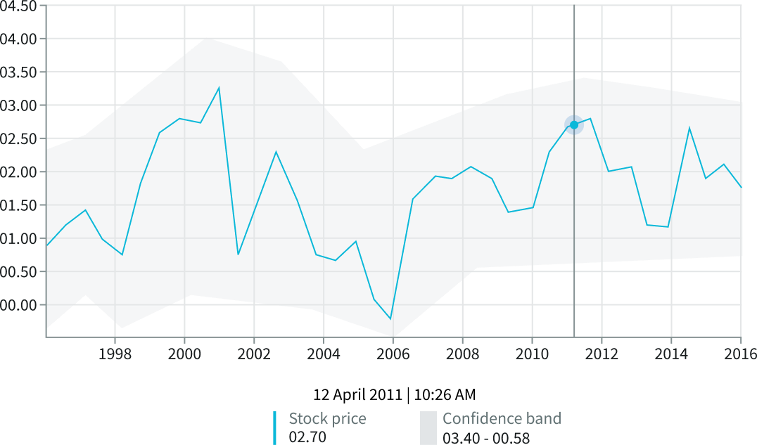
Confidence band
A confidence band indicates the desired values for a given range within a specific confidence interval. Confidence bands are only available when indicators are the selected data source.
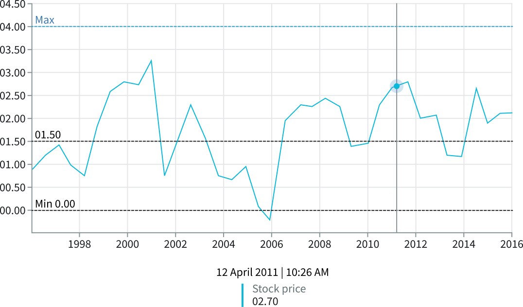
Threshold
A threshold is a visual indicator of specific, static limits on the y-axis. Each threshold appears as a line and optional label in the chart. Thresholds are only available when indicators are the selected data source.
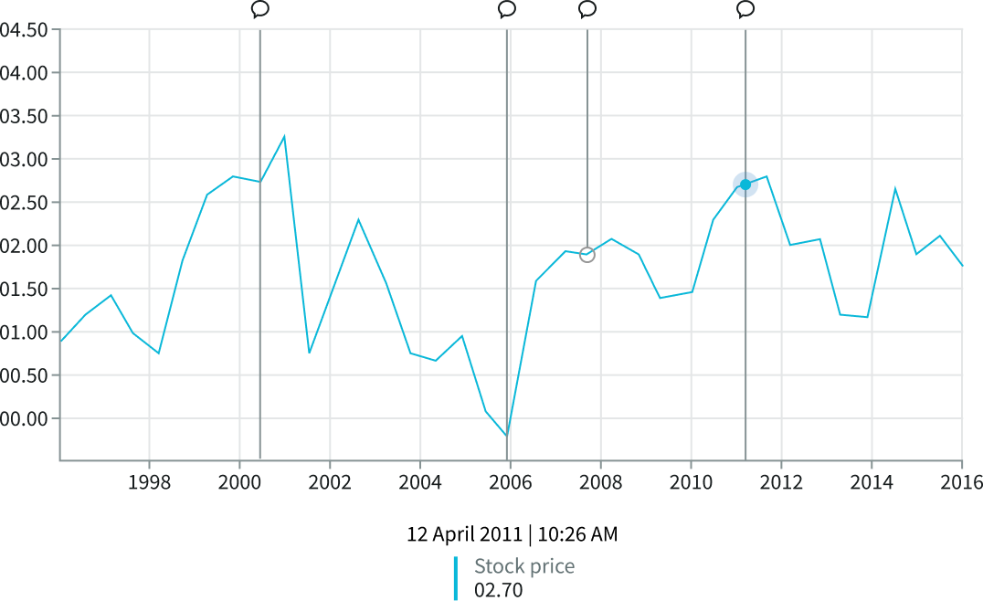
Comments
Comments are annotations that mark data points where significant events occurred. Comments are only available when indicators are the selected data source.
Data updates
Configure filter conditions and enable data drilldown from data points on the chart. You can configure your chart to update on a defined refresh interval, measured in minutes.
Follow filters
By default, any filters set on the workspace page and those set on the data source are applied. You can use the “Follow filters” property to prevent any filter input from the workspace page. Filters set on the data source always run on the component.
Filter icon
The filter icon and the number of filters impacting the visualization display by default. To hide them, unselect the “Show filter icon.”
Drill down
By default, users can drill down into data or launch a URL directly from a chart by selecting data points, slices, categories, or scores. This lets users view data such as records and record lists from data tables or KPI data from indicators or go to a URL that you specify.
Drill down label
You can add text that appears in tooltips and describes what happens when the user selects a chart data point.
Refresh after being away
You can configure your chart to update automatically or on a defined refresh schedule.
Refresh requested
When the new value of this property is different from the previous one, you can trigger refresh by setting up a string that can be passed down.
Use data cache
You can cache user queries to shorten the load time for the data visualization. Unselected by default.
Info messages
Displays generic error messages by default.
Extended error messages
You can choose to show extended error messages which contain more details that can be helpful to admins. Unselected by default.
Custom no data message
By default, when a data source doesn’t return any info, the “no data available” message displays with generic content. However, you can set a custom message by changing the title, illustration, and message content.
Presentation
The presentation properties control the physical appearance of the chart. Use these properties to control how your users consume the data. Select the chevron icon to expand the section and display the properties in each category.
Display settings
Select display setting for your time series chart.
Chart variations
Chart variations are only available for column type time series charts. The values displayed in these variants are defined by the field selection in the “Group by” property.
The 2 variations are: stacked and side-by-side.
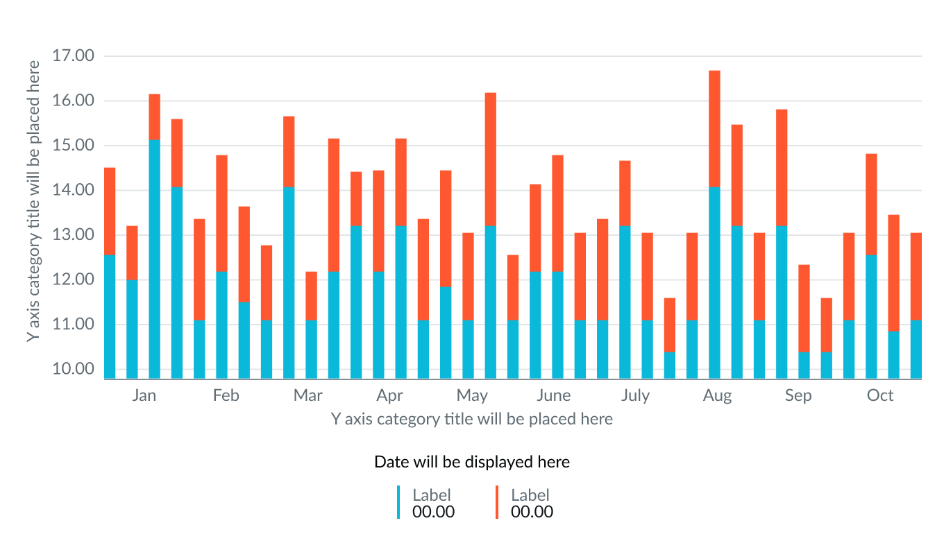
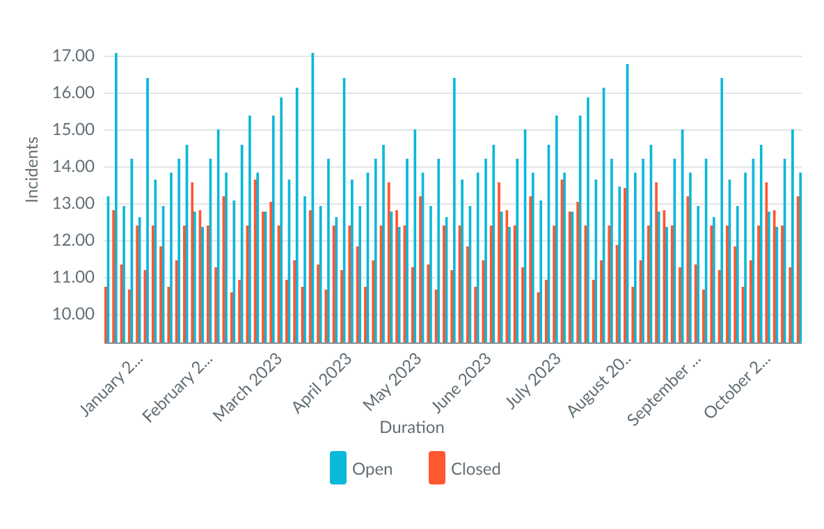
stacked columns
The stacked column type compares two sets of data with two different colored segments that represent the different indicators. There isn't a limit to the number of bars you can use, however, too many bars may affect the user’s ability to identify and compare data.
Use this type when you want to show the cumulative result of two sets of data over the same time interval.
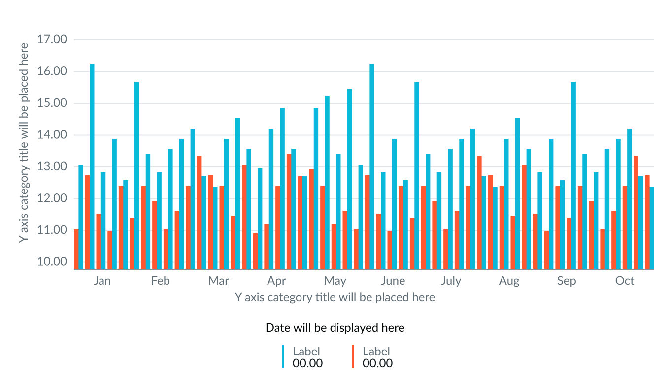
side-by-side columns
The side-by-side (grouped) variant compares values for two data sets for the same time interval displayed as columns next to each other. This enables users to make quick comparisons between different data sets in one chart.
Line stroke width
You can configure the line width for time series charts that display data with lines. Select line weights of either 1 or 2 pixels. The default weight is 2 pixels.
Data table
You can select to show a table with chart and graph data below the chart for easier screen reader access.
Data point markers
For line, spline, area, and step time series charts, you can have a marker show at each data point on the chart including where values are zero (0) or missing.
No value display format
You can choose to show zero (0) when there’s no value in the selected dataset or configuration.
Continuous line
For table data, when there is no data for a specific time, you can choose to show no gap in the chart and show a continuous line.
X and Y axes
You can configure the y-axis label and its position on the right or the left of the chart. Select a value range for the y-axis that can accommodate the values you expect from your data. The default range is dynamic, meaning that the range increases or decreases automatically to accommodate the range of data displayed in the chart. Enter a negative value for the bottom of the range to display any negative values from the data source selected.
You can configure the x-axis label or hide it.
Legend
The legend on a chart shows a label and a value for a point or segment selected on the graph. The legend position is configurable for the top, bottom, left, and right sides of the chart.
Data labels
Show or hide the labels on the chart that indicate the value of each data point.
Colors
Choose a single color or use the color selector to define the color of a line, bar, score, or segment, Color selection options differ slightly, depending on the visualization selected. A color picker provides a list of predefined colors in a dropdown list with a search field.
Design recommendations
Learn how to apply time series in your design.
UI text guidelines
These are some recommendations for using text within time series.
- Labels should be short and unique.
- Keep information in the legend concise to avoid overlapping and truncation.
Behavior
Learn how time series behaves when the display changes or a user interacts with the component.
States
Time series charts have 2 states: hover and selected.
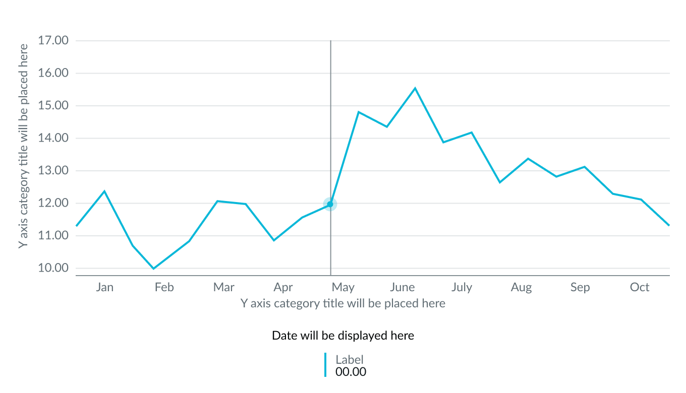
Hover
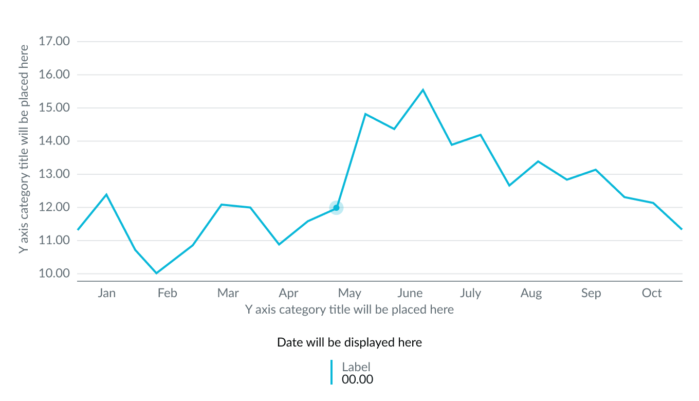
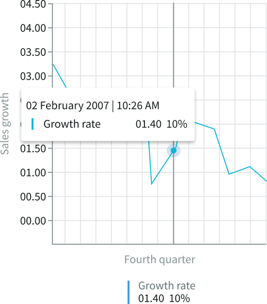
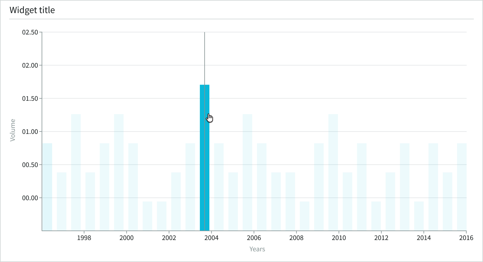
When a user hovers over a data point in a line or area chart, both the grid lines and the data point are highlighted, and the register displays the data point’s value. The hover state shows a vertical line that visually connects the y-axis with x-axis and highlights the data point in the timeline. The data point shows a marker with a halo around it. If you have enabled the tooltip, it displays when the user’s cursor touches the data point’s threshold.
The color of the data point and halo are inherited from the time series line color. The line doesn’t change color on hover.
When a user hovers over a column in a column chart, they see chart details for a specific data point. The register displays the value and label in the data details with a timestamp above it. The color of the identifier changes to show which column the user selected, and the surrounding column colors fade.
Selected
When the user selects the data point, the halo and vertical line disappear, and the data point appears larger and darker. Selecting the data point triggers the click event action.
Responsive behaviors
Learn how time series responds to changes in a container or display.
Label rotation
The x-axis labels rotate to fit when the container shrinks.
Hidden labels
When the container is too small for the labels to display, they disappear. When the user hovers over a data point, the missing information shows in a tooltip.
Interactions
Users can select data points in a time series chart to open individual records.
Truncation
Long, x-axis labels truncate when the container shrinks and display tooltips containing the full label text.
Usability
Time series complies with all internationalization and accessibility requirements.
Internationalization
When a time series chart is internationalized to a right-to-left (RTL) language, the labels, values, and chart details read from right-to-left. However, the origin of the x and y axes remains aligned to the left.
Accessibility
Learn how to access the actionable elements of time series through keyboard interactions.
Keyboard interactions
Users can interact with time series using the keyboard. They can access the chart navigator and legend with these keyboard keys.
With focus within chart
- Tab: Moves focus forward through the UI elements
- Shift + Tab: Moves focus backward through the UI elements
- Esc: Dismisses displayed tooltip
- Enter: Triggers an action associated with an interactive element when in focus, such as opening a list view for a data point
Datasets Mode
- Alt + S (Mac: Option + S): Sets the navigation mode to datasets.
- Arrow up, down, right, left (dataset mode): Moves focus within the chart area; up and left moves left, down and right moves right
Data Points Mode
- Alt + P (Mac: Option + P): Sets the navigation to be by data points
- Arrow up, down, right, left (data point mode): Moves focus within the chart area; up and down move vertically within a dataset, left and right move horizontally
Coordinate Pixel Mode
- Alt + C (Mac: Option + C): Sets the navigation to be by coordinate pixels and provides the most granular access to every corner of the chart area
- Arrow up, down, right, left: Moves focus within the chart area or the legend 1 pixel at a time ; up and down move vertically within a dataset, left and right move horizontally
- Shift + Arrow up, down, right, left: Moves focus within the chart area or the legend by 10 pixels
- Shift + Control + Arrow up, down, right, left: Moves focus within the chart area or the legend by 100 pixels
Navigating large charts quickly:
- Page up (Mac: fn + Arrow up or left): Moves focus to the top-left end of the chart
- Page down (Mac: fn + Arrow down or right): Moves focus to the bottom-right end of the chart area
With focus within chart legend
- Arrow right, left: Moves focus within the legend
- Enter/Space: Mutes dataset
Screen readers
Screen readers can’t read the elements of a chart itself currently. A screen reader can read values from the data table that accompanies the chart via manual use of the arrow keys on the user’s keyboard, and either the data table or a human-generated description of the data being communicated must accompany the chart. Data tables are enabled with an accessibility control in user preferences on the instance and not in the component.
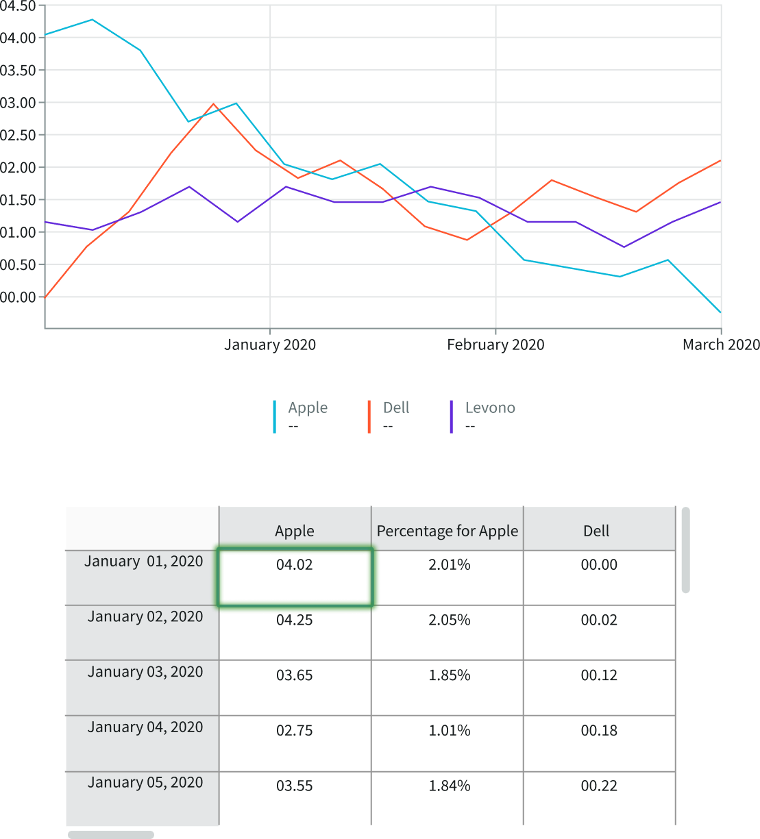
This example shows the time series data table. The screen reader reads the entries as the user manually navigates the table using the arrow keys.