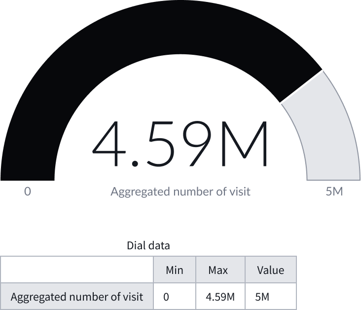
Anatomy
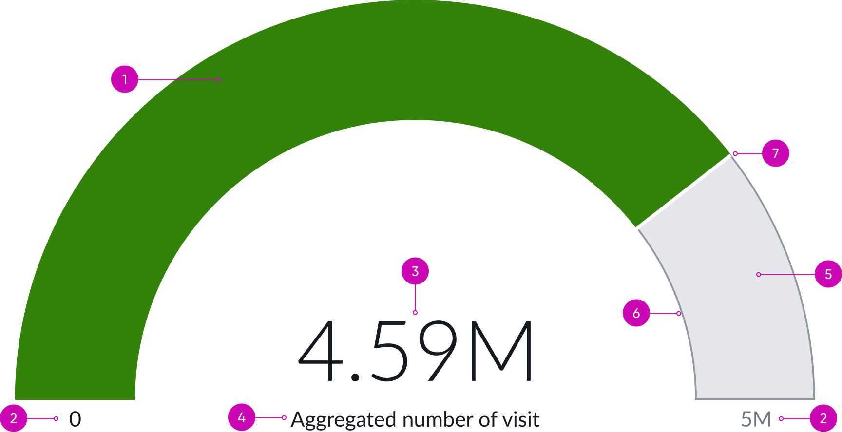
- Dial foreground: Filled in color portion of dial that represents progress made
- Minimum and maximum values (optional): Minimum and maximum values the progress is measured against
- Value: Numerical or percentage progress total
- Unit label (optional): Total progress value information
- Dial background fill: Filled in color portion of dial that represents the progression not achieved
- Dial background border (optional): Color border around dial background fill
- Dial divider (optional): Thin line that divides the dial foreground and background
Usage
Use a dial chart to display how a singular, linear range of progress information changes. The user can quickly view the progression to a numerical or percentage maximum value. Dial chart is usually used in executive dashboards to represent key indicators related to any domain such as, academics, healthcare, analysis, and human resources.
Variants
Learn about the attributes of dial chart.
Sizes
Dial chart size can be configured. The size you specify depends on your use case. The chart is placed in the center of the Data visualization container and retains a fixed width to height ratio.
Min width
The minimum width for dial chart is 200 px. There isn’t a max width property. The chart maximizes based on the data visualization container.
Min height
The minimum height for dial chart is 100 px. There isn’t a max height properthy. The chart height maximizes base on the data visualization container.
Configurations
Learn how to customize dial chart by configuring the available properties. Configuration has two categories: data and presentation.
Data Sources
You can select between 4 different data sources for your visualization: system data tables, preconfigured Performance Analytics indicators, Usage Insights, and Telemetry to visualize telemetry KPIs and trends from the Telemetry Data Connector (traces/metrics/logs). If you are changing your data source, the option list provides suggestions based on previous selections and items that match your search.
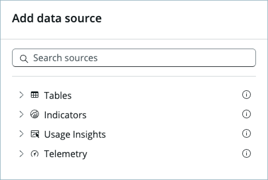
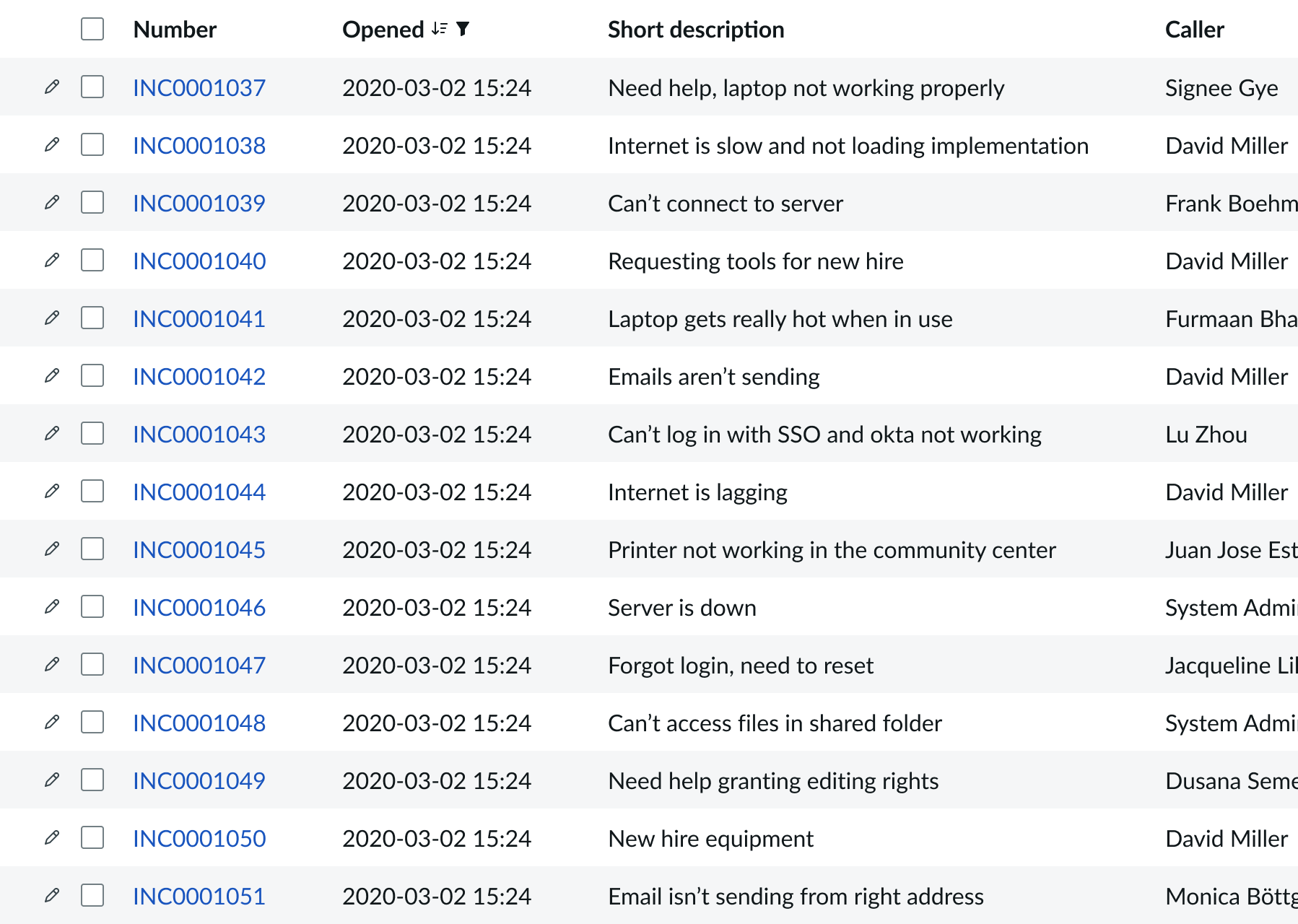
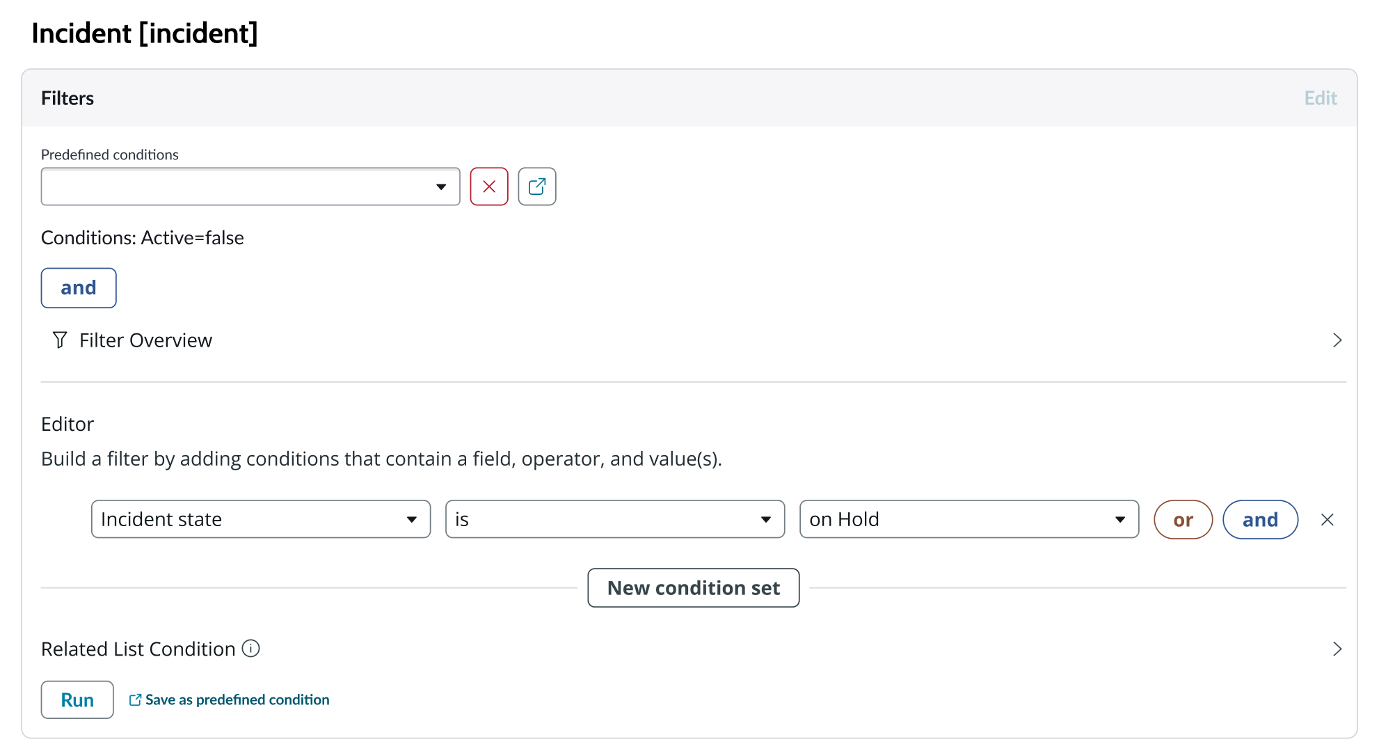
Tables
You can select any table from the system to use in your visualization and filter that data. When you apply a table as the data source, a preview list appears showing all available records in that table.
A condition builder above the list enables you to set filter conditions on the data before using it in your visualization. This is useful for limiting the data shown in the chart to only the data you need.
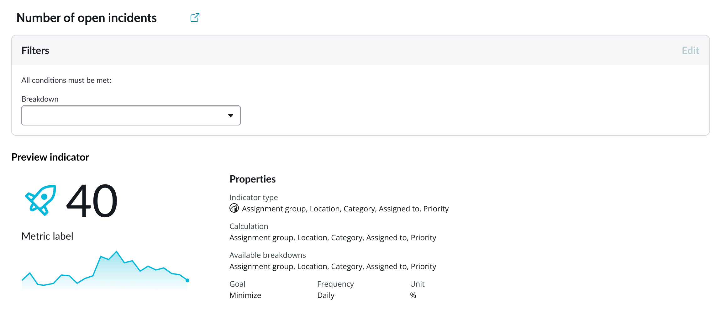
Indicators
Indicators are preconfigured business metrics that assess performance across attributes such as cost, quality, technical risk, investments, user satisfaction, and business value. Indicators are configured in the Performance Analytics application and reflect common measurements that users need. If breakdowns are defined for an indicator, you can apply filter conditions on those values.
Data snapshot indicators
Data snapshot type of indicators enable intraday collection and analysis, filtering by breakdown hierarchy, with the ability to report partial scores.
Key features:
- Move beyond daily snapshots: Collect and analyze data multiple times throughout the day (intraday) for granular insights.
- Breakdown hierarchy: Filter through hierarchical structures (department to team to individual) to pinpoint issues and identify trends at any level.
- Partial scores: Track progress toward goals mid-period in order to take corrective action early instead of waiting for periods to close.
- Deeper insights: Drill down through multiple dimensions to uncover hidden patterns.
- Simplified setup: Create fewer, more generalized indicators.
- Dynamic filtering: Apply breakdowns on-demand without preconfiguration.
- Reduced maintenance: Fewer indicators mean less ongoing work.
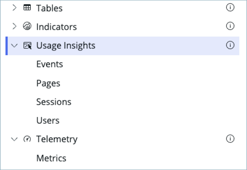
Usage Insights
Usage insights are the user experience analytics data points: events, page views, sessions, and users.
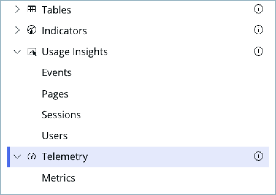
Telemetry
Use this data source to visualize telemetry KPIs and trends from the Telemetry Data Connector (traces/metrics/logs) in Platform Analytics.
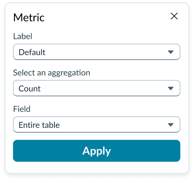
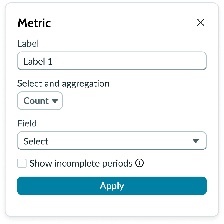
Metric selection
Select the specific data from the data source to display in the chart and the label that identifies it. Select an aggregation type from the dropdown list. You can select a specific field from the data source table to display in the chart. If you leave the field empty, all fields are used, depending on any filtering conditions you applied when you selected the data source.
Date range
You can use the “Apply date range” setting to apply a date range filter from filter component or manual configuration to the visualization.
Auto aggregation periods
For Data Snapshot Indicators, automatically picks the best aggregation period when a date filter is used. Affects only this visualization and does not change the indicator's default aggregation period. Clear the checkbox to always use the indicator's default period.
Metric label
You can display a label below the metric value. Not visible by default.
No data available
You can display a zero (0) when no data is available.
Show incomplete periods
For Data Snapshot indicators only. To provide users real time progress tracking, for each “Metric” you can select the “Show incomplete periods” setting to display scores for the current, incomplete period to track progress.
Data properties
Data properties selects and organizes the data you want your users to see from the source. Configuration options in UI Builder depend on whether you select table data or indicators. Some configurations for indicator data sources require that the indicator have breakdowns.
Header and border
The component header displays along the top and contains the title and description you give the visualization. By default, the header is configured to show, but the content is empty.
Visualization border
By default, a border around the chart. Unselect the “Show border” option to remove it.
Header separator
You can add a separator line between the header and the visualization. Disabled by default.
Chart title
By default, the chart title is blank, but you can add a title. When you add a title for your chart, you’re able to customize the color and make it wrap.
Header level
By default, text in the header is set to heading level 2 (H2). Heading levels H1 through H6 are also available.
Title alignment
By default, the title is aligned to the Start side. The start size can be the left or right depending on the language you use. Other options available from the dropdown are “Center” and “End”.
Title wrap
By default, long titles truncate with an ellipsis, and a tooltip showing the full title on hover, but you can set the title to wrap instead.
Title truncation
By default, the title text truncates at the end of the first line of text, but you can set the line of truncation to 2 or 3 lines instead. This option becomes available when the title truncates.
Refresh option
By default, refresh is available to the user in the “More options” menu, but you can hide it. This gives you more control over how refresh options are exposed on dashboards so you can align refresh behavior with your intended usage.
Header background color
By default, the color of the header background is neutral-0 (white). You can specify a different color (including a custom color) for the background.
Select a color for the visualization header background that aligns with your dashboard theme, branding, or design preferences. The color you choose applies only to the visualization header background.
For better accessibility, make sure a good color contrast exists between the header background and title text. The minimum contrast requirement for normal text is 4.5:1, and for large text is 3:1. To verify, check the contrast ratio in the color picker.
Note: Theming is not supported when you select a custom color.
Title color
By default, the title text is neutral-21 (black). You can specify a different color (including a custom color) for the title text.
You should select a color for the chart title that aligns with your dashboard theme, branding, or design preferences. The color you choose applies only to the chart title.
For better accessibility, make sure a good color contrast exists between the header background and title text. The minimum contrast requirement for normal text is 4.5:1, and for large text is 3:1. To verify, check the contrast ratio in the color picker.
Note: Theming is not supported when you select a custom color.
Data drilldown
You can configure data charts to enable users to drill down into data directly from a chart by clicking anywhere on the chart. This enables users to view data such as records and record lists from data tables or KPI data from indicators.
Data update
By default, users can add individual chart filters, and use the filters set on that workspace page. You can also configure your chart to update automatically in real time or on a defined refresh schedule.
Follow filters
By default, any filters set on the workspace page and those set on the data source are applied. You can use the “Follow filters” property to prevent any filter input from the workspace page. Filters set on the data source always run on the component.
Filter icon
The filter icon and the number of filters impacting the visualization display by default. To hide them, unselect the “Show filter icon.”
Drill down
By default, users can drill down into data or launch a URL directly from a chart by selecting data points, slices, categories, or scores. This lets users view data such as records and record lists from data tables or KPI data from indicators or go to a URL that you specify.
Refresh after being away
You can configure your chart to update automatically or on a defined refresh schedule.
Refresh requested
When the new value of this property is different from the previous one, you can trigger refresh by setting up a string that can be passed down.
Real time update
Updates score in real time.
Use data cache
You can cache user queries to shorten the load time for the data visualization. Unselected by default.
Info messages
Displays generic error messages by default.
Extended error messages
You can choose to show extended error messages which contain more details that can be helpful to admins. Unselected by default.
Custom no data message
By default, when a data source doesn’t return any info, the “no data available” message displays with generic content. However, you can set a custom message by changing the title, illustration, and message content.
Presentation
The presentation properties control the physical appearance of the chart. Use these properties to control how your users consume the data.
Display settings
You can use the following to modify the display of the data visualization.
Value label size
You can change the chart label size from the default M (medium) to S (small) or L (large).
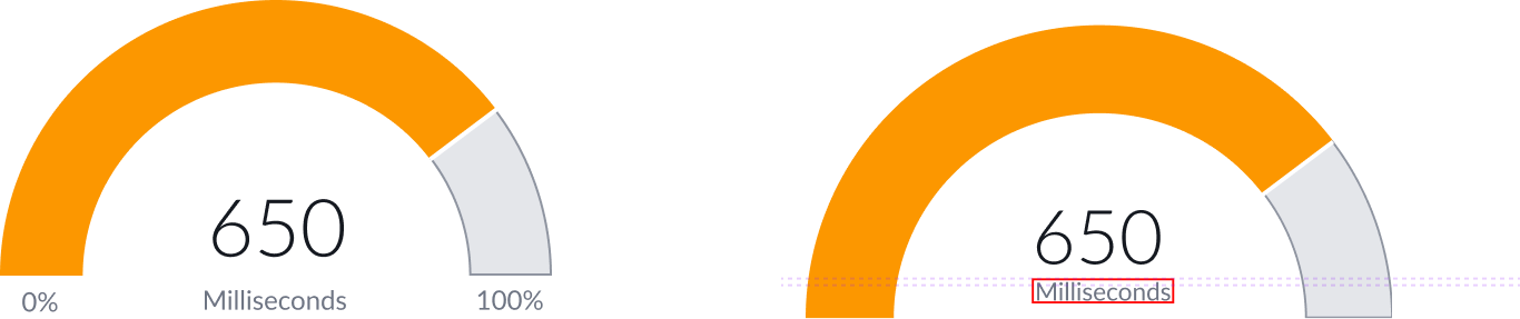
Min/max values
Show or hide the mininum and maximum value labels. These labels are shown by default.
You can specify these values when you select the data source. Based on the data source you select, these values are numerical or percentages. In some cases, you can edit the min/max value type.
Inner radius
Decimal number to set the ratio of inner radius to outer radius of the dial chart. The default is 0.7 and the values can be from 0.7 to 0-.95.
Data table
You can use this setting to show a table with chart and graph data under the chart for easier screen reader access.
Colors
Choose a single color or use the color selector to define the color of the filled in portion of a dial chart. Color selection options differ slightly, depending on the visualization selected. A color picker provides a palette/list of predefined colors in a popup with a search field.
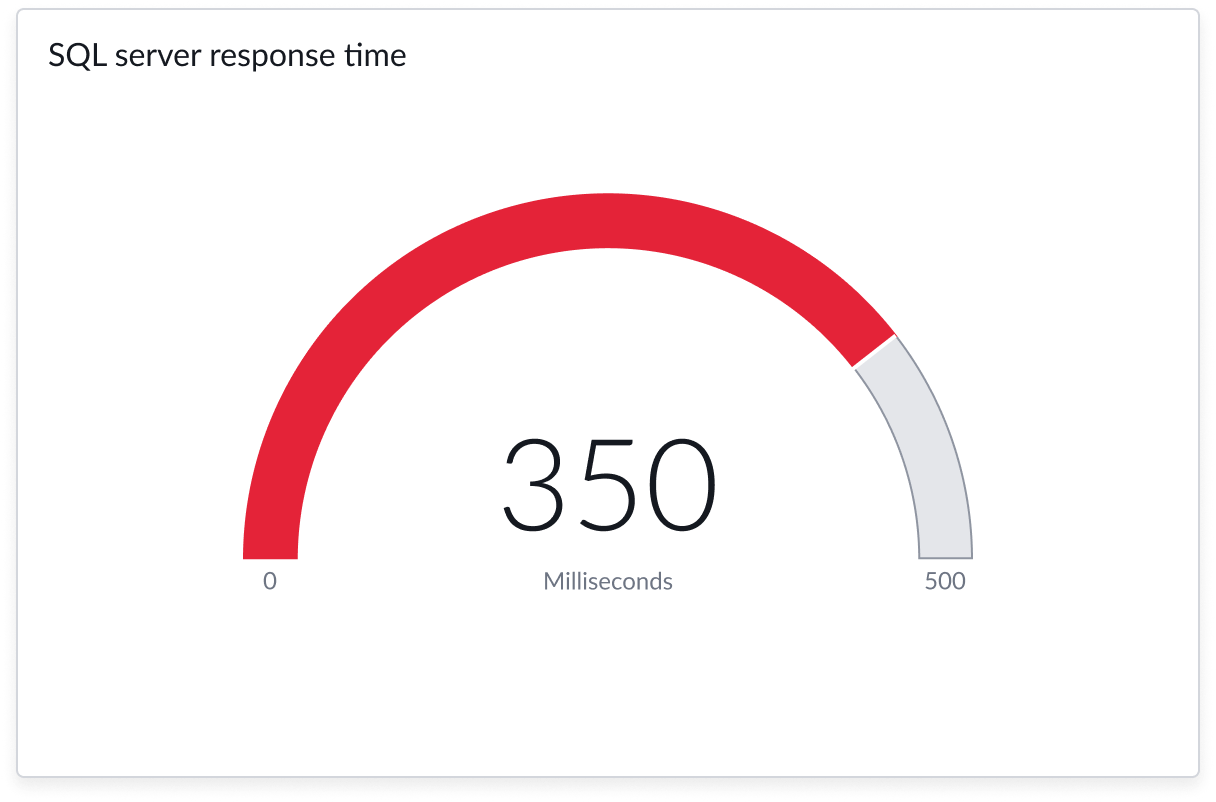
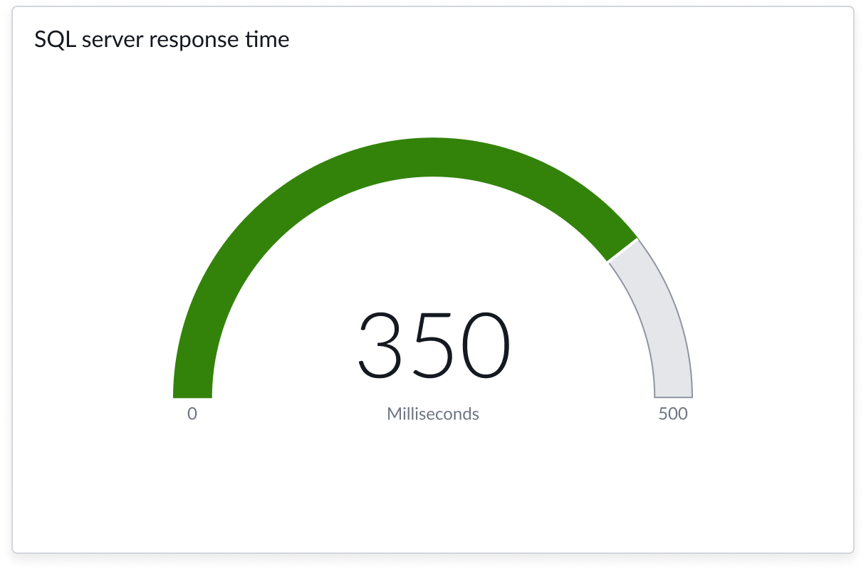
Dial colors
Dial chart typically uses 2 colors; a neutral background color that defines the boundaries of the dial (background color) which is determined by the theme you are using, and a contrasting color within the dial boundaries that is sized based on the current value (foreground color).
Optionally, you can define a color rule that changes the foreground color based on the proximity to the pre-defined maximum value.
Color selections in UI Builder are not available for charts that use Performance Analytics indicators as a data source. For these data sources, the foreground color is determined by the progress value compared to the maximum value. Those colors are configured in the indicators on the instance.
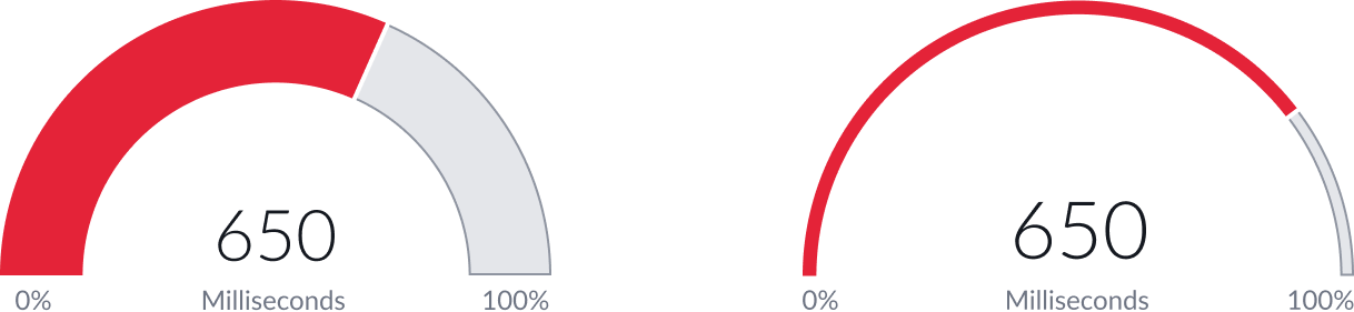
Color rules
Charts using a table as a data source enable you to create color rules for different values. You can add multiple rules to apply different colors to different value ranges.
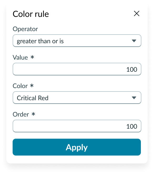
In this example, the rule displays the dial foreground in red when critical incidents reach a certain threshold.
Design recommendations
Learn how to apply dial chart in your design. Dial chart is commonly used visual tools to represent single progressive values, the gauge color is usually used for communicating the severity of data,
Keep the alert color usage be consistent with elsewhere on the UI.
Avoid using positive gauge color to communicate critical information

Keep using colors with enough color saturation
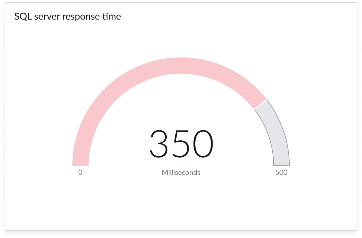
Avoid using colors with low saturation on the dial foreground
UI text guidelines
These are some recommendations for using text within dial chart:
- Avoid using long labels that expand beyond the container width. Labels don’t wrap and will truncate.
- Adjust the font size of the unit value label so it fits in the space available. Large numbers don’t wrap and will truncate.
Behavior
Learn how dial chart behaves when the display changes or a user interacts with the component.
States
Dial chart has the following states: default, focus, hover, and no data.
| State | Example |
|---|---|
| Default | 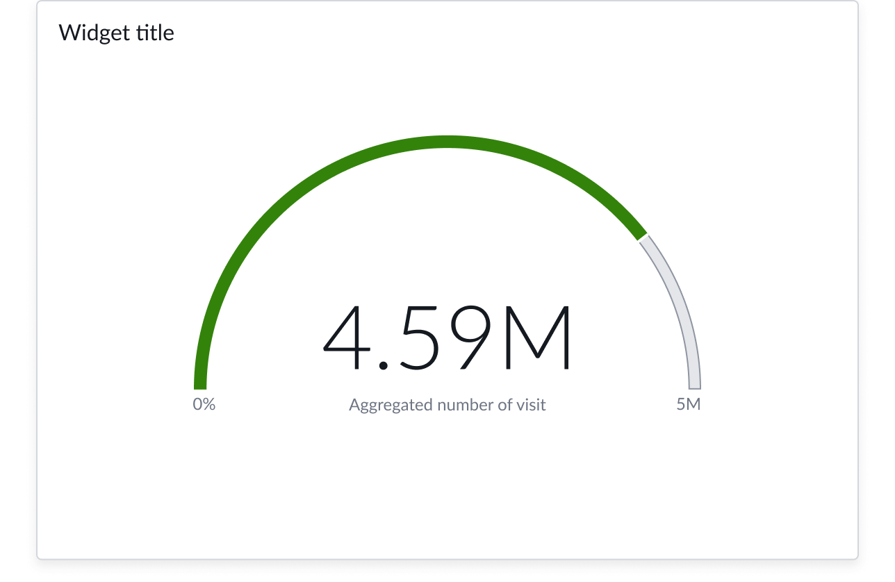 |
| Focus | 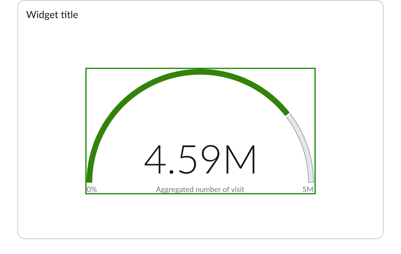 |
| Hover | 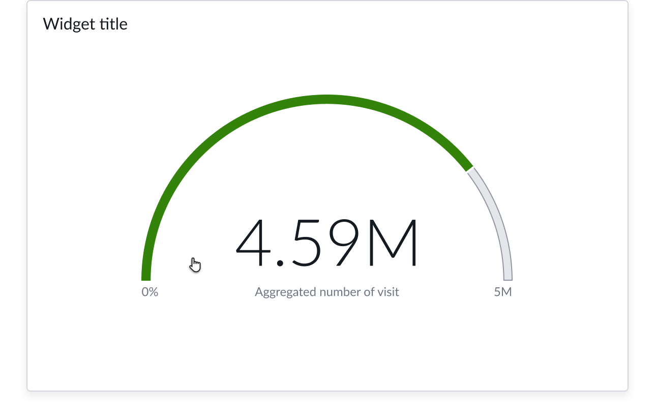 |
| No data | 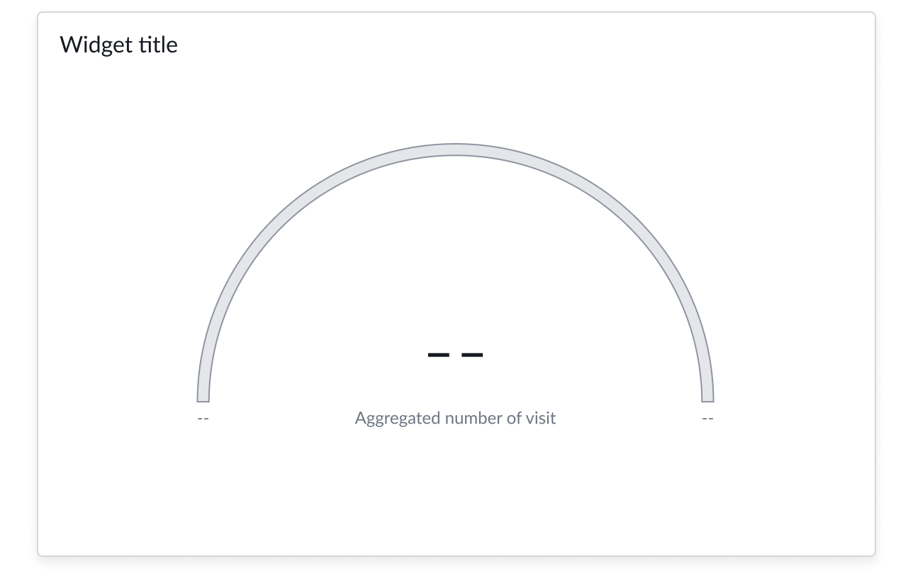 |
Responsive behaviors
Learn how dial chart responds to changes in a container or display.
Chart positioning
The data chart is always centered within the container and retains a fixed height/width ratio. The height and width of the chart is responsive to the data visualization container size with a 16 point inner padding.
Data chart can’t be manually adjusted.
Interactions
When you configure data drilldown, users can open records directly from data chart by selecting any part of the chart.
Truncation
When text in dial chart exceeds the width of the container or content area, the text truncates with an ellipsis, and a tooltip shows the full content on hover.
Usability
Dial chart complies with all internationalization and accessibility requirements.
Internationalization
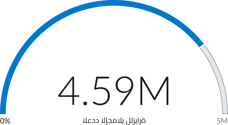
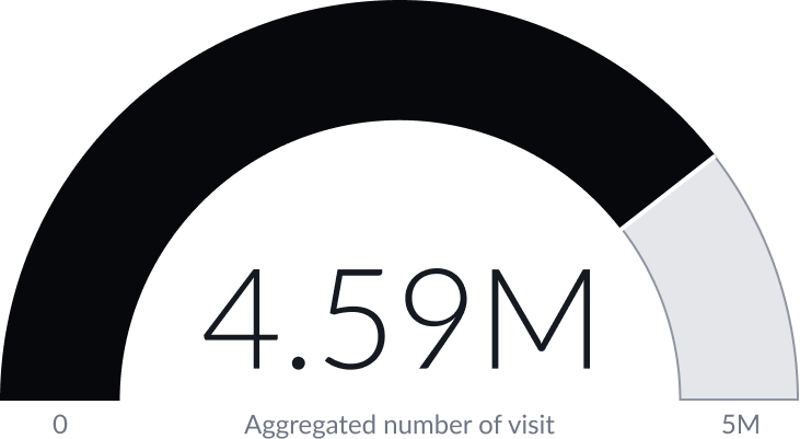
When a dial chart is internationalized to a right-to-left (RTL) language, the chart unit value label reads from right-to-left. The dial still flows from left to right with the minimum value on the left and the maximum value on the right.
Accessibility
Learn how to access the actionable elements of dial chart through keyboard interactions and screen readers.
Accessibility mode
The dial foreground will be on monochrome, all other element colors don’t change.
Keyboard interactions
Users can access the chart navigator with these keyboard keys:
- Tab: Moves focus forward from the whole chart area through any truncated labels
- Shift + Tab: Moves focus backward from any truncated labels to the whole chart area
Screen readers
Dial charts can be configured with an ARIA label to describe to screen reader users what the chart shows. However, the screen reader can’t read the elements of the chart itself. A screen reader can read values from a data table that accompanies the chart via manual use of the arrow keys on the user’s keyboard. Data tables are enabled with an accessibility control in user preferences on the instance and not in the component.