

Anatomy
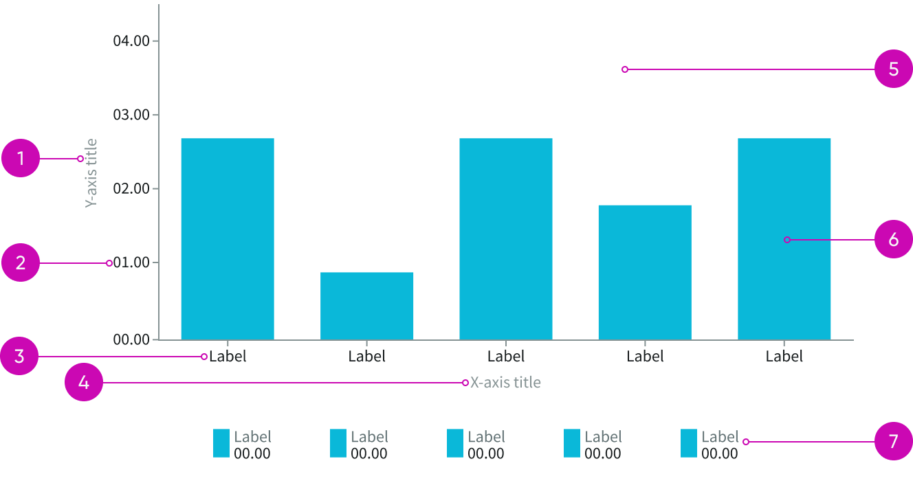
- Y-axis title: Text label describing y-axis values
- Y-axis labels: Incremental values for y-axis
- X-axis labels: Text labels identifying data categories
- X-axis title: Text label describing x-axis data
- Grid: Area to display data bars for categorized values; default charts have X-axis grid lines only
- Data bars: Bars that show aggregated values; the bars are proportional to the values each represents
- Graph register (legend): Shows values for each of the bars in the chart
Usage
Use bar charts to help users compare categorized data. Whether you display the bars vertically or horizontally depends on your preference, the type of data you’re displaying, and the space available in your page.
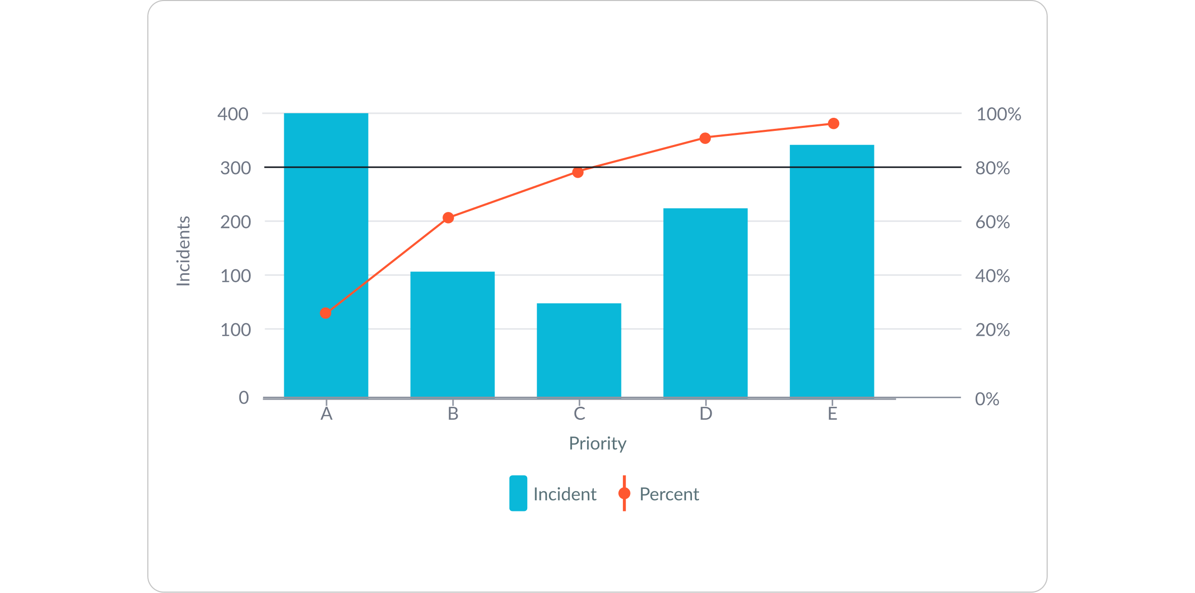
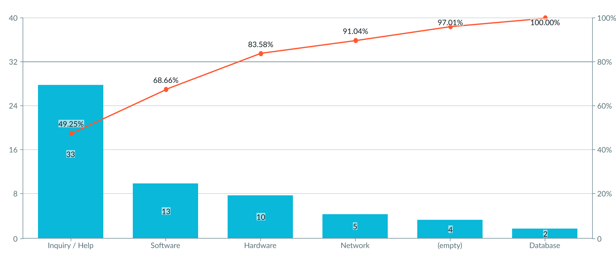
Pareto chart is similar to bar chart but it also includes a line graph. A Pareto chart displays vertical bars that represent individual values (frequency or cost) in descending order, and a line with data points that represents the cumulative total. The Pareto chart also marks the 80% point on the y-axis with a horizontal line which the user can hide.
Types
Bar chart has the following types: Vertical, Horizontal, and Pareto.
Vertical chart
Vertical bar chart displays categories as vertical columns. You can use vertical bars to display data with negative values.
Horizontal chart
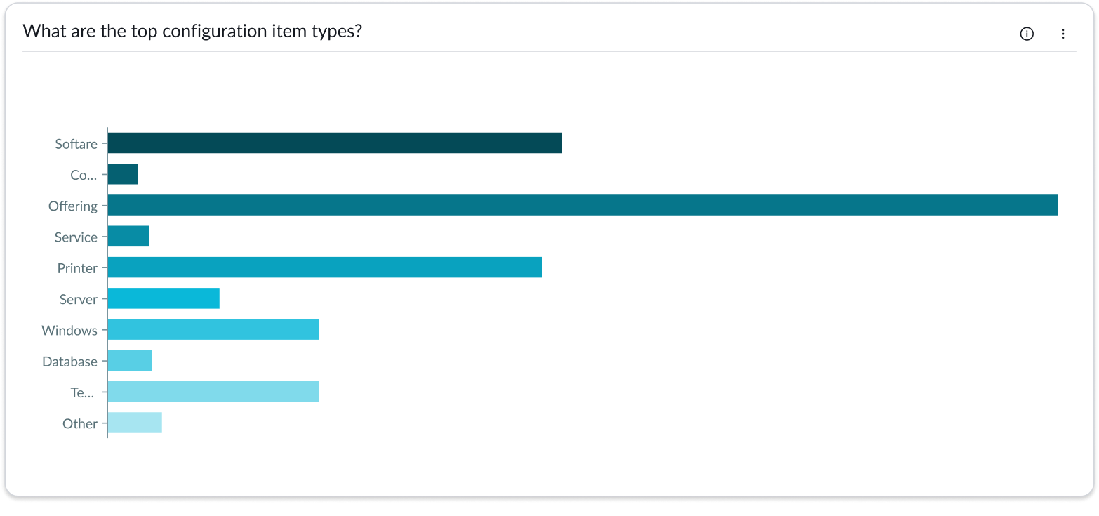
Horizontal bars offer more space for showing long data labels that won’t fit within vertical columns.
Pareto chart
The Pareto chart, based on the Pareto principle, is used in strategic business management to prioritize resources and efforts. It identifies the few vital factors that often result in the most significant overall improvement when optimized. Bar chart calculates the Pareto line based on a series, such as types of complaints.
Use Pareto chart to:
- Optimize priorities: Identify crucial issues that offer the biggest gains, embodying the Pareto principle - 20% of causes lead to 80% of the effects.
- Analyze efficiency: Pin-poInt the most influential factors, enabling the user to allocate resources for the greatest business advantage.
- Track effectiveness: Graphically track business strategy performance pre- and post-implementation, ensuring that the crucial issues are addressed.
Configurations
Learn how to customize bar charts by configuring the available properties. Configuration has two categories: data and presentation.
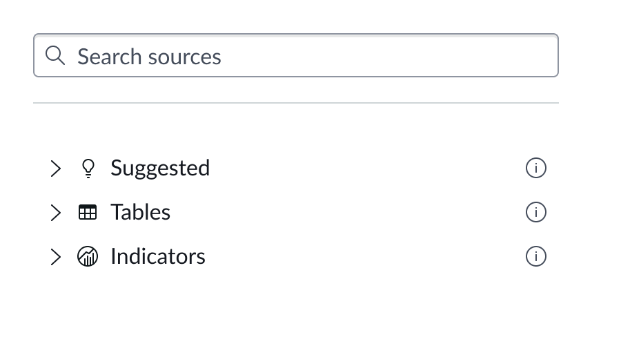
Data source
You can select between different data sources for your visualization: system data tables and preconfigured Performance Analytics indicators. If you are changing your data source, the option list provides suggestions based on previous selections and items that match your search.
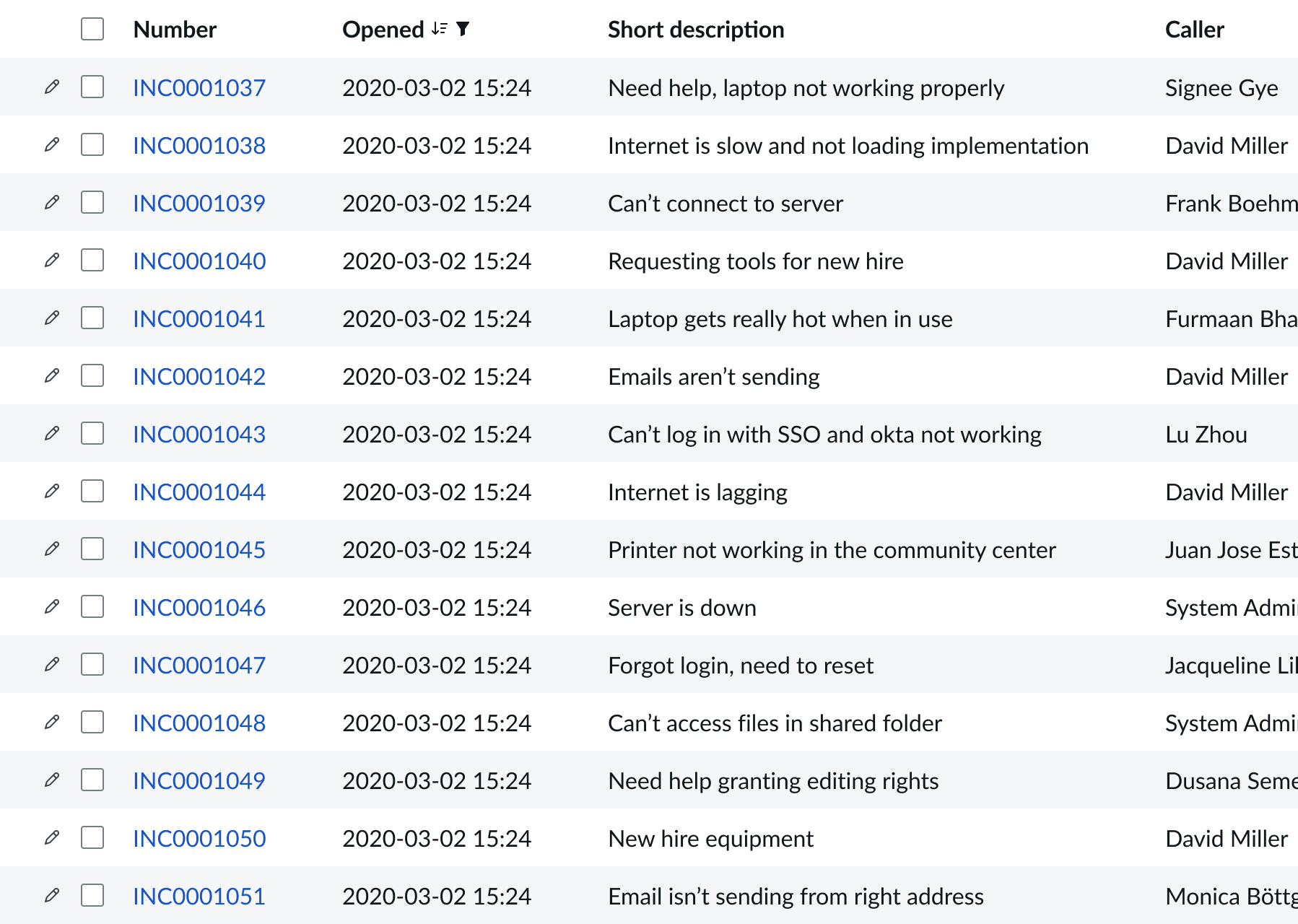
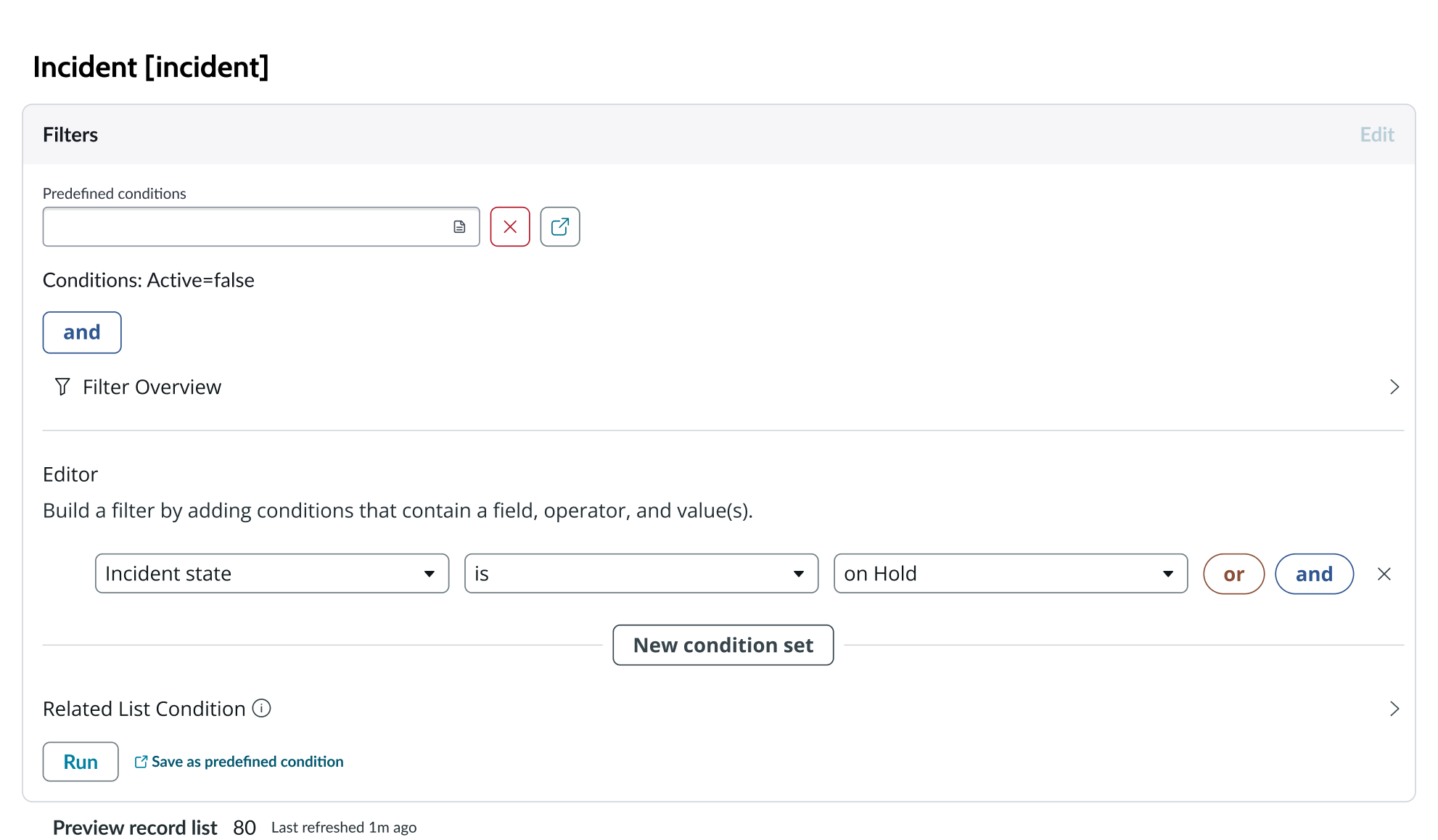
Tables
You can select any table from the system to use in your visualization and filter that data. When you apply a table as the data source, a preview list appears showing all available records in that table.
A condition builder above the list enables you to set filter conditions on the data before using it in your visualization. This is useful for limiting the data shown in the chart to only the data you need.
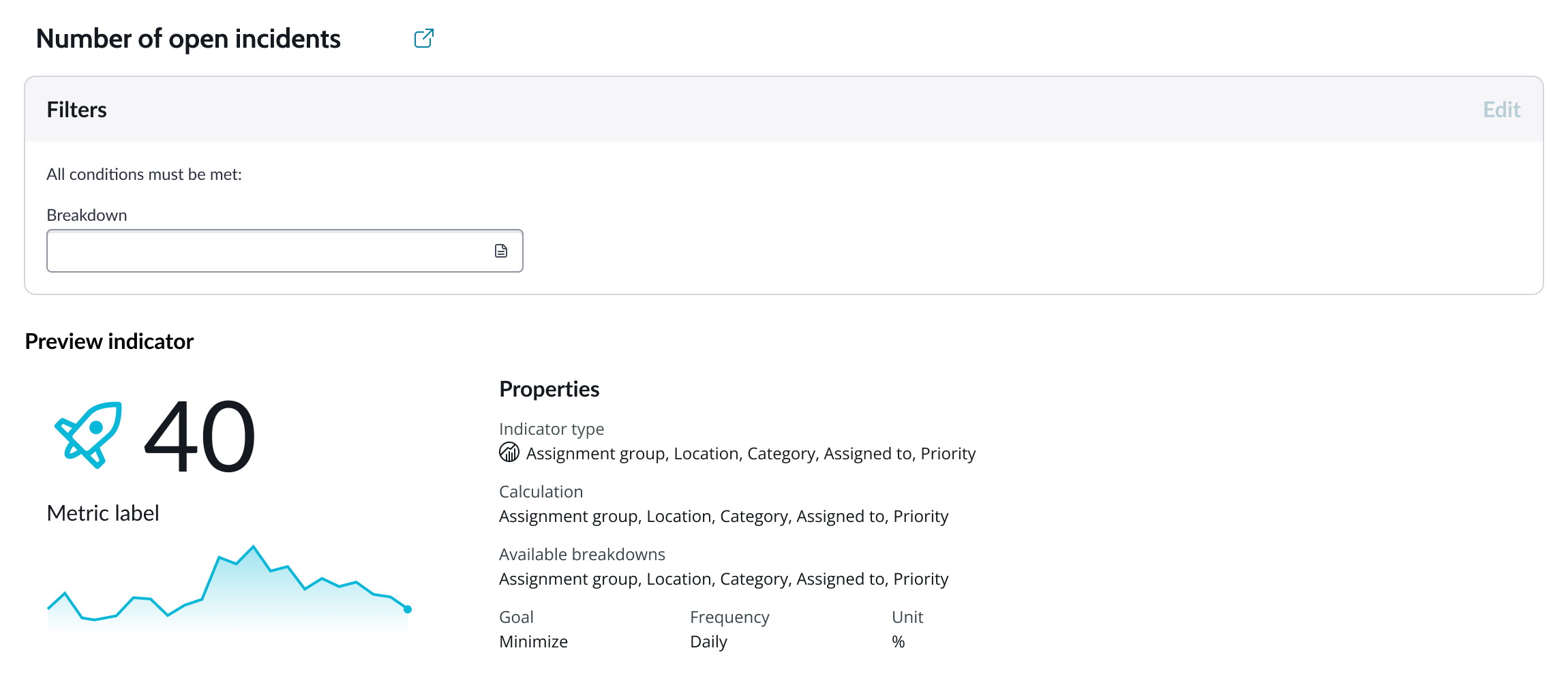
Indicators
Indicators are preconfigured business metrics that assess performance across attributes such as cost, quality, technical risk, investments, user satisfaction, and business value. Indicators are configured in the Performance Analytics application and reflect common measurements that users need. If breakdowns are defined for an indicator, you can apply filter conditions on those values.
Data snapshot indicators
Data snapshot type of indicators enable intraday collection and analysis, filtering by breakdown hierarchy, with the ability to report partial scores.
Key features:
- Move beyond daily snapshots: Collect and analyze data multiple times throughout the day (intraday) for granular insights.
- Breakdown hierarchy: Filter through hierarchical structures (department to team to individual) to pinpoint issues and identify trends at any level.
- Partial scores: Track progress toward goals mid-period in order to take corrective action early instead of waiting for periods to close.
- Deeper insights: Drill down through multiple dimensions to uncover hidden patterns.
- Simplified setup: Create fewer, more generalized indicators.
- Dynamic filtering: Apply breakdowns on-demand without preconfiguration.
- Reduced maintenance: Fewer indicators mean less ongoing work.
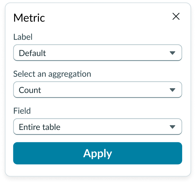
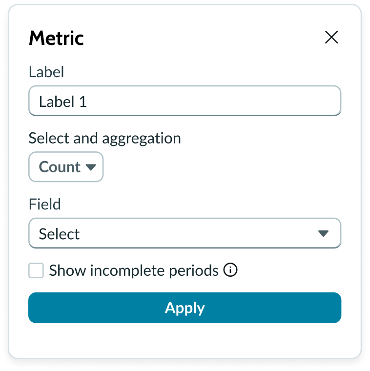
Metric selection
Select the specific data from the data source to display in the chart and the label that identifies it. Select an aggregation type from the dropdown list. You can select a specific field from the data source table to display in the chart. If you leave the field empty, all fields are used, depending on any filtering conditions you applied when you selected the data source.
Show incomplete periods
For Data Snapshot indicators only. To provide users real time progress tracking, for each “Metric” you can select the “Show incomplete periods” setting to display scores for the current, incomplete period to track progress.
Grouping data
Grouped charts compare one or more data sets across all categories. “Group by” is used with aggregate functions like Sum, Count, or Average. The function selected tells the data provider how to treat the data when it is grouped. You can select a field (for table data sources) or a breakdown value (for indicator data sources) as the grouping value.
Note: Not all indicator data sources have available breakdown values. Charts that use indicator data sources without breakdown values can’t be grouped.
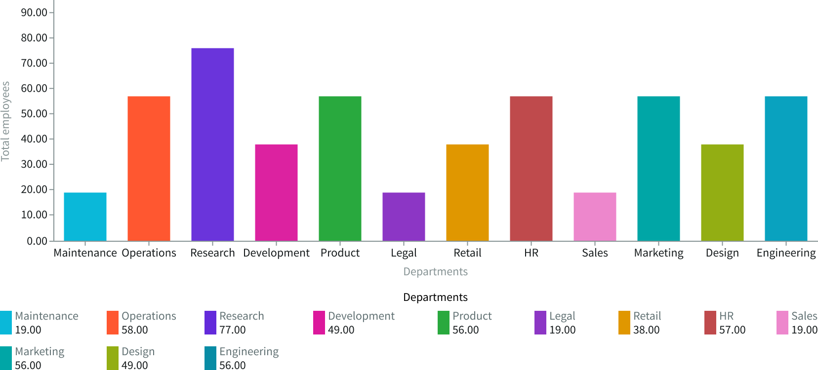
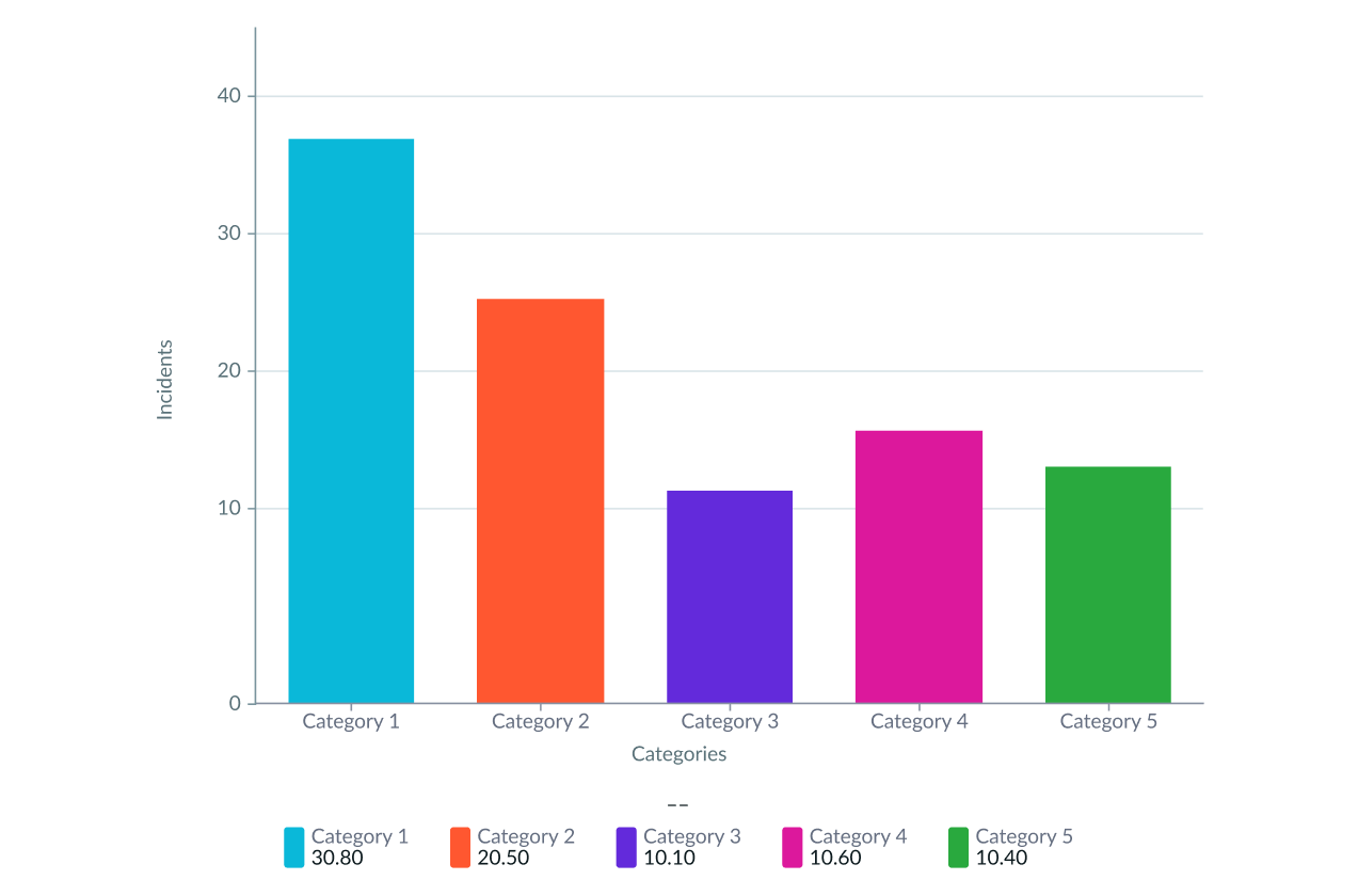
In this example, a vertical bar chart is grouped by the Department field and shows the number of employees in each department.
Data properties
Data properties selects and organizes the data you want your users to see from the source. Configuration options in UI Builder depend on whether you select table data or indicators. Some configurations for indicator data sources require that the indicator have breakdowns.
Sorting
For vertical and horizontal bar charts, you can enable a sorting feature that orders the data columns by name or by value, in ascending or descending order. Sorting begins at the intersection of the X and Y axes and goes from left to right for horizontal bar charts and from bottom to top for vertical bar charts. Sorting is available for all data source types: table, indicator, and user experience.
Date range
You can use the “Apply date range” setting to apply a date range filter from filter component or manual configuration to the visualization.
Auto aggregation periods
For Data Snapshot Indicators, automatically picks the best aggregation period when a date filter is used. Affects only this visualization and does not change the indicator's default aggregation period. Clear the checkbox to always use the indicator's default period.
Header and border
The component header displays along the top and contains the title you give the visualization. By default, the header is configured to show, but the content is empty.
Visualization border
By default, a border around the chart. Unselect the “Show border” option to remove it.
Header separator
You can add a separator line between the header and the visualization. Disabled by default.
Chart title
By default, the chart title is blank, but you can add a title. When you add a title for your chart, you’re able to customize the color and make it wrap.
Header level
By default, text in the header is set to heading level 2 (H2). Heading levels H1 through H6 are also available.
Title alignment
By default, the title is aligned to the Start side. The start size can be the left or right depending on the language you use. Other options available from the dropdown are “Center” and “End”.
Title wrap
By default, long titles truncate with an ellipsis, and a tooltip showing the full title on hover, but you can set the title to wrap instead.
Title truncation
By default, the title text truncates at the end of the first line of text, but you can set the line of truncation to 2 or 3 lines instead. This option becomes available when the title truncates.
Refresh option
By default, refresh is available to the user in the “More options” menu, but you can hide it. This gives you more control over how refresh options are exposed on dashboards so you can align refresh behavior with your intended usage.
Header background color
By default, the color of the header background is neutral-0 (white). You can specify a different color (including a custom color) for the background.
Select a color for the visualization header background that aligns with your dashboard theme, branding, or design preferences. The color you choose applies only to the visualization header background.
For better accessibility, make sure a good color contrast exists between the header background and title text. The minimum contrast requirement for normal text is 4.5:1, and for large text is 3:1. To verify, check the contrast ratio in the color picker.
Note: Theming is not supported when you select a custom color.
Title color
By default, the title text is neutral-21 (black). You can select a different color (including a custom color) for the title text.
You should select a color for the chart title that aligns with your dashboard theme, branding, or design preferences. The color you choose applies only to the chart title.
For better accessibility, make sure a good color contrast exists between the header background and title text. The minimum contrast requirement for normal text is 4.5:1, and for large text is 3:1. To verify, check the contrast ratio in the color picker.
Note: Theming is not supported when you select a custom color.
Data update
By default, users can add individual chart filters, and use the filters set on that workspace page. You can also configure your chart to update automatically in real time or on a defined refresh schedule.
Follow filters
By default, any filters set on the workspace page and those set on the data source are applied. You can use the “Follow filters” property to prevent any filter input from the workspace page. Filters set on the data source always run on the component.
Filter icon
The filter icon and the number of filters impacting the visualization display by default. To hide them, unselect the “Show filter icon.”
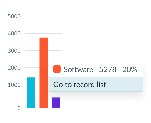
Drill down
By default, users can drill down into data or launch a URL directly from a chart by selecting data points, slices, categories, or scores. This lets users view data such as records and record lists from data tables or KPI data from indicators or go to a URL that you specify.
Drill down label
You can add text that appears in tooltips and describes what happens when the user selects a chart data point.
Show selected data point
To visually show the selected data point use this property. By default, it isn’t selected. Often can be used when the chart is acting as filter.
Refresh after being away
You can configure your chart to update automatically or on a defined refresh schedule.
Refresh requested
When the new value of this property is different from the previous one, you can trigger refresh by setting up a string that can be passed down.
Use data cache
You can cache user queries to shorten the load time for the data visualization. Unselected by default.
Info messages
Displays generic error messages by default.
Extended error messages
You can choose to show extended error messages which contain more details that can be helpful to admins. Unselected by default.
Custom no data message
By default, when a data source doesn’t return any info, the “no data available” message displays with generic content. However, you can set a custom message by changing the title, illustration, and message content.
Presentation
The presentation properties control the physical appearance of the chart. Use these properties to control how your users consume the data.
Display settings
You can use the following to modify the display of the data visualization.
Height
Bar chart size is configured using a height setting expressed in pixels. You can configure any size you want for your visualization. Select the size, based on the amount of data in your chart, the range of values, and the resolution of the data that you want to show. The default chart size is 250 pixels.
Data table
You can use this setting to show a table with chart and graph data under the chart for easier screen reader access.
% of total tooltip
By default, when the user hovers over a data point such as a bar, the percentage of the total Y-axis value is displayed in a tooltip. This can be hidden.
X and Y axes
For all types of bar charts, you can add a title to the X- and Y-axis, hide either axis, and hide the background grid.
Y-axis
For vertical and horizontal bar charts, you can select a value range for the Y-axis that accommodates the values you expect from your data. The default range is dynamic, meaning that the range increases or decreases automatically to accommodate the range of data displayed in the chart.
Enter a negative value for the bottom of the range to display any negative values from the data source selected.
X-axis
You can add an X-axis title, have long x-axis labels wrap, and set a maximum label size to something other than the default 100 pixels.
If you want, you can change the truncation type from the default end to start or middle.
Legend
By default, the visualization displays a legend. The legend position relative to the chart is configurable for above, below, left, and right sides.
You can display the value corresponding to the area of the chart the user hovers on. The value displays as a tooltip and in the chart legend.
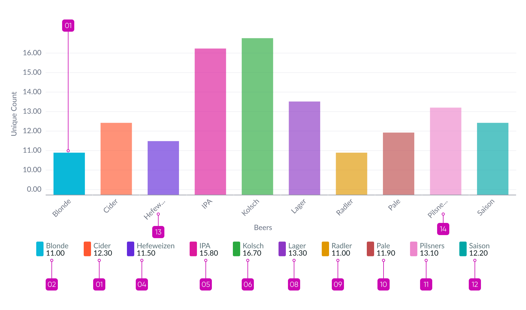
Data label
You can add data labels to each bar in a basic and Pareto chart. These labels help the user see the exact value without having to estimate. Data labels appear centered horizontally and vertically within the bar and near each point on the Pareto line. If the bar is too small to accommodate the data label, it appears above the bar.
Colors
Choose a single color or use the color selector to define the color of a bar. Color selection options differ slightly, depending on the visualization selected. A color picker provides a list of predefined colors in a dropdown list with a search field.
Chart variations
When you have more than one metric, these variations are available for vertical and horizontal bars: stacked, side-by-side, and normalized.
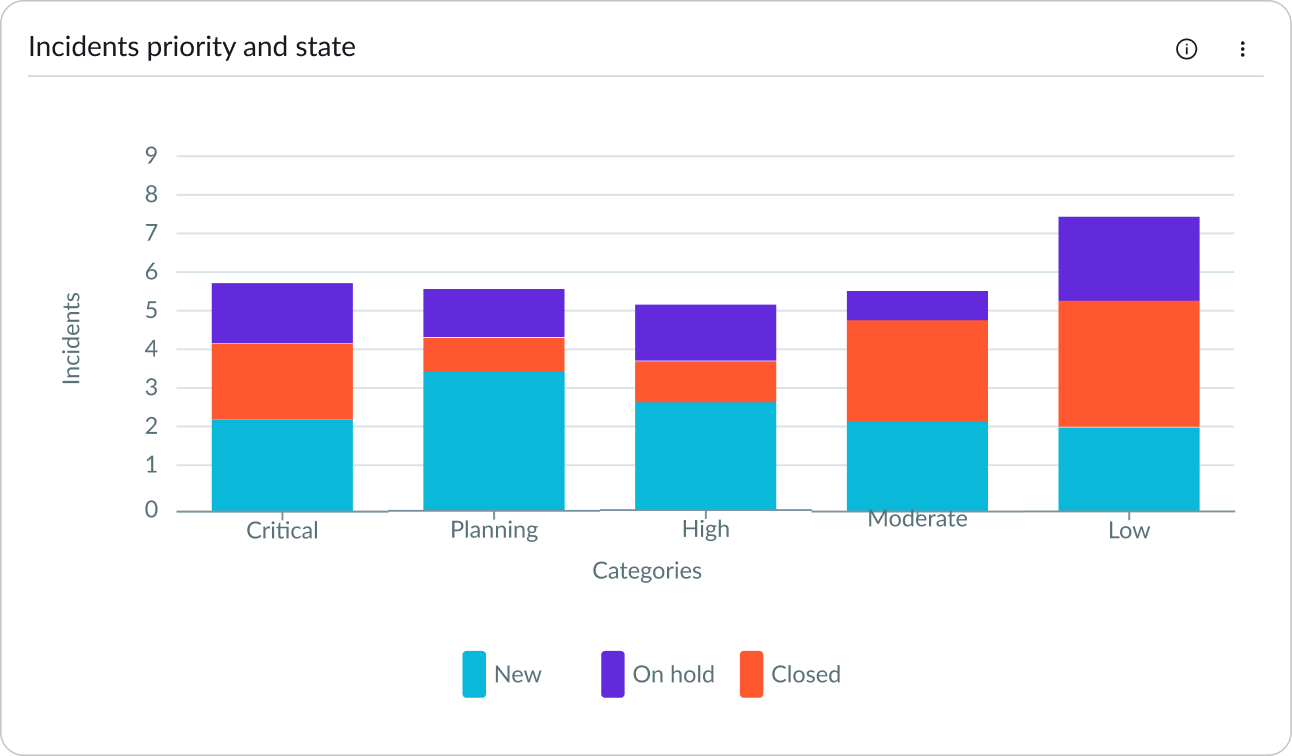
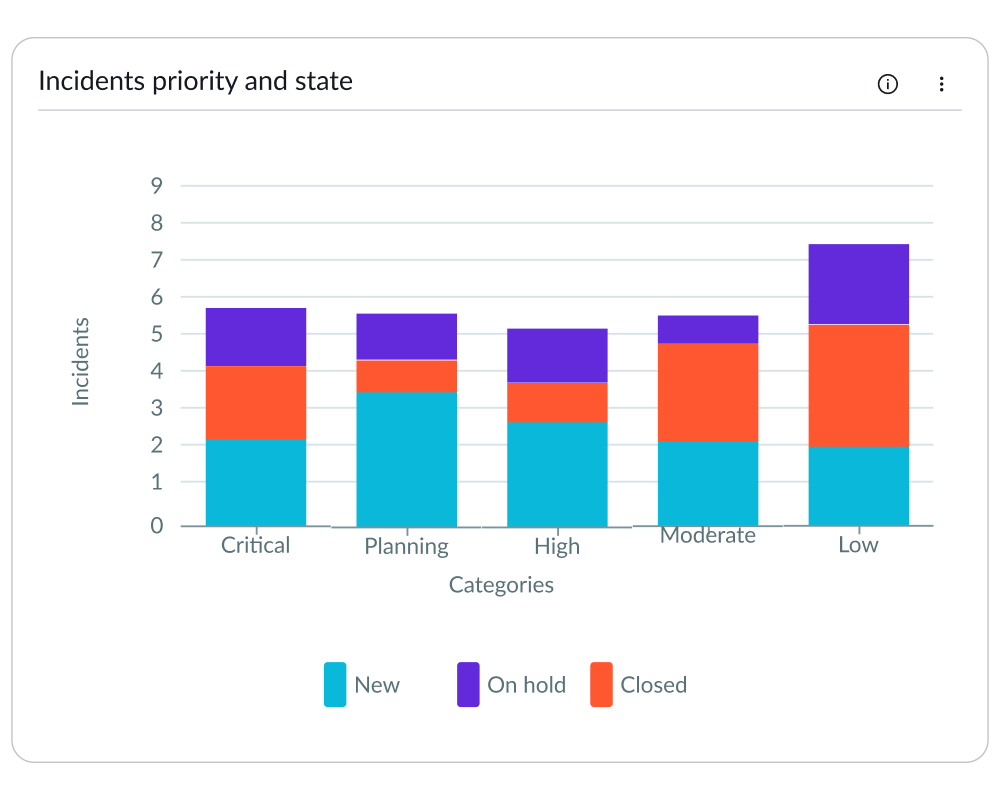
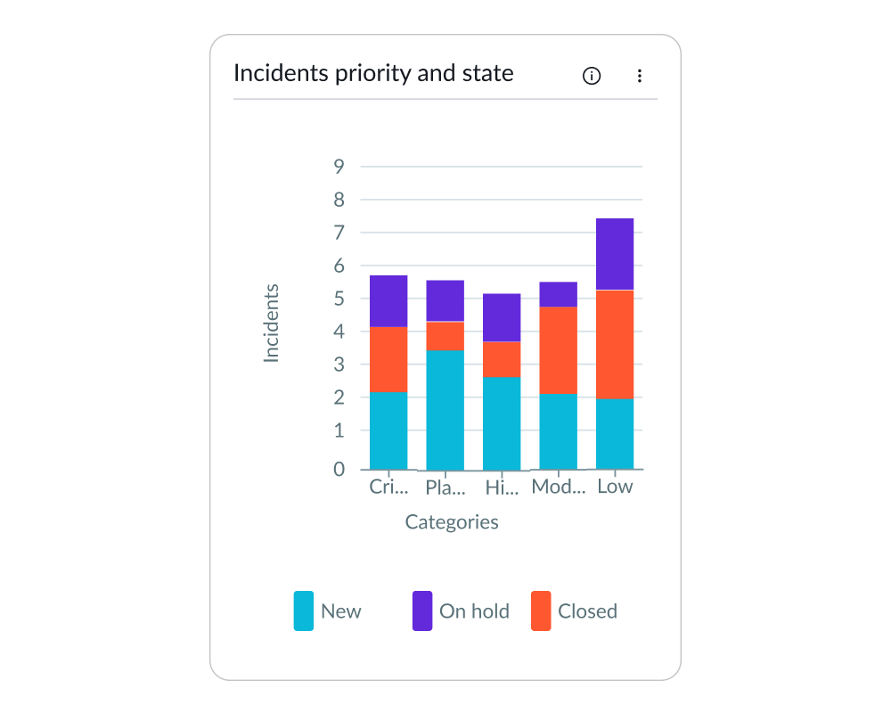
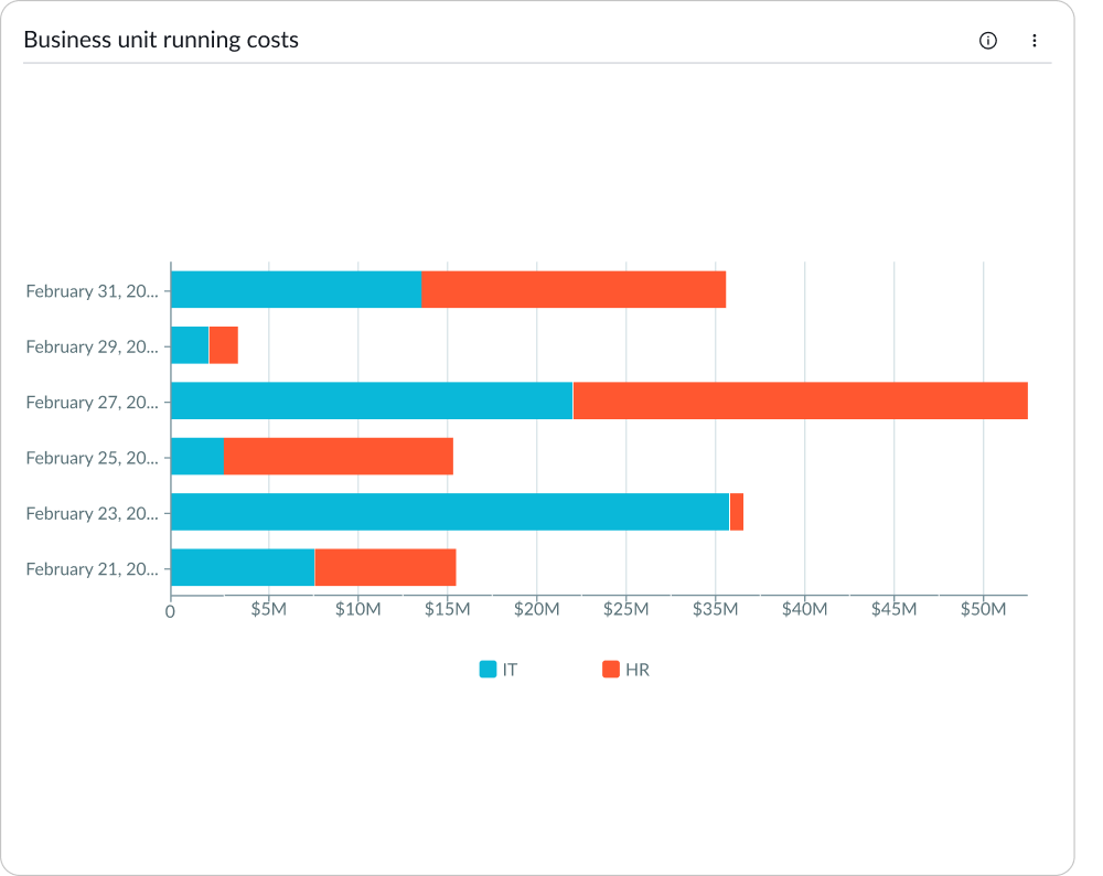
Stacked bar
Add two grouping fields to create a stacked bar chart showing sub-categories of a specific category as data segments in a single bar. Data labels on stacked bar charts assist the user in determining the relative value of each segment. You can display stacked bar charts in either vertical or horizontal views.
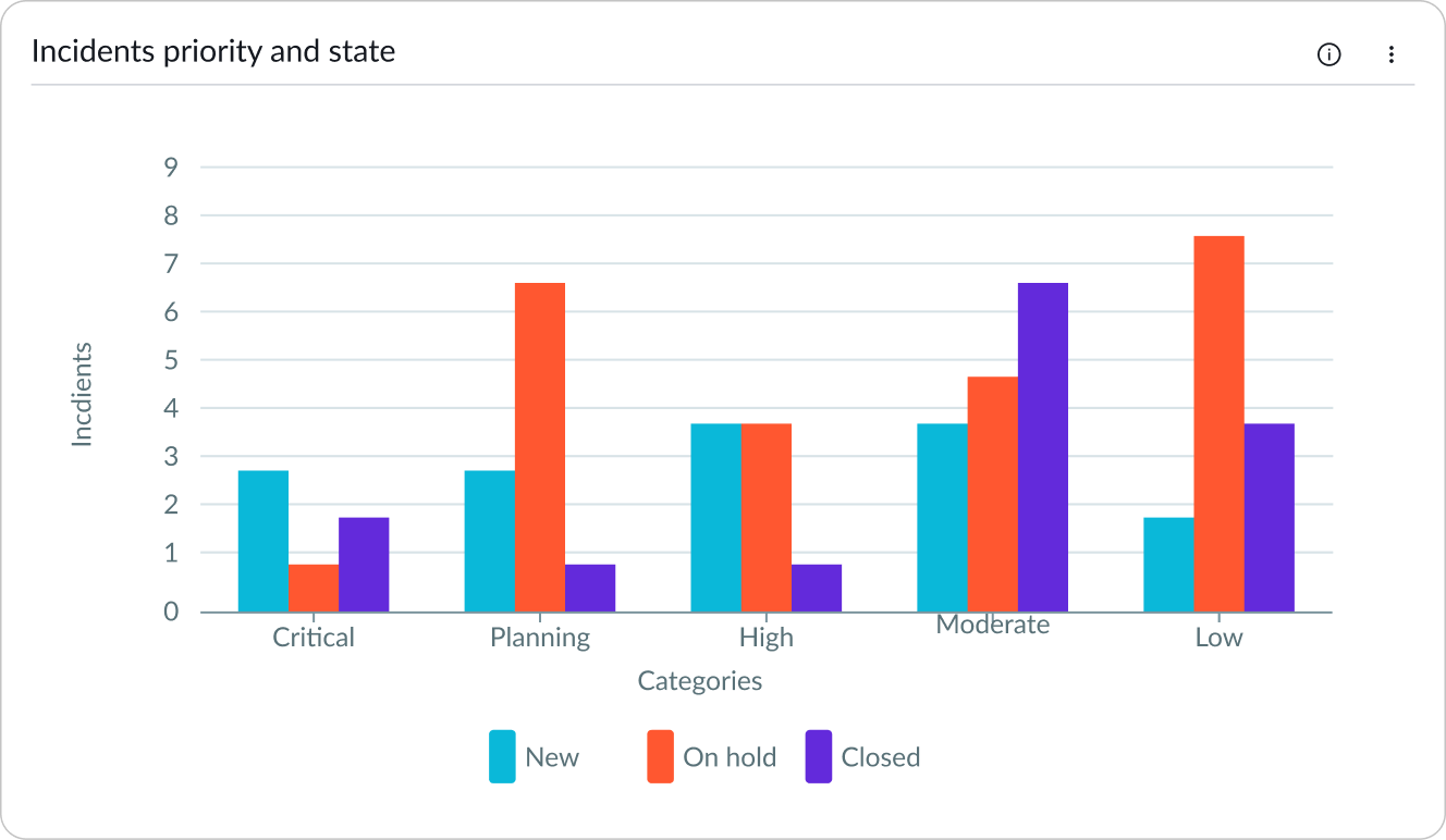
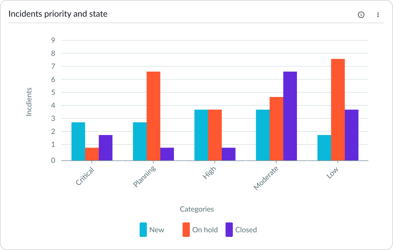
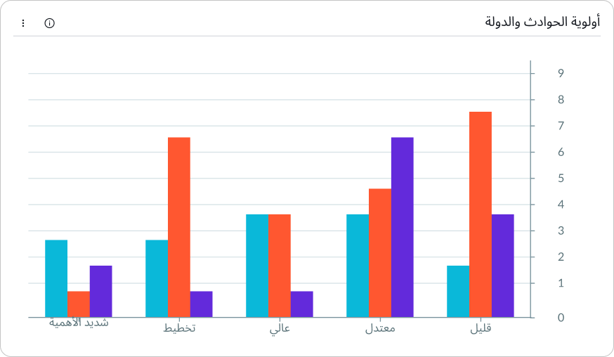
Side-by-side bars
Create a side-by-side bar chart that displays all the sub-categories for a category as a group of bars. You can display side-by-side bar charts in either vertical or horizontal views.
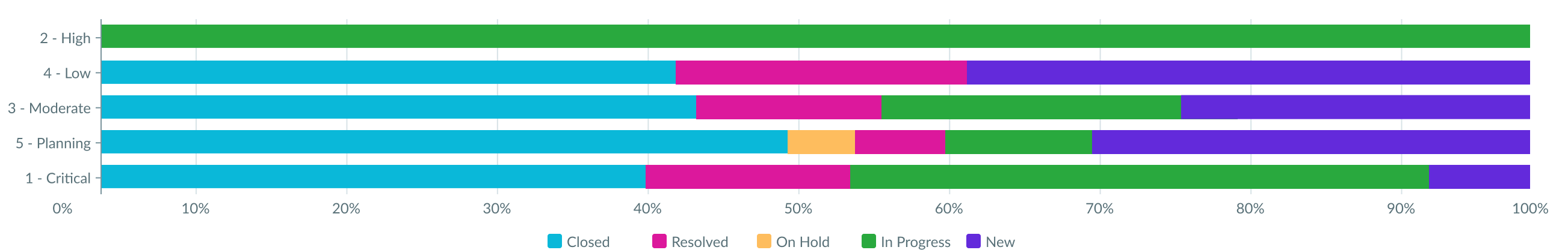
Normalized bars
Create a normalized bar chart, in which the y-axis displays percentages from 0 to 100. Each category displays up to the 100 percent mark, and the sub-categories appear as segments of those bars. The length of each segment shows the relationship of that sub-category to the entire category.
Design recommendations
Learn how to apply bar charts in your design.
Create space between the bars to make similar values easier to distinguish from one another.
Bars clustered too close together are hard to differentiate if adjoining values are similar.
Behavior
Learn how data visualization behaves when the display changes or a user interacts with the component.
Responsive behaviors
Learn how bar charts respond when the container size shrinks.
Label rotation
The x-axis labels rotate to fit when the container shrinks.
Hidden labels
When the container is too small for the labels to display, they disappear. When labels disappear, the full label text is visible within a data tooltip.
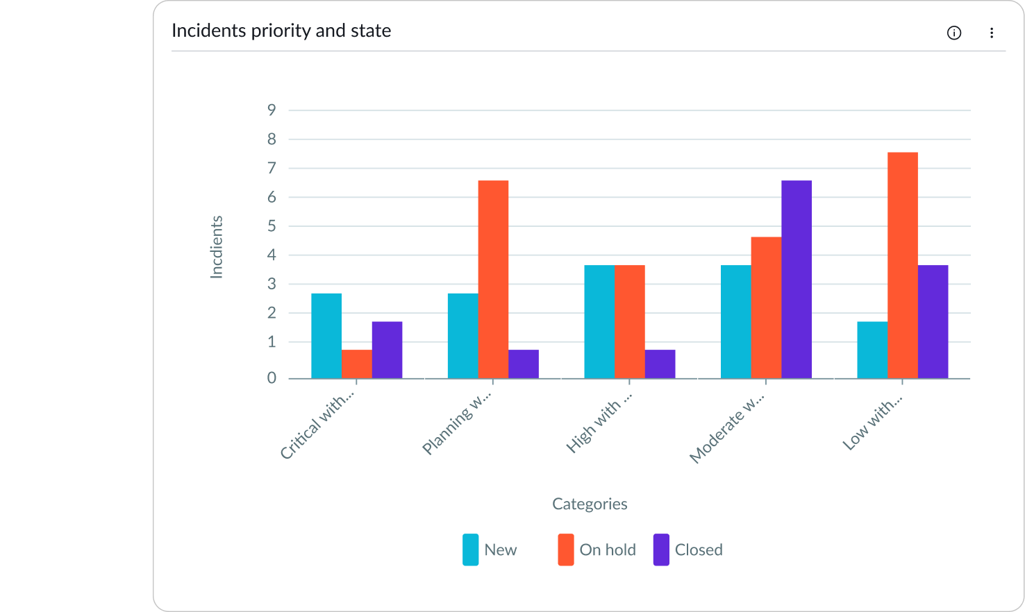
Truncation
Long x-axis labels truncate when the container shrinks and display tooltips containing the full label text.
In this example, long labels have rotated and truncated to fit in a smaller container.
Long y-axis labels in horizontal bar charts can also truncate when the container shrinks.
Interactions
Users can open records directly from any chart visualization when data drilldown is enabled. Users can open record lists from bar charts by selecting a category.
Usability
Bar chart complies with all internationalization and accessibility requirements.
Internationalization
When a bar chart is internationalized to a right-to-left (RTL) language, the y-axis values align on the right. The chart labels and values all read from right-to-left.
Accessibility
Learn how to access the actionable elements of bar chart through keyboard interactions and screen readers.
Bar chart tab order
This is the high-level tab order for bar chart.
Tab order of focus
Keyboard interactions
Users can interact with bar chart using the keyboard. They can access the chart navigator and the chart legend with these keyboard keys.
With focus within chart
- Tab: Moves focus forward through the UI elements
- Shift + Tab: Moves focus backwards through the UI elements
- Esc: Dismisses displayed tooltip
- Enter/return: Triggers an actionable element when in focus, such as opening a list view or muting a dataset
Datasets mode
- Alt + S/Option + S: Sets the navigation to be by datasets; this is the default navigation mode
- Arrow up, down, right, left: Moves focus within the chart area or the legend; up and left moves left, down and right moves right
Data points mode
- Alt + P/Option +P: Sets the navigation to be by data points
- Arrow up, down, right, left: Moves focus within the chart area or the legend; up and down move vertically within a dataset, left and right move horizontally
Coordinate pixel mode
- Alt + C/Option + C: Sets the navigation to be by pixels and provides the most granular access to every corner of the chart area
- Arrow up, down, right, left: Moves focus within the chart area or the legend 1 pixel at a time; up and down moves vertically within a dataset, left and right move horizontally
- Shift + Arrow up, down, right, left: Moves focus within the chart area or the legend by 10 pixels
- Shift + Control + Arrow up, down, right, left: Moves focus within the chart area or the legend by 100 pixels
Navigating large charts quickly
- Page up (Mac: Fn + Arrow up or left): Moves focus to the top-left end of the chart
- Page down (Mac: Fn + Arrow down or right): Moves focus to the bottom-right end of the chart area
With focus on chart legend
- Arrow right, left: Moves focus within the legend
- Enter/Space: Mutes dataset
Screen readers
A screen reader user can read values from a data table that accompanies the chart. Data tables are enabled with an accessibility control in user preferences on the instance and not in the component.
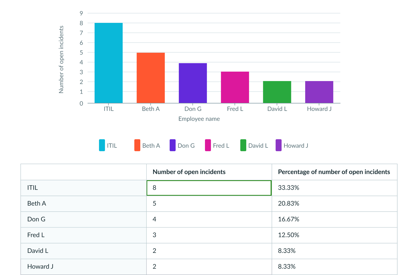
This example shows the bar chart data table. The screen reader reads the entries as the user manually navigates the table using the arrow keys.