

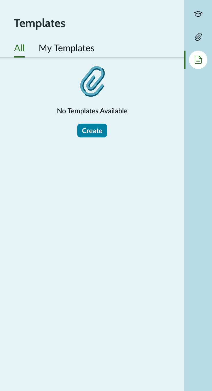
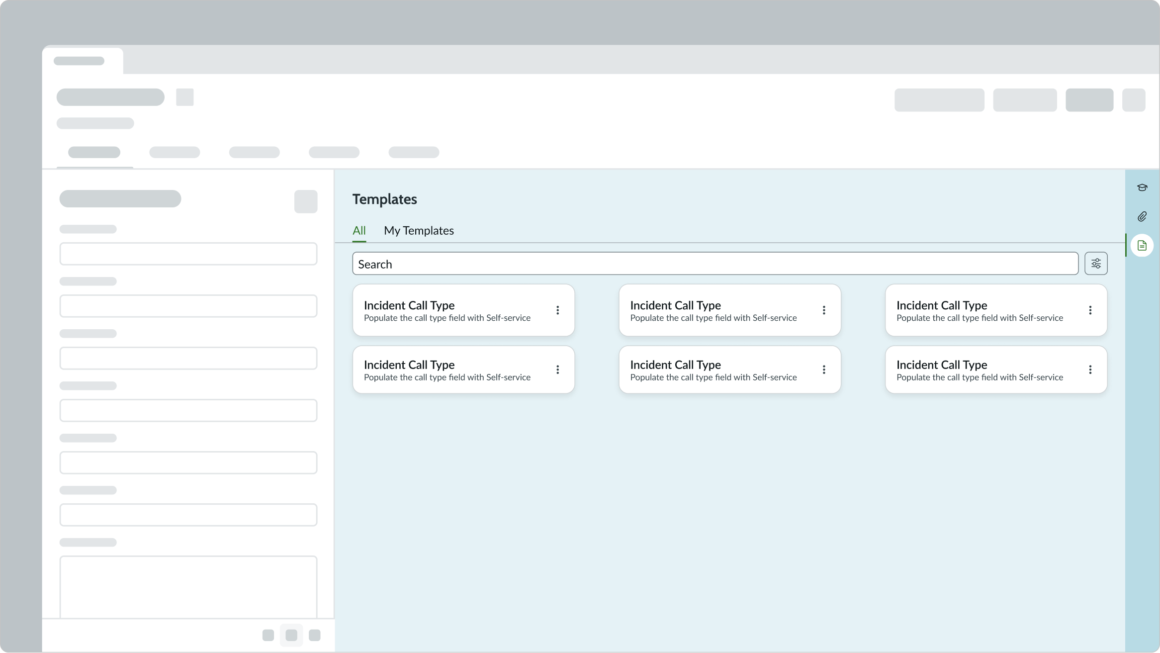
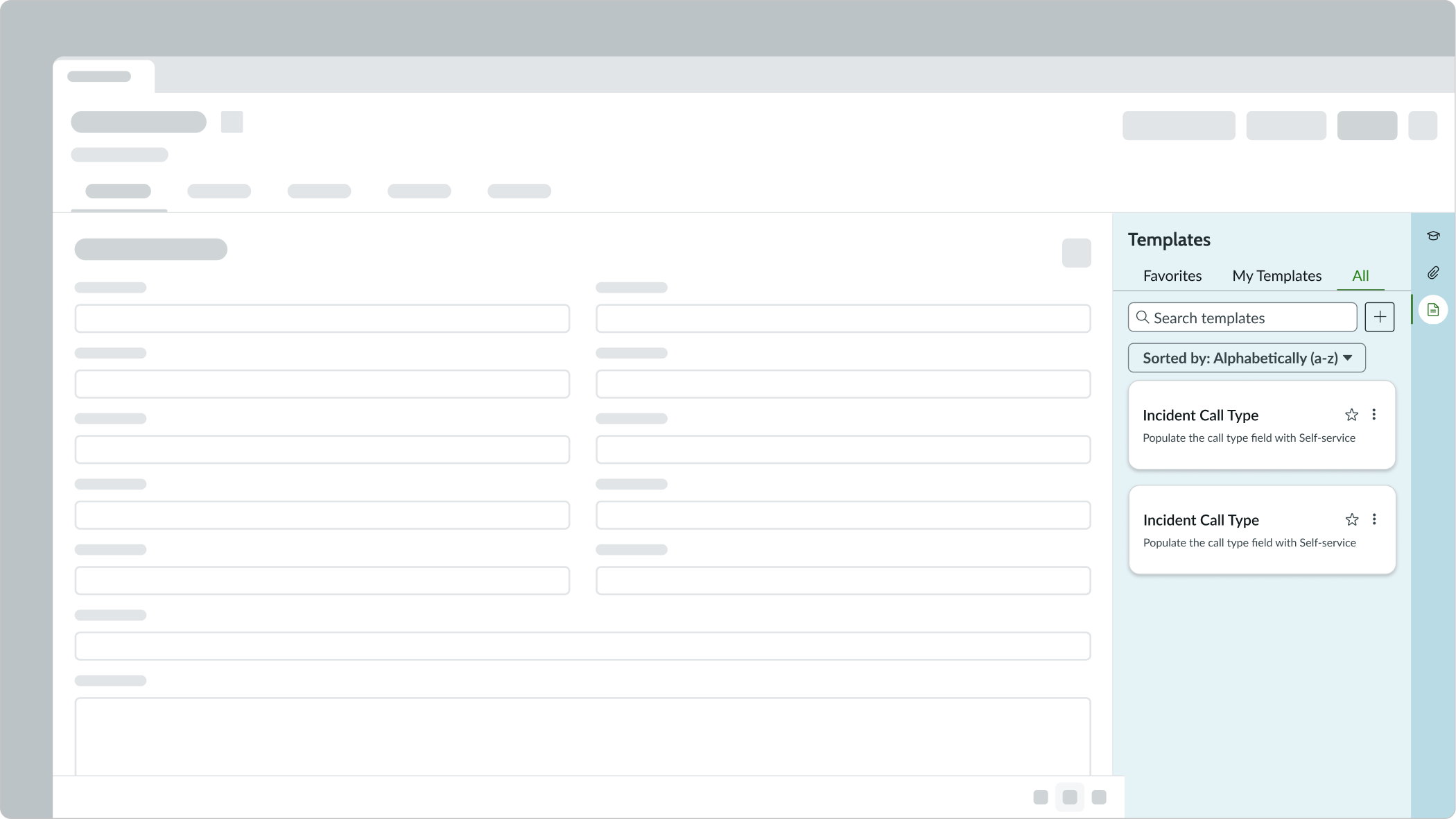
Anatomy
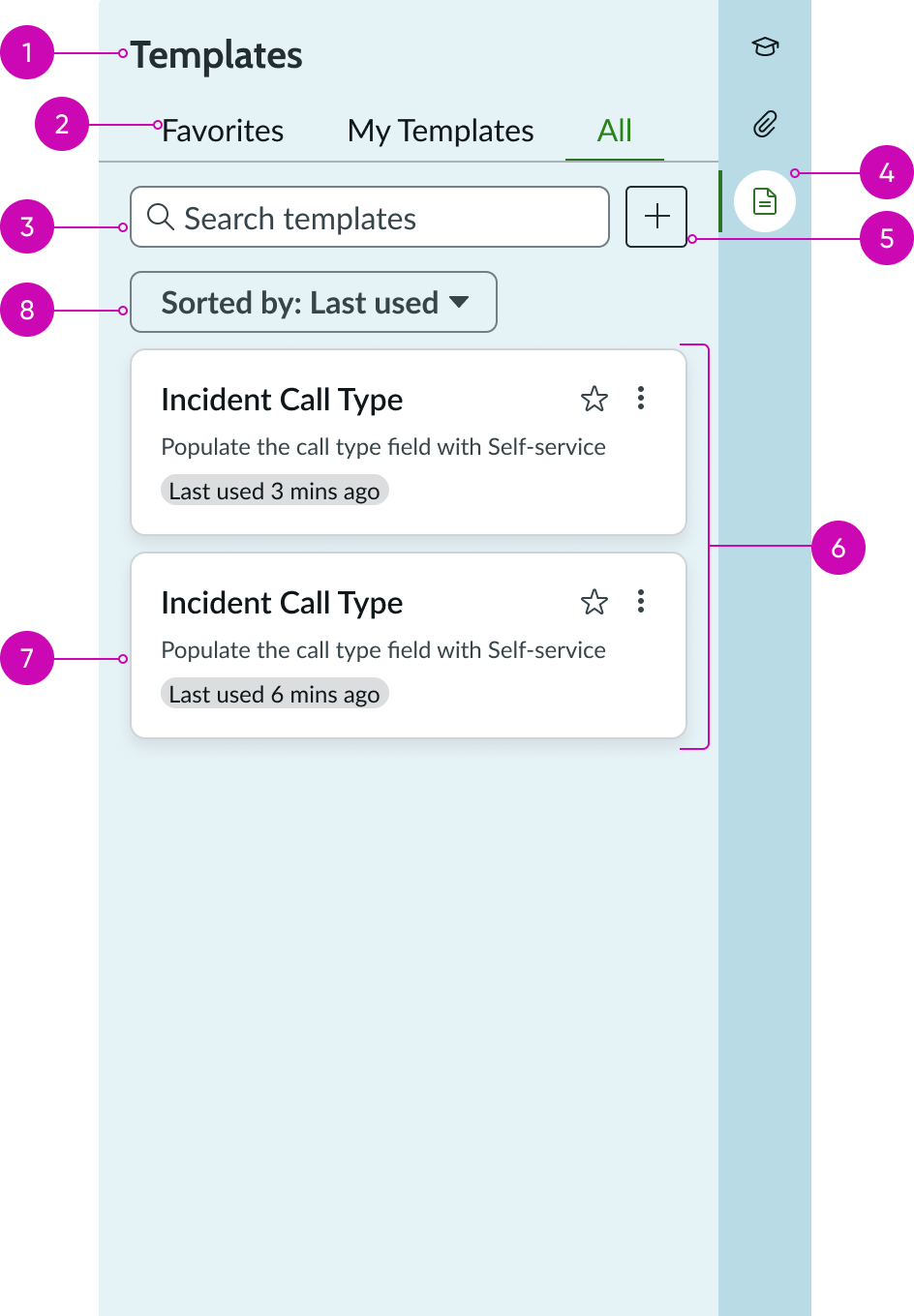
- Heading: Identifies the set of tiles
- Category: Provides access to all templates or the user's templates only
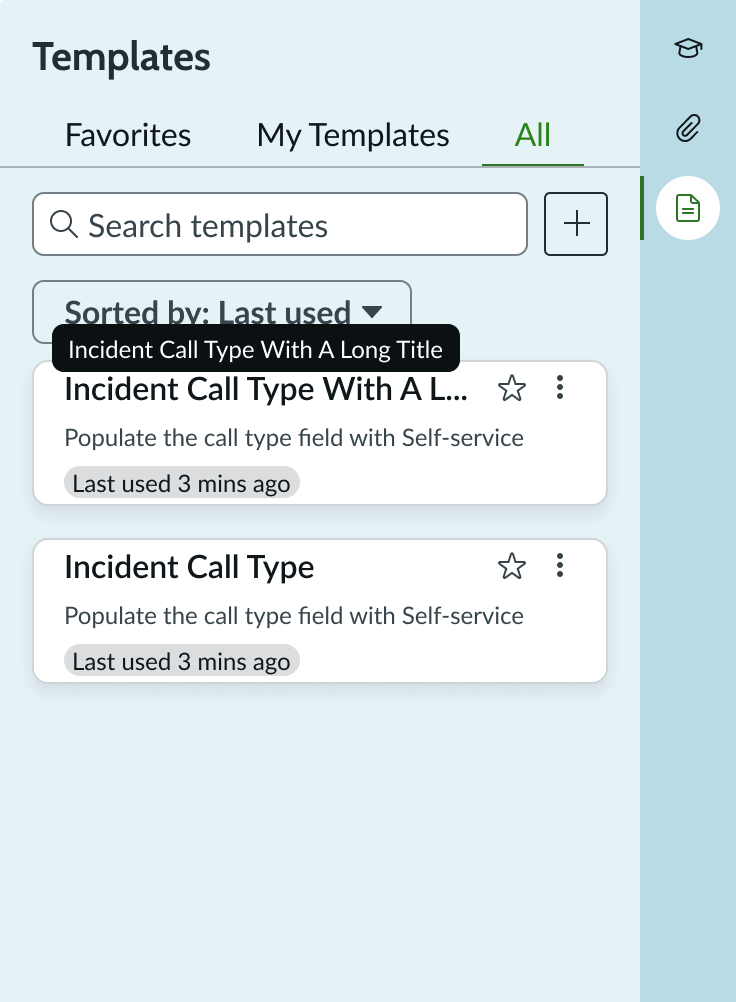
- Search field: Locates templates by titles in a specific list of a highlighted tab
- Contextual side panel icon: Shows the templates feature is available
- Create template: Initiates a flow to create a new template
- Tile list: Shows tiles in alphabetical order by template title (and refreshes with updates)
- Tile: Includes title, subtext, and action menu
- Sort button: Sorts the list alphabetically or by the order of last use
Usage
Learn about the form templates component and find out how to use it in your design. The iconic button opens a form in a child tab allowing the user to create a new template. All new templates created are automatically assigned to the user.
When the user selects a template tile, all applicable fields are applied to the current form. Fields that aren't present on the current record trigger a warning message telling the user that the field values haven't been applied. The user can close the message at any time.
Types
The form templates component appears in full size only and displays within the contextual side panel.

Configurations
Learn how to customize form templates by configuring the available properties.
Presets and controllers
This component has a preset configuration that sets properties and event handlers, making it ready for use. You can override preset values with a custom configuration if needed. Preset values won’t upgrade with updates. To avoid using presets, configure manually. One preset can apply to a single component instance. See presets for more info.
A preset is linked to a controller, which serves as a data resource. Controllers provide configuration data and event bindings for the component. Selecting a preset adds the required controller to the page, allowing new components to use its preset. For more on controllers, see controllers. For default presets, see view properties and events in the controller API.
Actions
You can configure certain actions to show in the tile action menu based on the end-user's permissions.
Design recommendations
Learn how to apply the form templates component in your design.
Put the component into a container large enough for much of the content to be seen without having to scroll (for example, the contextual side panel).
Avoid putting the component into a small container because much of the content will be cut off and multiple scroll bars will be required to navigate the component.
UI text guidelines
These are some recommendations for using text within the form templates component.
- Use sentence case for all titles, labels, and column headers
- Keep all text labels short and informative to increase readability and scanning
- Keep content concise and purposeful to provide value to the user
- Capitalize only the first letter and any proper nouns in a string of text
- Ensure content is contextual and specific to offer guidance and support to the user
Behavior
Learn how the form templates component behaves when the display changes or a user interacts with the component.
States
The form templates component has the following states: tile empty, tile hover, tile selected, and tile action menu.
In this example, the templates component tile is in an empty state.
In this example, the templates component tile is in a hover state.
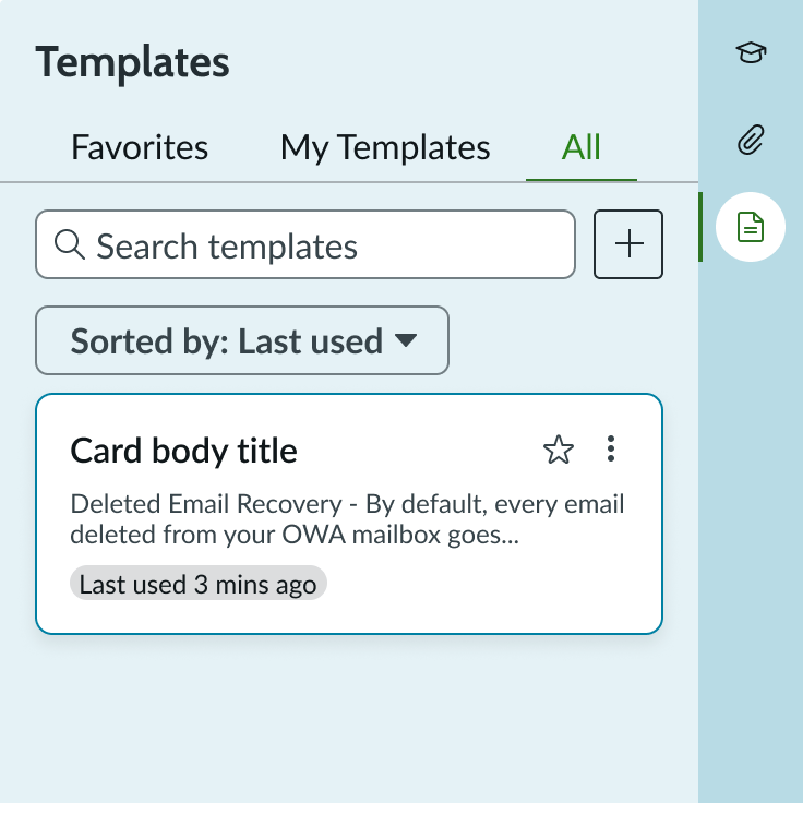
In this example, the templates component tile is in a selected state.
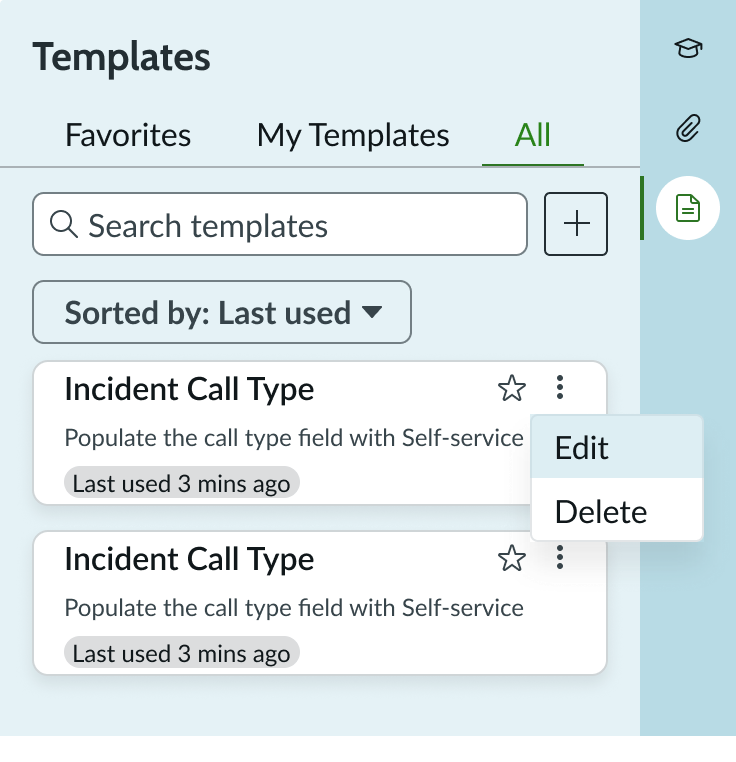
In this example, the templates component tile is in an action menu state.
Responsive behaviors
Tiles resize horizontally only, and a scroll bar appears when the vertical space is filled. The height of the tiles doesn't change. As the width of the container increases, the width of the tiles also increases (up to maximum size), and the tiles transition from a single-column view to a multi-column view.
In this example, tiles are in a single column view at maximum width.
In this example, tiles are in a 3-column view at maximum width.
Interactions
Learn how the form templates component responds when a user interacts with it.
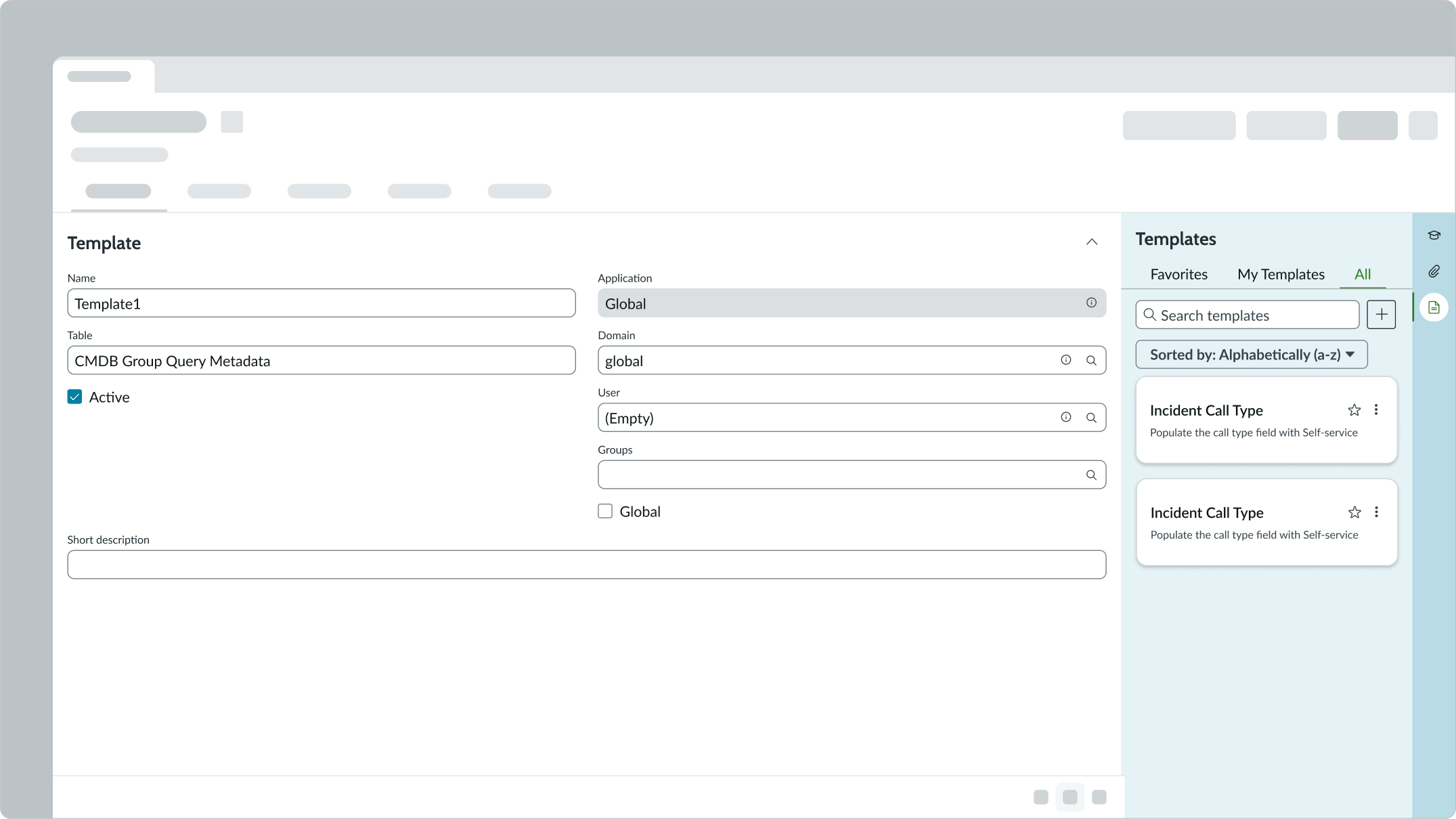
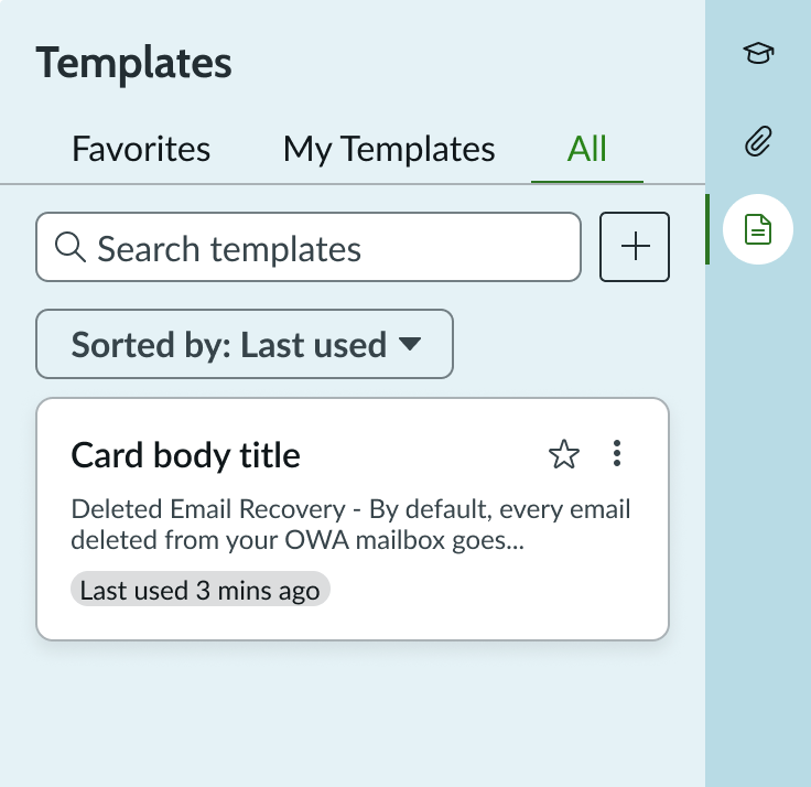
Tile
Each tile includes a short title, description, and action menu. Selecting a tile applies the template to the current record. When the user applies a template, all field values set in the template replace the existing field values in the record.
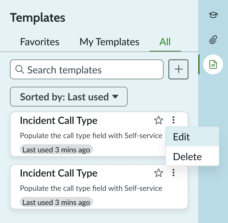
In this example, the action menu opens with editing options.
You can determine an end-user's access to action menu options. If a user has not been granted edit or delete actions, that option doesn’t appear in the menu. Users not granted either of the menu options don’t have the action menu present in the template tile. Templates appear in alphabetical order.
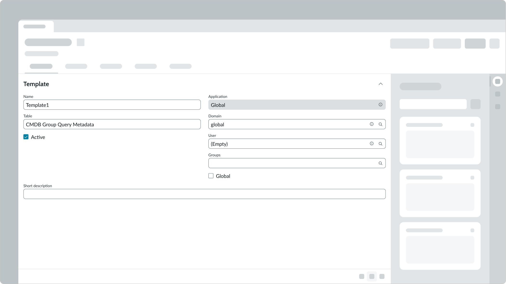
In this example, the function for editing an existing template is in an open child tab.
Iconic button
Users can create new templates by selecting the iconic button. This opens a form in a child tab for the user to complete. Once the new template has been saved, it appears within the "My Templates" and "All" categories in the contextual side panel.
Search
The user can search for templates by titles and short descriptions to apply to the current record.
Favorites
The Favorites tab displays templates that the user has marked as favorites. Users can add or remove templates from the Favorites tab by selecting or deselecting the star icon.
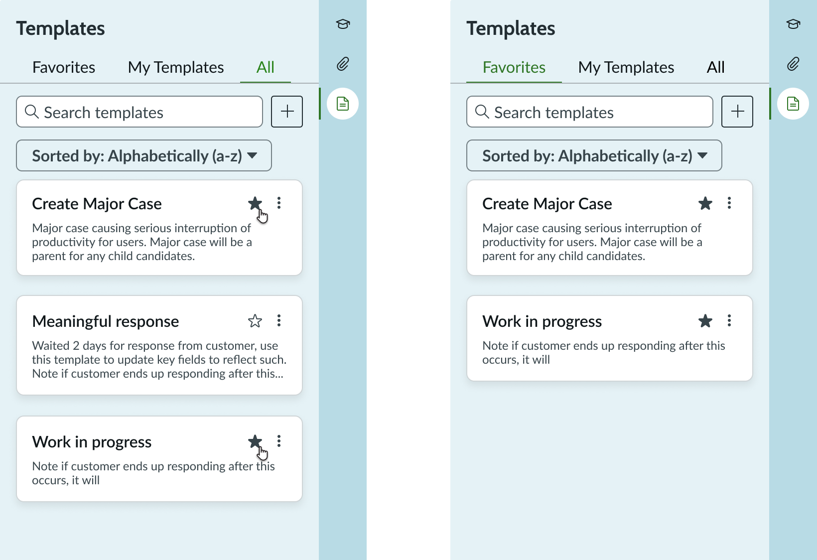
In this example, the All tab shows two templates added as favorites. The Favorites tab displays these templates.
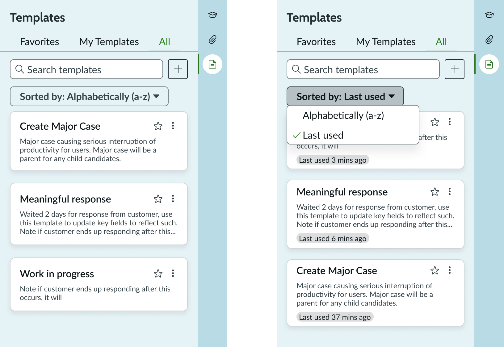
Sort
The user can sort the tiles alphabetically or by the order they were last used. By default, the tiles are sorted alphabetically. The sort order is maintained across individual tabs.
Show alert if a template is already applied on the record
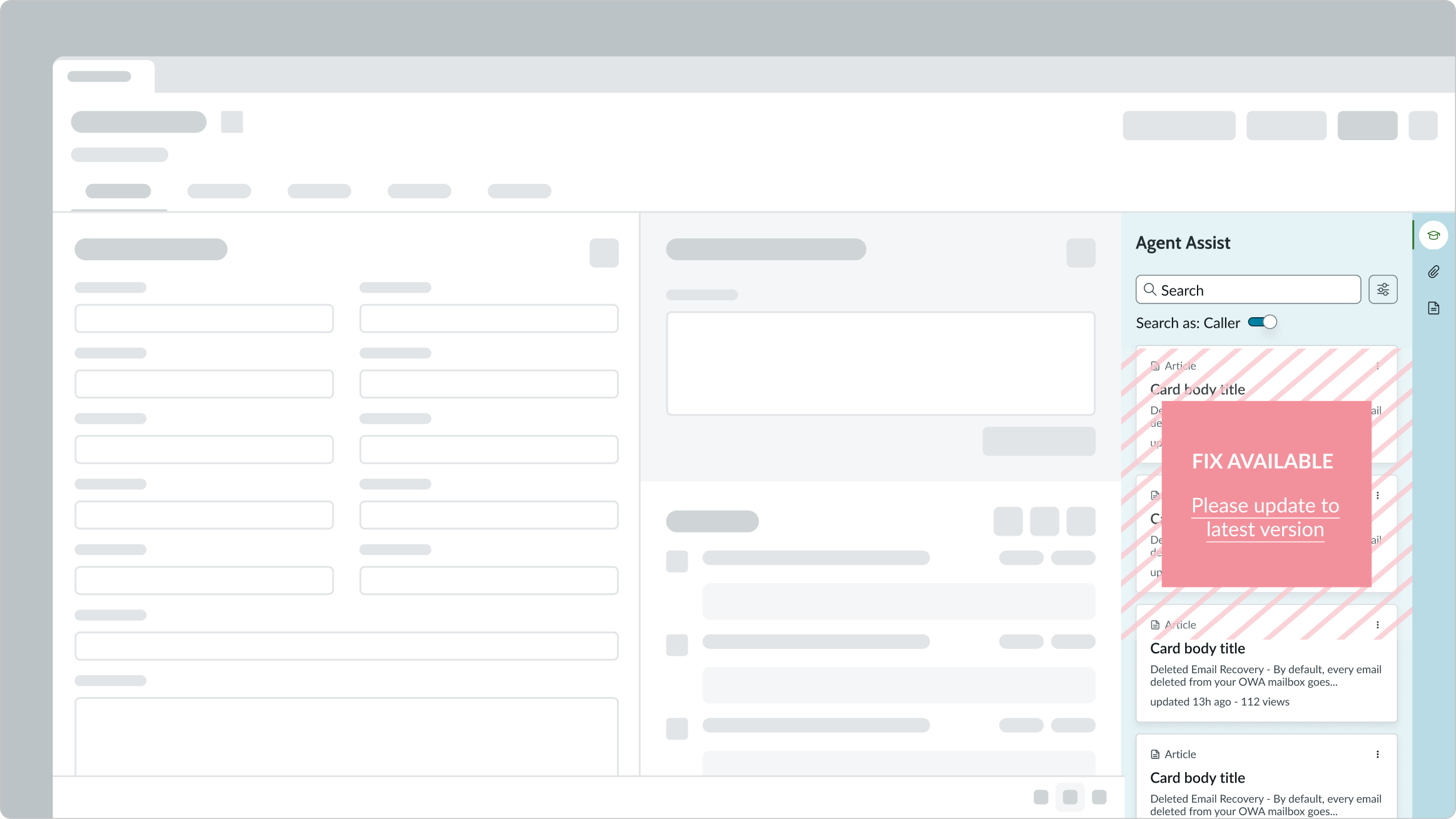
Admins can choose to show an alert when a user applies a template to a record and then later tries to apply the same template to the same record. The alert displays a confirmation dialog notifying the user that this template was previously applied to the record. The user can confirm if they want to reapply the same template to the record. This option is disabled by default.
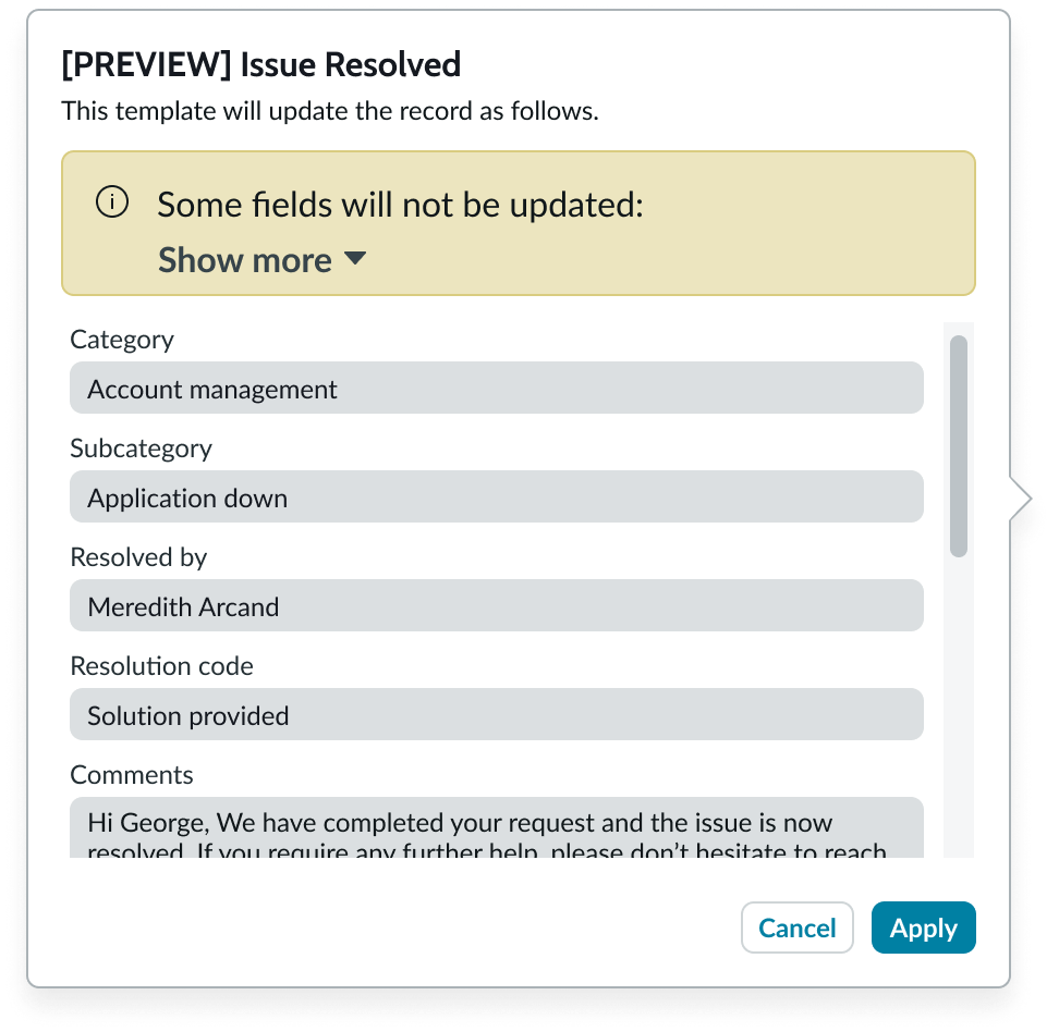
Preview button
Agents can use the Preview button to understand all the fields that will be affected when they apply a particular template. The preview content pops up in a modal and is enabled by default.
Truncation
When text in the template tile exceeds its maximum width, the text truncates with an ellipsis and a tooltip shows the full content on hover.
Usability
The form templates component complies with all internationalization and accessibility requirements.
Internationalization
When the display translates to a right-to-left (RTL) language, the component content flows from right to left, maintaining the hierarchy.
Accessibility
Learn how to access the actionable elements of the form templates component through keyboard interactions and screen readers.
[Component name] tab order
Standard introduction:
This is the tab order for
Components with subcomponents, templates, or bundles introduction:
This is the high-level tab order for
Note: For tab stop information about sub components of
Keyboard interactions
You can access the actionable elements of the form templates component with these keyboard keys:
- Tab: Shift focus to template tiles and tile menus, starting at the top and moving down the list of tiles in alphabetical order. The focus will move from the template tile then to the tile menu. Content of the tile does not shift when in focus (for example, truncated text does not expand when the tile is in focus).
- Shift+Tab: Moves focus in the opposite direction of the tabbing focus (for example, focus moves from a template tile menu to the associated tile then to the template tile menu from the tile above it).
- Enter/Space: Applies the template currently in focus on the template tile and can open the template tile menu and execute the actions in that menu.
- Up and Down arrows: When focus is inside the template tile menu, the up and down arrow keys are used to move between the tile menu options.
Screen readers
When you apply ARIA labels to a component, the screen readers announce the controls and content of the form templates component in the prescribed tab order.
- Search bar: "search field"
- Plus button: "create new template"
- Template tiles: "template tile"
- Tile menu: "template tile menu"