Anatomy
Learn about the individual parts of attachments.
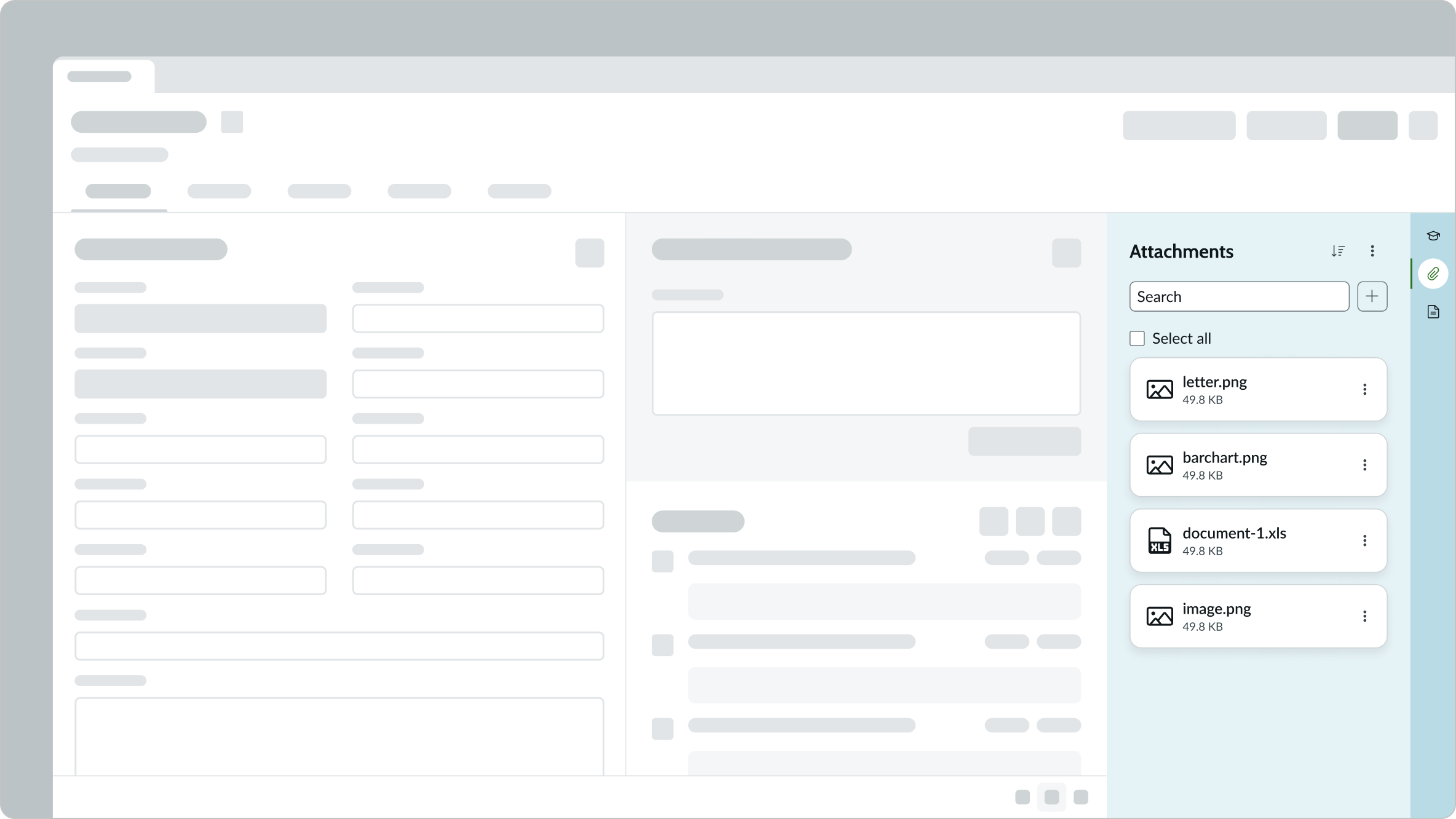
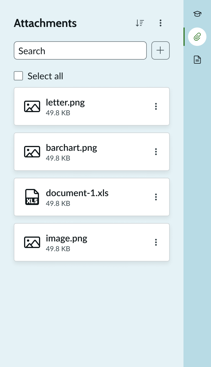
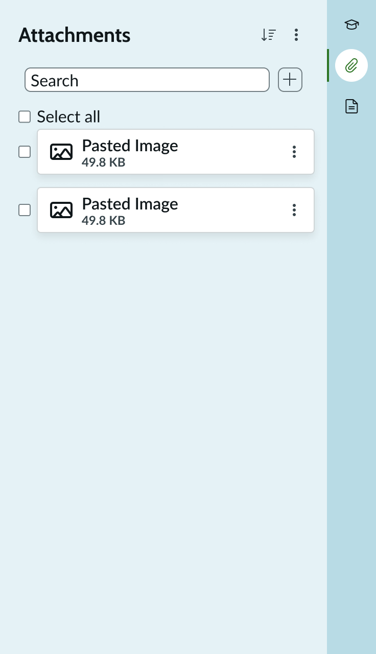
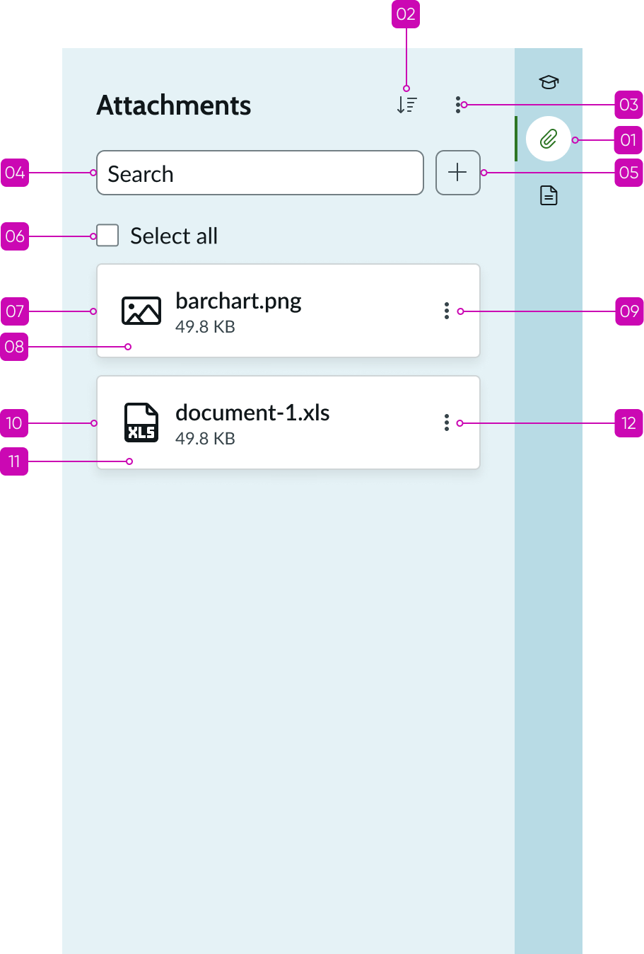
Main anatomy
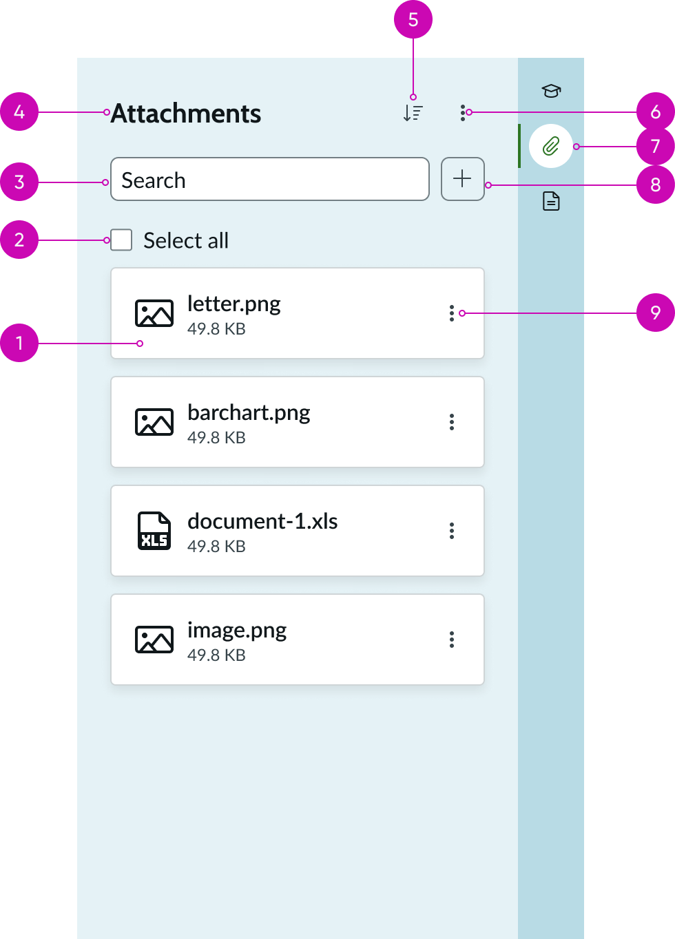
- Attachment card: Includes the attachment thumbnail, file name, metadata, and action menu
- Select all checkbox: Selects or deselects all attachments at once
- Attachment search: Search box to search for attachments based on file name
- Heading: Identifies the set of attachments
- Sort: Sorts the attachments alphabetically based on file name
- More Actions: Displays a list of actions that can be performed on all or selected attached files
- Attachments tab: Displays in the contextual side panel noting attachments to view (full component within contextual side panel only)
- Add files button: Uses iconic button for the full size and bare button for the compact size component to add a file
- Attachment card actions: Displays a list of actions that can be performed on the attached file
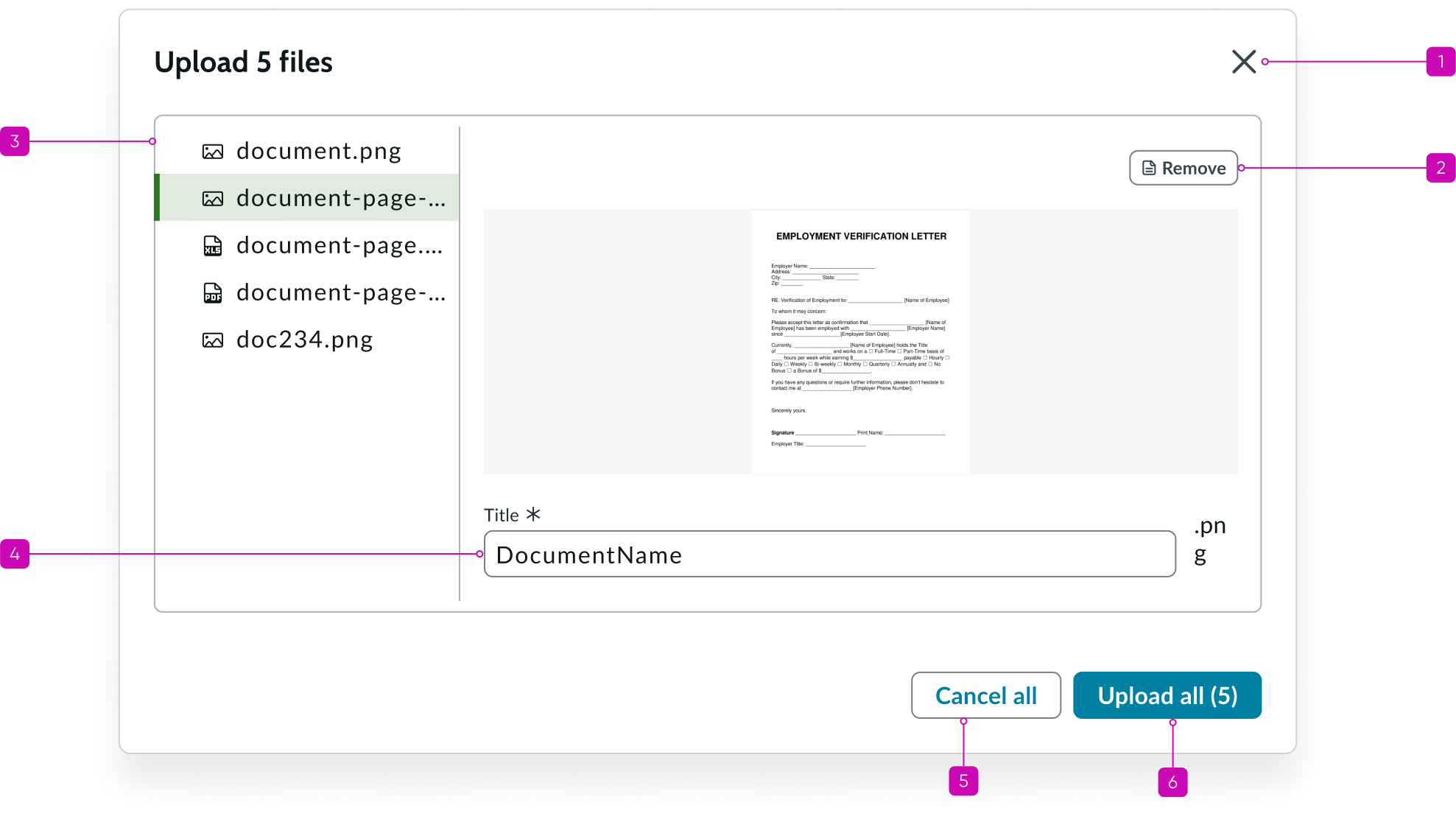
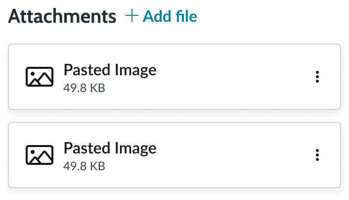
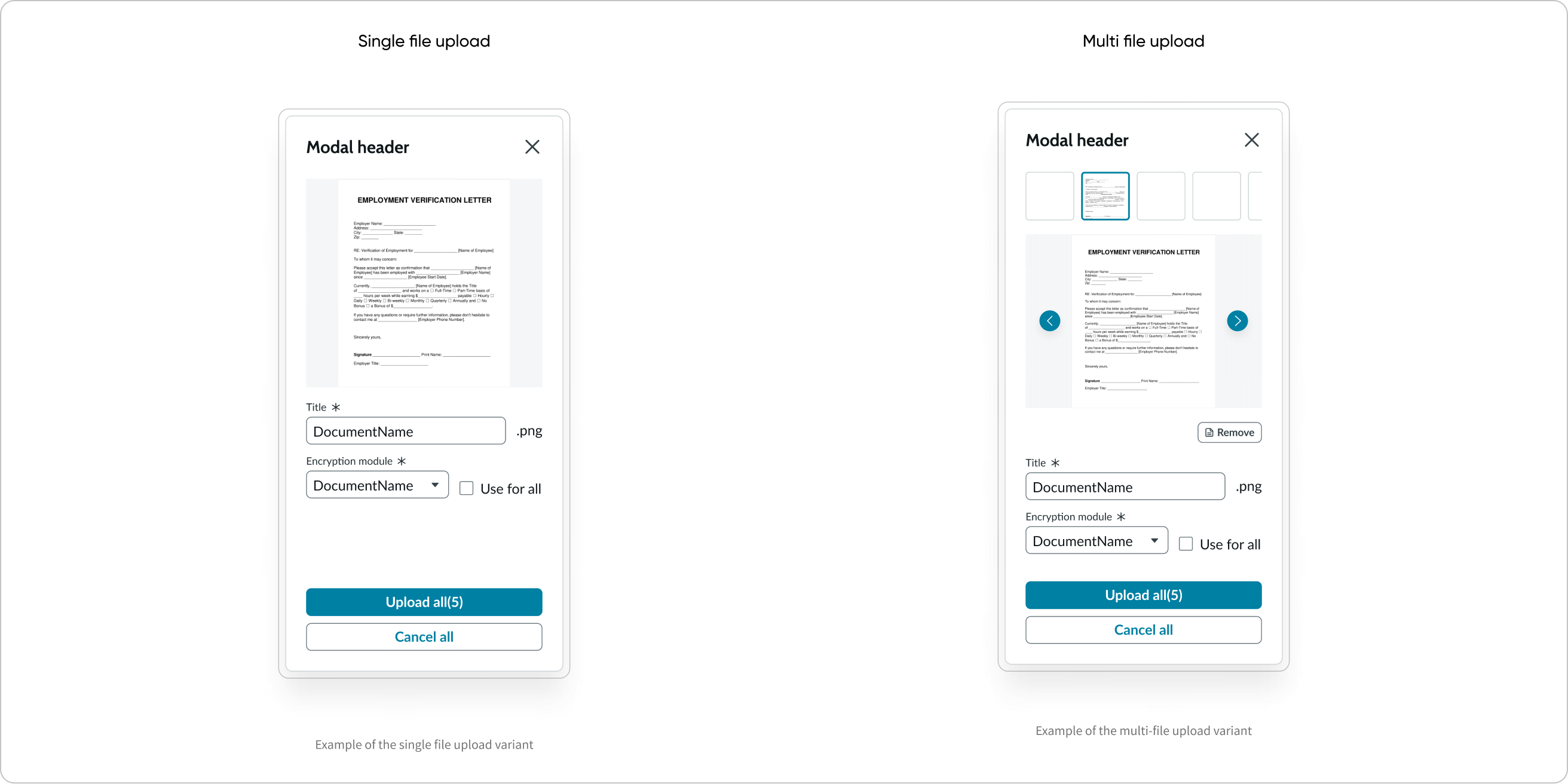
Upload preview modal
Desktop version
- Upload preview modal title: Upload preview modal title and number of files selected for upload
- Files list: Displays the files selected for upload
- File title: Displays the file name and extension; file name is editable
- Encryption module drop-down: Allows selecting the encryption module to apply to the file before uploading it
- Cancel button: Cancels the file upload operation and closes the upload preview modal
- Upload button: Uploads all the files with the changes made to file name or encryption settings
- Encryption module checkbox: Allows applying the encryption setting to all the files in the modal
- File preview: Displays a preview of the selected file in the upload preview modal
- Remove button: Removes the selected file from the upload list
- Close button: Closes the upload preview modal
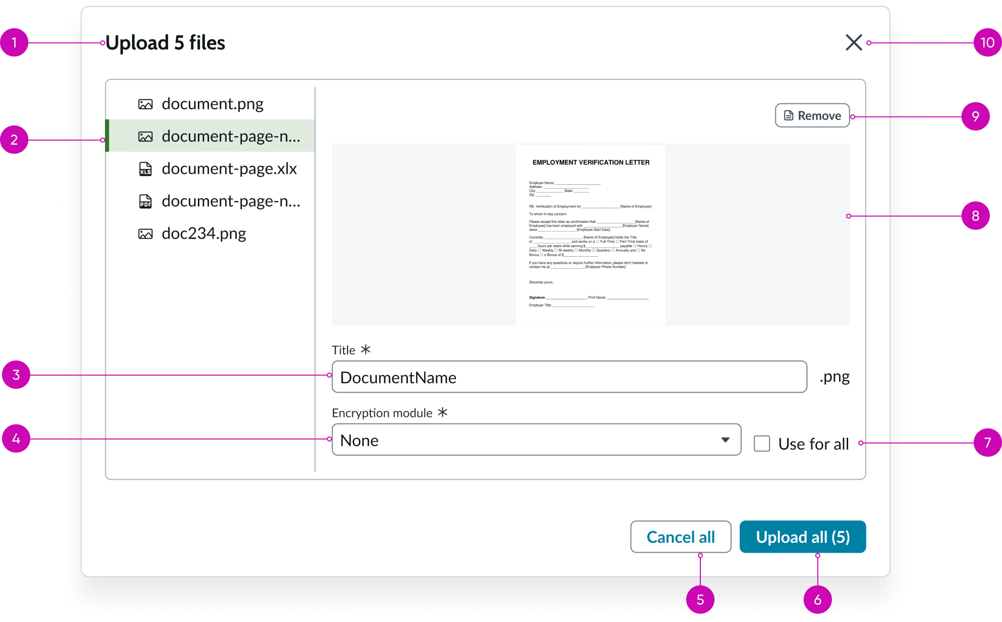
Mobile responsive version
- Upload preview modal title: Upload preview modal title and number of files selected for upload
- Files list: Displays the files selected for upload
- File title: Displays the file name and extension; file name is editable
- Encryption module drop-down: Allows selecting the encryption module to apply to the file before uploading it
- Cancel button: Cancels the file upload operation and closes the upload preview modal
- Upload button: Uploads all the files with the changes made to file name or encryption settings
- Encryption module checkbox: Allows applying the encryption setting to all the files in the modal
- File preview: Displays a preview of the selected file in the upload preview modal
- Remove button: Removes the selected file from the upload list
- Close button: Closes the upload preview modal
Usage
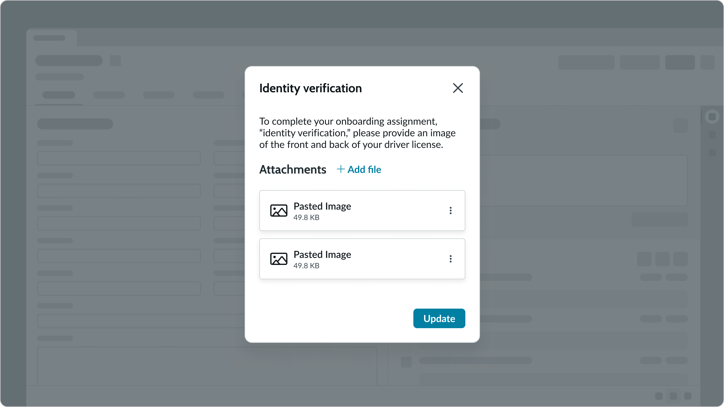
Use the attachments component to upload files with the browse file button. The button opens a window for the user to select a local file to add as an attachment. The attachments component supports the following attachment file types: .gif, .png, .bmp, .pdf, .ppt, .doc, .xls, and .txt. An admin can set the supported file types. When configured, users can create or delete attachments in the attachment repository.
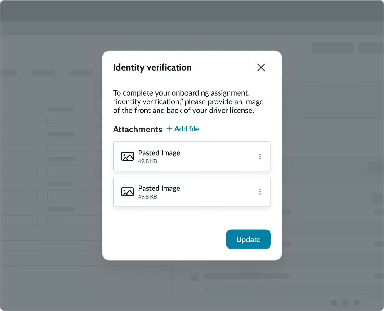
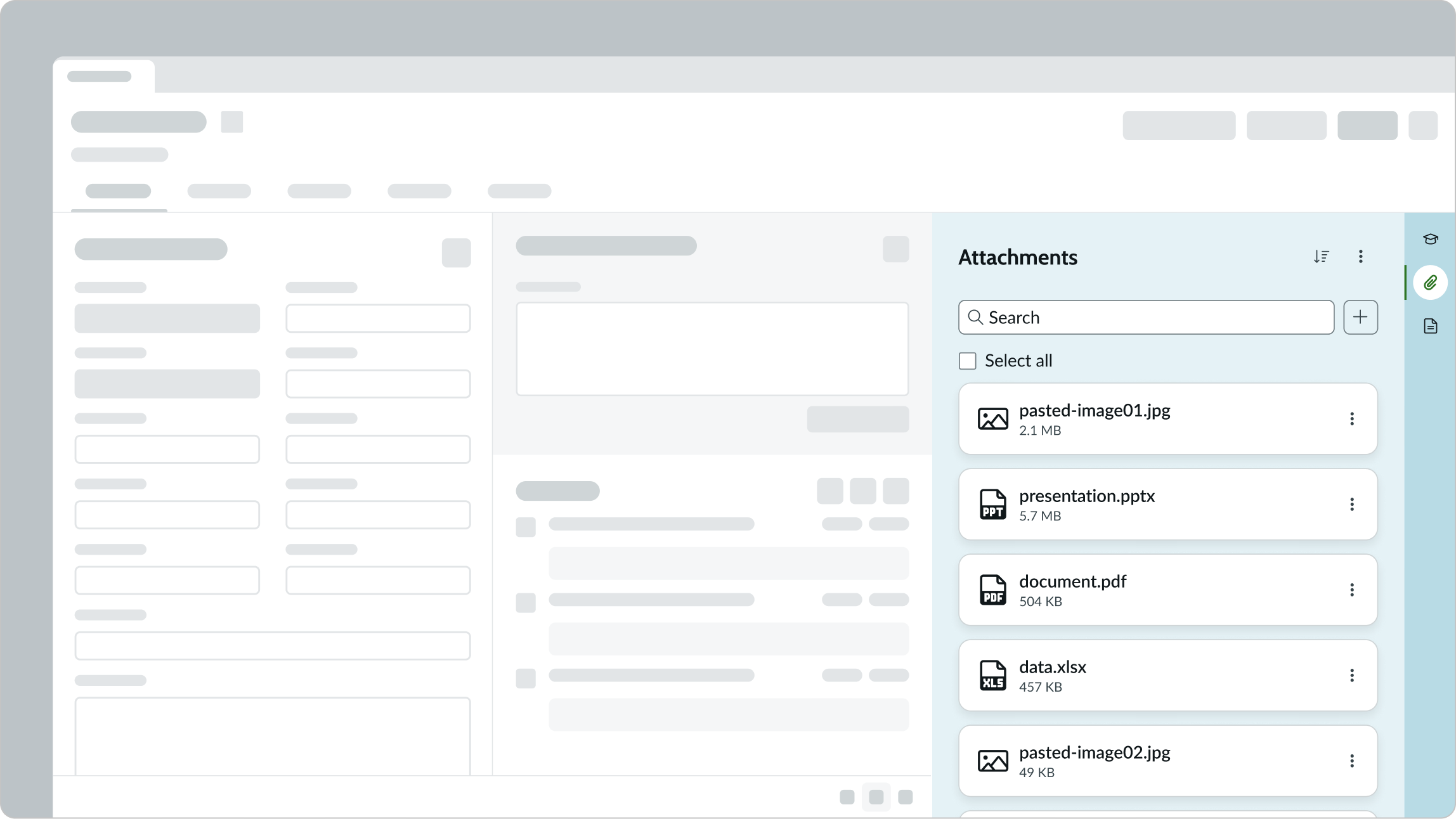
You can place the full component in a contextual side panel on a page or as a related item, where the attachments are associated with specific records.
Example of the full version of the attachment component configured in the contextual side panel.
Variants (responsive version)
Learn about the mobile-responsive variants of the attachments component.
The attachments component comes in full and compact versions. The full version is often seen with a contextual side panel, while the compact version is often placed inside a card or modal.
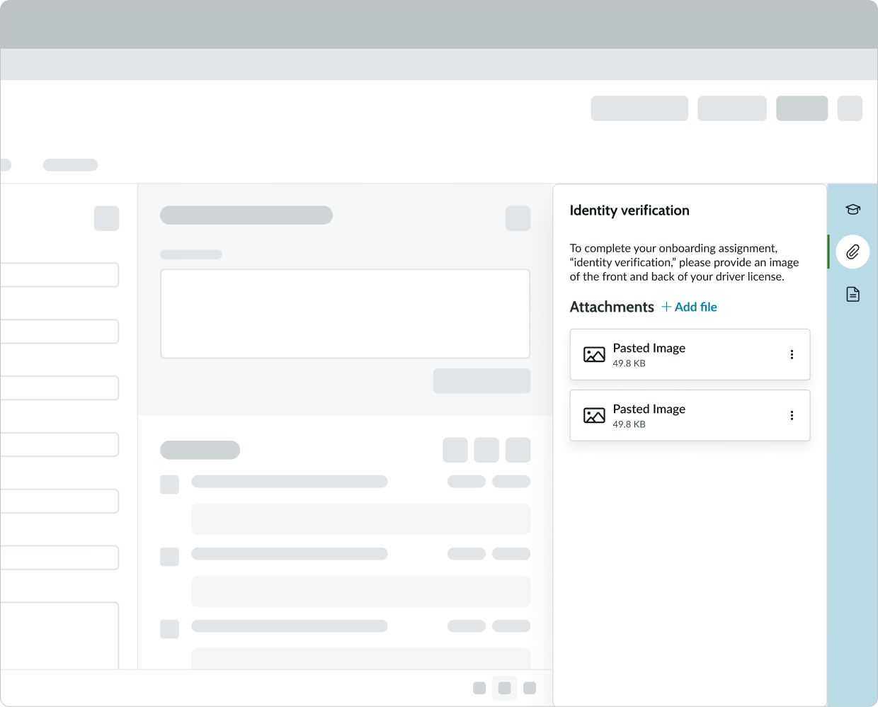
Full version (used in contextual side panel)

Example of the attachments component in a contextual side panel
Compact version
Example of the compact version of the attachments component in a modal
Compact version (used inside card or modal)
Example of the compact version of the attachments component in a modal
Custom

Example of the custom variant of the attachments component
Sizes
The full and compact component versions expand and contract to fit the container.
Compact spacing mode - turned off
Example of the component with compact spacing disabled
Compact spacing mode - turned on
Example of the component with compact spacing enabled
Configurations
An admin can configure the attachments presence to display or not as needed for certain users.
Presets and controllers
This component has a preset configuration that sets properties and event handlers, making it ready for use. You can override preset values with a custom configuration if needed. Preset values won’t upgrade with updates. To avoid using presets, configure manually. One preset can apply to a single component instance. See presets for more info.
A preset is linked to a controller, which serves as a data resource. Controllers provide configuration data and event bindings for the component. Selecting a preset adds the required controller to the page, allowing new components to use its preset. For more on controllers, see controllers. For default presets, see view properties and events in the controller API.
Custom layout
You can use a custom icon or button to represent the Attachments component. Selecting the button opens the preview upload modal.
File size
You can define the maximum size of a file that a user can attach to a record. If not defined, the maximum allowed file size is 1024MB.
File type
You can define the type of files allowed to be uploaded. If not defined, every file type is supported.
Design recommendations
Learn how to apply attachments in your design.
Put a compact component into a small container like a modal or playbook card, because it's designed to fit a small space for optimal usage.
Don't put a custom attachment component (compact) into a large container like contextual side panel, because valuable options like search functionality may be lost.
UI text guidelines
These are some recommendations for using text with attachments.
- Use sentence case for all titles, labels, and column headers
- Keep all text labels short and informative to increase readability and scanning
- Keep content concise and purposeful to provide value to the user
- Capitalize only the first letter and any proper nouns in a string of text
- Ensure content is contextual and specific to offer guidance and support to the user
Behavior
Learn how the attachments component behaves when the display changes or a user interacts with the component.
States
The attachments component has the following states: empty and attachment card hover.
Empty
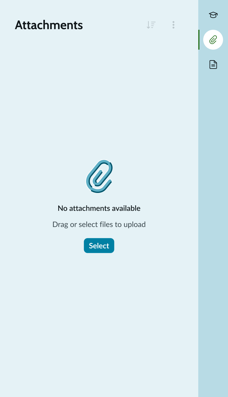
Empty state
Attachment card hover
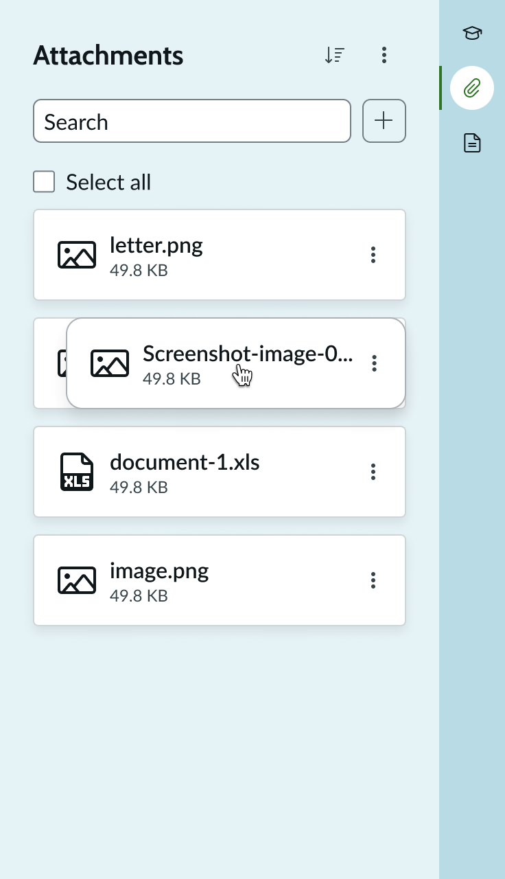
Attachment card hover
Responsive behaviors
Full or compact attachment cards, adjust to the container size. The cards expand with the container size until the maximum card size is reached and then they transition into a multi-column view. For example, the full component can appear within the contextual side panel. The attachment cards shift sizes within their breakpoints to conform to the size of the container.
Example showing attachment cards expanding with the container size until the maximum card size is reached
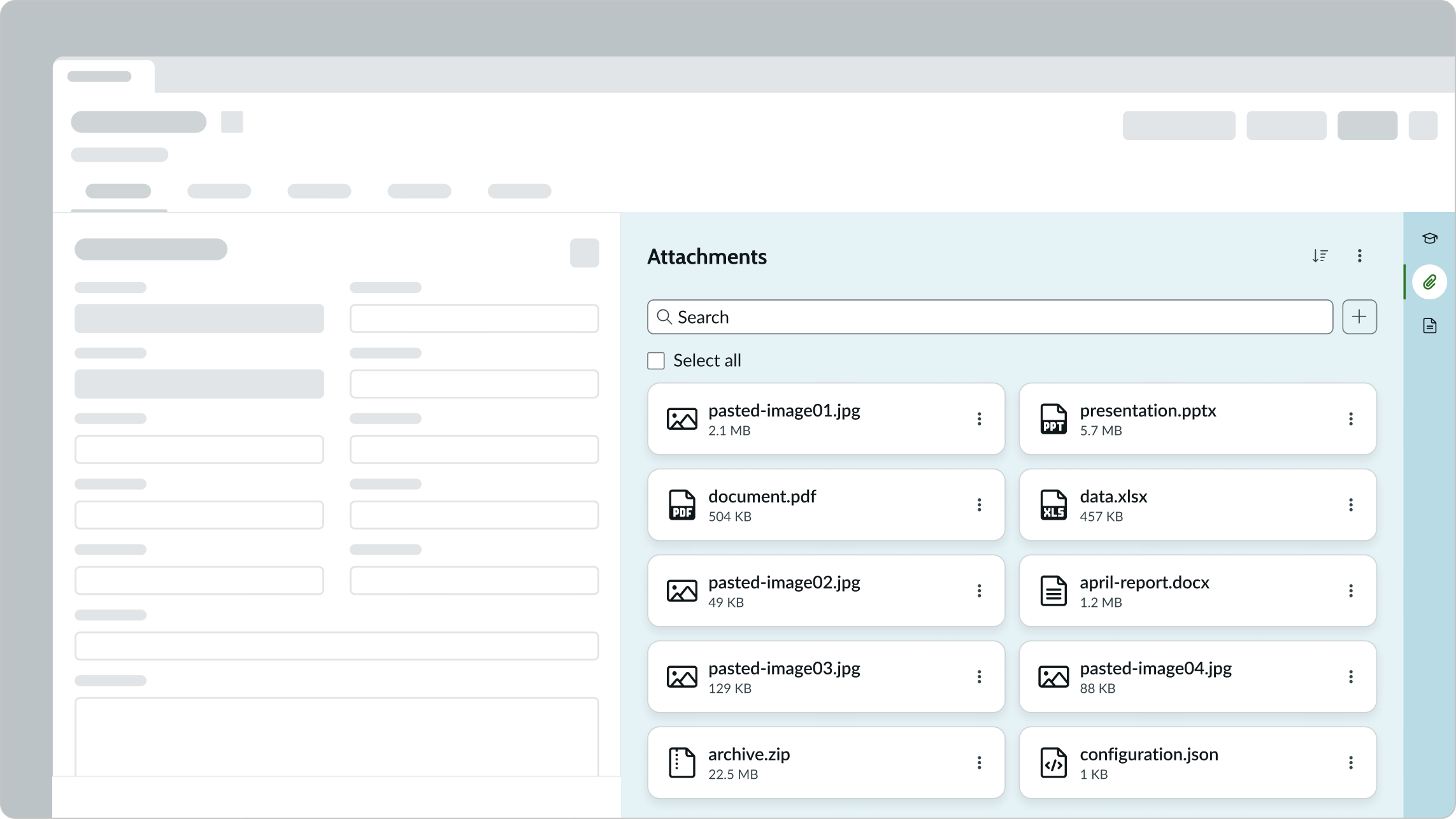
Example showing the full component is in a multi-column view (2 columns)
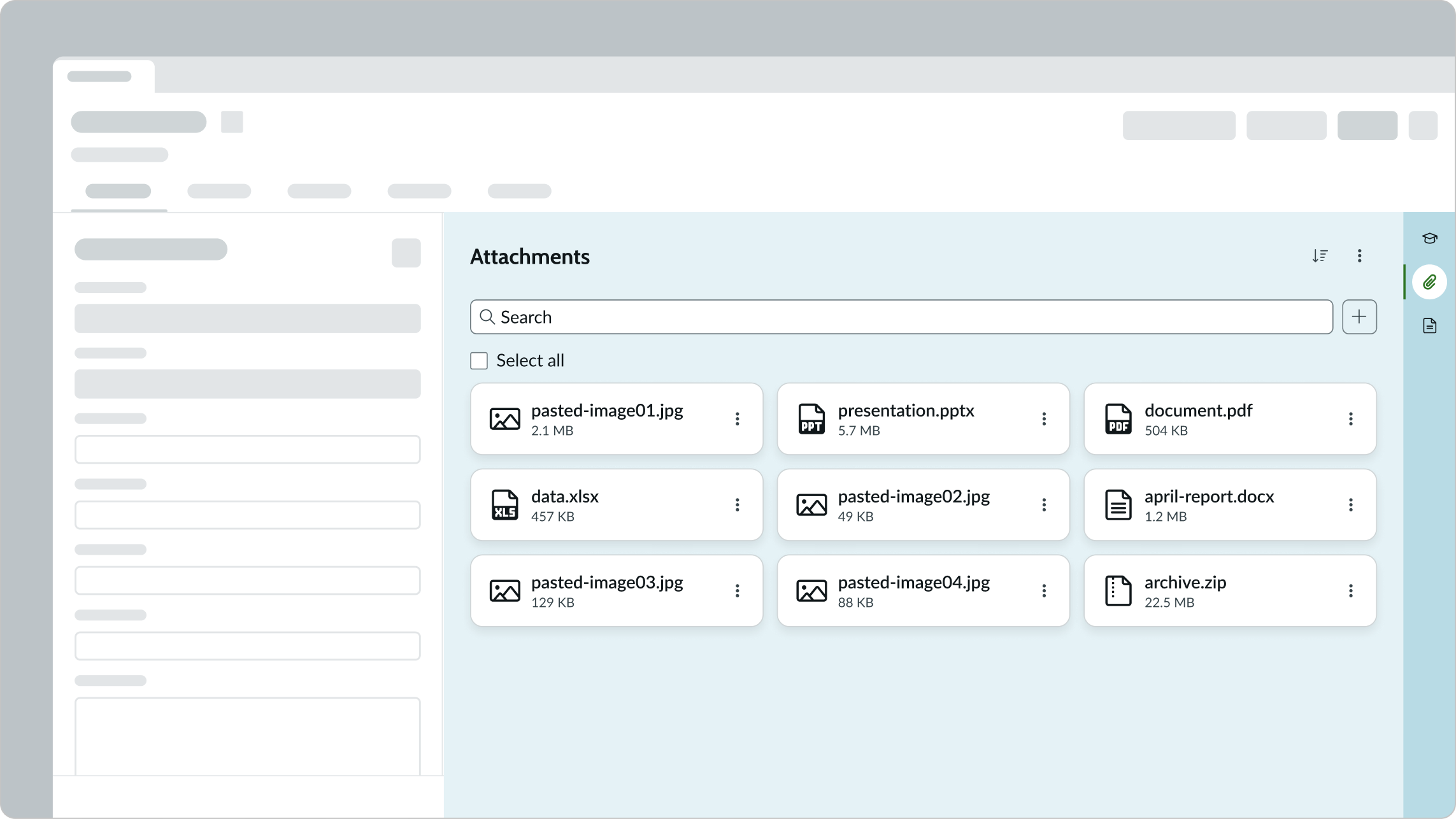
Example showing the full component is in a multi-column view (3 columns)
Mobile-responsive behavior
On smaller screes, such as a mobile screen, the attachment component and the upload preview modal resize to fit the screen. All elements shift to accommodate the screen size.
Interactions
The attachments component allows users to drag and drop files for upload, download all or individually selected files, interact with the attachment actions menu, upload using a button, and search through attachments (full component only).
Example showing the attachment card menu configured with options
Drag and drop
When there is a full component present in the contextual side panel or as a related item, the user can select one or multiple attachments to drag and drop anywhere into the window for upload.
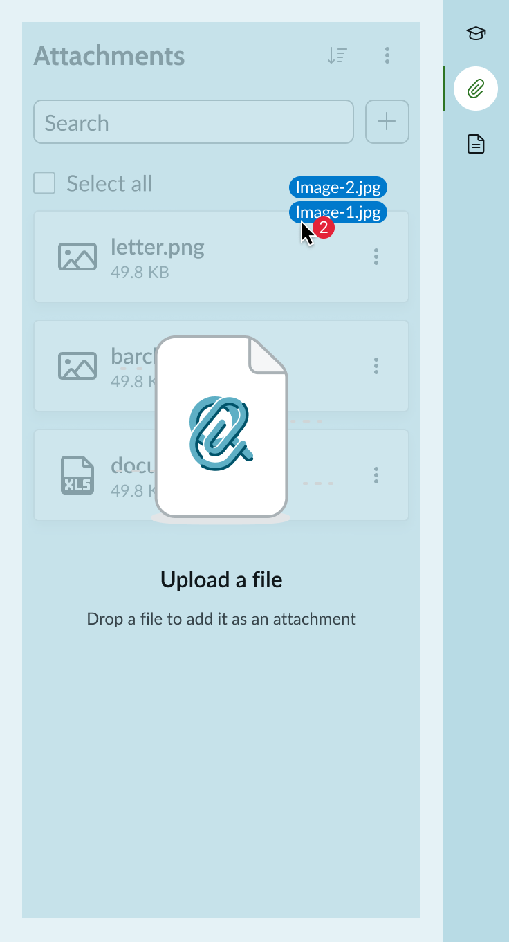
Example showing the drag and drop interaction
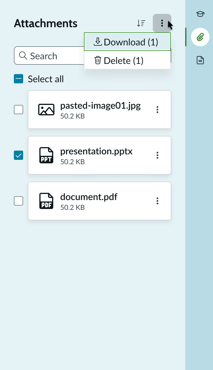
Download
The user can download all available files by selecting the More Actions icon, then selecting Download all (full version only). The files download as a ZIP file.
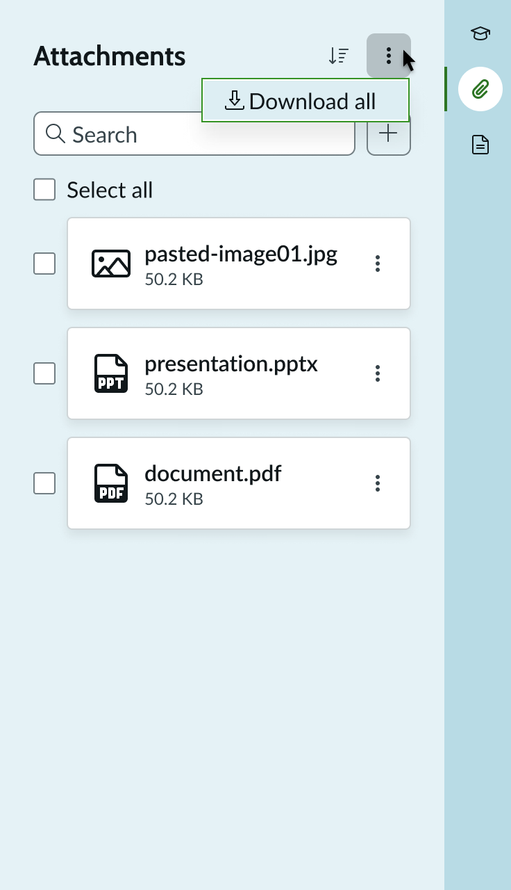
The user can also choose to download only the files they select (full version only).
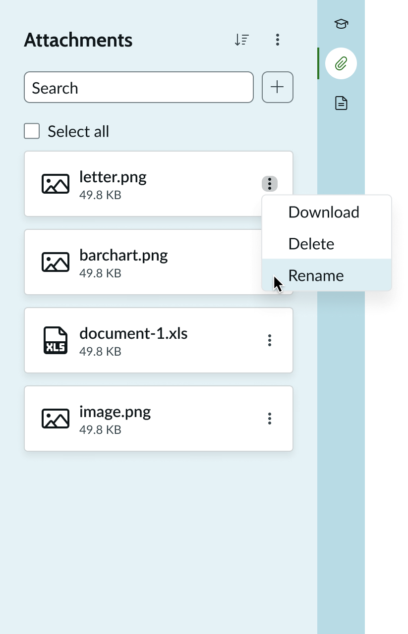
Rename
The user renames an attached file by selecting the Attachment actions icon, selecting Rename, and then editing the file name. The user can also rename the file in the upload preview modal.
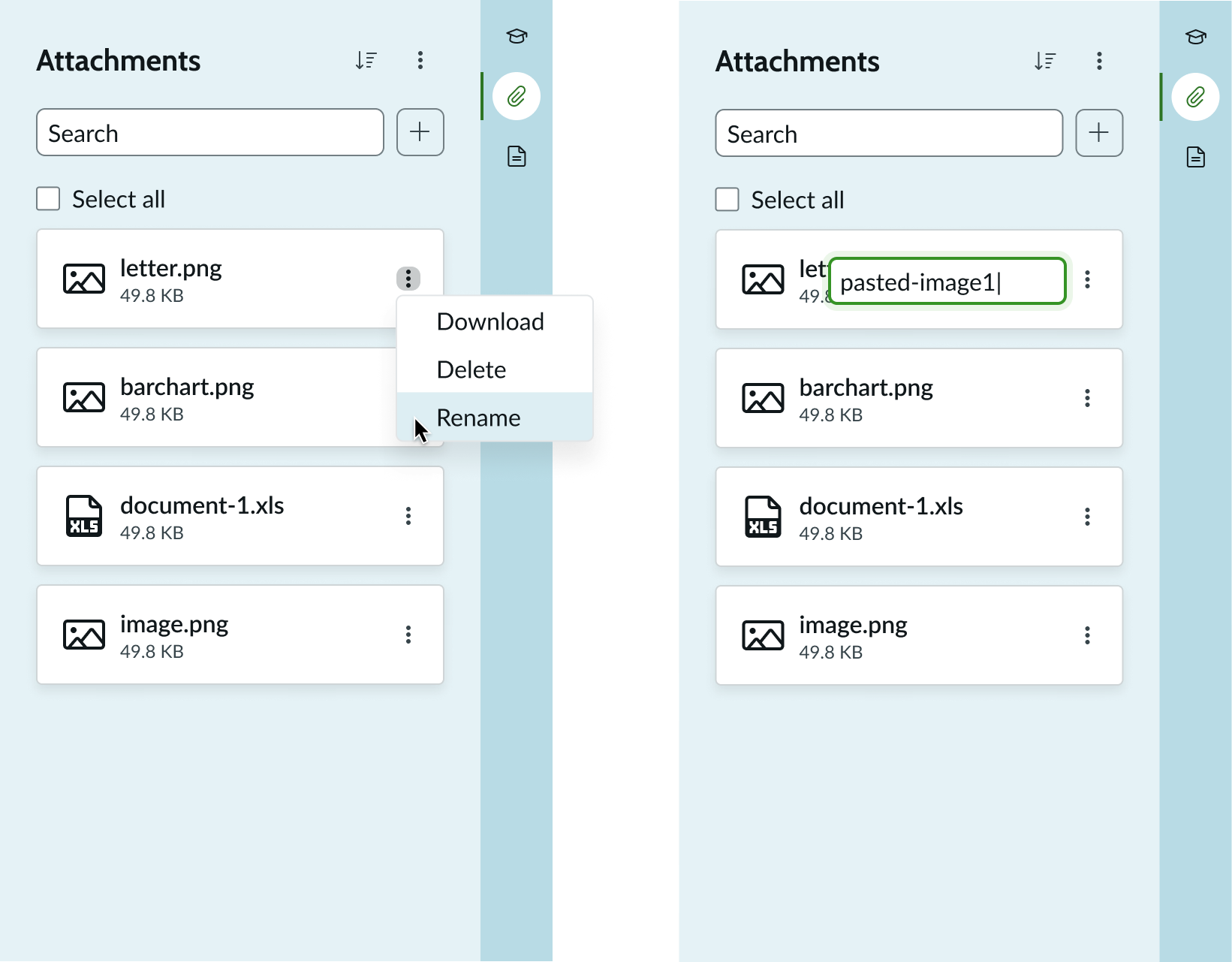
Example showing the attachment renaming interaction
Attachment card
Includes the attachment thumbnail (or NDS default thumbnail for that file type, if a thumbnail from the attachment is not available), file name, metadata, and action menu.
Users are granted access to different edit features in the attachment actions menu. Full editing access offers rename, download, and remove actions. Restricted editing will not see these options in the attachment actions menu. If the end user doesn't have access to any of the editing features, the actions menu will not appear in the attachment card. Files appear in the order uploaded.
Search field
Lets users look for attachments by file names associated with records, playbook steps, and emails (full version only).
Browse button
Uses iconic button for the full version and bare button for the compact version of the component to bring up a system browser window that lets the user select a local file to add as an attachment.
Truncation
When text in the attachments component exceeds the width of the container or content area, the text truncates with an ellipsis, and a tooltip shows the full content on hover.
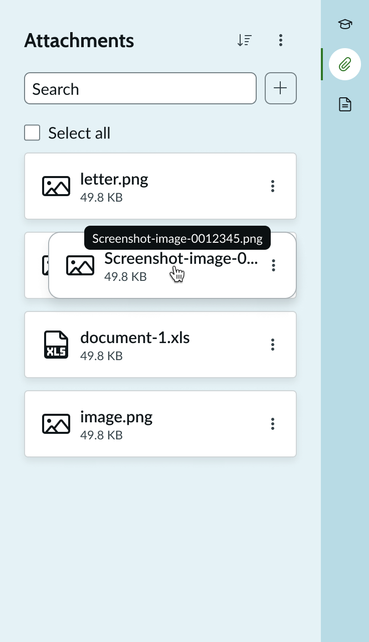
Example showing text truncation
Usability
The attachments component complies with all internationalization and accessibility requirements.
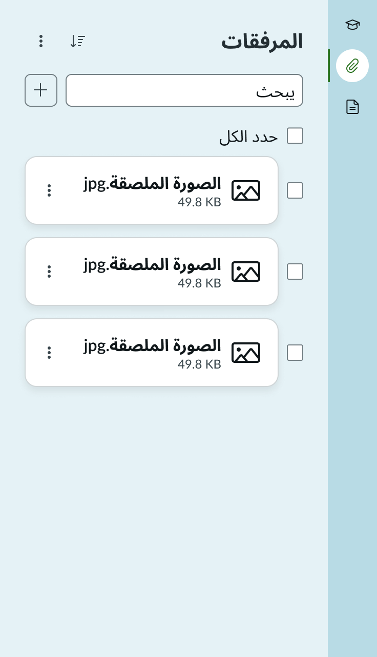
Internationalization
When the display translates to a right-to-left (RTL) language, the component content flows from right to left, maintaining the hierarchy.
Accessibility
Learn how to access the actionable elements of attachments through keyboard interactions.
Keyboard interactions
You can access the actionable elements of the attachments component with these keyboard keys:
- Tab: Shifts focus to attachment card and attachment actions menus, starting at the top and moving down the list of cards in chronological order, based on the attachment upload. The focus will move from the attachment card and then to the attachment actions menu. Content of the attachment card does not shift when in focus (e.g., truncated text does not expand when the card is in focus).
- Shift+Tab: Moves focus in the opposite direction of the tabbing focus (e.g., focus moves from an attachment actions menu to the associated card and then to the attachment actions menu from the card above it).
- Enter/Space: Opens the attachment for the card currently in focus in a full screen preview as well as opening the attachment actions menu and executing the actions.
- Up/Down arrows: When focus is inside the attachment actions menu, the up and down arrow keys are used to move between the menu options.
Tab order
Attachments component tab order
Upload preview modal tab order