

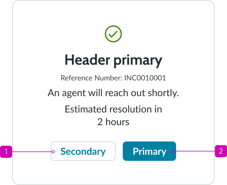
Anatomy
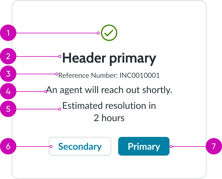
- Icon (optional): A symbol or character that supports a specific action or use case; you can customize the color of the icon to reflect the message status
- Header: Success message that shows the user's completed task; the text is customizable based on the type of confirmation
- Caption (optional): Text label and reference number for the newly created content
- Secondary message (optional): Text that provides more info to the success message; can inform the user about next steps
- Resolution message (optional): Text that provides an estimation as to when the task will be resolved; includes date and time-related information
- Secondary action (optional): Button that can take the user to the page associated with the new record; you can configure where this action takes the user
- Primary action (optional): Button that can take the user to the record detail page they generated; you can configure where this action takes the user
Subcomponents
Usage
Use the confirmation message component to notify a user that they have successfully performed an action (like submitting a form). You can use this component for anonymous or logged in scenarios.
Confirmation messages are important because they give the user certainty that their submission was received and that it didn't time out or get lost.
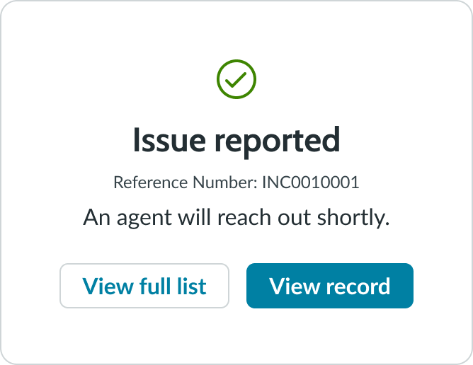
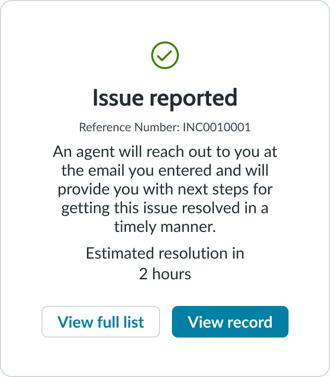
Record created
Use a confirmation message after the user has created something new within the experience. It provides the user with context and additional actions to go directly to the new record or view the collection of records.

In this example, the user reported an issue and can either view the issue by selecting the primary button or view a listing page of similar records by selecting the secondary button.
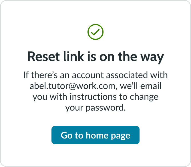
Request submitted
Use a confirmation message to inform the user that their submission was received. This provides the user with next steps or additional information, as well as an action to go elsewhere or return to the experience.

In this example, the confirmation message affirms that the user submitted a request to reset their password.
Variants
Learn about confirmation message and find out how to use it in your design.
Types
Learn about the different types for confirmation message.
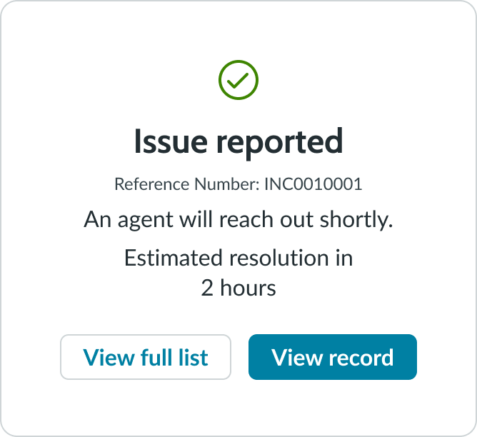
Record created
This type provides the user information for the record they created. It also provides a primary action (go to the created record) and a secondary action (go to a list of others they have created).
In this example, the confirmation message confirms that the user submitted an issue.
Request submitted
Also known as the non-record related type, this type provides the user with simple information about the request they submitted. In this scenario, the user is not logged in so a single action to take them back to the homepage is available. (Other examples could be for a survey form submitted.)
In this example, the confirmation message notifies the user of this password reset request.
Configurations
Learn how to customize confirmation message by configuring the available properties.
Order
All subcomponents and elements within the component are in fixed positions that can't be changed. For example, you can't move the buttons to the top of the container.
Subcomponents
All subcomponents and elements within the confirmation message are optional except for the header. If all optional subcomponents and elements aren't included within the configuration, the space that they occupy collapses. The included subcomponents then move to occupy the additional space.
You can't show only a secondary button within this component. If a single action is available, it displays as a primary button.
Design recommendations
Learn how to apply confirmation message in your design.

Keep secondary message short and concise to provide the user with the most important information.
Avoid long secondary messages, as this creates visual clutter. Use secondary messages to concisely describe next steps or additional information.
Keep button labels short and concise for better readability.
Avoid using long button labels.
Alignment and positioning
Within the confirmation message component, the subcomponents always appear in the same position. If any subcomponents aren't included, the space that they would occupy is collapsed and the remaining subcomponents move to occupy that space.
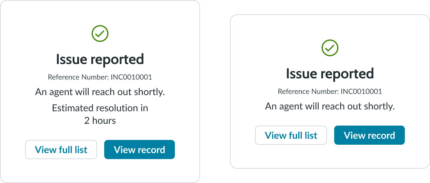
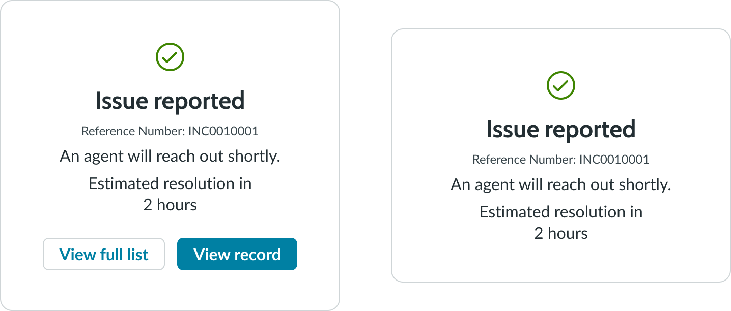
For example, if you choose not to include the resolution message, the space collapses and the buttons move up.
UI text guidelines
These are some recommendations for using text within confirmation message:
- Headers should start with the object that was submitted, followed by a verb in the past tense
- Use the exclamation mark sparingly throughout your design, as users may find repetitive exclamations insincere
- Keep the dropdown trigger text short and simple
- Button labels should always start with a verb
- Use intuitive language for the button labels; the user should know what to expect when they select the button
Behavior
Learn how confirmation message behaves when the display changes or a user interacts with the component.
States
The button component states apply to the primary and secondary actions within the confirmation message component.
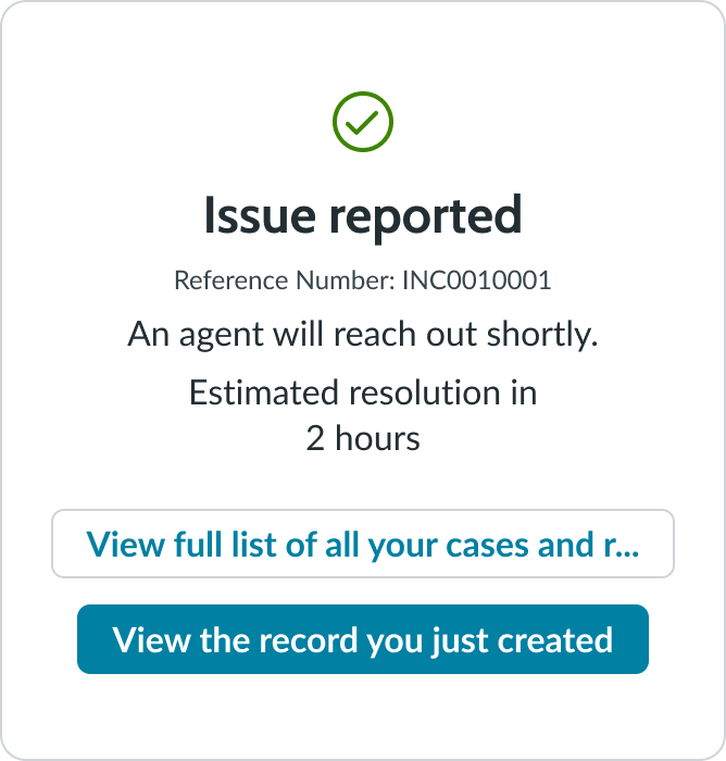
Responsive behaviors
The confirmation message is responsive based on the container and size of the display. Within the confirmation message, text wraps to the next line if it exceeds the width of the subcomponent. If the length of the button labels exceeds the width of the container, the buttons stack vertically instead of staying side by side. This also happens when as the container width shrinks for smaller displays.
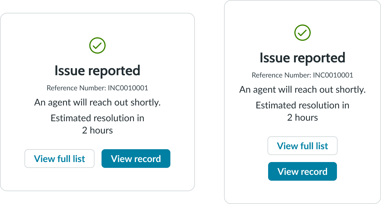
In this example, the subcomponents rearrange based on the width of the container.
Interactions
The user can only interact with the primary and secondary buttons within the confirmation message.
Truncation
The text in confirmation message doesn't truncate. If the text for the header, secondary message, or resolution message exceeds the line it's on, it wraps to the next line.
Usability
Confirmation message complies with all internationalization and accessibility requirements.
Internationalization
When the display translates to a right-to-left (RTL) language, the primary and secondary buttons flip their positions. The record number (if included) doesn't translate and retains its left-to-right (LTR) layout. However, the label that supplements the record number translates and appears to its right.

Accessibility
Learn how to access the actionable elements of confirmation message through keyboard interactions and screen readers.
Confimation message tab order
This is the tab order for confirmation message.
This shows the tab order for the confirmation message.
Keyboard interactions
Users can only use their keyboard to access the button components in a confirmation message.
- Tab: Navigates through the button set; it follows the specified tab order
- Space or Enter: Initiates the button action
Screen readers
Screen readers follow the standard tab order. For left-to-right (LTR) and right-to-left (RTL) languages, tab order begins with the secondary button.