Anatomy

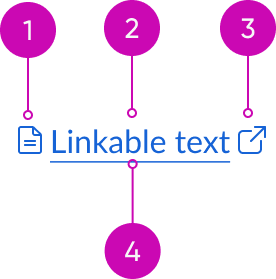
- Icon before (optional): You can place an icon at the beginning of the label; the icon size is proportional to the label size
- Label: A string of linked text that describes the intent of the link
- Underline (optional): A way to provide extra visual emphasis on a text link
- Icon after (optional): You can place an icon at the end of the label; the icon size is proportional to the label size
Subcomponents
Usage
Use text link within the content in the display or within other components to direct a user to another page or area.
Avoid using a text link to encourage an action, cause a change in the UI, or manipulate data. For these types of interactions, use the button component instead.
Variants
Learn about the variants of text link.
Types
Text link has the following different variants: primary and secondary.
Primary
Use the primary variant except for when it doesn't comply with WCAG 2 AA standards.

Secondary
Use the secondary variant when the primary style doesn't meet WCAG 2 AA contrast and color requirements on backgrounds with color.

Configurations
Learn how to customize text link by configuring the available properties
Icon start
If defined, icon start specifies the icon to display at the start of the label. For valid inputs, see usage guidelines for icon.

Icon end
If defined, icon end specifies the icon to display at the end of the label. For valid inputs, see usage guidelines for icon.

Alert messages
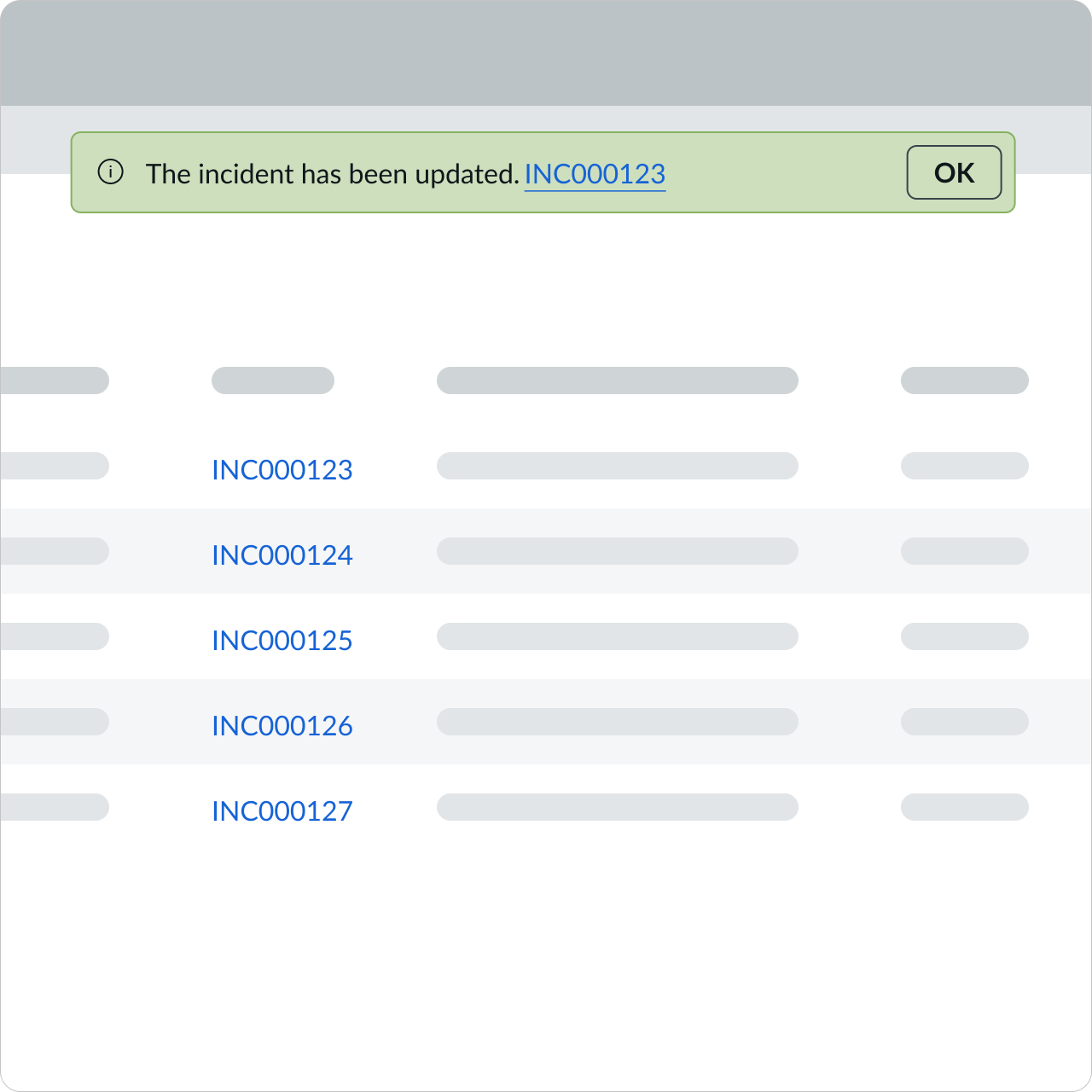
You can configure a text link within an alert to provide context to the alert message.

In this example, the case number within the alert message is a text link that takes the user to the case.
List
Configure a text link in a list to provide additional context to an individual list item.

In this example, the list displays case numbers as text links. A user can select one of the text links to get more detailed information for that specific case. These text links aren't underlined to reduce visual distraction.
Design recommendations
Learn how to apply text link in your design.

Underline a text link when you want to get the user's attention. If they’re part of a long list, use the text link without underline.

Avoid underlining text links if they're part of a long list because it creates an unnecessary visual distraction.
UI text guidelines
Consider these recommendations for labeling a text link:
- Keep labels short. Long labels make the linked words hard to read.
- Use verbs for text links. Verbs give the reader a direct call to do something.
- Avoid generic labels. By using a specific label, you help people understand where a link goes.
- For example, “View record” tells the user where the link will go and what they will view
- If you need to use a generic link like “Learn more” due to limited space, remember to provide alt text to tell screen readers where the link goes. Remember to also include the visible label in the alt text as well.
Behavior
Learn how text link behaves when the display changes or a user interacts with the component.
States
Text link has the following states: default, hover, and pressed. The color of a text link changes between states. If the text link includes an underline, each state will also include the underline styling.
| State | Primary | Secondary |
|---|---|---|
| Default | ||
| Hover | ||
| Pressed |
Responsive behaviors
If a text link wraps, the link style also wraps with it.

Without underline

With underline
Usability
Text link complies with all internationalization and accessibility requirements.
Accessibility
Keyboard interactions
- Tab: Shifts focus to the link
- Enter: Launches the link and moves focus to the link target
Forced colors
Text link supports the use of Forced Colors, most commonly activated through Windows high contrast themes.

