Anatomy
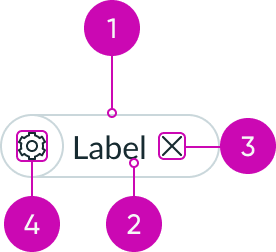
- Container: Contains all elements of a pill
- Label: Text that adds context to the pill's functionality
- Dismiss button (optional): A way for the user to interact with the pill
- Identifier (optional): An avatar or icon that visually represents the label
Usage
Use to indicate selected values in multi-select fields. The pill component can contain information such as inputs, actions, or attributes. A pill dynamically appears based on the interaction that creates it. For actions that need to be consistently available, consider using a button.
Variants
Learn about the attributes of pill.
Types
A pill contains information like inputs, actions, or attributes. There are the following different types of pills: selection pills, input pills, and tagging pills.
Selection pill
A selection pill is a filter that doesn't have an action. The user can turn the pill on and off by selecting and deselecting it.

In the image above, the selection pill is shown in both the unselected state (no fill color) and selected state (primary color).
Use a selection pill to filter a list of items. The user can apply multiple filters at once by selecting more than one pill.
Input pill
An input pill displays the user's choice in an input field. Use an input pill to differentiate user inputs from one another.

Tagging pill
A tagging pill uses a user's name as the label. You can optionally add an avatar to distinguish users from one another.
Use a tagging pill for assigning users to a task.

Sizes
A pill is available in the following sizes: extra small, small, and medium.
Extra small
Use an extra small pill to accommodate reduced padding and height, as well as to provide visual consistency. The size of the font, avatar (if included), and presence icon is extra-small. The icon size is small.
For example, for a small typeahead component, you need to use an extra-small pill.
| Label only | Label and presence avatar | Label and icon |
|---|---|---|
Small
Use a small pill for input fields, dropdowns, and popovers. The size of the font, icon, avatar (if included), and presence icon are all the small size.
Note: small is the default size for pill.
| Label only | Label and presence avatar | Label and icon |
|---|---|---|
Medium
Use a medium pill for user or system-generated filters. The font size is medium size, but the icon, avatar, and presence icon are small size.
| Label only | Label and presence avatar | Label and icon |
|---|---|---|
Configurations
Learn how to customize pill by configuring the available properties.
Pill label
Configure the pill label property to display text inside the pill that explains the pill’s function.
Size
Configure this property to choose the size of your pill.
Interaction
By default, pill responds to user interaction, such as selecting it, hovering over it, and receiving focus. If you don’t want a pill to react to user interaction and become regular text, you can specify “None.”
Dismiss button
You can configure pill to display a dismiss button. When selected, the dismiss button removes the pill.
Disable
Use to mute the pill color and prevent user interactions. By default, this feature is not enabled.
Icon or avatar
If you add an identifier to the pill component, you can configure it to be an icon or an avatar.
Add an icon to a pill when the label could benefit from a visual cue.

Add an avatar for a tagging pill, when the label is a user's name.

Selected
By default, the pill isn’t selected. Use this property to display the selected state. If you want to handle the action manually, you can override this default behavior by using the “Manage selected” property.
Manage selected
Use this property to override automatic updates to the “Selected” property, allowing the parent or application to handle updates manually and trigger custom actions.
Tooltip
Configure the tooltip property to display text in the tooltip assigned to a dismiss button. If no content is provided, the default text is “Remove.”
Design recommendations
Learn how to apply pill in your design.
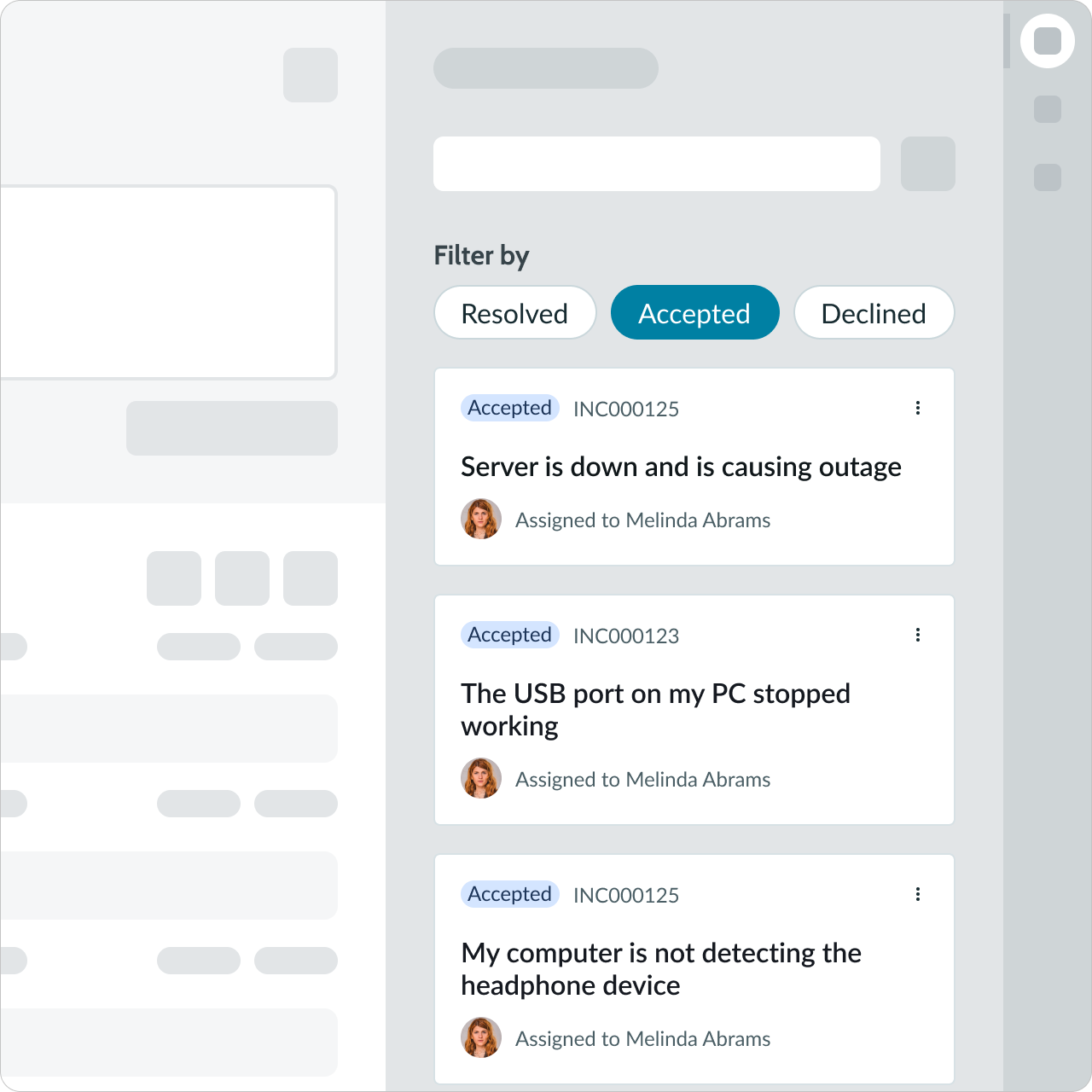
Use selection pills in groups of two or more to give users options.
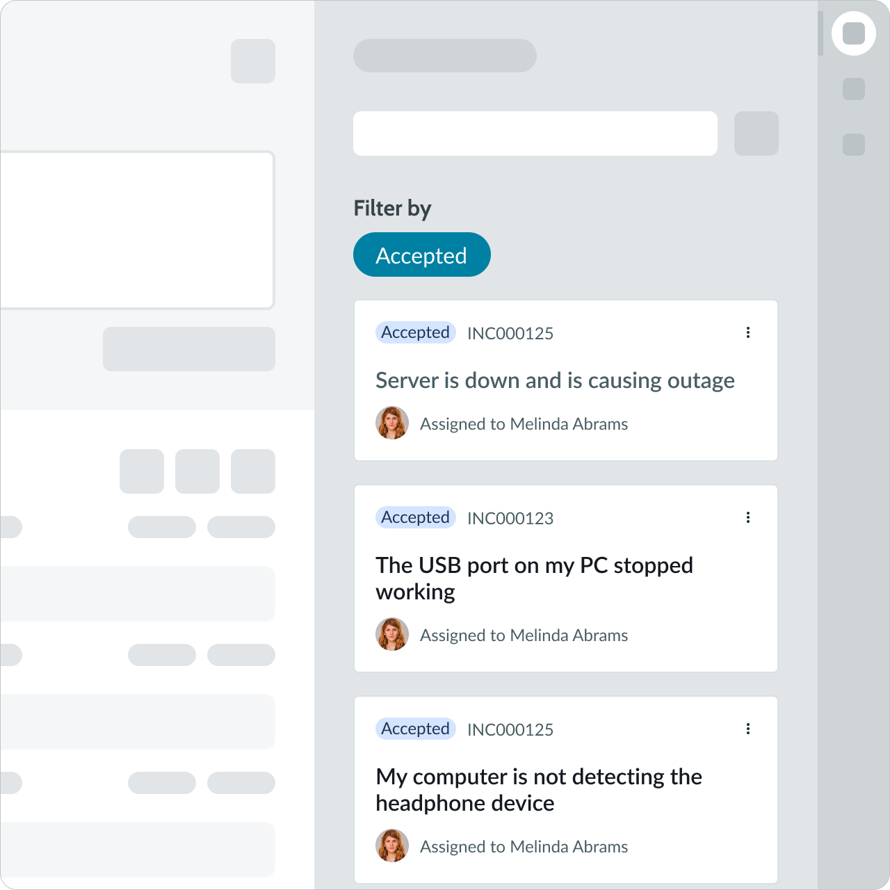
Selection pills shouldn't be presented as a single option.
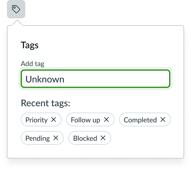
Pills should fit within the display.
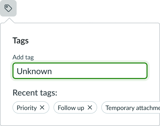
Don't allow your display to cut off pills or force users to scroll to see other options.
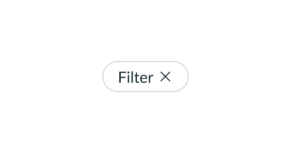
Keep labels in a pill short and concise for better readability.
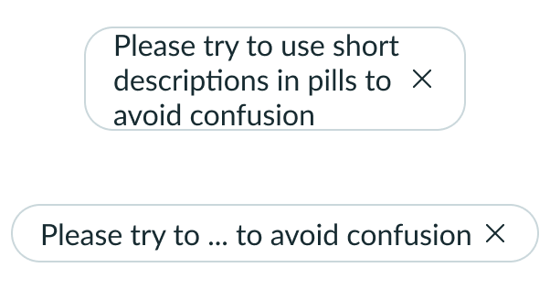
Avoid long labels in a pill.
UI text guidelines
These are some recommendations for using text within pill:
- If you’re using a selection pill, the label should describe different ways to filter what the person is viewing
- For example, two side-by-side selection pills could be “All” and “My tasks”
- If you’re using an input pill, the labels for the choices will be what the person has chosen or selected
- If you’re using an identifier with the label, the icon should make sense with the label
Behavior
Learn how pill behaves when the display changes or a user interacts with the component.
States
Pill has the following states: default, hover, hover on dismiss button, focus, active, selected, hover on selected, active on selected, and disabled.
Note: The same states apply to both the pill and dismiss, but they are applied separately (i.e. the state only applies to the dismiss button when the user directly interacts with it).
| State | Without Identifier | With Identifier |
|---|---|---|
| Default | ||
| Hover | ||
| Hover on dismiss button | ||
| Focus | ||
| Active (pressed) | ||
| Selected | ||
| Hover on selected | ||
| Active on selected | ||
| Disabled |
Responsive behavior
When multiple pills appear in an input field, they will stack on top of one another.
| Single-line Use Case | Multi-line Use Case |
|---|---|
 |
 |
Truncation
The label text determines the width of the pill unless you enforce a container width. Containers provide pills a set width with their truncation behavior.
Though truncation is available, avoid text with long character counts.

Interactions
Learn how pill responds when a user interacts with it.
Remove pill
The user can remove the pill using the "X" button. This action is available for input and tagging pills, but not for selecting pills.
Select pill
The user activates a pill by selecting it.
Usability
Pill complies with all internationalization and accessibility requirements.
Internationalization
When the display translates to a right-to-left (RTL) language, the elements flip. The label appears on the right and the action appears on the left. If the pill has an identifier, it appears to the right of the label.


Accessibility
Learn how to access the actionable elements of pill through keyboard interactions and screen readers.
Keyboard interactions
The input pill has the following keyboard interactions:
- Up and down arrow: Moves to the previous or next row
- Right and left arrow: Moves focus to the next or previous element
- Enter: When focus is on the label, it will select the pill; when focus is on the action, it will remove the pill
- Delete: Removes the filter; when pills are added or removed, an off-screen live region informs screen reader users of the result of the action so they don't have to move focus to confirm that the action was completed
- Home or Fn + left arrow: Moves focus to the first pill
- End or Fn + right arrow: Moves focus to the last pill
The selection pill has the following keyboard interactions:
- Up and down arrow: Moves to the previous or next row
- Right and left arrow: Moves focus to the next or previous element
- Enter/Space: When focus is on the label, it will enable the filter; when focus in on an enabled filter, it will disable the filter
- When pills are enabled or disabled, an off-screen live region informs screen reader users of the result of the action so they don't have to move focus to confirm that the action was completed
- Remember that multiple pills can be turned on and off in a single display
- Home or Fn + left arrow: Moves focus to the first pill
- End or Fn + right arrow: Moves focus to the last pill
Screen readers
If the pill doesn't have a label, or if the label doesn't describe the pill's function, you can configure the icon with an aria-label property. This property creates alt text that the screen reader can use to announce the pill’s function.
Available ARIA properties for the button and icon components in a pill are:
- aria-braillelabel
- aria-brailleroledescription
- aria-colindextext
- aria-description
- aria-label
- aria-placeholder
- aria-roledescription
- aria-rowindextext
- aria-valuetext

